
motion
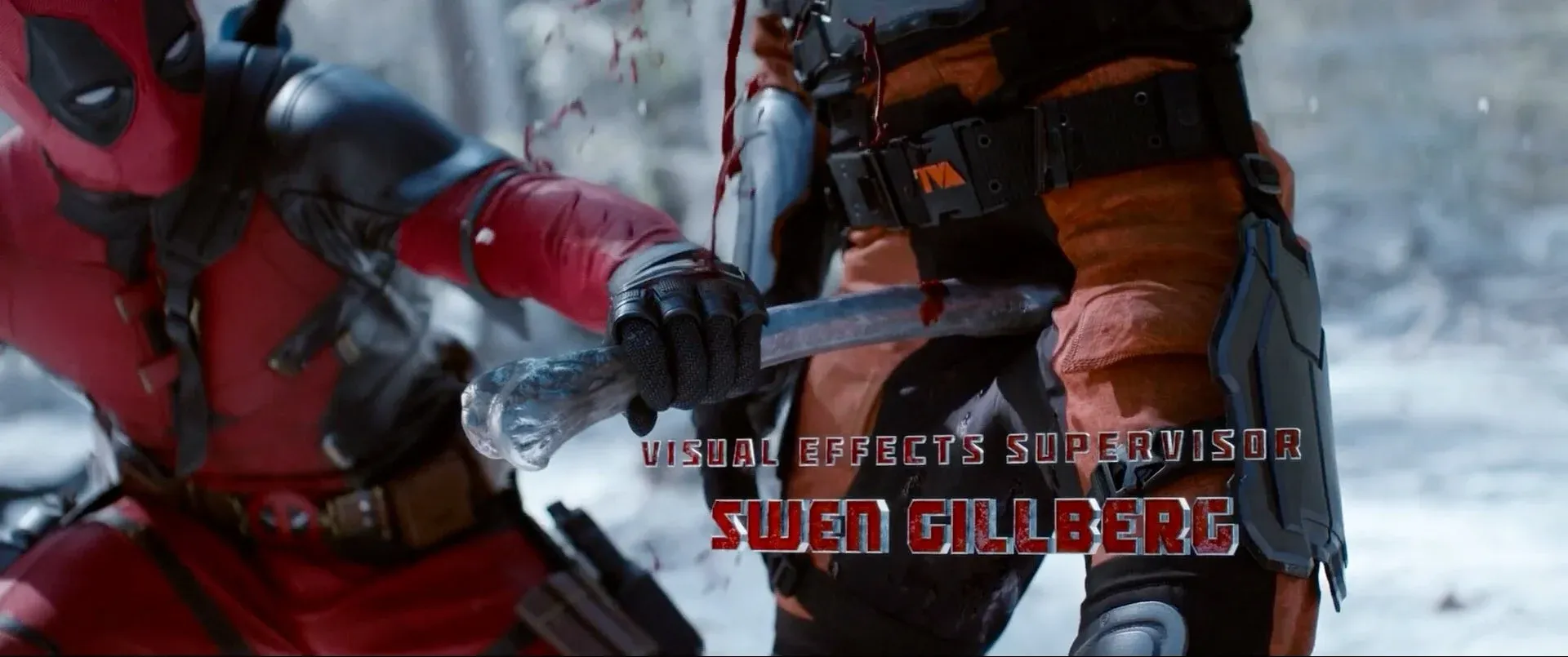
Khám phá chuỗi tiêu đề mở đầu đầy ấn tượng của Deadpool & Wolverine
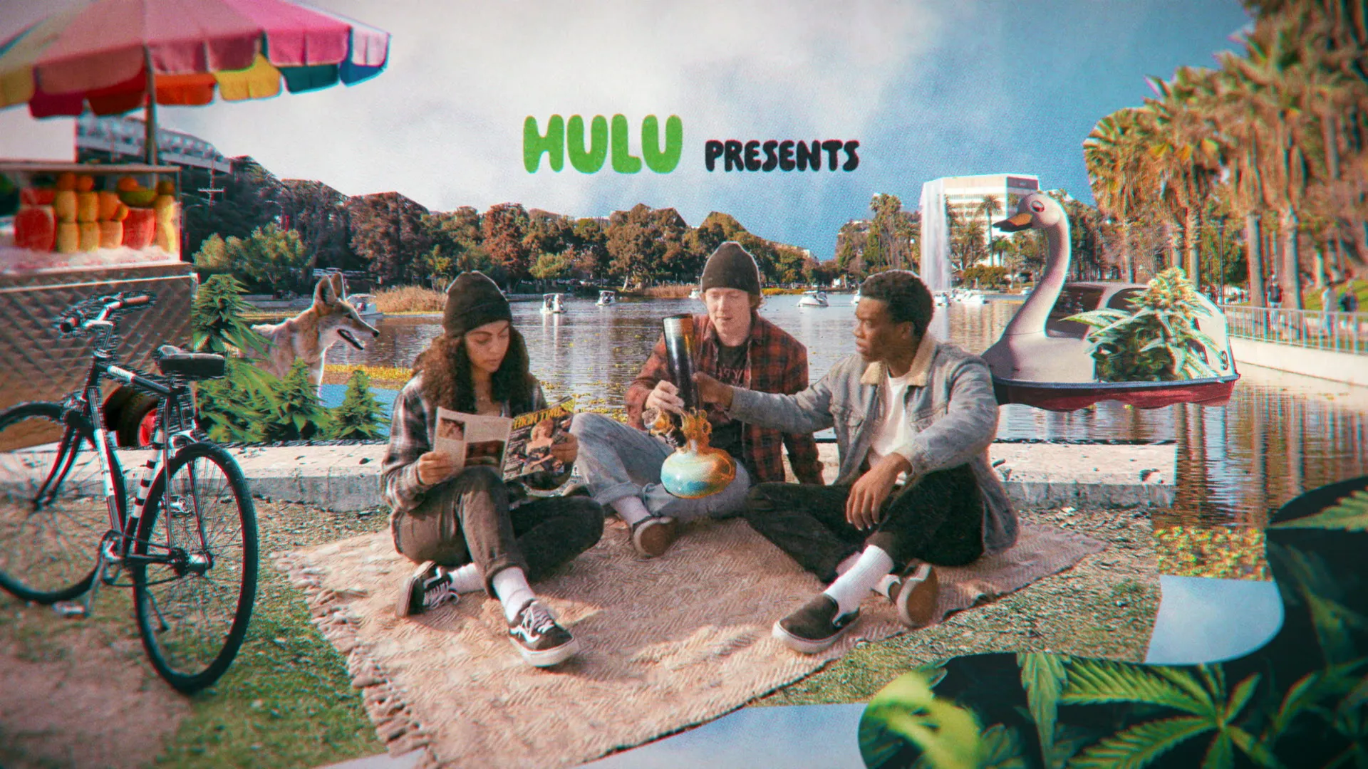
Ấn tượng với bộ title sequence đầy “ảo giác” của 4×20: Quick Hits từ Wesley Ebelhar
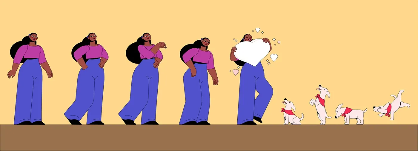
Khám phá hậu trường hoạt họa siêu dễ thương trong dự án “Girl and dog”
Series hoạt hình Ozzy Fox của Disney bỗng dưng lan truyền chóng mặt vì nghi vấn “rác AI”
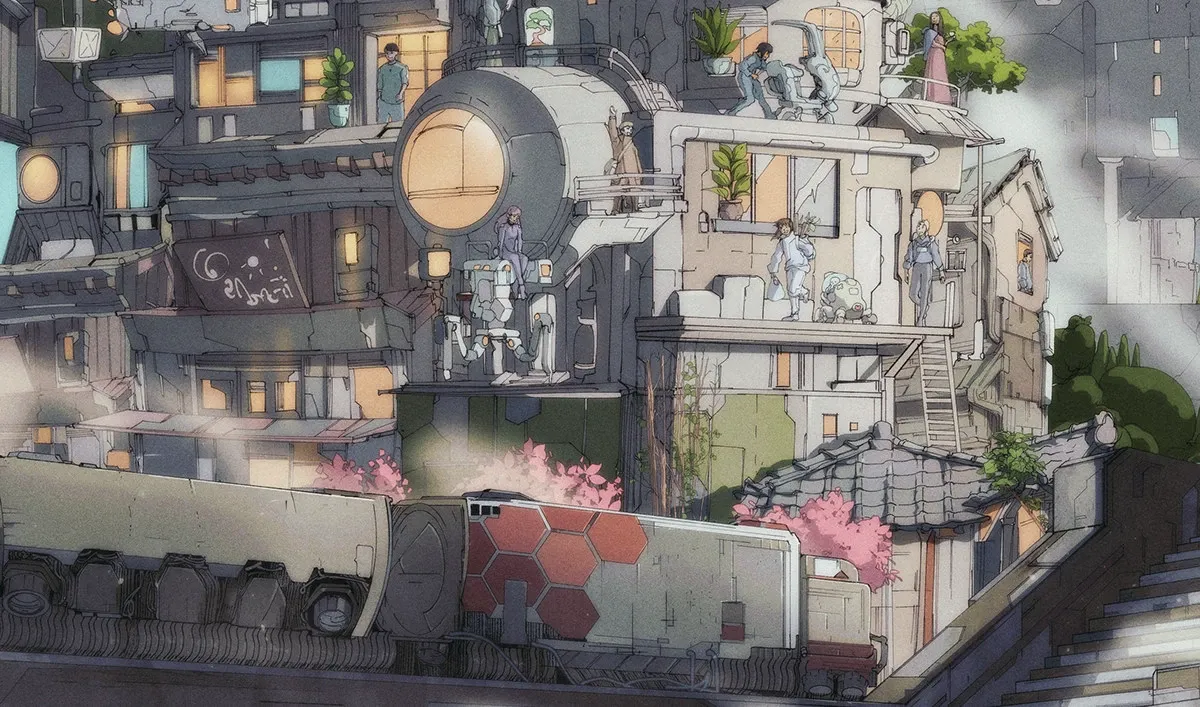
Tales of the Forgotten Hành Trình Sáng Tạo Từ Bản Phác Thảo Đến Ảnh Động Hoàn Chỉnh

Phim ngắn mở màn đầy cảm xúc tại Hội nghị Thượng đỉnh One Health 2026
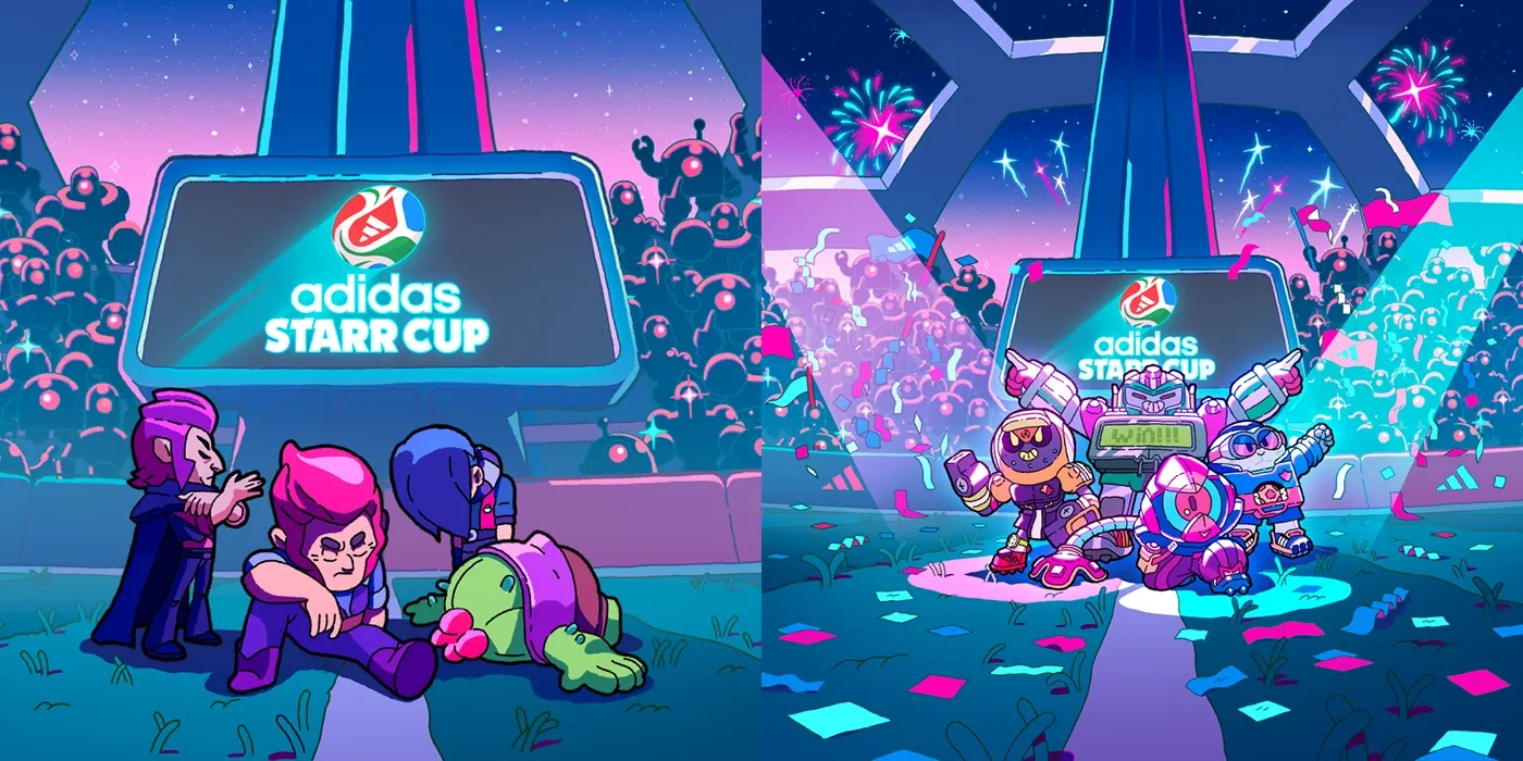
Trận cầu hỗn loạn đầy thú vị từ dự án hoạt hình Brawl Stars x adidas
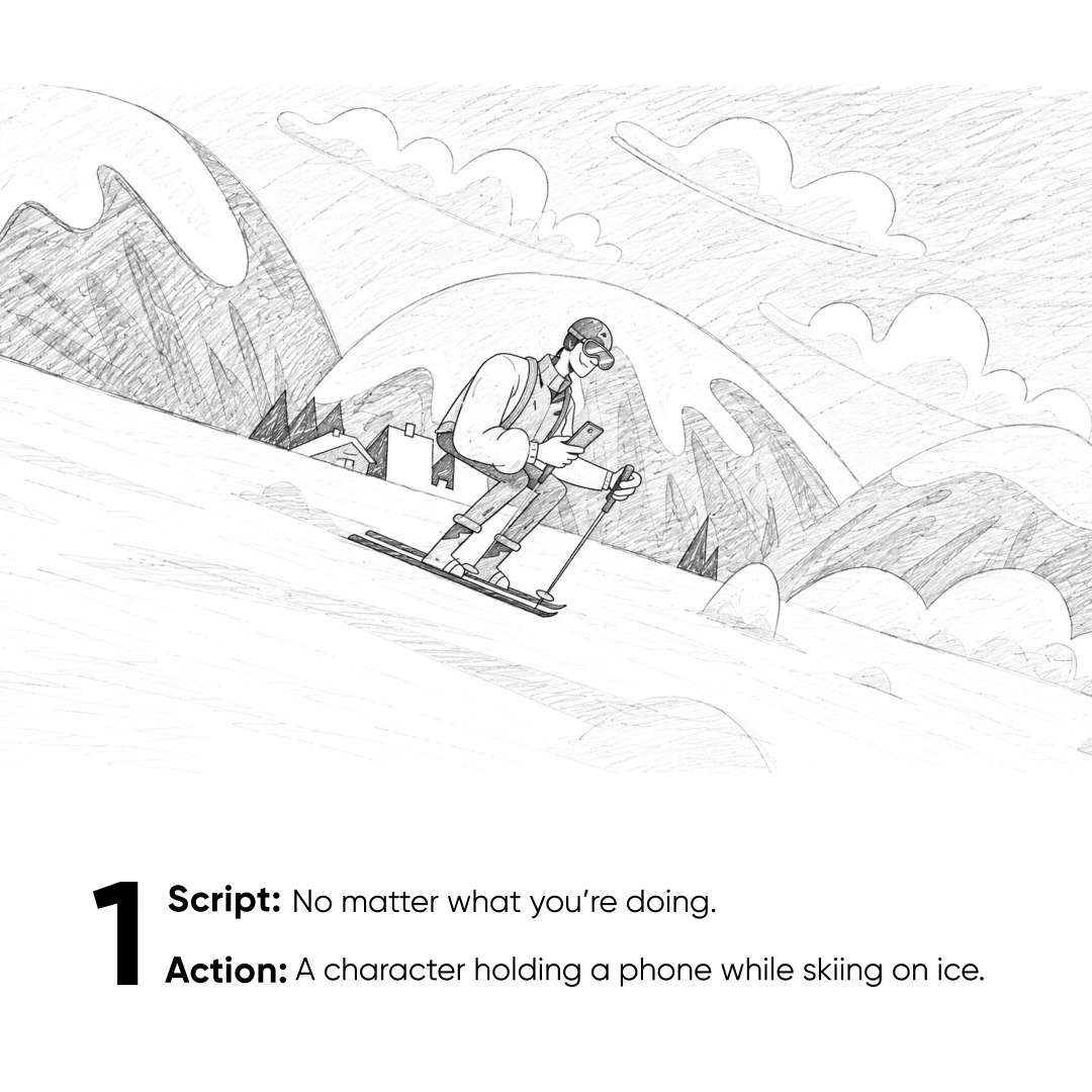
Exness Promo Animation – Những chuyển động đầy năng lượng từ designer Sina Salariy
Điểm mặt 8 bộ phim hoạt hình gây tranh cãi dữ dội nhất lịch sử từ Bugs Bunny đến Masha and the Bear

Sự Kết Hợp Mãn Nhãn Giữa KOHLER x Flamingo Estates Qua Bàn Tay Của Fluent Studio
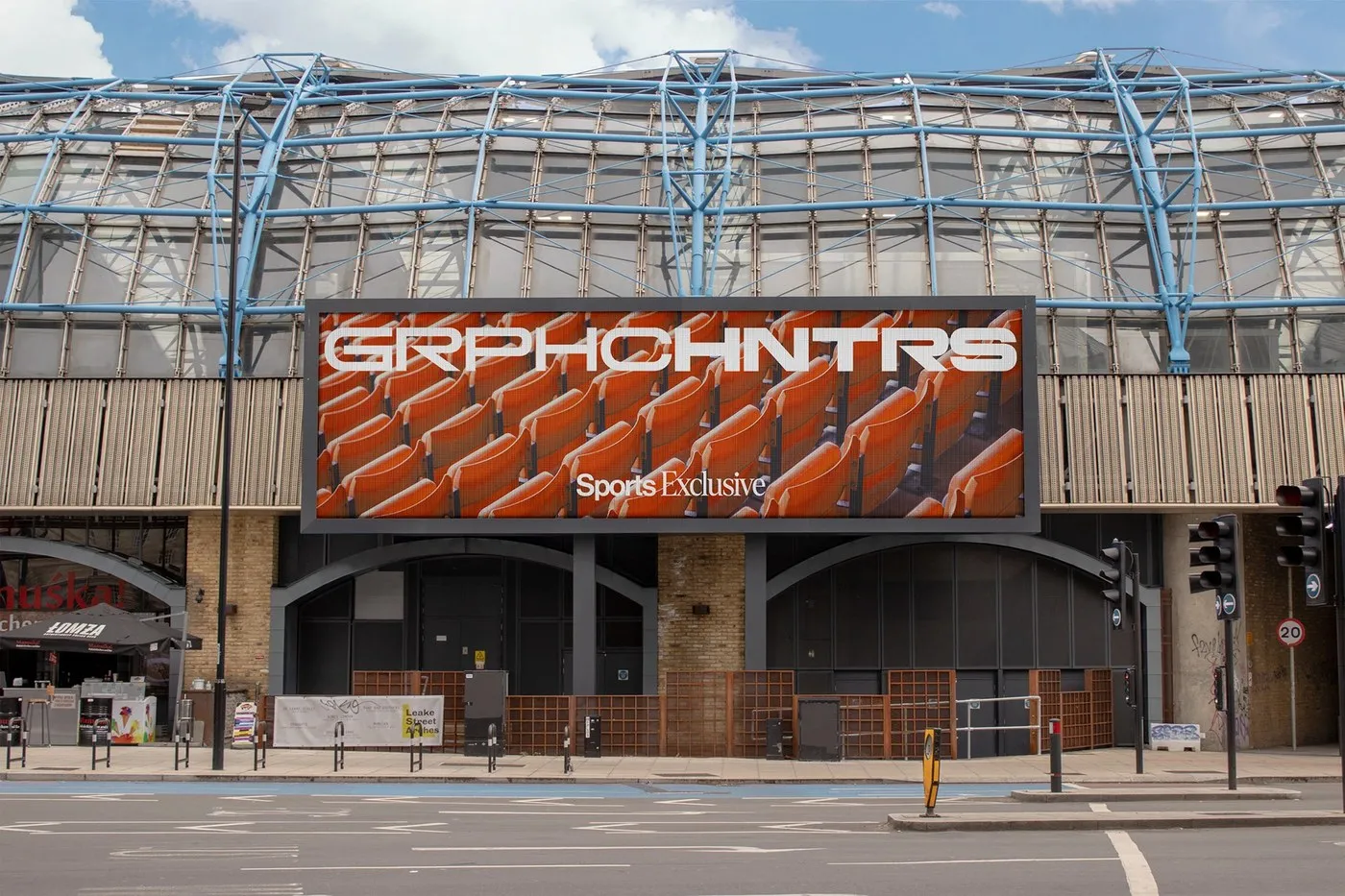
Monga Design Tái Định Nghĩa Bản Sắc Thể Thao Cho Graphic Hunters Bằng Motion Design Branding
Khi âm thanh trực tiếp nhào nặn thị giác trong dự án João Vaz Oliveira Reel 2026
Chiêm ngưỡng Showreel 2026 cực chất từ Motion Designer Patric Ortmann
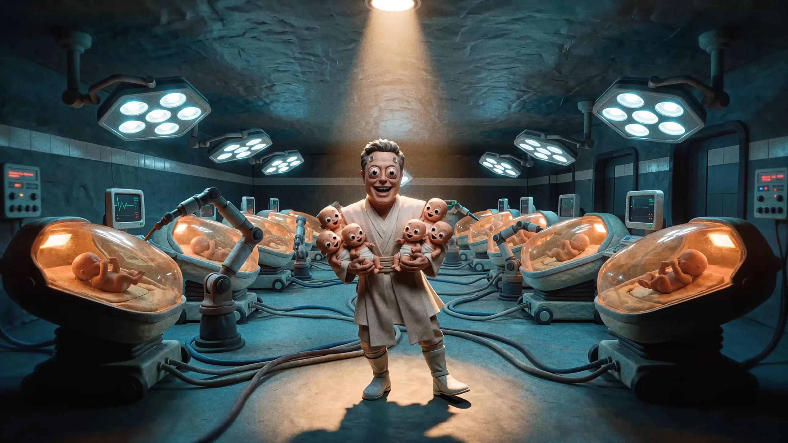
Bunker Boyz của Private Island: Màn “khịa” cực gắt các tỷ phú công nghệ bằng chính công nghệ AI
game
branding
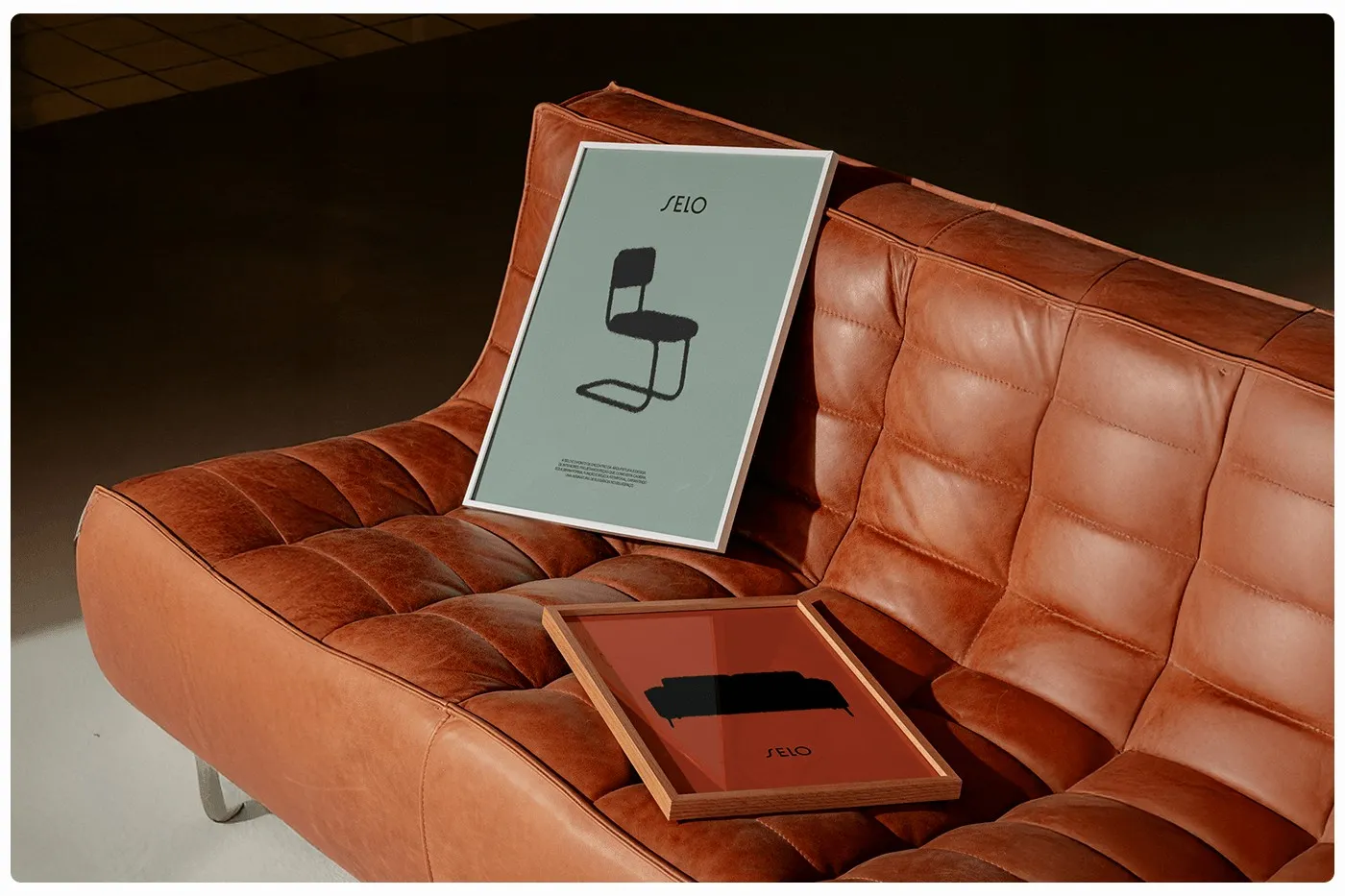
SELO Modern Furniture Brand Identity by Estúdio BRN BRANDS
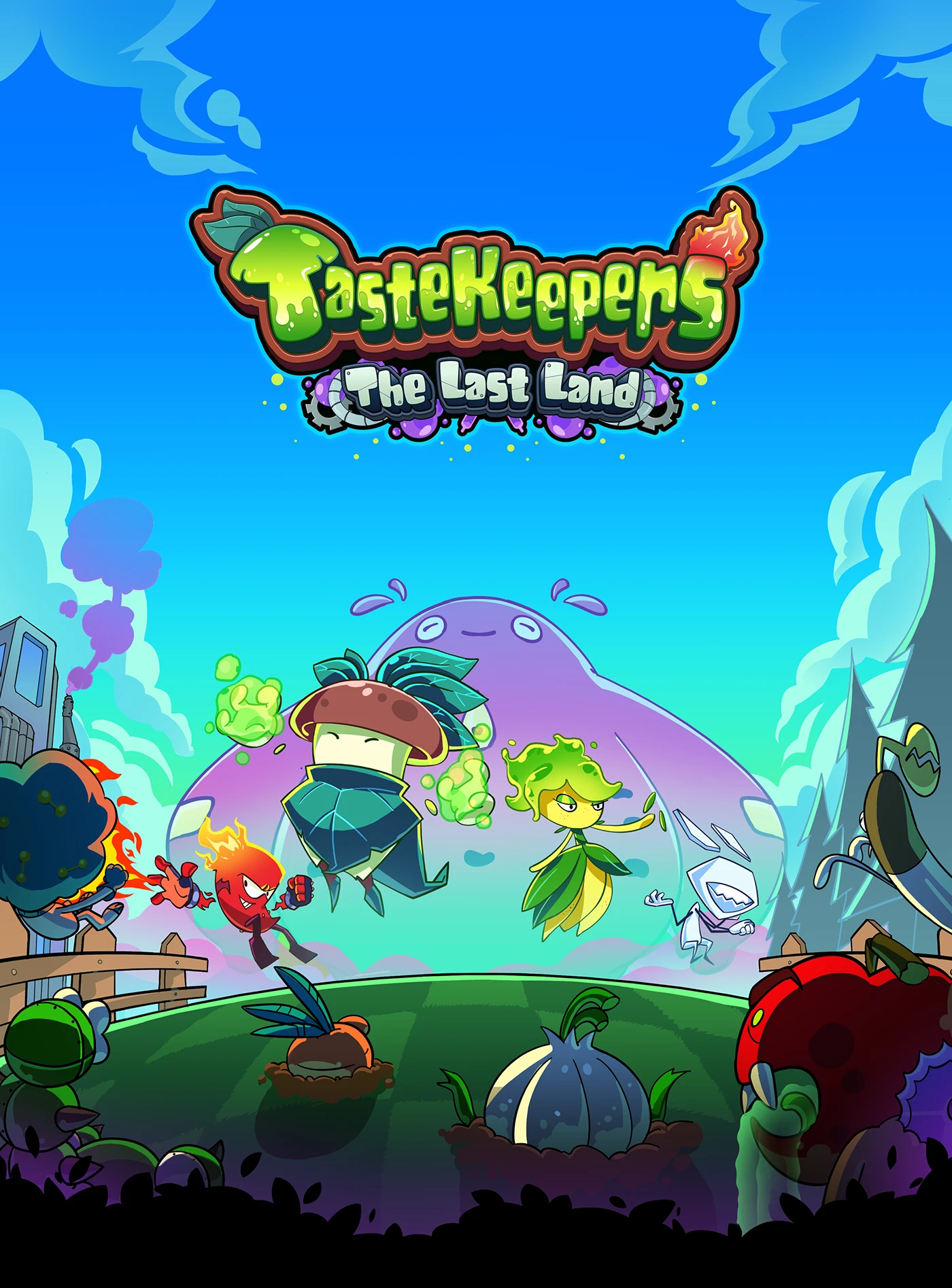
TasteKeepers – The Last Land: A Creative Visual Concept by WOBL Creative
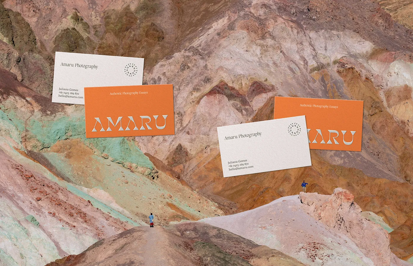
Amaru Photography: Andean Culture Meets Modern Branding by Fernando Rodrigues
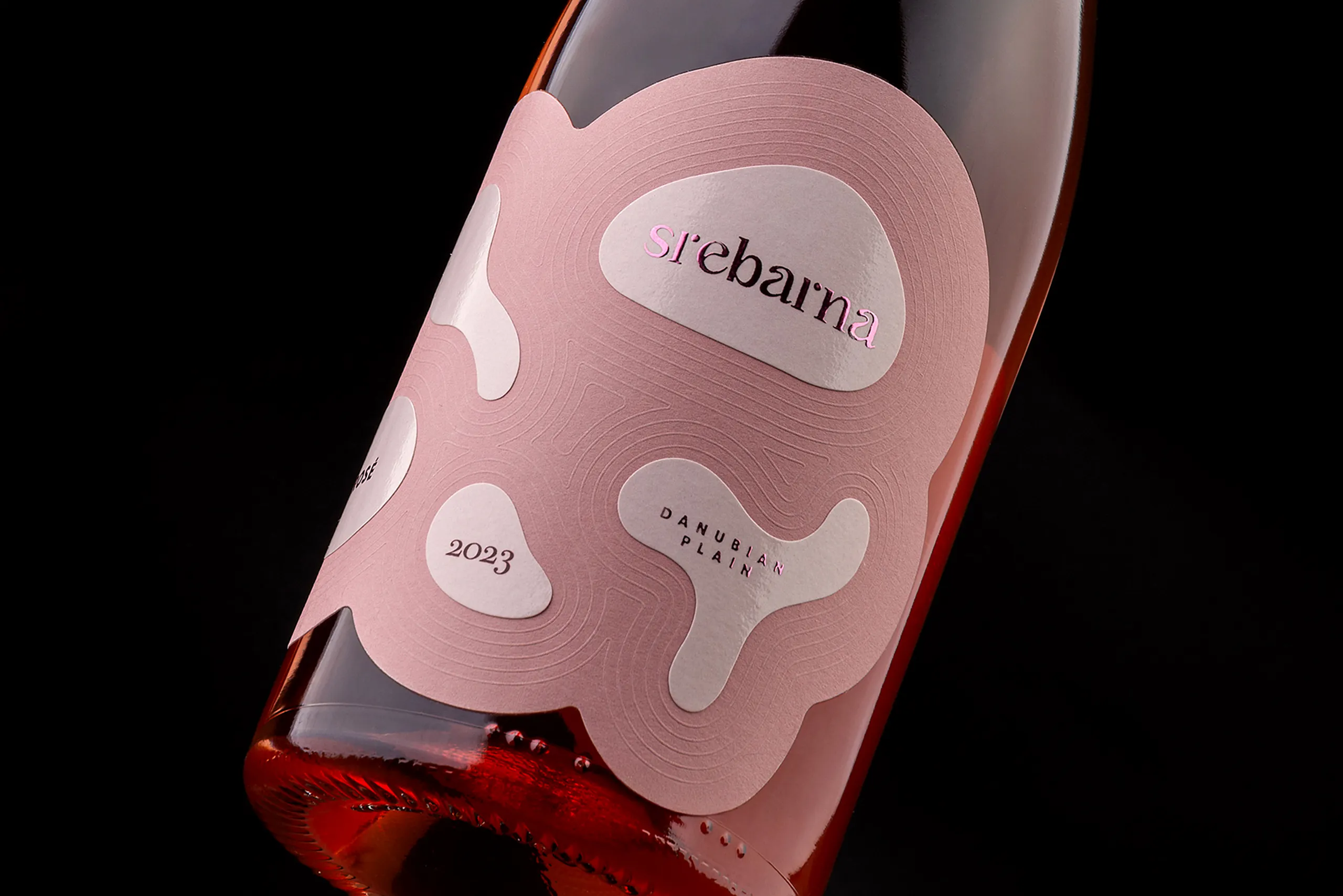
Srebarna Rosé – Packaging Design Shaped by the Ripples of the Lake
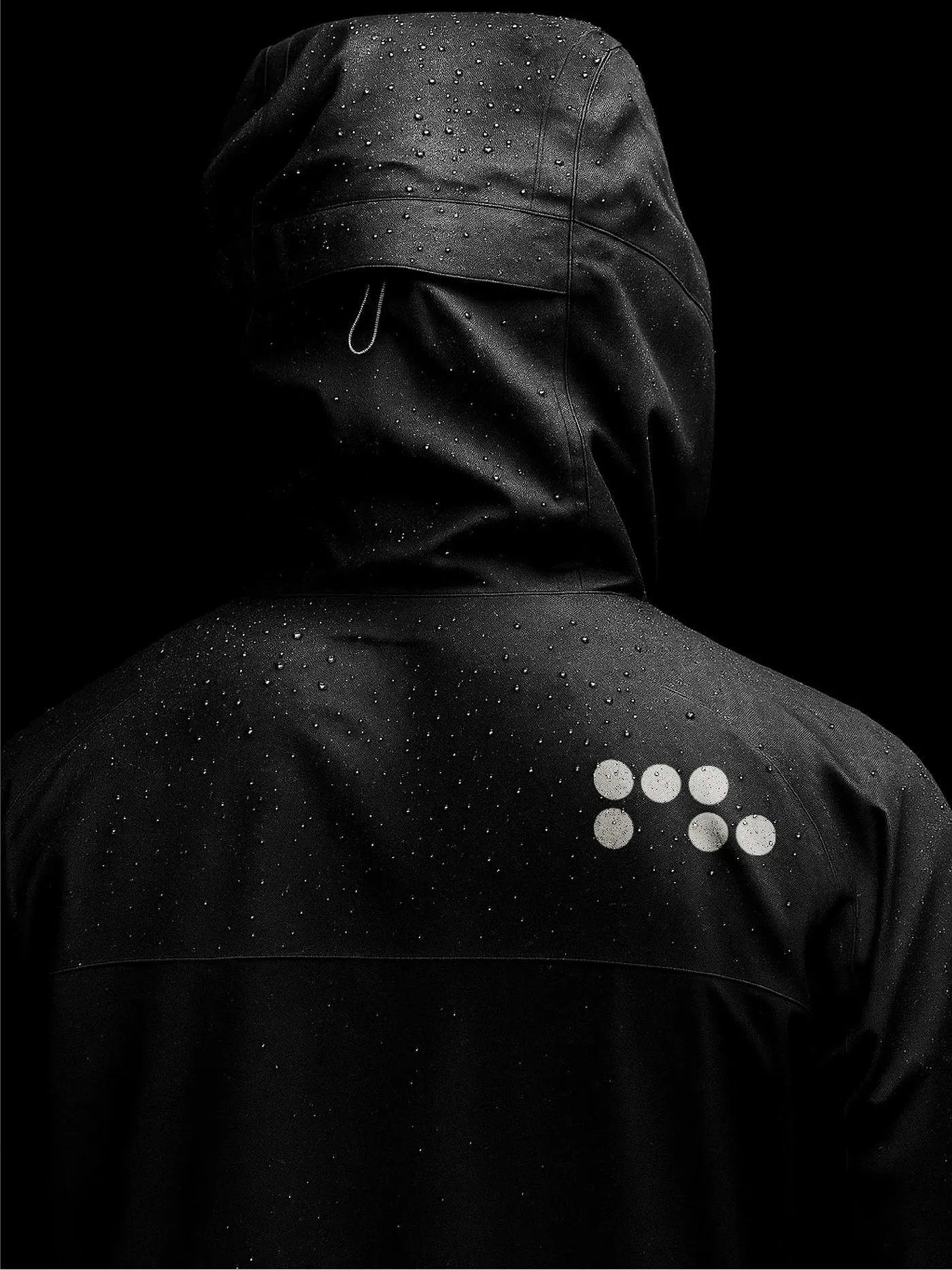
Runlab: Technical Running Apparel and Modular Dot-Matrix Branding
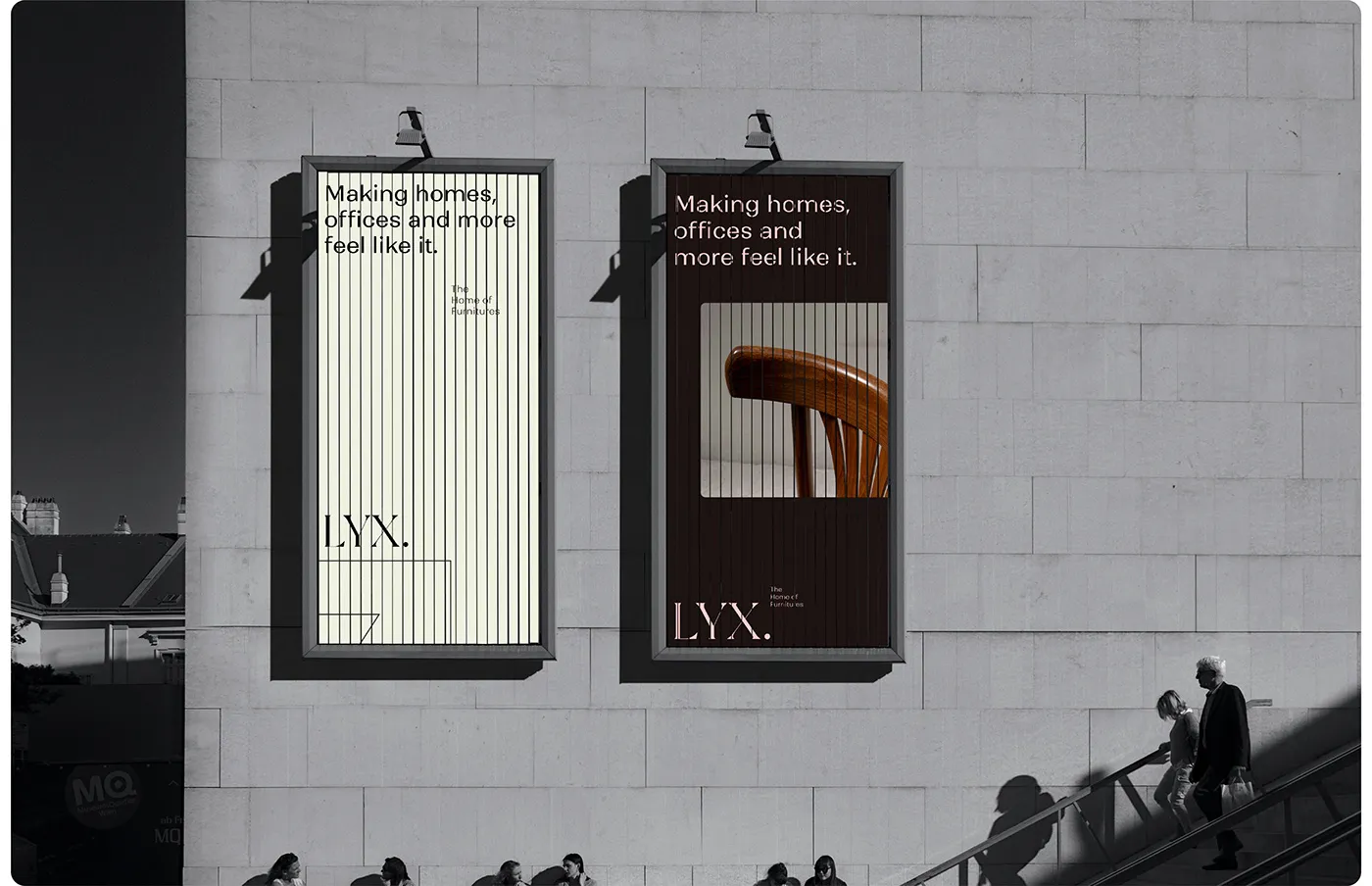
LYX Brand Identity: Editorial Typography and Luxury Furniture Design by Muhammad Abu Bakr
good stuffs
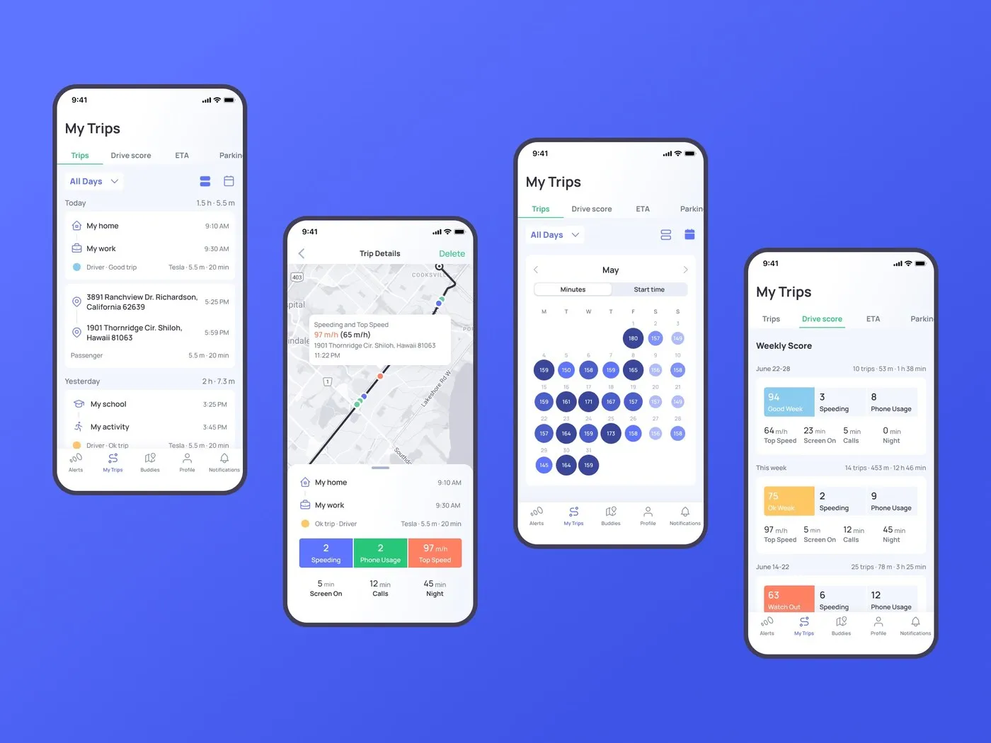
Otozen Mobile App: Designing a High-Contrast UI/UX for Safe Driving
The interface of the Otozen mobile app is beautifully crafted, keeping drivers focused on the road through an incredibly smart information architecture. A modular grid system is used to its full potential, keeping the UI super clean and geometrically precise.…
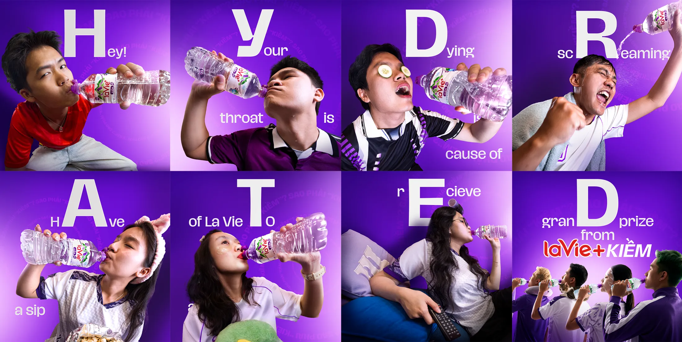
Nestlé La Vie and Ogilvy Vietnam Turn Football Ad Breaks Into Real Hydration Moments
There is nothing worse than tuning into a football match at home, only to have the halftime excitement totally ruined by an endless barrage of commercial breaks. Talk about a major buzzkill for the fans! Recognizing this ultimate frustration, La…
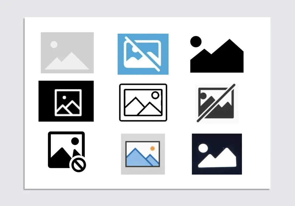
The Unexpected Origin and Symbolism of the Mountain Peak Image Placeholder
Ever been browsing the web and ran into that lonely little box with two mountain peaks because an image failed to load or is taking its sweet time? It is the universal placeholder icon for a missing image. But ever…
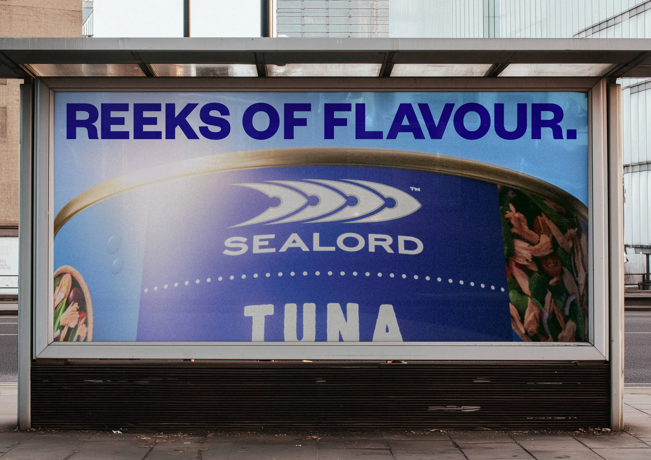
Sealord and Motion Sickness Launch We Love Fish Campaign to Fight Fishame
Seafood brand just teamed up with creative agency motionsickness to launch “We Love Fish”—a fresh brand platform encouraging New Zealanders to proudly embrace their love for fish without any awkwardness. The core concept revolves around “fishame” (that pesky fish shame)—the…
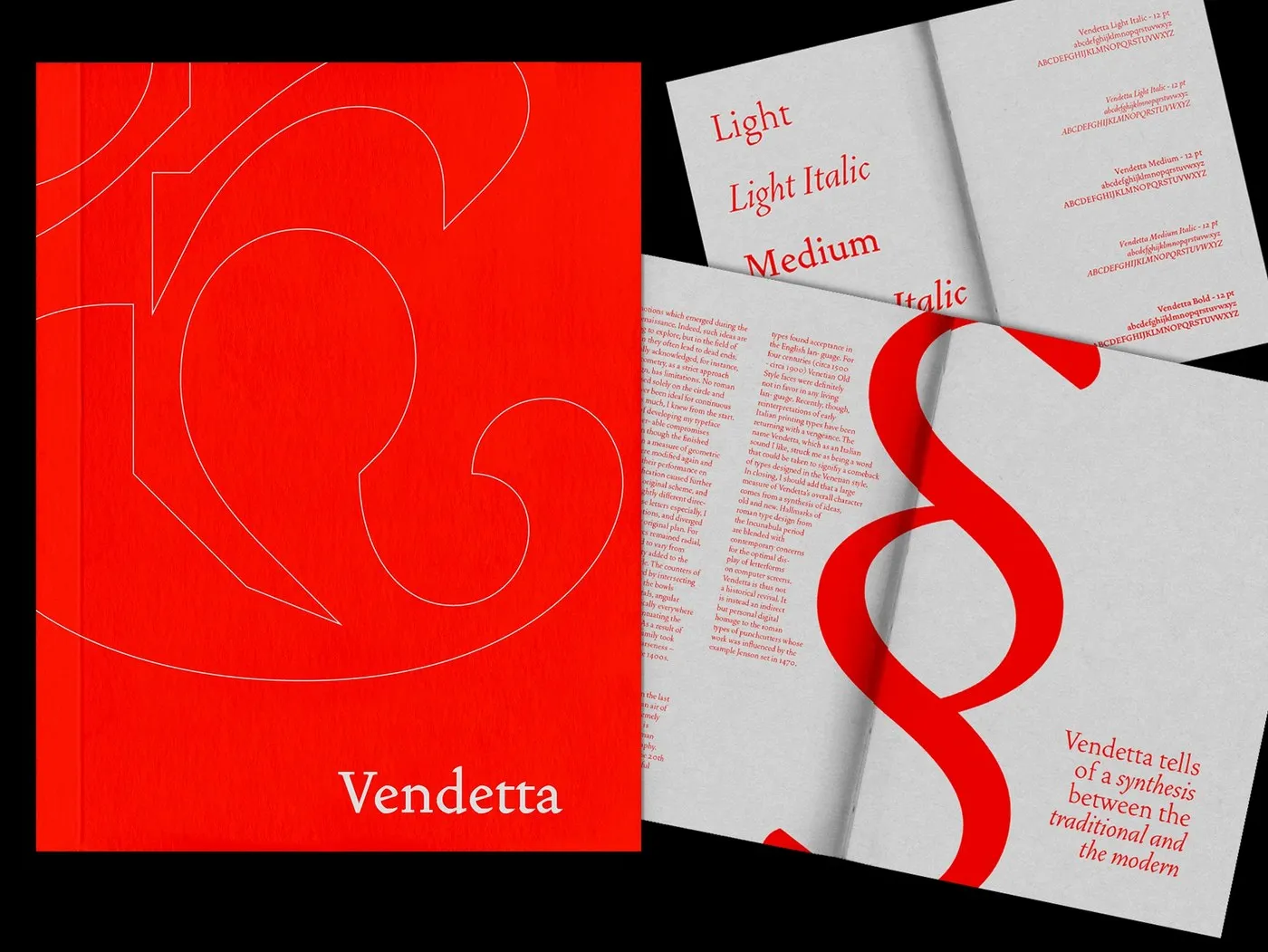
Vendetta Type Specimen Book Design by Bruno King
Bruno King just dropped a super fresh perspective with this type specimen book design for the Vendetta typeface. It’s a masterful balance of print proportions and historic geometric vibes. The project shows serious discipline when it comes to using a…
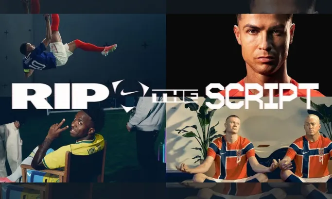
Nike Rejects the Rules with Rip the Script World Cup Commercial
Nike’s latest World Cup commercial just dropped, and it brings a wildly chaotic and unique concept called “Rip the Script.” Crafted by longtime creative agency partner Wieden+Kennedy and director Dan Streit, this spot is a massive, joyful celebration of pure…
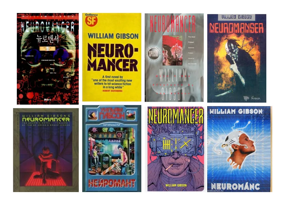
Apple TV’s Neuromancer Poster Sparks Discussion on Cyberpunk Adaptation
The iconic sci-fi novel that basically built the cyberpunk genre and predicted a ton of today’s tech—William Gibson’s Neuromancer—is finally hitting the small screen! Apple TV is turning this 1984 masterpiece into a 10-episode series, leaving fans everywhere a mix…
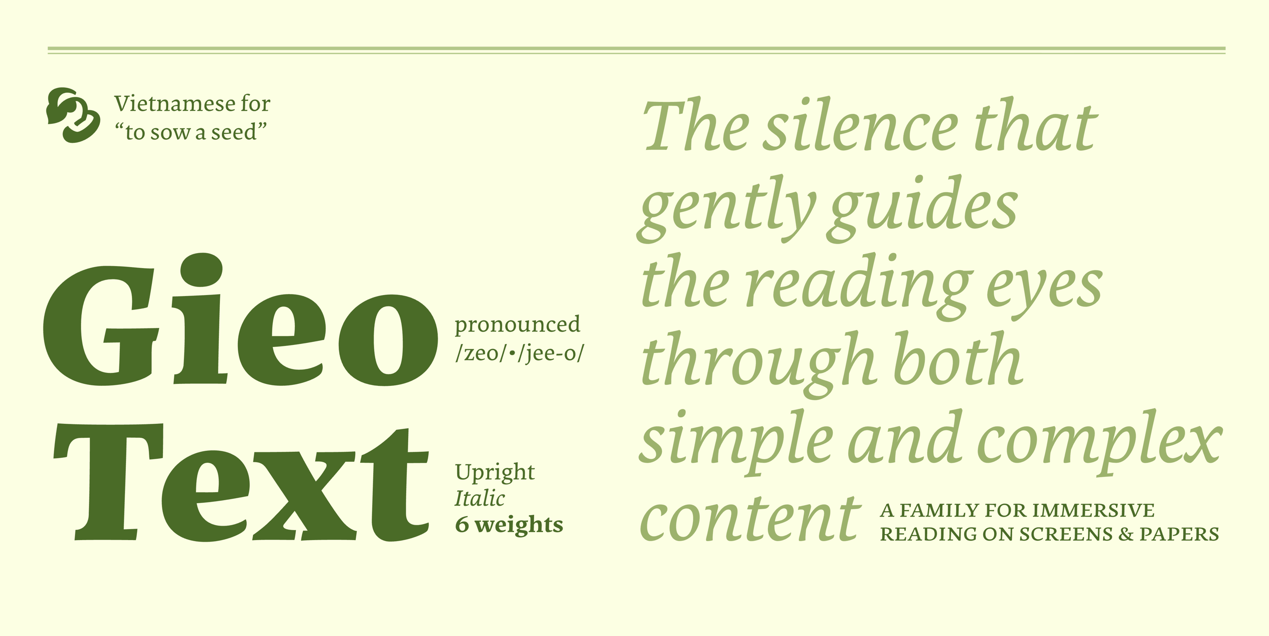
Gieo Text: A Venetian-Inspired Typeface for Digital Reading by Linh Nguyễn
Gieo Text is a super exciting typeface designed by Linh Nguyễn from ÁccentiaType studio. This project actually started out as a practical assignment during the Master of Typeface Design (MATD) 20/21 program at the University of Reading. The name “Gieo”…
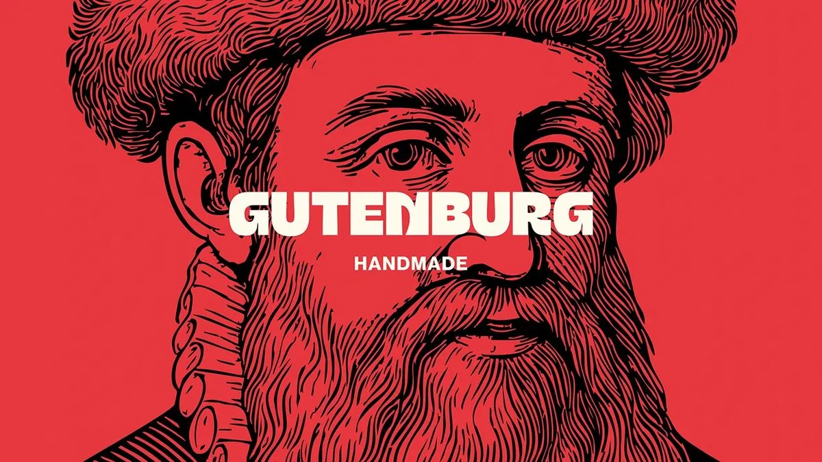
Heavy Typography and High Contrast for Gutenburg’s Identity
Gutenburg just dropped a seriously stunning editorial identity packed with high-contrast layouts and strategic typography. Created by Gutenburg Design Studio, this project pairs beautifully with packaging that carries a distinct, traditional print vibe. The creative studio built a modular font…
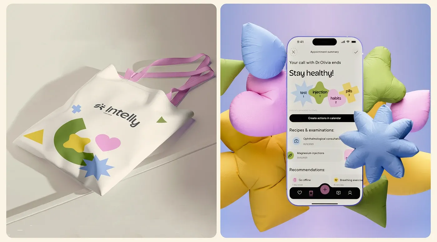
Intelly Mobile Healthcare App UI with Modern Modular System
Intelly’s in-house design team just dropped a super slick, modular design system for a healthcare mobile app. The interface absolutely shines thanks to a brilliant color palette: a deep, medical-vibe navy background paired with soothing mint green action cards and…
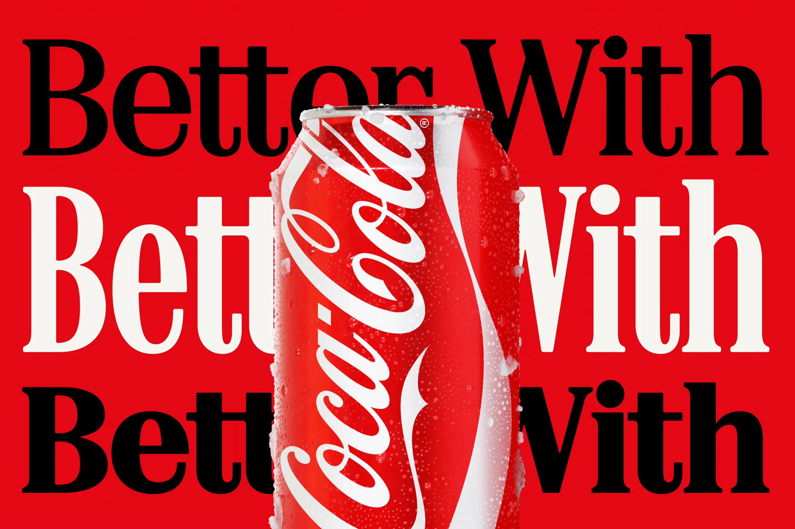
Coca-Cola New Typography Identity Sparks Marlboro Font Comparisons
Coca-Cola just dropped a major brand identity refresh courtesy of design agency JKR, and it is all about the typography. This new look elevates “Better With”—a retro serif typeface originally crafted by Brody Associates back in 2023—right to center stage…
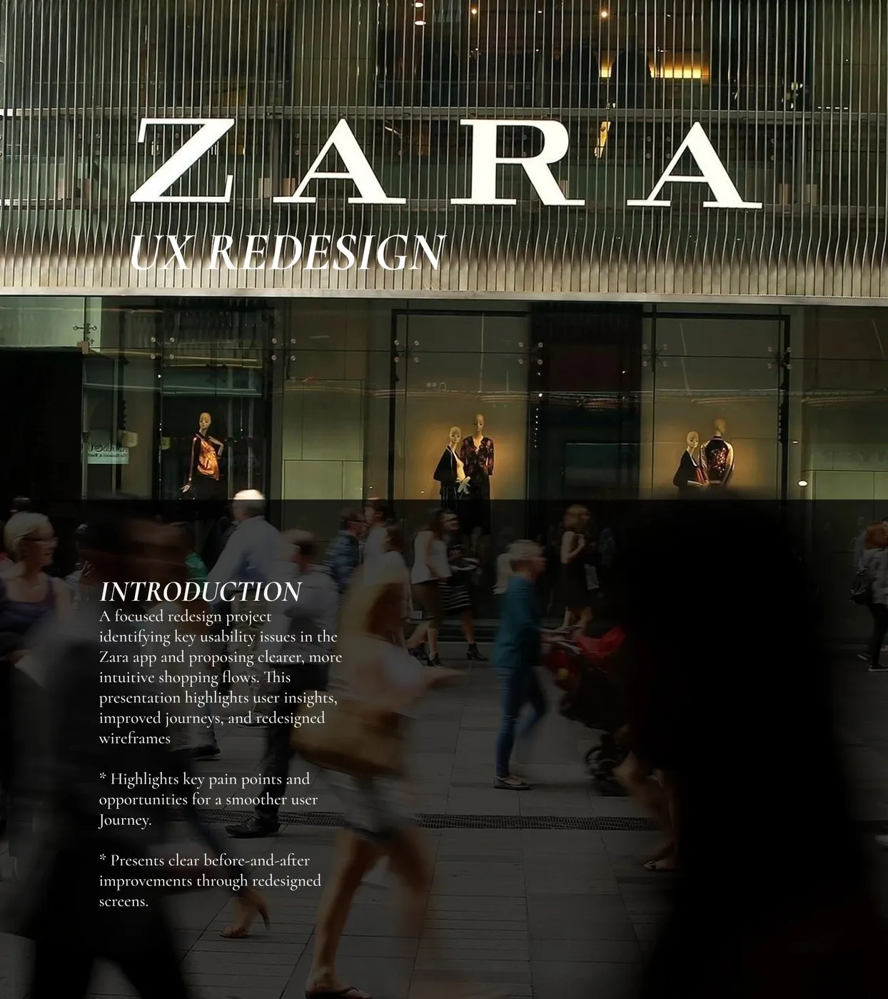
Zara Mobile App UI/UX Redesign by Afra M I: Solving Checkout Friction
The Zara shopping app is a staple for fashion lovers everywhere, but let’s be real—browsing it can sometimes feel a bit clunky. To tackle these little headaches, designer Afra M I came up with a brilliant mobile UI/UX redesign aimed…