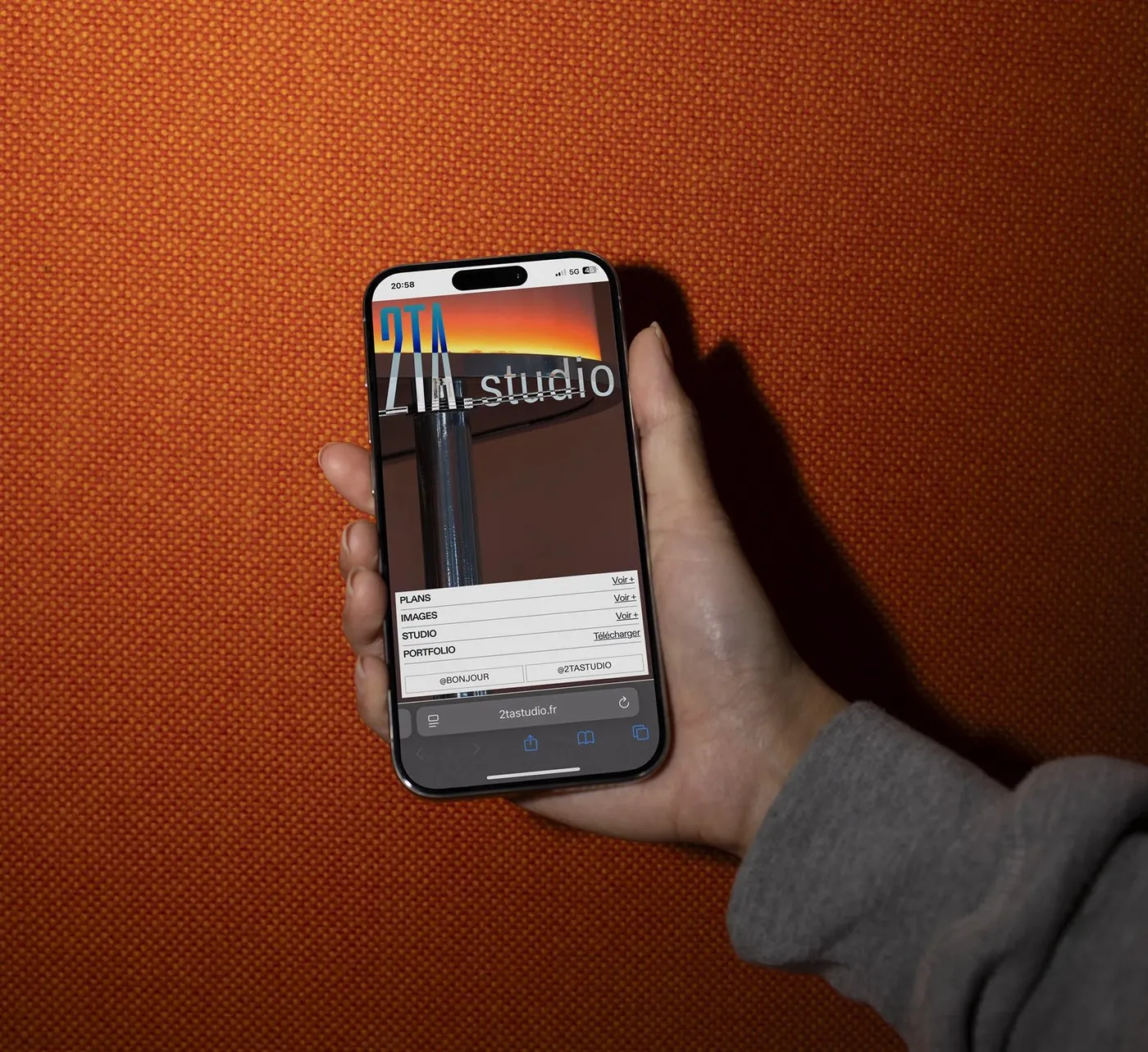
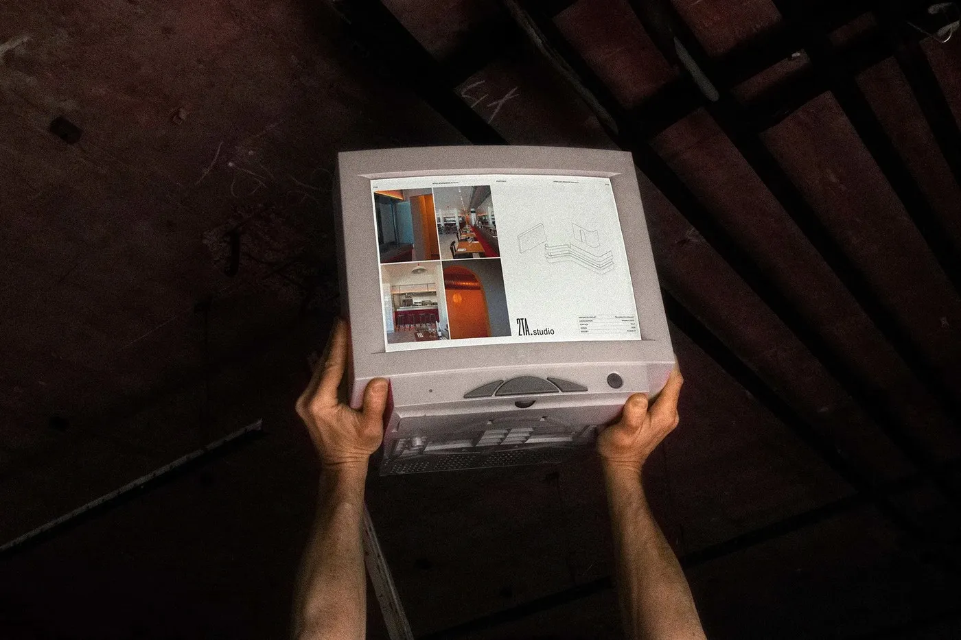
Editorial Design for 2T ARCHITECTURE by Florian Cornut: Discipline, White Space, and Pure Elegance When architectural thinking meets graphic design, magic happens—resulting in something amazingly crisp, structured, and visually soothing. The editorial design project for 2TA Studio by designer Florian Cornut is a textbook example of this perfect harmony!
Founded by architects Matias Tapia and Loïc Trieulet, 2TA Studio is a firm dedicated to meticulous craftsmanship across residential and public projects alike. To capture this exact ethos, Florian Cornut crafted a design language that feels quiet yet incredibly grounded. In this system, white space isn’t just empty room—it’s treated like a tangible building material. Paired with raw, authentic photography featuring concrete, stone, and tactile surfaces, every spread radiates clarity and order.
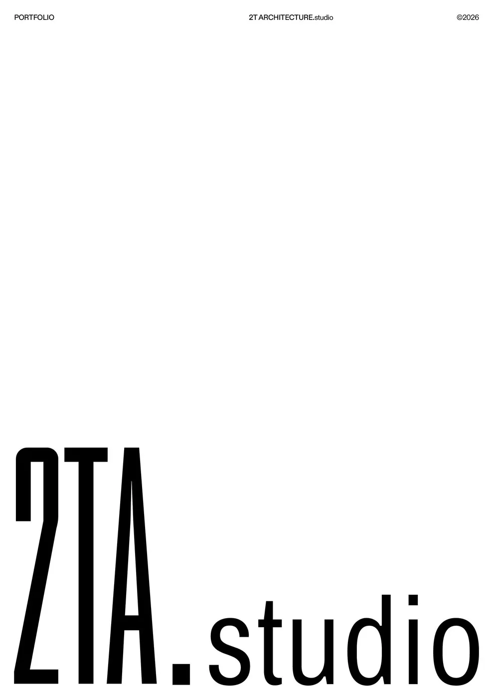
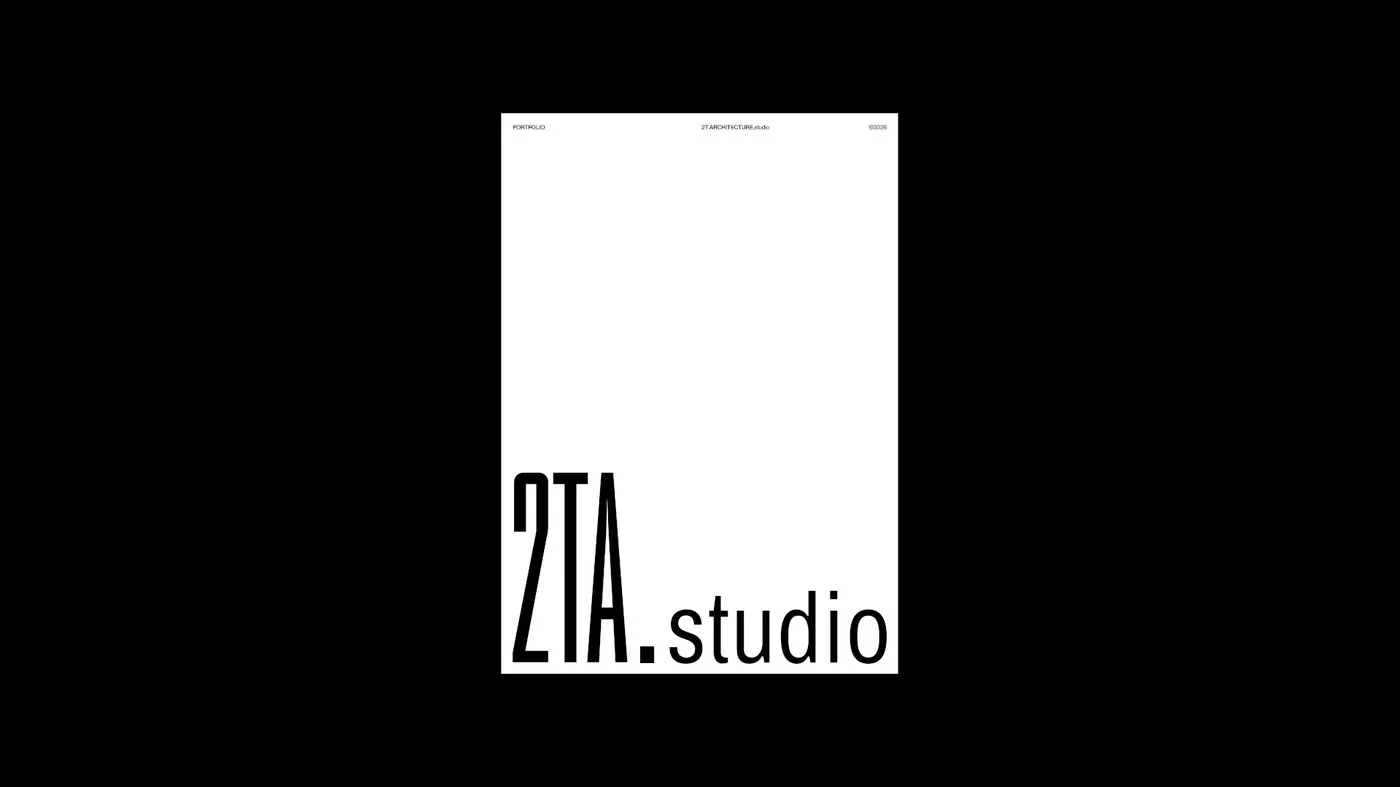
Meticulous Grid System and Typography At the heart of this entire editorial layout is the Diatype font family by ABC Dinamo. This clean grotesque typeface delivers an effortless reading experience, whether flipped through in print or scrolled through on a screen.
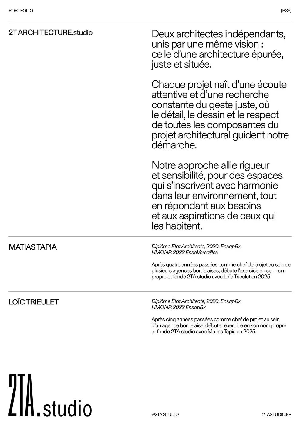
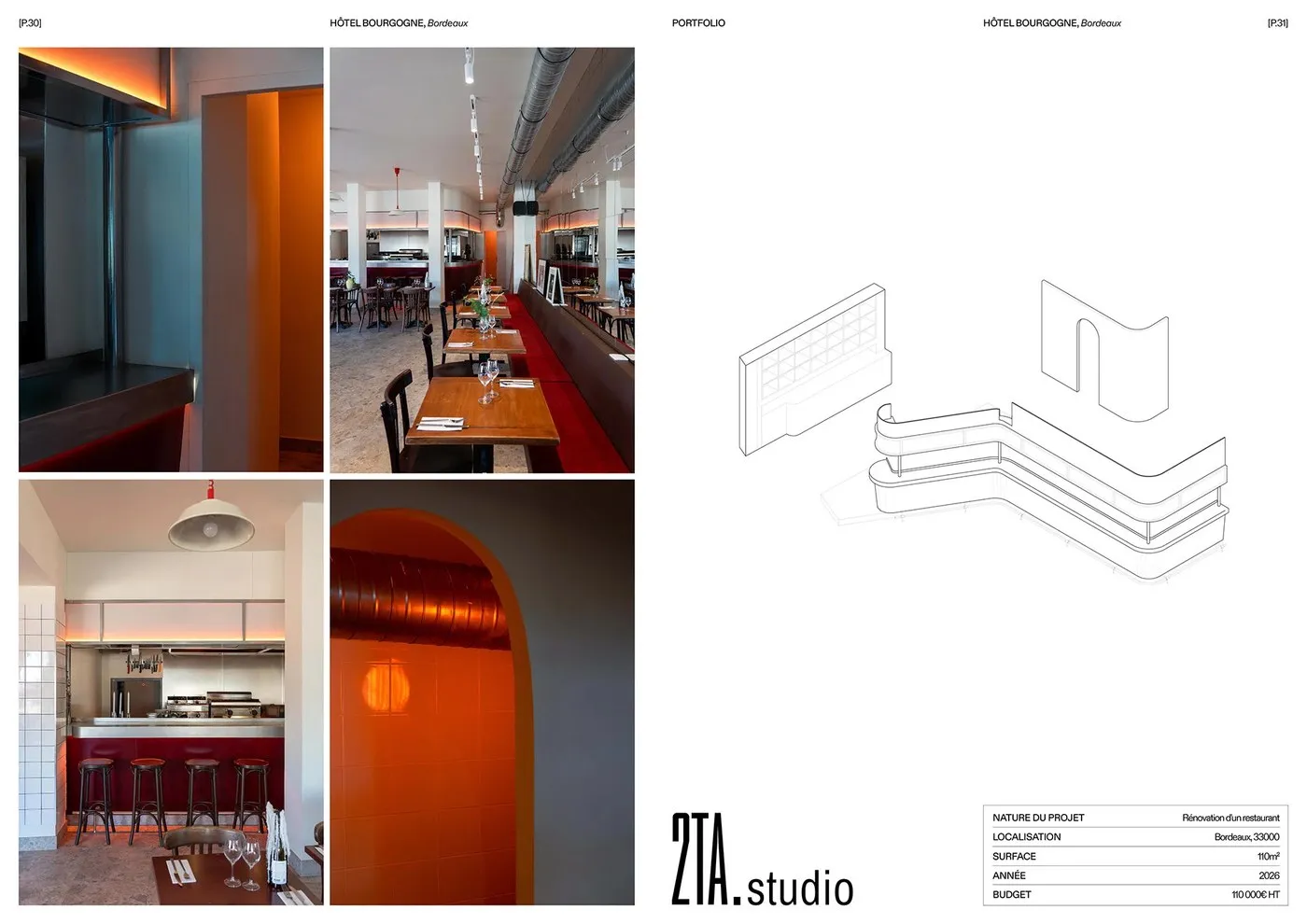
Alongside the typography, a strict column grid system organizes spatial layouts for technical drawings and project photography. Generous margins give floor plans plenty of breathing room, balancing seamlessly with neatly arranged blocks of text below. Fine details like running headers and image captions adhere strictly to line spacing and precise size contrast. By keeping a consistent baseline grid, the entire publication maintains a smooth visual rhythm from cover to cover.
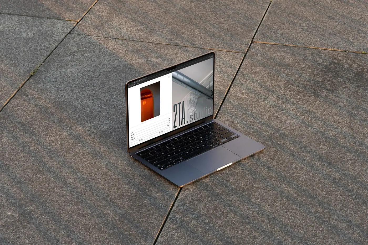
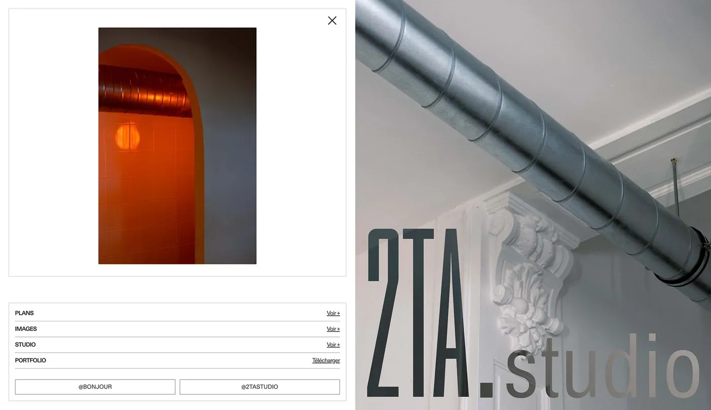
Bridging Print and Digital Experiences Another fantastic highlight of this project is how effortlessly it bridges the tactile charm of a physical book with web browsing. The leisurely pace of an architecture book translates smoothly onto screen layouts. Combining uncoated paper stock for print with crisp digital typography creates a wonderfully cohesive look across all touchpoints.
Thoughtful restraint always creates timeless visual impact! Head over to www.behance.net/gallery/254272243/2T-ARCHITECTURE-%28Studio%29-Website-Editorial-Design to explore the full project showcase and see how a well-crafted editorial system elevates architectural design.
Thiết kế Editorial cho 2T ARCHITECTURE bởi Florian Cornut: Kỷ luật, khoảng trắng và sự tinh tế
Khi tư duy kiến trúc kết hợp với thiết kế đồ họa, kết quả thu được thường mang một vẻ đẹp vô cùng chỉn chu và ngăn nắp. Dự án thiết kế editorial dành cho 2TA Studio của designer Florian Cornut là một ví dụ điển hình cho điều đó.
2TA Studio được sáng lập bởi hai kiến trúc sư Matias Tapia và Loïc Trieulet, một văn phòng kiến trúc luôn đề cao sự tỉ mỉ qua từng công trình nhà ở lẫn không gian công cộng. Để truyền tải trọn vẹn tinh thần này, Florian Cornut đã xây dựng một ngôn ngữ thiết kế tĩnh lặng nhưng cực kỳ vững chãi. Trong hệ thống thiết kế này, khoảng trắng không đơn thuần là khoảng trống bỏ lại, mà được xử lý như một chất liệu kiến trúc thực sự. Kết hợp cùng những góc máy chân thực về bê tông, đá và vật liệu thô, mỗi trang bố cục đều toát lên tính rõ ràng và trật tự.
Hệ thống lưới và typography chỉn chu
Điểm tựa của toàn bộ hệ thống editorial này nằm ở bộ font Diatype đến từ studio ABC Dinamo. Phông chữ grotesque sạch sẽ này mang lại cảm giác dễ chịu trên cả ấn phẩm in lẫn giao diện web.
Bên cạnh typography, hệ thống lưới (column grid) được áp dụng vô cùng nghiêm ngặt để phân chia không gian cho bản vẽ kỹ thuật và hình ảnh công trình. Lề trang được mở rộng giúp các bản vẽ mặt bằng “dễ thở” hơn, kết hợp hài hòa với các khối văn bản đặt gọn gàng bên dưới. Các chi tiết nhỏ như running header hay chú thích ảnh đều tuân thủ khoảng cách dòng và tương phản kích thước chuẩn xác. Nhờ việc duy trì đường baseline cố định, toàn bộ ấn phẩm luôn giữ được nhịp điệu thị giác nhất quán từ đầu đến cuối.
Cầu nối giữa sách in và trải nghiệm số
Một điểm thú vị khác của dự án là khả năng kết nối mượt mà giữa trải nghiệm cầm nắm của một cuốn sách in và thao tác lướt web. Nhịp điệu thong dong của một cuốn sách kiến trúc được đem trọn vẹn lên giao diện màn hình. Sự kết hợp giữa chất liệu giấy uncoated khi in ấn và kiểu chữ sắc nét trên nền tảng kỹ thuật số đã tạo nên một tổng thể đồng nhất.
Sự tiết chế đúng lúc luôn mang lại hiệu quả thị giác lâu bền. Bạn có thể xem chi tiết bộ dự án này của www.behance.net/gallery/254272243/2T-ARCHITECTURE-%28Studio%29-Website-Editorial-Design trên Behance để xem cách một hệ thống editorial bài bản tôn vinh các tác phẩm kiến trúc.