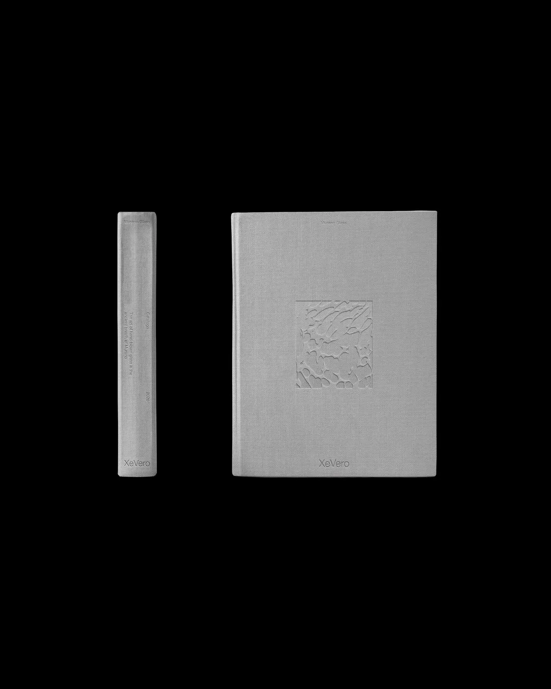
Xe Vero Catalog: Where White Space Elevates Murano Glass Craftsmanship Designing a print publication for a heritage Murano glass brand is all about finding the sweet spot between Venetian artisanal tradition and modern visual thinking. For the Xe Vero catalog project, Italian design studio Suerte Studio built a layout centered around the concept of calculated white space—bianco progettato.
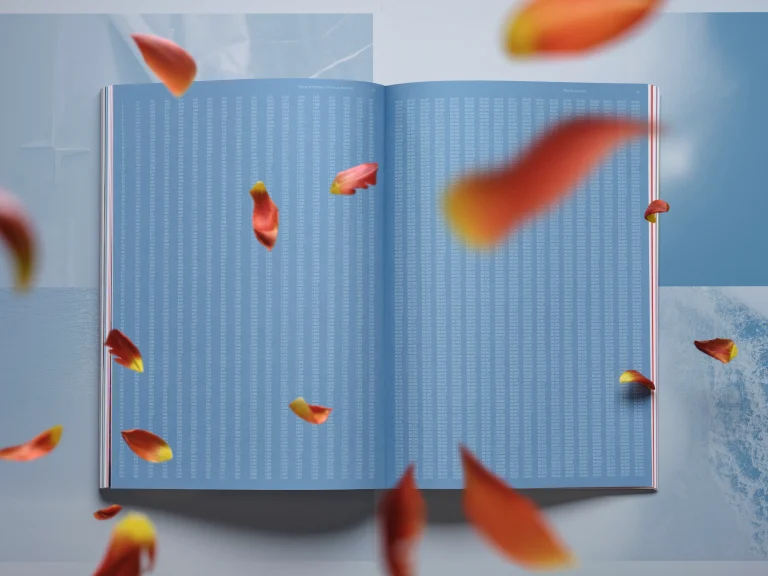
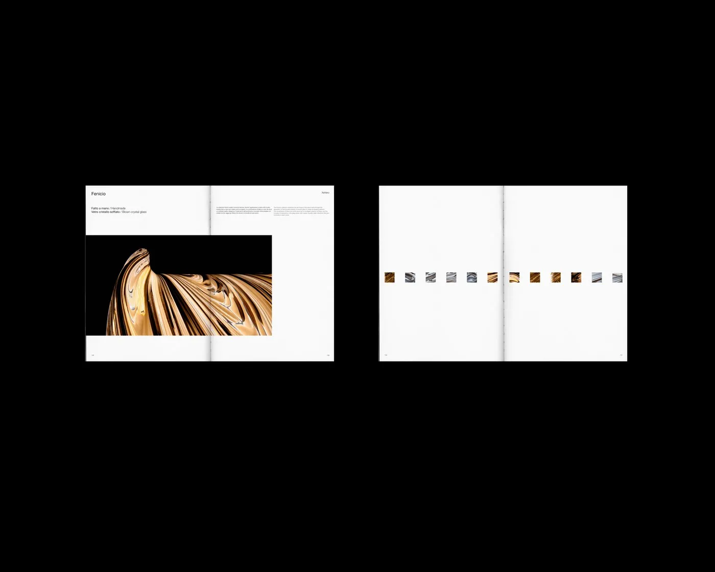
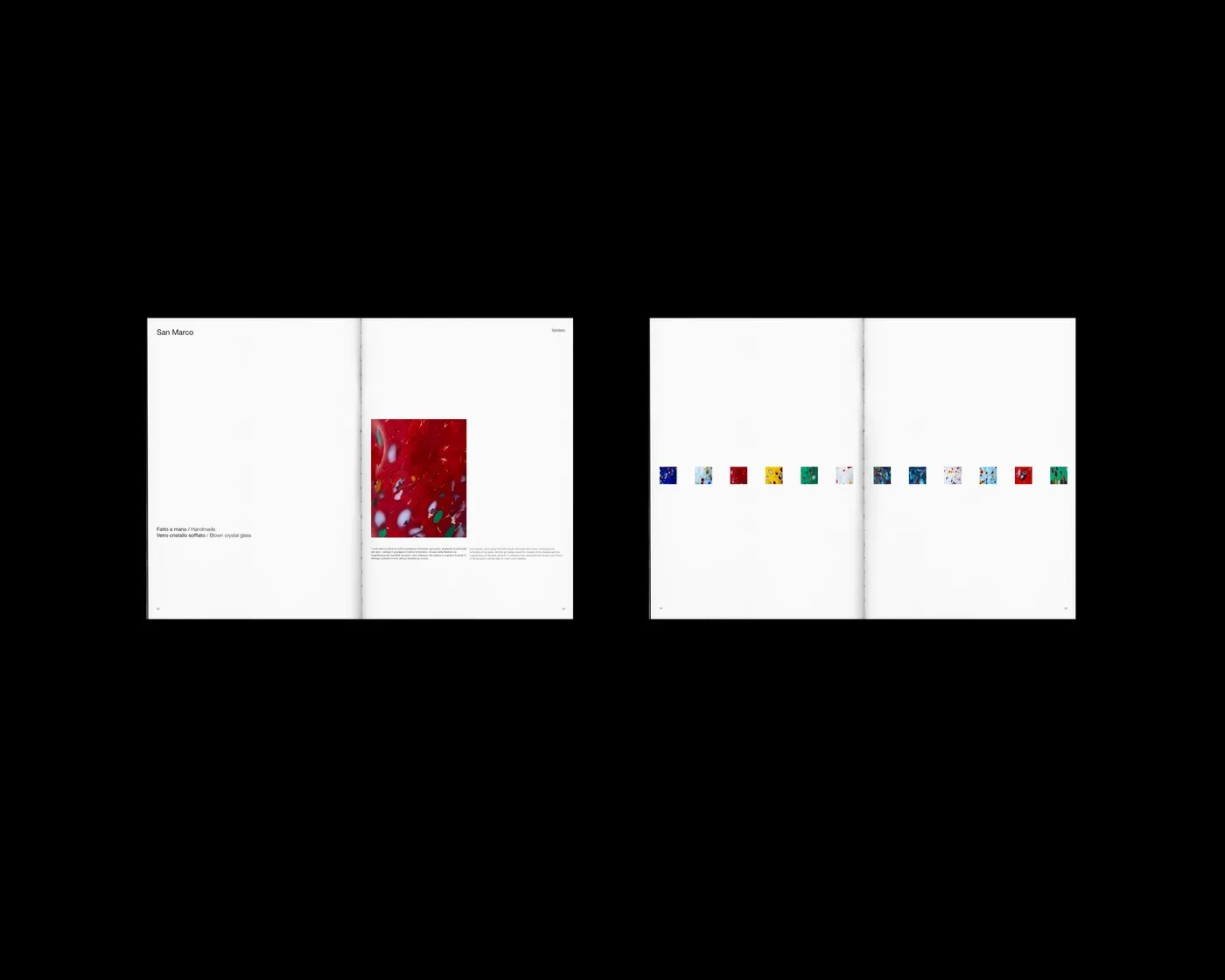
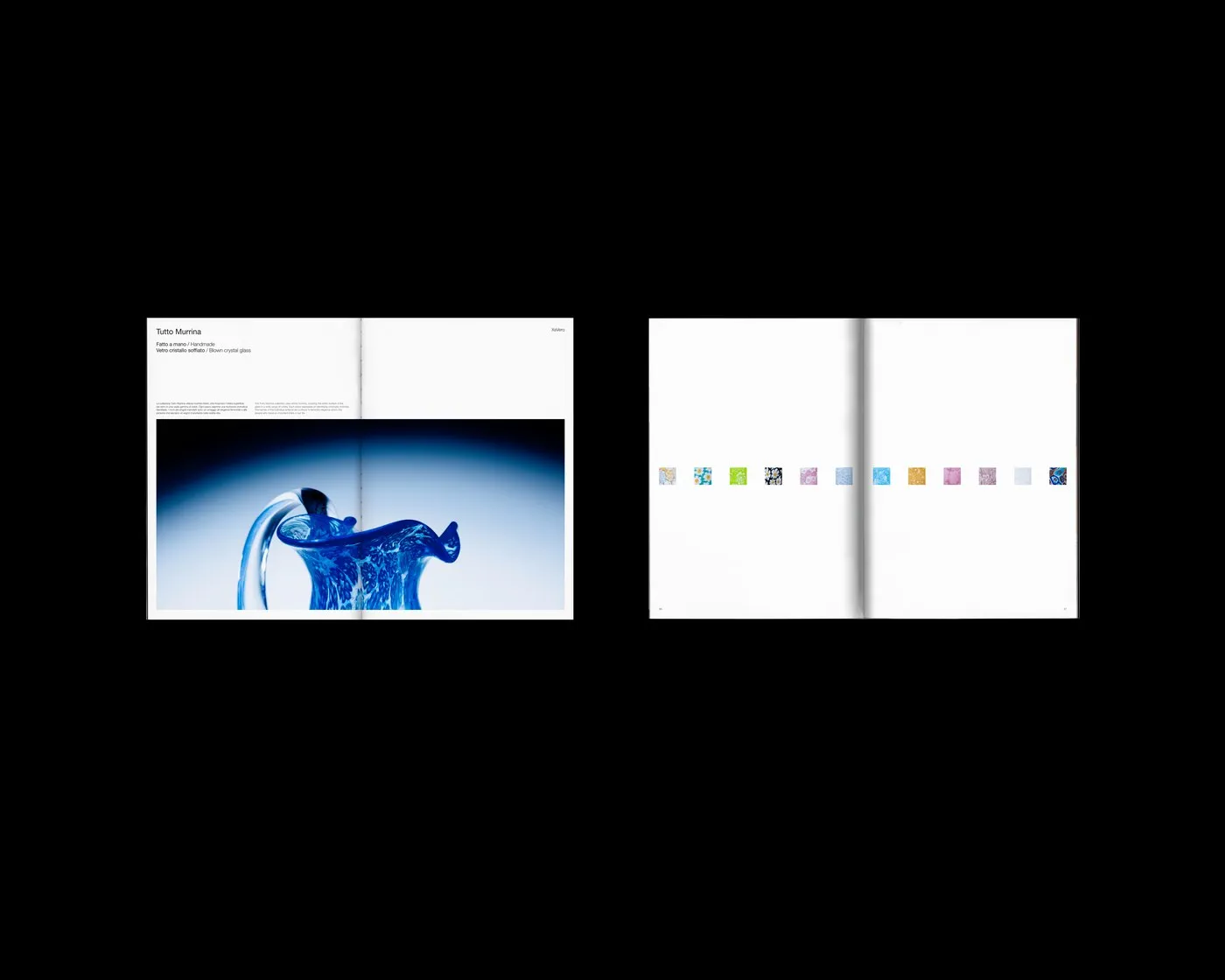
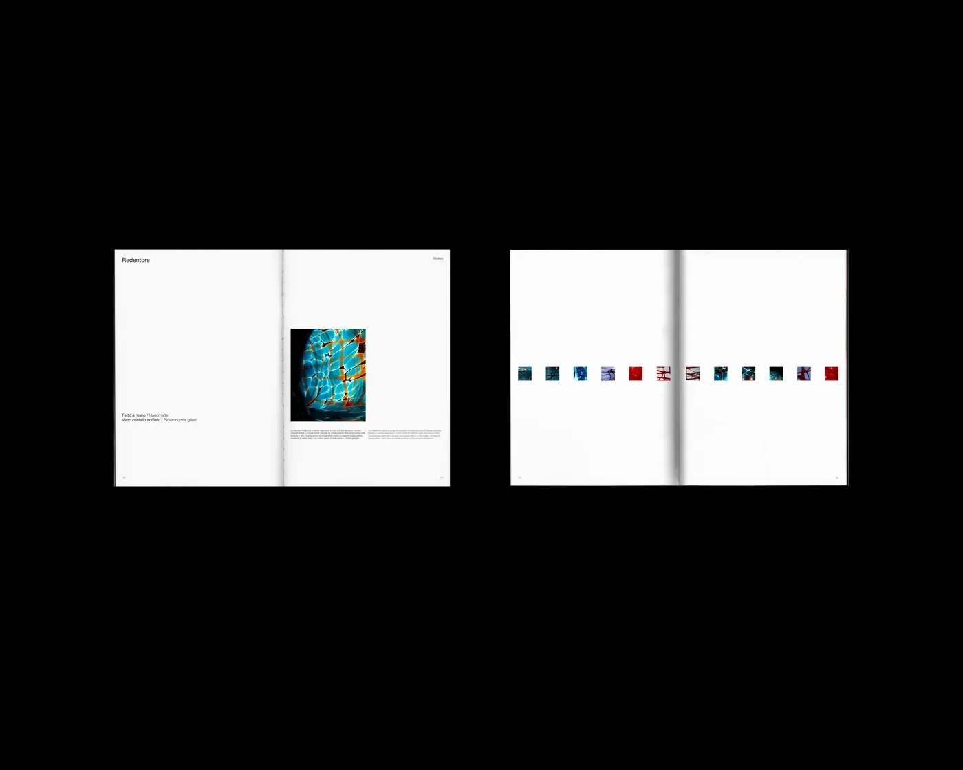
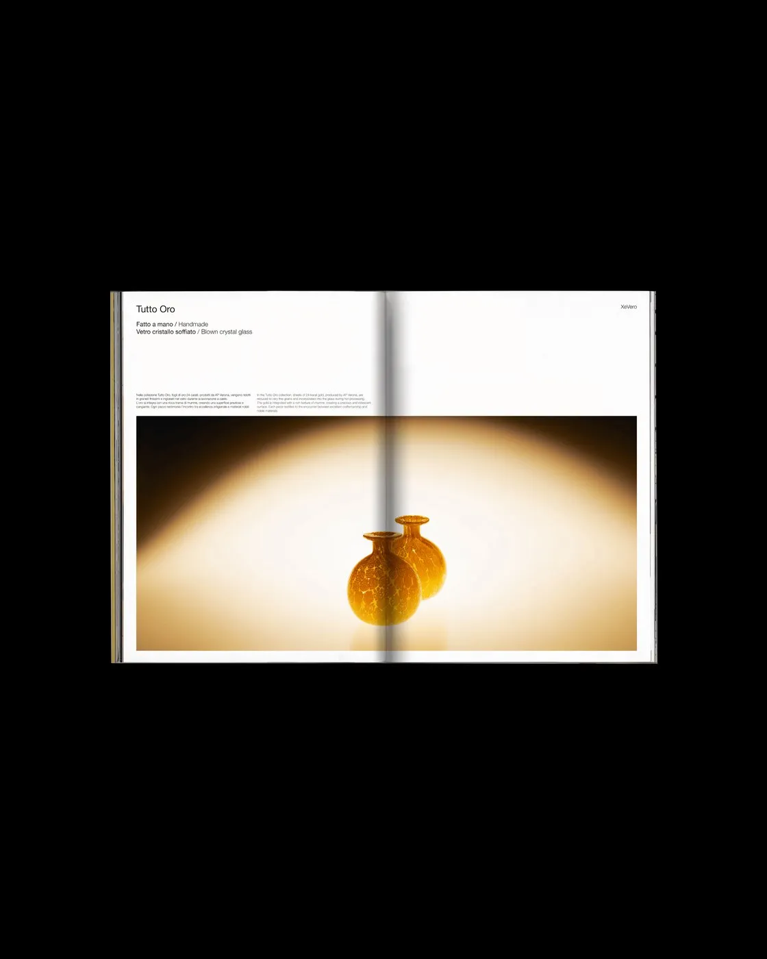
Instead of crowding pages with dense technical specs or unnecessary decorative clutter, negative space is treated as a true architectural element. Generous margins give each piece plenty of breathing room, letting viewers fully focus on the depth of color, soft curves, and gorgeous light refraction of the glass.
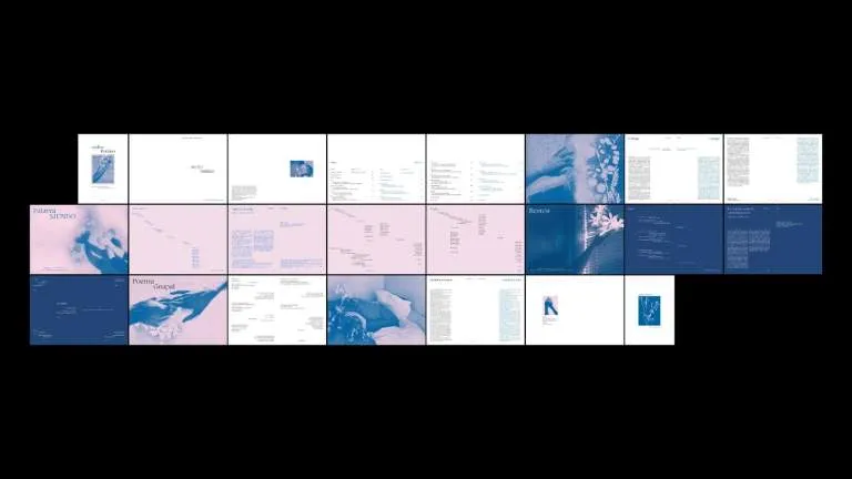
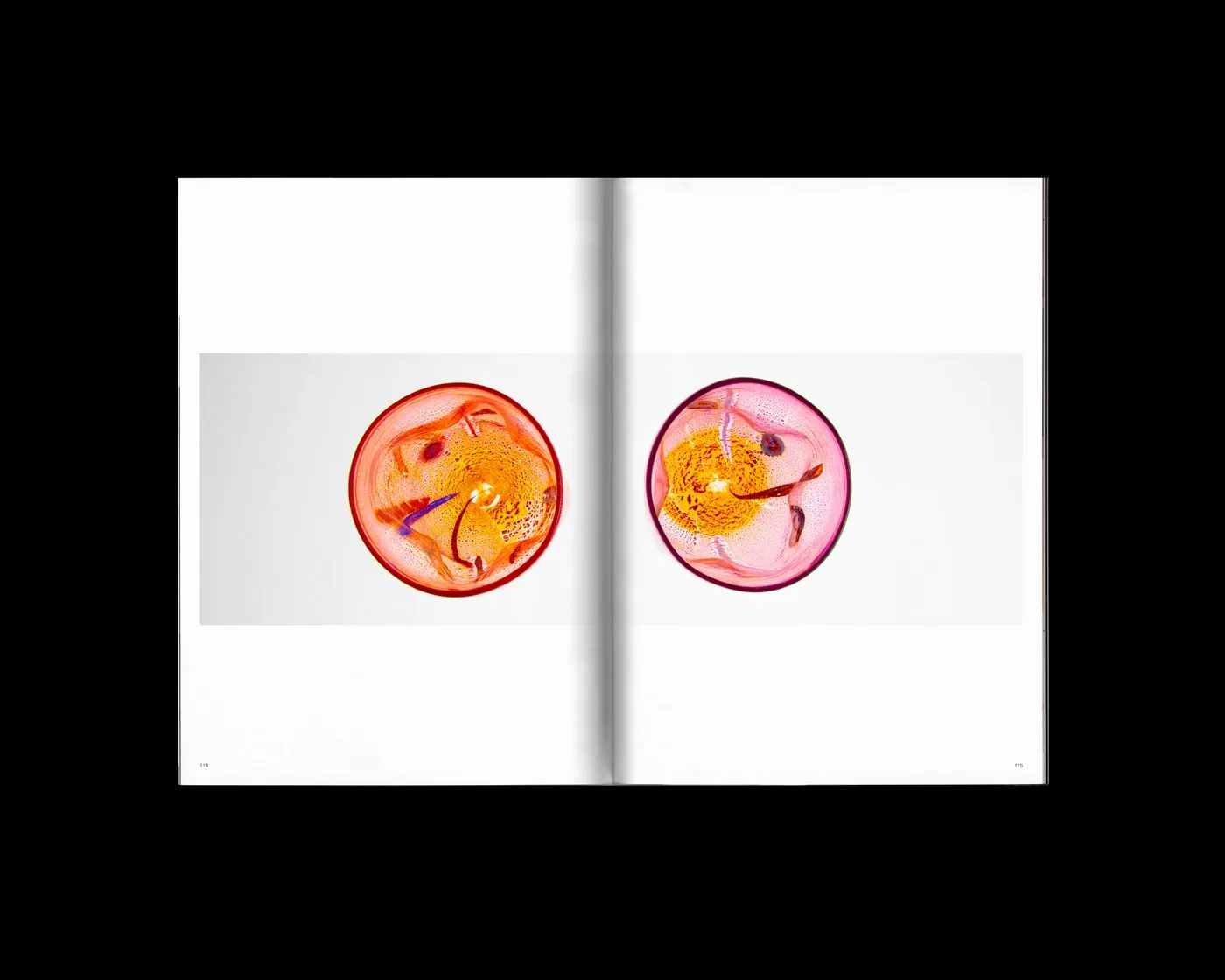
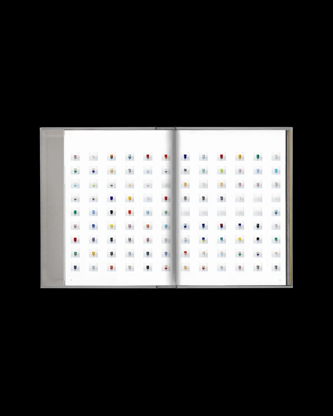
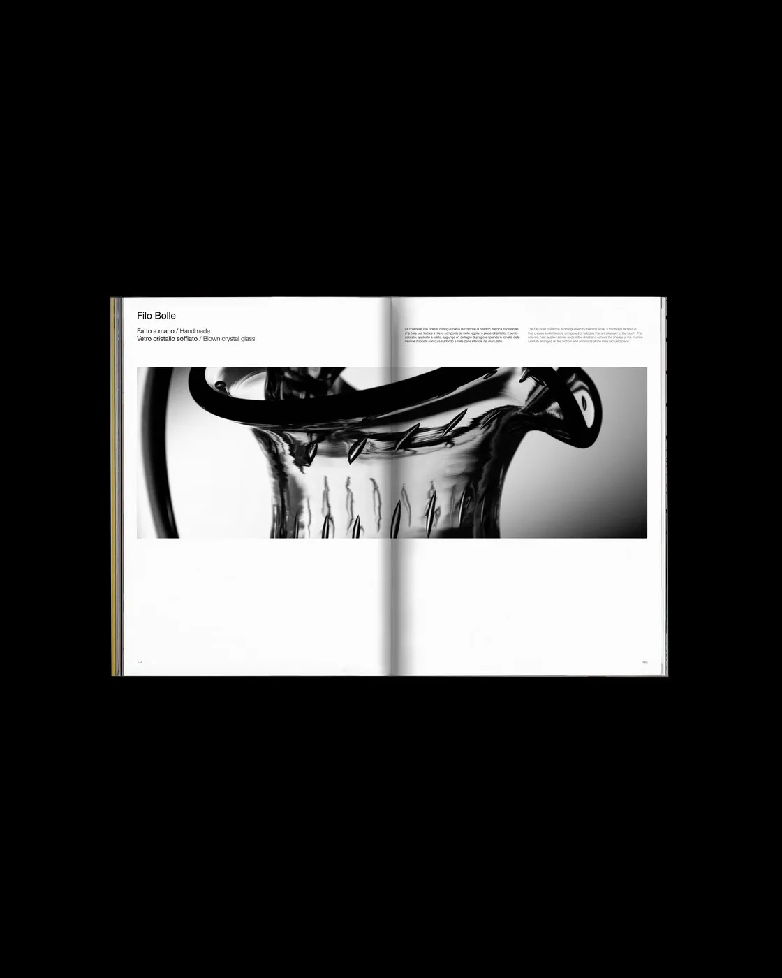
An asymmetric multi-column grid creates a distinctive visual rhythm across every layout. Typography keeps things super restrained, featuring delicate grotesque numbers, subtle technical specs, and clean sans-serif captions tucked neatly into the outer margins. Thanks to this minimalist setup, the studio photography takes center stage. A thoughtful mix of macro detail shots and dramatic full-bleed images gently guides readers to savor the transparency and fluid versatility of Venetian glass.
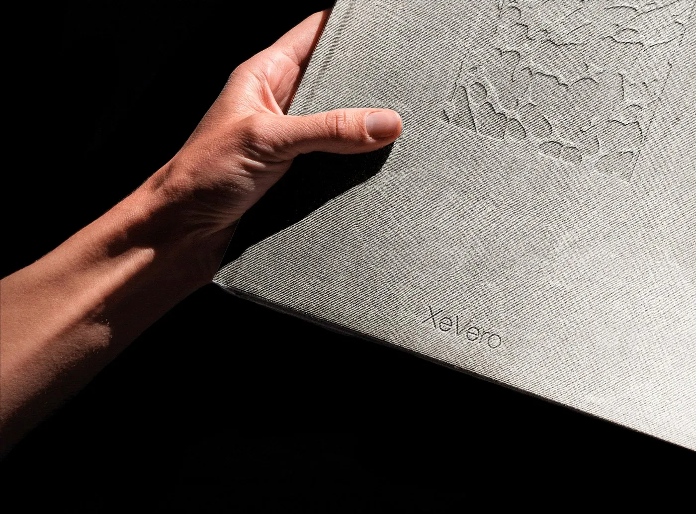
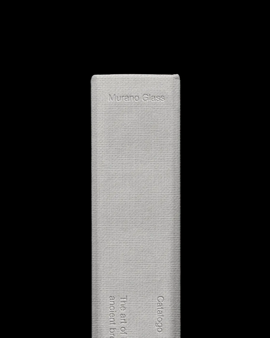
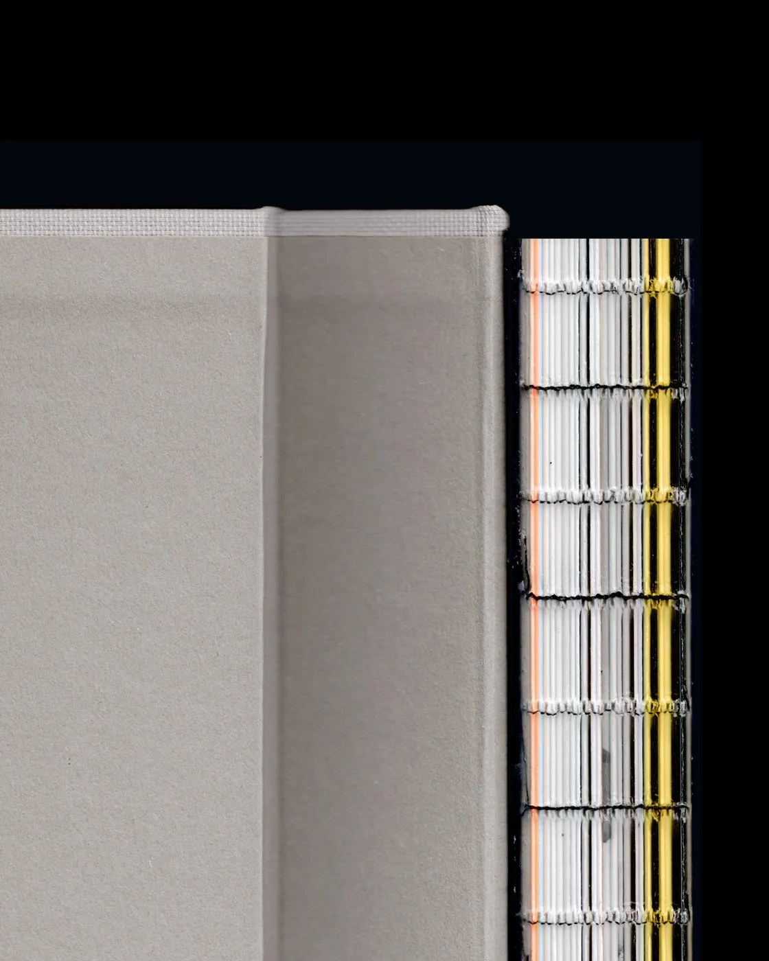
The visual experience goes hand-in-hand with the physical print quality. Printed on heavy uncoated paper stock with high ink density, crisp trim edges, and sturdy binding, this catalog feels incredible in hand. Prepress work in InDesign and Photoshop captured every tiny reflection and subtle color shift, striking a perfect balance between industrial precision and fine craftsmanship.
Check out the full project details at www.suertestudio.com/progetti/xevero-editorial.
Catalogue Xe Vero: Nơi Khoảng Trắng Tôn Vinh Nghệ Thuật Thủy Tinh Murano
Thiết kế ấn phẩm cho một thương hiệu thủy tinh Murano lâu đời là bài toán cân bằng giữa di sản thủ công Venice và tư duy thị giác hiện đại. Trong dự án catalogue cho Xe Vero, studio thiết kế Suerte Studio từ Ý đã xây dựng bố cục dựa trên khái niệm khoảng trắng có tính toán (bianco progettato).
Thay vì lấp đầy trang sách bằng thông số kỹ thuật hay các chi tiết trang trí rườm rà, thiết kế coi khoảng không như một yếu tố kiến trúc thực thụ. Lề trang rộng rãi tạo khoảng thở cho từng sản phẩm, giúp người xem tập trung hoàn toàn vào độ sâu màu sắc, đường cong mềm mại và khả năng khúc xạ ánh sáng của chất liệu thủy tinh.
Lưới bố cục nhiều cột bất đối xứng (asymmetric multi-column grid) tạo nên nhịp điệu thị giác rất riêng qua từng trang dàn. Hệ thống typography được tiết chế tối đa với các chữ số grotesque mảnh, chỉ số kỹ thuật tinh tế và phần chú thích sans-serif nằm gọn ở viền ngoài. Nhờ sự giản lược này, những bức ảnh chụp trong studio trở thành điểm nhấn chính. Việc đan xen giữa ảnh chụp chi tiết cận cảnh (macro) và ảnh tràn lề (full-bleed) giúp dẫn dắt người đọc thưởng thức từ từ độ trong suốt và tính linh hoạt của thủy tinh Venice.
Trải nghiệm thị giác còn gắn liền với chất liệu in ấn thực tế. Cuốn catalogue sử dụng chất liệu giấy dày không phủ (uncoated heavy paper stock), độ đậm mực cao, mép cắt gọn gàng cùng kỹ thuật đóng sổ chắc chắn. Quy trình sản xuất trên InDesign và Photoshop đã giữ trọn từng vệt phản quang nhỏ nhất cùng sự chuyển sắc tinh tế, tạo nên sự giao thoa giữa độ chính xác công nghiệp và nét thủ công tinh xảo.
Xem chi tiết dự án tại www.suertestudio.com/progetti/xevero-editorial.