Atelier Poético by Lina Irene Rossi: A Beautiful Rhythm Between Grid Layouts and Poetic Type
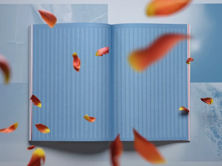
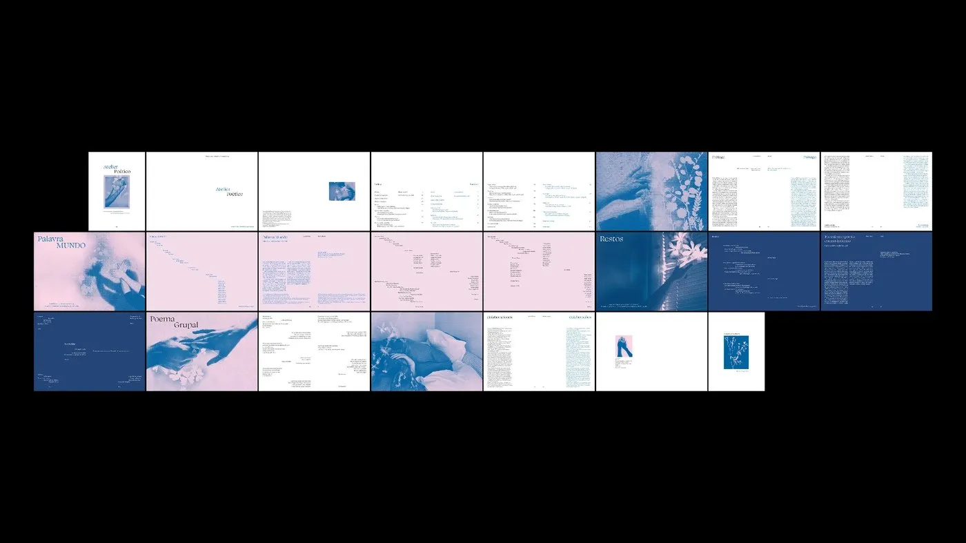
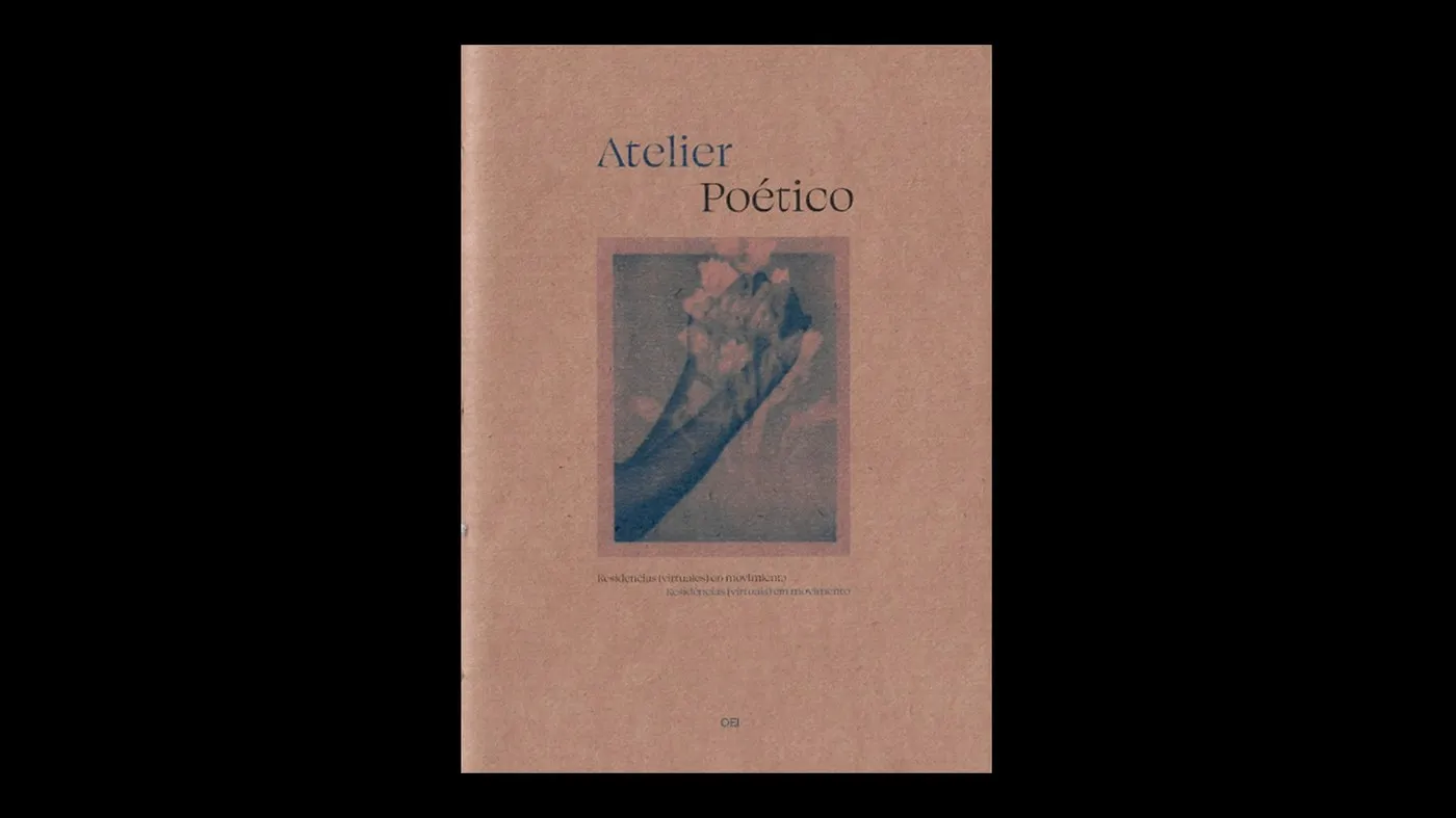
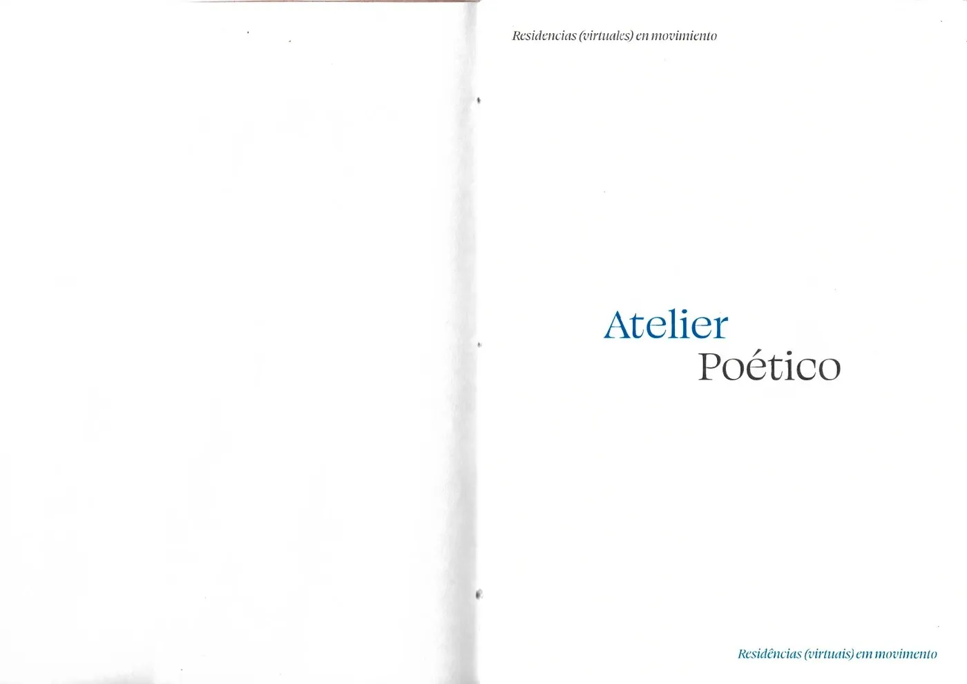
Atelier Poético is a gorgeous 44-page booklet designed by Lina Irene Rossi for OEI, serving as an introductory feature for a poetry residency book series. Developed at FADU UBA Cátedra Cosgaya, this project shines with a heavy focus on typographic layout, hitting the perfect sweet spot between editorial rhythm and core graphic design principles. The choice of warm beige paper, neutral light brown tones, and soft monochromatic imagery creates an incredibly cozy, inviting reading vibe. Thanks to sleek sans-serif typography, generous margins, and subtle contrast between characters, scattered verses beautifully transform into a cohesive, structured masterpiece on the page.
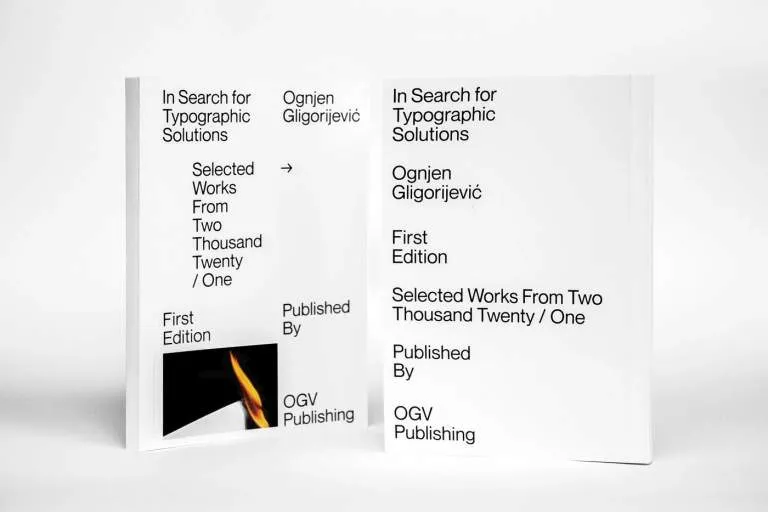
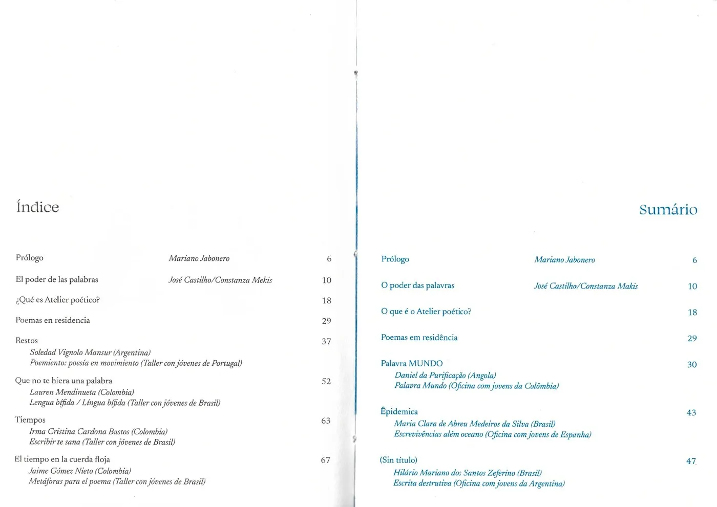
At the heart of this editorial design is a super disciplined grid system that perfectly elevates the rhythm of the poems, stanza alignments, typographic standards, and textual hierarchy. By locking down strict structural boundaries, the designer masterfully uses negative space and letterforms to guide the eyes across every single spread. The size contrast between section headers, main verses, and tiny metadata is perfectly calculated to keep things harmonious without ever distracting the reader. Because of this, even the most text-heavy poems are an absolute breeze to read, proving just how powerful a modular grid can be when shaping deep literary publications.
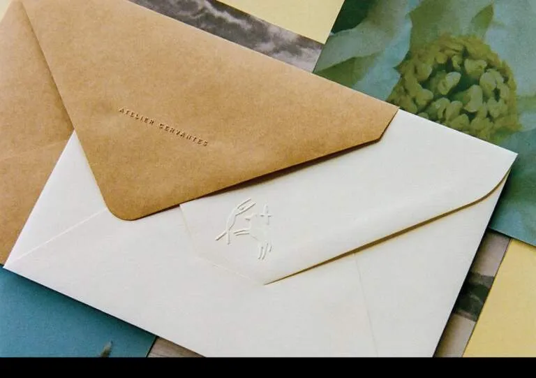
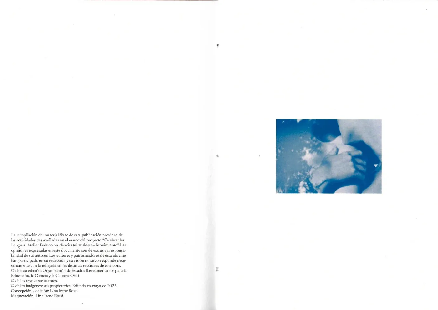
But it doesn’t just stop at the visuals—the publication also plays with contrasting paper textures, signatures, and page layouts to bring the poetry theme to life. The curated imagery beautifully blends quiet architectural textures and soft, organic shapes with the structured layout grid, striking a delicate balance between text and visual art. Every little detail—from the paper grain and ink density to the trim margins, debossed titles, and precise saddle-stitch binding—ensures the physical piece feels just as intentional and impactful as the typography itself. This flawless execution is a fantastic masterclass for contemporary literary editorial design and production.
Check out the full project on www.behance.net/gallery/253155923/Atelier-Potico-Plaquette.
Atelier Poético bởi Lina Irene Rossi: Sự kết hợp nhịp nhàng giữa layout grid và chất thơ của chữ
Atelier Poético là một ấn phẩm plaquette dày 44 trang được Lina Irene Rossi thiết kế riêng cho OEI, đóng vai trò như một tập tài liệu giới thiệu cho chuỗi sách về lưu trú thơ ca. Dự án này được phát triển tại FADU UBA Cátedra Cosgaya với hệ thống nhận diện chú trọng vào layout typography, tạo nên sự cân bằng giữa nhịp điệu dàn trang và các nguyên lý thiết kế đồ họa. Việc sử dụng chất liệu giấy màu beige ấm, tông màu nâu nhạt trung tính kết hợp cùng hình ảnh đơn sắc dịu nhẹ đã mang lại một không gian đọc cực kỳ gần gũi. Kiểu chữ sans-serif thanh mảnh, phần margin rộng rãi và sự tương phản nhẹ nhàng giữa các ký tự đã biến những đoạn thơ rời rạc thành một chỉnh thể đồng nhất và có cấu trúc chặt chẽ trên trang giấy.
Nền tảng của thiết kế editorial này là một hệ thống lưới (layout grid) cực kỳ kỷ luật, giúp tôn lên nhịp điệu của các bài thơ, sự căn chỉnh các khổ thơ, các tiêu chuẩn typography và phân cấp thông tin (textual hierarchy). Bằng cách thiết lập các ranh giới cấu trúc chặt chẽ, nhà thiết kế đã tận dụng khoảng trống (negative space) và hình khối của chữ để dẫn dắt thị giác qua từng trang đôi. Sự tương phản về kích thước giữa các tiêu đề phần, khổ thơ chính và các thông tin siêu dữ liệu nhỏ (metadata) được tính toán kỹ lưỡng để giữ được sự hài hòa tổng thể mà không làm người đọc phân tâm. Nhờ vậy, ngay cả những đoạn thơ dày đặc chữ vẫn rất dễ đọc, cho thấy sức mạnh của modular grid trong việc định hình các ấn phẩm văn học có chiều sâu.
Không chỉ dừng lại ở mặt thị giác, ấn phẩm còn khai thác sự tương phản giữa các chất liệu giấy, tay sách và các trang đóng cuốn để làm nổi bật chủ đề thơ ca. Phần hình ảnh được chọn lọc kỹ lưỡng, kết hợp kết cấu kiến trúc tĩnh lặng, hình ảnh hữu cơ mềm mại với lưới layout, tạo nên sự cân bằng tinh tế giữa câu chữ và nghệ thuật thị giác. Sự tỉ mỉ trong việc chọn vân giấy, mật độ mực, lề xén, phần tiêu đề dập chìm (debossed) cho đến kỹ thuật đóng gáy dập ghim (saddle-stitch) chính xác đã giúp các chi tiết vật lý có sức nặng tương đương với phần typography. Cách hoàn thiện này thực sự là một ví dụ đáng học hỏi cho việc sản xuất và thiết kế editorial văn học đương đại.
Xem toàn bộ dự án của www.behance.net/gallery/253155923/Atelier-Potico-Plaquette trên Behance.