
motion
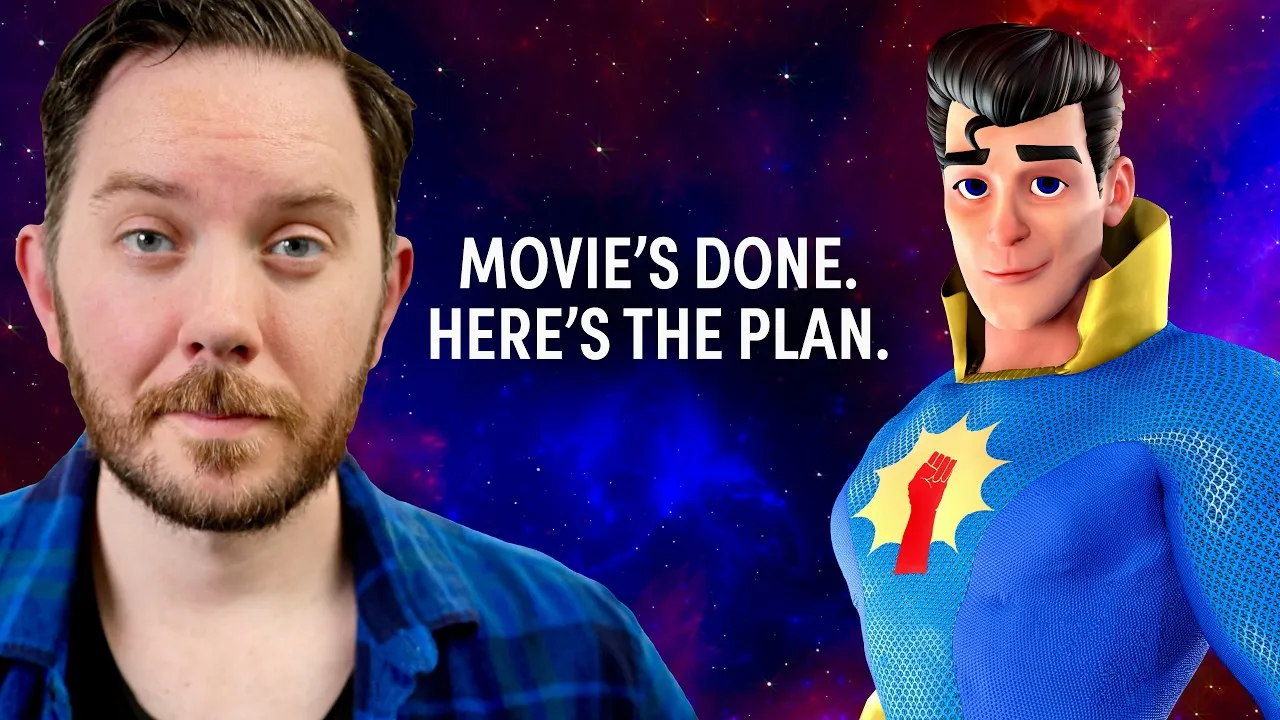
YouTuber Austin McConnell Spent 4 Years Learning 3D Animation to Revive an Obscure 1960s Superhero
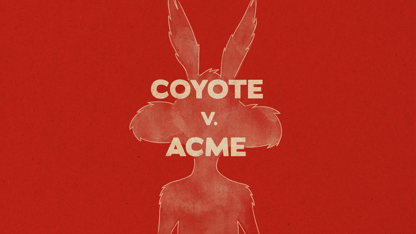
COYOTE VS. ACME — Main on End Title Sequence by Michael Lo

Inequality – An Animated Short on Economic Disparities by Gui Jorge
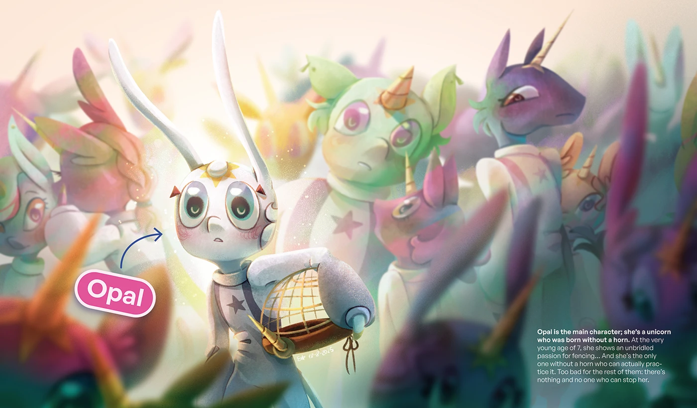
LOS HIJOS DE AMALTEA: 2D Feature Film Proposal by Estrella Vázquez Cabeza
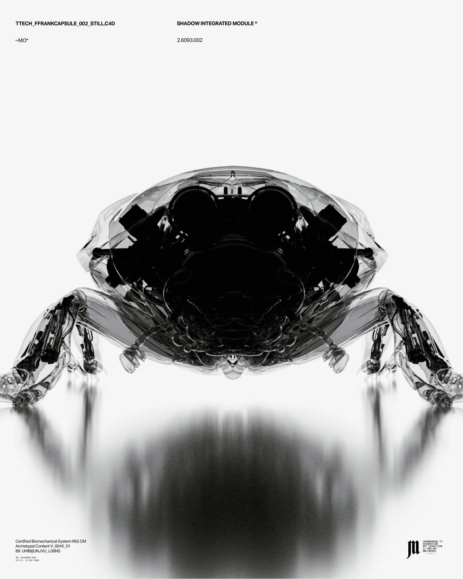
Artifex Creatura: Joan Moreno’s Animated Upgrade Protocol
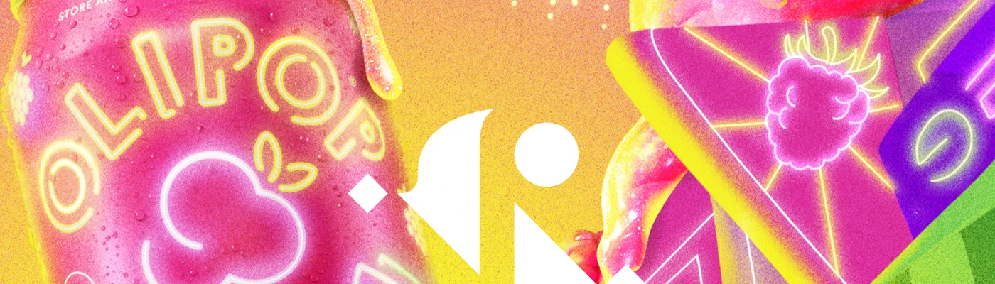
Bringing Nostalgia to Life in Olipop’s ‘Raspberry Sherbet’ Campaign
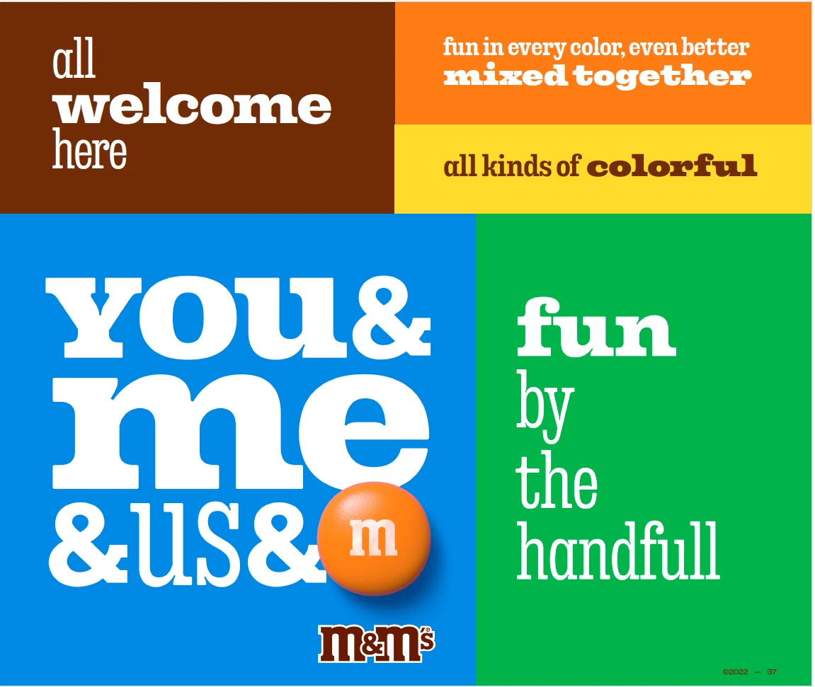
M&M’S World Cup 2026 Animation Spot by Francisco Castro

Pitch Styleframes for Netflix’s “Dead Boy Detectives” Main Titles by Lusine Arakelyan
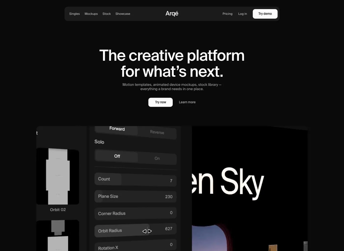
Arqé: A Modular Motion Design Platform for Digital Brand Systems
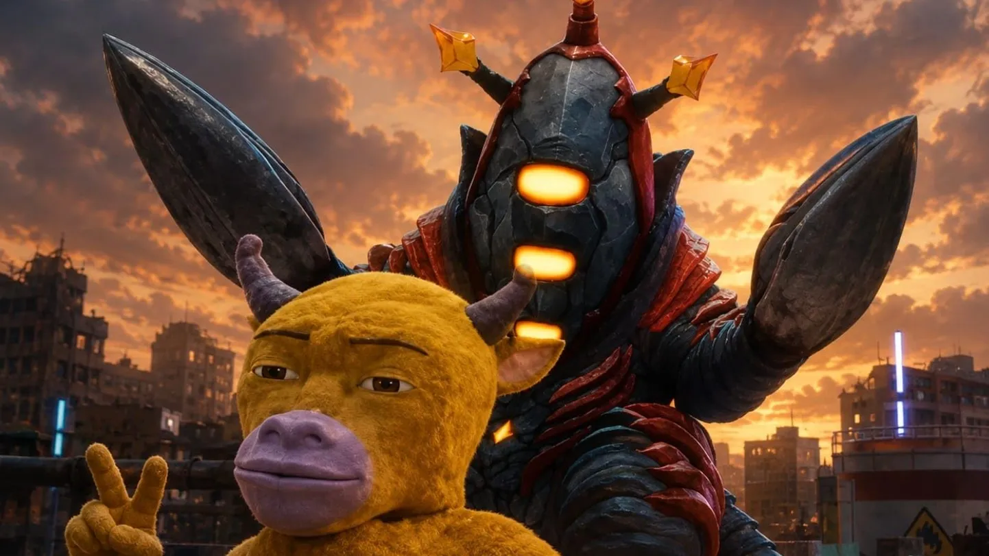
How Niu Lai Sparked a Punk Rock Revolution in 3D Animation
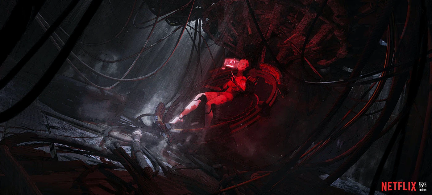
Spider-Rose Visual Development for Love, Death & Robots by Eduardo Pena
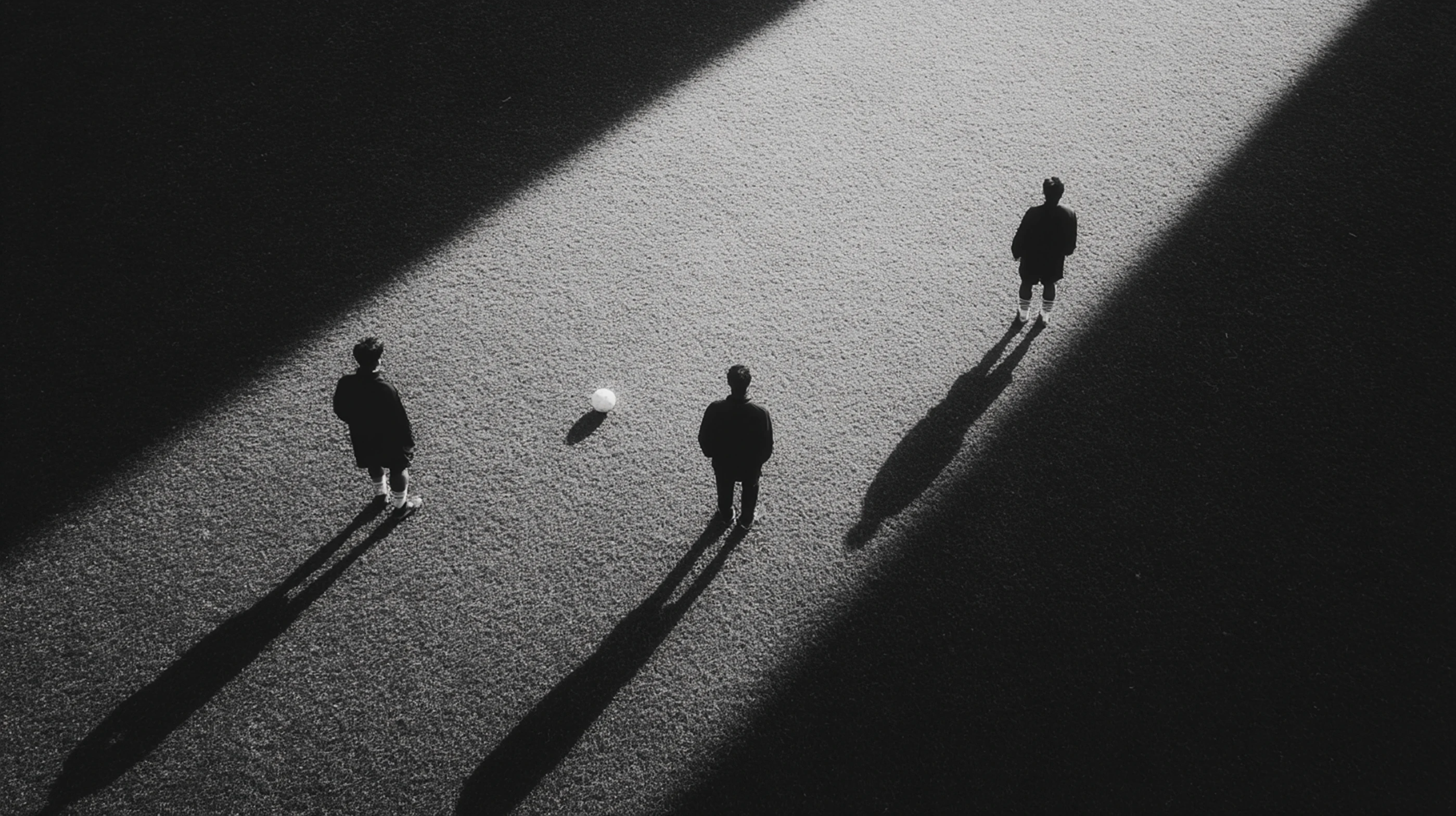
NFF x Nike x Unisport: Reimagining Viking Heritage for the 2026 World Cup Kit Campaign
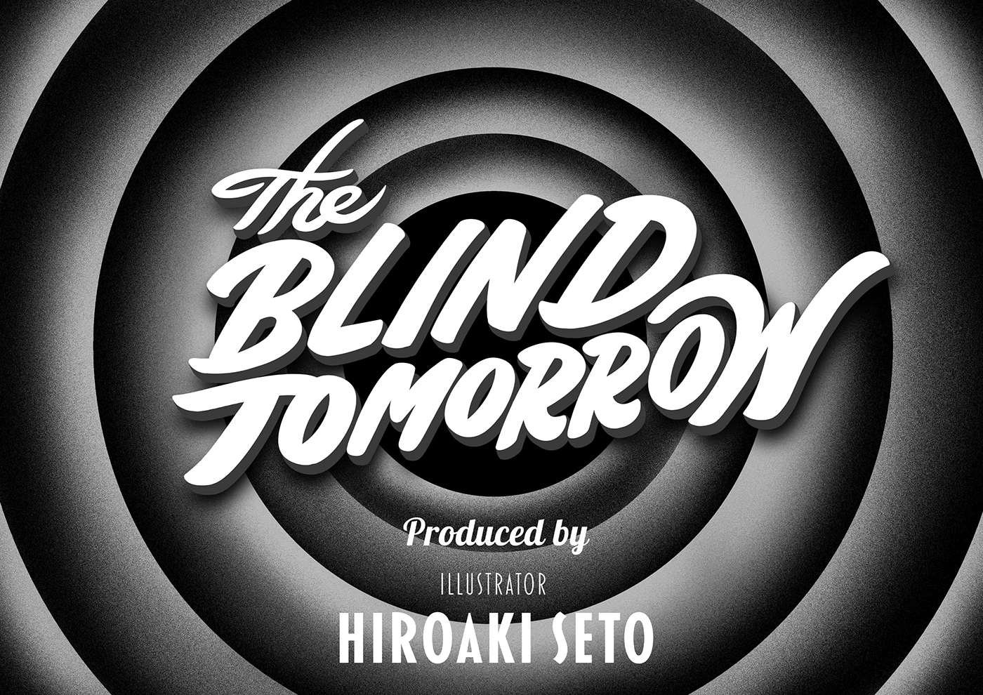
Blind Tomorrow: Opening Concept Draft by Hiroaki Seto
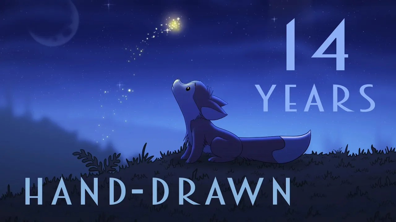
Michel Gagné Releases First Trailer for 14-Year Solo Animated Feature ‘The Saga of Rex’
game
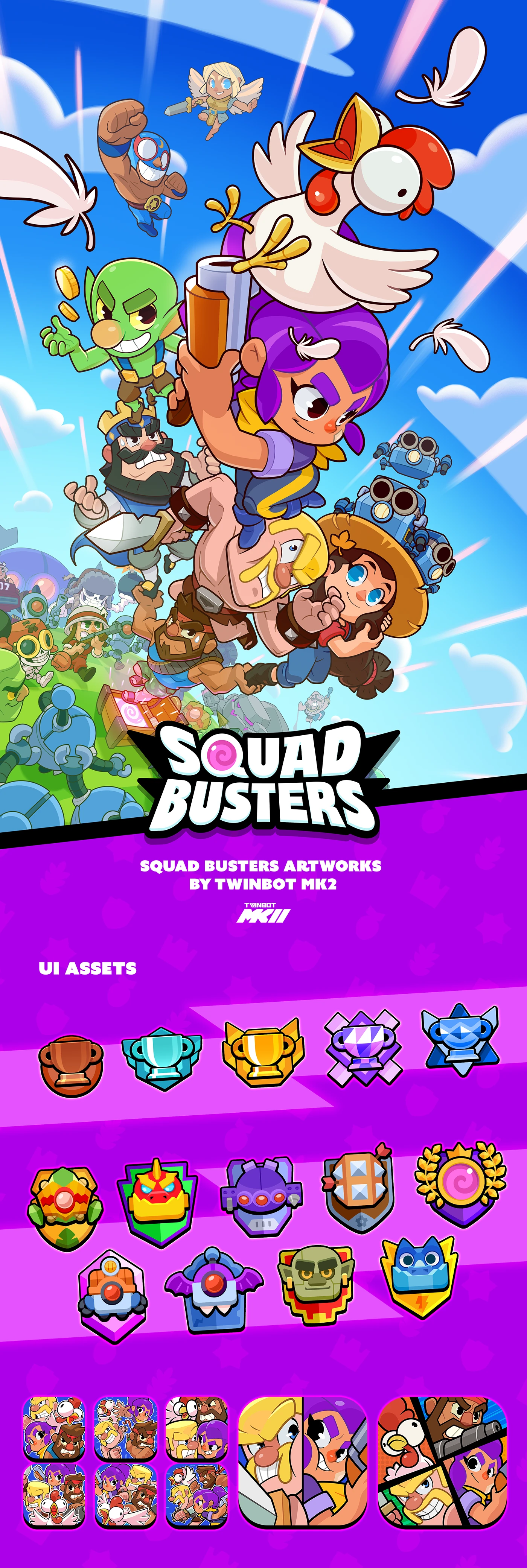
Squad Busters Artworks – Featuring Twinbot Mk2
STAR LEGION – Visual Concept and Art Direction for a Casual Game
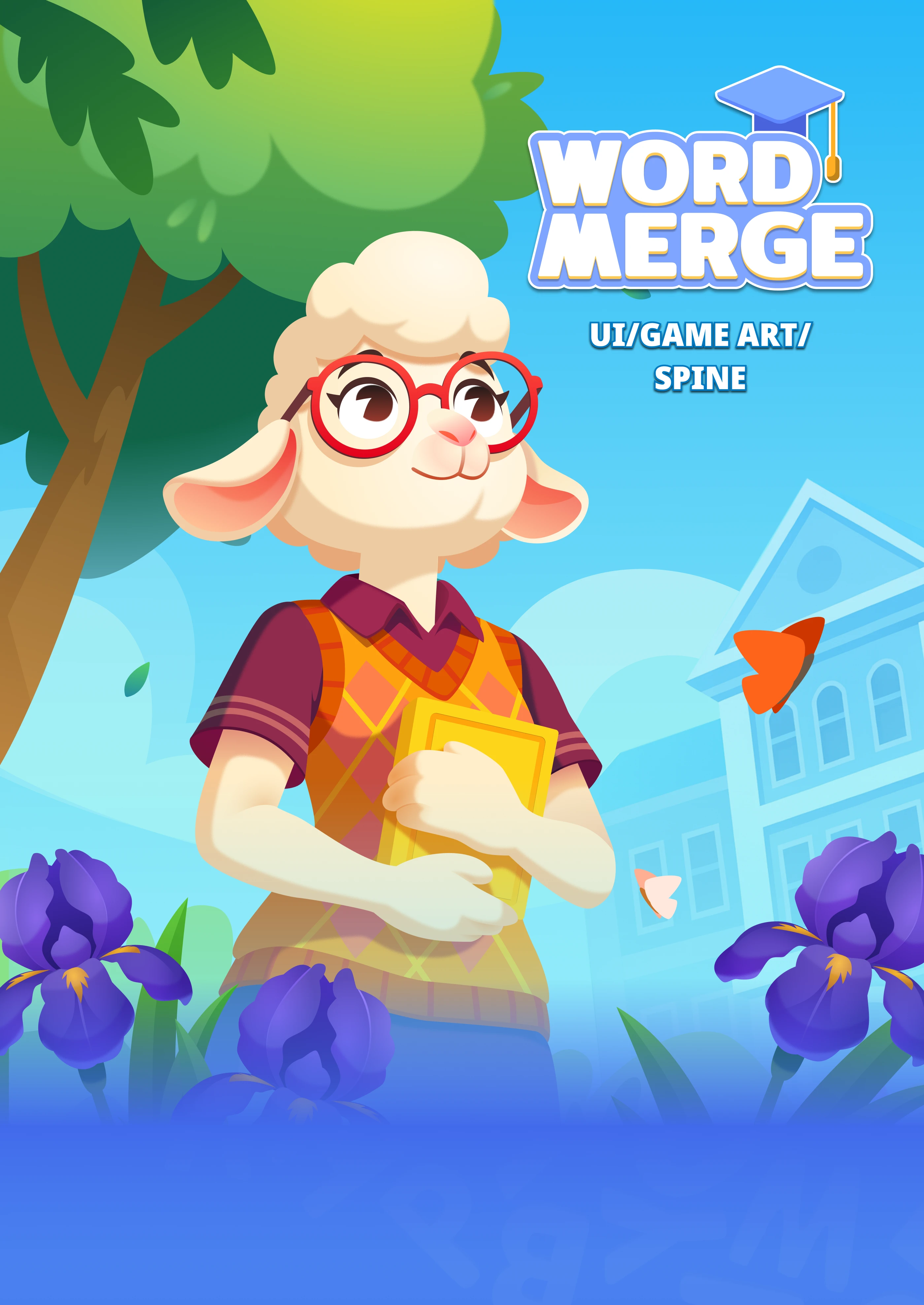
Word Merge Game Art and UI Design by Viktoria Borodenko

Game Art: Merge Cooking by Duyen Duyen
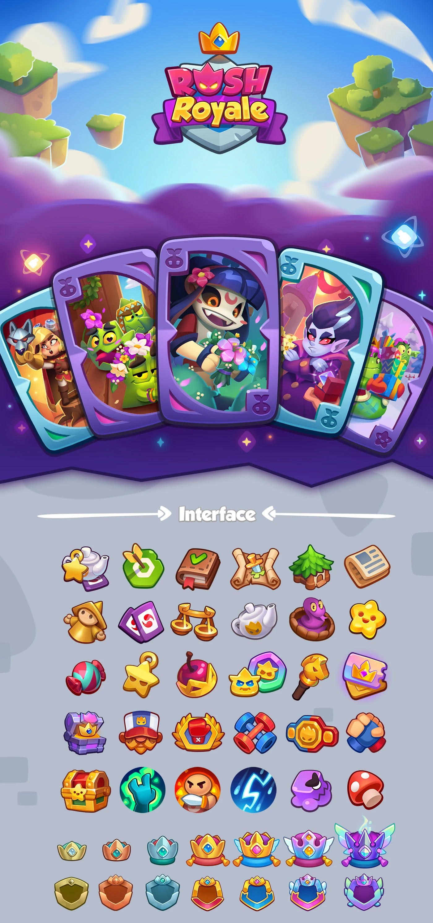
Visual Art and Character Concepts for Rush Royale
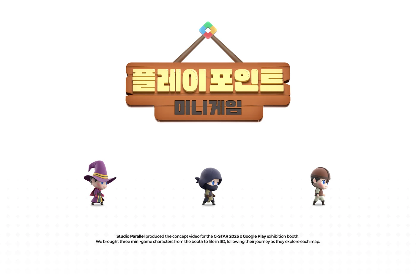
2025 G-Star x Google Play Points Mini Games Concept
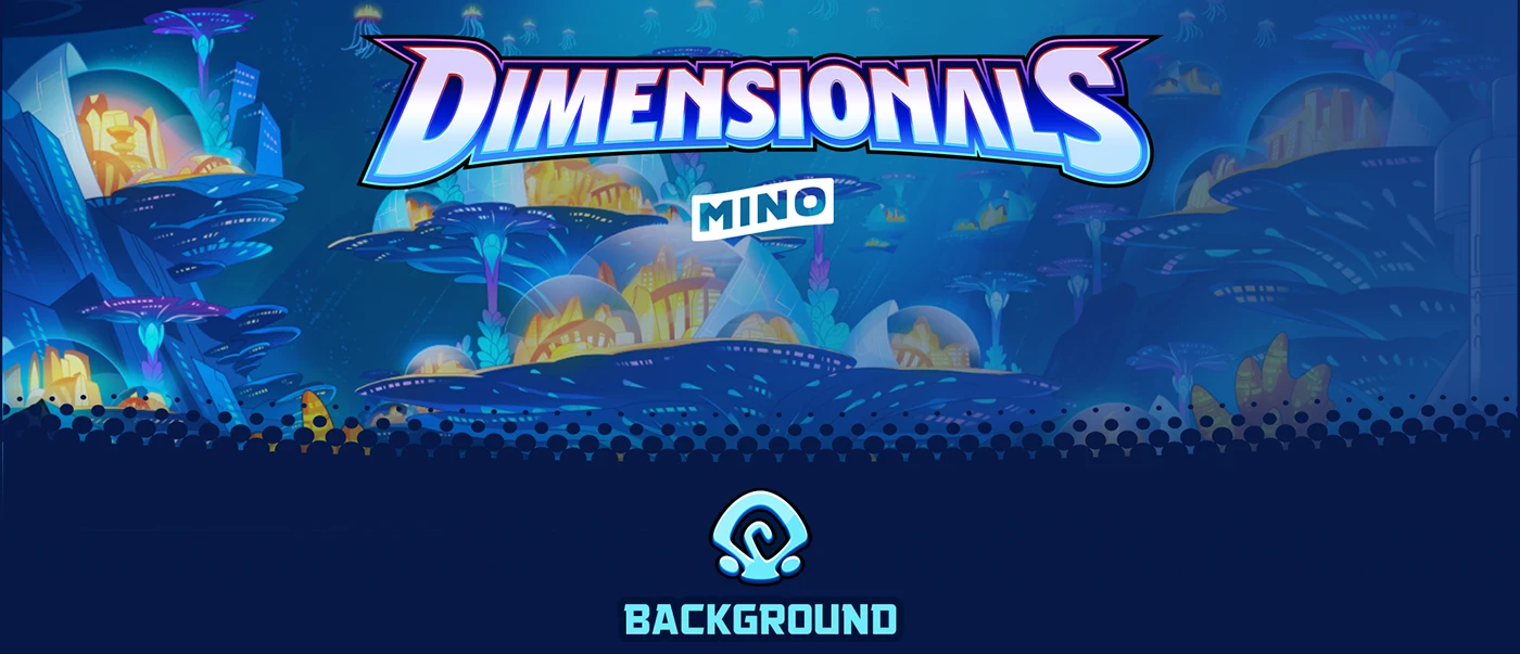
Dimensionals: Behind the Art and Animation of Mino Games
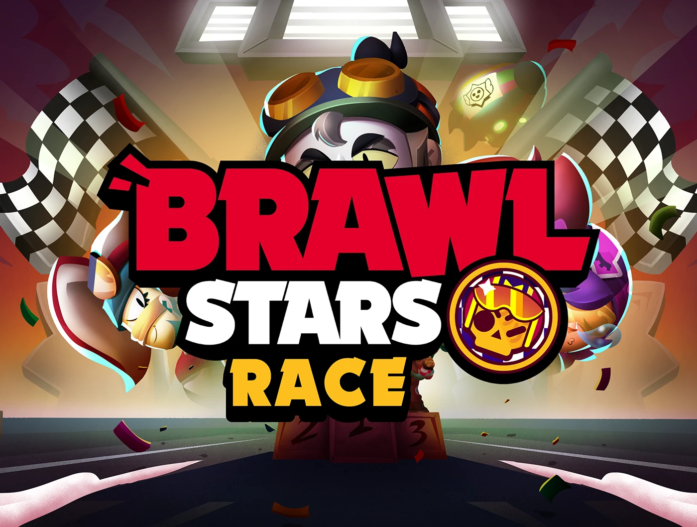
Brawl Race: A Fan-Made Motorsport Concept for Brawl Stars
Bureaucracy Inc. – Transforming Corporate Chaos into an Engaging Idle Tycoon
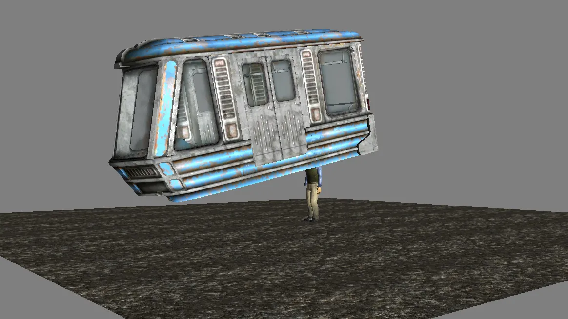
How Fallout 3’s Metro Train Actually Works Behind the Scenes
branding
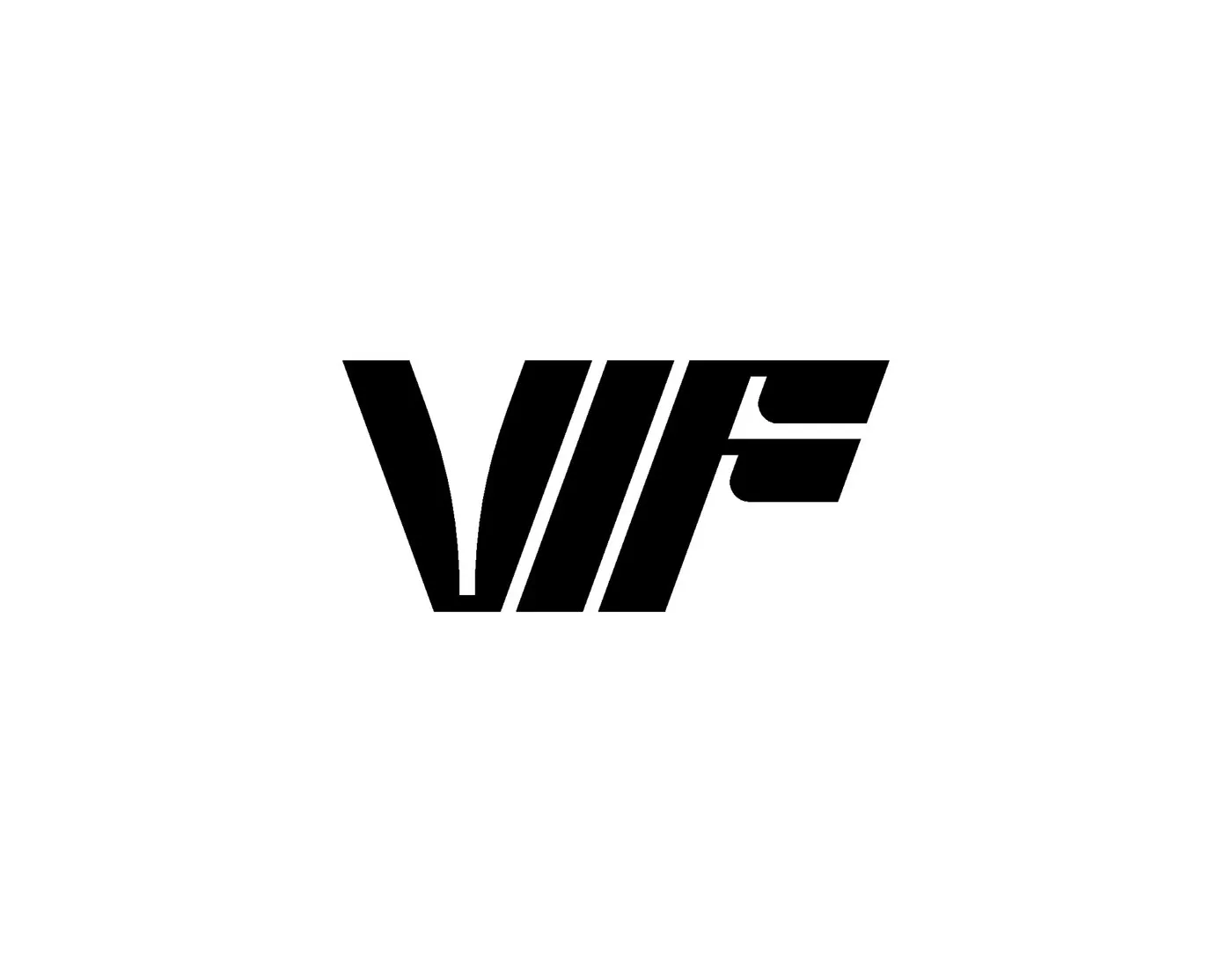
Vif Visual Identity: A Bold Modular System by Brand Brothers
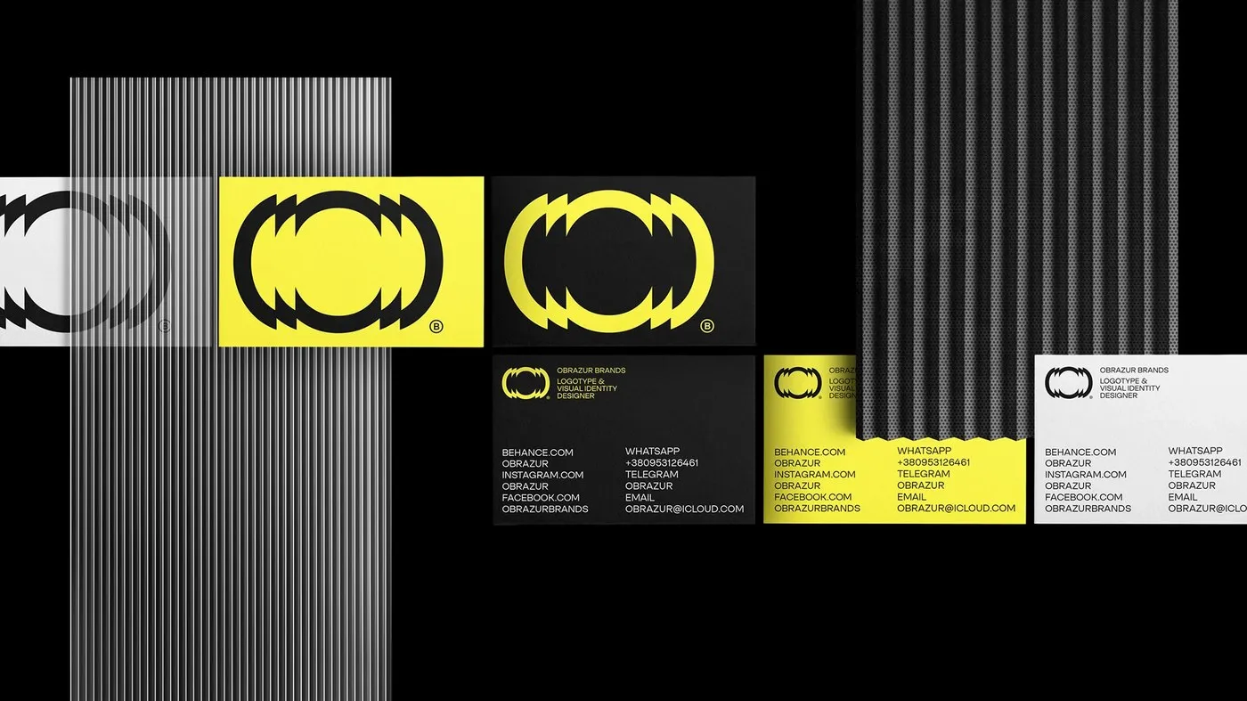
Obrazur Concept: A Kinetic Visual Identity System by Obrazur Brands
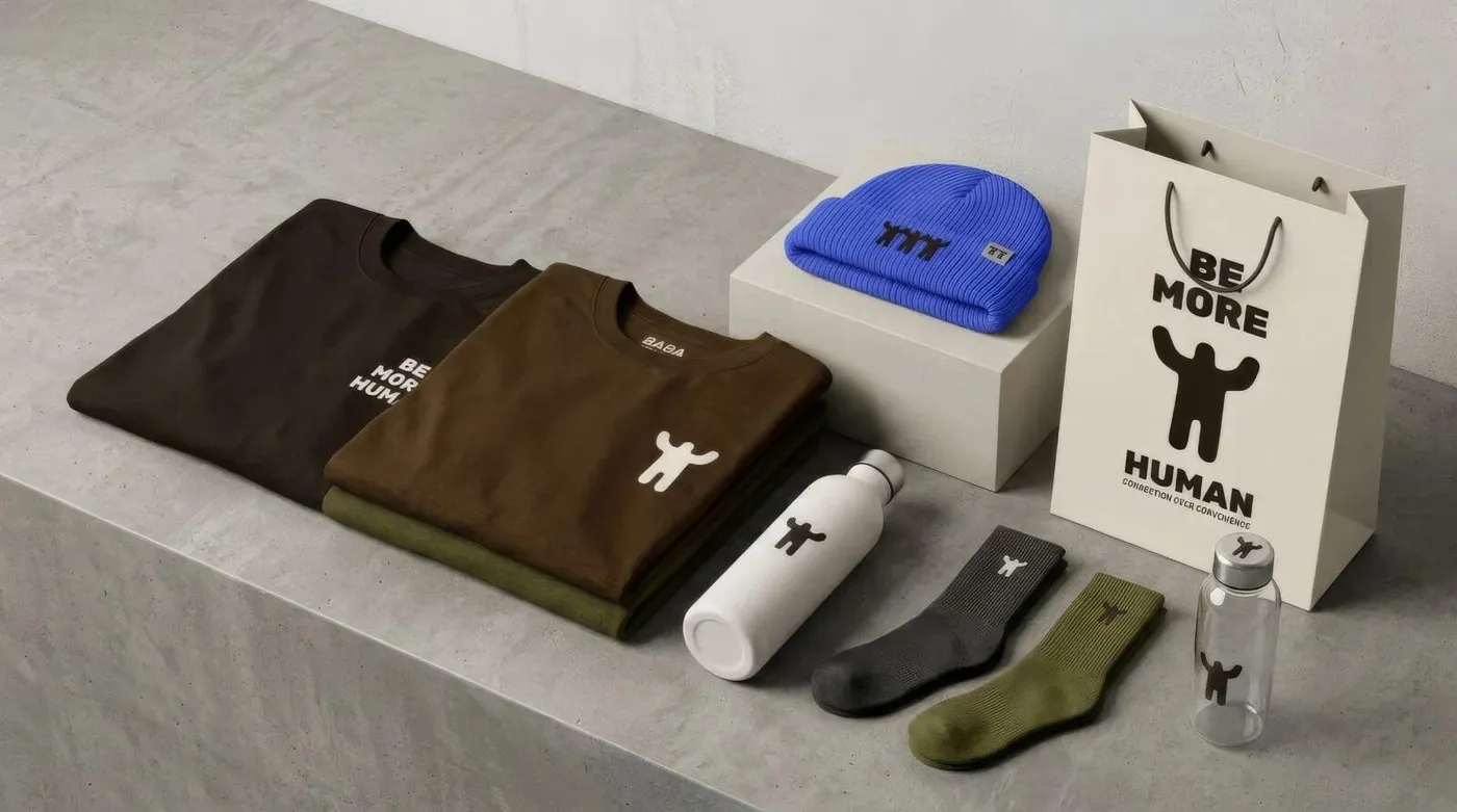
Be More Human: How Defy Built an Understated Brand Identity Rooted in Community
ATELIER 99 Brand Identity: Craftsmanship and Modern Graphic Restraint by Tolgahan Çalışkan
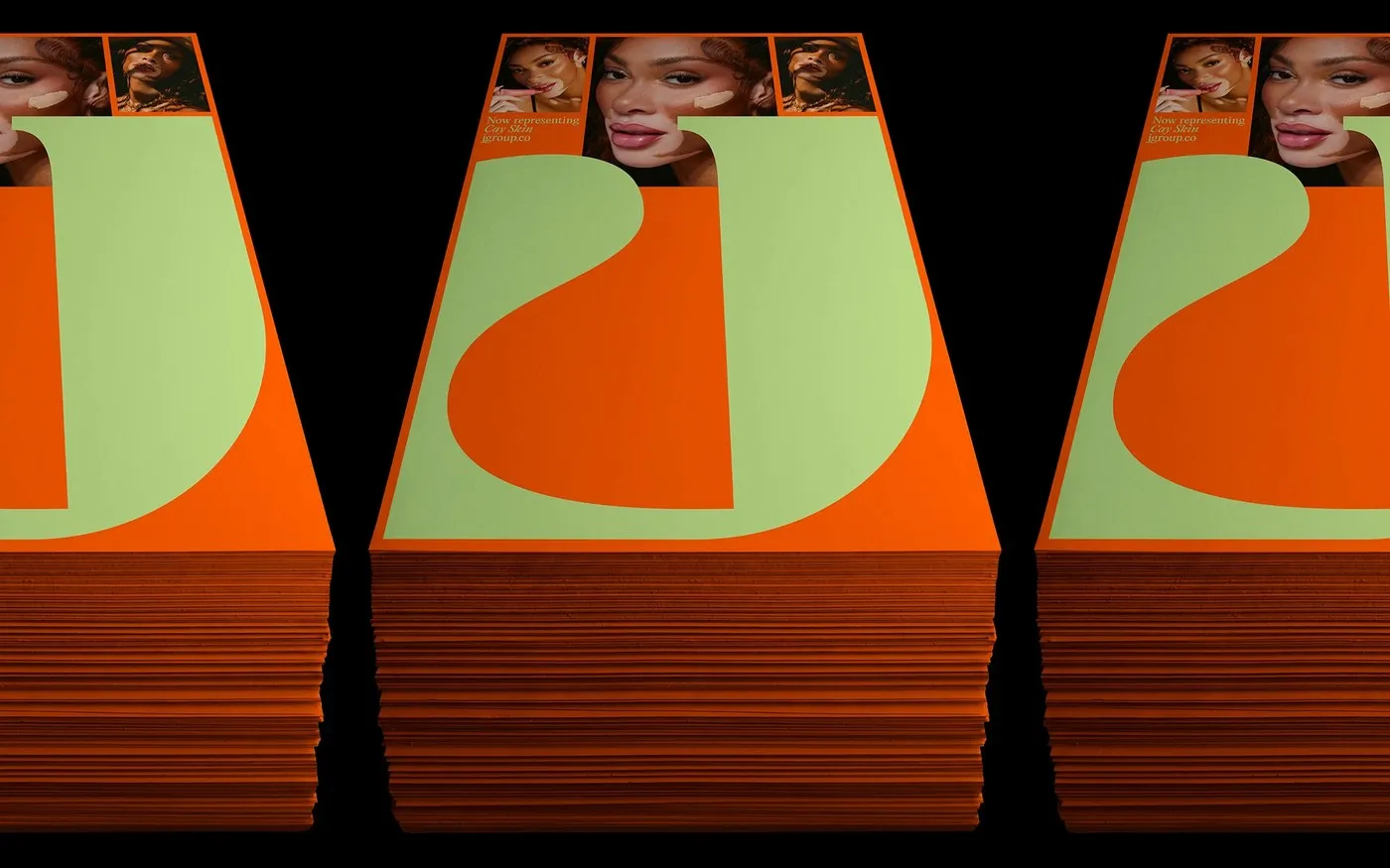
JGroup Rebrand: A Solar Visual Identity System by Rafael Cardoso

Jack’s Coffee Club: Retro Road Trip Aesthetics by Studio Miles
good stuffs
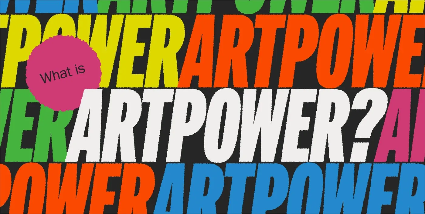
ARTPOWER Marks Tortoise’s First Year with a Striking Debut Zine
ARTPOWER Drops Debut Zine to Celebrate Tortoise’s First Anniversary To mark one year of Tortoise, the cultural organization ARTPOWER just released its very first zine. Guided by founder Janera Solomon, Tortoise was created to bring financial power, autonomy, and long-term…
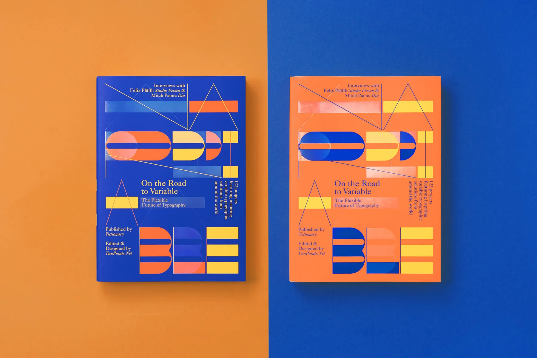
On the Road to Variable, Captures the Future of Type
On the Road to Variable: Shaping the Future of Variable Typography Looking back at the journey behind On the Road to Variable, it becomes clear this is way more than just another design book—it’s the result of a major mindset…
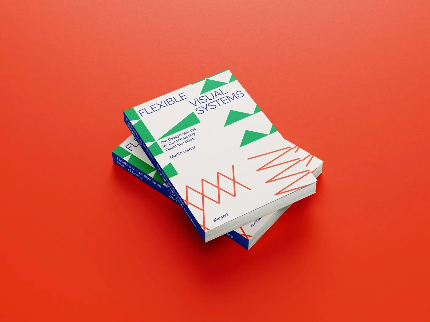
A 320-Page Guide to Dynamic Brand Identity Systems
Flexible Visual Systems by twopoints.net: The Ultimate Manual for Dynamic Visual Identities Clocking in at 320 pages, “Flexible Visual Systems” by Dr. Martin Lorenz from twopoints.net distills two decades of system-building expertise into a masterfully structured manual. Published by Slanted…
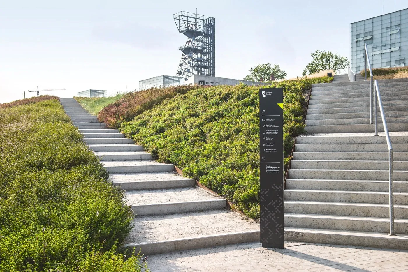
Silesian Museum Wayfinding: Spatial Design for a Former Coal Mine by Aleksandra Krupa
Silesian Museum Wayfinding: Spatial Design on a Former Coal Mine by Aleksandra Krupa Navigating a 2.7-hectare former coal mine site with four levels below ground is no small design challenge! For the Silesian Museum project in Katowice, Poland, designer Aleksandra…
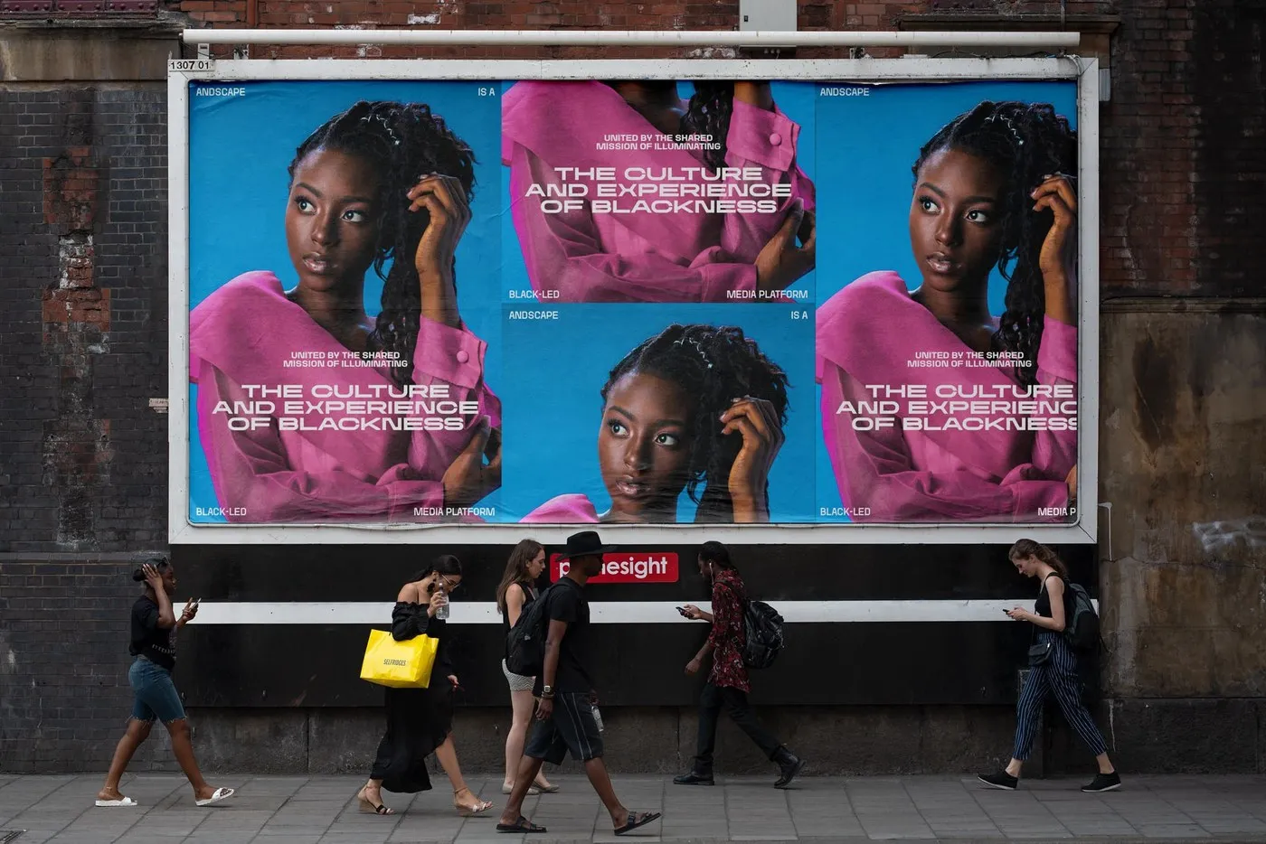
Andscape: A 27-Style Flexible Typeface for ESPN
The Andscape Font Family by twopoints.net: A Super Flexible Typography Solution for ESPN ESPN teamed up with design studio twopoints.net to create Andscape—a custom bespoke typeface designed for a media platform dedicated to uplifting Black identity and stories. This massive…
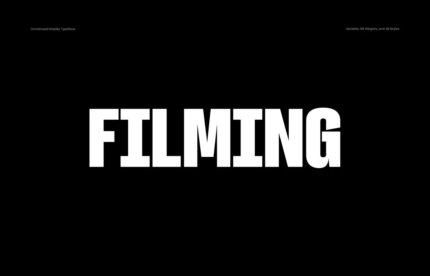
Filming Typeface by Rajesh Rajput: A Bold Condensed Display Font for Cinematic Titles
Filming Typeface: A Cinematic Condensed Font by Rajesh Rajput Searching for a tall, sleek font that makes movie titles and posters instantly eye-catching? Filming Typeface by designer Rajesh Rajput is a fantastic standout choice. This condensed display typeface delivers a…
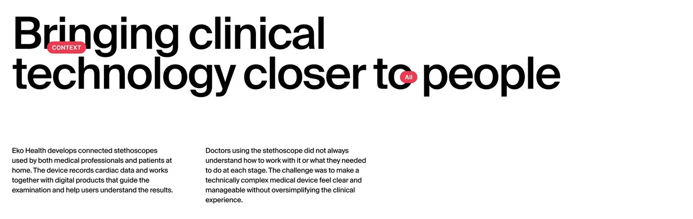
Eko Health Ecosystem: Crafting a Seamless Medical UI/UX Design by Humbleteam
Optimizing Healthcare Experiences: Designing Eko Health’s UI/UX Ecosystem with Humbleteam Digital stethoscopes are amazing at picking up faint heart and lung sounds, but raw audio graphs can be a total headache for medical teams to decipher on the fly. To…

Weird and Wonderful: The Creative Visual Universe of A. Bran
Weird and Wonderful: A. Bran’s Unique Visual Take A. Bran’s “Weird and Wonderful” project serves up a completely fresh and spontaneous visual space. True to its name, the collection gathers visuals that are a bit quirky yet endlessly captivating, showcasing…
TT Nooks Serif v2.000: TypeType Foundry’s Modern Display Serif Redesign
TT Nooks Serif v2.000 from TypeType Foundry: A Modern Display Serif with Unique Slipper-Shaped Serifs TypeType Foundry just dropped a 2.000 update for TT Nooks Serif, a modern display serif packed with sharp character, sturdy structure, and generous proportions. High…
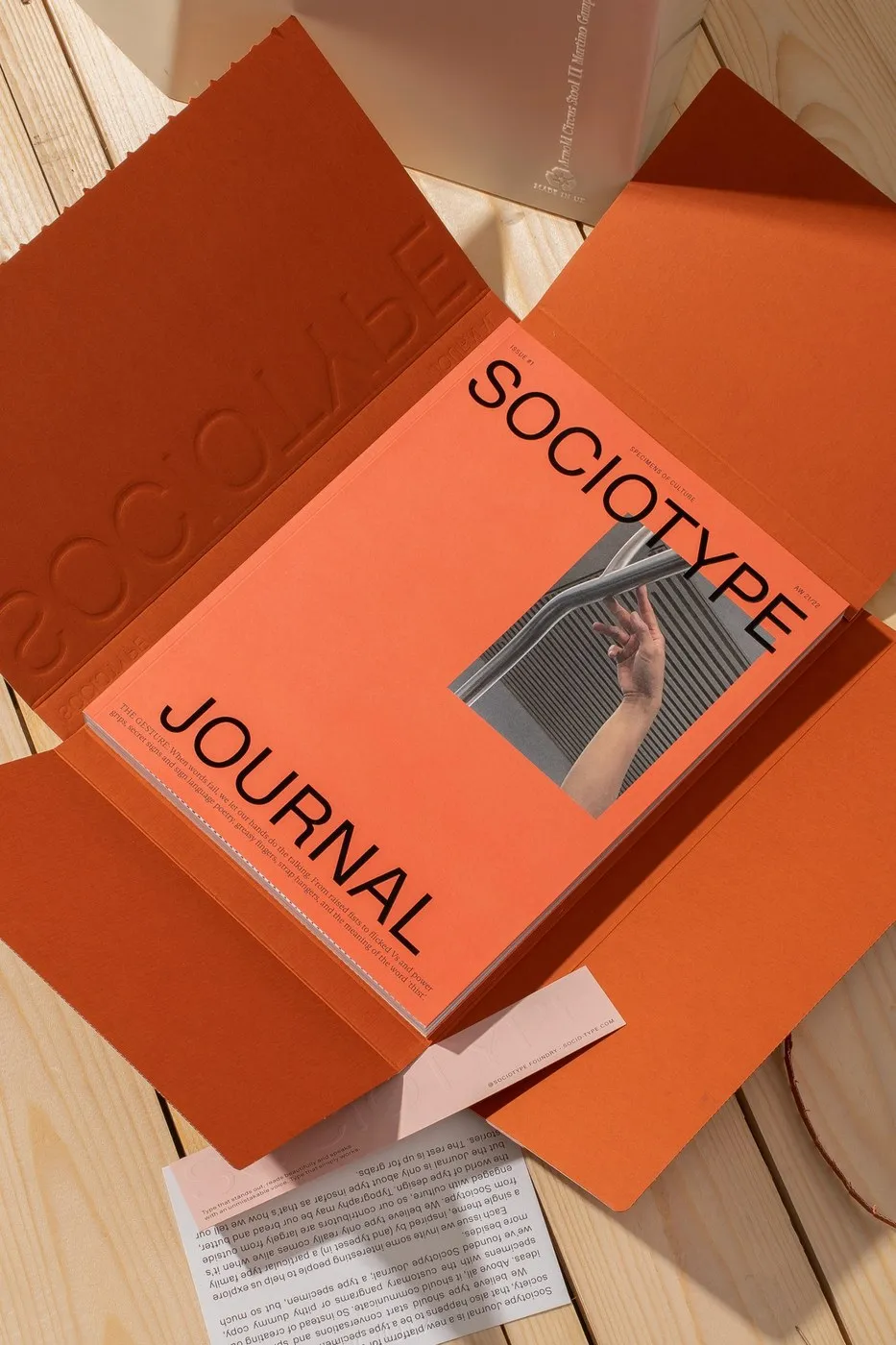
Sociotype Journal Issue 1: Typography and Layout in “The Gesture”
Sociotype Journal Issue 1: Layout Design Meets Typography London-based foundry Sociotype launched Sociotype Journal Issue #1—a hybrid publication combining a culture magazine with a type specimen for their serif superfamily, Gestura. Centered around the theme “The Gesture,” this 224-page, 210…
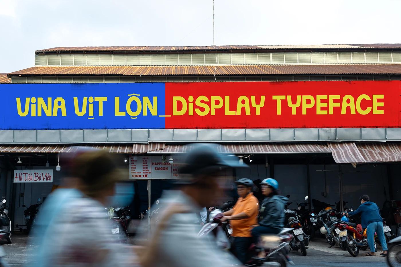
Vina Vit Lon: A Bold Display Typeface Rooted in Vietnamese Street Culture
Vina Vịt Lộn: A Street Culture-Inspired Typeface by Truong Di As modern design relies more and more on AI, local eatery signage has been losing some of that rustic, authentic charm. To bring back the soul of those familiar street…
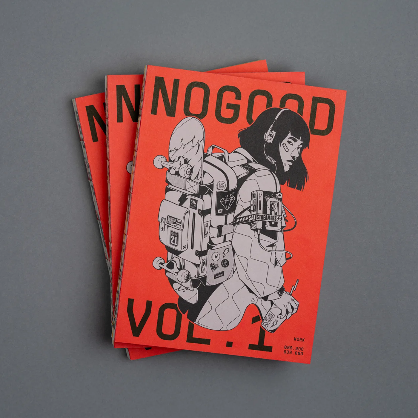
The NoGood Book: 5 Years of Vector Illustration and Editorial Artwork
The NoGood Book: A 5-Year Retrospective on Vector Illustration & Editorial Design The NoGood Book is a self-published monograph by NoGood Studio, capturing a five-year creative journey filled with vector illustrations and editorial designs. This ultimate art book gathers everything…