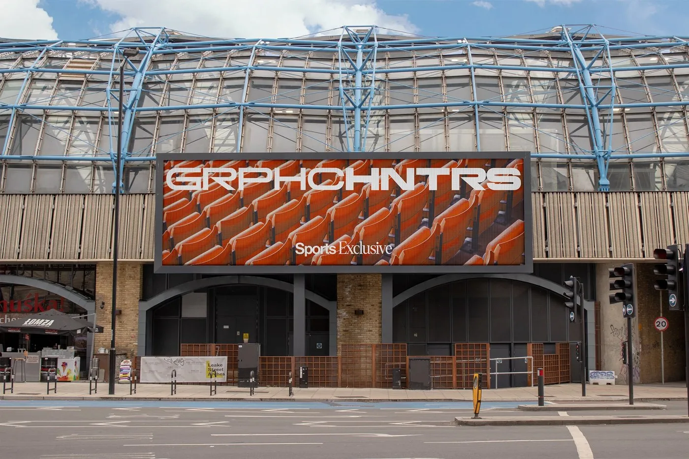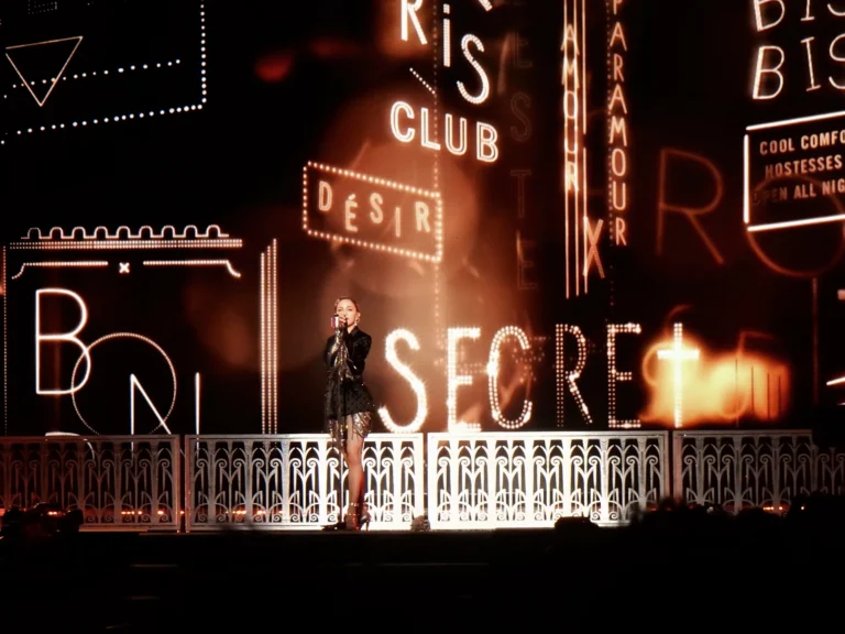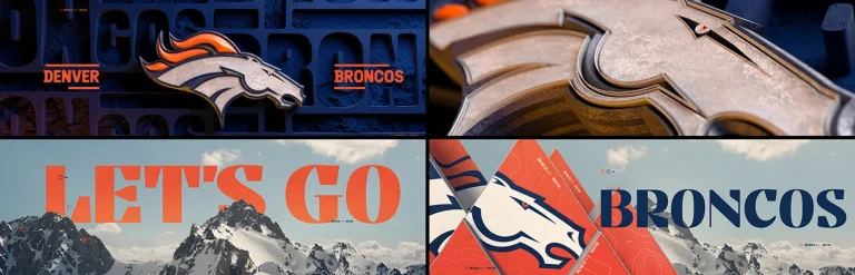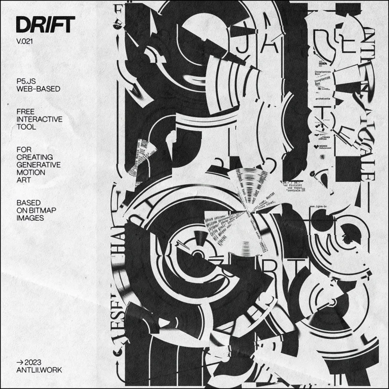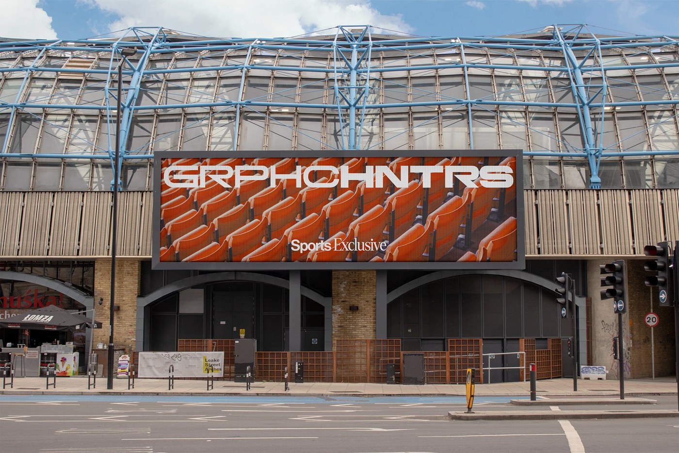
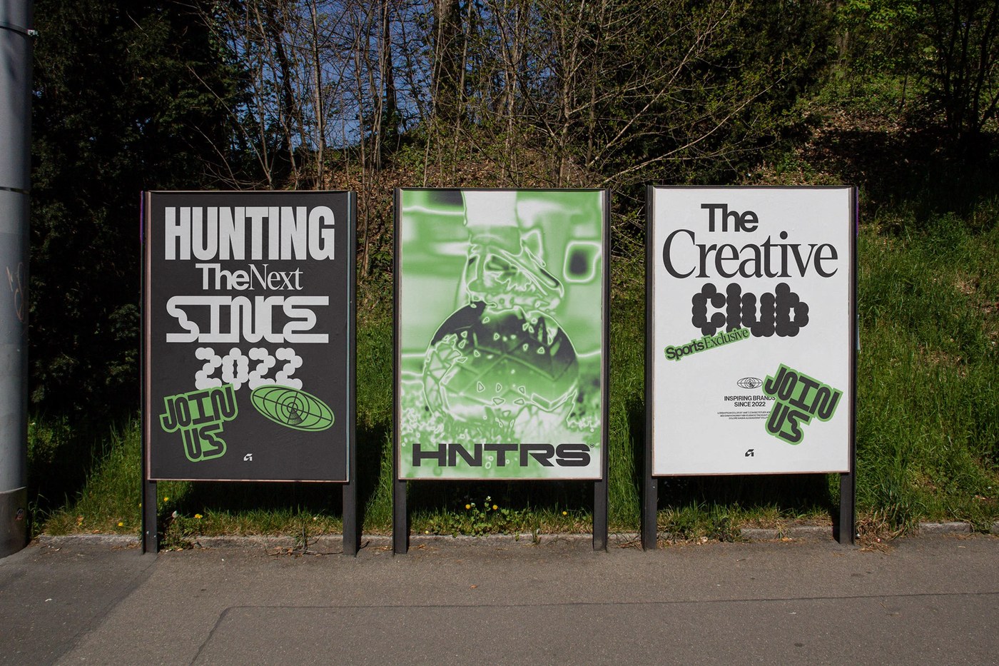
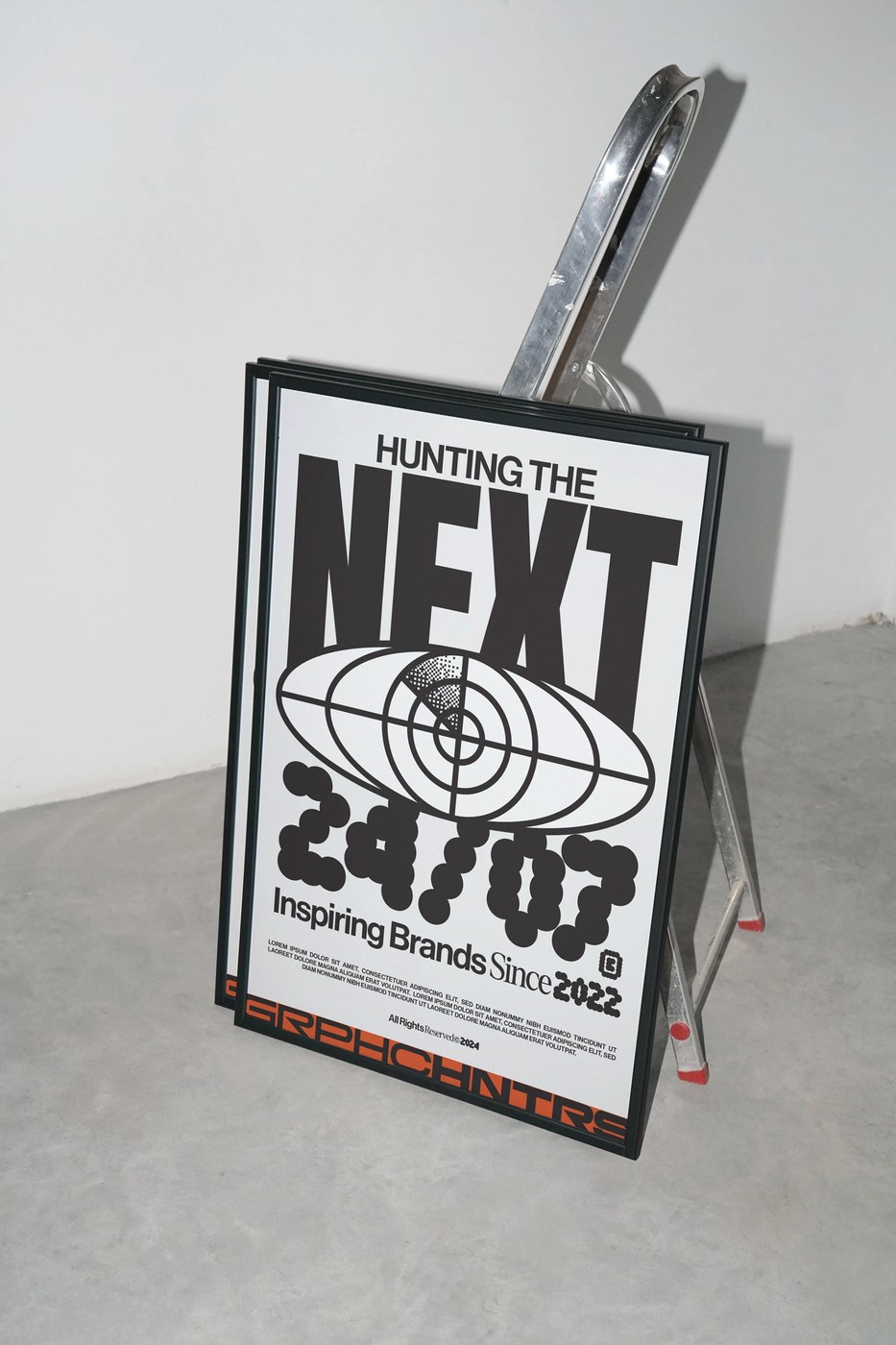
Monga Design vừa làm mới diện mạo đầy cá tính và đa chiều của Graphic Hunters thông qua ngôn ngữ thiết kế chuyển động (motion design branding) đầy ấn tượng.
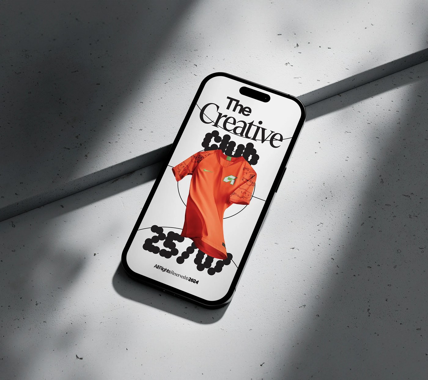
Bố cục của dự án này ứng dụng hệ thống lưới (grid system) cực kỳ chặt chẽ, kết hợp cùng những hình khối bất đối xứng táo bạo và đồ họa tương phản cao để tạo nên một thị giác mạnh mẽ. Các mô-típ thể thao được sắp xếp gọn gàng trong một hệ khung hình tối giản, giúp thiết kế dễ dàng thích ứng tốt trên các sản phẩm vật lý. Từ các ấn phẩm in ấn cho đến kỹ thuật số, cấu trúc hình khối module đều hướng mắt người xem một cách mượt mà, giữ được sự cân bằng và chuyên nghiệp tuyệt đối.
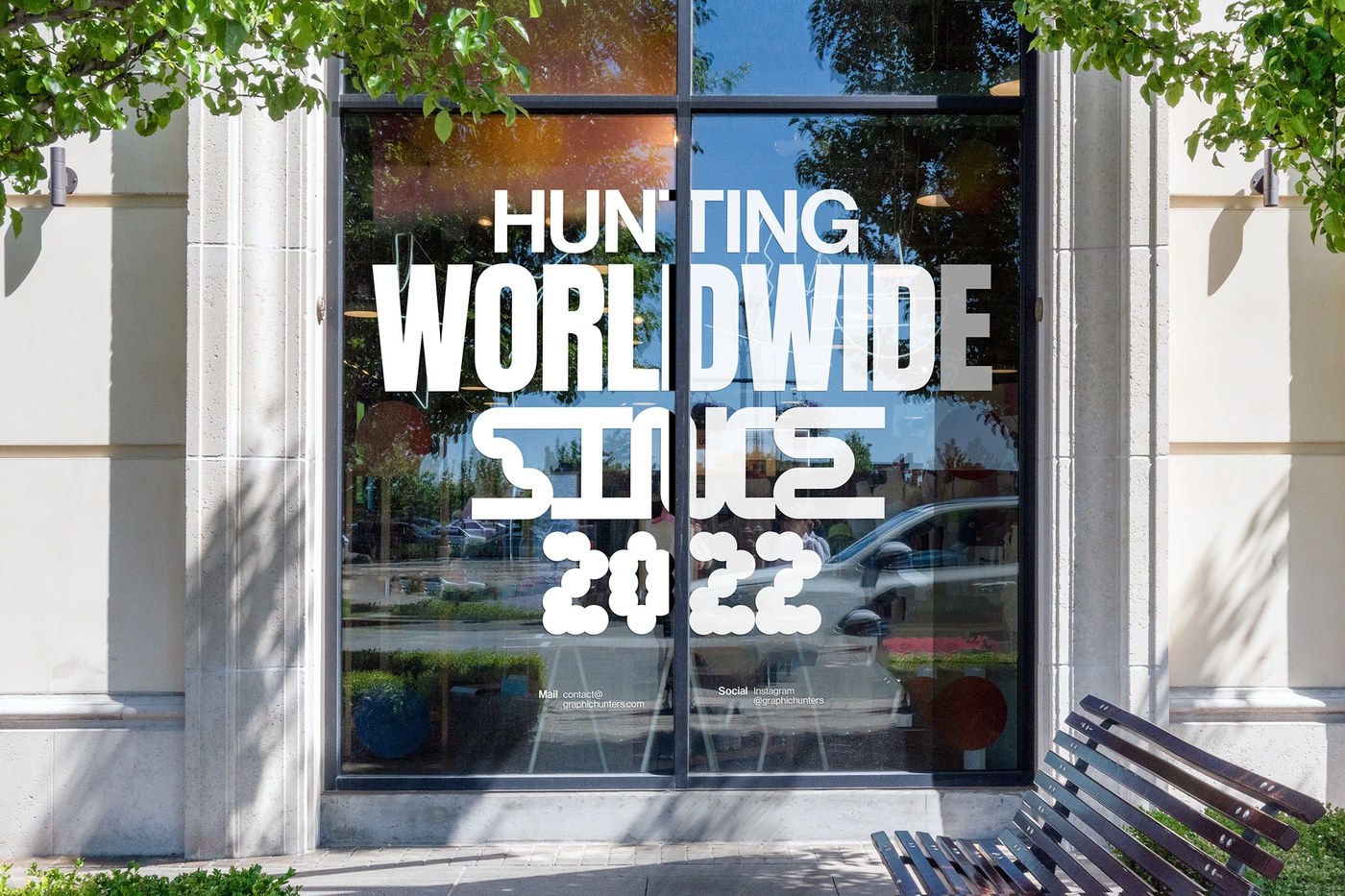
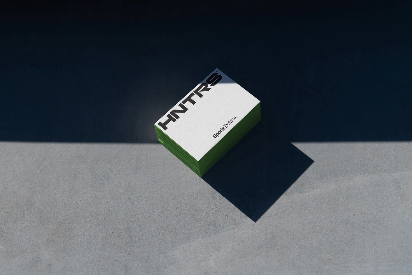
Hệ thống chữ (typography) cũng được tính toán rất kỹ lưỡng với phông sans-serif cỡ lớn tạo phân cấp thị giác (hierarchy) rõ rệt. Bảng màu chủ đạo xoay quanh sắc đen huyền bí và trắng tinh khôi, đi kèm các chi tiết tương phản để làm nổi bật phông nền tối. Điểm cộng lớn nằm ở phần merchandise cao cấp, nơi các chi tiết dập nổi (embossed) và chất liệu giấy mỹ thuật dày dặn được kết hợp ăn ý, mang lại cảm giác cao cấp chuẩn phong cách thời trang thể thao.
Monga Design đã khéo léo đặt dự án này tại điểm giao thoa giữa thể thao và thời trang cao cấp. Thay vì đi theo lối mòn đại trà, studio đã lấy cảm hứng từ chủ nghĩa hiện đại Thụy Sĩ (Swiss modernism) với bố cục lưới kinh điển của thiết kế dàn trang (editorial design). Sự hòa quyện giữa năng lượng thể thao năng động và nét thanh lịch trong cấu trúc đã tạo nên một chuẩn mực mới cho motion design branding, giúp Graphic Hunters mang đến một góc nhìn hoàn toàn mới cho thẩm mỹ thể thao.
Khám phá toàn bộ dự án trên Behance bởi www.behance.net/gallery/206012231/Graphic-Hunters-Visual-Identity-and-Merch.
Monga Design just gave Graphic Hunters a super fresh, multi-dimensional look using some seriously impressive motion design branding.
The project’s layout relies on a rock-solid grid system combined with daring asymmetrical shapes and high-contrast graphics to deliver a powerful visual punch. Sports motifs are neatly organized within a minimalist framing system, making the design easily adaptable for physical products. From print to digital, the modular block structure smoothly guides the viewer’s eye, maintaining a perfect balance and a highly professional feel.
The typography is meticulously thought out, featuring large sans-serif fonts that establish a crystal-clear visual hierarchy. The main color palette revolves around a sleek black and crisp white, paired with high-contrast details that pop against the dark background. A major highlight is the premium merchandise, where embossed details and thick fine art paper come together beautifully to create a high-end luxury sportswear vibe.
Monga Design brilliantly positioned this project right at the intersection of sports and haute couture. Instead of following generic trends, the studio drew inspiration from Swiss modernism, incorporating the classic grid layouts typically seen in editorial design. Blending dynamic athletic energy with elegant structure raises the bar for motion design branding, giving Graphic Hunters a completely fresh take on sports aesthetics.
Check out the full project on www.behance.net/gallery/206012231/Graphic-Hunters-Visual-Identity-and-Merch.