
motion
Bộ đôi Witness gia nhập Sibling Rivalry: Sự kết hợp giữa cảm xúc và nghệ thuật kể chuyện
OddBeast và bước chuyển mình mới với hai vị trí lãnh đạo chủ chốt

Kathryn Henderson trở thành Giám đốc Điều hành Sáng tạo mới tại Versus
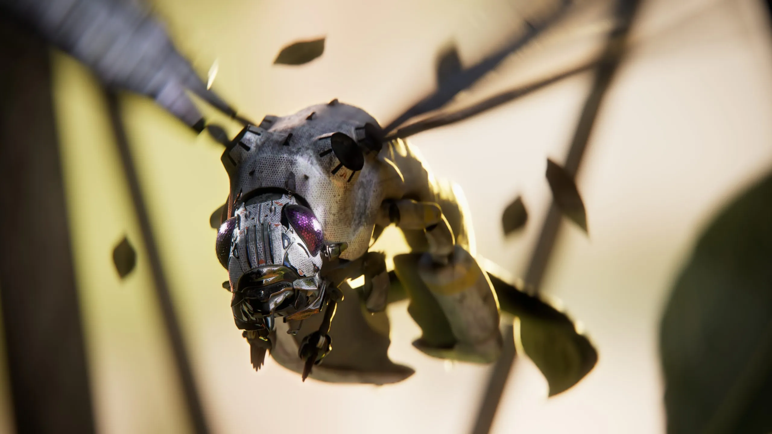
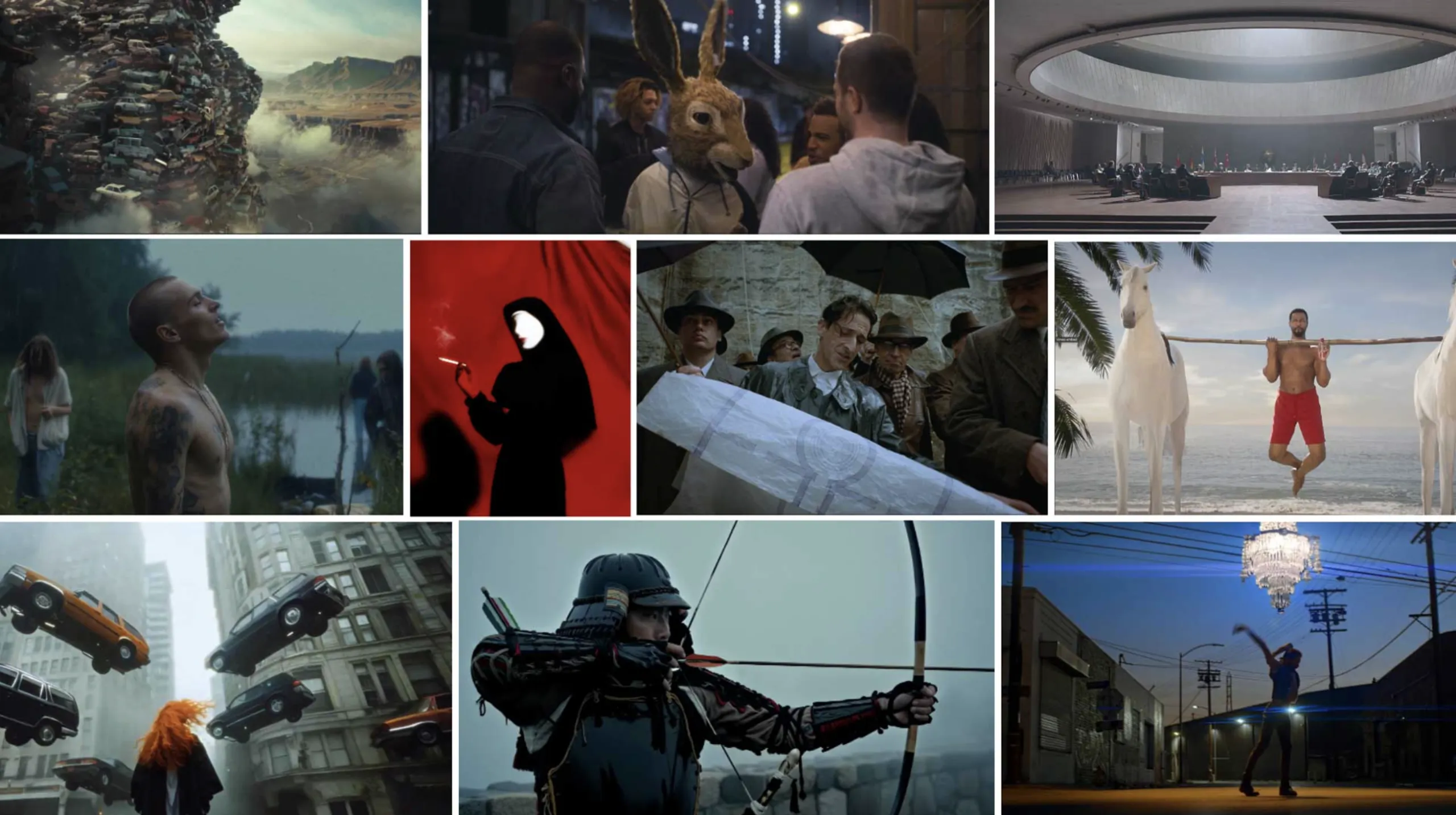
The Pony Express: Phim hoạt hình viễn tưởng đầy hứa hẹn vừa lộ diện trailer đầu tiên
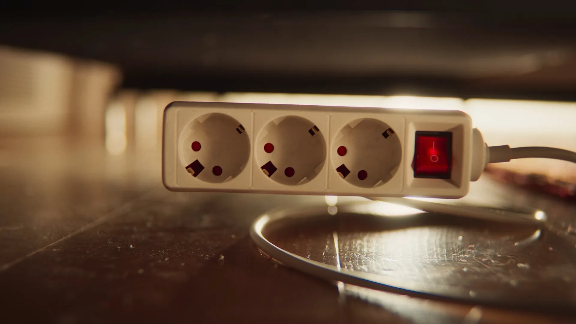
Những chiếc ổ cắm điện “biết hát” trong chiến dịch mới của Nexus Studios cho Energie AG

Spiders & Sparrows: Chương mới đầy linh hoạt của bộ đôi đứng sau những chiến dịch toàn cầu
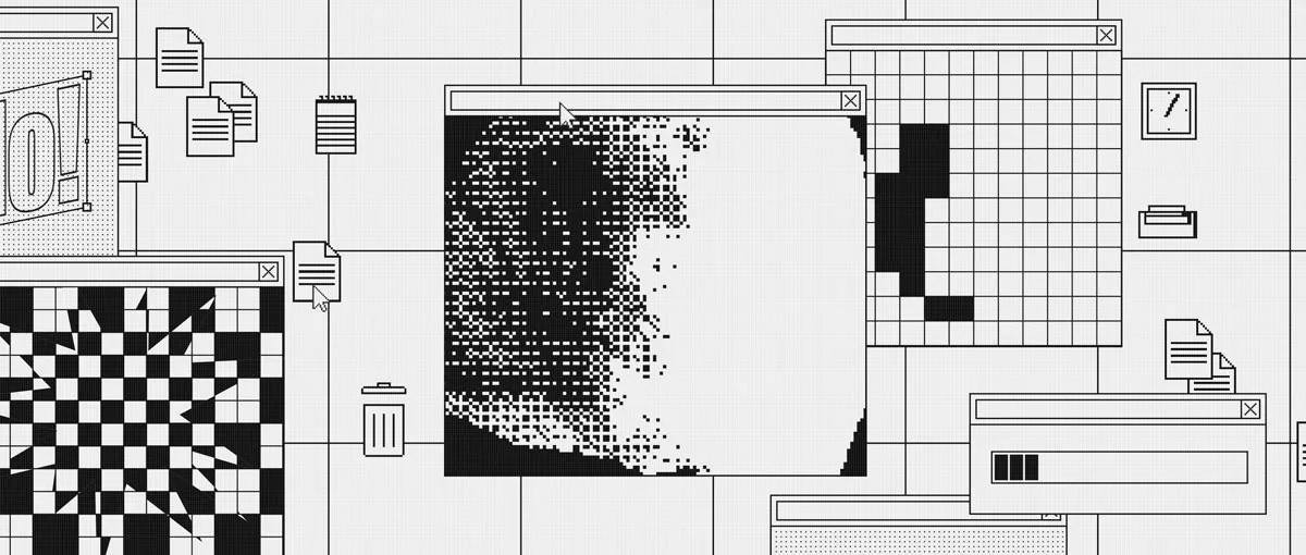
Phim mở màn lễ hội Playgrounds In Motion do Nexus Studios thực hiện
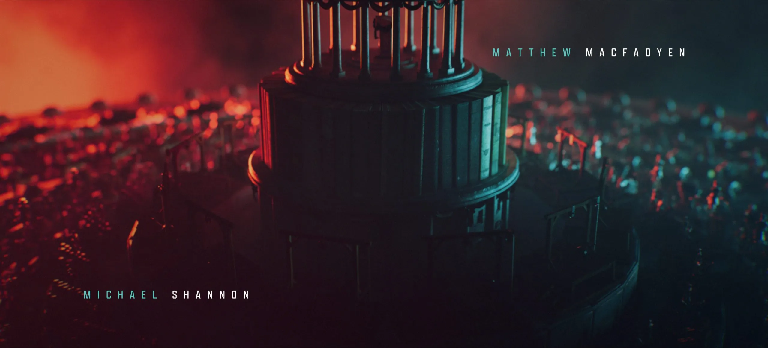
Cỗ máy Zoetrope đầy mê hoặc trong intro phim Death by Lightning của Netflix
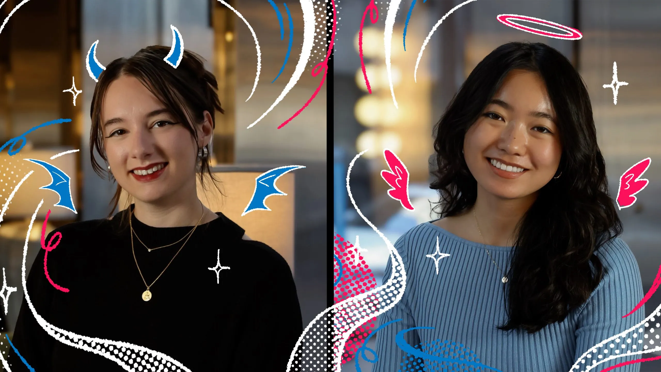
MAKE chào đón hai thành viên mới gia nhập đội ngũ sản xuất
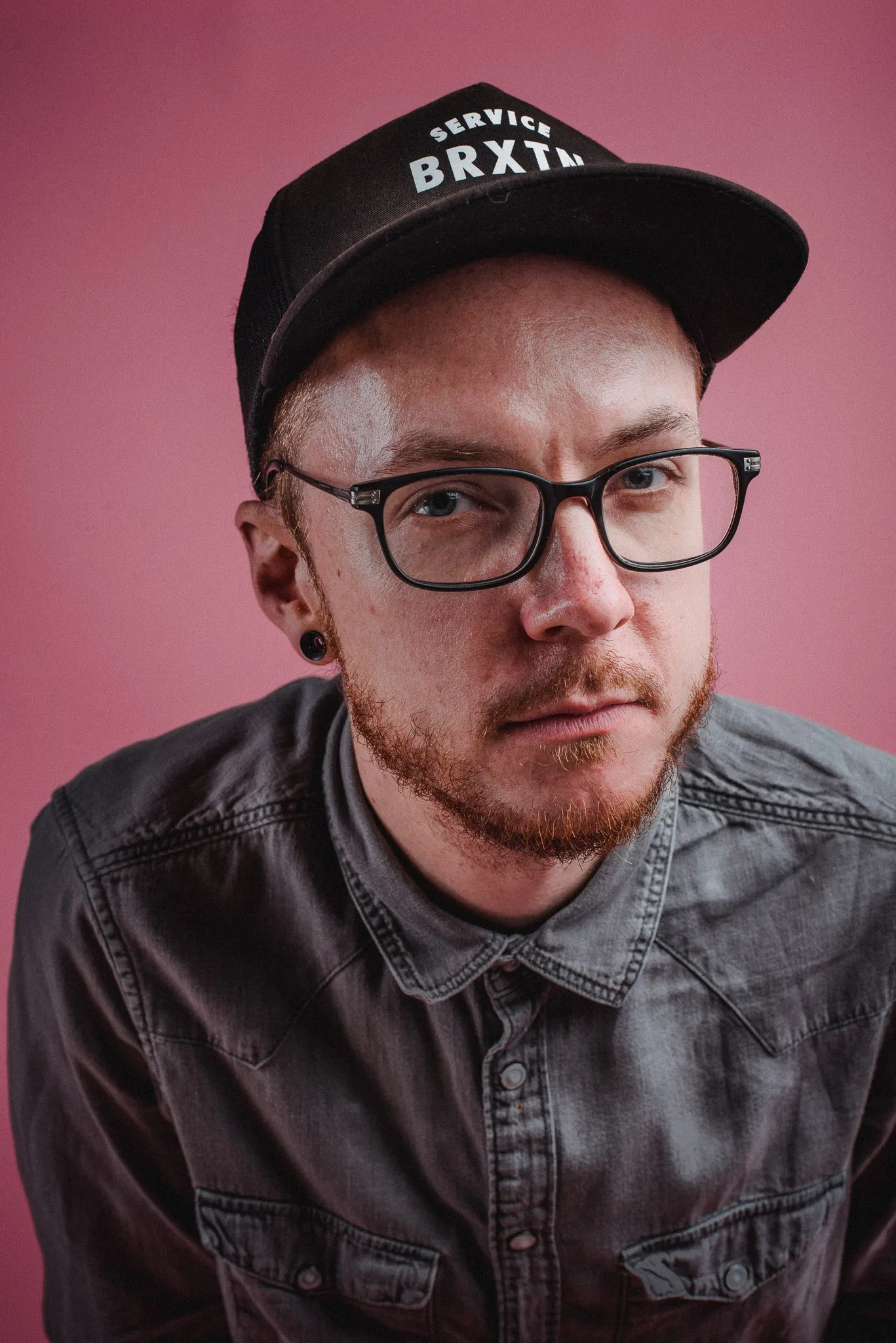
Đạo diễn đa tài Tim Fox chính thức gia nhập đội ngũ Final Frontier
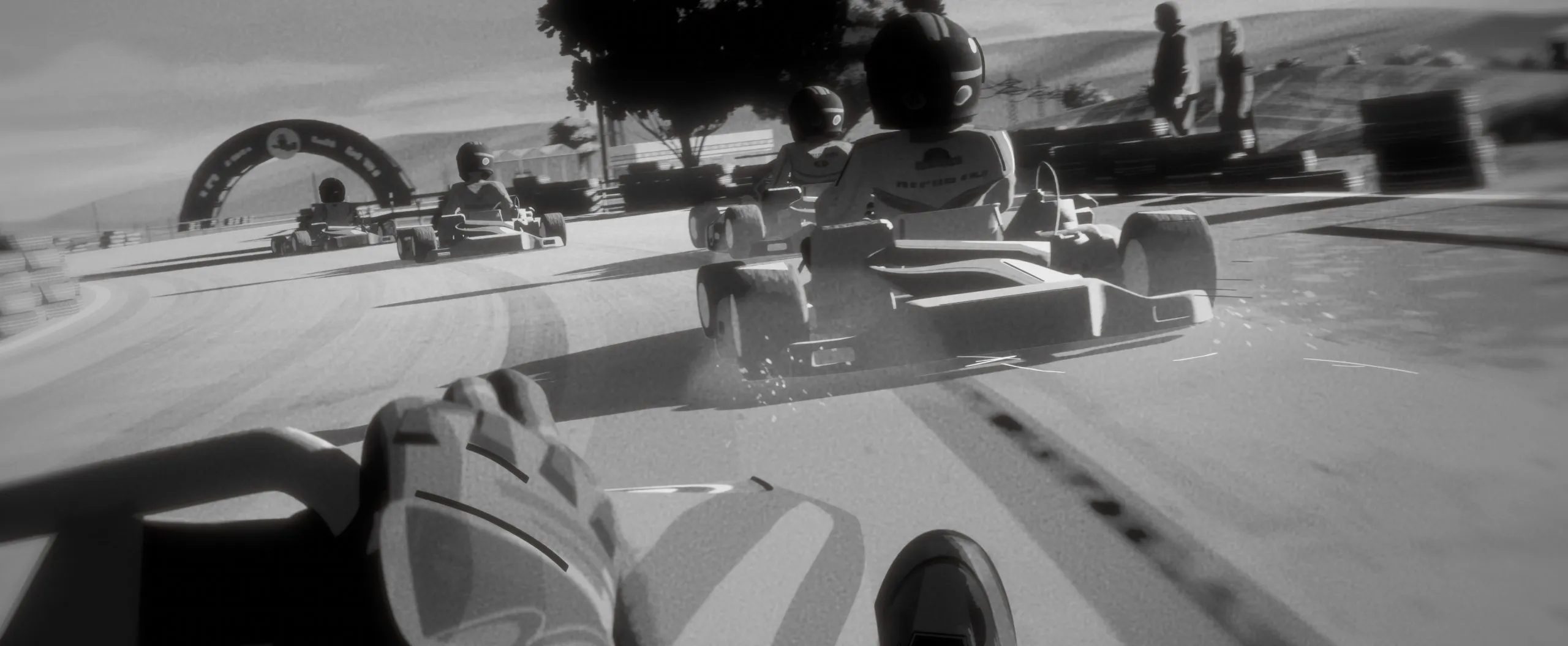
Aston Martin F1 x Coinbase: Hành trình tìm lại chính mình qua những thước phim hoạt hình nghệ thuật
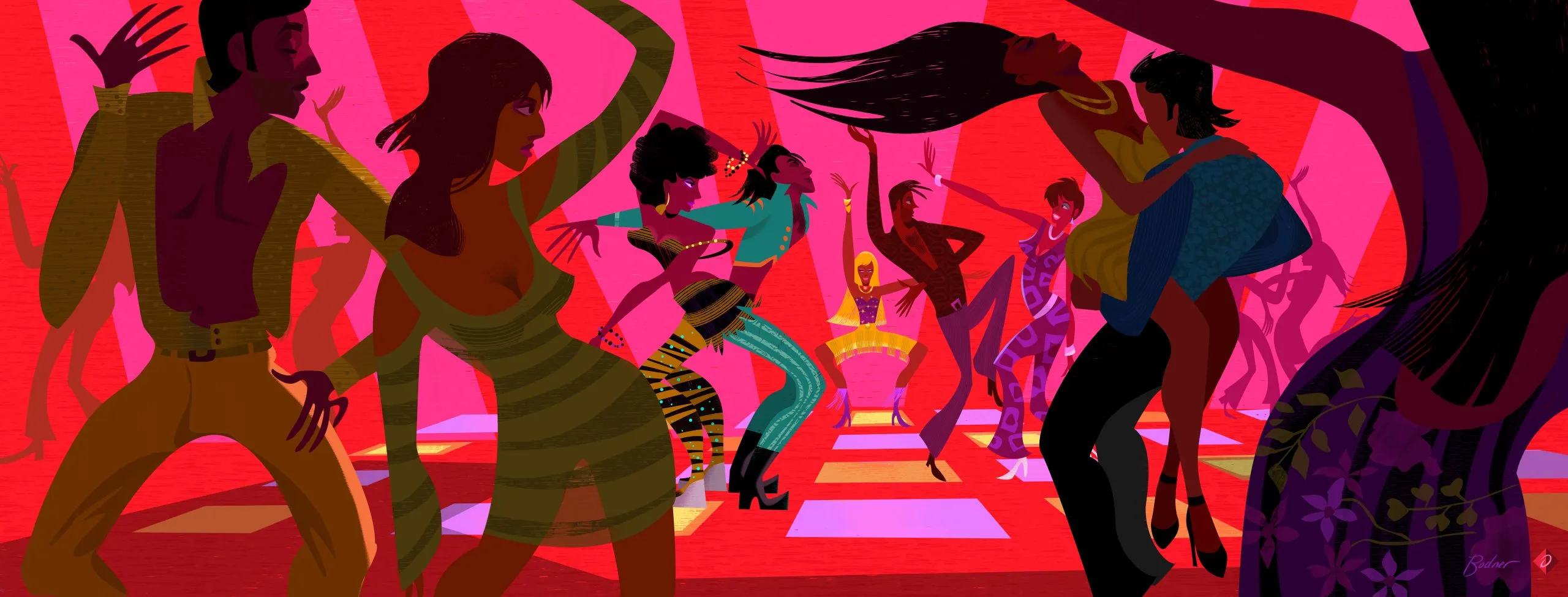
Thế giới hình ảnh của Alan Bodner: Từ hoạt hình kinh điển đến nghệ thuật thị giác độc bản
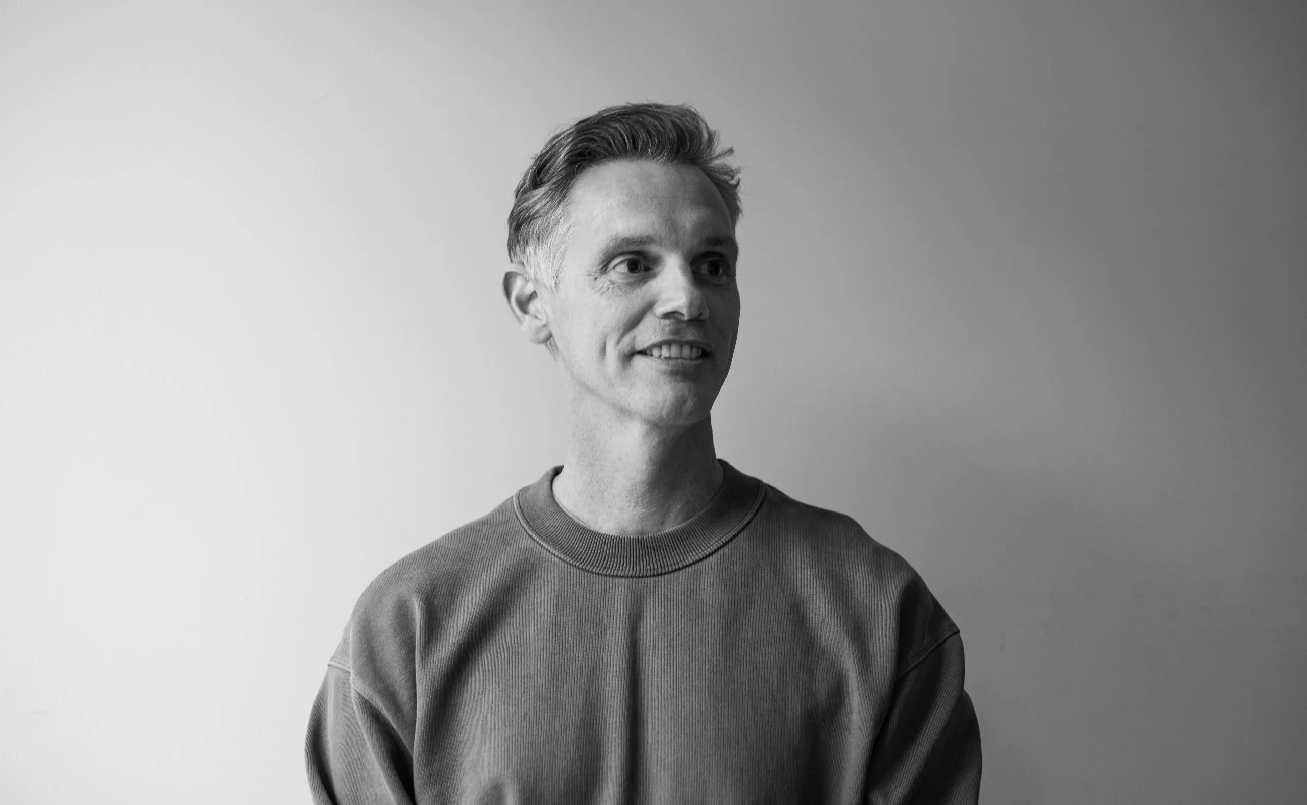
Heckler bổ nhiệm Adrian Lawrence làm Giám đốc Sáng tạo Toàn cầu, hướng tới mô hình studio tích hợp
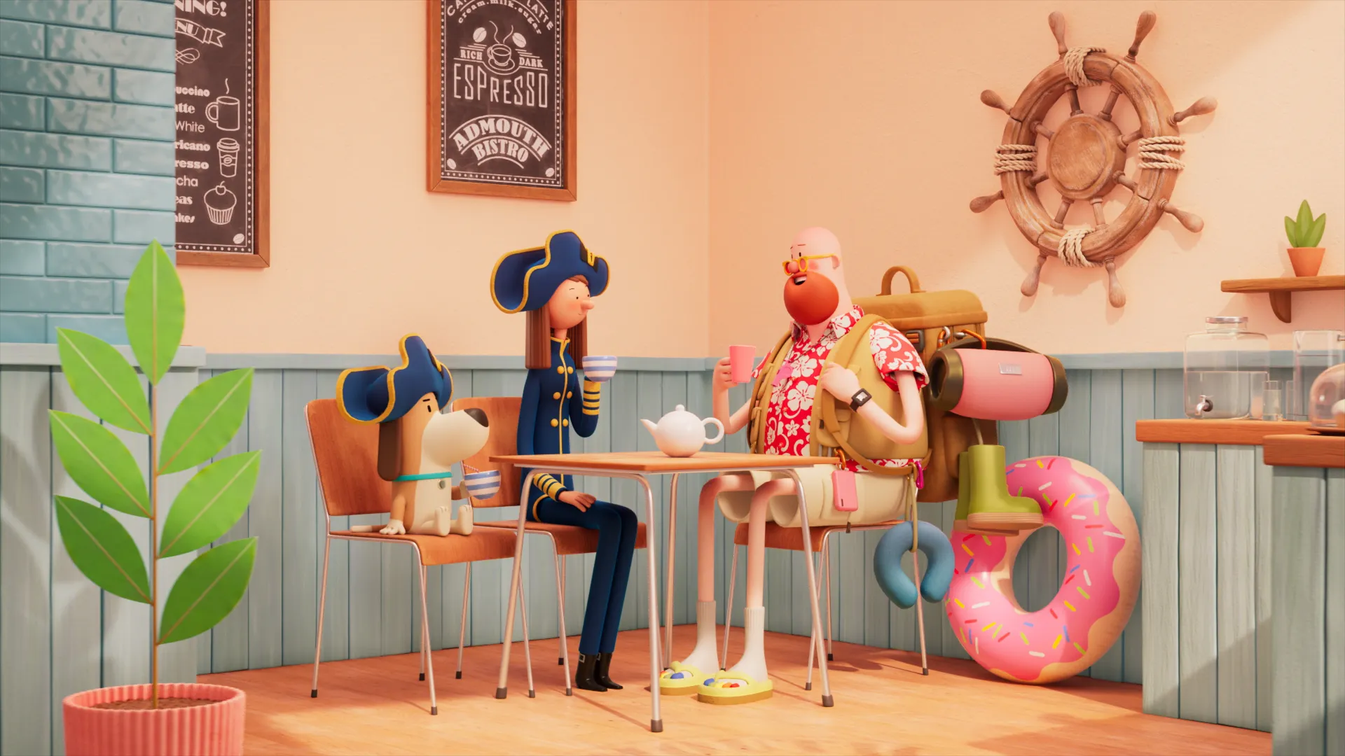
Admiral Insurance và phim ngắn hoạt hình “Ready for Anything” đầy ấm cúng từ Studio AKA
game
branding
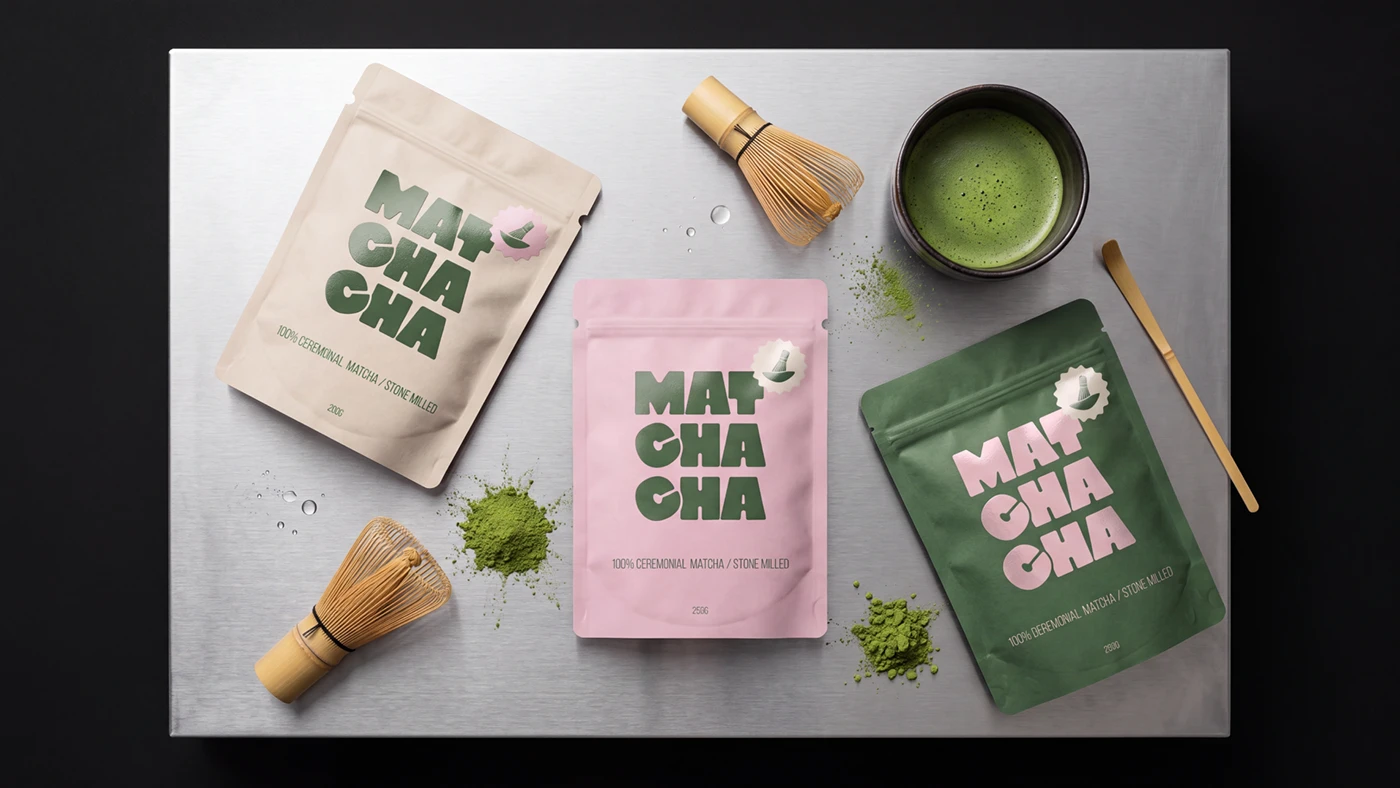
Matchacha Branding: Modern Japanese Tea Studio Identity by Yuliya Kuznetsova
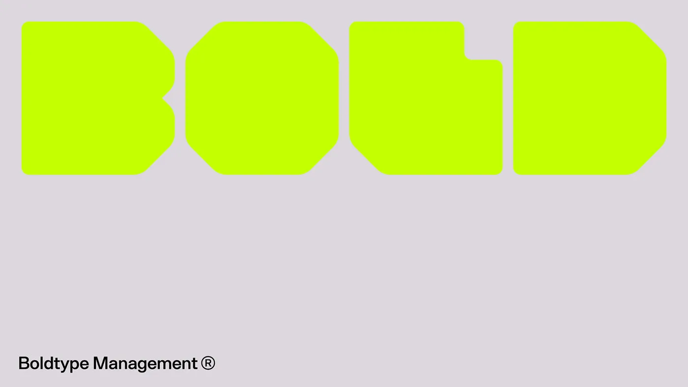
Boldtype Management: High-Contrast Branding with Ultra-Bold Typography
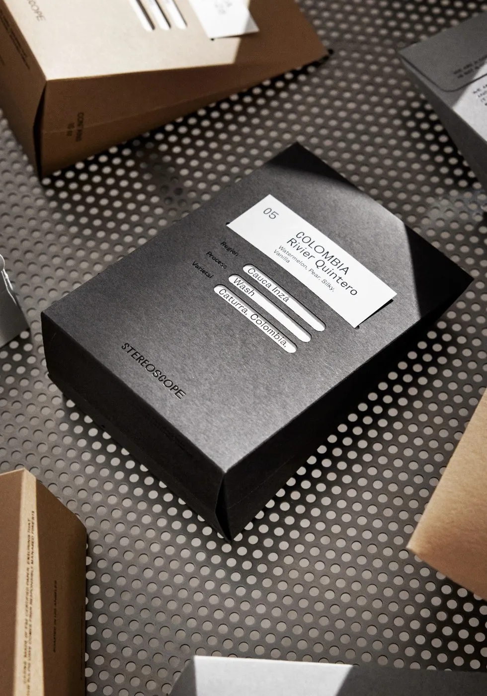
OlssønBarbieri Crafts Sculptural Packaging for Stereoscope Coffee
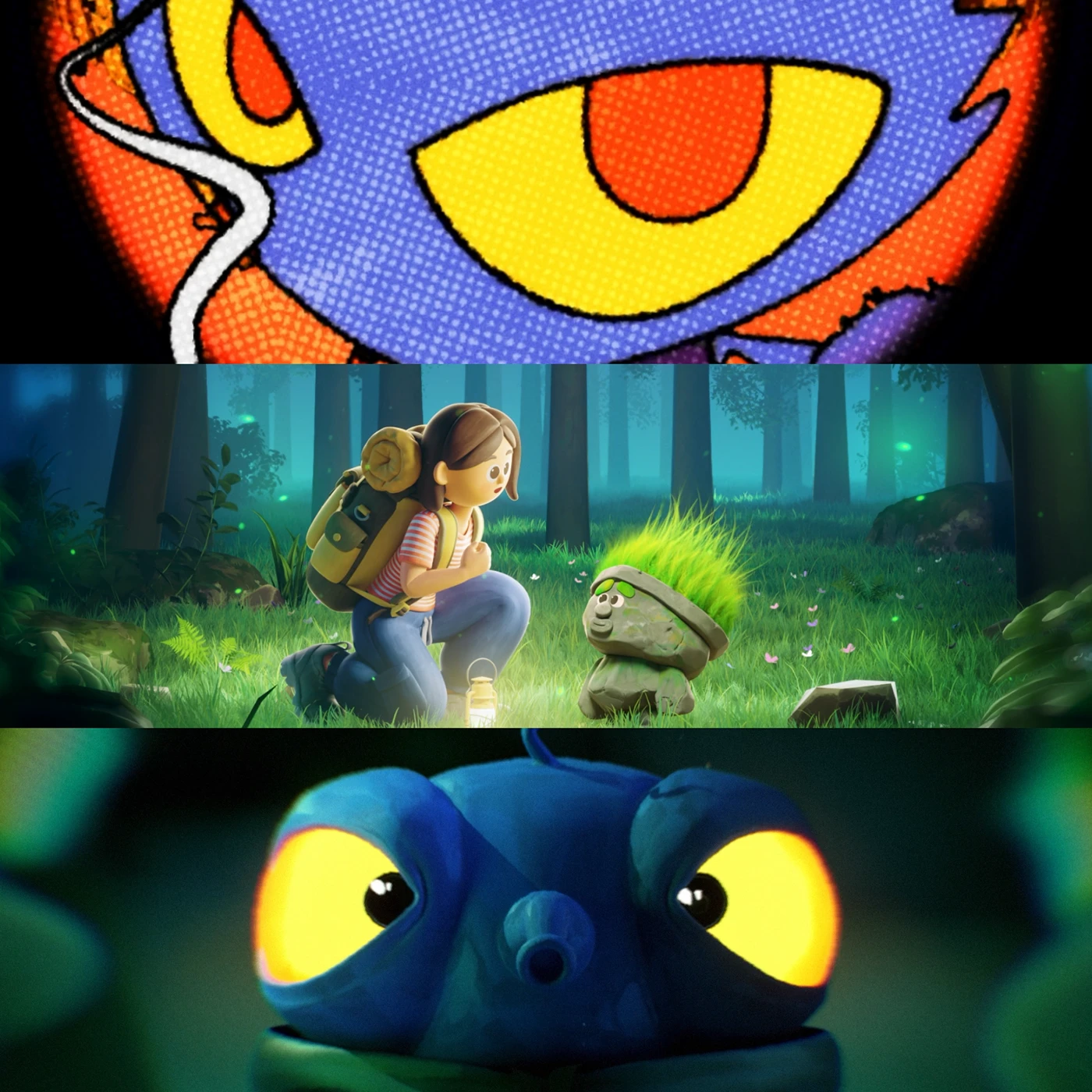
ROUNDNROUND Series 2026 Visual Design Showcase
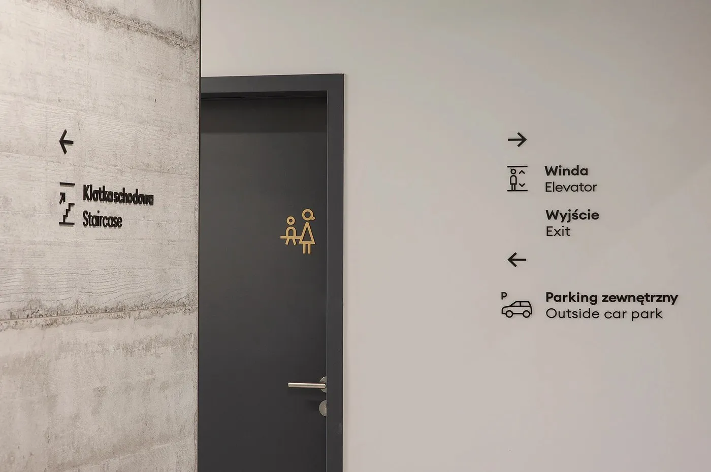
How Blank Studio Integrated Wayfinding into FORMAT Office’s Raw Architecture
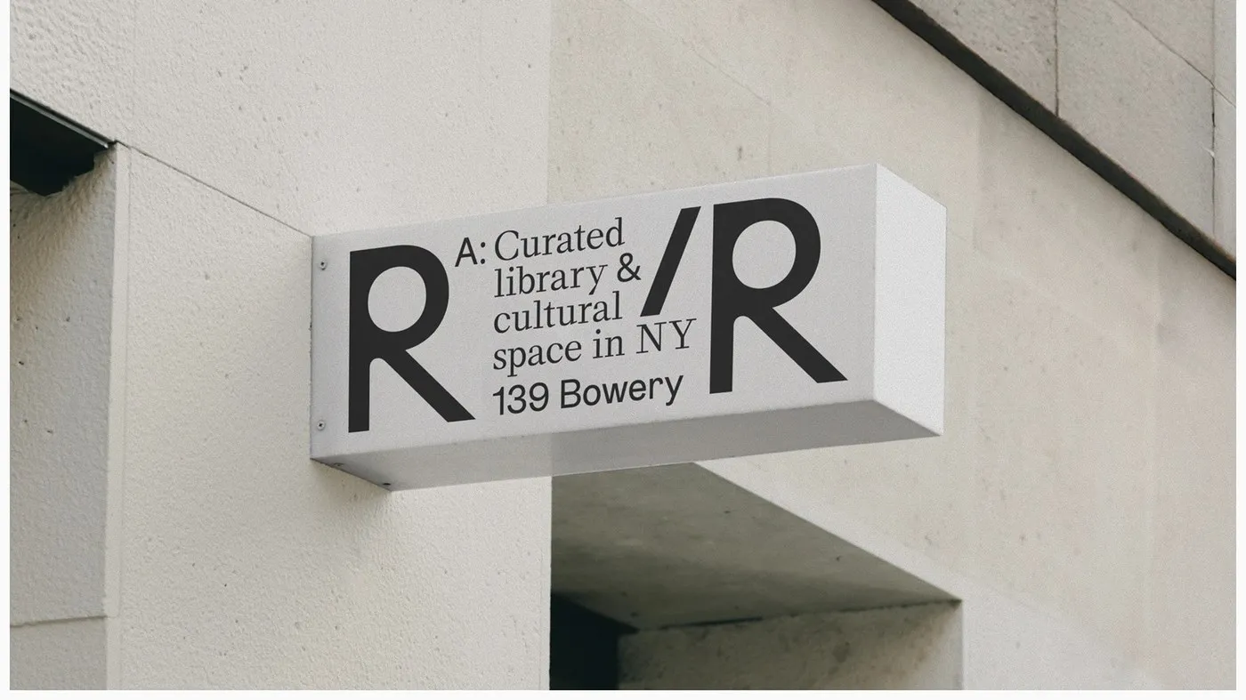
Branding Design for Reading Rooms Cultural Space by Anatolie Micaliuc
good stuffs
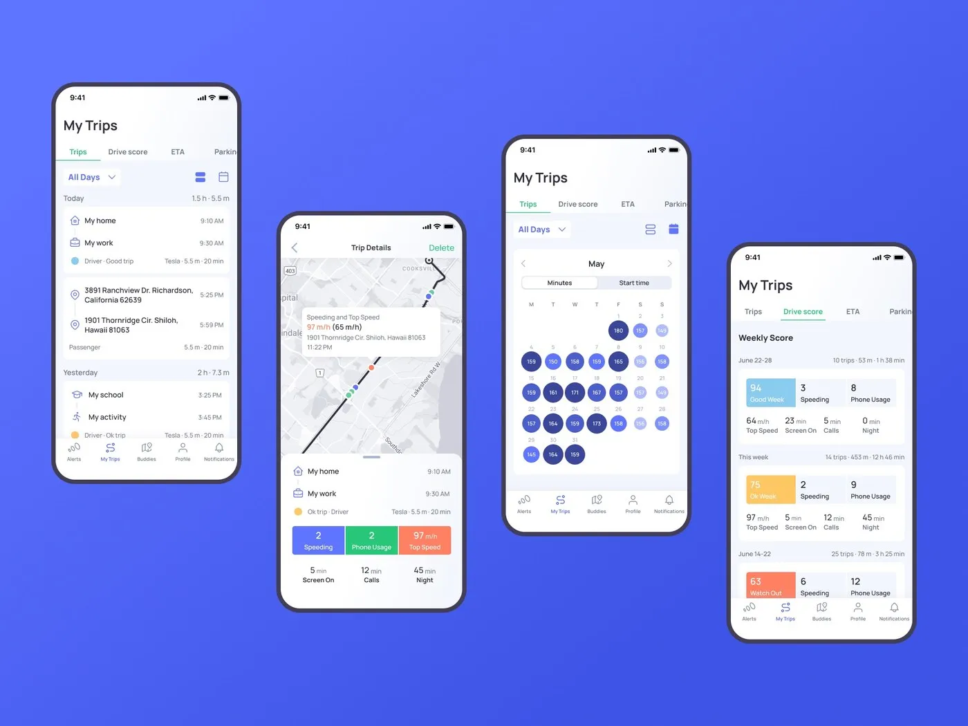
Otozen Mobile App: Designing a High-Contrast UI/UX for Safe Driving
The interface of the Otozen mobile app is beautifully crafted, keeping drivers focused on the road through an incredibly smart information architecture. A modular grid system is used to its full potential, keeping the UI super clean and geometrically precise.…
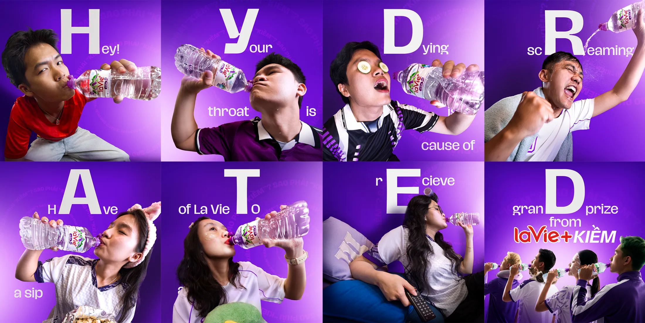
Nestlé La Vie and Ogilvy Vietnam Turn Football Ad Breaks Into Real Hydration Moments
There is nothing worse than tuning into a football match at home, only to have the halftime excitement totally ruined by an endless barrage of commercial breaks. Talk about a major buzzkill for the fans! Recognizing this ultimate frustration, La…
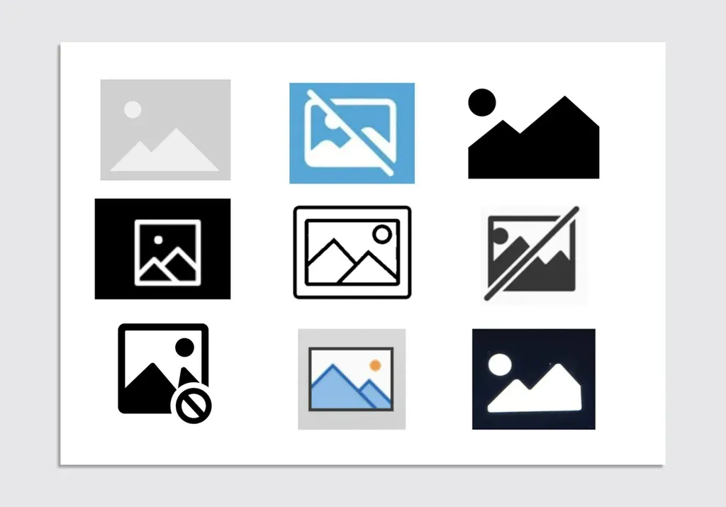
The Unexpected Origin and Symbolism of the Mountain Peak Image Placeholder
Ever been browsing the web and ran into that lonely little box with two mountain peaks because an image failed to load or is taking its sweet time? It is the universal placeholder icon for a missing image. But ever…
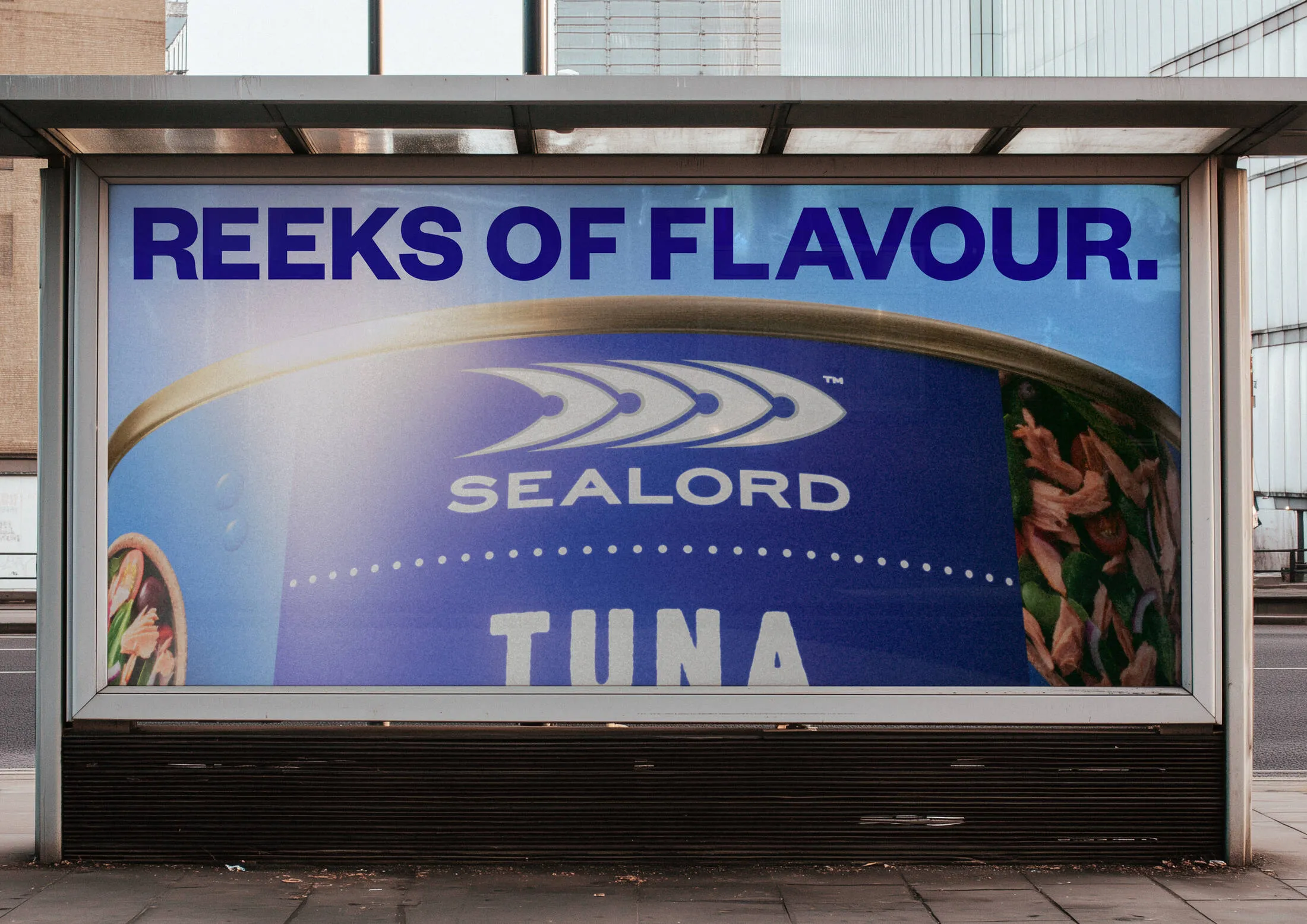
Sealord and Motion Sickness Launch We Love Fish Campaign to Fight Fishame
Seafood brand just teamed up with creative agency motionsickness to launch “We Love Fish”—a fresh brand platform encouraging New Zealanders to proudly embrace their love for fish without any awkwardness. The core concept revolves around “fishame” (that pesky fish shame)—the…
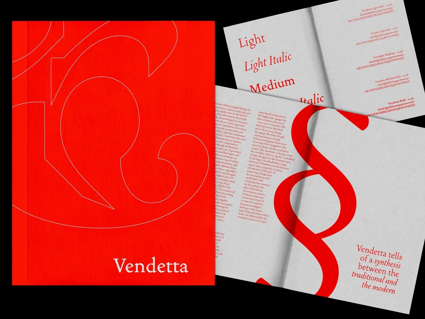
Vendetta Type Specimen Book Design by Bruno King
Bruno King just dropped a super fresh perspective with this type specimen book design for the Vendetta typeface. It’s a masterful balance of print proportions and historic geometric vibes. The project shows serious discipline when it comes to using a…
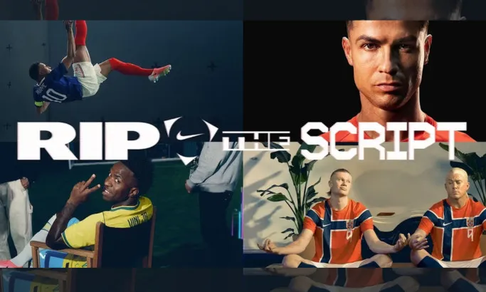
Nike Rejects the Rules with Rip the Script World Cup Commercial
Nike’s latest World Cup commercial just dropped, and it brings a wildly chaotic and unique concept called “Rip the Script.” Crafted by longtime creative agency partner Wieden+Kennedy and director Dan Streit, this spot is a massive, joyful celebration of pure…
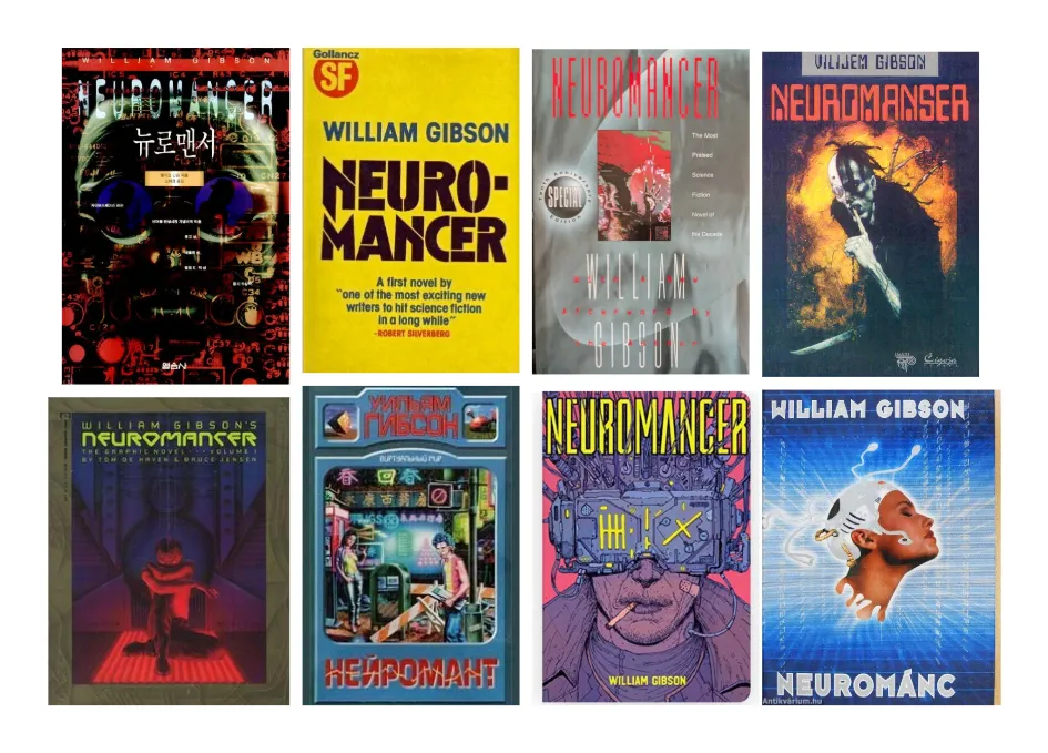
Apple TV’s Neuromancer Poster Sparks Discussion on Cyberpunk Adaptation
The iconic sci-fi novel that basically built the cyberpunk genre and predicted a ton of today’s tech—William Gibson’s Neuromancer—is finally hitting the small screen! Apple TV is turning this 1984 masterpiece into a 10-episode series, leaving fans everywhere a mix…
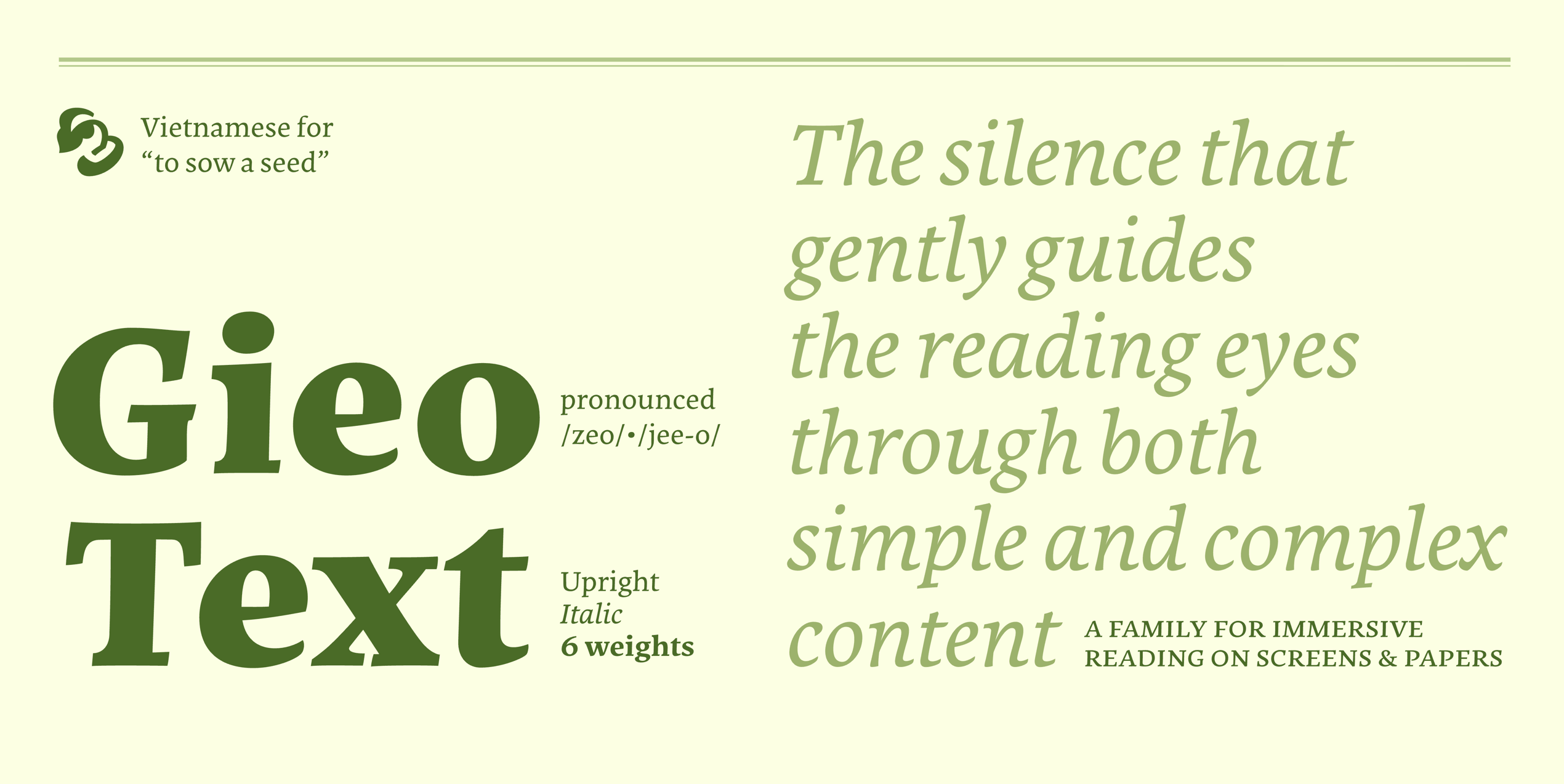
Gieo Text: A Venetian-Inspired Typeface for Digital Reading by Linh Nguyễn
Gieo Text is a super exciting typeface designed by Linh Nguyễn from ÁccentiaType studio. This project actually started out as a practical assignment during the Master of Typeface Design (MATD) 20/21 program at the University of Reading. The name “Gieo”…
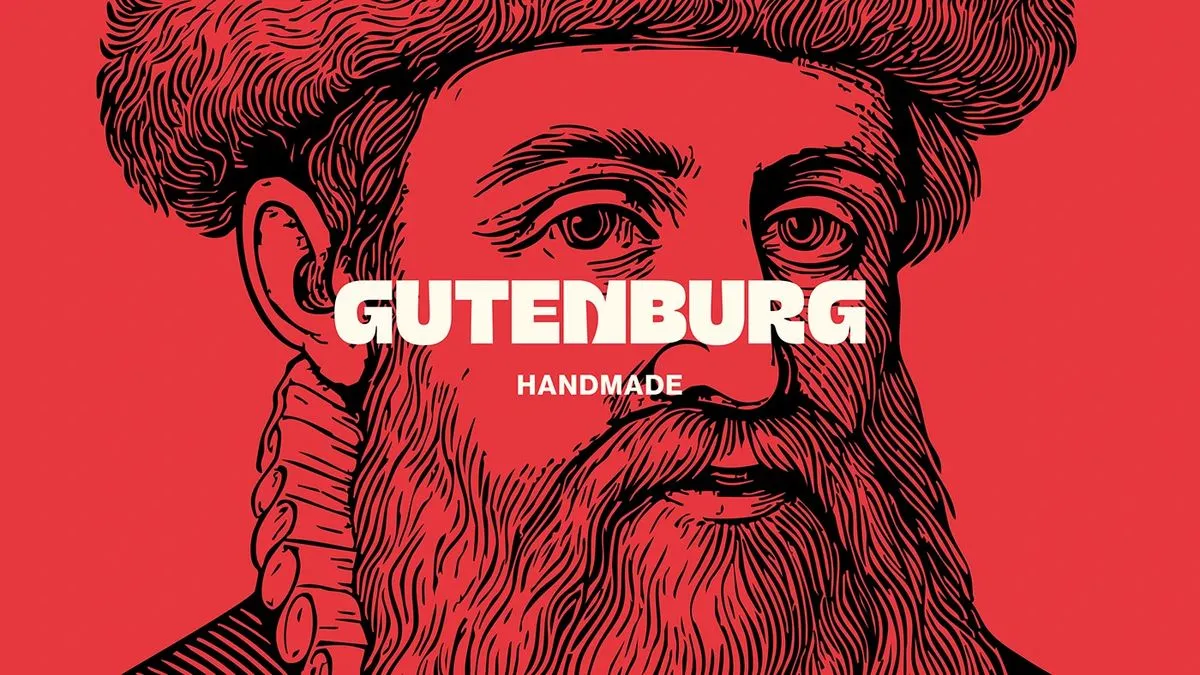
Heavy Typography and High Contrast for Gutenburg’s Identity
Gutenburg just dropped a seriously stunning editorial identity packed with high-contrast layouts and strategic typography. Created by Gutenburg Design Studio, this project pairs beautifully with packaging that carries a distinct, traditional print vibe. The creative studio built a modular font…
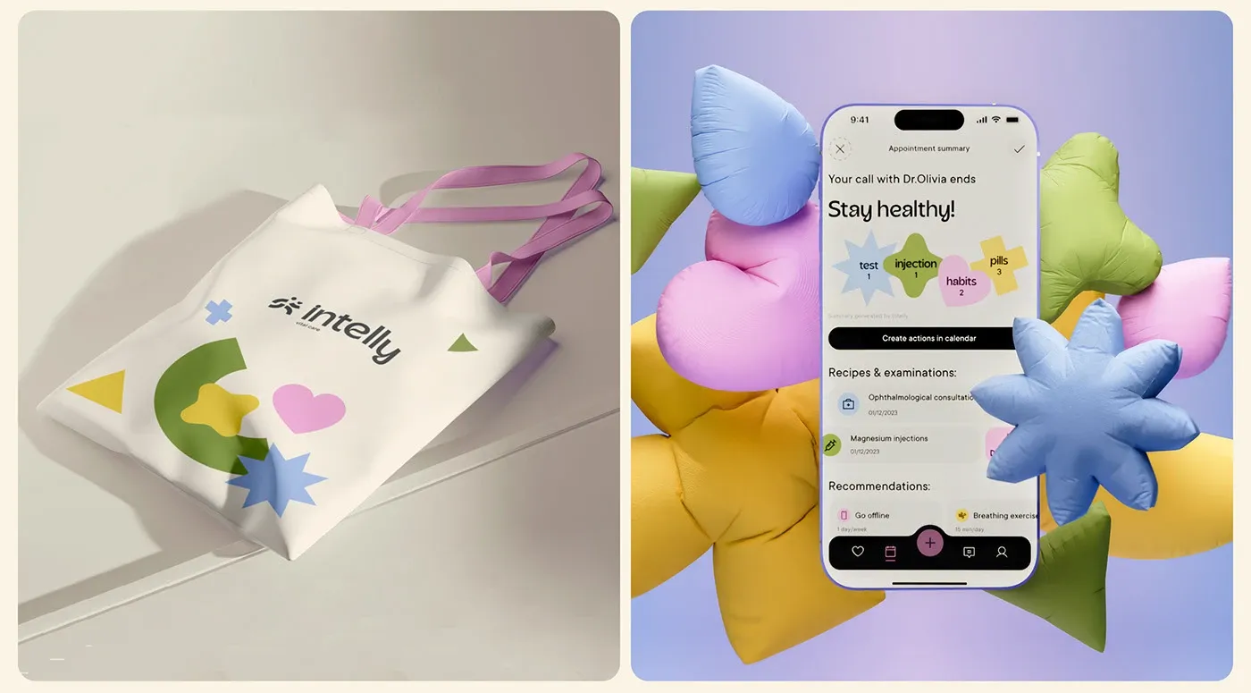
Intelly Mobile Healthcare App UI with Modern Modular System
Intelly’s in-house design team just dropped a super slick, modular design system for a healthcare mobile app. The interface absolutely shines thanks to a brilliant color palette: a deep, medical-vibe navy background paired with soothing mint green action cards and…
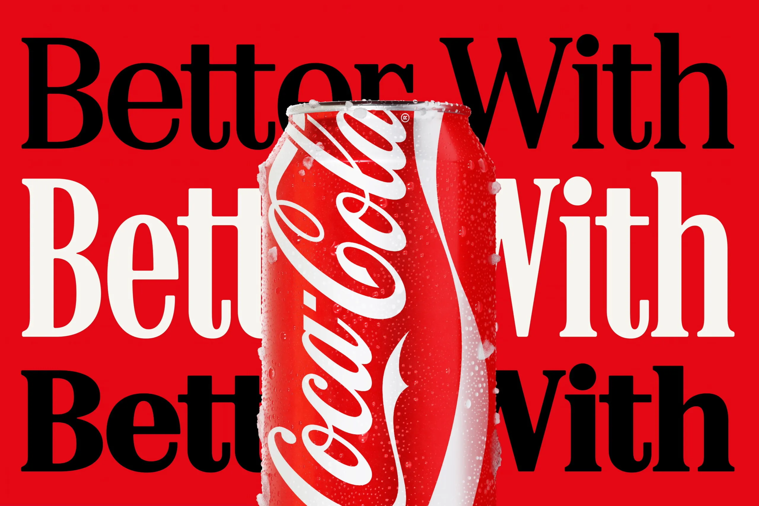
Coca-Cola New Typography Identity Sparks Marlboro Font Comparisons
Coca-Cola just dropped a major brand identity refresh courtesy of design agency JKR, and it is all about the typography. This new look elevates “Better With”—a retro serif typeface originally crafted by Brody Associates back in 2023—right to center stage…
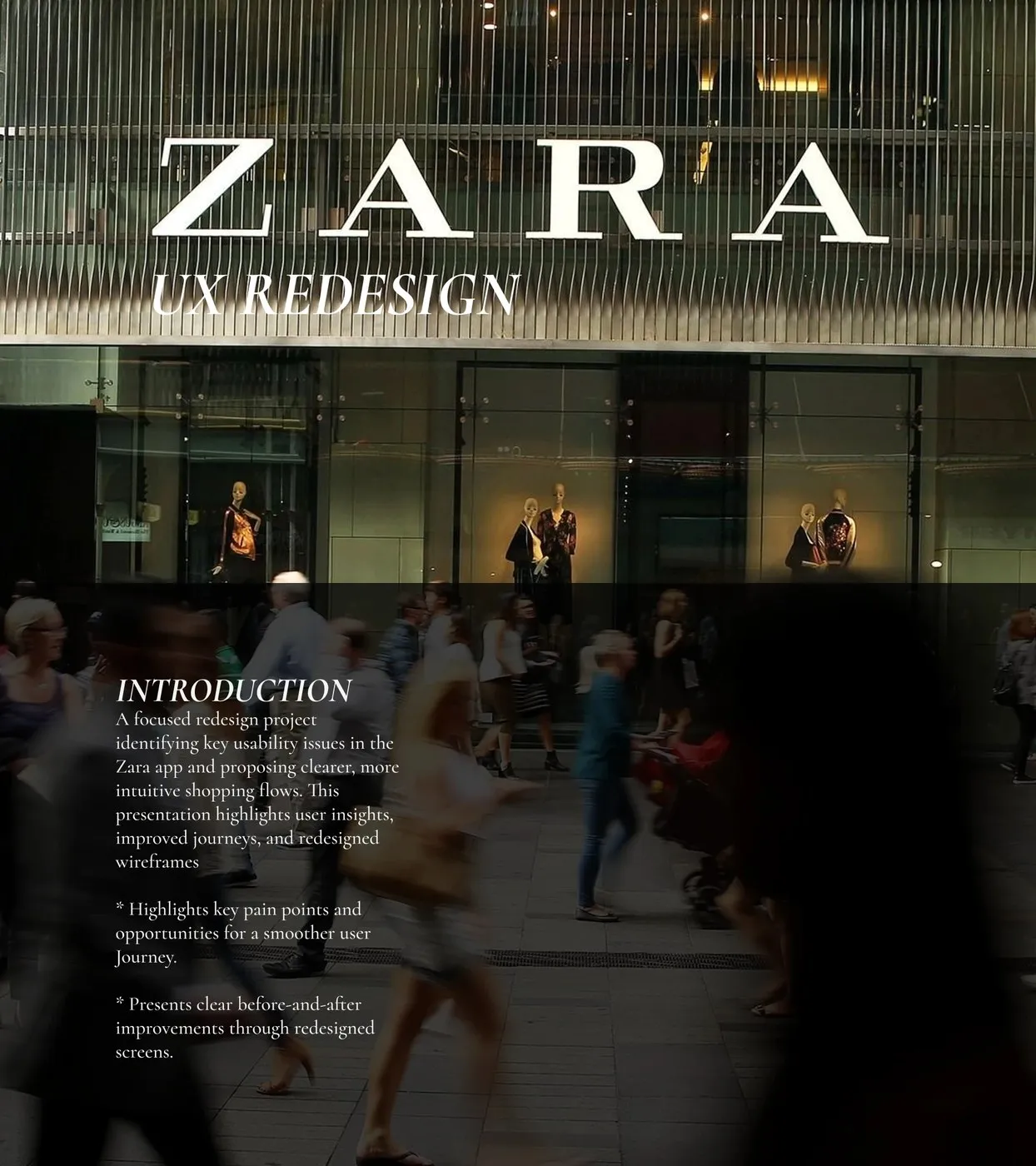
Zara Mobile App UI/UX Redesign by Afra M I: Solving Checkout Friction
The Zara shopping app is a staple for fashion lovers everywhere, but let’s be real—browsing it can sometimes feel a bit clunky. To tackle these little headaches, designer Afra M I came up with a brilliant mobile UI/UX redesign aimed…