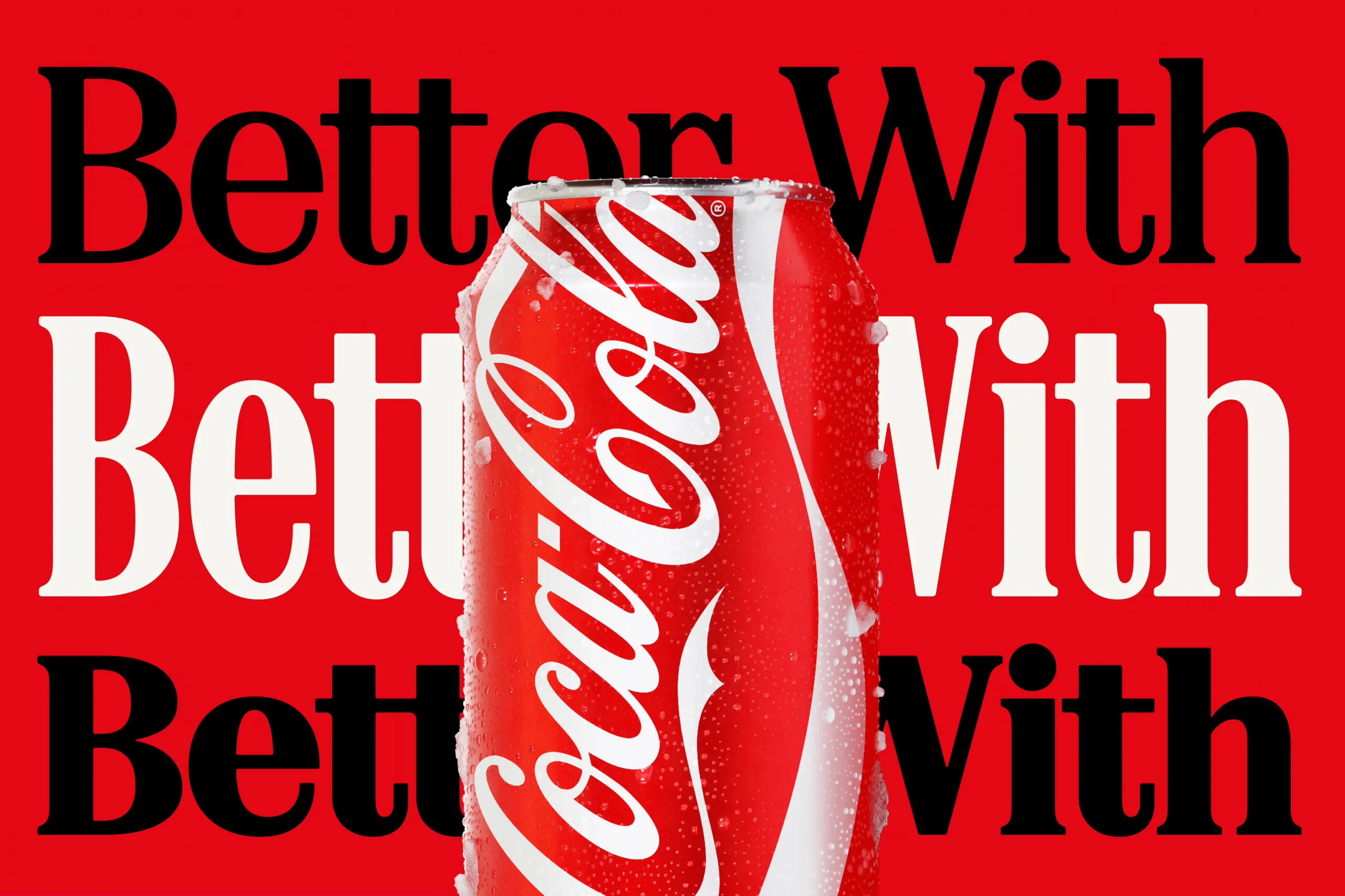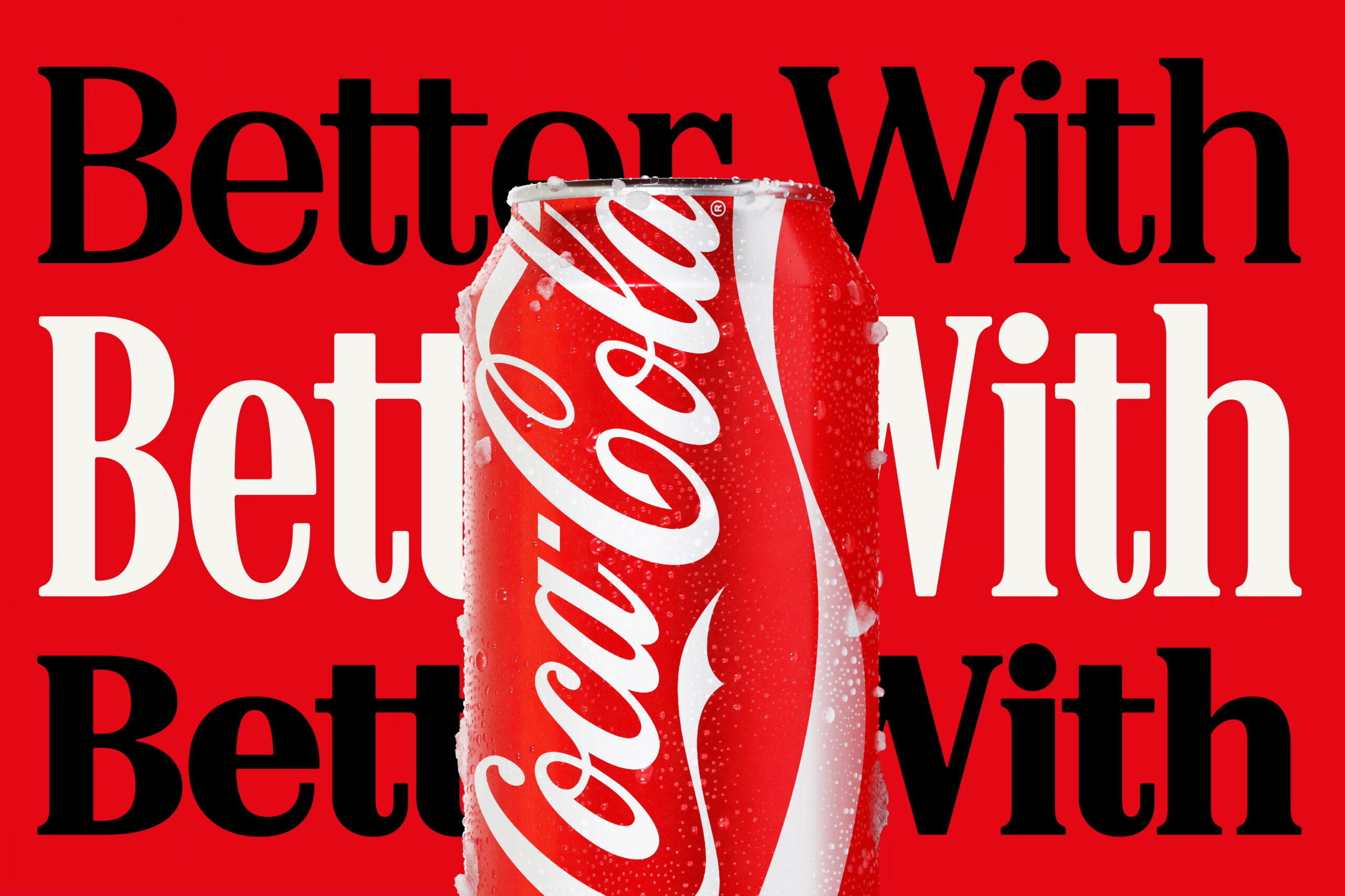
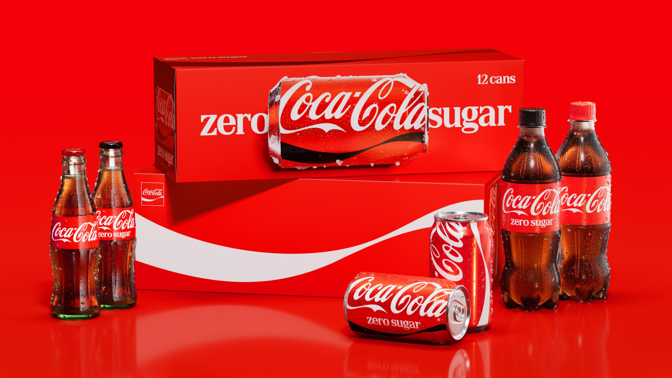
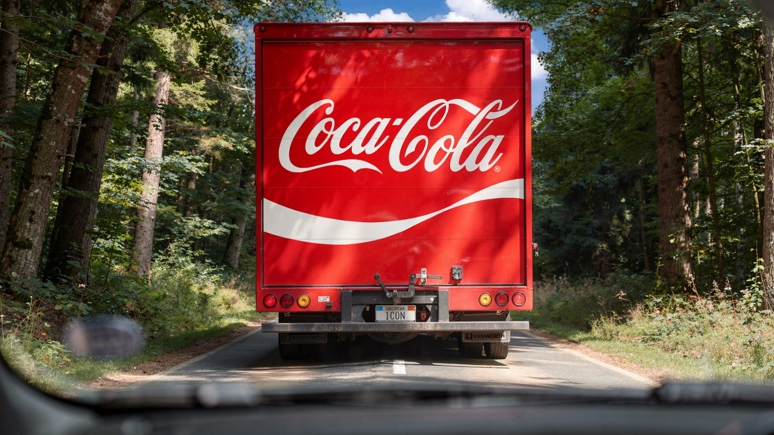
Coca-Cola just dropped a major brand identity refresh courtesy of design agency JKR, and it is all about the typography. This new look elevates “Better With”—a retro serif typeface originally crafted by Brody Associates back in 2023—right to center stage across global packaging and marketing campaigns.
Naturally, the internet immediately spotted a hilarious coincidence. The new vintage-vibe serif font looks strikingly similar to the iconic typography found on a pack of Marlboro cigarettes. While they aren’t an exact match, the visual parallel is hard to ignore, especially since both brands share that legendary red-and-white color scheme. Social media users are already roasting the beverage giant, calling it a surprisingly self-aware design choice for a sugary soda brand to accidentally take style cues from one of the most famously addictive products on the planet.
The timing of this critique is a bit awkward, landing right as sugar taxes roll out in various countries. Even so, some pop-culture fans are joking that Coca-Cola might just be tapping into the viral TikTok “fridge cigarette” trend, where opening a crisp, ice-cold can of Diet Coke is celebrated as the ultimate modern workday smoke break.
Coca-Cola vừa trình làng bộ nhận diện thương hiệu mới với sự lột xác toàn diện do JKR thực hiện, tập trung mạnh mẽ vào mảng typography. Dự án lần này đưa font chữ serif mang tên “Better With” – một sáng tạo từ năm 2023 của Brody Associates – lên làm nhân tố chủ đạo trên cả bao bì lẫn các chiến dịch truyền thông.
Tuy nhiên, cộng đồng mạng đã nhanh chóng phát hiện ra một sự trùng hợp thú vị. Kiểu chữ serif mang phong cách retro mới của Coca-Cola trông vô cùng giống font chữ đặc trưng trên vỏ bao thuốc lá Marlboro. Dù không hoàn toàn trùng khớp, nét tương đồng về mặt thị giác là điều khó phủ nhận, đặc biệt khi cả hai thương hiệu đều sở hữu tông màu đỏ-trắng kinh điển. Nhiều người hài hước bình luận rằng đây là bước đi đầy “tự nhận thức” của một hãng đồ uống có đường khi sử dụng thiết kế gợi liên tưởng đến một sản phẩm gây nghiện nổi tiếng.
Sự so sánh này diễn ra vào thời điểm khá nhạy cảm khi các chính sách như “thuế đường” đang được áp dụng tại nhiều quốc gia. Tuy vậy, một số ý kiến lại cho rằng biết đâu Coca-Cola đang ngầm hưởng ứng trào lưu “fridge cigarette” đang cực kỳ thịnh hành trong giới trẻ trên TikTok – nơi một lon Diet Coke mát lạnh được ví von như một quãng nghỉ giải lao để giải tỏa áp lực công việc.