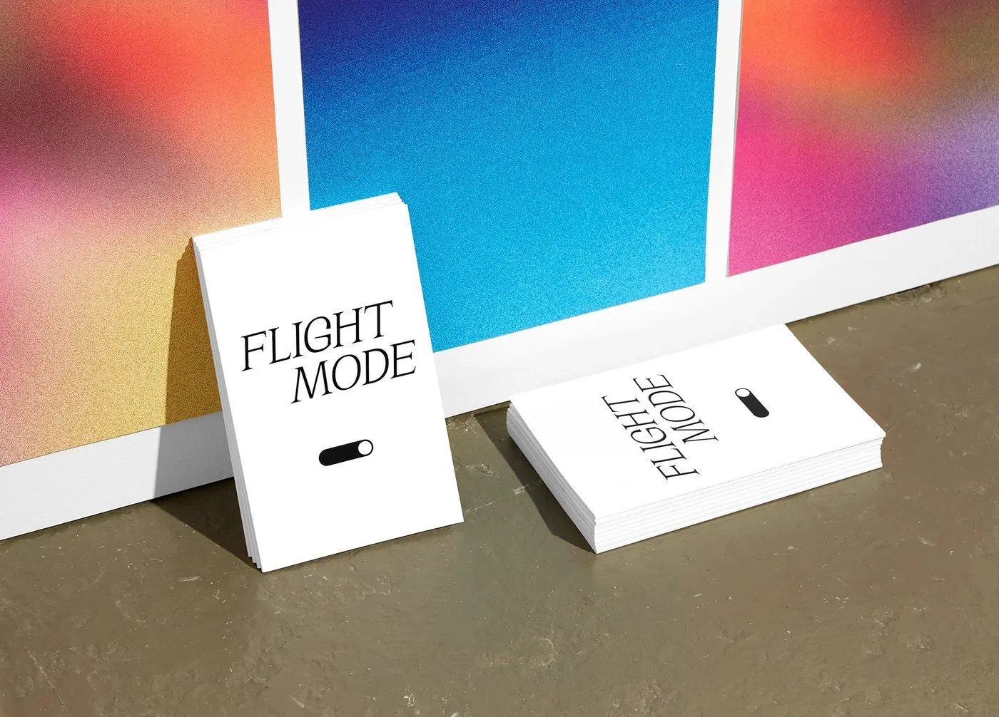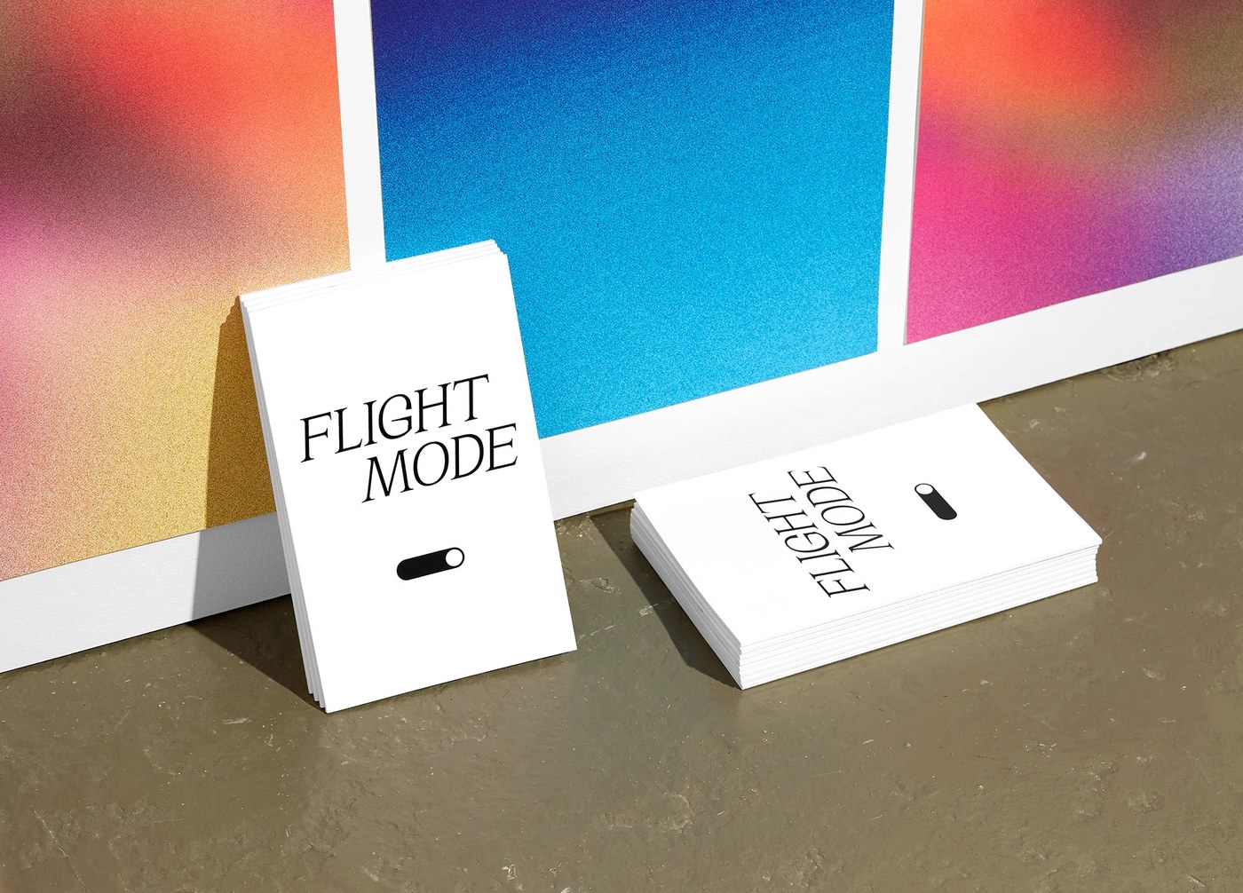
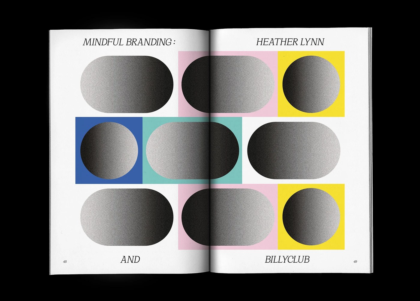
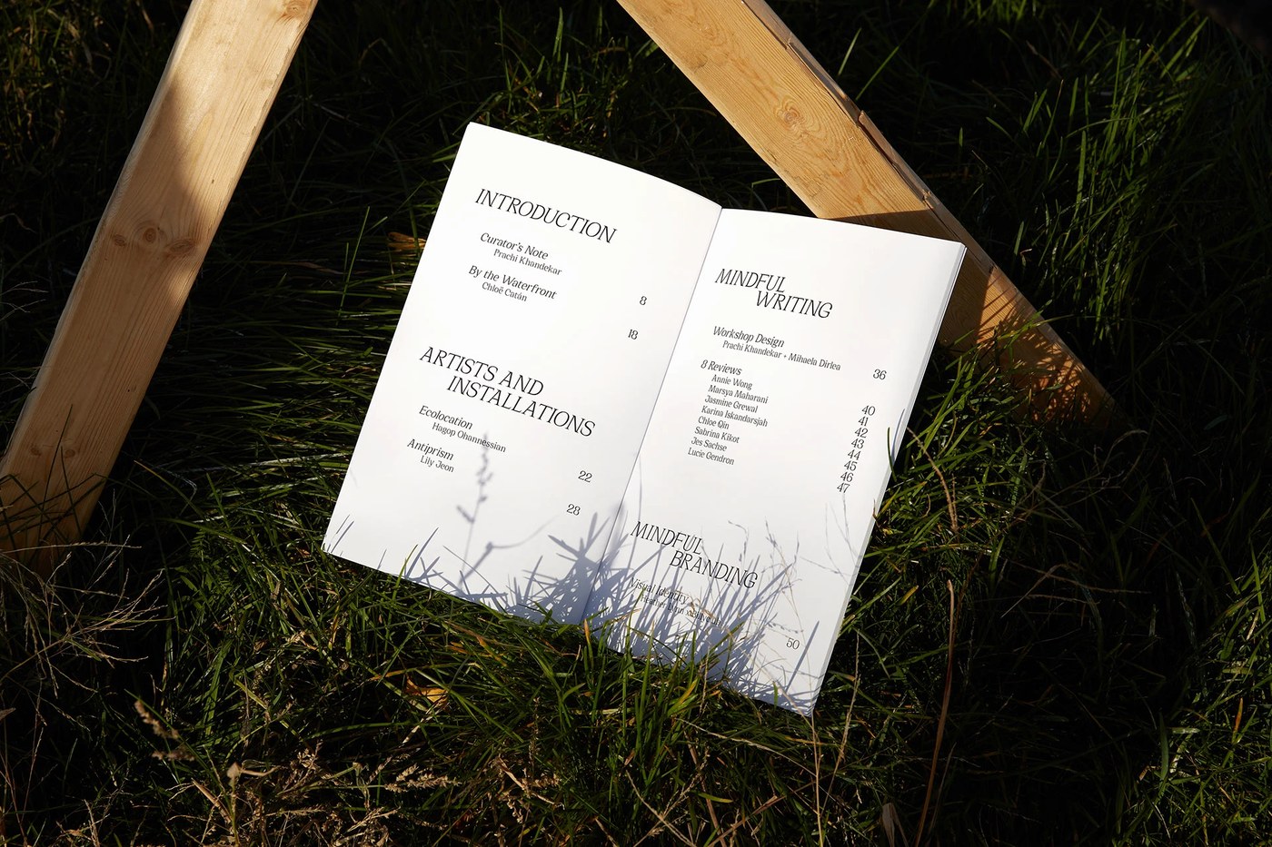
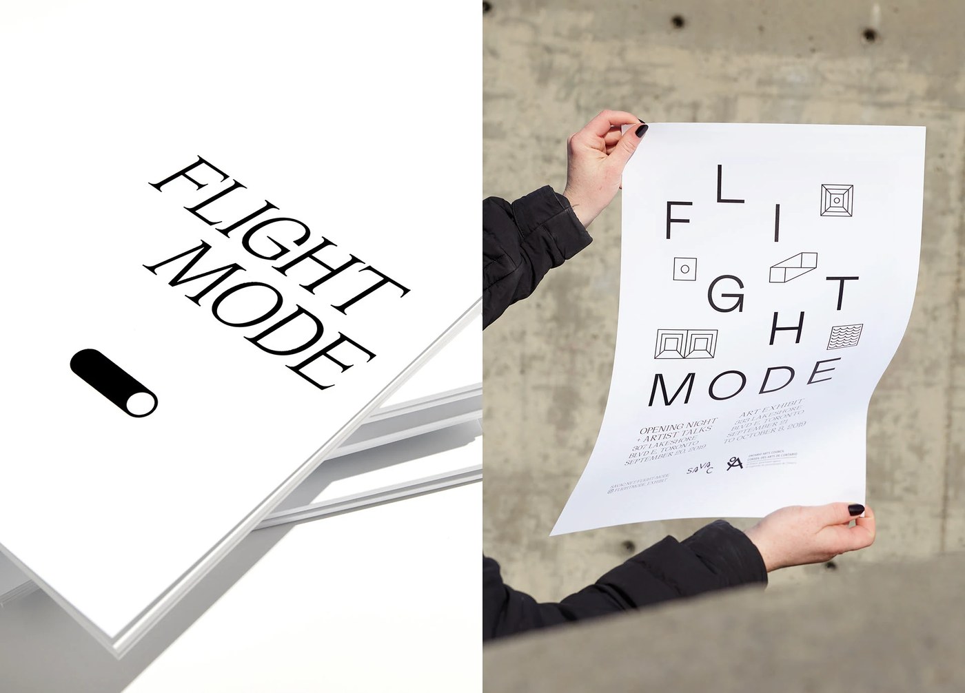
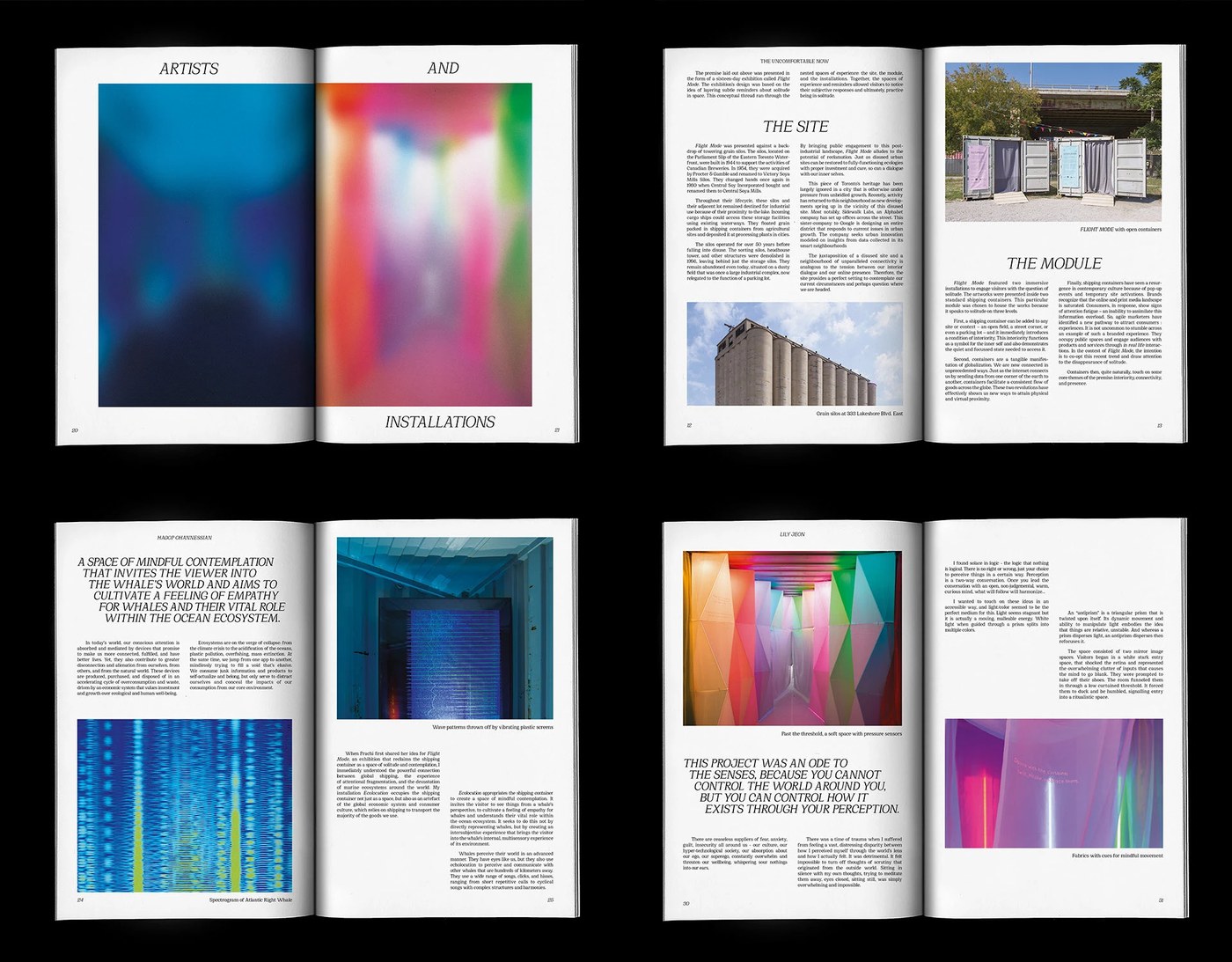
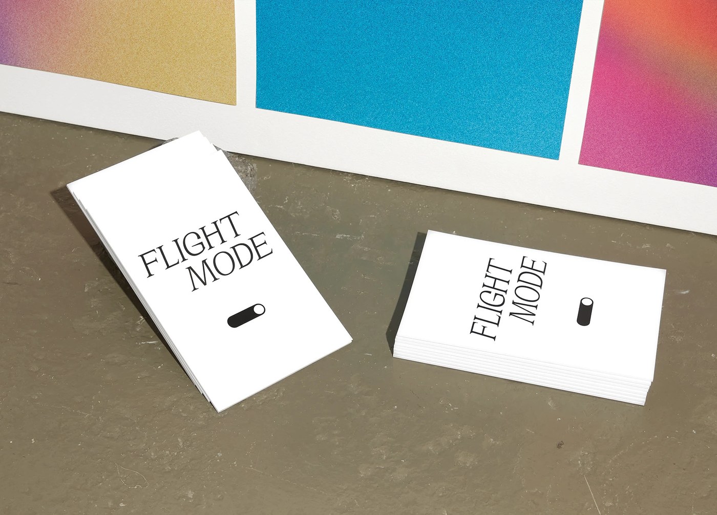
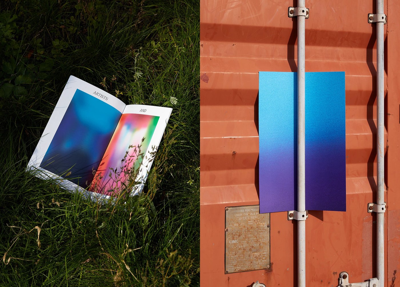
The visual identity and catalogue for Heather Lynn and Billyclub’s Flightmode exhibition is an absolute masterpiece, perfectly blending concept and execution. Drawing inspiration from the theme of solitude, the design team crafted dreamlike visual spaces. Instead of putting the artwork front and center right away, blurred graphic assets are cleverly used to spark curiosity and create the perfect backdrop. The layout structure takes cues from the industrial venue itself. Clean lines echoing the surrounding neighborhood pair beautifully with a spacious layout that softens the exhibition’s heavier themes. A major highlight is the use of simple geometric shapes and plenty of negative space to define the structure, giving it an open, clean, and incredibly airy feel. Every tiny detail is intentional, creating striking contrasts that make navigating the information effortless.
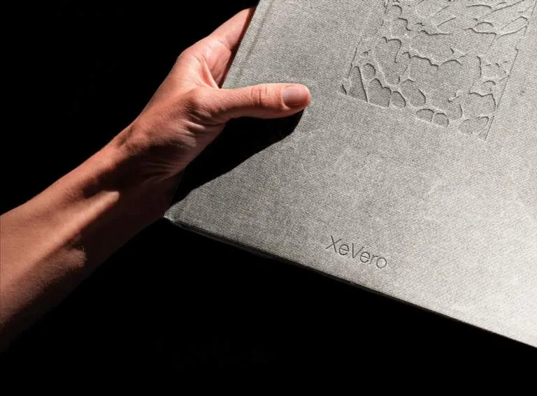
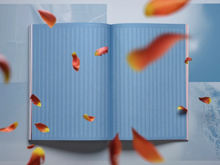
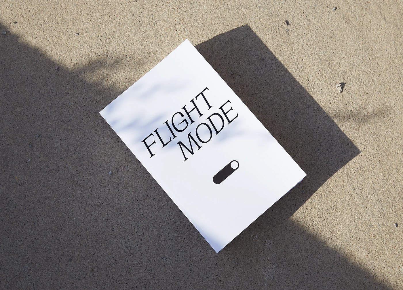
Typography-wise, the publication features Cirka—designed by Pangram Pangram—which pairs beautifully with the elegant logo for a light, airy vibe. Another standout feature is the combination of bright color palettes printed on gorgeous textured paper. Delicate line-work iconography scattered throughout the pages adds an extra layer of sophistication. Kudos to BookArt for the top-tier printing and binding; it feels solid, square, and genuinely satisfying to hold. Natural, soothing colors combined with a flexible grid system keep the typography sharp and readable, even at tiny sizes. This strong visual hierarchy shows just how much meticulous care went into every single detail.
This project is the result of a powerhouse collaboration featuring Prachi Khandekar, Lily Jeon, and Hagop Ohannessian, successfully turning the abstract concept of “solitude” into a tangible, physical experience within the art space. The case study visuals were beautifully captured through the lens of Vincent Castonguay, with documentary photography by Remi Carreiro. This identity system shines just as brightly on the gallery walls as it does in print, preserving its artistic soul and turning the catalogue into a true collector’s item. Check out the www.behance.net/gallery/104715825/FLIGHTMODE-exhibition-identity-catalogue to explore this stunning project in full!
Bộ tài liệu nhận diện và catalogue cho triển lãm Flightmode của Heather Lynn và Billyclub thực sự là một sản phẩm chỉn chu từ phần nhìn đến ý tưởng. Lấy cảm hứng từ sự cô độc, đội ngũ thiết kế đã tạo ra những không gian thị giác đầy mơ màng. Thay vì phô diễn tác phẩm nghệ thuật quá sớm, họ khéo léo sử dụng các chi tiết đồ họa làm mờ (blurred graphic assets) để khơi gợi sự tò mò và tạo khung nền hoàn hảo cho các tác phẩm. Cấu trúc layout được khơi nguồn từ chính không gian công nghiệp nơi diễn ra triển lãm. Những đường nét gọn gàng mang hơi thở của khu phố xung quanh, kết hợp cùng bố cục thoáng đãng giúp làm dịu đi chủ đề có phần nặng nề. Điểm cộng lớn là việc ứng dụng các hình khối hình học đơn giản cùng khoảng trắng (negative space) như một chất liệu định hình cấu trúc, mang lại cảm giác cởi mở, sạch sẽ và cực kỳ thông thoáng. Từng chi tiết nhỏ đều được sắp xếp có chủ đích rõ ràng, tạo nên sự tương phản ấn tượng để điều hướng thông tin hiệu quả.
Về mặt font chữ, ấn phẩm này sử dụng Cirka – một sản phẩm thiết kế của Pangram Pangram, kết hợp mượt mà với phần logo thanh thoát tạo cảm giác nhẹ nhàng bay bổng. Điểm nhấn tiếp theo chính là sự phối hợp của những cặp màu sắc tươi sáng trên nền chất liệu giấy có bề mặt vân nhám ấn tượng. Các biểu tượng icon dạng nét mảnh (line-work iconography) trang trí trên trang sách cũng góp phần làm tăng độ tinh tế. Phải dành lời khen cho BookArt vì khâu in ấn và đóng gáy cực kỳ chắc chắn, vuông vức, mang lại trải nghiệm cầm nắm rất đằm tay. Màu sắc tự nhiên, dịu mắt đi kèm hệ thống lưới cấu trúc tùy biến linh hoạt giúp typography hiển thị rõ ràng ngay cả ở các size chữ nhỏ. Sự phân cấp thị giác (visual hierarchy) mạnh mẽ này cho thấy sự chăm chút kỹ lưỡng trong từng chi tiết.
Dự án là sự kết hợp ăn ý của cả một ê-kíp chất lượng, bao gồm Prachi Khandekar, Lily Jeon và Hagop Ohannessian, giúp biến khái niệm “sự cô độc” thành một trải nghiệm vật lý có thể chạm vào trong không gian nghệ thuật. Phần hình ảnh case study được ghi lại trọn vẹn qua ống kính của Vincent Castonguay và phần tài liệu ảnh từ Remi Carreiro. Hệ thống nhận diện này không chỉ hoạt động hiệu quả trên các mảng tường gallery mà khi đưa lên trang in vẫn giữ nguyên vẹn cái chất nghệ thuật, biến cuốn catalogue thành một món đồ đáng để sưu tầm. Các bạn có thể ghé thăm trang web của www.behance.net/gallery/104715825/FLIGHTMODE-exhibition-identity-catalogue để xem đầy đủ dự án ấn tượng này nhé!