
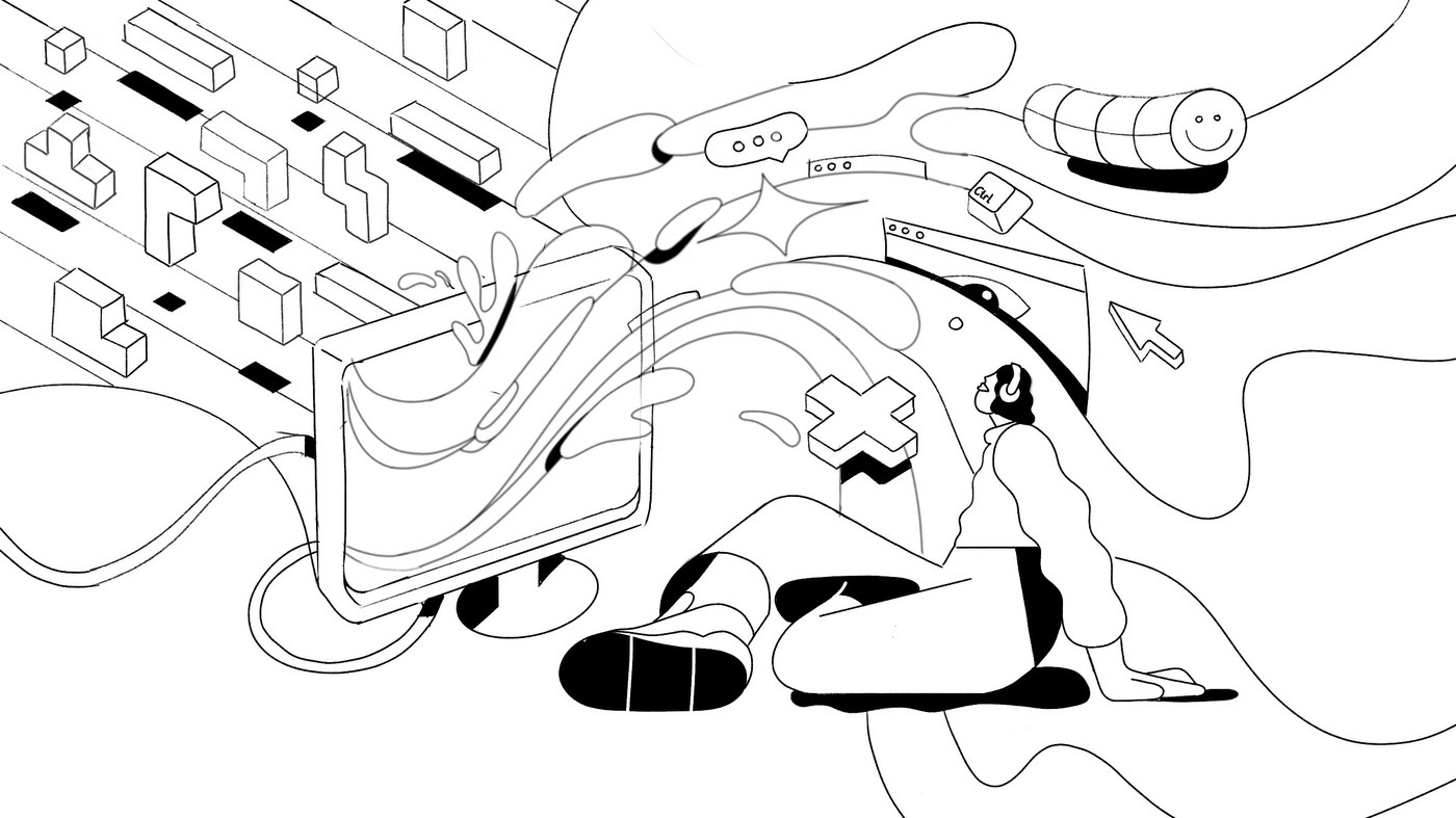
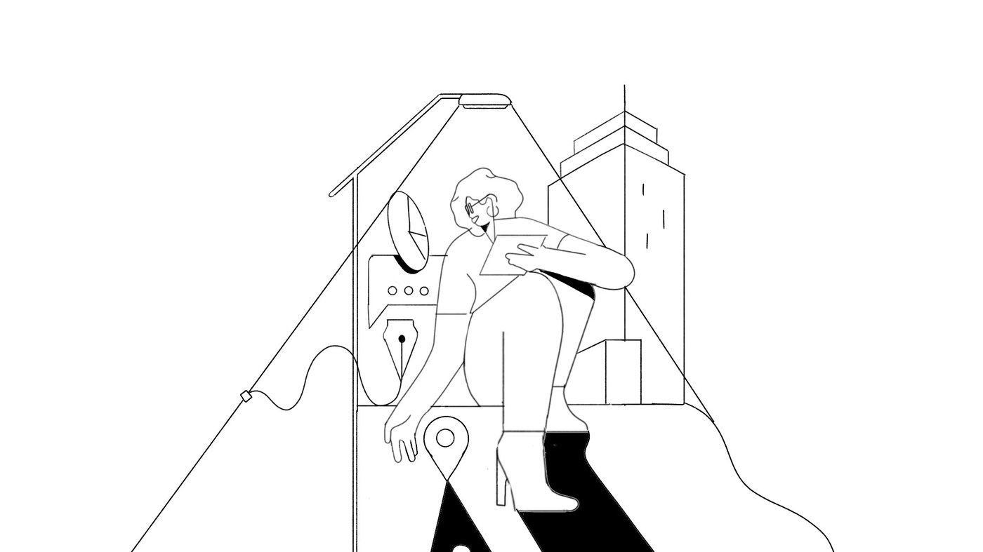


Bulma Illustrates vừa mang đến những layout minh họa cực kỳ chất lượng cho tạp chí Harvard Business Review (HBR), giúp cụ thể hóa những quyết định kinh doanh khô khan thành các hình ảnh trực quan sinh động.
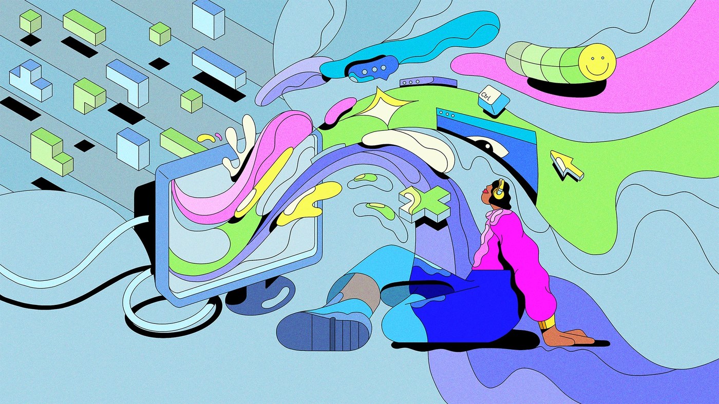
Nhìn vào các tác phẩm, người xem sẽ thấy ngay cách tác giả sử dụng các lớp vector rất chắc tay để tạo nên nhịp điệu thị giác. Những hình khối hình học đơn giản được tận dụng khéo léo để định hình cho các khái niệm trừu tượng, kết hợp cùng các mảng màu lớn tạo nên sự tương phản đầy chủ ý. Khoảng trống (negative space) tinh tươm giúp từng thông điệp ẩn dụ có thêm không gian để “thở”. Thay vì sa đà vào chi tiết phức tạp, bộ tranh đề cao tính cân bằng khi mọi thành phần đều được đặt chuẩn chỉnh trên một hệ thống lưới mô-đun (modular grid) chính xác. Việc lựa chọn bố cục bất đối xứng cùng các đường chéo mạnh mẽ giúp dẫn dắt mắt nhìn của độc giả một cách tự nhiên và tăng thêm phần kịch tính cho trang sách.
Để làm mềm những đường nét kỹ thuật số sắc lẹm, một lớp hiệu ứng giả lập chất liệu giấy (paper noise) đã được phủ lên các mảng màu phẳng, mang lại cảm giác xúc giác mộc mạc và chân thực. Dự án tuân thủ một hệ thống bảng màu khá giới hạn với các tông màu chủ đạo ấm áp tương tác cùng sắc xám dịu nhẹ. Sự tiết chế này giúp phân tách các ý tưởng cốt lõi một cách rõ ràng mà không gây cảm giác rườm rà, rắc rối.
Bulma Illustrates là một studio thiết kế danh tiếng, chuyên sáng tạo các tác phẩm minh họa ý niệm hiện đại cho những thương hiệu hàng đầu. Phong cách của họ kế thừa tinh thần chỉ đạo nghệ thuật (art direction) truyền thống, không đi theo những lối ví von hài hước thông thường mà hướng tới hệ thống đồ họa thông minh, tinh tế. Cách tiếp cận nghiêm túc này không chỉ giải quyết triệt để các bài toán nội dung hóc búa của tòa soạn mà còn góp phần định hình xu hướng cho dòng tranh minh họa báo chí đương đại.
Bulma Illustrates just dropped some seriously high-quality editorial layouts for Harvard Business Review (HBR), beautifully turning dry business decisions into vibrant, eye-catching visuals.
Taking a look at the artwork, it’s easy to see how masterfully the vector layers are stacked to create a wonderful visual rhythm. Simple geometric shapes are cleverly used to map out abstract concepts, while large color blocks create a super intentional contrast. Clean negative space gives each metaphorical message plenty of room to breathe. Instead of getting bogged down in messy details, this series is all about balance, with every single element perfectly aligned to a precise modular grid. Plus, the choice of asymmetrical layouts and strong diagonals naturally guides the reader’s eyes and injects a little extra drama into the pages.
To soften those ultra-sharp digital edges, a subtle paper noise texture overlays the flat colors, giving everything a wonderfully tactile, rustic feel. The project sticks to a pretty tight color palette, using warm primary tones that play nicely with soft grays. This restraint beautifully separates core ideas without making things feel cluttered or overwhelming.
Bulma Illustrates is a renowned design studio known for creating modern conceptual illustrations for top-tier brands. Their style honors traditional art direction, skipping the usual humorous tropes in favor of a smart, sophisticated graphic system. This thoughtful approach doesn’t just crack the editorial team’s toughest content puzzles—it’s also helping shape the future of contemporary editorial illustration.