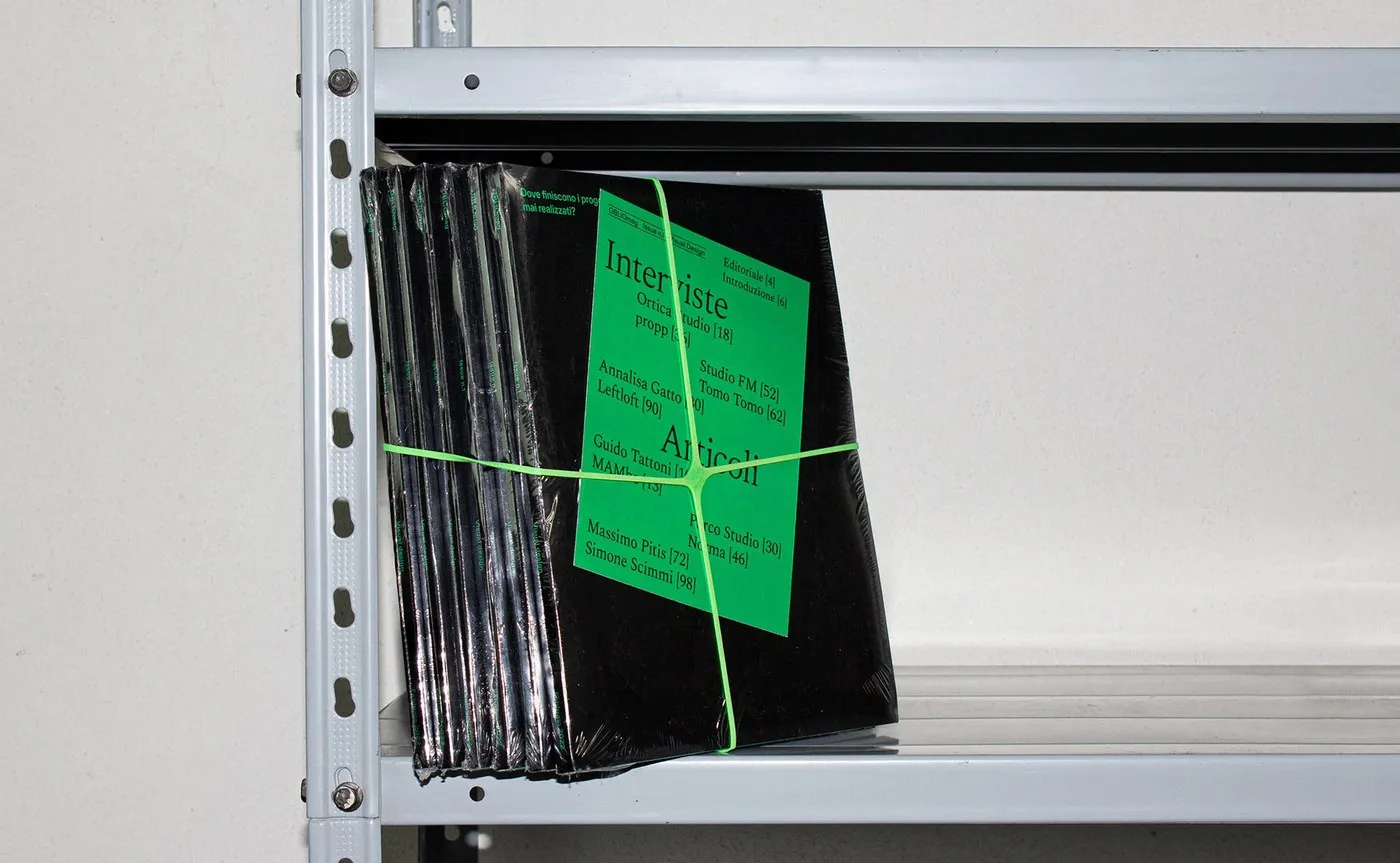
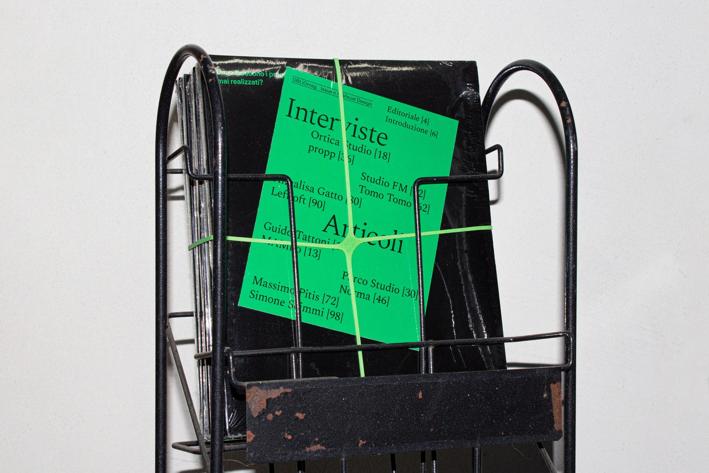
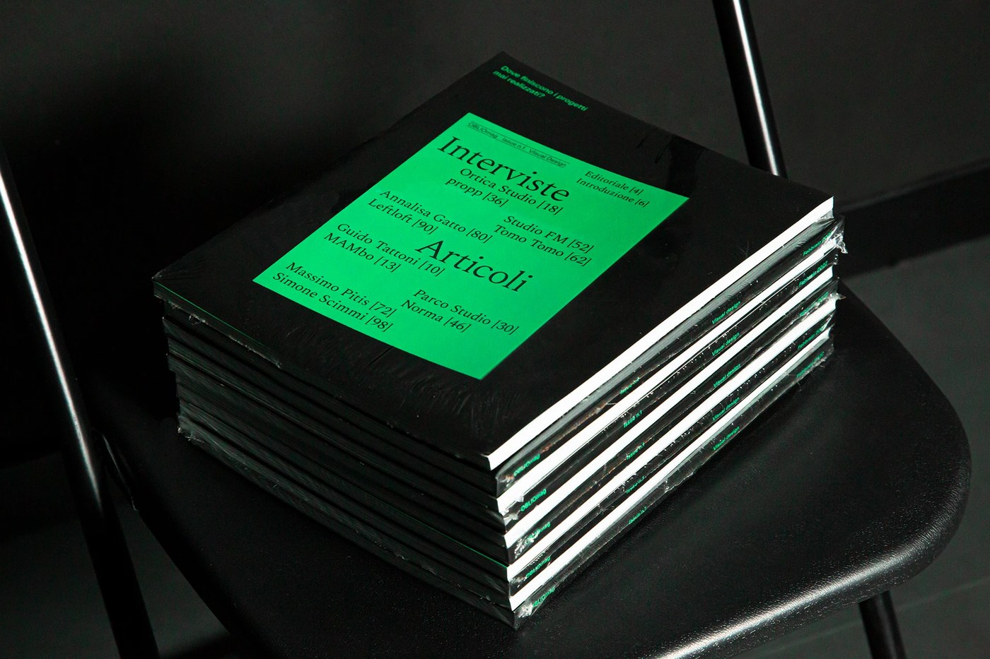
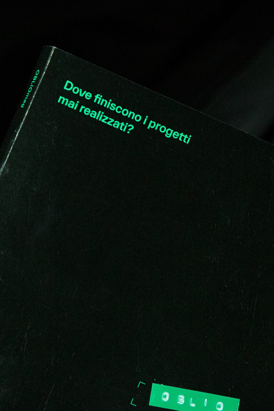
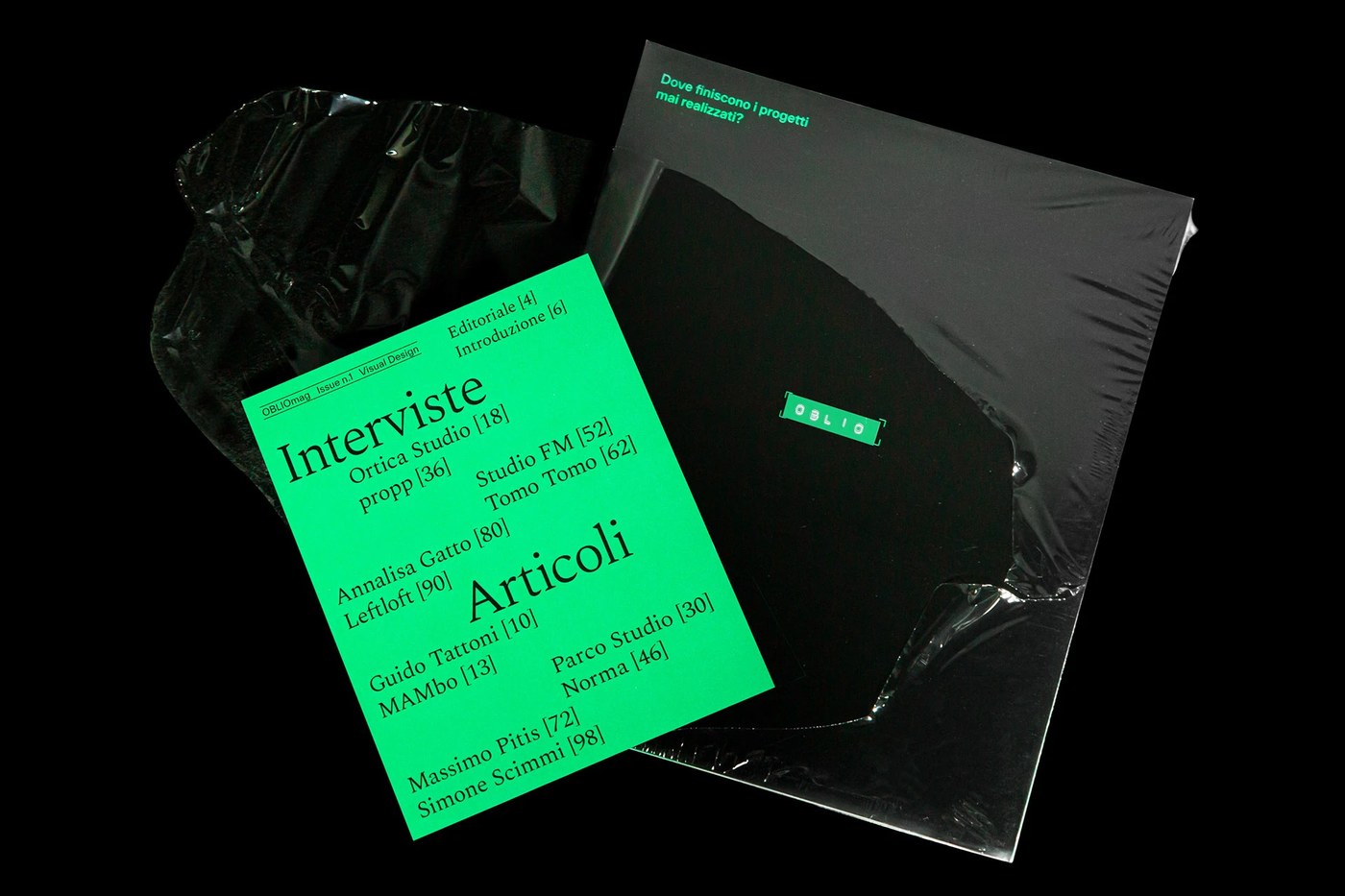
Bạn đã bao giờ thắc mắc số phận của những bản thiết kế bị khách hàng từ chối sẽ đi về đâu chưa? Dự án tạp chí in ấn mang tên Oblio của nhà thiết kế Federico Agnelli chính là một câu trả lời đầy tính nghệ thuật, khi chọn khai thác một góc nhìn cực kỳ độc đáo: những dự án thiết kế chưa từng được ra mắt do thất bại, bị từ chối, hoặc đơn giản là thiếu hụt thời gian và kinh phí.
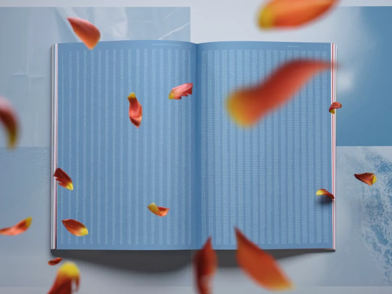
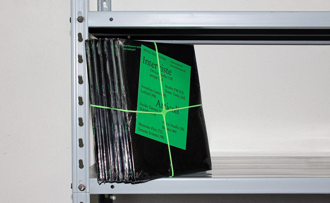
Với ấn phẩm này, Federico Agnelli đã sử dụng hệ thống lưới modular cực kỳ gọn gàng và sạch thế. Cách phân cấp thị giác rõ ràng giúp cấu trúc các trang layout trở nên mạch lạc hơn. Ngôn ngữ hình ảnh của tạp chí tạo ra một sự căng thẳng đầy thu hút nhờ vào việc tận dụng tối đa những khoảng trắng (white space). Sự kết hợp này mang lại cảm giác vừa nhẹ nhàng, bay bổng nhưng cũng rất chặt chẽ và kỷ luật. Mỗi trang tạp chí đều nổi bật với độ tương phản cực kỳ mạnh mẽ, tập trung hoàn toàn vào câu chuyện của những ý tưởng còn dang dở. Qua đó, những hệ thống thiết kế này đã phơi bày những góc khuất đầy chân thực trong quá trình sáng tạo của các designer. Bên cạnh đó, trải nghiệm xúc giác cũng được chăm chút kỹ lưỡng thông qua việc lựa chọn chất liệu giấy. Tạp chí sử dụng giấy Burgo Selena màu trắng tự nhiên để mang lại bề mặt nhám thô mộc, chân thật.
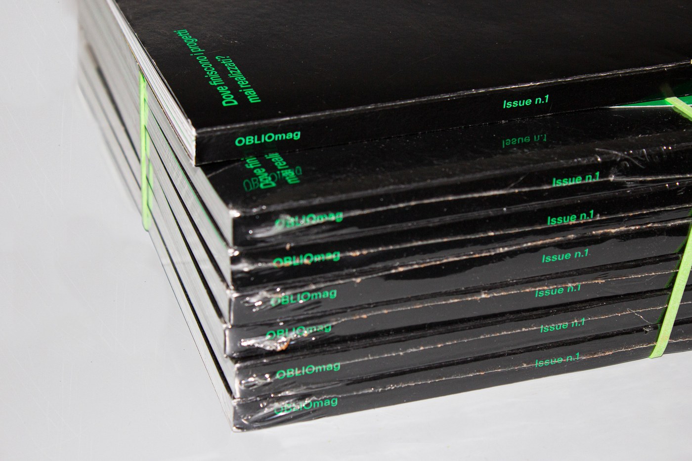
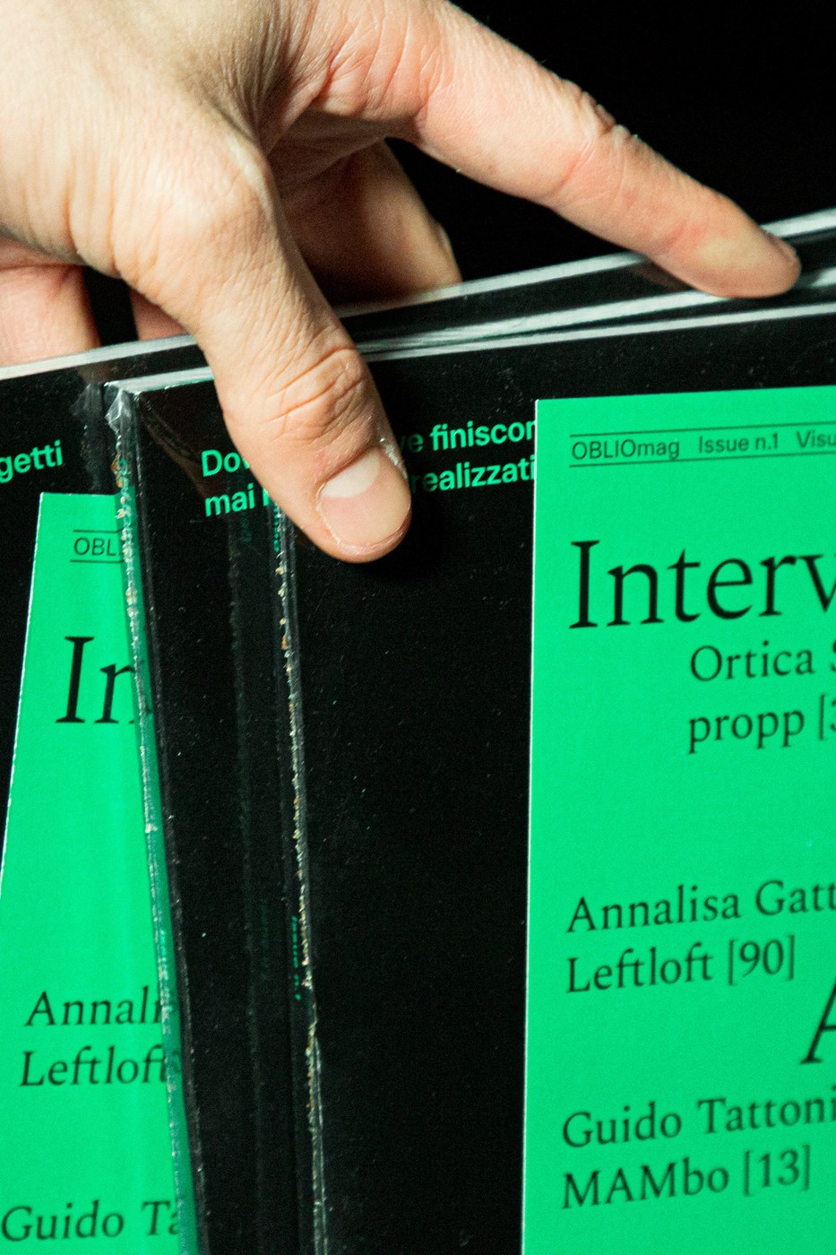
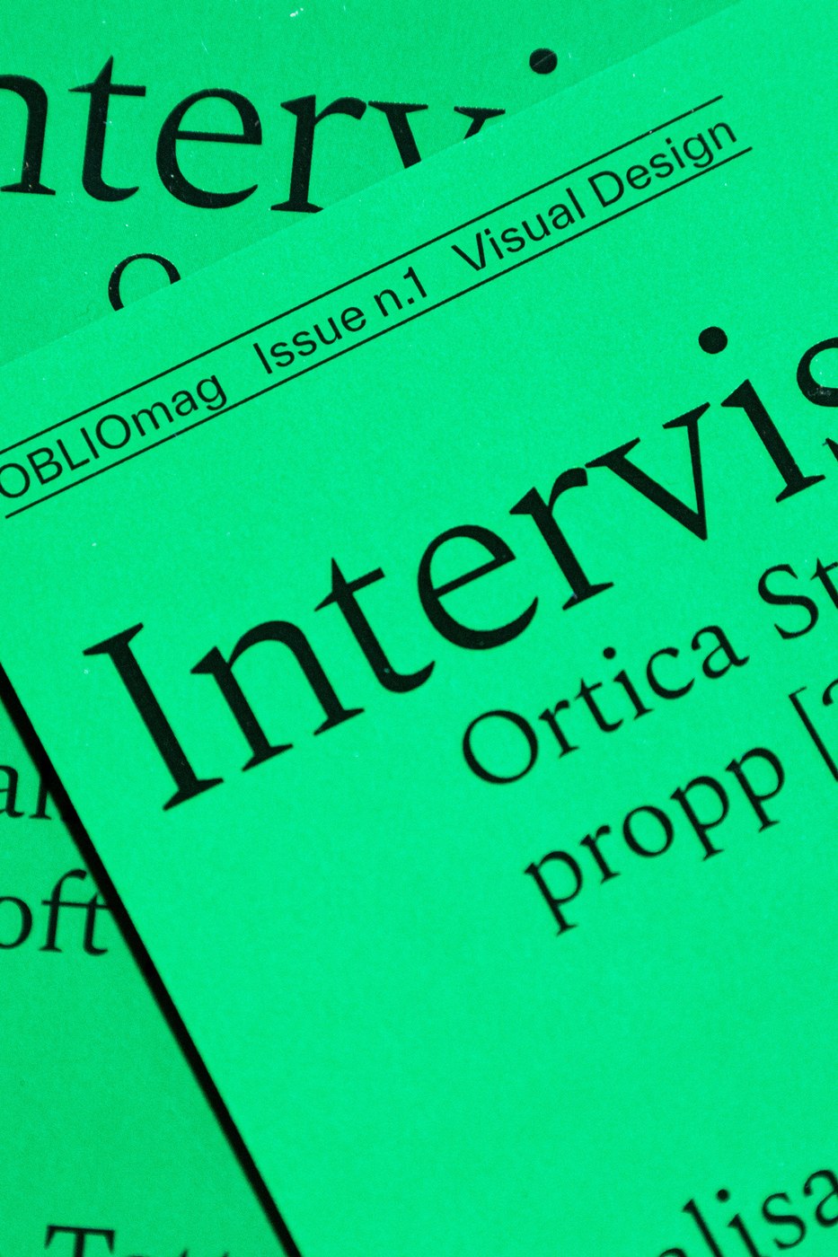
Về mặt typography, phần layout của tạp chí là sự kết hợp giữa hai phông chữ Everett và Spectral. Sự tương phản đầy thú vị giữa những chi tiết không chân (sans-serif) đậm nét của Everett với phần thân chữ có chân (serif) mềm mại của Spectral tạo nên một nhịp điệu thị giác vô cùng cuốn hút. Toàn bộ hệ thống layout được giữ tính kỷ luật cực kỳ nghiêm ngặt, với mực đen in trên nền giấy trắng tạo nên độ tương phản tối đa. Đặc biệt, phần bìa tạp chí sử dụng chất liệu giấy bóng Burgo Experia, tạo nên sự đối lập thú vị về mặt chất liệu và mang lại cảm giác cao cấp khi cầm trên tay. Mỗi trang phỏng vấn đều tuân thủ nghiêm ngặt các quy tắc hình học chặt chẽ.
Oblio Magazine là một lời khẳng định rằng thất bại cũng là một công cụ sáng tạo tuyệt vời. Thông qua việc phỏng vấn 7 studio và 3 nhà thiết kế, ấn phẩm đã lột tả một góc nhìn khác về những tiếc nuối trong nghề sáng tạo, đồng thời chứng minh giá trị của những sản phẩm chưa bao giờ được hoàn thiện.
Bạn có thể khám phá thêm thông tin chi tiết về dự án thú vị này trên trang portfolio của www.behance.net/gallery/142788277/Oblio.
Ever wonder what happens to all those brilliant design concepts that get rejected by clients? Graphic designer Federico Agnelli has a beautiful answer. His print magazine project, Oblio, takes an incredibly unique look at the unreleased side of design—the projects that fell through, got rejected, or were simply shelved due to lack of time or budget.
For this publication, Federico Agnelli leans into an incredibly clean, modular grid system. The super-clear visual hierarchy makes navigating the layouts a total breeze. What’s really cool is how the visual language creates this captivating tension by playing with generous amounts of white space. It feels airy and open, yet tightly disciplined all at once. Every single page pops with high contrast, keeping the spotlight entirely on these unfinished ideas. It’s an honest, raw peek behind the curtain of the creative process. Plus, the tactile experience is just as thought-out—printed on Burgo Selena natural white paper, giving it a beautifully textured, raw feel in your hands.
On the typography front, the layouts brilliantly pair the bold, sans-serif Everett with the elegant, serif Spectral. The contrast between Everett’s sharp edges and Spectral’s soft curves creates a gorgeous visual rhythm. The layout discipline is strict, using deep black ink on crisp white paper for maximum impact. To top it all off, the cover features glossy Burgo Experia paper, creating a satisfying contrast with the textured inside pages and giving it a high-end, premium feel. Even the interview pages adhere to a strict, geometric structure.
Oblio Magazine is a beautiful reminder that failure can actually be a fantastic creative tool. Featuring interviews with seven design studios and three independent designers, this publication offers an intimate look at creative “what-ifs,” proving there is immense value and beauty in projects that never quite made it to the finish line.
You can dive deeper into this fascinating project over on Federico’s www.behance.net/gallery/142788277/Oblio.