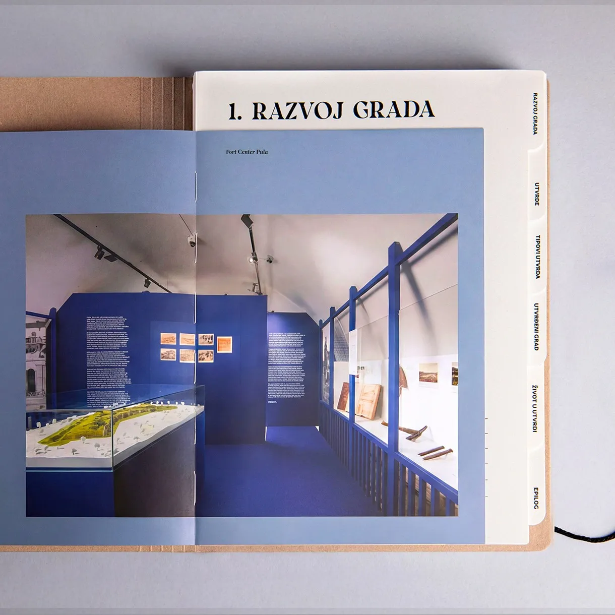
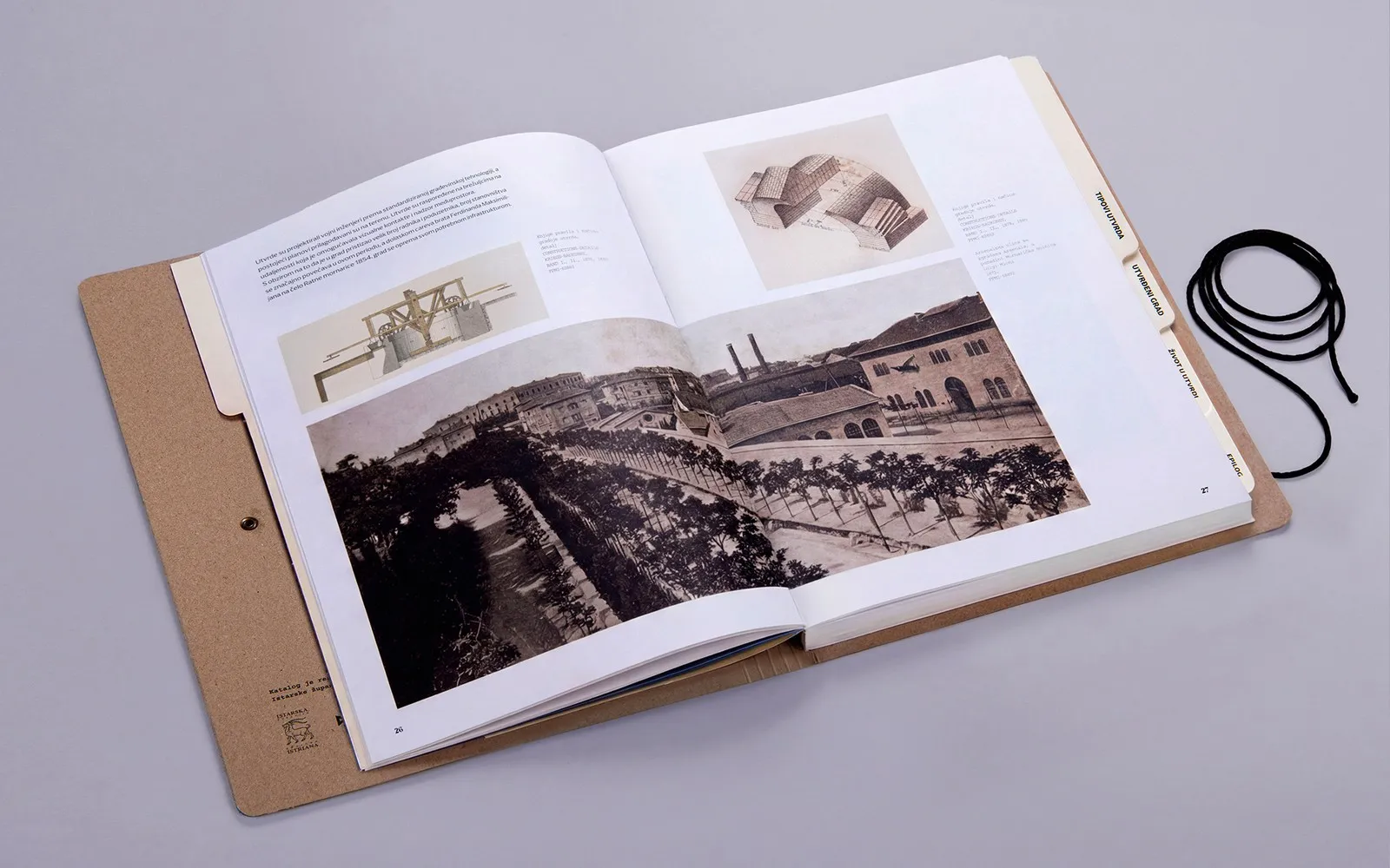
Turning Historical Archives into a Military Dossier: Impressive Design by Studio Tumpić/Prenc Instead of squeezing museum documents and archival photos into a standard catalog layout, Studio Tumpić/Prenc transformed a historical record of Pula’s 19th and early 20th-century fortress system for the Historical and Maritime Museum of Istria into what feels like a naval officer’s personal dossier. Each page retains its unique format and color palette, layered naturally as if freshly pulled from a desk drawer.
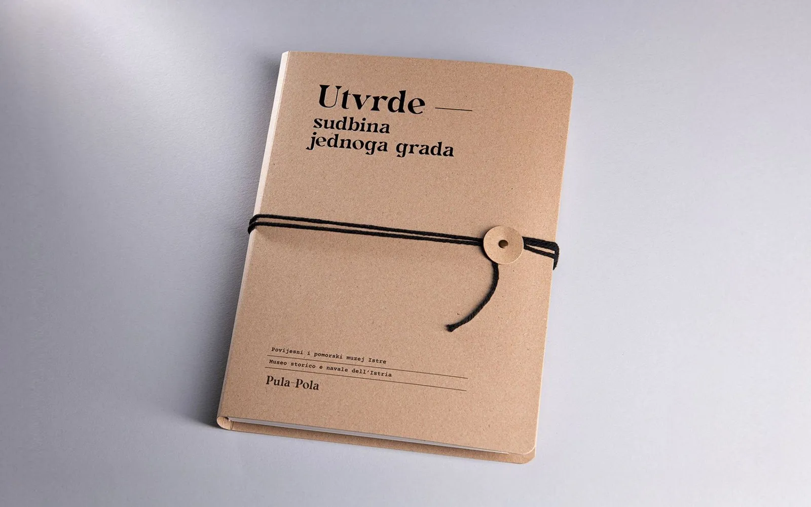
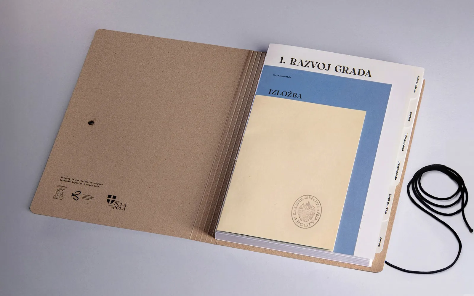
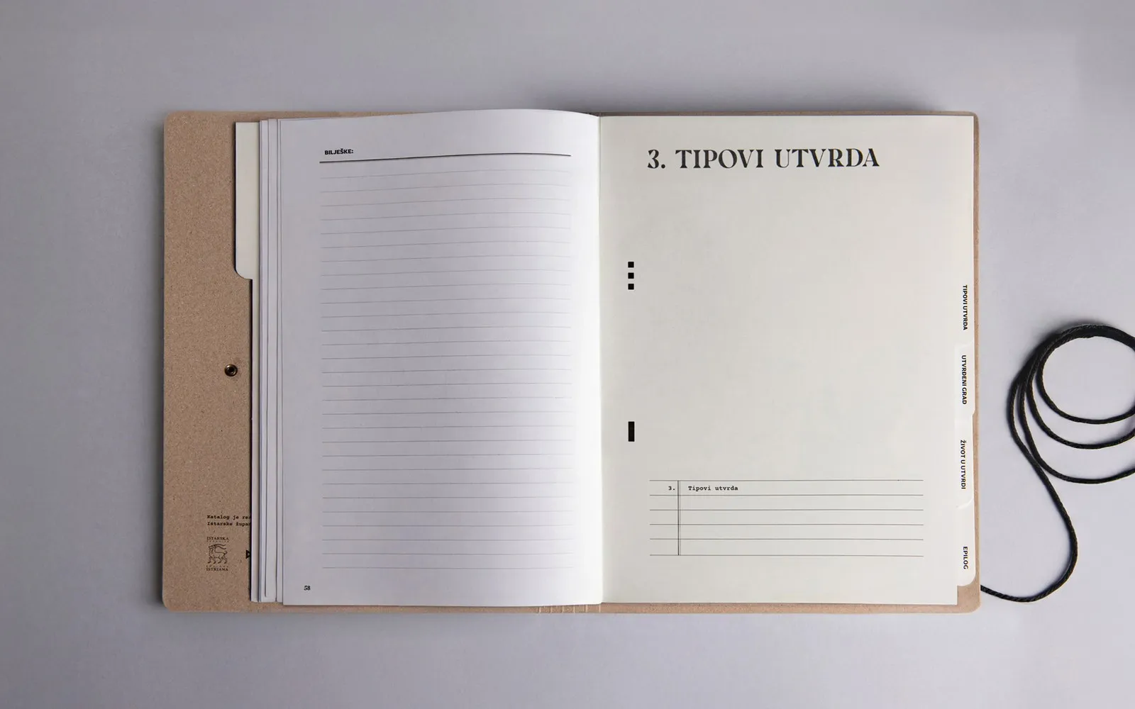
The publication’s materials carry a deep archival spirit. The cover is made from raw kraft paper fastened with a black cord, paper buttons, and metal eyelets that act as file binders. Inside, heavyweight paper tab dividers trimmed along the edges neatly organize the content into six distinct sections. The pages transition smoothly from off-white to soft blue tones, complete with a lined note-taking page titled “BILJEŠKE”.
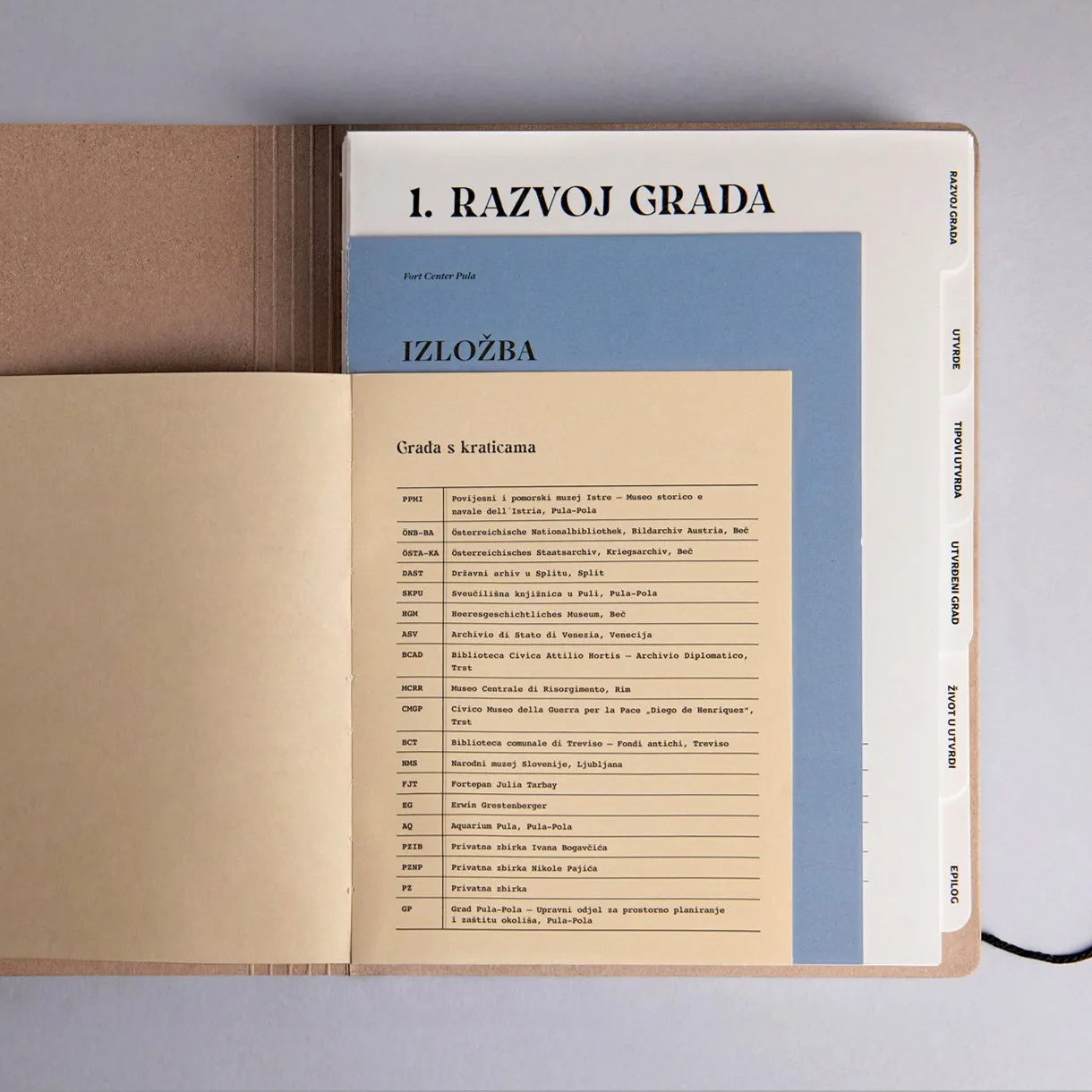
From a typography standpoint, high-contrast serif typefaces were chosen for titles and chapter openers, printed directly in bold black on raw kraft paper to evoke the authentic vibe of 19th-century military paperwork. At the same time, a clean typewriter-style monospace font handles abbreviation lists, fine print, and publishing info, paired with small caps running vertically along the section tabs. The layout grid stays super flexible, shifting dynamically across every two-page spread.
The coolest detail? This design is built to embrace the test of time. Through regular handling and page-turning, the piece naturally develops wear marks over time, turning the reading experience into part of the book’s evolving aesthetic. This clever concept earned the project a Third Place tie in the Books: Entire Package category at the 2026 PRINT Awards.
Check out more details about the project on the www.tumpic-prenc.hr/en/projects/utvrde-sudbina-jednoga-grada/.
Biến Catalogue Lịch Sử Thành Hồ Sơ Quân Sự: Thiết Kế Ấn Tượng Từ Studio Tumpić/Prenc
Thay vì ép các trang tài liệu bảo tàng và ảnh lưu trữ vào khuôn khổ một cuốn catalogue tiêu chuẩn, Studio Tumpić/Prenc đã biến cuốn sách ghi chép về hệ thống pháo đài thế kỷ 19 và đầu thế kỷ 20 của Pula cho Bảo tàng Lịch sử và Hàng hải Istria thành một tập hồ sơ cá nhân của sĩ quan hải quân. Mỗi trang sách giữ nguyên sự đa dạng về định dạng lẫn tông màu, xếp chồng lên nhau tự nhiên như thể vừa được rút ra từ ngăn kéo bàn làm việc.
Chất liệu của ấn phẩm mang đậm tinh thần lưu trữ. Bìa sách làm từ giấy kraft khép lại bằng dây buộc màu đen, cúc giấy và khoen kim loại đóng vai trò như nẹp cố định hồ sơ. Bên trong, các thẻ phân trang bằng giấy định lượng dày cắt tỉa ở rìa giúp chia nội dung thành sáu phần rõ rệt. Các trang sách chuyển đổi tông màu từ trắng ngà sang xanh nhạt, đi kèm một trang kẻ dòng dành riêng cho người đọc ghi chú với tiêu đề “BILJEŠKE”.
Về mặt typography, tựa đề và phần mở đầu mỗi chương được chọn kiểu chữ serif tương phản cao, in đen trực tiếp lên nền kraft thô nhằm tái hiện cảm giác của văn bản quân sự thế kỷ 19. Cùng lúc đó, phông chữ máy in đơn khoảng (monospace) được dùng cho các danh sách viết tắt, chú thích nhỏ và thông tin xuất bản, kết hợp cùng chữ in hoa nhỏ (small caps) chạy dọc các thẻ phân trang. Hệ thống lưới dàn trang được giữ ở mức linh hoạt, thay đổi qua từng trang đôi.
Điểm đặc biệt nhất là thiết kế này được tạo ra để chấp nhận dấu vết thời gian. Qua quá trình lật mở và cầm nắm, ấn phẩm sẽ dần hình thành vết mòn tự nhiên, biến trải nghiệm đọc thành một phần diện mạo của cuốn sách. Ý tưởng thiết kế này đã giúp tác phẩm đoạt giải Ba (đồng hạng) ở hạng mục Books: Entire Package tại PRINT Awards 2026.
Xem thêm các thông tin khác của dự án tại www.tumpic-prenc.hr/en/projects/utvrde-sudbina-jednoga-grada/.