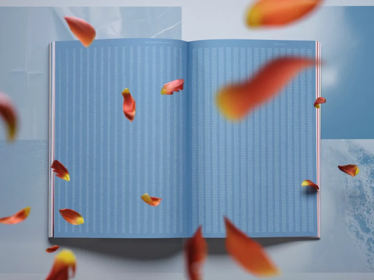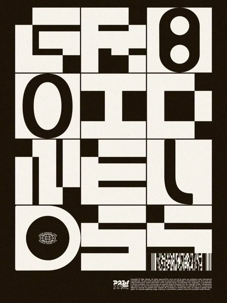
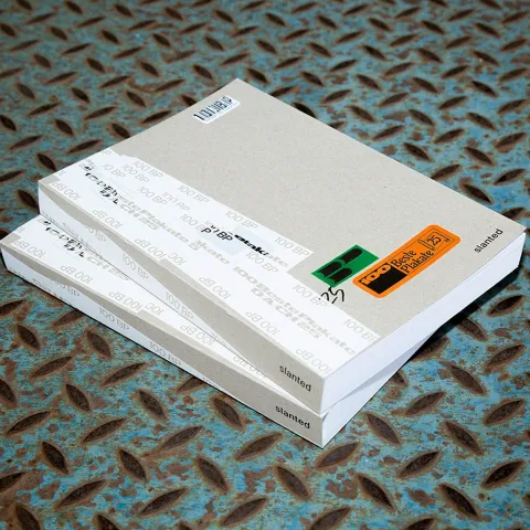
Cuốn niên giám 100 Beste Plakate đã quay trở lại với một ý tưởng thiết kế đậm chất thực tế và mang hơi hướng của ngành vận chuyển. Toàn bộ các tác phẩm poster xuất sắc được đóng gói trong một diện mạo thô mộc nhưng vô cùng bài bản.
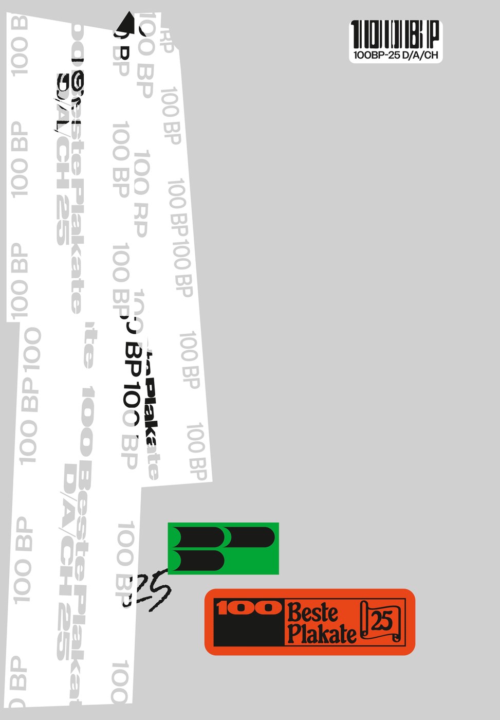
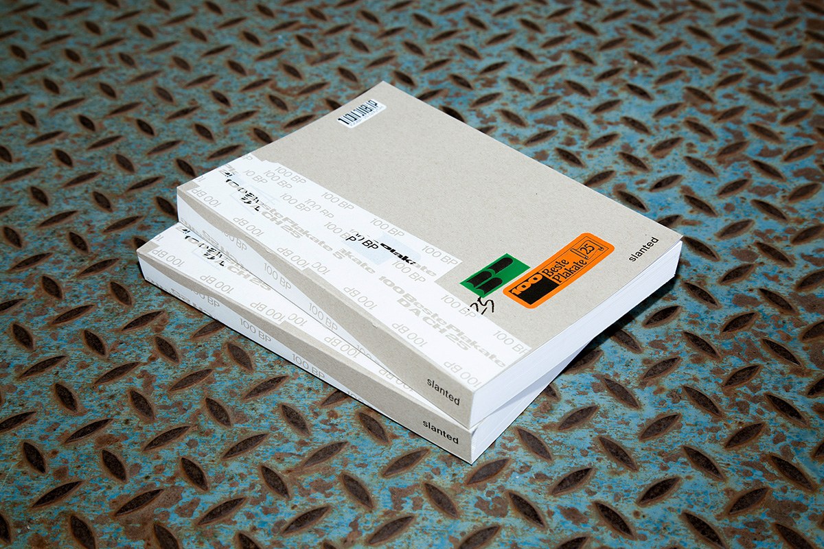
Được thực hiện bởi bộ đôi designer Ira Ivanova và Lou Hillereau tại Berlin, cuốn sách mô phỏng hình dáng của một kiện hàng gửi bưu điện. Phần bìa sử dụng bìa cứng xám không tẩy trắng, tạo điểm nhấn bằng các sticker màu xanh lá và cam rực rỡ. Những dải băng dính quấn quanh gáy và cạnh sách biến bao bì thông thường thành một hệ thống đồ họa thống nhất. Cách sắp xếp này phản ánh đúng tinh thần thô ráp của cuộc thi 100 Beste Plakate, tạo ra sự giao thoa thú vị giữa tính tiện dụng và sự tinh tế trong thiết kế biên tập (editorial design). Việc xem cuốn sách như một bưu kiện giúp phân cấp thông tin rõ ràng, gợi nhắc về quá trình phân phối các ấn phẩm in ấn vật lý.
Trải nghiệm thị giác và vật liệu đầy tính thực tế
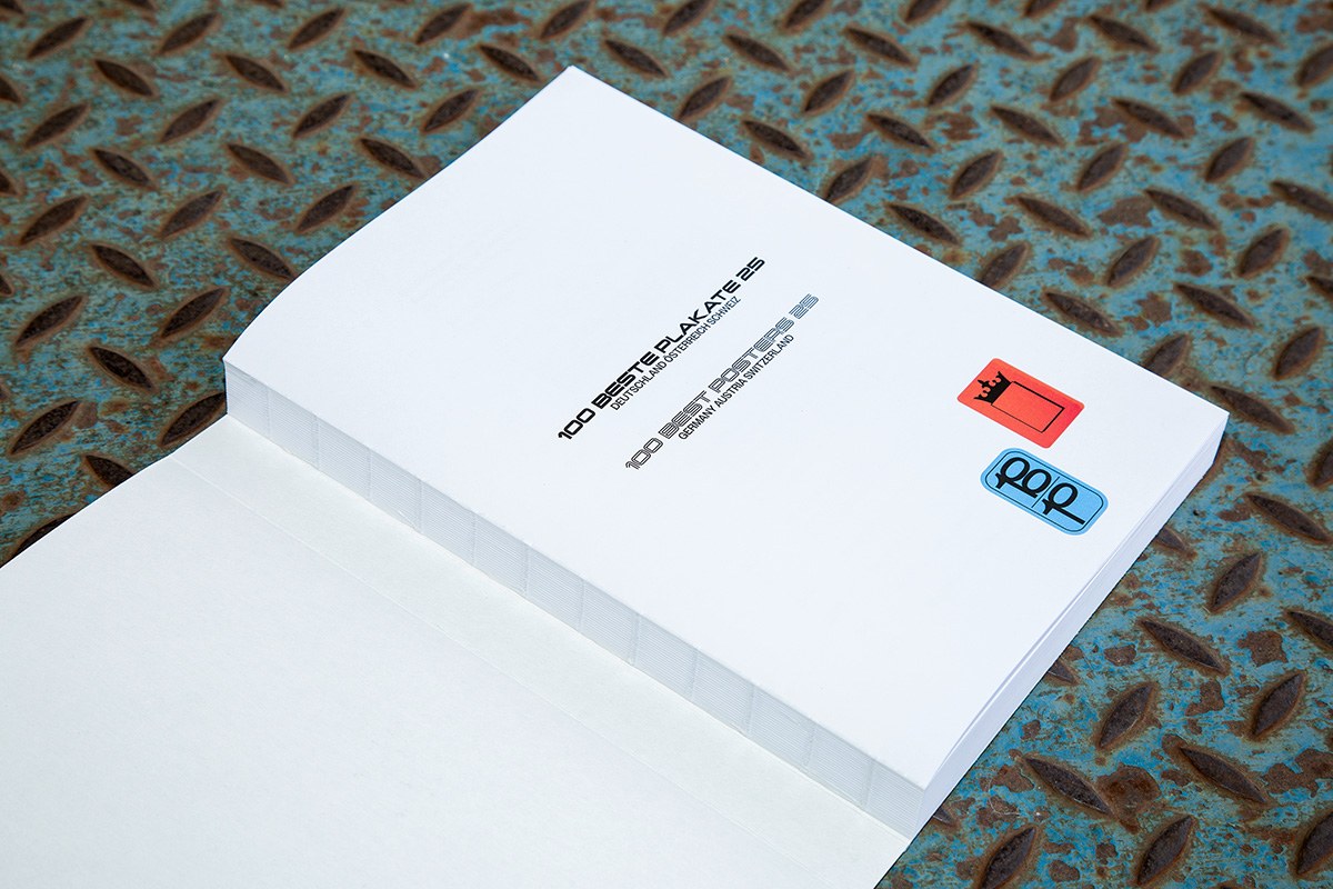
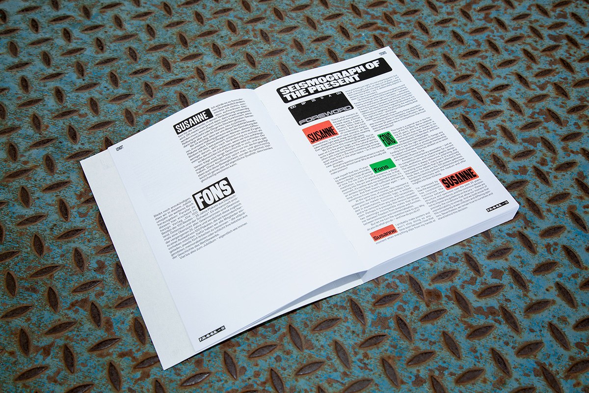
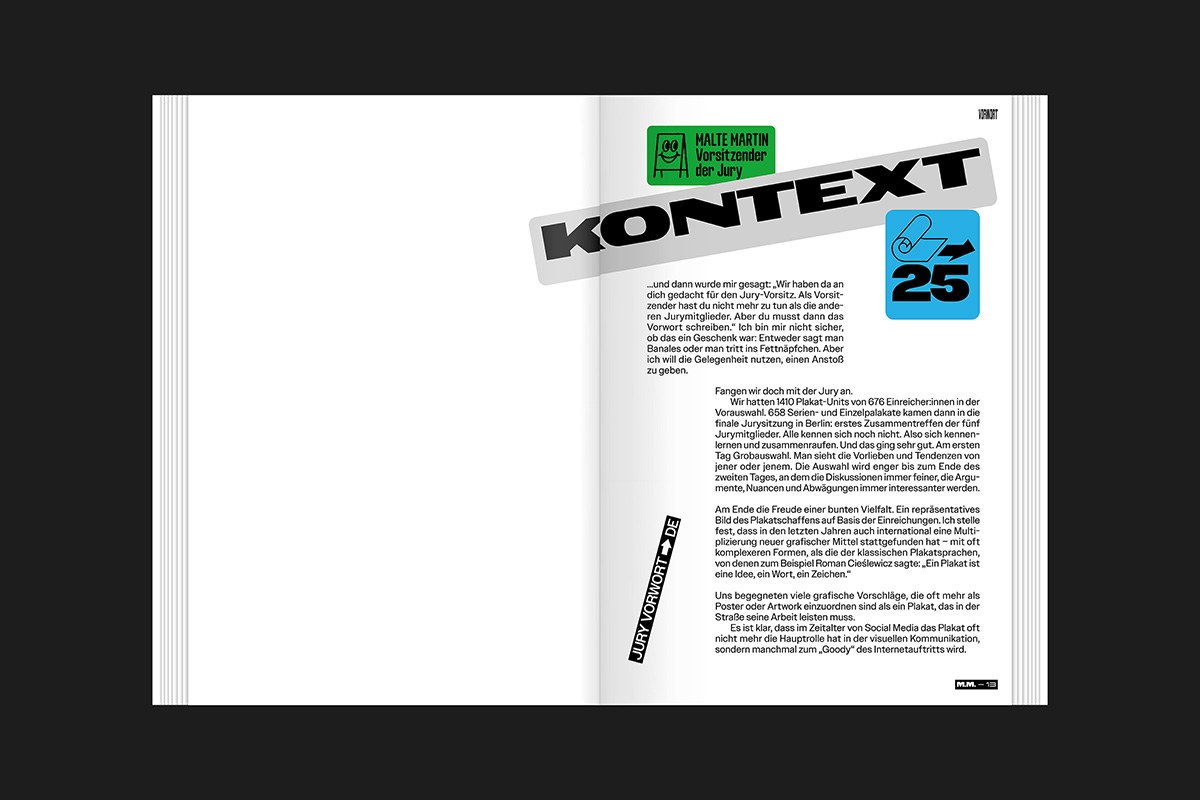
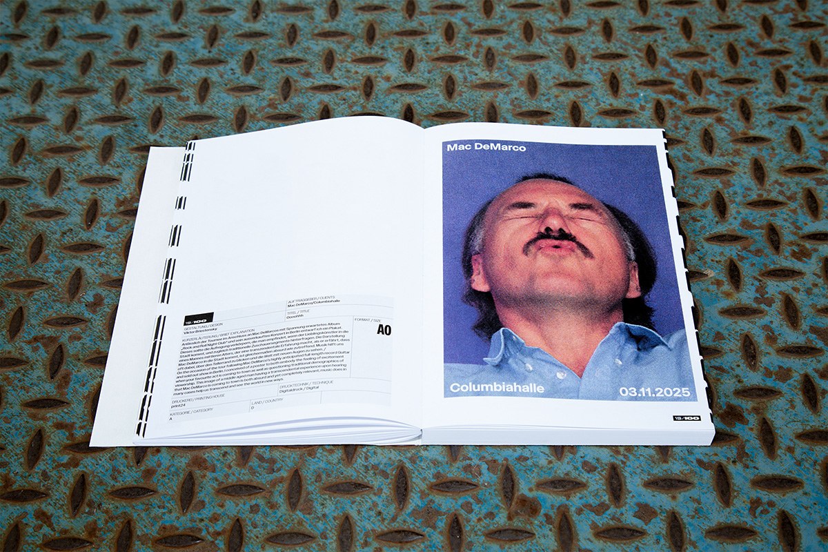
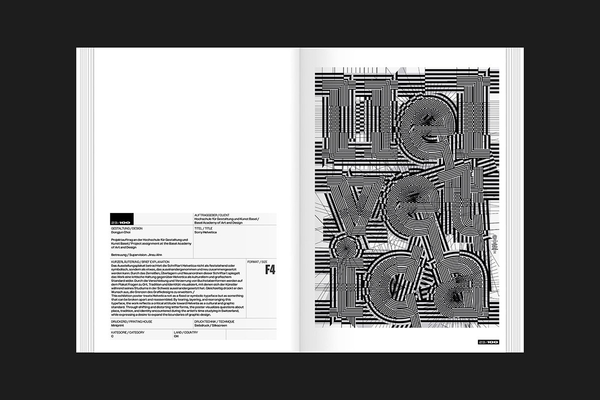
Bên trong cuốn sách, tinh thần thực dụng vẫn được duy trì xuyên suốt. Chất liệu giấy dày dặn cùng đường khâu chỉ lộ ra ngoài nhấn mạnh giá trị cầm nắm của ấn phẩm. Hệ thống typography được tính toán tỉ mỉ, kết hợp giữa các dòng chú thích sans-serif nhỏ gọn và những thành phần hiển thị (display elements) mạnh mẽ. Bảng màu tối giản với tông giấy trắng ngà và các mảng màu xám đậm giúp các poster đoạt giải trở thành tâm điểm. Dù phong cách hình ảnh đa dạng, hệ thống lưới (grid system) kỷ luật vẫn đảm bảo bố cục toàn trang luôn thống nhất.
Ấn phẩm này ghi lại sự chuyển mình của thiết kế poster tại các khu vực nói tiếng Đức. Slanted Publishers tiếp tục đồng hành cùng cuộc thi để mang đến những bản in chất lượng hàng năm. Bằng cách tập trung vào giá trị vật liệu, cuốn sách khẳng định vị thế riêng biệt trước sự lên ngôi của các phương tiện kỹ thuật số. Đây là một nguồn tài liệu quý giá cho giới chuyên môn và những người sưu tầm thiết kế. Độc giả có thể tìm mua trực tiếp tại slanted.de/product/100-beste-plakate-25/
The 100 Beste Plakate yearbook is back, and this time it’s leaning hard into a raw, shipping-inspired aesthetic. It’s a masterclass in making “industrial” look incredibly intentional, wrapping the year’s best posters in a package that feels both rugged and refined.
Designed by the Berlin-based duo Ira Ivanova and Lou Hillereau, this volume is a dead ringer for a postal parcel. The cover sports unbleached grey cardboard punctuated by vibrant green and orange stickers. Packing tape wraps around the spine and edges, turning standard shipping materials into a cohesive graphic system. This approach perfectly captures the gritty, hands-on spirit of the 100 Beste Plakate competition, striking a cool balance between utility and high-end editorial design. Treating the book like a package creates a clear information hierarchy and serves as a tactile nod to the physical distribution of print media.
A Tactile and Visual Deep Dive
Inside, that utilitarian vibe stays front and center. Heavy paper stock and exposed thread stitching emphasize the book’s physical presence and craftsmanship. The typography is super tight, pairing clean, compact sans-serif captions with bold, punchy display elements. A minimal palette of ivory paper and deep grey accents keeps the focus exactly where it belongs: on the winning posters. Even with a wide range of visual styles, a disciplined grid system keeps every page feeling locked-in and consistent.
This publication documents the latest evolution of poster design across German-speaking regions. Slanted Publishers has teamed up with the competition once again to deliver another top-tier annual print. By leaning into materiality, this book carves out its own space in an increasingly digital world. It’s an essential pick-up for design pros and collectors alike. Grab a copy over at slanted.de/product/100-beste-plakate-25/