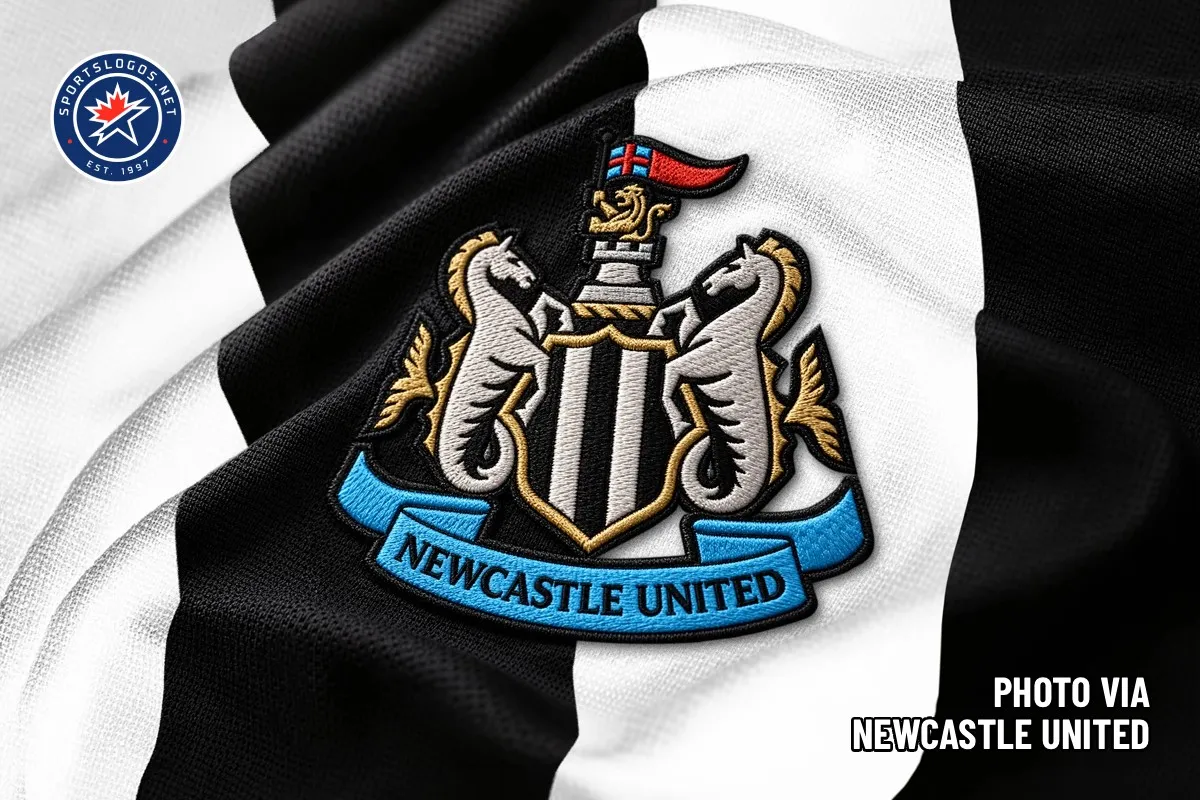
Redesigning Newcastle United’s Crest: Polishing 38 Years of Heritage Through Fan Trust After 38 years with the exact same look, Newcastle United officially unveiled a fresh new take on its iconic crest. This isn’t some wild overhaul or over-the-top redesign—it’s the awesome result of two full years of dedicated listening to the fan community.
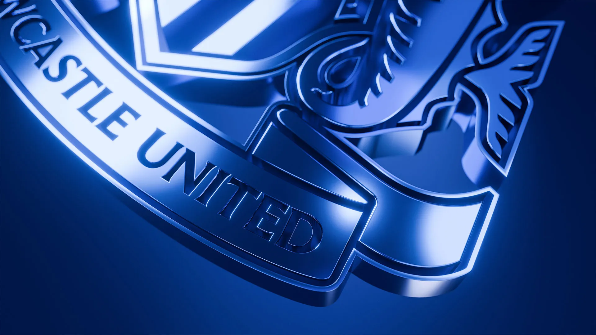
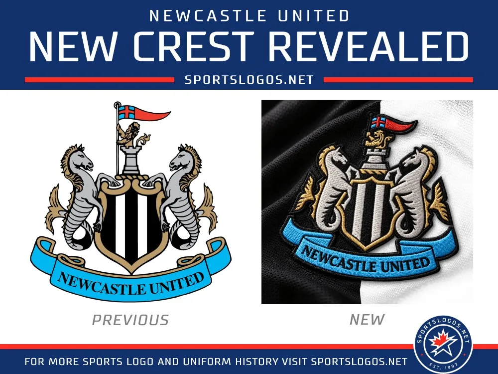
Every single beloved element that makes up the soul of the Magpies remains completely intact: from the castle, the black-and-white striped shield, and the sea-horse hippocampi, to the golden lion holding the St. George flag and the classic club ribbon. Everything just received a sleek polish with sharper, bolder vector work. The reason is super simple: 84% of surveyed supporters asked for a refined upgrade to the existing emblem rather than starting from scratch.
The design team didn’t stop at tweaking the main crest; they built out an entire brand design system, including a bespoke typeface and fresh secondary marks for long-term versatility. Take a close look at the details: the lion’s stance looks noticeably more regal, the castle geometry feels crisp and balanced, and the line weights are perfectly dialed in. Because of that, the logo stays razor-sharp and instantly recognizable, whether shrunk down to a tiny mobile favicon or scaled up on stadium signage.
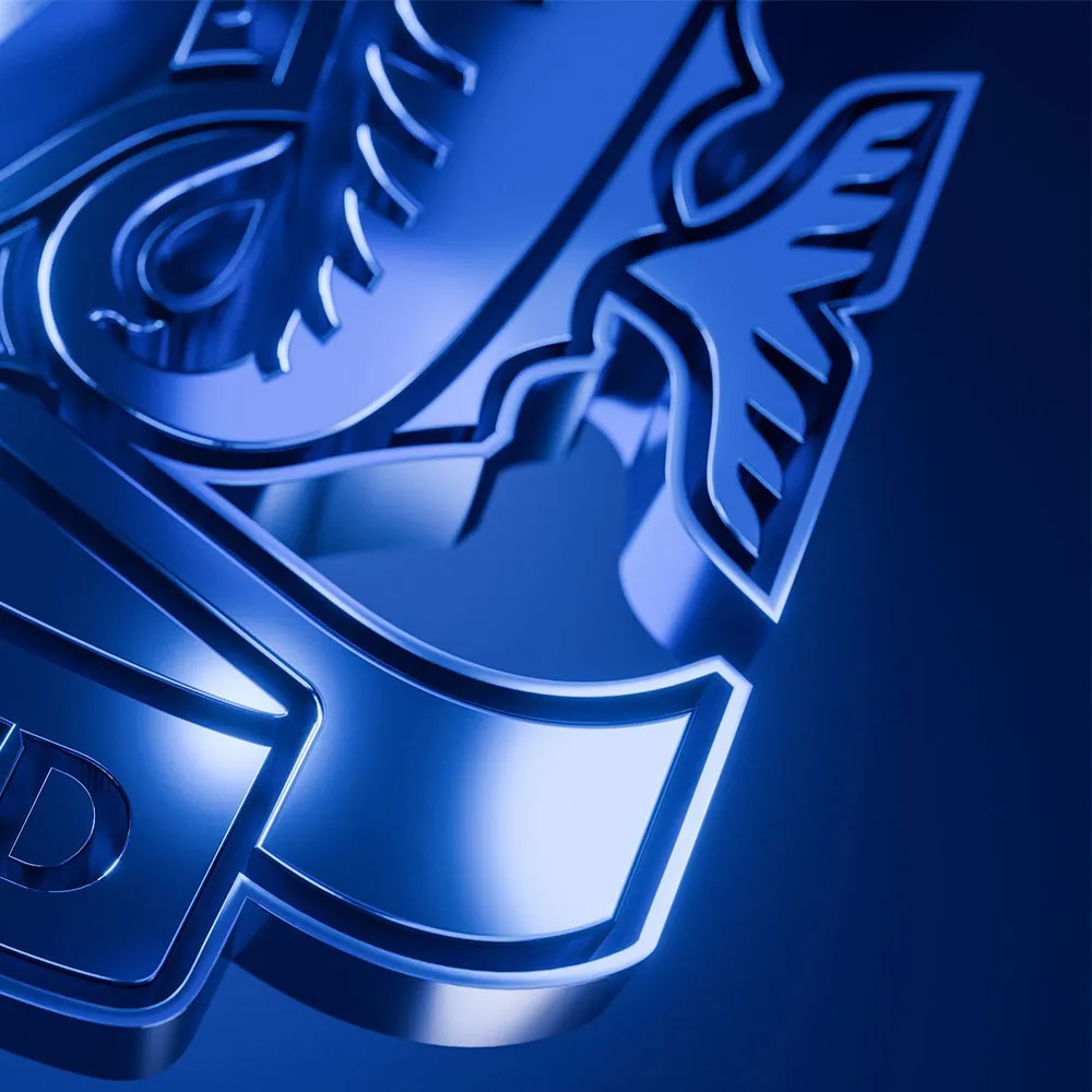
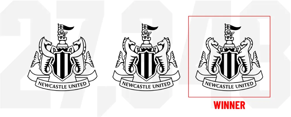
During the fan vote from August 6 to August 27, supporters chose between three final concepts. All three shared the same shield, banner, castle, and lion, differing only in the sculpting of the hippocampi. Concept C won in a landslide, taking 64.8% of the vote across 27,348 participants. This design made a splash thanks to rounder head silhouettes, a punchier mane, and beautifully subtle jaw shading.
Led by Creative Director Kenneth McIver—a die-hard Newcastle fan and Nike veteran—the project hits digital platforms right away. From there, the new crest will progressively roll out across stadium graphics and broadcasts, culminating in its official debut on match kits for the 2027/28 season.
Check out the full story behind this refreshed crest at www.creativereview.co.uk/newcastle-united-new-crest-design-brand-identity-kenneth-mciver/.
Tái thiết kế logo Newcastle United: Khi di sản 38 năm được tinh chỉnh bằng niềm tin của người hâm mộ
Sau 38 năm giữ nguyên diện mạo, Newcastle United vừa chính thức trình làng phiên bản logo mới. Đây không phải là một màn “đập đi xây lại” quá đà, mà là thành quả sau hai năm lắng nghe ý kiến tận tụy từ cộng đồng người hâm mộ.
Tất cả những chi tiết quen thuộc làm nên linh hồn của Chích Chòe đều được giữ lại trọn vẹn: từ tòa lâu đài, chiếc khiên sọc đen trắng, cặp hà mã cưỡi sóng (hippocampi), chú sư tử vàng cầm cờ St George cho đến dải ruy-băng mang tên câu lạc bộ. Mọi thứ chỉ được gọt giũa lại với nét vẽ sắc sảo, dứt khoát hơn. Lý do rất đơn giản: 84% người hâm mộ khi được khảo sát đã yêu cầu nâng cấp biểu tượng hiện tại chứ không muốn thay mới hoàn toàn.
Đội ngũ thiết kế không chỉ tinh chỉnh logo chính mà còn xây dựng cả một hệ thống nhận diện thương hiệu (design system) hoàn chỉnh, bao gồm bộ font chữ bespoke và logo phụ mới nhằm phục vụ cho các định hướng phát triển lâu dài. Nhìn kỹ vào chi tiết, tư thế của chú sư tử trông uy nghi hơn hẳn, hình khối của tòa lâu đài được cân chỉnh gọn gàng, và độ dày nét vẽ (line weights) được tối ưu hóa chuẩn xác. Nhờ vậy, logo vẫn giữ được sự rõ ràng và nhận diện tốt dù xuất hiện ở kích thước siêu nhỏ như favicon trên điện thoại hay phóng to trên biển hiệu sân vận động.
Trong cuộc trưng cầu ý kiến từ ngày 6 đến 27 tháng 8, các CĐV đã được lựa chọn giữa ba phương án cuối cùng. Cả ba đều dùng chung phần khiên, banner, lâu đài và sư tử, chỉ khác biệt ở tạo hình của cặp hà mã. Kết quả là Phương án C đã giành chiến thắng áp đảo với 64,8% lượt bình chọn từ 27.348 người tham gia. Thiết kế này gây ấn tượng nhờ phần đầu tròn trịa hơn, bờm rõ nét và phần bóng đổ dưới hàm được tiết chế tinh tế.
Dự án do Giám đốc Sáng tạo Kenneth McIver — một CĐV trung thành của đội bóng và từng làm việc tại Nike — dẫn dắt. Logo mới sẽ lập tức xuất hiện trên các nền tảng kỹ thuật số, sau đó từng bước phủ sóng ở hệ thống biển hiệu, sóng truyền hình và chính thức lên trang phục thi đấu từ mùa giải 2027/28.
Xem đầy đủ câu chuyện về chiếc logo mới này tại www.creativereview.co.uk/newcastle-united-new-crest-design-brand-identity-kenneth-mciver/.