GridType Vol. 1 by Slanted Publishers: When Digital Type Tools Step onto the Printed Page
GridType Vol. 1: Type & Tools from Karlsruhe-based Slanted Publishers is an impressive blend of open-spine editorial design and 10 experimental stencil typefaces. Every single one of these typefaces was created using grid-type.com web-based stencil generator inspired by the Plaque Découpée Universelle, a single-plate lettering stencil system dating back to the 1870s.
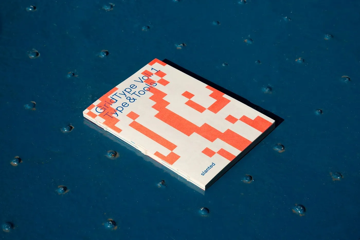
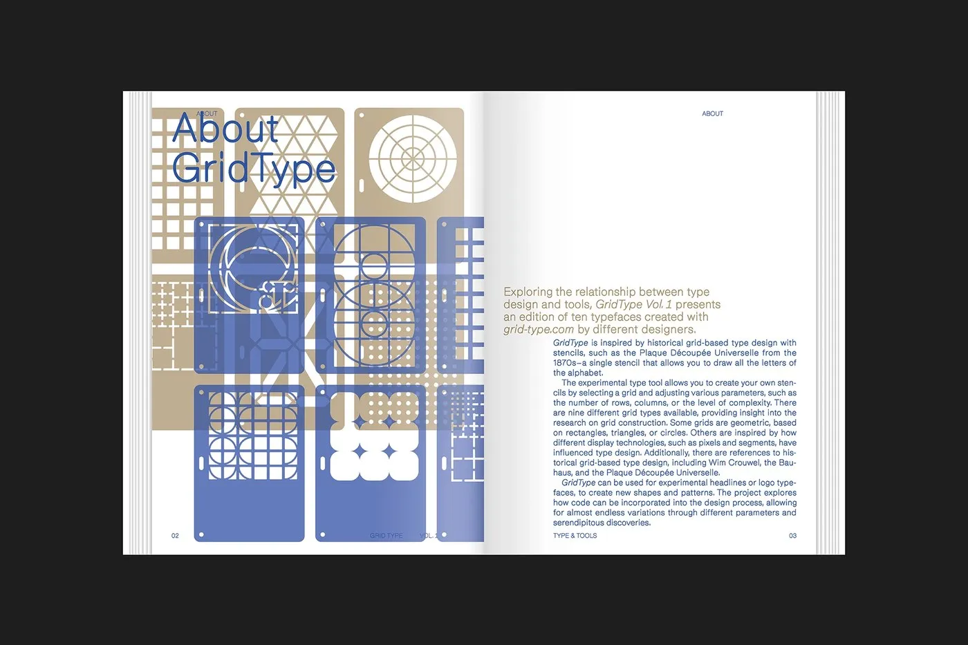
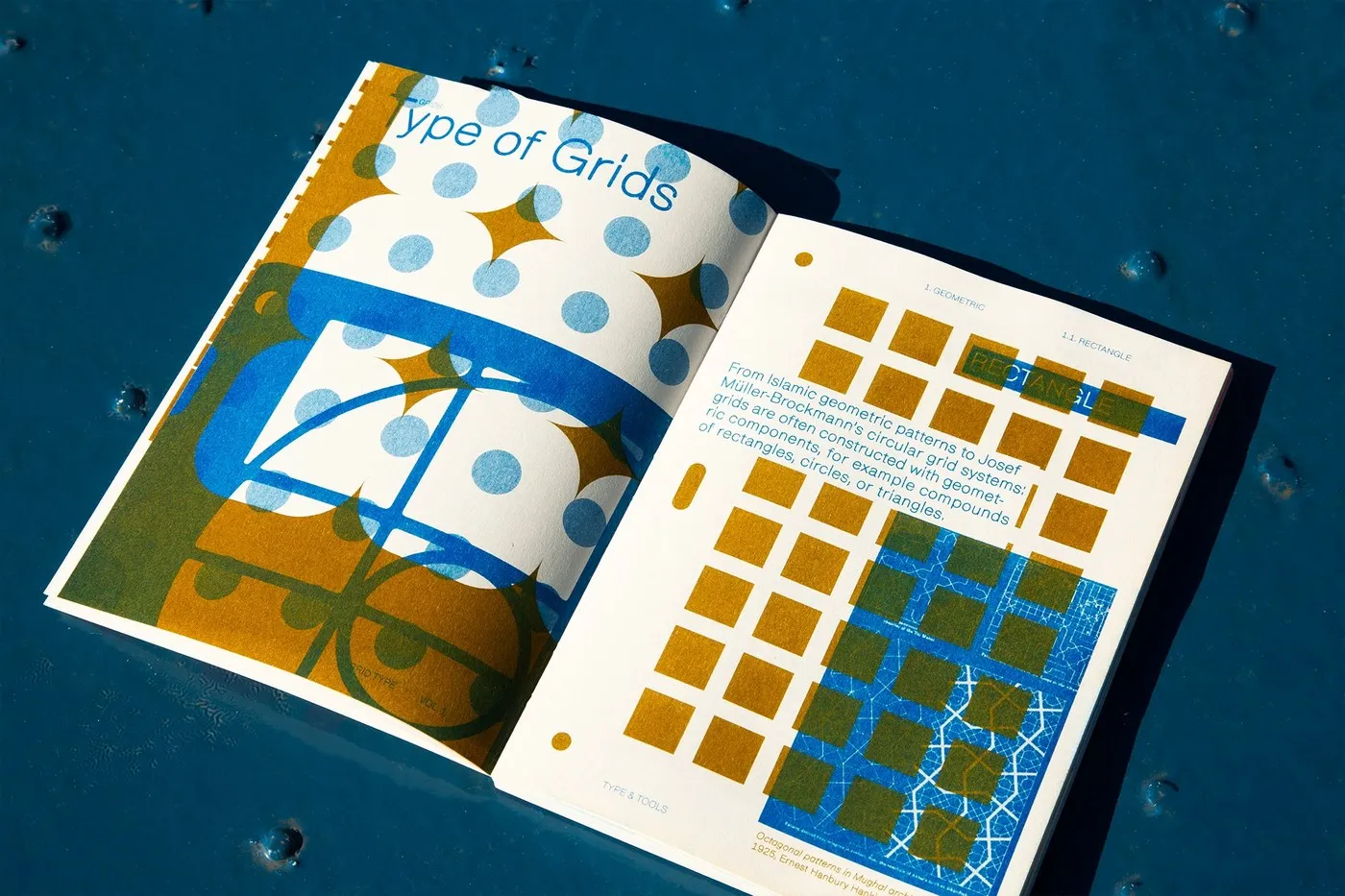
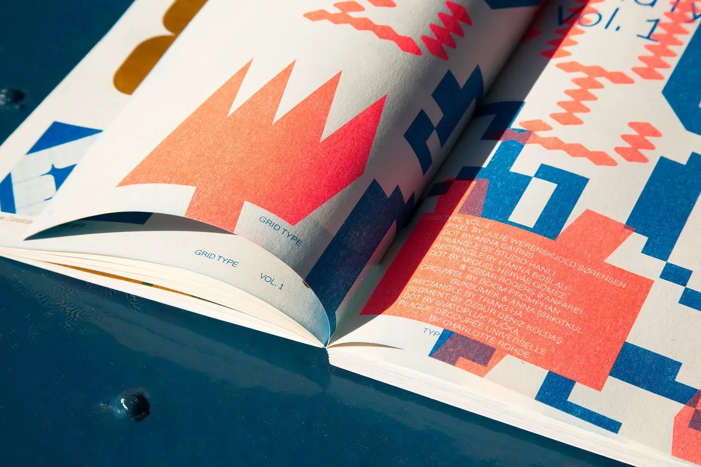
Wrapped in an uncoated paper cover, the book makes an immediate visual splash with a diagonal vermilion pixel-staircase graphic set right below the cobalt blue title. The fully exposed, thread-sewn spine allows the book to lay completely flat when opened, keeping the inner margins perfectly visible. Right on the “About GridType” page, layered stencil cards in light brown and periwinkle blue showcase nine versatile grid frameworks—ranging from rectangular, triangular, and radial matrixes to dot grids. Even though every designer worked from the exact same code-based grid setup, each resulting typeface turned out wildly distinct.
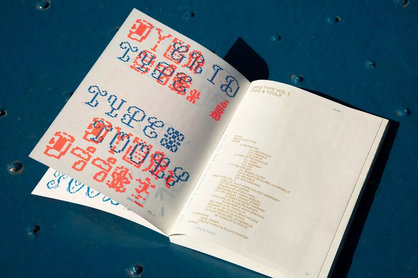
Flipping to the first page, the layout draws a crisp line between navigation elements and featured display work through clever choices in paper weight and ink opacity. Faint red and cobalt cross-stitch lettering bleeds through a thin white flyleaf, sitting right alongside an olive-inked table of contents. This contents section sets off an exciting journey connecting localized grid systems with rich typographic history—bridging Roman du Roi, the Bauhaus, and Wim Crouwel, while drawing surprising links between 1925 Mughal octagonal motifs and Josef Müller-Brockmann’s circular grids.
Diving deeper into the book leads right into dedicated showcase spreads for each featured designer:
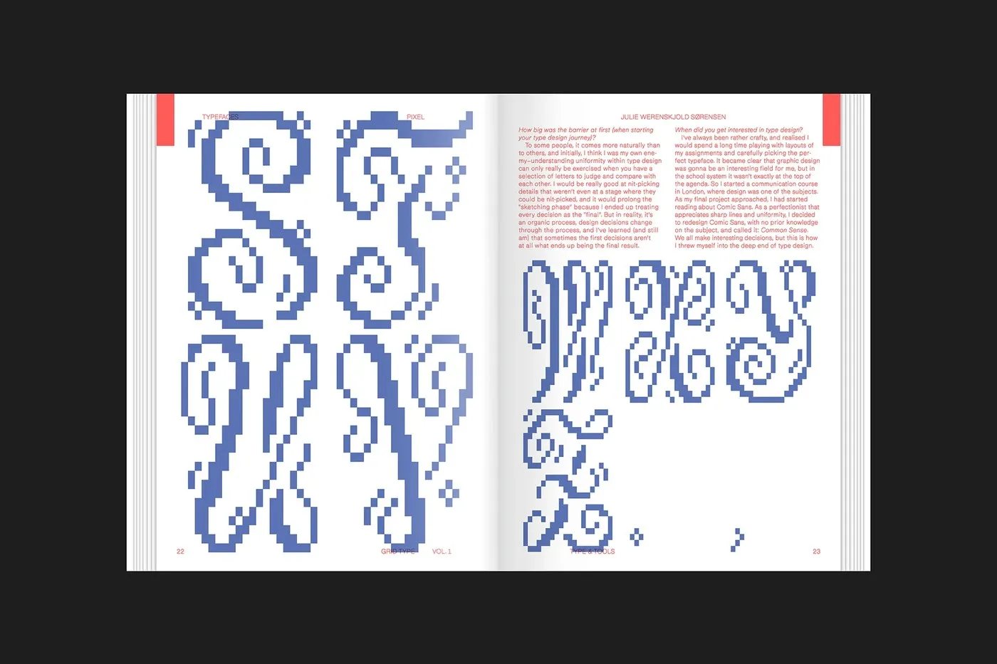
- Julie Werenskjold Sørensen (Pixel spread): Stacks calligraphic cobalt uppercase letters from S to Z using stepped pixel blocks, anchored by two red Q&A columns and full-bleed corner tabs.
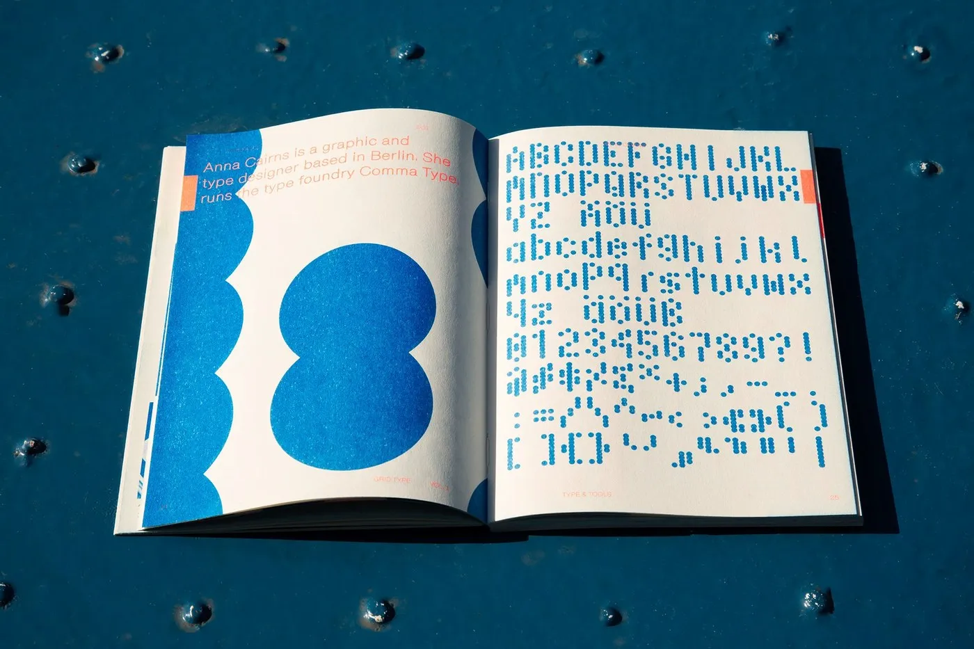
- Anna Cairns (Comma Type, Berlin): Transforms a dot matrix into a full deep blue alphabet, set right across from a cropped figure eight.
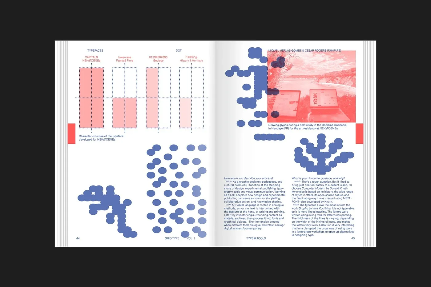
- Miquel Hervás Gómez & César Rogers (Fanfare): Displays a complete specimen of uppercase, lowercase, numerals, and punctuation within four coral dot frames crafted during an art residency in Hendaye, France. Their accompanying interview directly connects Donald Knuth’s METAFONT software with traditional letterpress printing.
Digital tool experiments might not last forever online, but Slanted Publishers’ editorial design gives these creative explorations a permanent physical home through eye-popping fluorescent coral and cobalt inks.
GridType Vol. 1 từ Slanted Publishers: Khi công cụ tạo font kỹ thuật số bước ra trang sách in
Ấn phẩm GridType Vol. 1: Type & Tools đến từ nhà xuất bản Slanted Publishers (Karlsruhe) là sự kết hợp ấn tượng giữa thiết kế editorial đóng gáy trần (open-spine) và 10 bộ typeface stencil thử nghiệm. Tất cả các bộ chữ này đều được tạo ra từ grid-type.com — một công cụ tạo stencil trên trình duyệt web lấy cảm hứng từ hệ thống thước kẻ chữ một tấm Plaque Découpée Universelle ra đời từ những năm 1870.
Bìa sách làm bằng chất liệu không tráng phủ (uncoated), tạo điểm nhấn thị giác với hình họa nấc thang pixel màu đỏ vermilion cắt chéo phía dưới dòng chữ tiêu đề màu xanh cobalt. Phần gáy sách được khâu chỉ để lộ hoàn toàn, giúp các trang sách khi mở ra có thể nằm phẳng hoàn toàn mà không bị che khuất phần mép lề bên trong. Ngay ở trang About GridType, các tấm thẻ stencil màu nâu nhạt và xanh periwinkle xếp lớp lên nhau, hé lộ 9 hệ thống lưới (grid) linh hoạt từ ma trận hình chữ nhật, hình tam giác, hướng tâm đến các chấm tròn. Dù sử dụng chung một tập lệnh code để thiết lập khung lưới, kết quả tạo hình cho từng bộ chữ lại hoàn toàn biệt lập.
Lật mở trang đầu tiên, phần thiết kế dàn trang đã phân tách rõ rệt giữa điều hướng (navigation) và tác phẩm trưng bày (display work) thông qua định lượng giấy và sắc độ mực: chữ thêu chữ thập sắc đỏ và cobalt in faint xuyên qua trang lót (flyleaf) mỏng màu trắng, đặt cạnh trang mục lục in màu olive. Phần mục lục này mở ra hành trình kết nối giữa các hệ thống grid địa phương và lịch sử typography, từ Roman du Roi, Bauhaus cho đến Wim Crouwel, hay mối liên hệ giữa hoa văn bát giác Mughal năm 1925 với hệ thống lưới tròn của Josef Müller-Brockmann.
Đi sâu vào nội dung là không gian trình diễn của từng nhà thiết kế:
- Julie Werenskjold Sørensen (Pixel spread): Xếp chồng các ký tự in hoa cobalt theo phong cách calligraphic từ S đến Z bằng các ô vuông giật cấp, được cố định bởi hai cột Q&A màu đỏ cùng các tab góc tràn bệ.
- Anna Cairns (Comma Type, Berlin): Biến đổi ma trận điểm (Dot matrix) thành bảng chữ cái sắc xanh hoàn chỉnh, đặt đối diện với hình số tám cắt cúp.
- Miquel Hervás Gómez & César Rogers (Fanfare): Dàn trang đầy đủ chữ in hoa, chữ thường, chữ số và dấu câu bên trong 4 khung chấm màu san hô được vẽ trong thời gian lưu trú nghệ thuật ở Hendaye, Pháp. Bài phỏng vấn đi kèm của họ kết nối trực tiếp phần mềm METAFONT của Donald Knuth với kỹ thuật in letterpress truyền thống.
Những trải nghiệm trên công cụ số có thể không tồn tại mãi mãi, nhưng thiết kế editorial của Slanted Publishers đã mang lại giá trị lưu trữ vật lý cho các thử nghiệm này thông qua những trang in mực huỳnh quang san hô và cobalt bắt mắt.