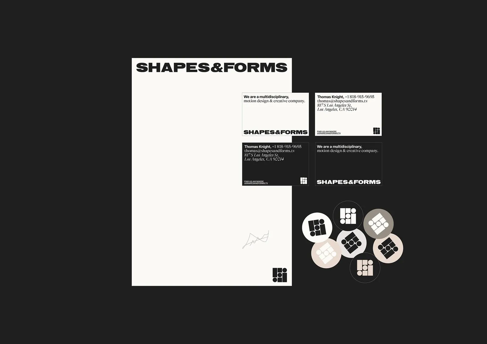
Florian Cornut’s Brand Identity Design for Shapes & Forms Take a look at the stationery flat lay for Shapes & Forms, and the first thing that stands out is pure polish and sophistication. Resting right in the center is a soft cream letterhead, surrounded by four matte charcoal and cream business cards for producer Thomas Knight at 817 S Los Angeles St, along with seven circular die-cut stickers in warm taupe, cream, and black. It’s a delightfully subtle and tactile starting point.
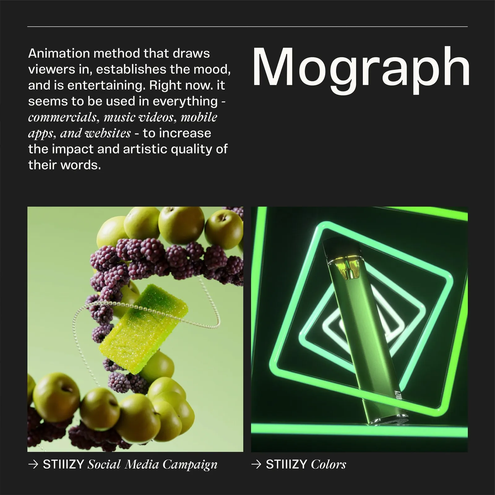
Creative Director Florian Cornut built this system between March and June 2023 alongside Brand Director Byron Regej, Casey Leigh Jordan, and Katelin Perry. Created for a multidisciplinary motion studio based in Los Angeles, New York, and Medellín, the branding doesn’t try to compete with client showreels for heavy hitters like the NFL, Super Bowl, Netflix, Hanacure, or Stiiizy. Instead, it delivers a sleek, architectural framework crafted straight out of Illustrator and InDesign.
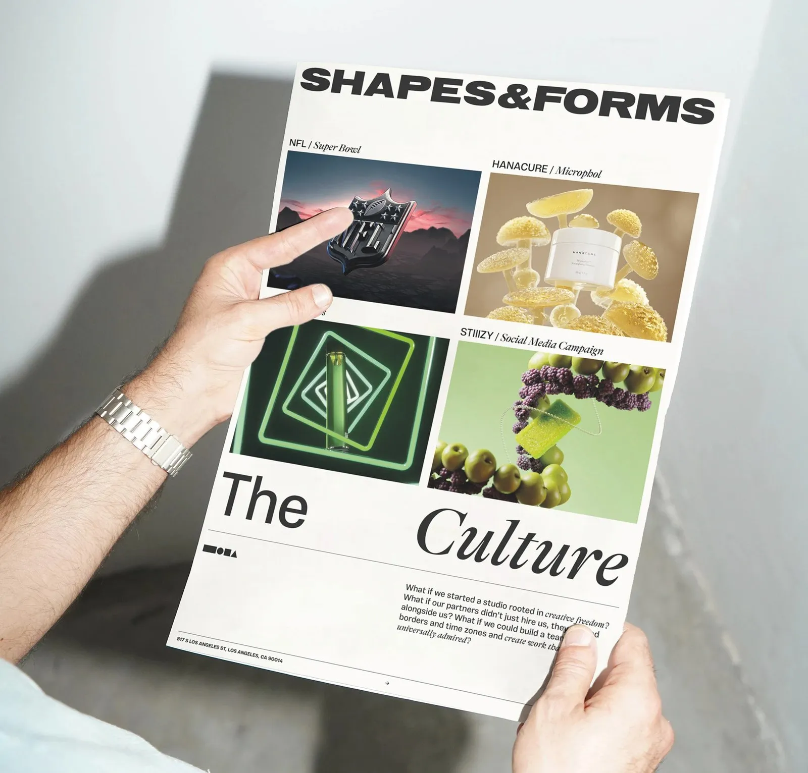
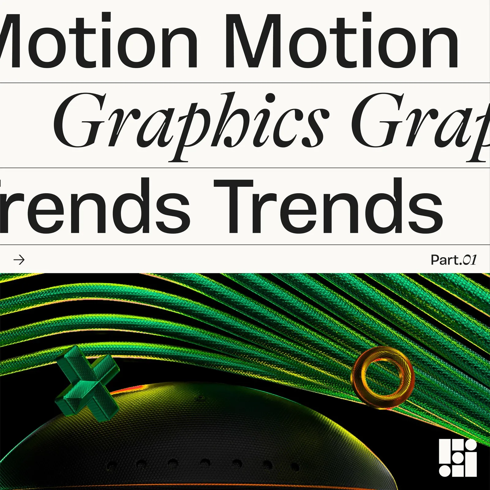
The typographic system blends two totally distinct styles. Plau Design’s wide grotesk typeface, Vinila, anchors the main wordmark and large headlines, while GT Alpina Fine Italic from Grilli Type injects a sharp, editorial flair. That contrast pops on the broadsheet spread and square Motion Graphics Trends cards, where bold, uppercase sans-serif lettering plays off delicate italic serifs. Everything runs smoothly on a 3×3 modular grid made of circles, squares, and vertical bars—a neat homage to keyframes and timeless layout proportions.
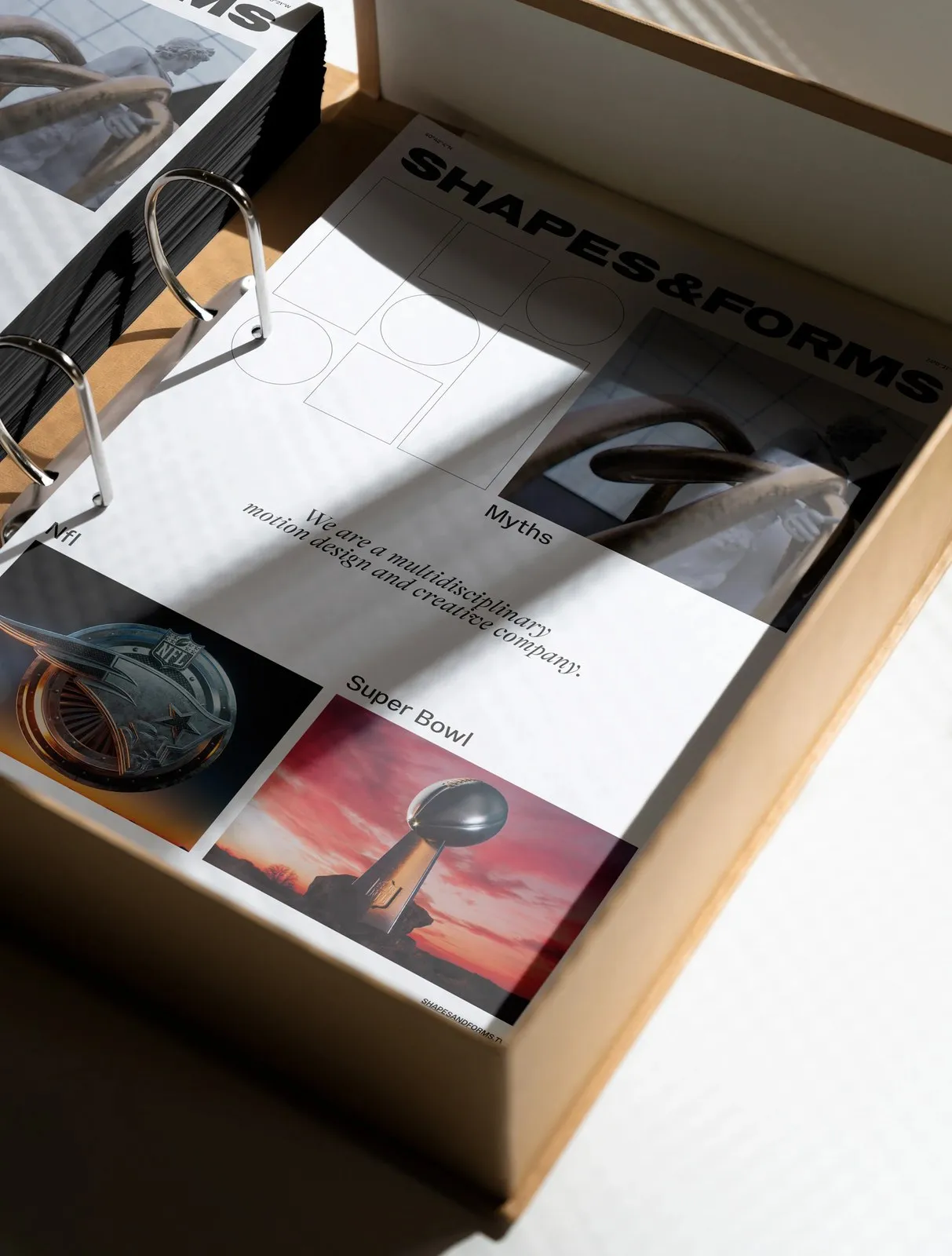
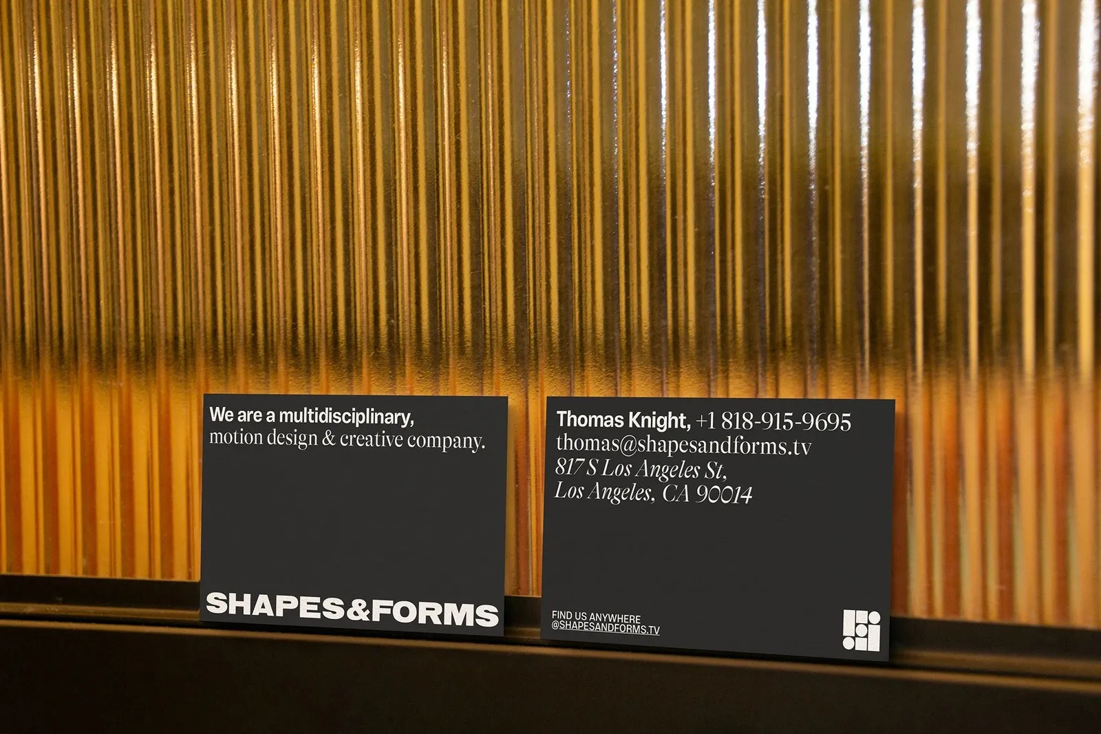
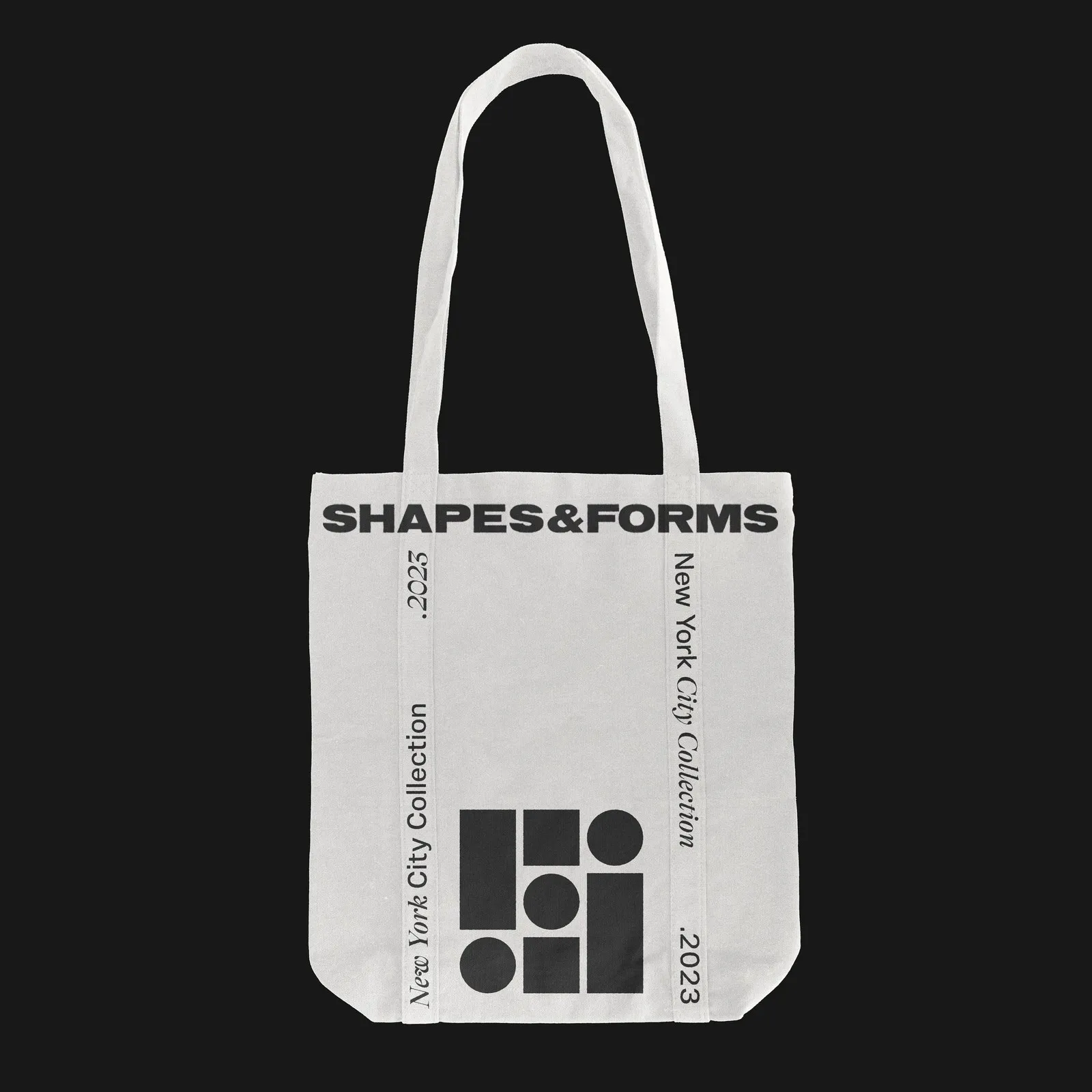
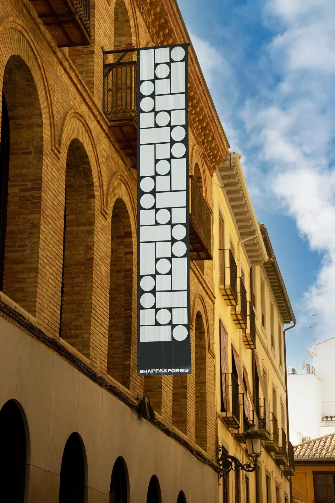
The physical touchpoints are just as carefully considered. A spiral-bound brandbook sits snug inside a raw cardboard storage box stamped with New York coordinates and wireframe diagrams. Next to it, matte black business cards sit against ribbed amber glass, a massive storefront banner brings fundamental shapes to an architectural scale, and a canvas tote bag sports running vertical text for the New York City collection. Every detail feels intentional, balanced, and purpose-driven.
Check out more work over on www.behance.net/FlorianCornut or explore the full project showcase on www.behance.net/gallery/179814569/Shapes-Forms-Branding-Visual-Identity-UIUX.
Thiết kế hệ thống nhận diện thương hiệu Shapes & Forms của Florian Cornut
Nhìn vào bức ảnh flat lay bộ văn phòng phẩm của Shapes & Forms, ấn tượng đầu tiên đến từ sự chỉn chu và tinh tế. Một tờ letterhead màu kem nhạt nằm ở trung tâm, xung quanh là bốn tấm business card màu than nhám và kem dành cho producer Thomas Knight tại địa chỉ 817 S Los Angeles St, cùng bảy chiếc sticker cắt hình tròn mang tông màu taupe ấm, kem và đen. Một điểm bắt đầu nhẹ nhàng và đầy tính xúc giác.
Giám đốc sáng tạo Florian Cornut đã xây dựng hệ thống này từ tháng 3 đến tháng 6 năm 2023 cùng giám đốc thương hiệu Byron Regej, Casey Leigh Jordan và Katelin Perry. Dự án dành cho một công ty motion đa ngành hoạt động tại Los Angeles, New York và Medellín. Vì studio này thường xuyên làm việc với các thương hiệu lớn như NFL, Super Bowl, Netflix, Hanacure hay Stiiizy, bộ nhận diện không cố giành sự chú ý với các reel sản phẩm của khách hàng. Thay vào đó, nó mang lại một khung cấu trúc mang tính kiến trúc tối giản được tạo nên từ Illustrator và InDesign.
Hệ thống chữ của dự án là sự kết hợp giữa hai phong cách khác biệt. Phông grotesk nét rộng Vinila từ Plau Design đảm nhận phần wordmark chính và các tiêu đề lớn, trong khi phông GT Alpina Fine Italic của Grilli Type mang đến nét điểm nhấn sắc sảo kiểu editorial. Sự tương phản này hiện rõ trên ấn phẩm broadsheet và các thẻ Motion Graphics Trends hình vuông, nơi các dòng chữ sans-serif in hoa dày dặn xen kẽ với nét serif nghiêng mảnh mai. Tất cả cùng vận hành trên bộ lưới 3×3 cấu thành từ hình tròn, hình vuông và thanh dọc — gợi nhớ đến keyframe và các tỉ lệ bố cục quen thuộc.
Yếu tố sản xuất thực tế cũng được trau chuốt tỉ mỉ. Cuốn brandbook đóng gáy lò xo nằm gọn trong hộp lưu trữ bằng carton thô in tọa độ New York cùng bản vẽ wireframe. Bên cạnh đó là business card màu đen nhám đặt cạnh lớp kính gân màu hổ phách, banner đen cỡ lớn ở mặt tiền tái hiện các hình khối cơ bản ở quy mô kiến trúc, cùng chiếc túi tote vải canvas mang dòng chữ chạy dọc cho bộ sưu tập New York City. Mọi chi tiết đều vừa đủ và thể hiện rõ mục đích thiết kế.
Bạn có thể xem thêm các sản phẩm khác từ www.behance.net/FlorianCornut hoặc theo dõi đầy đủ dự án trên www.behance.net/gallery/179814569/Shapes-Forms-Branding-Visual-Identity-UIUX.