A Unique Living Brand Identity by CLEVER°FRANKE for ADC
Design studio CLEVER°FRANKE just created a mind-blowing living brand identity for ADC, built from generative mathematical patterns, optimized by a custom AI model, and fine-tuned with human feedback. This standout project even took home Gold in the Brand Identity, Complete Systems category at the 2026 European Design Awards.
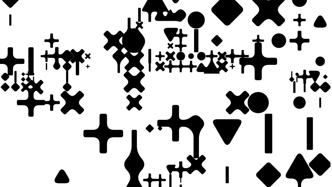
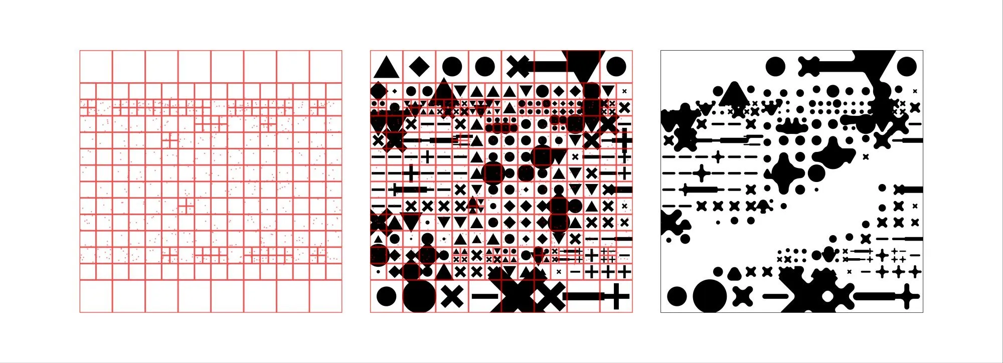
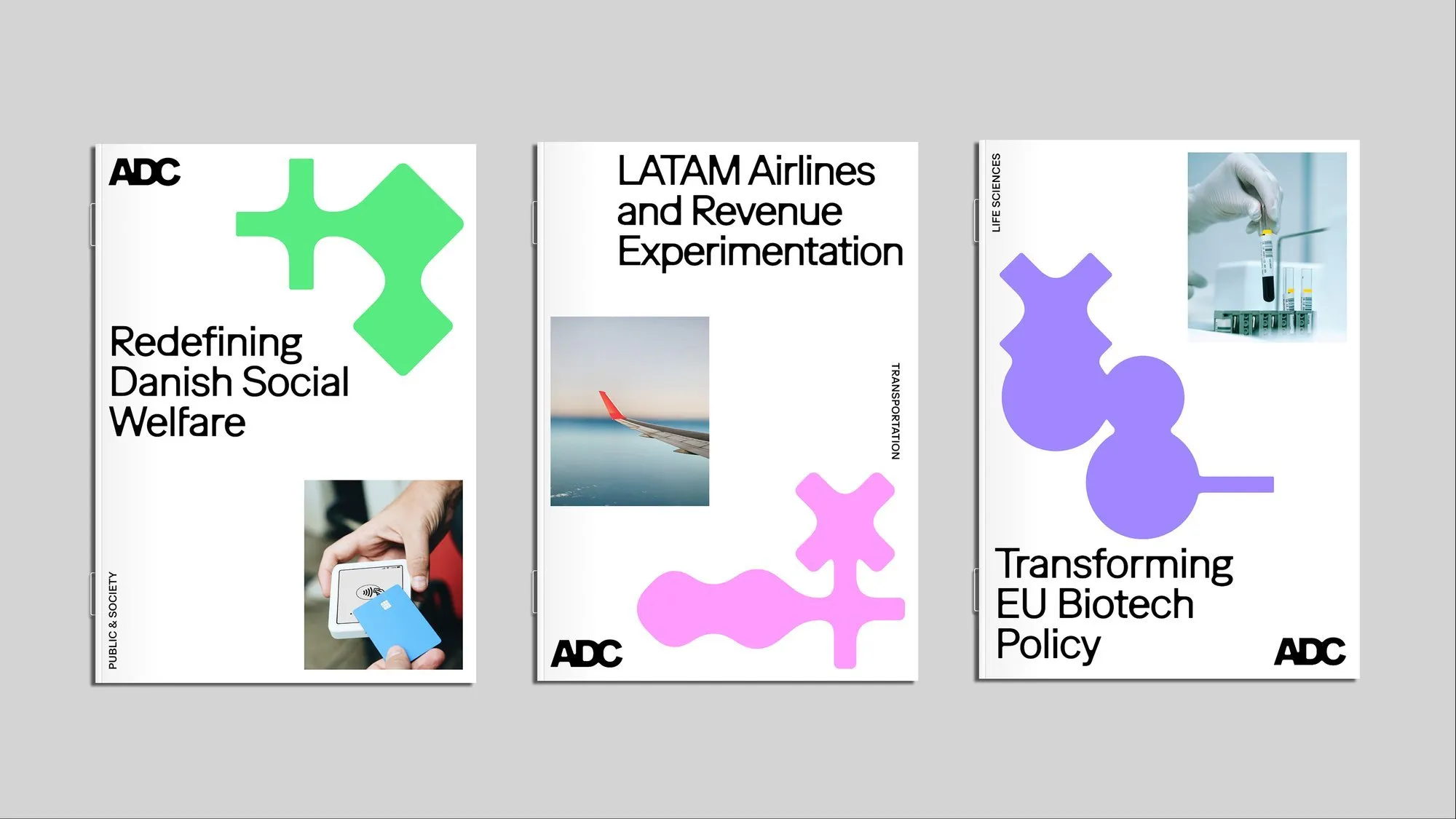
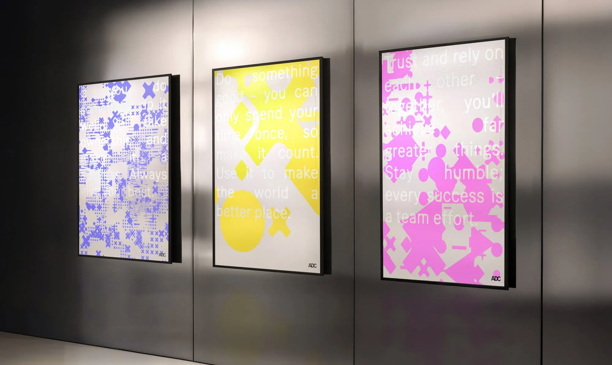
The foundation of this system starts with familiar mathematical operators like plus signs, multiplication crosses, dots, dashes, triangles, and diamonds. As they group and arrange based on density and proximity, they blend together into compositions that feel surprisingly organic while staying purely algorithmic. An underlying quadtree structure keeps every output sharing the same visual rhythm while staying totally unique. Meanwhile, the logo stays grounded in sleek black or white to stand strong against the constantly moving background patterns.
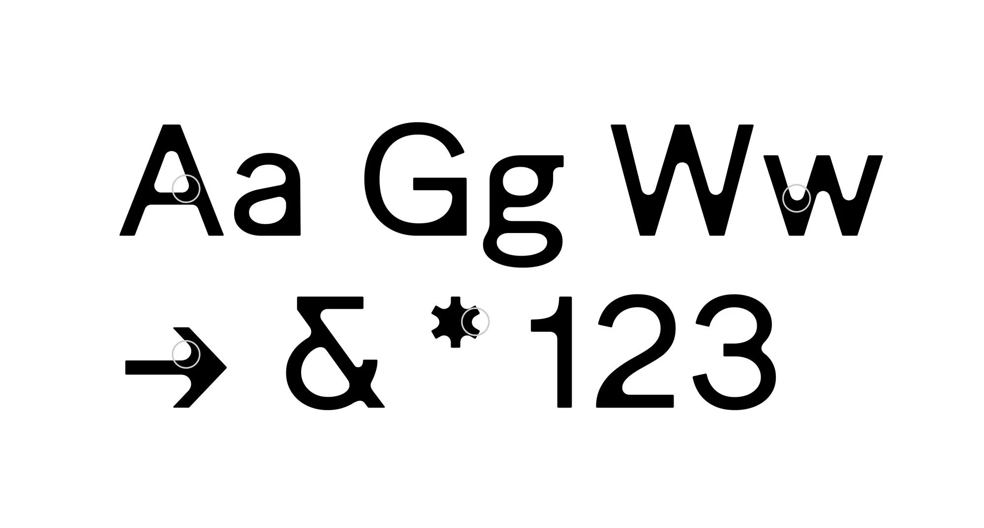
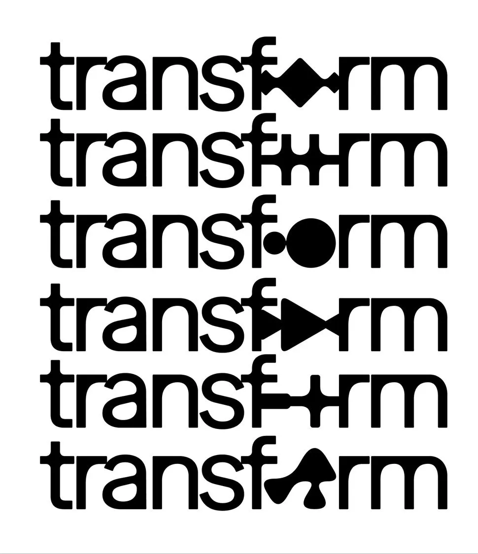
For the typography, the studio selected the font Ease from Studio Feixen. It sits right on the edge between clear structure and expressive freedom, giving a cool nod to the latent space in AI models. Combining technical credibility with a warm human feel, Ease helps everything from report covers to bold headlines speak in a consistent voice. The wordmark and type specimen tie together into one seamless system, rather than just dropping a logo on top of decorative artwork.
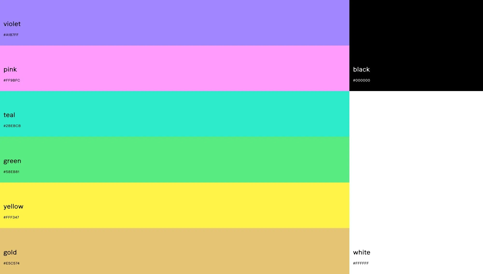
The project’s vibrant color palette breaks away from typical dark tech tropes, bringing in fresh tones like violet #A187FF, pink #FF9BFC, teal #2BEBCB, green #58EB81, yellow #FFF347, and gold #E5C574, with black and white reserved strictly for the logo. These colors shift dynamically across each generative pattern, making sure every asset—from financial reports to conference slide decks—feels cohesive yet distinctly unique.
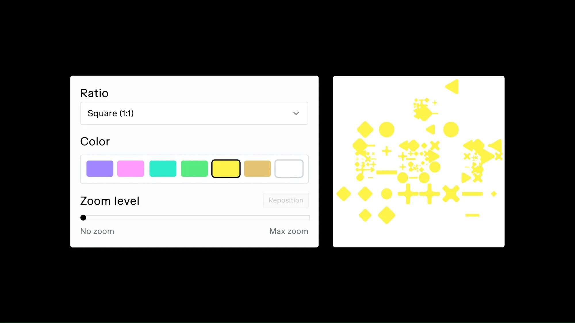
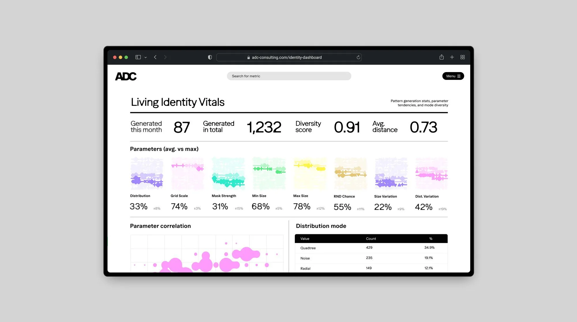
Behind the system is a generative engine driven by over 50 parameters, paired with a custom AI model trained on more than 100 data points reflecting ADC’s work, values, and people. Through a web tool, users simply type in a project description to map data into ADC’s embedding space, prompting the system to suggest three close pattern variations. Selecting a favorite option feeds that choice back into the model to refine future outputs. This entire workflow is tracked in real time on a “brand vitality dashboard,” recording 87 patterns generated in a single month, totaling 1,232 patterns with a diversity score of 0.91.
More details on this amazing project by www.cleverfranke.com/project/adc-brand-identity/toolkit/creative-strategy-%26-positioning are available on Behance.
Bộ nhận diện thương hiệu động độc đáo từ CLEVER°FRANKE dành cho ADC
Studio thiết kế CLEVER°FRANKE vừa tạo nên một bộ nhận diện thương hiệu động (living brand identity) cực kỳ ấn tượng cho ADC, được phát triển từ các họa tiết toán học generative, tối ưu bằng mô hình AI và hoàn thiện nhờ phản hồi từ con người. Dự án xuất sắc giành giải Vàng ở hạng mục Brand Identity, Complete Systems tại European Design Awards 2026.
Điểm xuất phát của hệ thống thiết kế này là những toán tử toán học quen thuộc như dấu cộng, dấu nhân, chấm tròn, gạch ngang, hình tam giác hay hình thoi. Khi được gom nhóm và sắp xếp dựa trên mật độ cũng như khoảng cách, chúng hòa quyện vào nhau tạo nên các bố cục vừa mang tính thuật toán vừa có nét hữu cơ tự nhiên. Cấu trúc quadtree ẩn bên dưới giúp mọi biến thể đầu ra đều giữ được nhịp điệu chung dù không hề trùng lặp. Trong khi đó, phần logo chỉ sử dụng hai màu đen hoặc trắng để luôn vững vàng trên nền các họa tiết chuyển động không ngừng.
Về typography, studio lựa chọn phông chữ Ease từ Studio Feixen. Đây là phông chữ nằm ở ranh giới giữa cấu trúc rõ ràng và sự tự do biểu cảm, gợi liên tưởng tới không gian ẩn (latent space) trong các mô hình AI. Nhờ sự kết hợp giữa tính kỹ thuật lẫn nét ấm áp, Ease giúp các thiết kế từ trang bìa báo cáo đến tiêu đề đều thể hiện chung một giọng nói đồng nhất. Phần wordmark và type specimen gắn kết chặt chẽ thành một hệ thống liền mạch chứ không đơn thuần là đặt logo lên trên phần trang trí.
Bảng màu của dự án tạo nên bước phá cách so với phong cách thiết kế công nghệ u tối thường thấy, sử dụng các tông màu tươi tắn như tím #A187FF, hồng #FF9BFC, xanh teal #2BEBCB, xanh lá #58EB81, vàng #FFF347 và vàng kim #E5C574, cùng hai màu đen trắng dành riêng cho logo. Các gam màu này dịch chuyển linh hoạt qua từng họa tiết generative. Nhờ vậy, từ một báo cáo tài chính cho đến slide thuyết trình hội thảo đều có sự liên kết thương hiệu mà vẫn giữ nét độc đáo riêng.
Đằng sau hệ thống là một công cụ generative vận hành bởi hơn 50 tham số, kết hợp cùng mô hình AI tùy chỉnh được huấn luyện từ hơn 100 dữ liệu về công việc, giá trị và con người của ADC. Thông qua công cụ trên web, người dùng chỉ cần nhập mô tả dự án để đưa dữ liệu vào không gian biểu diễn (embedding space) của ADC, hệ thống sẽ gợi ý 3 biến thể họa tiết gần nhất. Khi người dùng chọn ra phương án yêu thích, lựa chọn đó sẽ tiếp tục nạp lại vào mô hình để hoàn thiện các kết quả trong tương lai. Toàn bộ hoạt động này được theo dõi thời gian thực qua bảng điều khiển “brand vitality dashboard”, ghi nhận 87 họa tiết được tạo trong tháng, đạt tổng cộng 1.232 họa tiết cùng chỉ số đa dạng lên tới 0.91.
Bạn có thể xem thêm thông tin về dự án này của www.cleverfranke.com/project/adc-brand-identity/toolkit/creative-strategy-%26-positioning trên Behance.