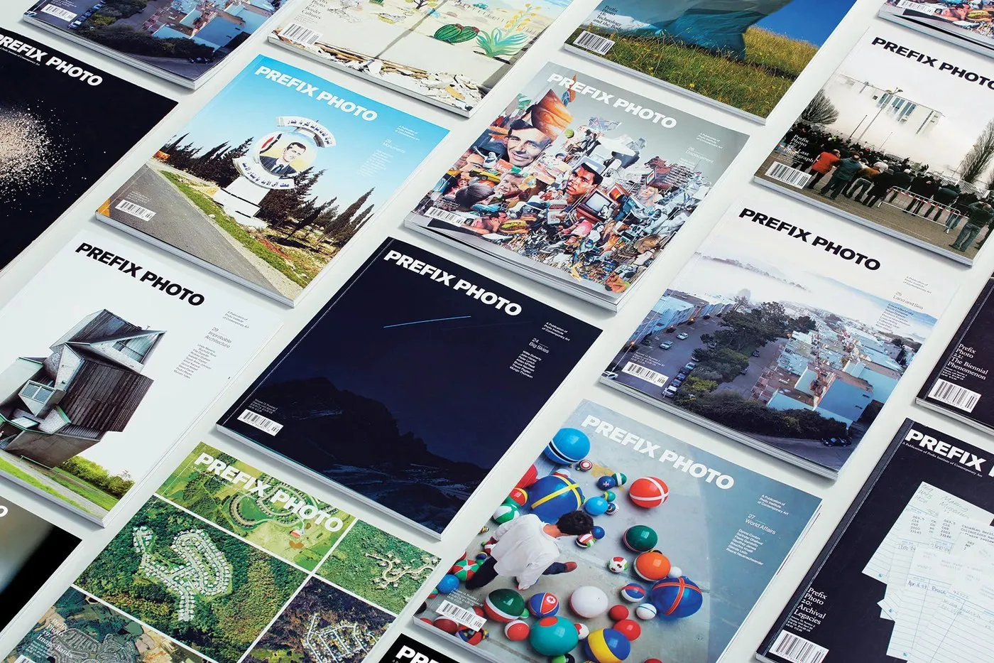
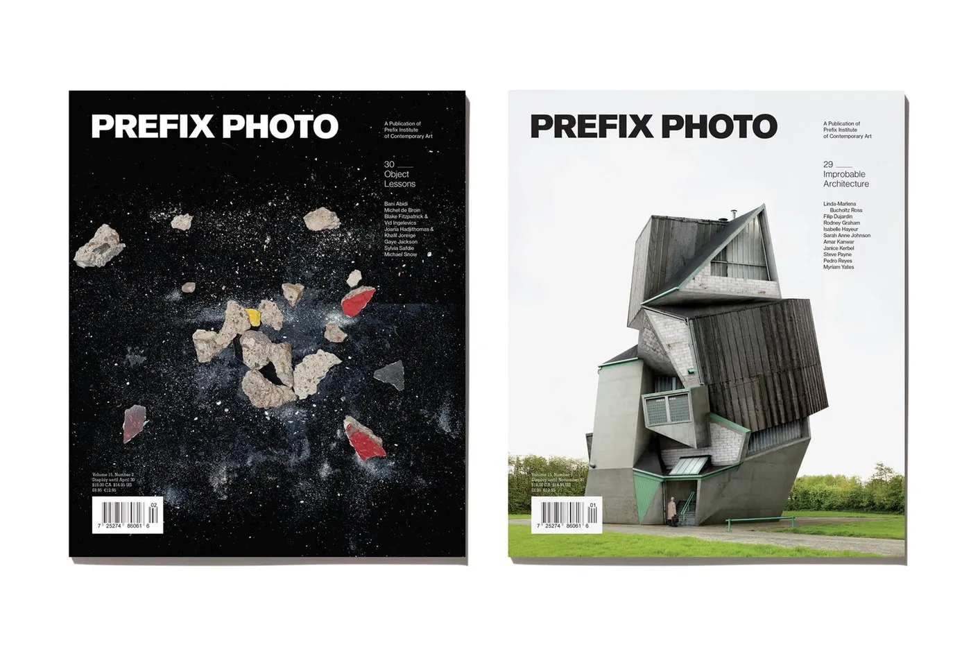
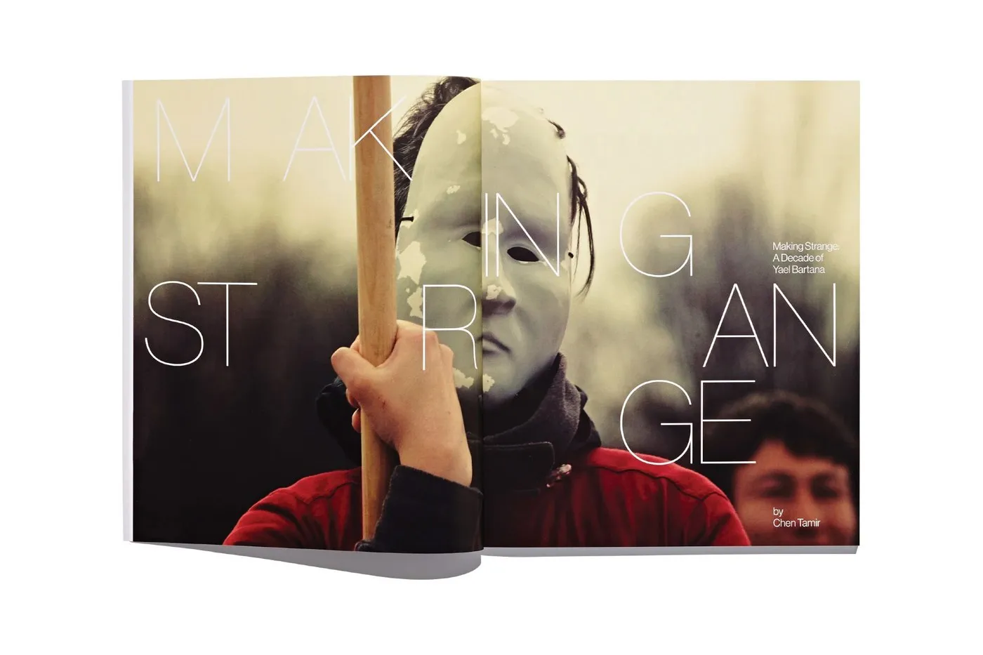
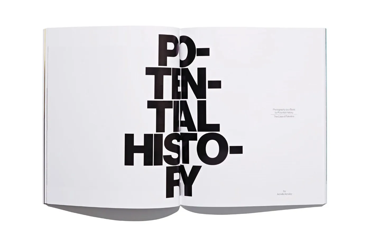
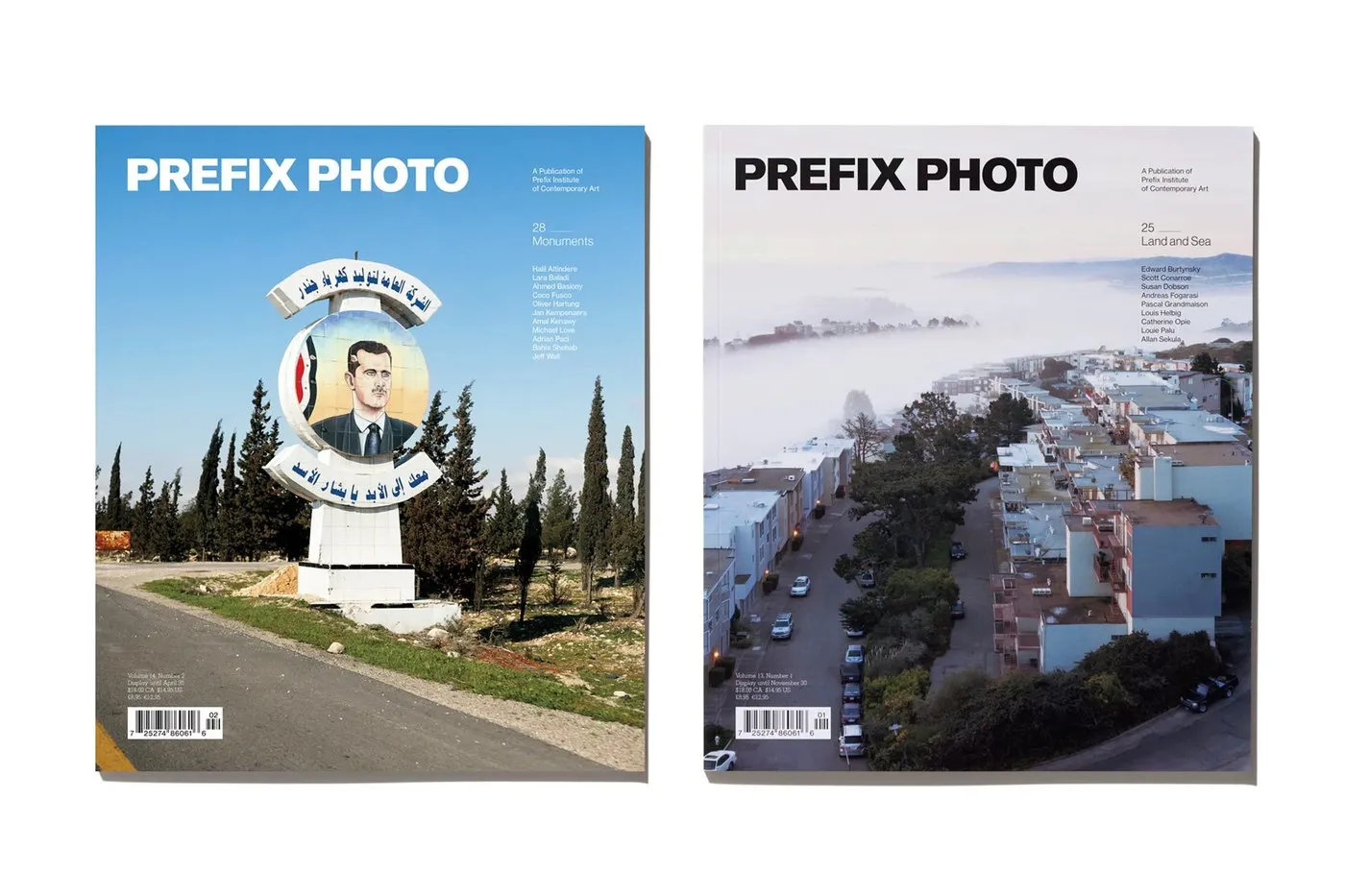
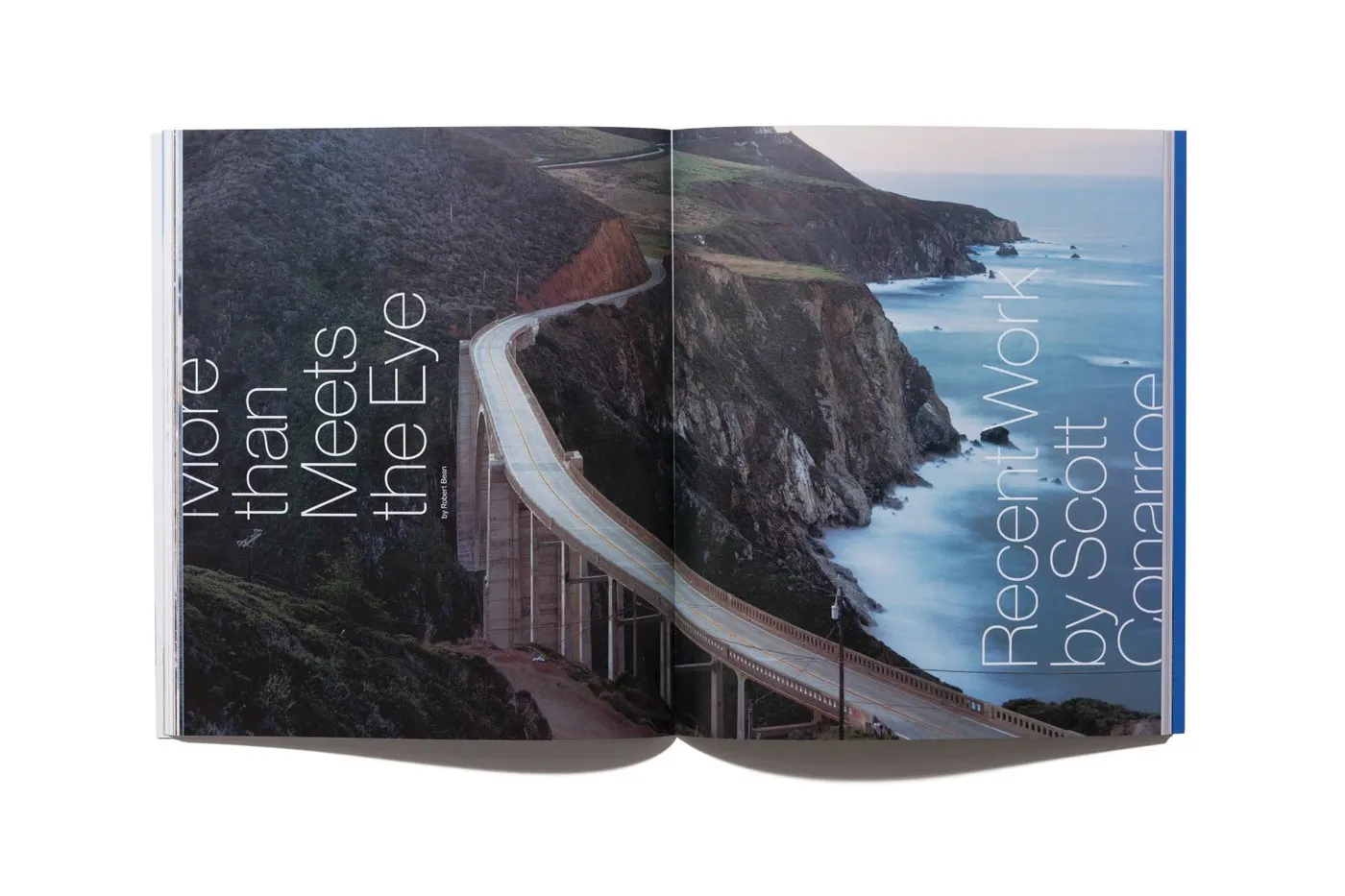
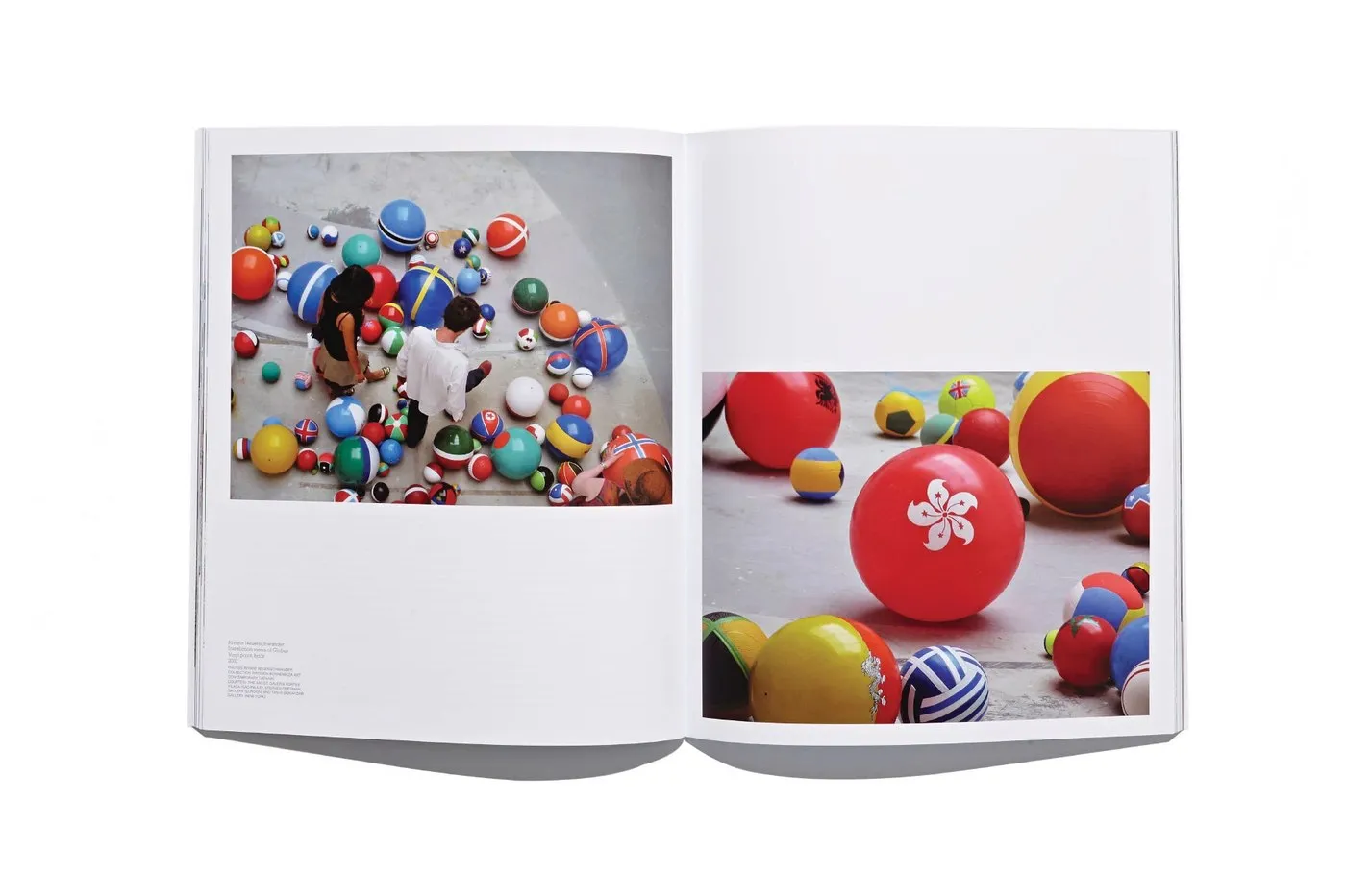
Prefix Photo Magazine: The Art of Editorial Layout and Print Craft from Underline Studio For over a decade, Toronto’s Underline Studio has been shaping the visual identity of Prefix Photo, an international magazine published by the Prefix Institute of Contemporary Art. The publication showcases Canadian and international photography through critical essays and visual portfolios. Rather than treating layout as a passive container for content, the studio developed a thoughtful editorial design system that feels like a curated gallery exhibition.
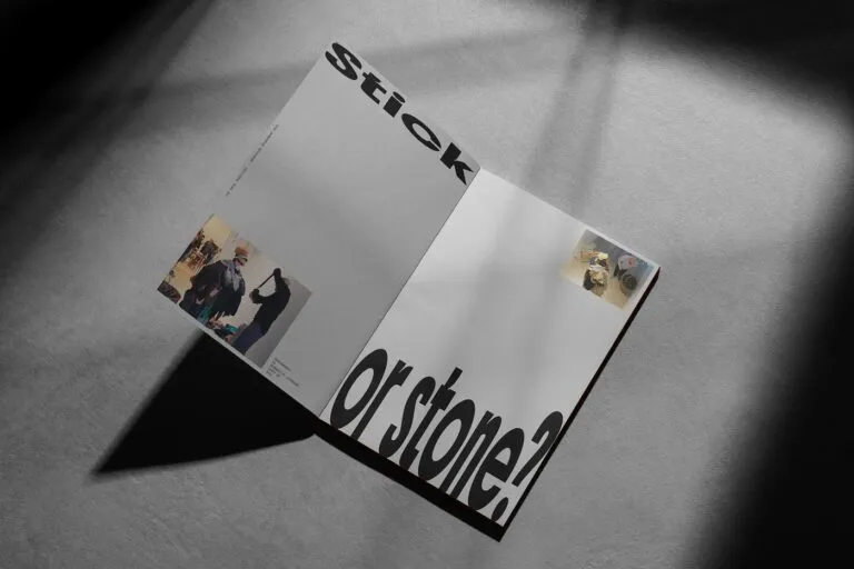
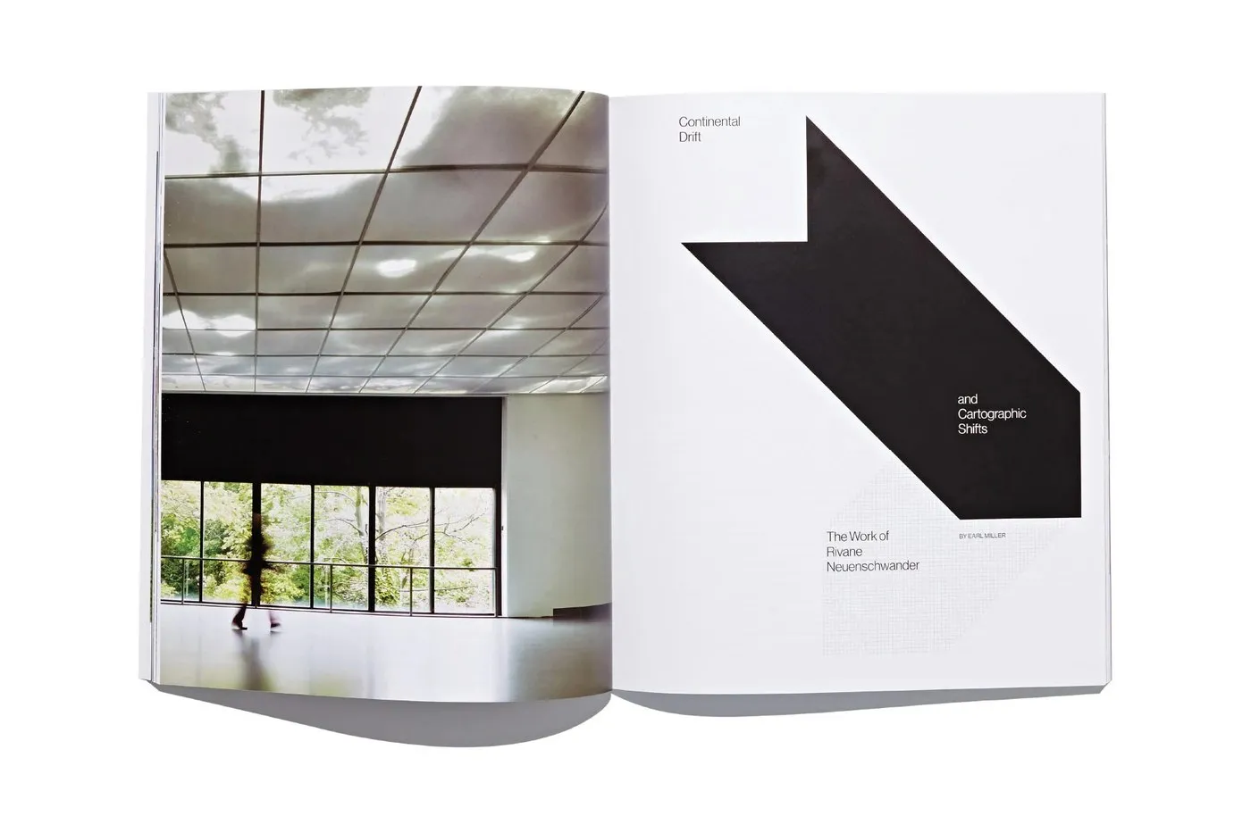
Striking full-bleed photos sit alongside carefully calculated white space, while deep black ink anchors text columns against bright paper. Every spread creates a smooth rhythm between quiet breathing room and visual impact, keeping the photography center stage without any unnecessary graphic clutter.
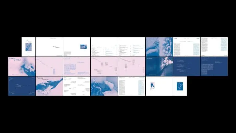
A Layout System Built for Contemporary Photography Underneath it all, a subtle layout grid keeps a wide range of photo styles and articles neatly organized. Underline Studio uses an asymmetric column structure that adapts effortlessly whether featuring long-form essays or brief critique pieces. Delicate serif running headers pair with page numbers tucked neatly into the outer margins, giving the top of each page plenty of room to breathe. Image captions stay grounded in a fixed bottom margin so they never encroach on the artwork. The result? A clear, natural reading experience that guides the eye effortlessly. Instead of relying on oversized typography to grab attention, the design shines through precise letter-spacing and compact line-spacing.
Print production plays a massive role in elevating the entire experience. Printed on heavyweight uncoated paper, the pages eliminate glare while keeping halftone dots sharp and ink depths rich. Spot varnish touches on select photo prints add a delightful tactile contrast between matte text surfaces and sleek images. On top of that, thread-sewn binding allows the magazine to lay completely flat across double-page spreads, protecting every detail from getting lost in the gutter. Underline Studio proves how a consistent editorial design philosophy can turn a regular periodical into a prized keepsake.
Check out the full project details on www.behance.net/gallery/37032143/Prefix-Photo-Magazine.
Tạp chí Prefix Photo: Nghệ thuật dàn trang và xử lý in ấn từ Underline Studio
Hơn một thập kỷ qua, Underline Studio – một thiết kế studio tại Toronto – đã đảm nhận vai trò định hình nhận diện thị giác cho Prefix Photo, tạp chí quốc tế do Prefix Institute of Contemporary Art phát hành. Ấn phẩm là nơi giới thiệu các tác phẩm nhiếp ảnh Canada lẫn quốc tế thông qua những bài luận phê bình và bộ sưu tập ảnh. Thay vì xem bố cục dàn trang như một chiếc hộp chứa nội dung thụ động, studio chọn cách phát triển một hệ thống editorial design chỉn chu, mang tinh thần tuyển chọn như trong một triển lãm nghệ thuật.
Những trang ảnh tràn lề (full-bleed) được xếp xen kẽ với các khoảng lề trắng được tính toán kỹ lưỡng. Sắc mực đen đậm giúp các cột chữ đứng vững trên nền giấy sáng. Mọi trang đôi đều tạo ra nhịp điệu nhịp nhàng giữa khoảng lặng và điểm nhấn thị giác, giúp tác phẩm nhiếp ảnh giữ vị trí trung tâm mà không bị nhiễu bởi các yếu tố đồ họa thừa thãi.
Hệ thống dàn trang cho nội dung nhiếp ảnh hiện đại
Hệ thống grid ẩn đằng sau đóng vai trò giữ trật tự cho nhiều phong cách nhiếp ảnh và bài viết khác nhau. Underline Studio áp dụng cấu trúc cột bất đối xứng (asymmetric column structure), dễ dàng tùy biến cho cả bài luận dài lẫn các đoạn phê bình ngắn. Phần running header dùng chữ serif mảnh dẻ đi cùng số trang (folio) nằm gọn ở lề ngoài, tạo khoảng thở dễ chịu cho mép trên trang sách. Phần chú thích ảnh (captions) được đưa về vùng lề dưới cố định để không cắt lấn vào khung hình. Nhờ vậy, thị giác người đọc được định hướng rõ ràng mà không tạo cảm giác gượng ép. Thay vì dùng font chữ cỡ lớn gây chú ý, thiết kế ưu tiên điều chỉnh khoảng cách chữ (tracking) chuẩn xác và khoảng cách dòng (tight leading) cô đọng.
Chất liệu in ấn cũng góp phần hoàn thiện trải nghiệm đọc trên từng trang giấy. Tạp chí sử dụng giấy không phủ (uncoated paper) định lượng dày để hạn chế chói sáng, đồng thời giữ độ sắc nét cho hạt tràm (halftone) và độ sâu của mực. Việc áp dụng lớp phủ bóng cục bộ (spot varnish) ở một số bản in ảnh tạo nên sự chuyển biến xúc giác thú vị giữa bề mặt chữ nhám và bề mặt hình ảnh. Bên cạnh đó, gáy sách may chỉ (thread-sewn binding) cho phép tạp chí mở phẳng hoàn toàn trên các trang đôi, tránh tình trạng mất chi tiết hình ảnh ở phần gáy (gutter loss). Underline Studio đã chứng minh rằng một tư duy editorial design nhất quán có thể biến một ấn phẩm định kỳ thành một sản phẩm đáng lưu giữ.
Xem chi tiết dự án tại www.behance.net/gallery/37032143/Prefix-Photo-Magazine.