
An Impressive Brand Identity System for EllisDon by Underline Studio Strategic branding and design shop Underline Studio took on the challenge of refreshing the visual communications system for EllisDon, a global construction and infrastructure building powerhouse. Handling over $3.5 billion in annual contracts is no small feat, so the big design challenge was clear: showcase the specialized expertise of each operational division in a way that feels polished, super sharp, and totally accessible.
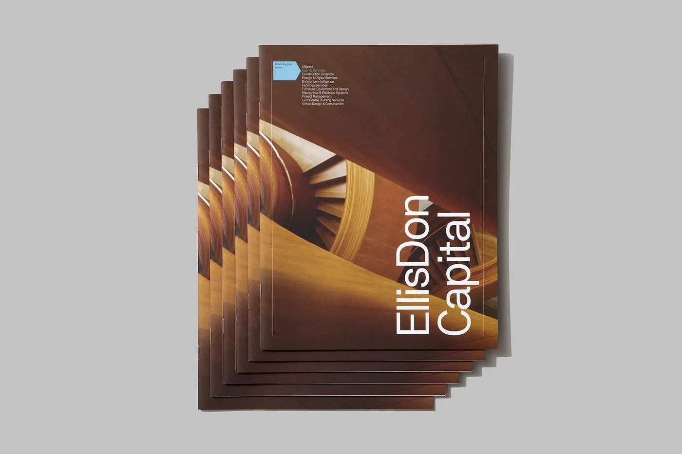
The studio’s solution? A tightly structured print framework, kicking off with the EllisDon Capital division. The visual standout lies in the slick contrast between high-contrast architectural photography and generous amounts of crisp white space. Right on the cover, eye-catching imagery like swirling timber curves and elevated transit corridors makes an immediate statement. Paired with bold vertical headers and pop-out cerulean blue callout tags, the layout smoothly guides the reader’s eye without feeling cluttered. Thanks to this smart design strategy, complex service offerings like financial advisory and public-private partnerships (P3) become effortlessly intuitive and easy to digest.
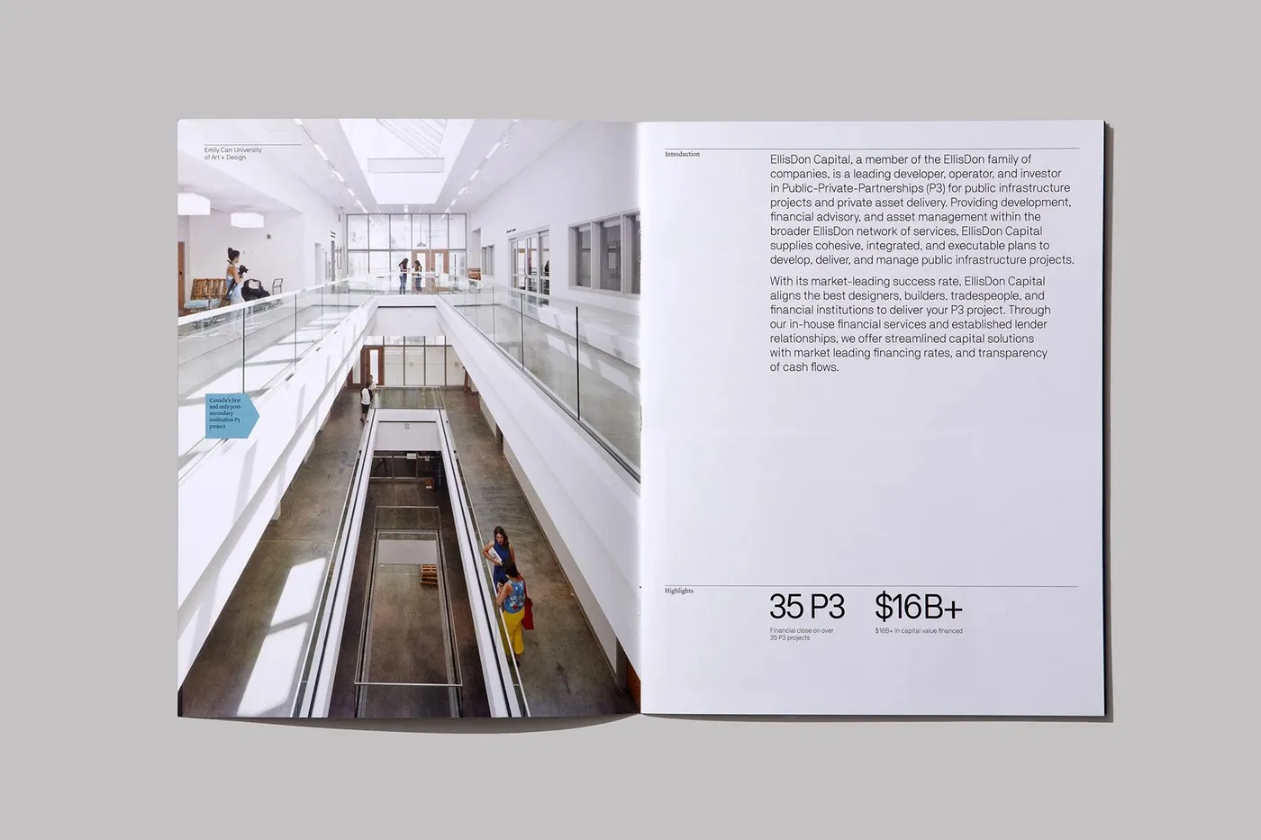
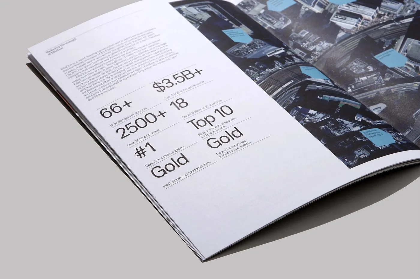
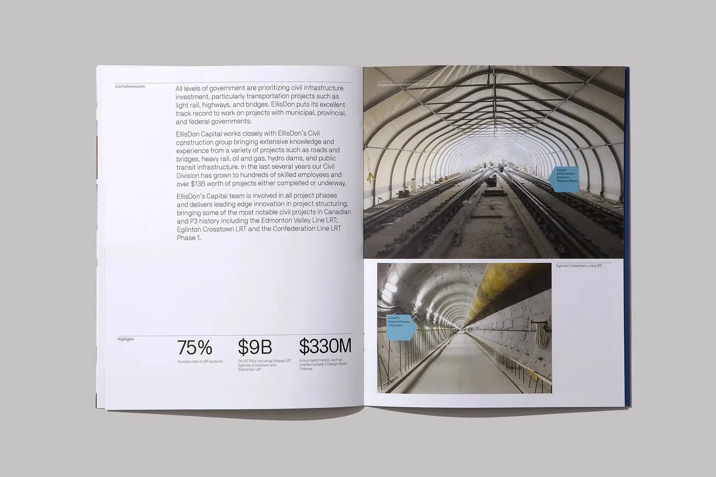
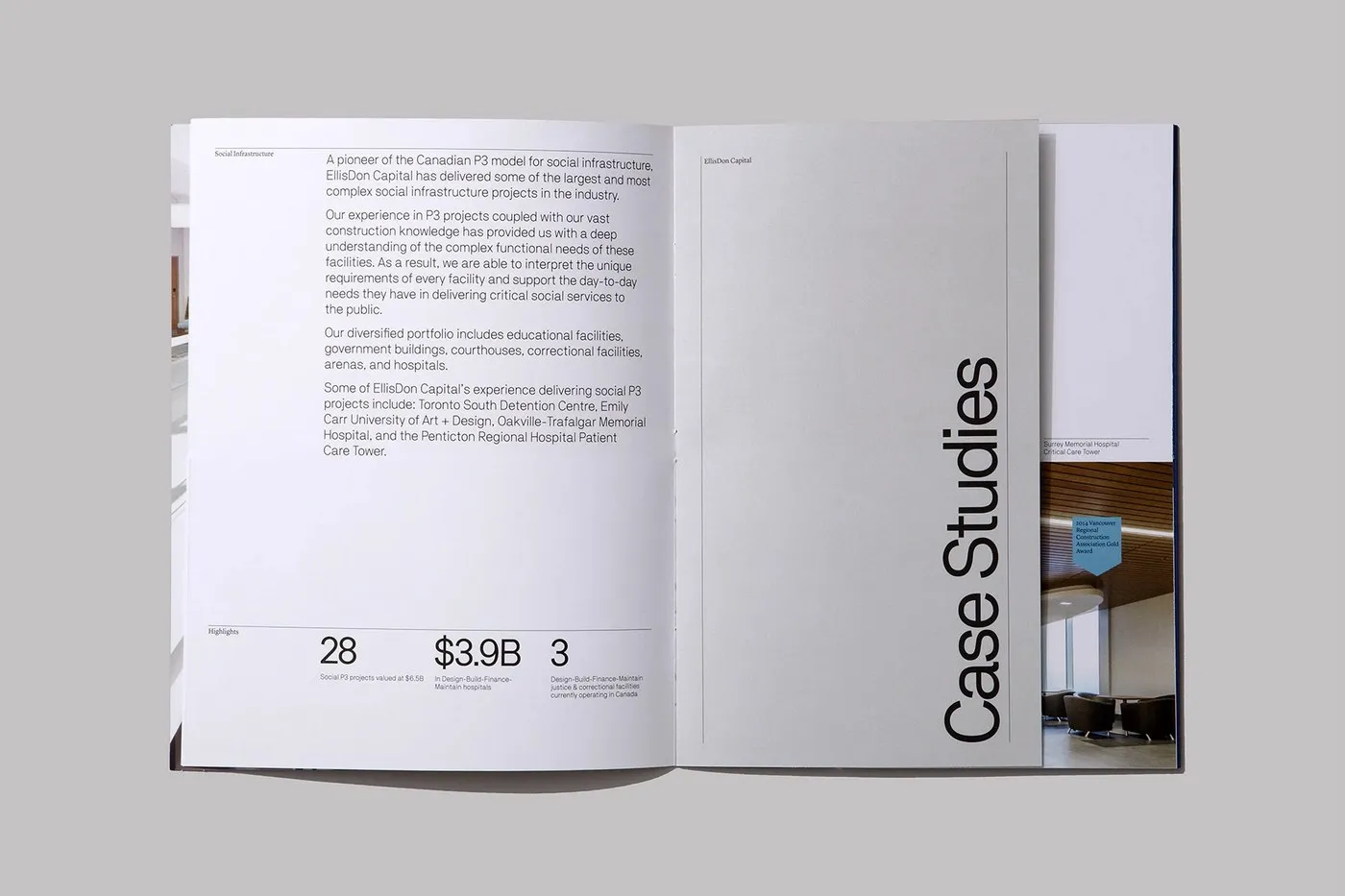
Step inside, and a carefully calculated asymmetrical grid architecture balances dense technical data with generous, airy margins. Underline Studio mapped out every spread using precise baseline alignment, pairing clean categories like “Civil Infrastructure” and “Social Infrastructure” with punchy data callouts. Eye-popping numbers like “35 P3” and “$16B+” serve as strong visual anchors near the bottom, resting right beneath delicate hairline rules.
One of the coolest design highlights is the clever use of a stepped insert system. Narrower divider pages featuring vertical “Case Studies” type peek over to reveal project photography underneath, giving readers a super engaging, tab-style navigation feel as they flip through the print piece.
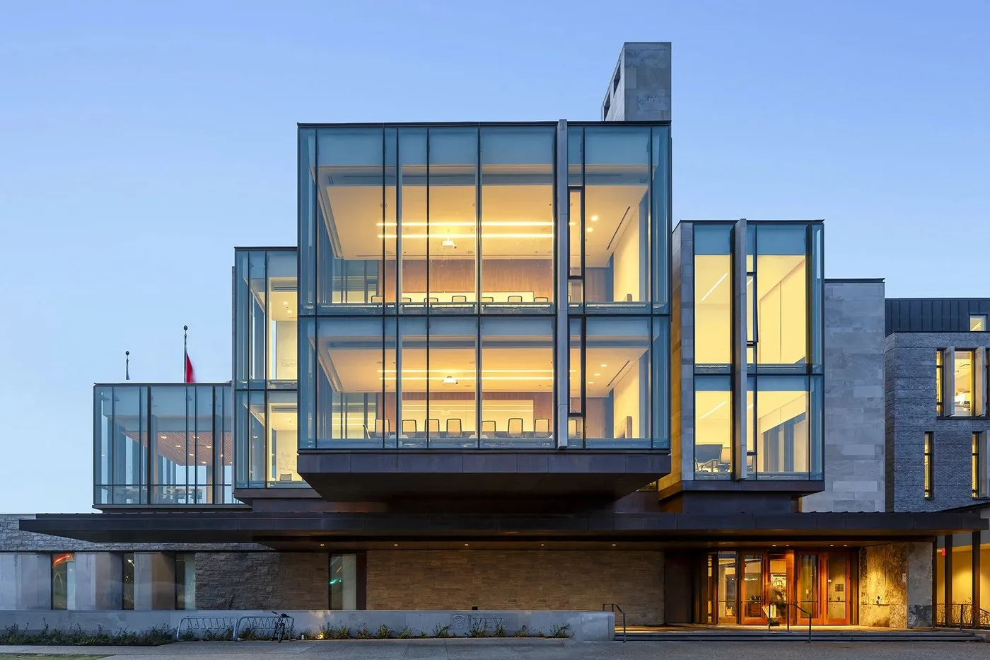
The print materials themselves were carefully chosen to reflect the precision and durability of civil engineering. Printed on smooth uncoated paper stock, the brochures crisp up every design detail, deep shadow, and vivid full-bleed project photo—featuring landmark projects like the Emily Carr University of Art + Design and the Richard Ivey Building. Steering clear of tired corporate tropes, Underline Studio leaned into disciplined Swiss typography and a modular template system, setting a fresh, timeless benchmark for branding in the construction and infrastructure sector.
Check out the full branding project on www.behance.net/gallery/73346725/EllisDon.
Hệ thống nhận diện thương hiệu ấn tượng cho EllisDon từ Underline Studio
Underline Studio, một studio thiết kế chiến lược và thương hiệu, đã thực hiện dự án làm mới hệ thống truyền thông thị giác cho EllisDon — tập đoàn xây dựng và dịch vụ hạ tầng toàn cầu. Với quy mô thực hiện các hợp đồng trị giá hơn 3,5 tỷ USD mỗi năm, thách thức đặt ra là làm sao để thể hiện rõ năng lực chuyên môn của từng bộ phận vận hành một cách vừa chỉn chu, vừa dễ tiếp cận.
Giải pháp của studio là xây dựng một khuôn mẫu ấn phẩm in ấn cực kỳ chặt chẽ, mở màn với phân nhánh EllisDon Capital. Điểm nhấn thị giác nằm ở sự đối lập đầy tinh tế giữa nhiếp ảnh kiến trúc có độ tương phản cao và những khoảng trắng cực kỳ rộng rãi. Ngay từ phần bìa, hình ảnh những đường xoắn gỗ hay hành lang giao thông trên cao đã tạo ấn tượng mạnh, kết hợp cùng kiểu chữ tiêu đề đặt theo chiều dọc và các thẻ ghi chú màu xanh cerulean nổi bật giúp điều hướng mắt người đọc mà không gây cảm giác rối rắm. Nhờ chiến lược thiết kế bài bản này, những mảng dịch vụ phức tạp như tư vấn tài chính hay hợp tác công tư (P3) đều trở nên trực quan và dễ hiểu hơn rất nhiều.
Bước vào bên trong, cấu trúc lưới (grid architecture) bất đối xứng được tính toán kỹ lưỡng để cân bằng giữa lượng dữ liệu kỹ thuật dày đặc và các khoảng lề đọc thoáng đãng. Underline Studio sắp xếp từng trang đôi dựa trên căn chỉnh đường cơ sở (baseline) chuẩn xác, kết hợp các mục phân loại rõ ràng như “Civil Infrastructure” hay “Social Infrastructure” với những con số dữ liệu được làm nổi bật. Các con số ấn tượng như “35 P3” hay “$16B+” đóng vai trò làm điểm tựa thị giác ở góc dưới, ngay phía dưới đường kẻ ngang (hairline rule) mảnh mai.
Một điểm sáng tạo vô cùng đắt giá trong hệ thống thiết kế này là việc áp dụng các trang chèn dạng giật cấp (stepped insert systems). Những tờ phân cách hẹp hơn với dòng chữ “Case Studies” xếp dọc sẽ để lộ ra hình ảnh dự án bên dưới, tạo nên trải nghiệm lật trang và điều hướng dạng thẻ (tab navigation) rất thú vị khi cầm trên tay bản in.
Chất liệu sản phẩm in cũng được chăm chút để thể hiện trọn vẹn tinh thần bền vững và chính xác của ngành kỹ thuật dân dụng. Các cuốn brochure sử dụng giấy uncoated bề mặt mịn, giúp tái hiện sắc nét từng đường nét thiết kế, độ sâu của mảng tối và màu sắc sống động của các bức ảnh dự án tràn viền (full-bleed) — tiêu biểu như các công trình Đại học Nghệ thuật + Thiết kế Emily Carr hay Tòa nhà Richard Ivey. Không sa đà vào những lối mòn thiết kế doanh nghiệp quen thuộc, Underline Studio đã chọn phong cách chữ Thụy Sĩ (Swiss typography) đầy kỷ luật cùng hệ thống template dạng module, tạo nên một chuẩn mực thiết kế thương hiệu bền vững cho các doanh nghiệp trong ngành xây dựng và hạ tầng.
Xem trọn vẹn dự án thiết kế thương hiệu này của www.behance.net/gallery/73346725/EllisDon trên Behance.