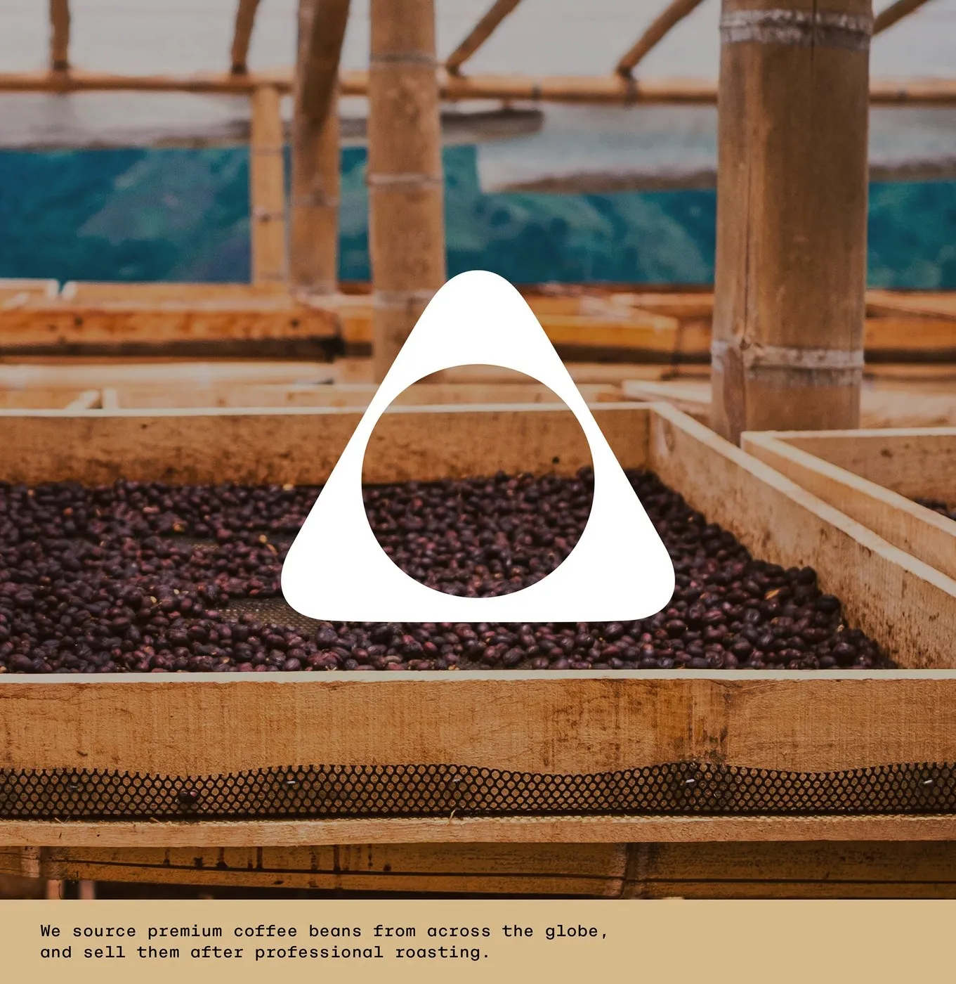
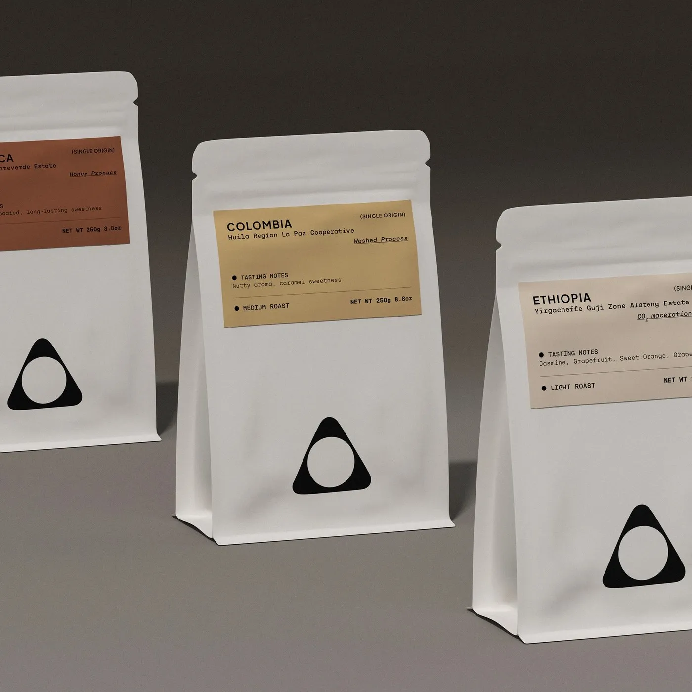
Minimalist Branding and Packaging for Desert Coffee Roasters by taoSTUDIO Desert Coffee Roasters is a specialty coffee roaster based out of Dubai, famous for sourcing top-tier beans from global farms and prestigious Cup of Excellence auctions. The visual identity and packaging lineup designed by taoSTUDIO effortlessly blends local desert charm with sleek, artisanal precision.
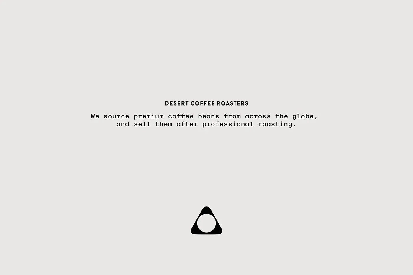
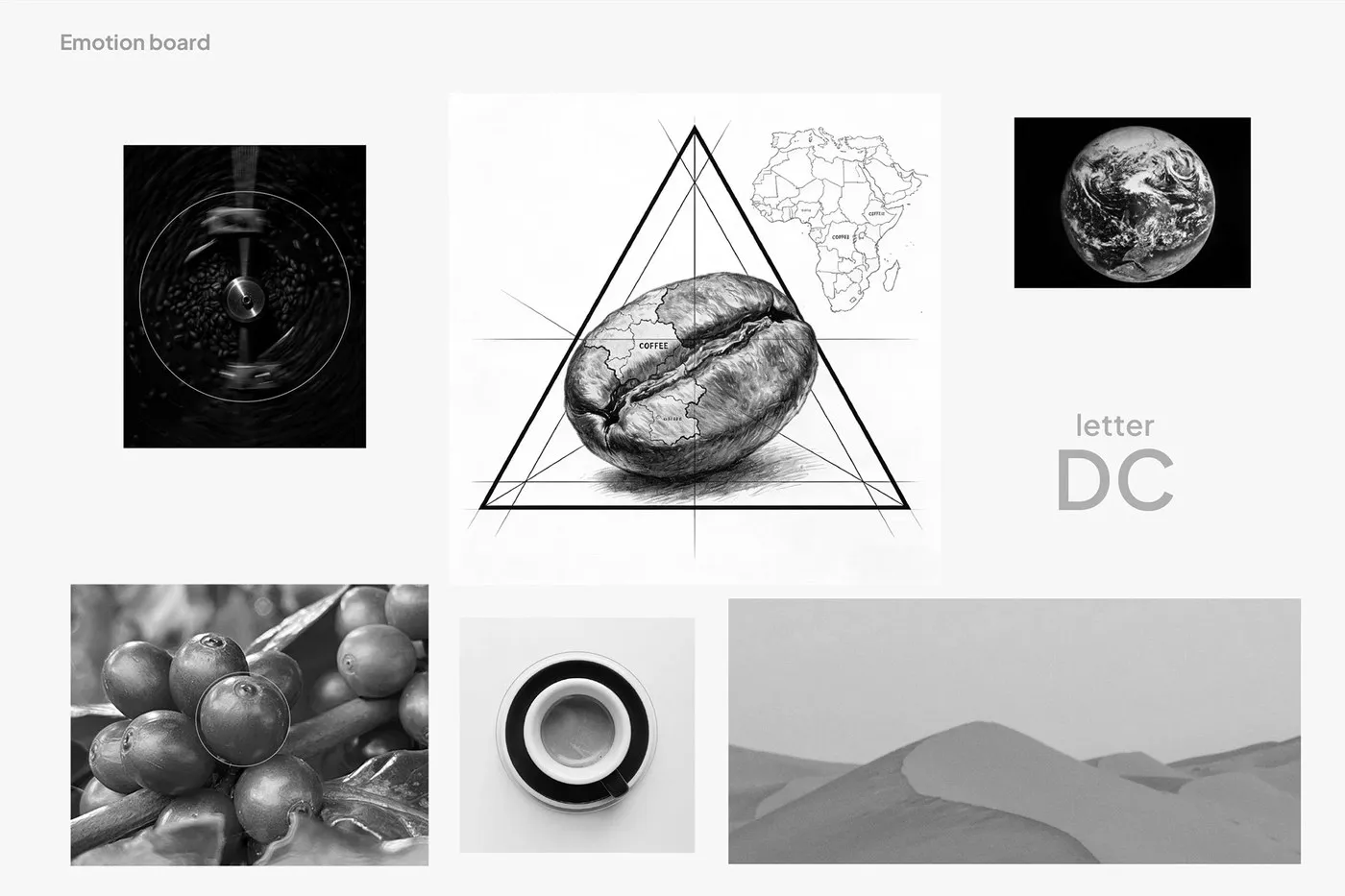
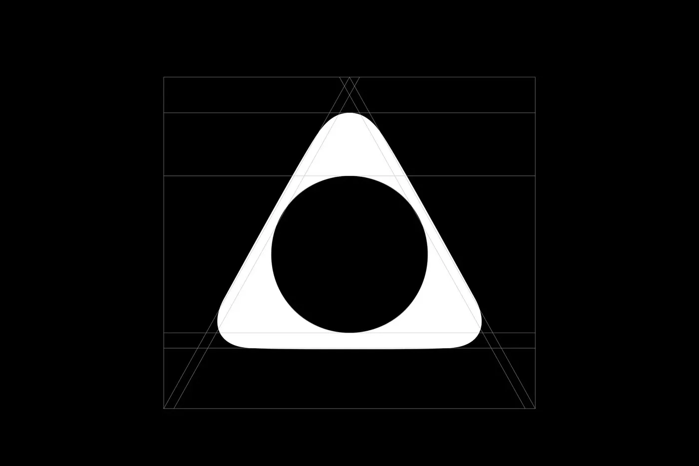
At the heart of the design sits a rounded-triangle logo constructed with clean mathematical ratios. In the specialty coffee world, a triangle represents three essential pillars: green bean quality, roasting technique, and extraction precision. Soft, flowing curves double as rolling sand dunes, plump coffee beans, and the smooth rim of a freshly brewed espresso cup.
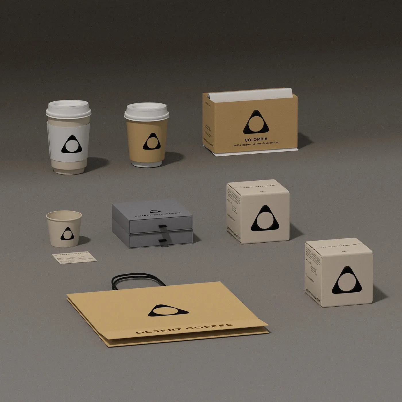
Instead of loud, flashy graphics, the packaging embraces warm, muted desert tones paired with tactile kraft paper—featuring sandy beige (#D2B48C), terracotta (#C86D51), and cozy soft gray accents. Single-origin coffees from Colombia, Costa Rica, and Ethiopia are intuitively color-coded using colored headers on each label, making it super easy to spot details on variety, processing method, and roast profile at a glance.
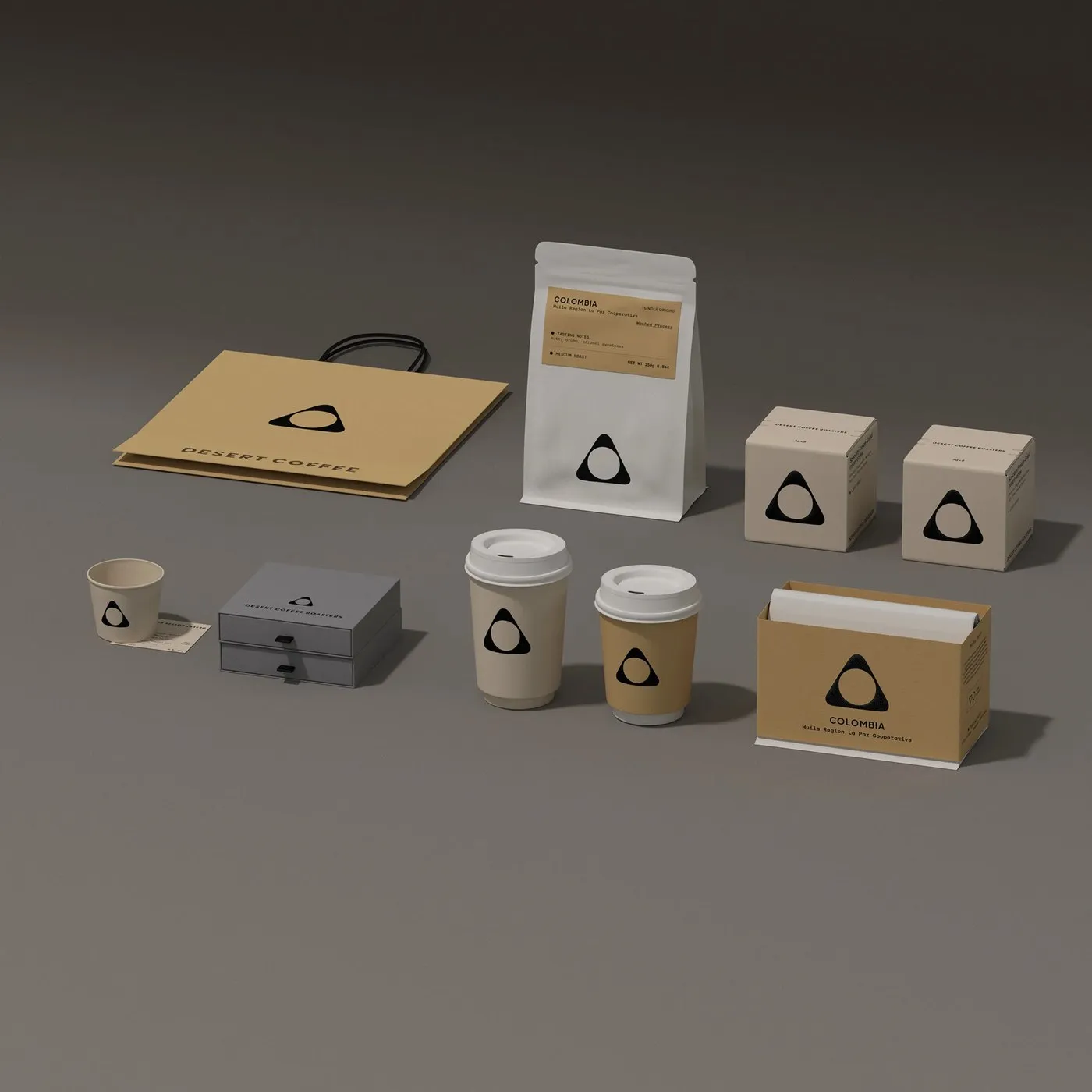
The packaging system offers great variety, featuring matte stand-up pouches, convenient drip coffee packets, sleek gray drawer-style gift boxes, and minimalist paper bags. This harmonious pairing of clean geometry and structured typography delivers a look that feels both modern and genuinely handcrafted.
Check out the full project on www.behance.net/gallery/243260233/DESERT-COFFEE-BRANDING-PACKAGING.
Bộ nhận diện thương hiệu và bao bì tối giản cho Desert Coffee Roasters của taoSTUDIO
Desert Coffee Roasters là thương hiệu rang cà phê đặc sản (specialty coffee) đến từ Dubai, nổi tiếng với việc tuyển chọn hạt từ nhiều nông trại trên thế giới và các phiên đấu giá Cup of Excellence. Dự án thiết kế nhận diện thương hiệu và hệ thống bao bì do taoSTUDIO thực hiện đã dung hòa khéo léo nét đẹp sa mạc bản địa cùng tinh thần thủ công chuẩn xác.
Tâm điểm của thiết kế nằm ở logo tam giác bo tròn được dựng từ những cung tròn tỉ lệ chuẩn. Trong thế giới specialty coffee, hình tam giác đại diện cho ba trụ cột quan trọng: chất lượng hạt thô, kỹ thuật rang và độ chính xác khi chiết xuất. Những đường cong mềm mại vừa tái hiện hình ảnh đồi cát nhấp nhô, hạt cà phê rang tròn trịa, vừa gợi liên tưởng đến vành tách espresso quen thuộc.
Về mặt màu sắc, packaging không đi theo hướng đồ họa rực rỡ mà chọn bảng màu sa mạc trầm ấm với chất liệu giấy kraft nhám, màu cát (#D2B48C), màu đất nung (#C86D51) cùng sắc xám ấm dịu nhẹ. Các dòng hạt single-origin từ Colombia, Costa Rica và Ethiopia được phân loại trực quan nhờ phần header màu sắc trên nhãn, giúp theo dõi thông tin về giống hạt, phương pháp sơ chế cũng như profile rang một cách nhanh chóng.
Hệ thống bao bì đa dạng gồm túi zip mờ dựng đứng, túi cà phê drip tiện lợi, hộp quà dạng ngăn kéo xám và túi giấy tối giản. Sự kết hợp giữa hình học chỉn chu và bố cục typography mạch lạc mang lại vẻ ngoài vừa hiện đại vừa đậm chất thủ công.
Chi tiết dự án có thể tham khảo thêm tại www.behance.net/gallery/243260233/DESERT-COFFEE-BRANDING-PACKAGING.