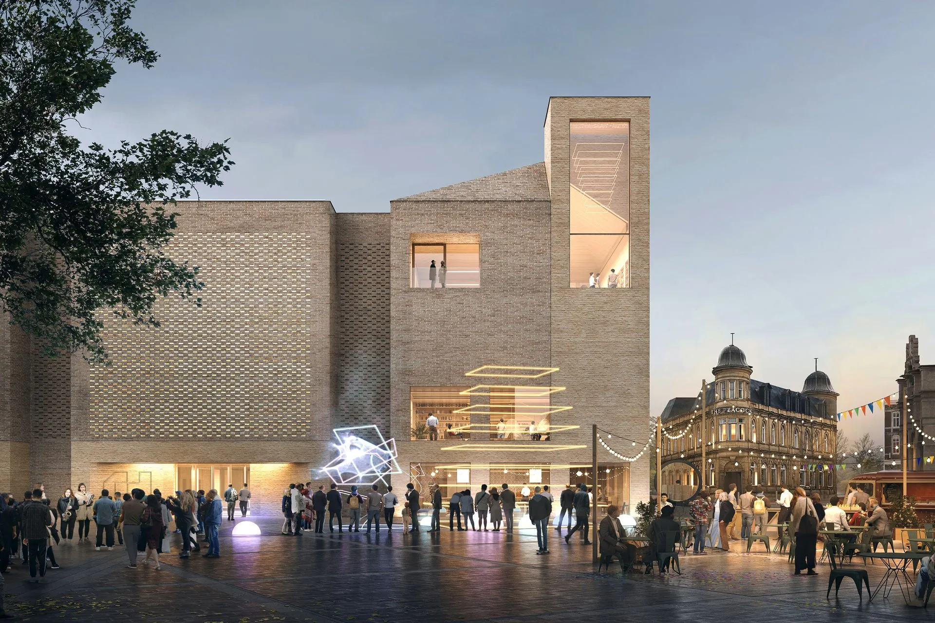
Culture House Sunderland Brand Identity by Studio Blackburn Studio Blackburn recently rolled out a fresh visual identity for Culture House Sunderland, built around a playful C&H monogram that rotates and snaps neatly into a house silhouette.
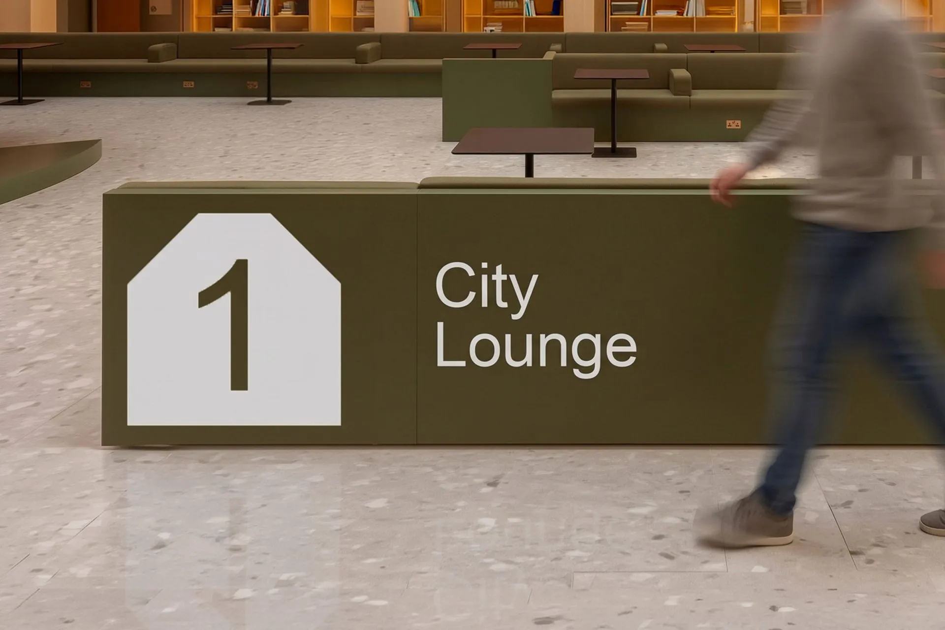
The real hero of this design system is the graphic container itself. A bold, solid black house shape sits on a vibrant red backdrop, effortlessly framing every single brand element—from the C&H monogram and community photo frames to wayfinding signage and edge-locked typography. The color palette blends warm and cool tones with striking confidence, pairing rich crimson banners with sky-blue library passes and sleek black merch. Thanks to flat, uncompromising blocks of color, the black mark pops with incredible clarity across every touchpoint, whether scaled up on street banners or down on a library card barcode.
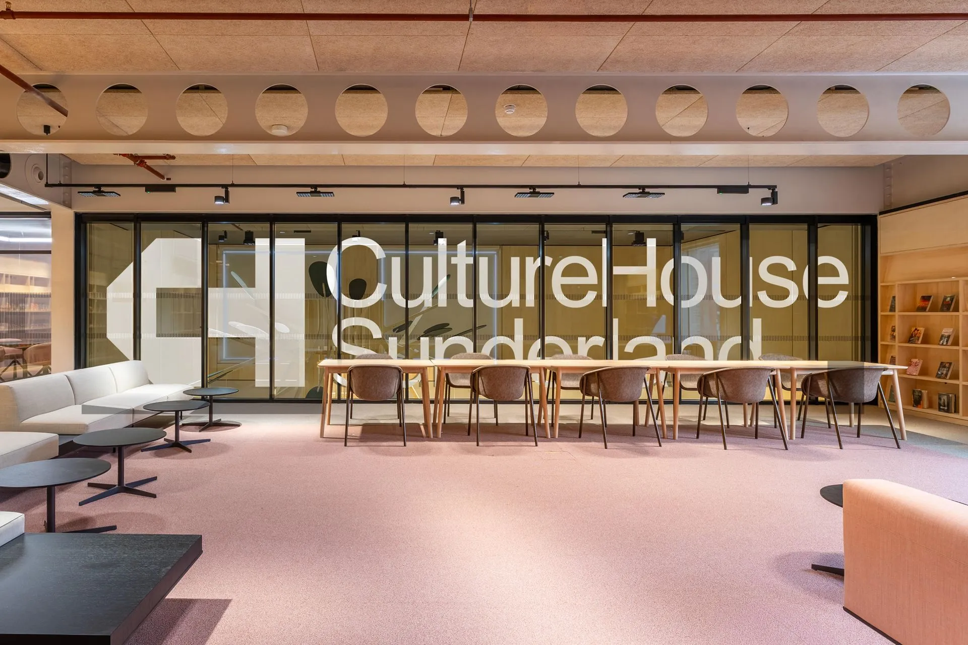
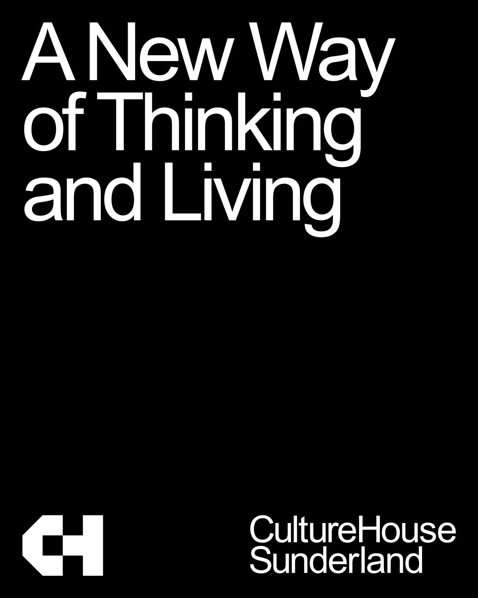
Alongside these bold graphic shapes, the typography stays delightfully clean and direct. Set in a punchy, heavy grotesque font, the “CultureHouse Sunderland” wordmark stacks neatly like a street address. At an architectural scale, giant white lettering stretches across massive glass walls, turning individual strokes into structural elements within the physical space. Meanwhile, the monogram shines at smaller scales: a squared “C” interlocks with an “H”, drawn on the exact same geometric grid as the house frame so it can rotate flexibly without losing its structural logic.
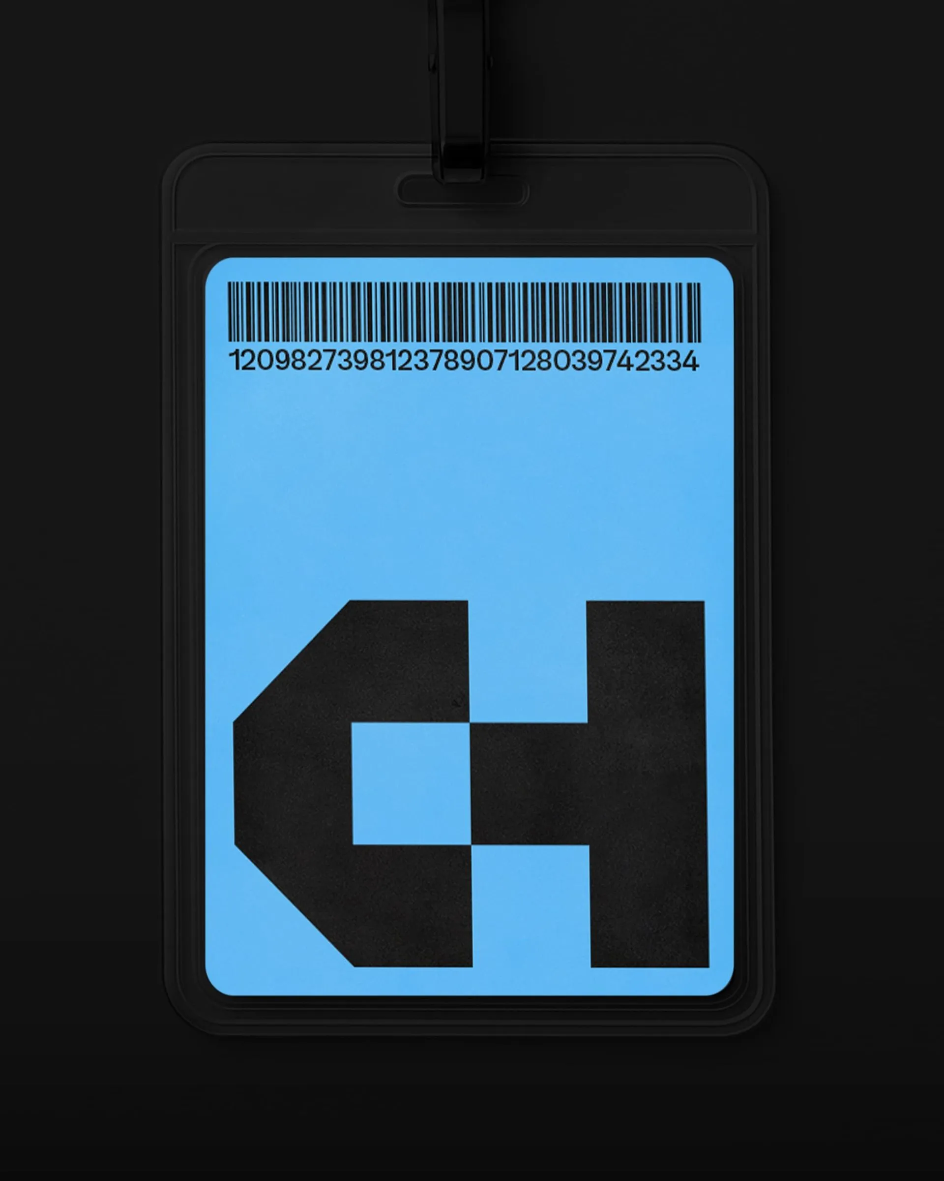
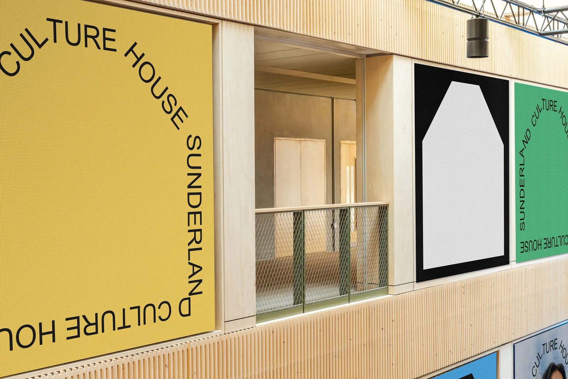
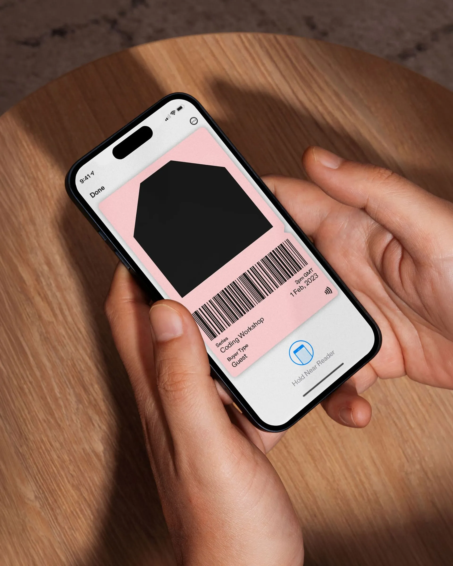
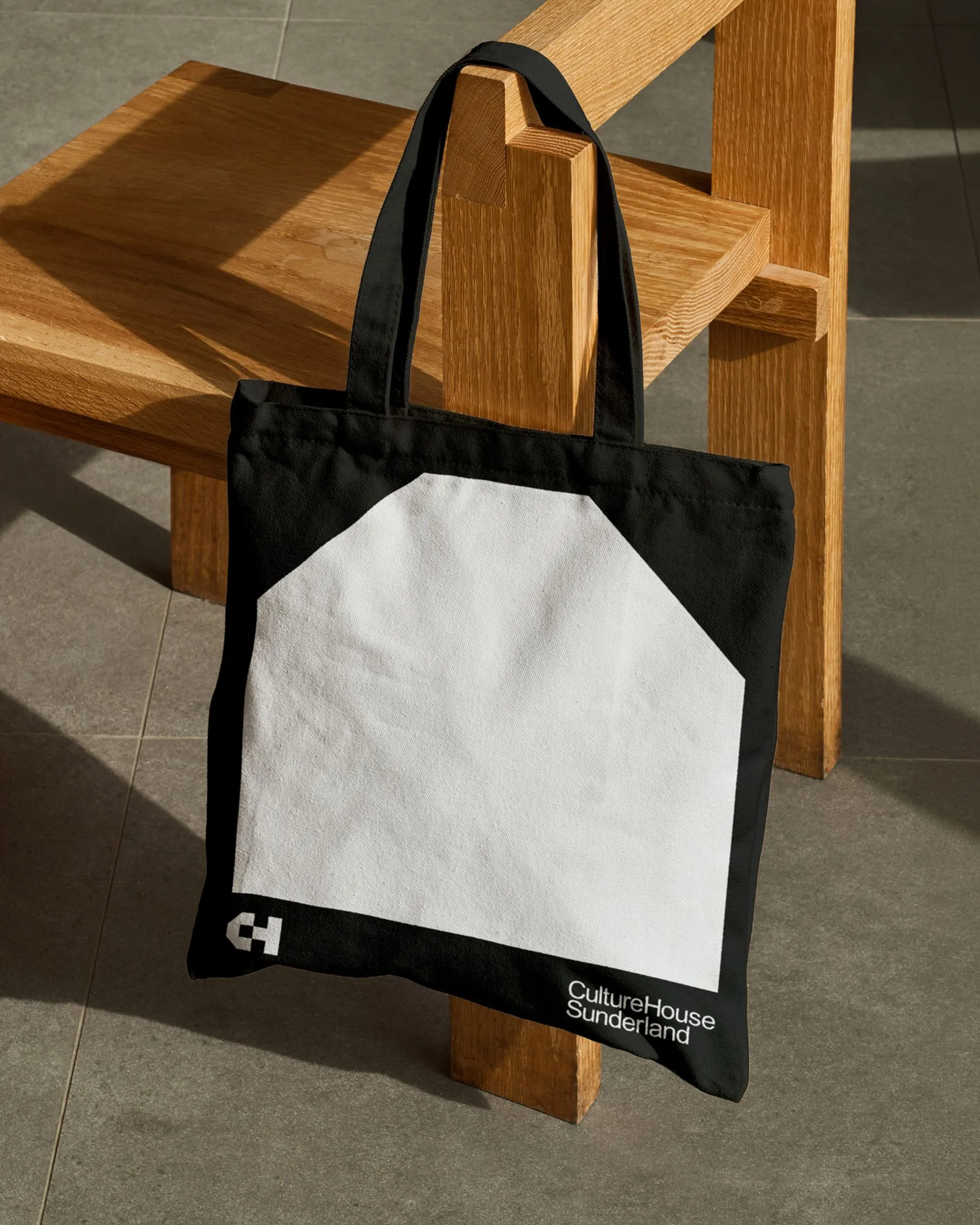
The power of this identity really comes alive across real-world applications. Lamppost banners create a commanding civic presence against Sunderland’s historic stone architecture. Digital screens feature energetic, animated text frames anchored in the same geometric framework, while print pieces stay remarkably crisp and minimal—like the sky-blue library pass with a giant mark resting over the barcode, or a black tote bag featuring an elongated white house graphic. With zero gradients and no complex decoration, pure color catches the eye while typography delivers the story.
Check out more details about the project on studioblackburn.com/work/culture-house.
Bộ nhận diện thương hiệu Culture House Sunderland từ Studio Blackburn
Studio Blackburn vừa ra mắt bộ nhận diện thương hiệu cho Culture House Sunderland, xây dựng xoay quanh monogram C&H có thể linh hoạt xoay chuyển và khớp gọn gàng vào khung hình ngôi nhà.
Điểm lực đòn bẩy trong thiết kế này chính là chiếc khung chứa thông tin. Một hình ngôi nhà màu đen vững chãi đặt trên nền đỏ rực rỡ, ôm trọn toàn bộ các yếu tố của bộ nhận diện: từ biểu tượng monogram C&H, khung ảnh cộng đồng, bảng chỉ dẫn wayfinding cho đến phần typography được khóa chặt vào các cạnh ngôi nhà. Bảng màu kết hợp giữa nóng và lạnh cực kỳ ăn ý — những tấm cờ treo màu đỏ sẫm đặt cạnh thẻ thư viện màu xanh da trời hay đồ merch màu đen tuyền. Nhờ các mảng màu phẳng dứt khoát, biểu tượng màu đen vẫn nổi bật rõ ràng dù xuất hiện trên cờ treo cột đèn hay mã vạch thẻ thư viện.
Đứng cạnh các hình khối đồ họa lớn, hệ thống typography lại giữ tinh thần tối giản và trực diện. Tên thương hiệu “CultureHouse Sunderland” sử dụng font grotesque nét dày, xếp chồng lên nhau gọn gàng như một dòng địa chỉ. Khi áp dụng lên không gian kiến trúc, dòng chữ màu trắng phủ dọc các bức tường kính lớn đến mức từng nét chữ trông như một phần của cấu trúc không gian. Trong khi đó, phần monogram lại phát huy tác dụng ở kích thước nhỏ: chữ C hình vuông lồng vào chữ H, phát triển trên cùng một lưới hình học với ngôi nhà để có thể xoay chuyển linh hoạt mà không làm mất đi tính logic.
Sự hiệu quả của bộ nhận diện thể hiện rõ qua các ứng dụng thực tế. Cờ treo cột đèn mang lại quy mô đô thị ấn tượng trước các công trình kiến trúc bằng đá của Sunderland. Màn hình hiển thị các khung chữ chuyển động dựa trên cùng khung hình học, còn các sản phẩm in ấn thì cực kỳ gọn gàng: chiếc thẻ thư viện màu xanh lam nổi bật với biểu tượng lớn đè lên mã vạch, hay túi tote màu đen với mảng hình ngôi nhà màu trắng trải dài. Không dùng hiệu ứng chuyển màu (gradient), không họa tiết trang trí phức tạp, màu sắc làm nhiệm vụ thu hút ánh nhìn trong khi typography đảm nhận phần truyền tải thông điệp.
Xem thêm chi tiết dự án tại studioblackburn.com/work/culture-house.