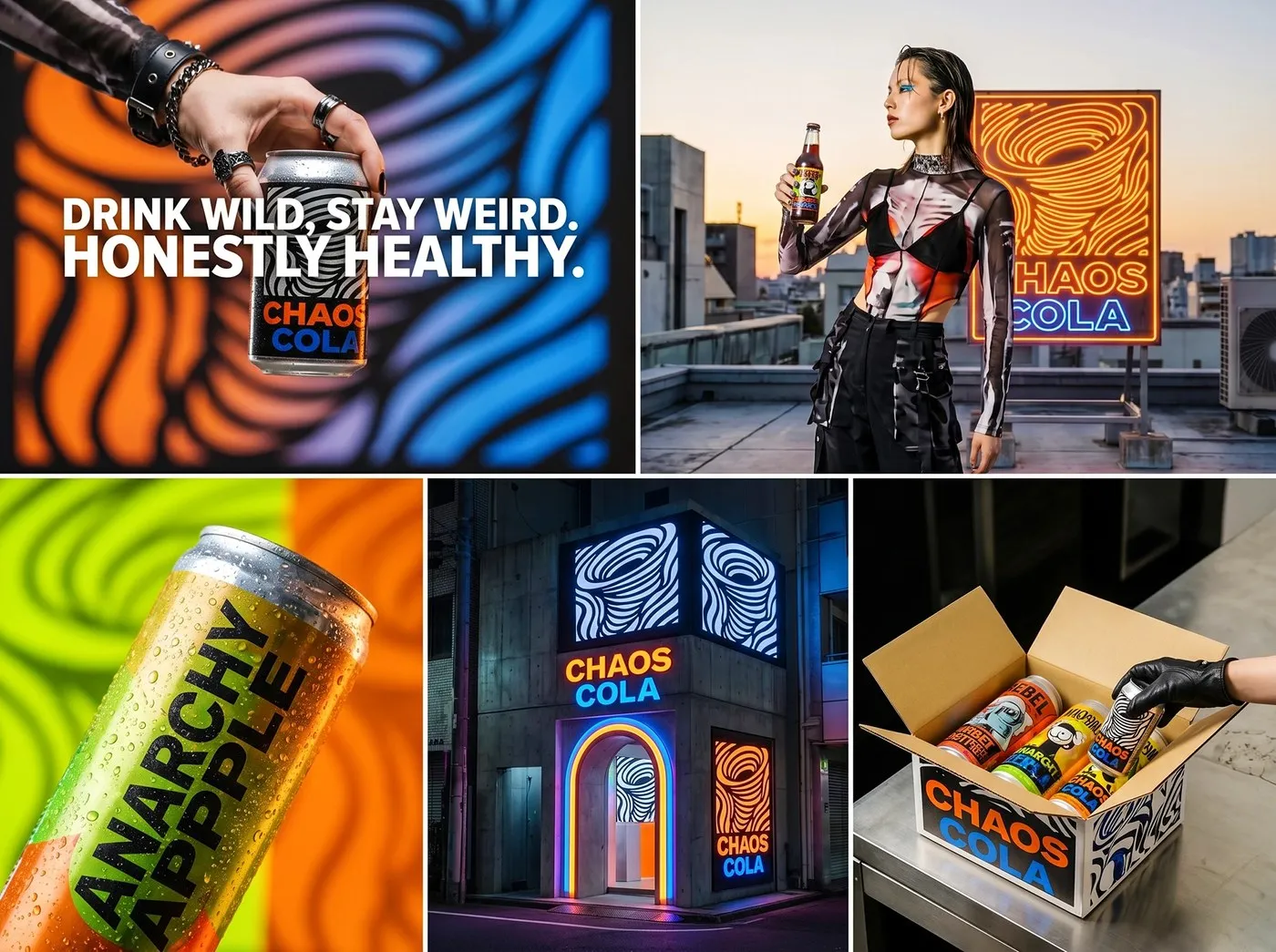
Chaos Cola Packaging Design by Up-Brands: Pure Rebellion Fueled by Op-Art and Underground Comics The beverage market often falls into a rut with minimalist designs, soothing pastel tones, or play-it-safe corporate conformity. Flipping the script entirely, design studio Up-Brands brought Chaos Cola to life with an unapologetically bold look packed with raw pop-anarchy energy and mind-bending visual flair.
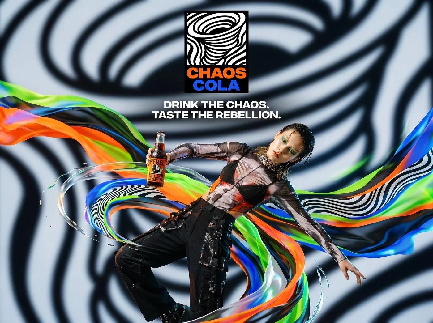
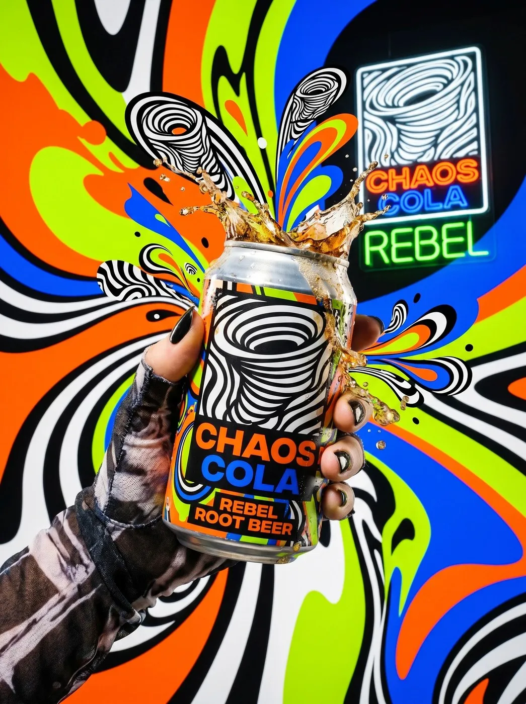
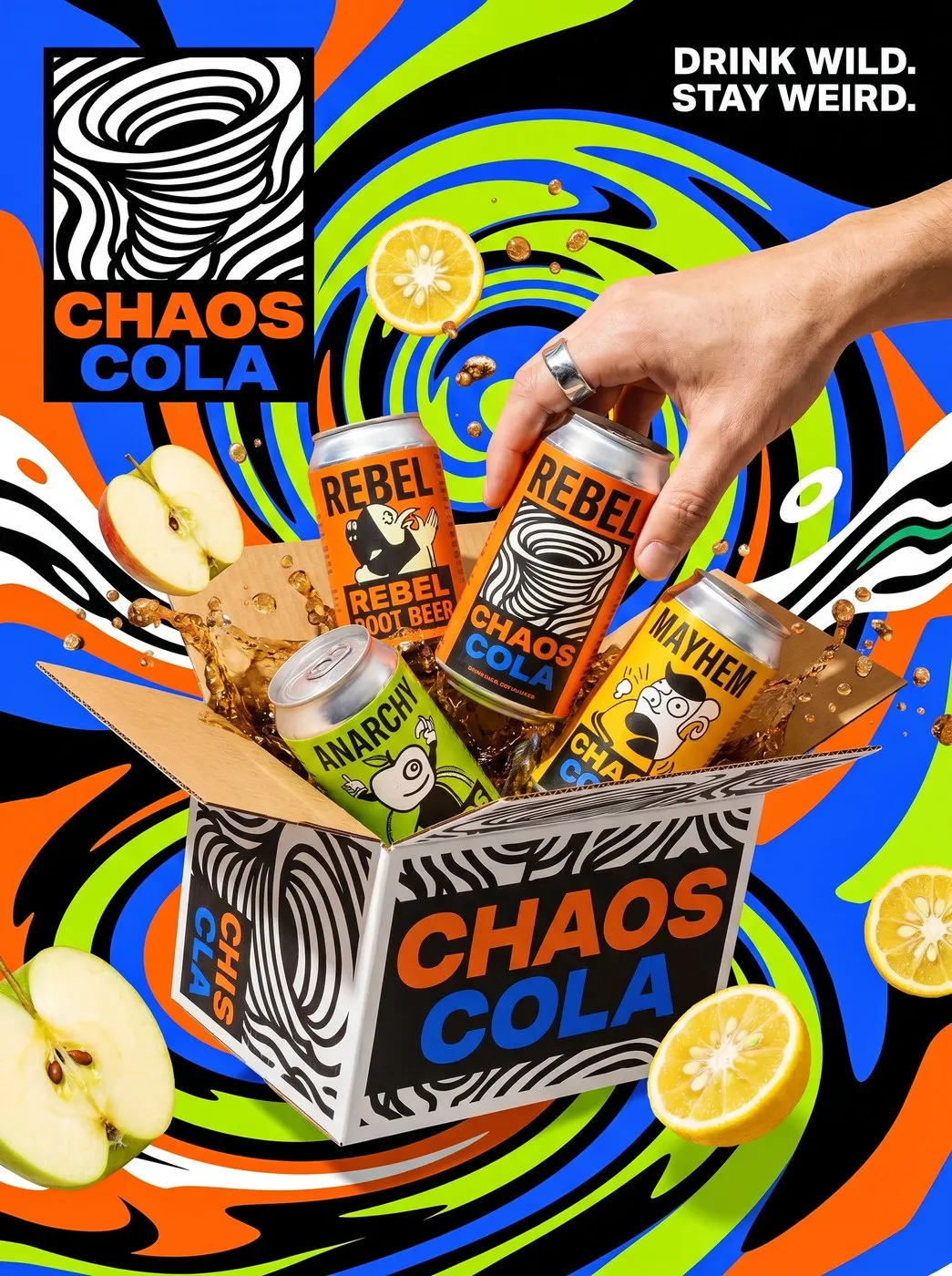
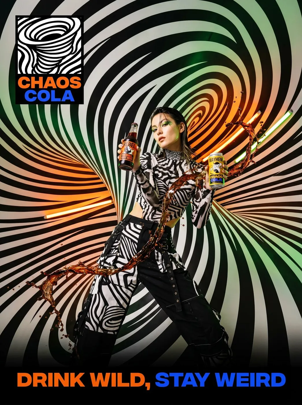
The brand’s main logo commands instant attention with a swirling vortex of meticulously hand-drawn Op-Art lines, neatly framed inside a rectangle alongside heavy condensed typography. Instead of toning down details to blend onto supermarket shelves, Chaos Cola’s packaging turns every can and bottle surface into a street art canvas, mixing trippy visual waves with underground comic characters.
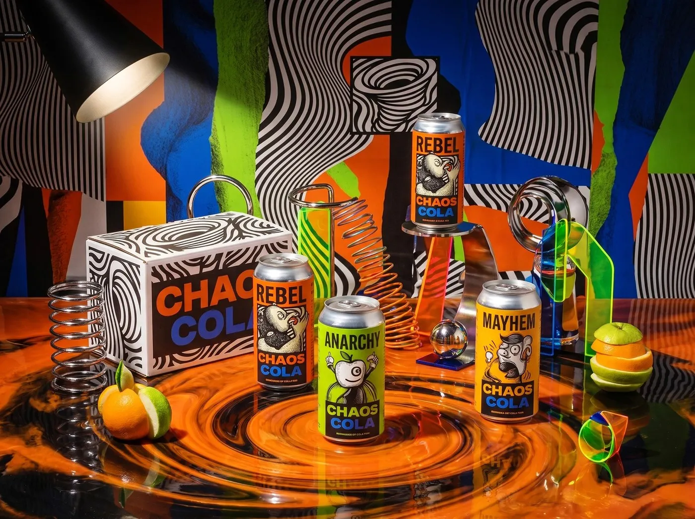
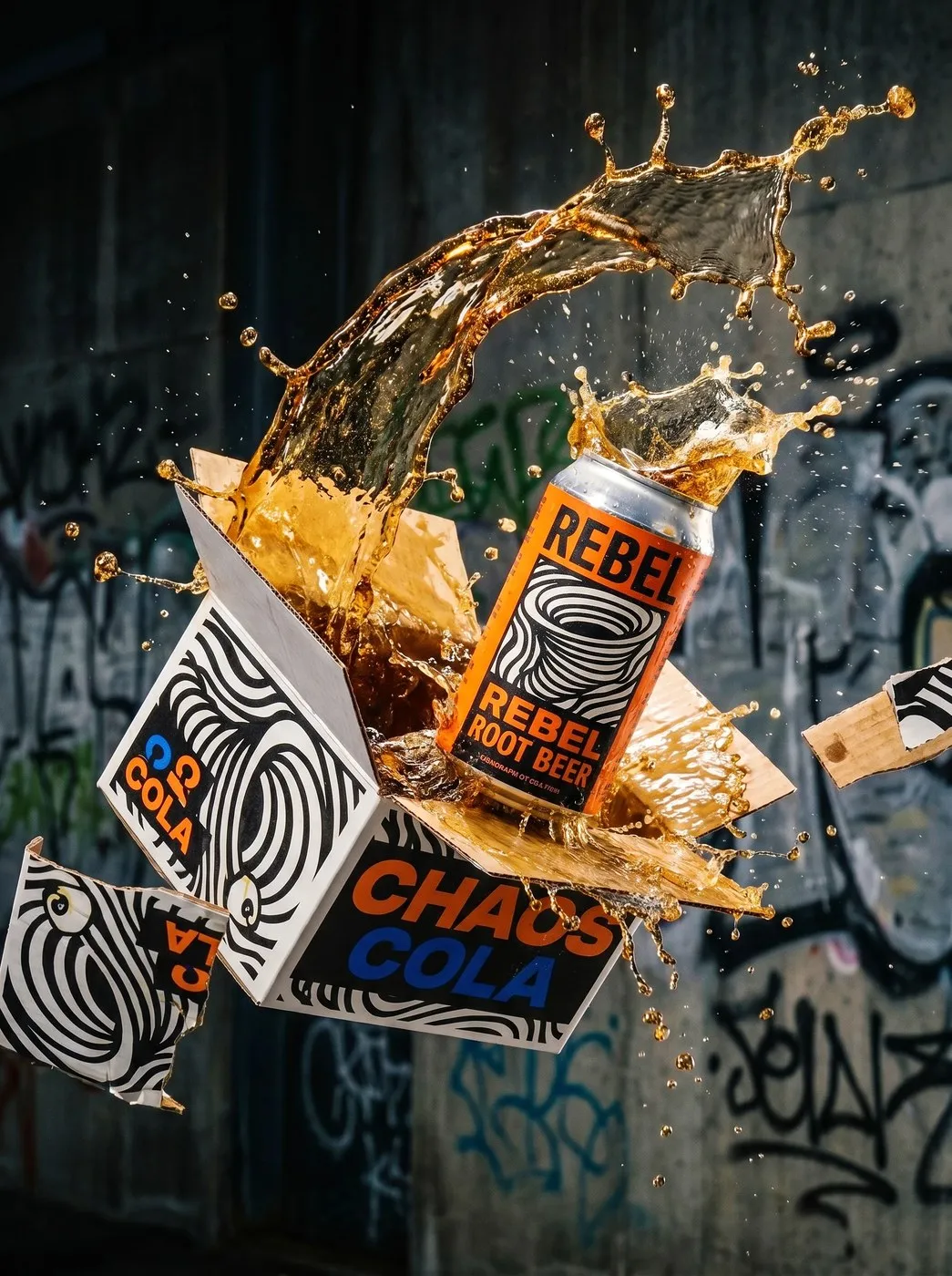
The project’s color palette is a clash of high-contrast warning shades like Chaos Orange, Anarchy Blue, and Rebel Green popping over black-and-white patterns. Flavor lines like Rebel Root Beer and Anarchy Apple feature playful, mutated fruit illustrations. Going beyond aluminum cans and glass bottles, the unboxing experience—dubbed the “Air-Drop Supply Crate”—is packed with personality, featuring a white corrugated carton covered in distorted typography, graffiti, and reflective skate-culture stickers.
When it comes to materials, the can body features a sleek matte finish that contrasts with glossy spot varnish on the lettering. The physical display space even blends raw concrete, neon lighting, and street tagging. Design files were meticulously handled in Illustrator and Photoshop to guarantee crisp execution of complex moiré patterns when printed on metal surfaces or paper fibers.
This project stands as proof that beverage packaging can deliver raw underground culture in a huge way while still meeting every commercial production standard.
Check out the full project on www.behance.net/gallery/252670395/CHAOS-COLA-Hardcore-Anti-Corporate-Soda-Op-Art.
Thiết kế bao bì Chaos Cola của Up-Brands: Sự nổi loạn từ nghệ thuật Op-Art và comic ngầm
Thị trường nước giải khát thường dễ rơi vào lối cũ với các thiết kế tối giản, màu pastel dịu mắt có phần an toàn. Đi ngược lại quy chuẩn đó, studio thiết kế Up-Brands đã mang đến cho dự án Chaos Cola một diện mạo đầy cá tính, lấy cảm hứng từ tinh thần pop-anarchy và hiệu ứng thị giác mạnh mẽ.
Logo chính của thương hiệu gây ấn tượng ngay lập tức với hình ảnh cơn lốc tạo từ các đường nét Op-Art vẽ tay tỉ mỉ, nằm gọn trong khung hình chữ nhật cùng phần typography dạng condensed đầy sức nặng. Thay vì tiết chế chi tiết để dễ nịnh mắt người mua trên kệ siêu thị, bao bì của Chaos Cola biến bề mặt lon và chai thành những bức họa đường phố, kết hợp giữa sóng thị giác ảo giác và hình ảnh các nhân vật comic ngầm.
Bảng màu của dự án là sự va chạm giữa các tông màu cảnh báo tương phản như Cam Chaos, Xanh Anarchy và Xanh lá Rebel trên nền họa tiết trắng đen. Các dòng hương vị như Rebel Root Beer hay Anarchy Apple đi kèm hình minh họa trái cây biến dị nghịch ngợm. Không dừng lại ở lon nhôm hay chai thủy tinh, trải nghiệm mở hộp mang tên “Air-Drop Supply crate” cũng được đầu tư với thùng carton gợn sóng trắng, phủ kín chữ biến dạng, graffiti và tem phản quang mang phong cách văn hóa trượt đán.
Về mặt chất liệu, phần thân lon sử dụng lớp phủ mờ (matte) tương phản với lớp phủ bóng (spot varnish) ở phần chữ. Thậm chí không gian trưng bày thực tế còn kết hợp chất liệu bê tông thô, đèn neon và các hình vẽ street tagging. Các file thiết kế được xử lý tỉ mỉ trên Illustrator và Photoshop để đảm bảo độ sắc nét của các đường moiré phức tạp khi in lên bề mặt kim loại hay xơ giấy.
Dự án này là minh chứng cho thấy thiết kế bao bì nước giải khát hoàn toàn có thể truyền tải văn hóa underground một cách mạnh mẽ mà vẫn đáp ứng đúng tiêu chuẩn sản xuất thương mại.
Xem đầy đủ dự án tại www.behance.net/gallery/252670395/CHAOS-COLA-Hardcore-Anti-Corporate-Soda-Op-Art.