How EVERLAND Built Urban Kind’s Brand Identity Around a Bold Shield Symbol Skincare shelves are super crowded, and most brands play it safe with soft, subtle designs. But design studio EVERLAND took a totally fresh, standout route when creating the brand identity for Urban Kind—a vegan skincare line founded by Peter Ternström—by designing a bold, punchy shape that stays unmistakably recognizable across the entire product lineup.
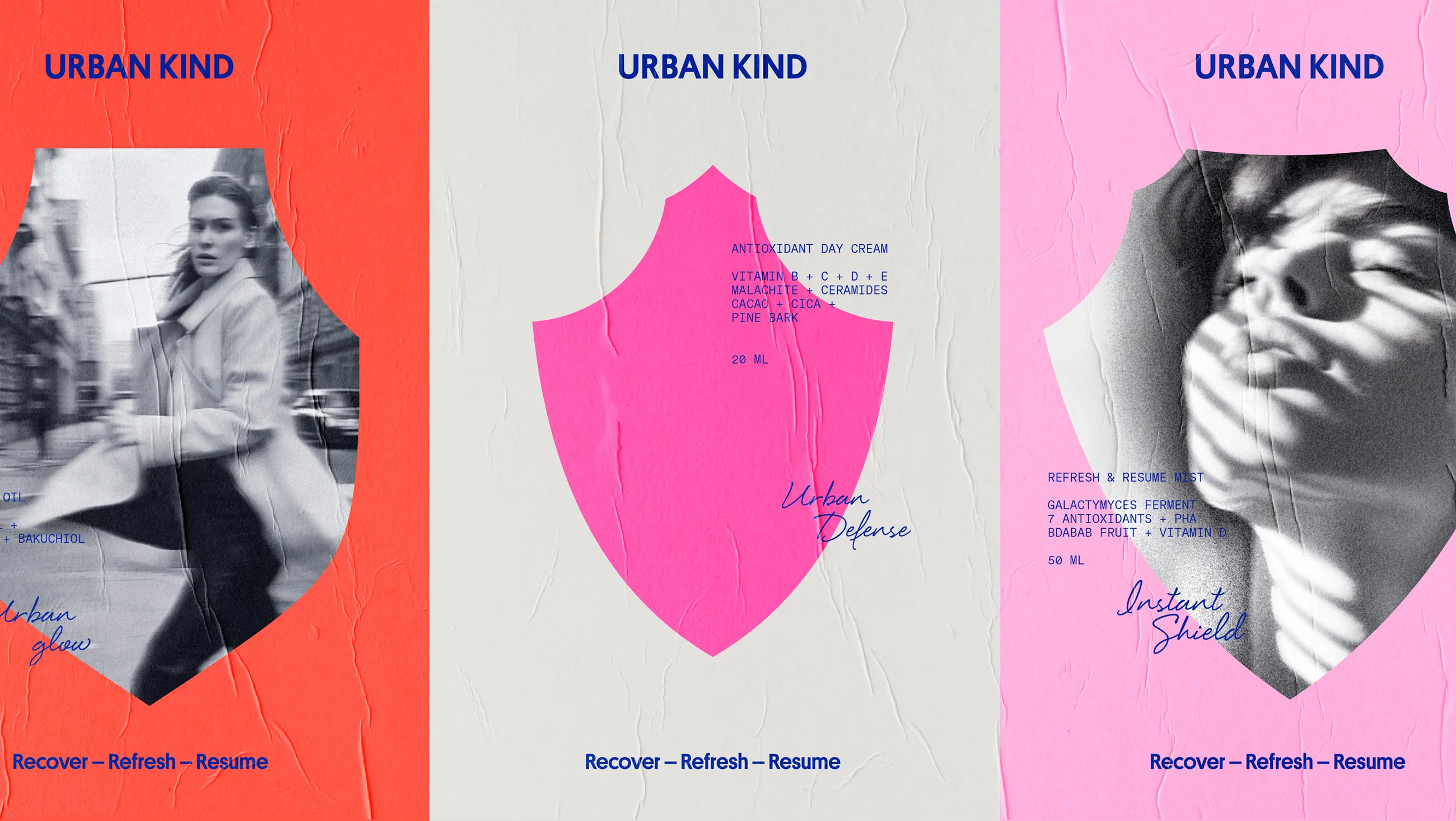
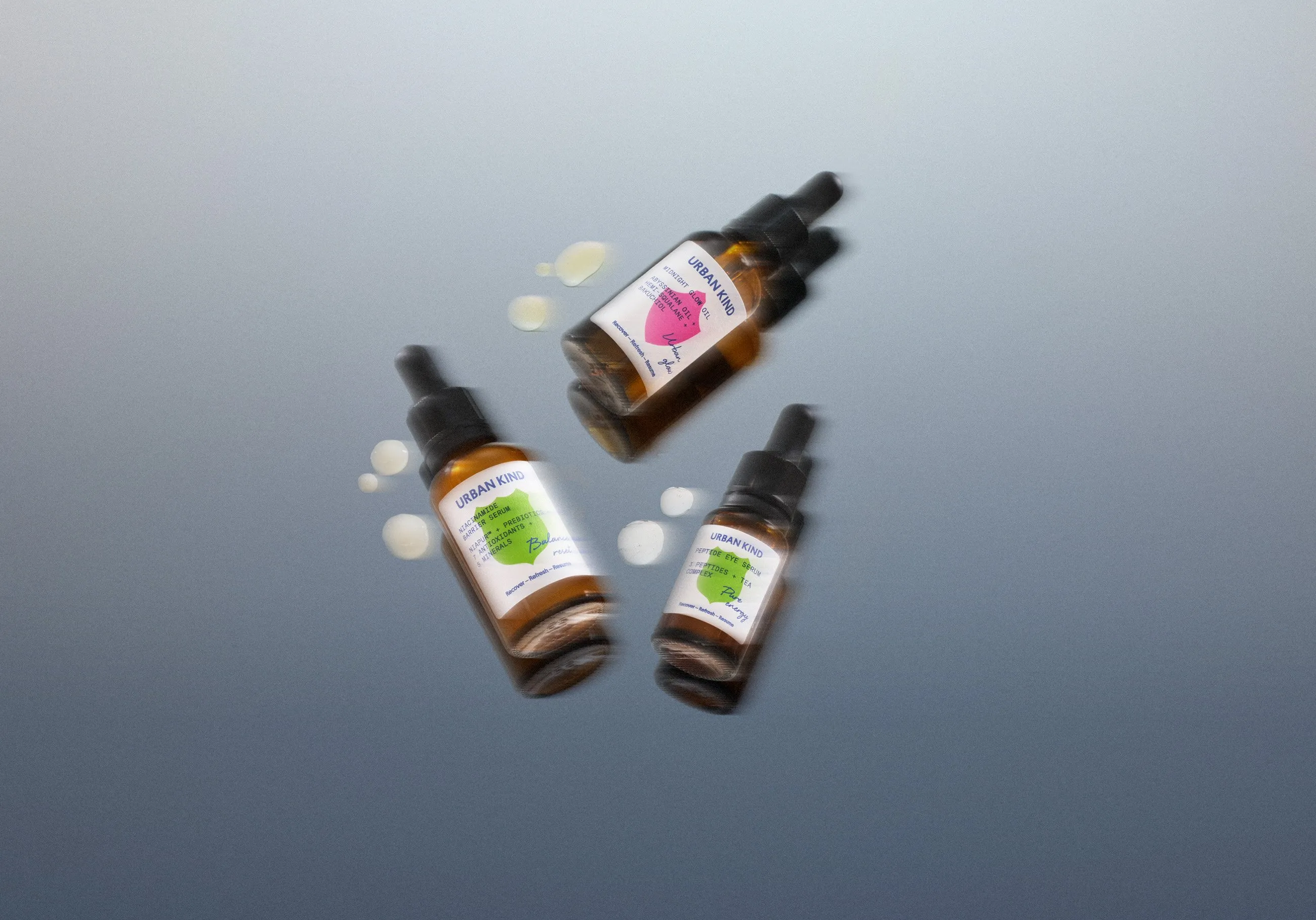
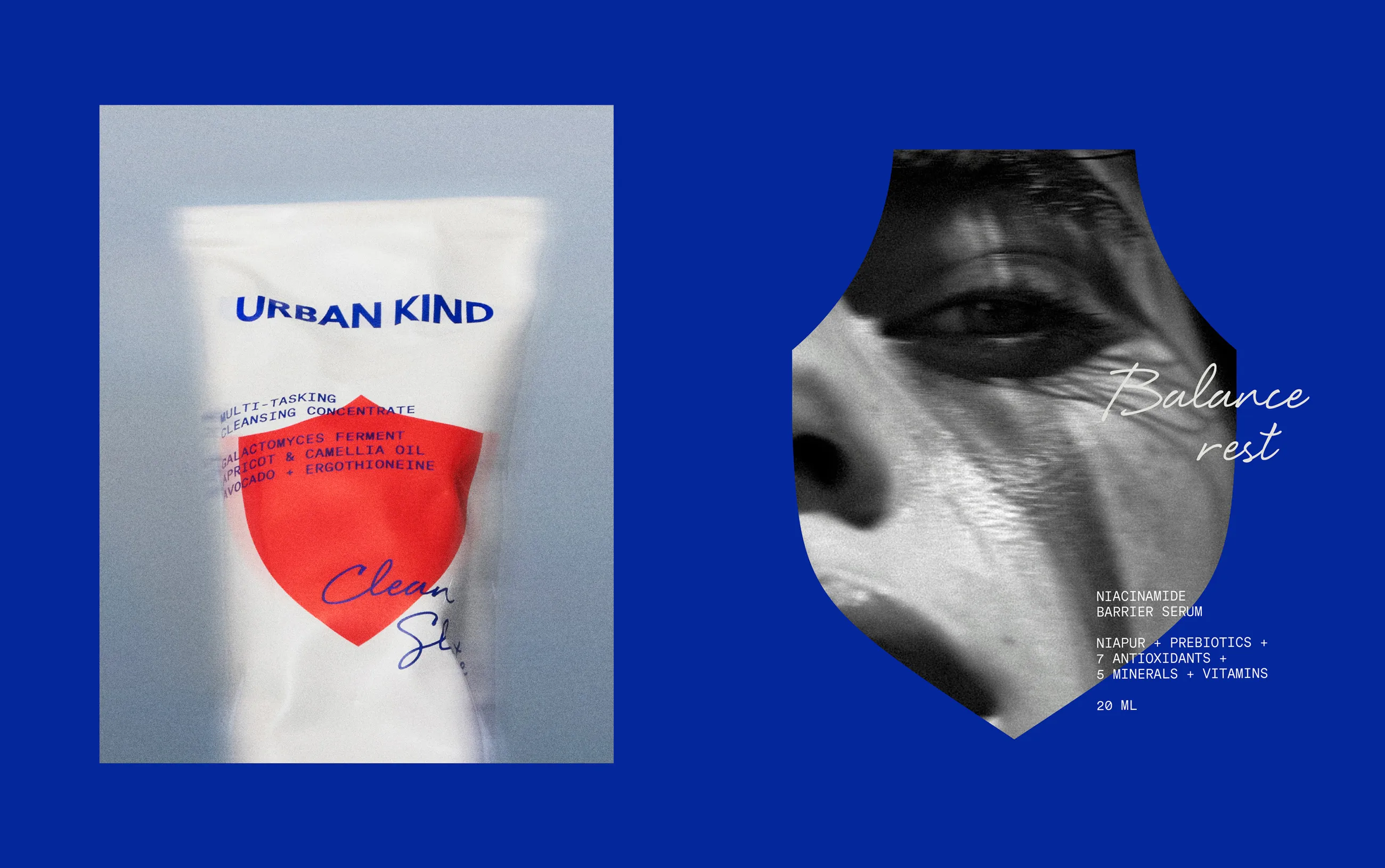
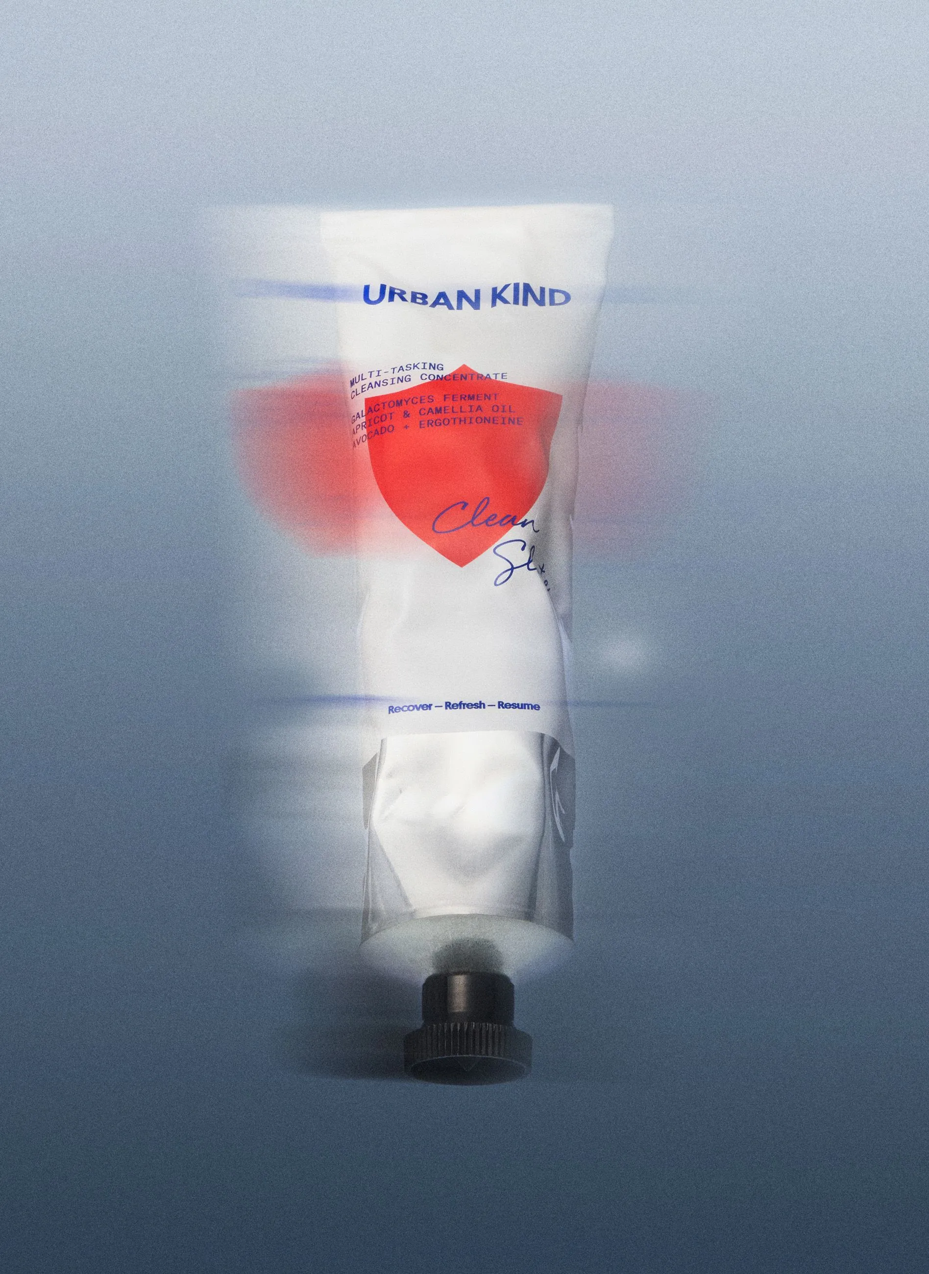
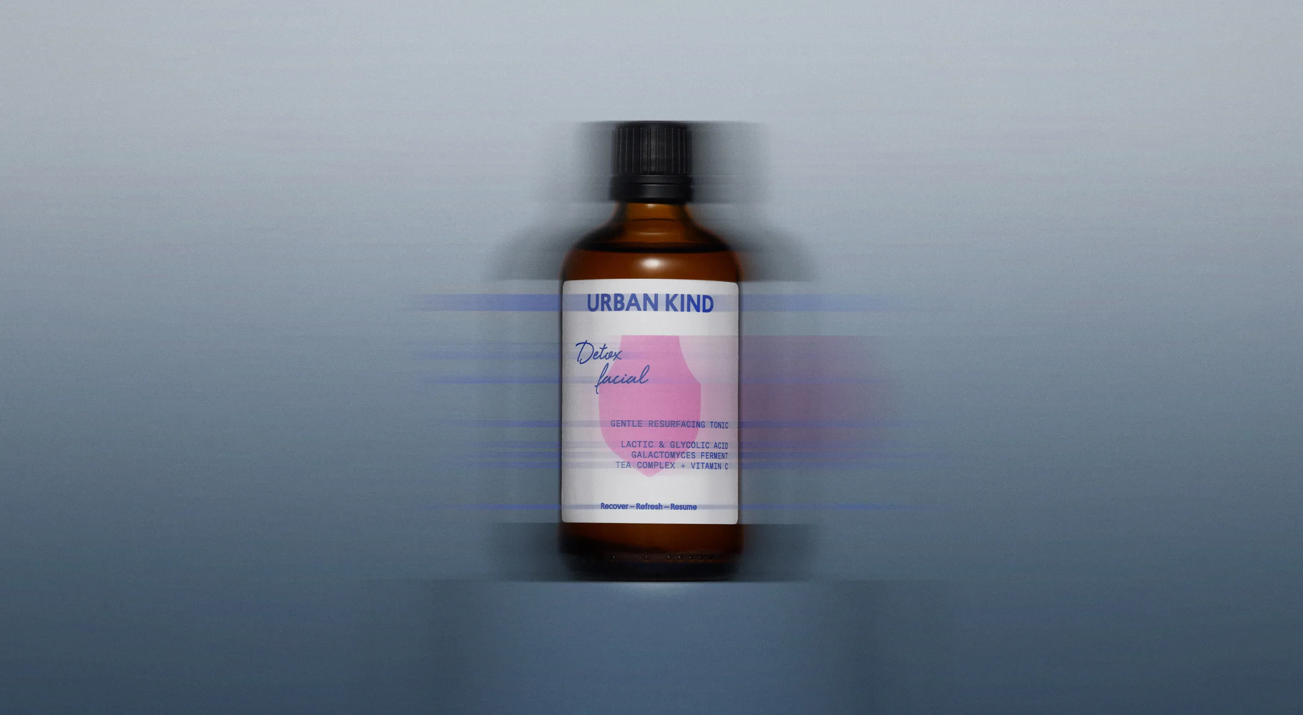
The shield motif was chosen to visually capture the idea of skin protection. Every single product features its own shield in a vibrant pop of color, like hot pink, acid green, signal red, or citrus orange. This playful color scheme acts as an intuitive visual guide, helping users seamlessly navigate each step of their daily skincare routine.
The project’s typography system thoughtfully blends three distinct typefaces, each serving its own purpose:
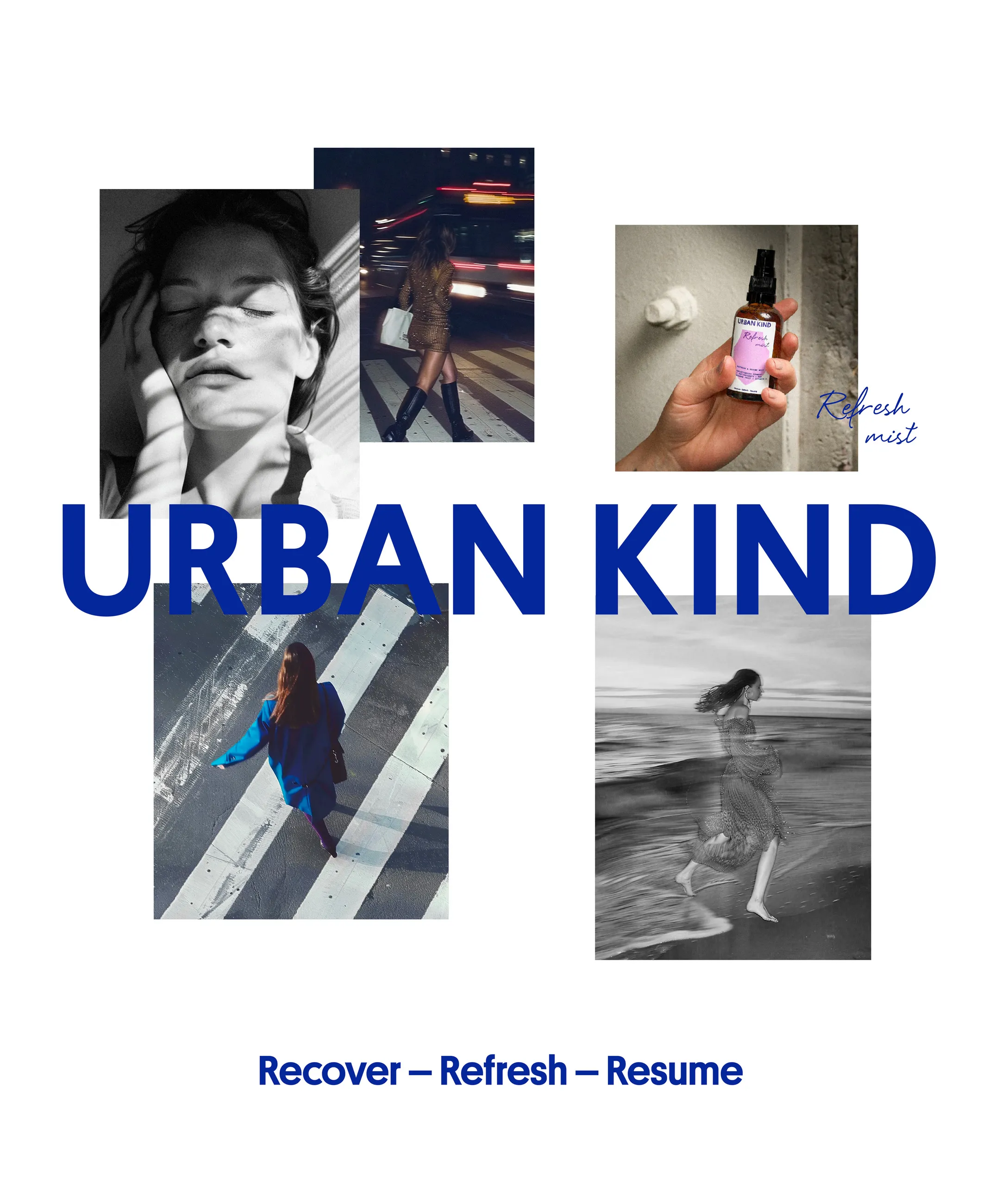
- A crisp blue grotesk wordmark brings a bold, confident feel to the URBAN KIND name on headers and kraft carton boxes.
- A handwritten script font adds an emotional, personal vibe to individual product names like Urban glow, Balance rest, Urban Defense, Instant Shield, and Detox facial.
- An all-caps monospace font delivers a sleek, lab-inspired aesthetic for listing ingredient details like NIACINAMIDE BARRIER SERUM.
Tactile, raw packaging materials—such as amber glass bottles with droppers, sleek aluminum tubes, and untreated kraft boxes—serve as the perfect backdrop to let those colorful shield graphics pop. The brand’s signature message, “Recover – Refresh – Resume,” is featured across packaging and posters as a unifying brand tagline.
The project also spotlights sister brand Raw Perfection, also founded by Peter Ternström, which features the LL Circular typeface alongside handcrafted illustrations on FSC-certified recycled paper packaging. Check out the full project showcase on everland.dk/work/urban-kind/.
Cách EVERLAND xây dựng bộ nhận diện cho Urban Kind từ biểu tượng chiếc khiên
Kệ hàng mỹ phẩm chăm sóc da vốn rất đông đúc và phần lớn các thương hiệu đều chọn cách xuất hiện nhẹ nhàng. Tuy nhiên, studio EVERLAND đã chọn hướng đi hoàn toàn khác khi làm branding cho Urban Kind – thương hiệu mỹ phẩm thuần chay do Peter Ternström sáng lập: tạo ra một hình khối nổi bật, dễ nhận diện và lặp lại liên tục trên từng sản phẩm.
Biểu tượng chiếc khiên được lựa chọn để hình dung về sự bảo vệ. Mỗi sản phẩm trong dòng sản phẩm sở hữu một chiếc khiên với màu sắc rực rỡ riêng như hồng rực, xanh acid, đỏ tín hiệu hay màu cam quýt. Hệ màu này đóng vai trò định hướng trực quan, giúp người dùng phân biệt các bước trong quy trình chăm sóc da.
Hệ thống typography trong dự án kết hợp ba kiểu chữ đảm nhận các vai trò khác nhau:
- Wordmark dạng font grotesk màu xanh dương thể hiện tên URBAN KIND dứt khoát trên tiêu đề và các hộp carton kraft.
- Font script viết tay dành cho tên riêng đầy cảm xúc của từng sản phẩm như Urban glow, Balance rest, Urban Defense, Instant Shield hay Detox facial.
- Font mono in hoa mang phong cách phòng thí nghiệm để liệt kê thành phần chi tiết như NIACINAMIDE BARRIER SERUM.
Chất liệu bao bì sử dụng các bề mặt mộc mạc như lọ thủy tinh màu hổ泊 kèm ống nhỏ giọt, tuýp nhôm và hộp giấy kraft thô chưa qua xử lý nhằm làm nổi bật mảng màu của chiếc khiên. Thông điệp “Recover – Refresh – Resume” được in trên bao bì, poster để làm điểm nhấn nhận diện cho thương hiệu.
Dự án cũng giới thiệu thương hiệu chị em Raw Perfection cùng do Peter Ternström sáng lập, sử dụng font LL Circular cùng hình minh họa thủ công trên bao bì giấy tái chế đạt chuẩn FSC. Bạn có thể xem thêm thông tin chi tiết về dự án tại trang web của everland.dk/work/urban-kind/.