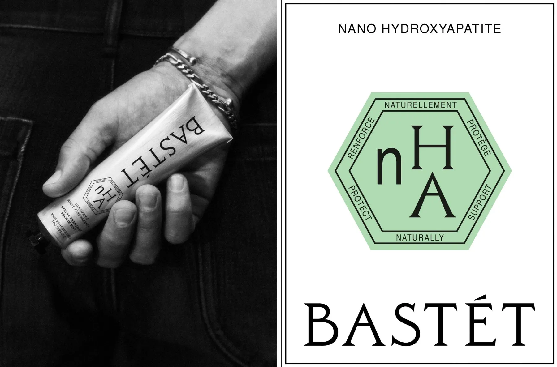
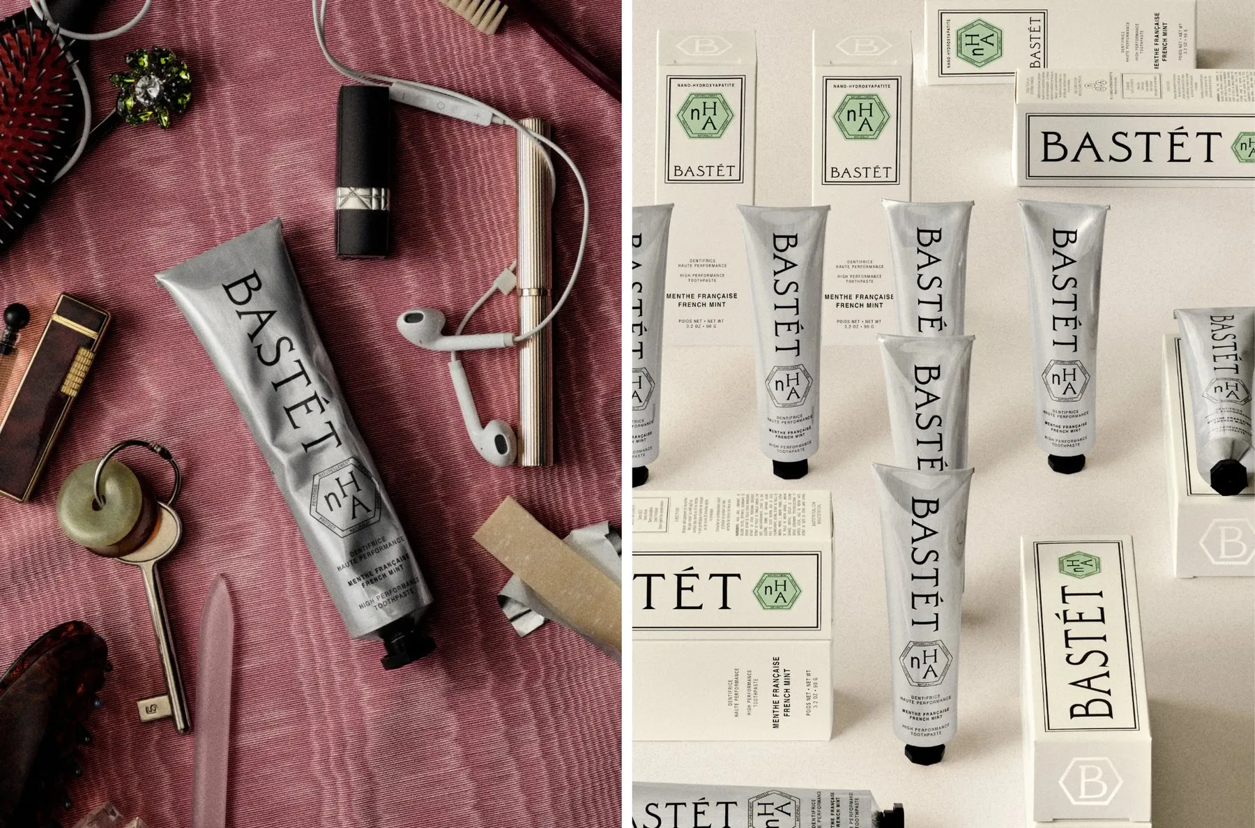
Bastét: How Wedge Studio Brought Toothpaste to the Vanity Counter Take a look at Bastét’s packaging design—what stands out most is actually what’s missing! There is no sign of the usual red, blue, and white combo, nor any big smile graphics. Instead, it rocks a raw aluminum tube with a sleek industrial vibe, paired with a minimalist palette of silver, black, and off-white, topped off with a single green hexagonal badge.
Design agency Wedge (based in Montréal and Los Angeles) built Bastét’s entire brand identity from the ground up, handling everything from naming and strategy to visual identity, packaging, and design guidelines. The prompt from the founders was short and sweet: craft a high-end oral care brand polished enough to earn a spot right on the vanity. Wedge’s clever solution turns daily brushing into a refreshing beauty ritual.
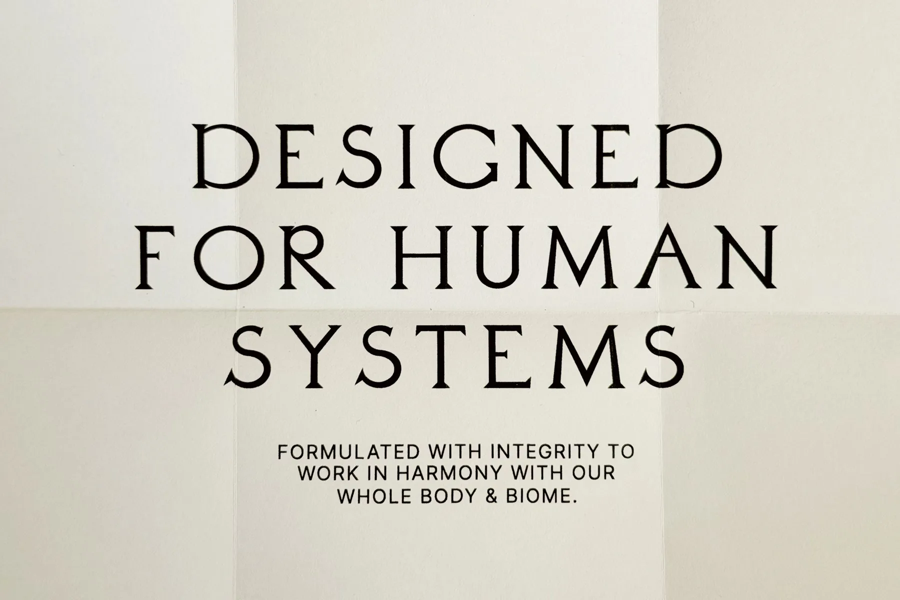
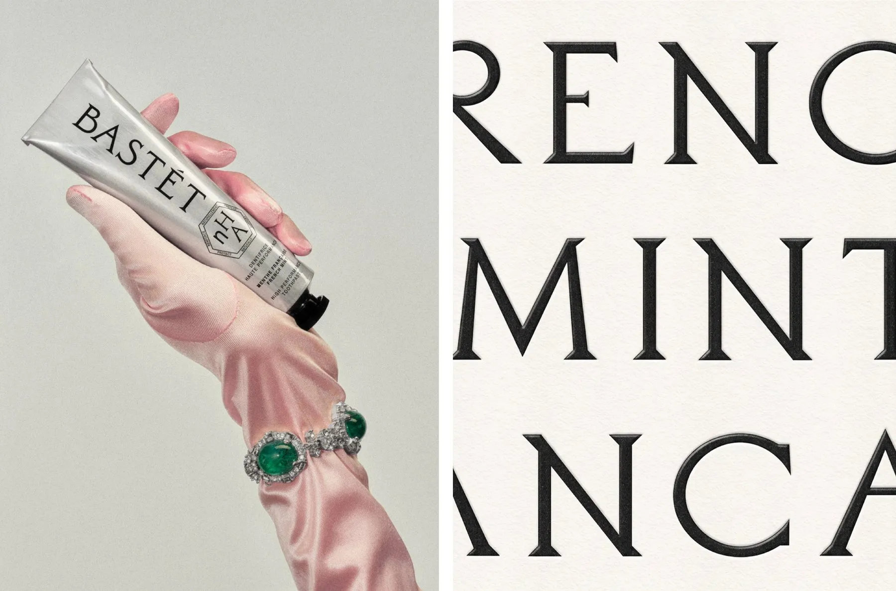
Architecturally-Inspired Wordmark and Typography The brand’s wordmark is completely custom hand-drawn rather than using off-the-shelf fonts. Wedge drew inspiration from stone-carved lettering on the facade of the Grande Galerie de l’Évolution at Paris’s Natural History Museum, dating back to 1889. With unique serifs, tight joints, and sharp open angles, the letterforms radiate precision and trust.
The primary typeface carries this spirit forward using Daubenton (designed by Olivier Dolbeau)—a high-contrast serif font from the Didot family. For smaller copy like the bilingual English-French ingredient list, the layout dials back to Nimbus Sans in Regular and Condensed styles to keep things super crisp and readable. Fitting two languages onto a single package pushed the design team to keep information ultra-focused, keeping only the essential details.
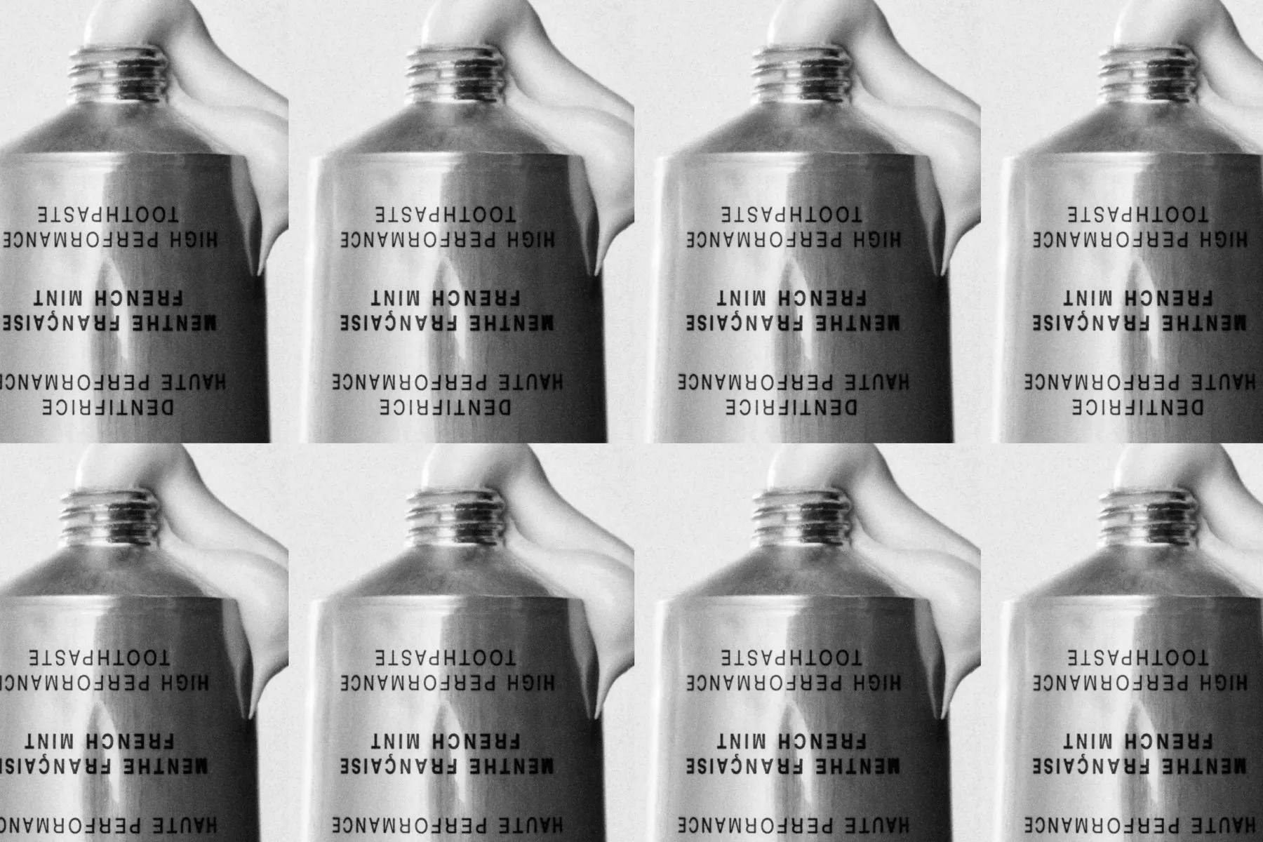
Packaging Materials and Art Direction When it comes to materials, the design takes a smart two-part approach: paper boxes crafted for retail shelves, and aluminum tubes tailored for the vanity top. Made from raw, uncoated aluminum, the tube catches light softly and gracefully dents over time, giving off the classic feel of an artist’s paint tube. That single green badge delivers a pop of color, spotlighting the hero ingredient nHA (nano-hydroxyapatite)—a natural mineral that protects enamel.
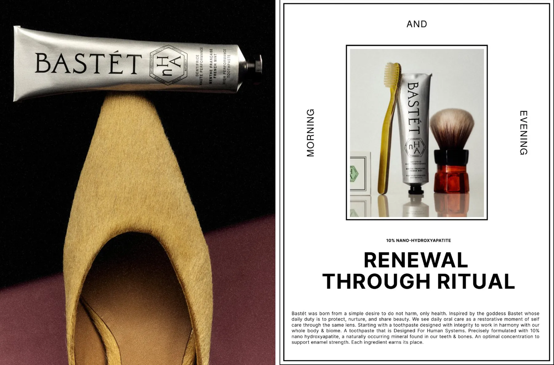
Wedge still kept a few classic industry standards, like a “No List” of excluded ingredients and brushing instructions. The project’s art direction focuses on giving a fresh, clean feeling rather than showing realistic smile shots. Fashion-inspired still-life photos set the scene: a tube nestled on a suede shoe, a silk-gloved hand draped in jewelry, or a chic handbag spilling its contents across pink silk.
Bastét: Bộ Nhận Diện Thương Hiệu Đưa Kem Đánh Răng Lên Kệ Mỹ Phẩm Của Wedge Studio
Nhìn vào thiết kế bao bì của Bastét, điểm gây ấn tượng đầu tiên lại chính là những chi tiết không xuất hiện. Hoàn toàn không có sự kết hợp màu đỏ, xanh, trắng quen thuộc, cũng không có hình ảnh nụ cười mở rộng. Thay vào đó là một tuýp nhôm nguyên bản mang nét công nghiệp, bảng màu tối giản gồm bạc, đen, trắng ngà và điểm xuyết duy nhất một chiếc huy hiệu hình lục giác màu xanh lá.
Studio thiết kế Wedge (có trụ sở tại Montréal và Los Angeles) đã xây dựng toàn bộ nhận diện thương hiệu cho Bastét, từ việc đặt tên, xây dựng chiến lược cho đến visual identity, bao bì và quy chuẩn thiết kế. Đề bài từ các nhà sáng lập khá ngắn gọn: tạo ra một thương hiệu chăm sóc răng miệng cao cấp, đủ tinh tế để giành một vị trí trên bàn trang điểm. Lời giải của Wedge là biến việc đánh răng hàng ngày thành một nghi thức làm đẹp và làm mới bản thân.
Wordmark và typography mang dấu ấn kiến trúc
Phần wordmark của thương hiệu được vẽ tay hoàn toàn chứ không dùng font chữ dựng sẵn. Wedge lấy cảm hứng từ những dòng chữ khắc đá trên mặt tiền tòa nhà Grande Galerie de l’Évolution thuộc Bảo tàng Lịch sử Tự nhiên Paris từ năm 1889. Các nét chữ sở hữu phần chân độc đáo, khoảng nối hẹp và góc mở sắc nét, tạo nên cảm giác chỉn chu và tin cậy.
Typeface chính của thương hiệu tiếp nối tinh thần này với bộ font Daubenton (do Olivier Dolbeau thiết kế) – một font serif tương phản cao thuộc họ Didot. Đối với các văn bản kích thước nhỏ như danh sách thành phần song ngữ (Anh – Pháp), hệ thống hạ xuống font Nimbus Sans bản Regular và Condensed để đảm bảo độ rõ ràng. Việc thể hiện hai ngôn ngữ trên cùng một mặt bao bì buộc nhóm thiết kế phải cô đọng thông tin, chỉ giữ lại những chi tiết cốt lõi.
Chất liệu bao bì và định hướng nghệ thuật
Về mặt chất liệu, thiết kế được chia làm hai phần: vỏ hộp giấy dành cho kệ bán lẻ, còn tuýp kem dành riêng cho không gian trang điểm. Tuýp kem làm từ nhôm không tráng phủ, bắt sáng nhẹ và dễ móp mềm theo thời gian sử dụng, tạo cảm giác giống như một tuýp màu vẽ của họa sĩ. Chiếc huy hiệu màu xanh lá cây là điểm nhấn màu sắc duy nhất, chịu trách nhiệm làm nổi bật thành phần hero nHA (nano hydroxyapatite) – một khoáng chất tự nhiên giúp bảo vệ men răng.
Wedge vẫn giữ lại một vài quy chuẩn quen thuộc của ngành như danh sách các chất không sử dụng (No List) và hướng dẫn đánh răng. Định hướng hình ảnh (art direction) của dự án tập trung truyền tải cảm giác sạch sẽ thay vì sử dụng hình ảnh nụ cười thực tế. Những bức ảnh tĩnh vật được dàn dựng theo phong cách thời trang: tuýp kem đặt trên chiếc giày da lộn, bàn tay đeo găng lụa mang trang sức, hay chiếc túi xách đổ tung đồ đạc trên nền lụa hồng.