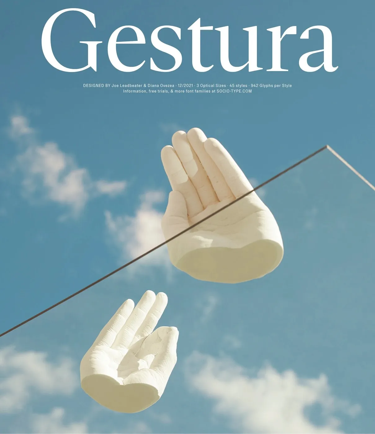

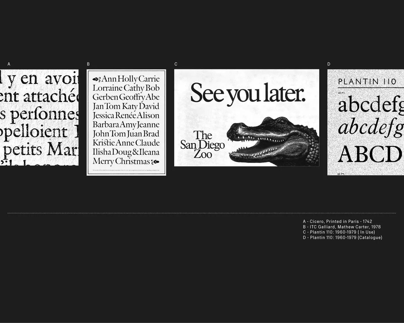

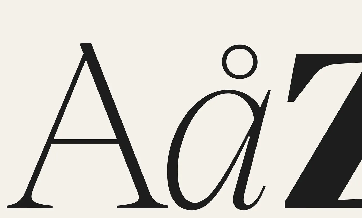
Gestura: A Fresh, Calligraphy-Inspired Modern Serif Superfamily from Sociotype Foundry Sociotype Foundry just dropped Gestura, an impressive serif superfamily designed by Joe Leadbeater and Diana Ovezea. The design traces its roots back to 16th-century old-style typography through Robert Granjon’s Gros Cicero, while also drawing inspiration from the elegance of Matthew Carter’s Galliard and the clean efficiency of Monotype’s Plantin. Instead of crafting a nostalgic replica, the design team infused sharp, modern touches, striking a sweet spot between editorial precision and fluid human warmth.
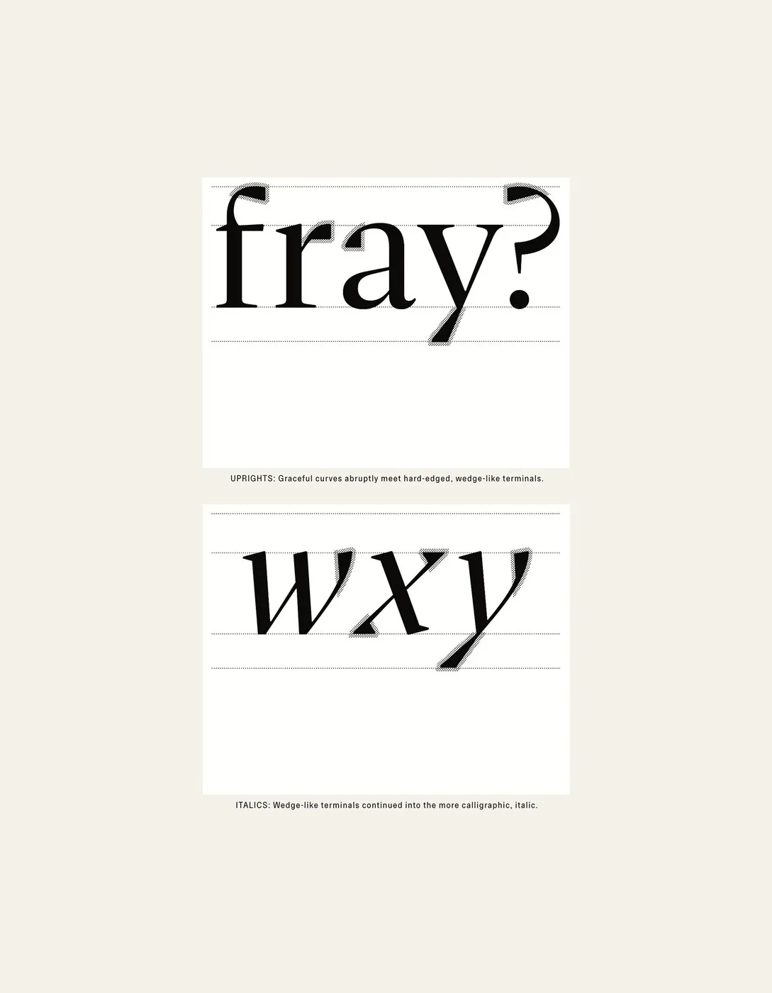
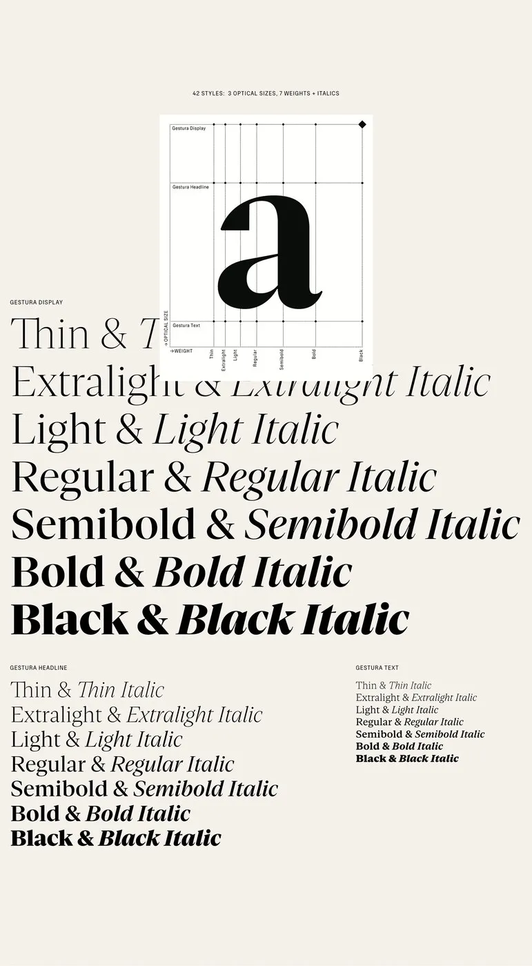
Technically speaking, Gestura features a smart system of three optical sizes: Display, Headline, and Text. The complete superfamily boasts 42 styles across seven weights ranging from Thin to Black, with over 900 glyphs per cut to effortlessly support complex publishing systems. In the upright posture, flowing curves meet sharp, wedge-like terminals. When switched to italics, geometric structure makes way for the rhythmic grace of broad-nibbed pen calligraphy, giving the terminals an extra crisp edge. The Display size cranks up the stroke contrast for high impact, whereas the Text version optimizes stems and opens up apertures to deliver maximum clarity during long-form reading.
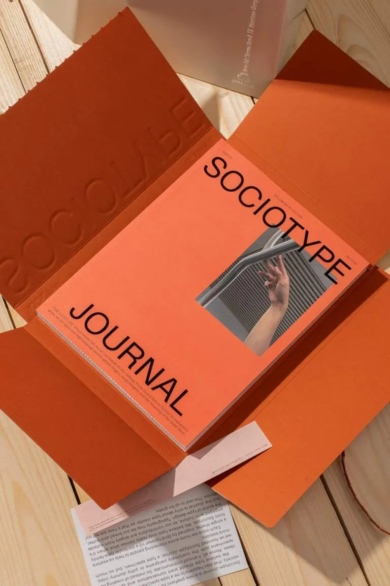
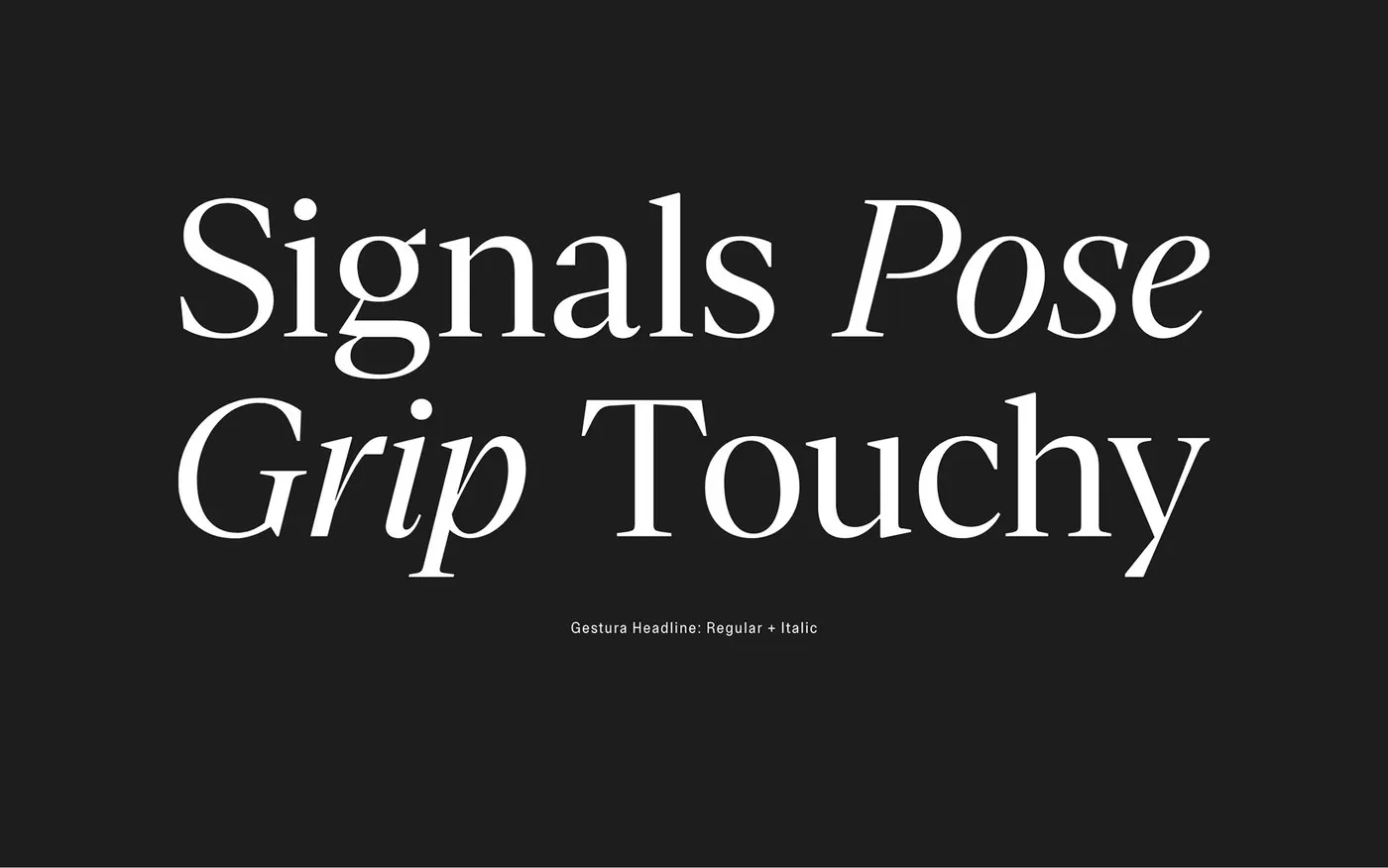
Gestura was shaped and field-tested side by side with the publication Sociotype Journal, proving its incredible adaptability across everything from dense essays to standout pull quotes and bold headlines. This project serves as proof that historic font forms remain a rich playground when shaped by a modern design mindset.
Check out more details about the project on www.behance.net/gallery/138400607/Gestura-Typeface.
Gestura: Bộ font serif hiện đại mang hơi thở thư pháp từ Sociotype Foundry
Sociotype Foundry vừa ra mắt Gestura, một họ font serif (serif superfamily) đầy ấn tượng được thiết kế bởi Joe Leadbeater và Diana Ovezea. Thiết kế này lấy gốc rễ từ phong cách old-style thế kỷ 16 qua mẫu Gros Cicero của Robert Granjon, đồng thời tham chiếu nét đẹp từ Galliard của Matthew Carter và tính gọn gàng của Plantin từ Monotype. Thay vì tạo ra một bản sao hoài cổ, nhóm thiết kế đã đưa vào những đường nét hiện đại sắc sảo, tạo nên sự cân bằng giữa tính kỷ luật trong thiết kế biên tập và nét mềm mại, linh hoạt của con người.
Về mặt kỹ thuật, Gestura sở hữu hệ thống gồm 3 kích thước quang học (optical sizes): Display, Headline và Text. Toàn bộ superfamily bao gồm 42 styles trải dài qua 7 độ dày (weights) từ Thin đến Black, với hơn 900 glyphs trong mỗi bản cắt nhằm đáp ứng các hệ thống xuất bản phức tạp. Ở dáng chữ đứng, các đường cong uyển chuyển kết hợp cùng chân nét (terminals) dạng nêm góc cạnh. Khi chuyển sang dáng nghiêng (italics), cấu trúc hình học nhường chỗ cho sự nhịp nhàng của nghệ thuật thư pháp bút ngòi bằng (broad-nibbed pen), giúp các chân nét trở nên sắc sảo hơn. Phiên bản Display nhấn mạnh vào độ tương phản nét chữ cực cao, trong khi phiên bản Text tối ưu hóa stem và aperture mở rộng để đảm bảo độ rõ ràng khi đọc các văn bản dài.
Gestura được định hình và thử nghiệm thực tế song song với ấn phẩm Sociotype Journal, chứng minh khả năng vận hành linh hoạt từ các bài luận dày đặc chữ cho đến các đoạn trích dẫn hay tiêu đề nổi bật. Đây là minh chứng cho thấy các hình thái font chữ lịch sử vẫn luôn là chất liệu đầy tiềm năng khi được nhào nặn bởi tư duy thiết kế hiện đại.
Xem thêm chi tiết về dự án tại www.behance.net/gallery/138400607/Gestura-Typeface trên Behance.