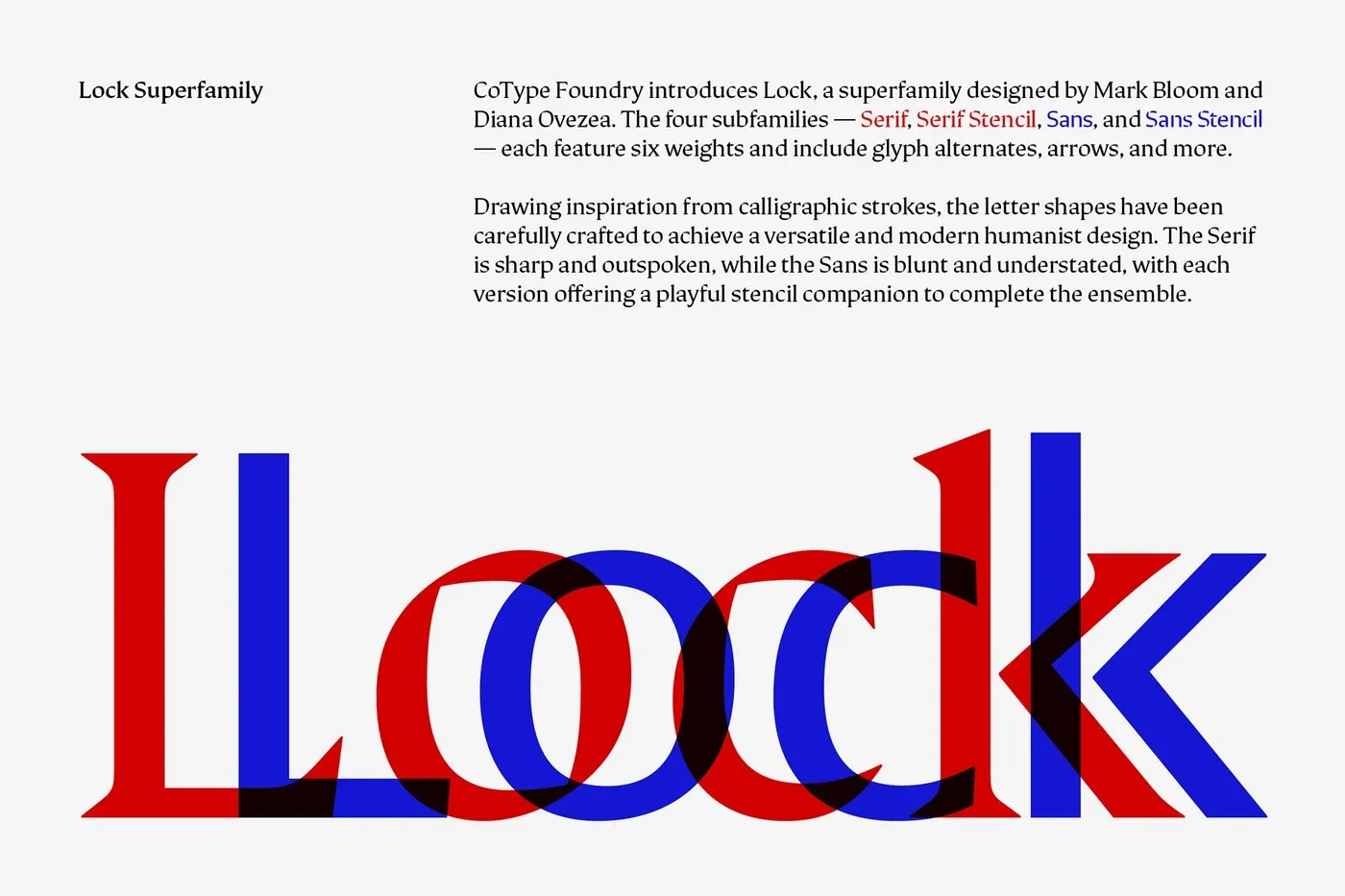
Lock Superfamily: Where Sharp Serifs Meet Minimal Sans Pairing contrasting font styles in a single design project is never a simple task. To solve this challenge, designers Mark Bloom and Diana Ovezea spent over two years developing the Lock Superfamily for CoType Foundry, delivering an ultra-flexible typographic system.
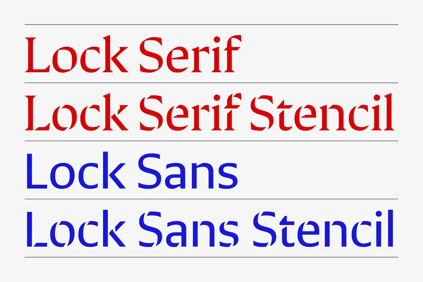
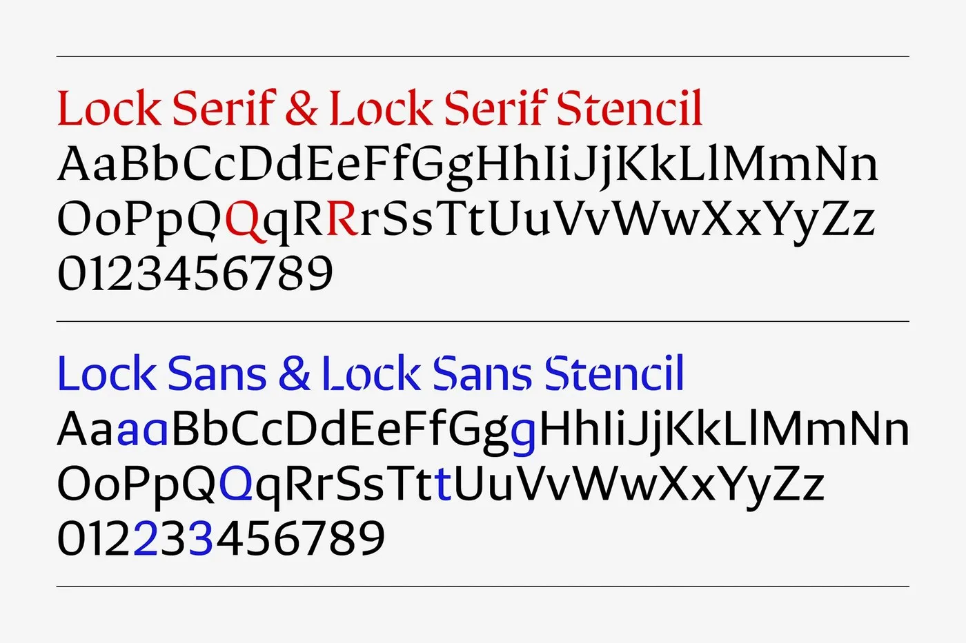
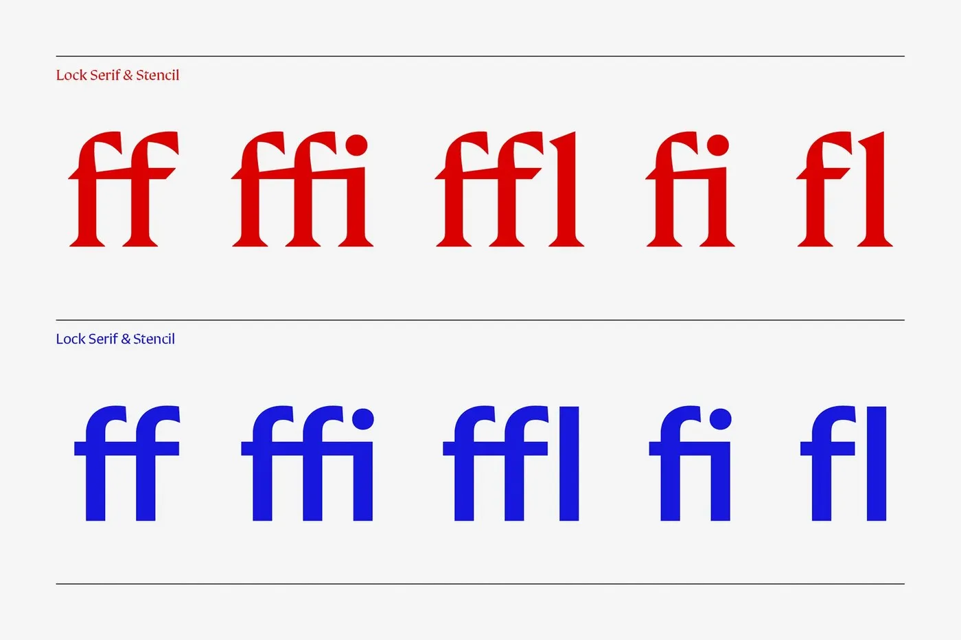
What makes Lock so exciting is how it brings two opposite ends of the spectrum together. On one side, Lock Serif boasts sharp, angular wedge serifs packed with personality. On the other, Lock Sans strips away decorative details to keep letterforms clean, direct, and minimal. Despite their visual contrast, both styles share the exact same broad-nib calligraphic skeleton. Thanks to matching proportions and cap heights, switching between classic editorial headlines and crisp modern body text is totally effortless and keeps layout flow perfectly intact.
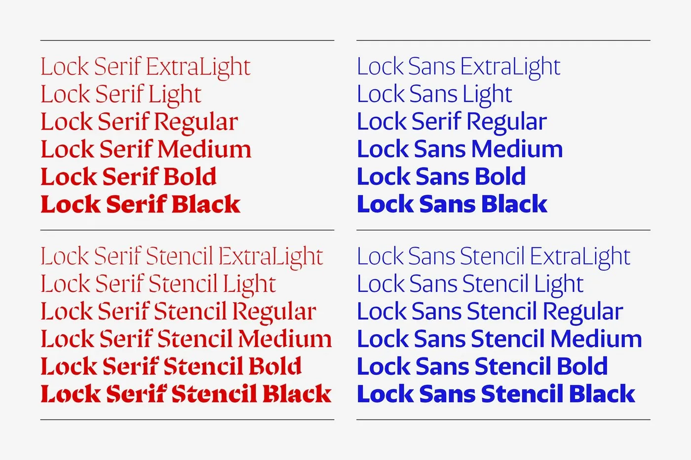
System Structure & Flexibility The typeface family breaks down into four main subfamilies across six weights, ranging from ExtraLight to Black. Going beyond standard Serif and Sans cuts, each branch also features a playful, characterful Stencil version. Instead of cold, mechanical breaks, the stencil cutouts follow the natural rhythm of broad-nib writing tools.
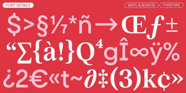
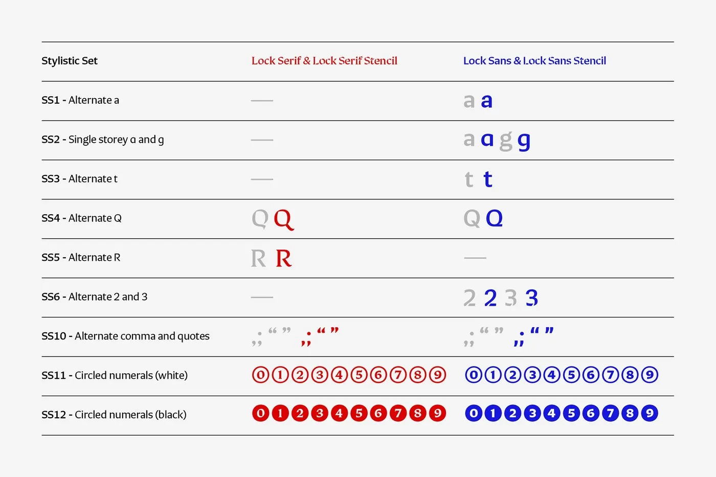
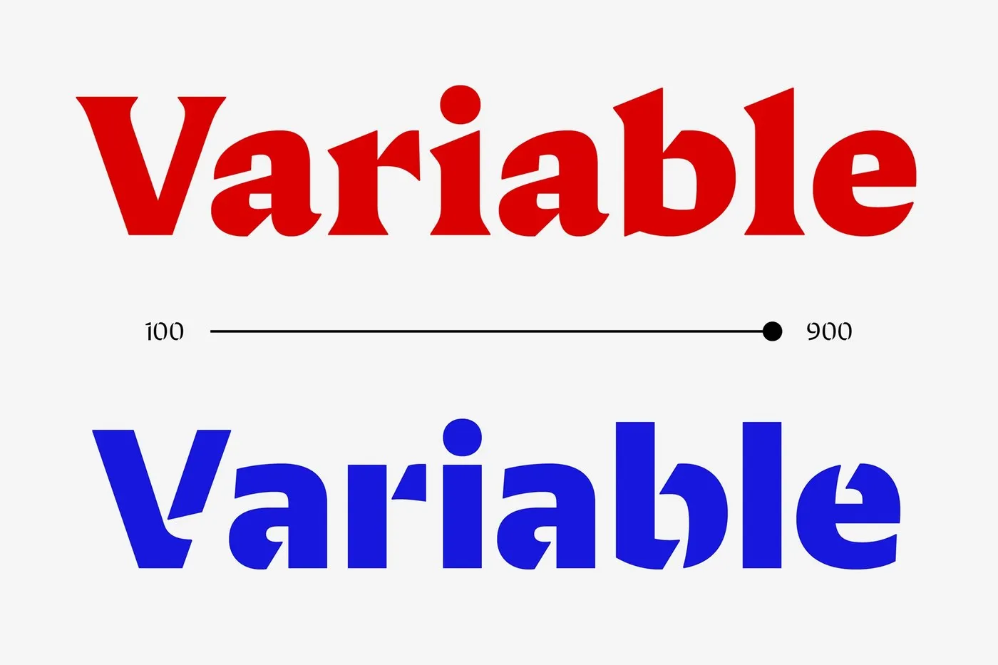
The Lock Superfamily also packs a Variable Font axis spanning 100 to 900 alongside 12 stylistic sets. Swapping out alternate character shapes for glyphs like ‘a’, ‘g’, ‘Q’, and ‘R’ or inserting circled numbers, arrows, and ligatures is as smooth as it gets.
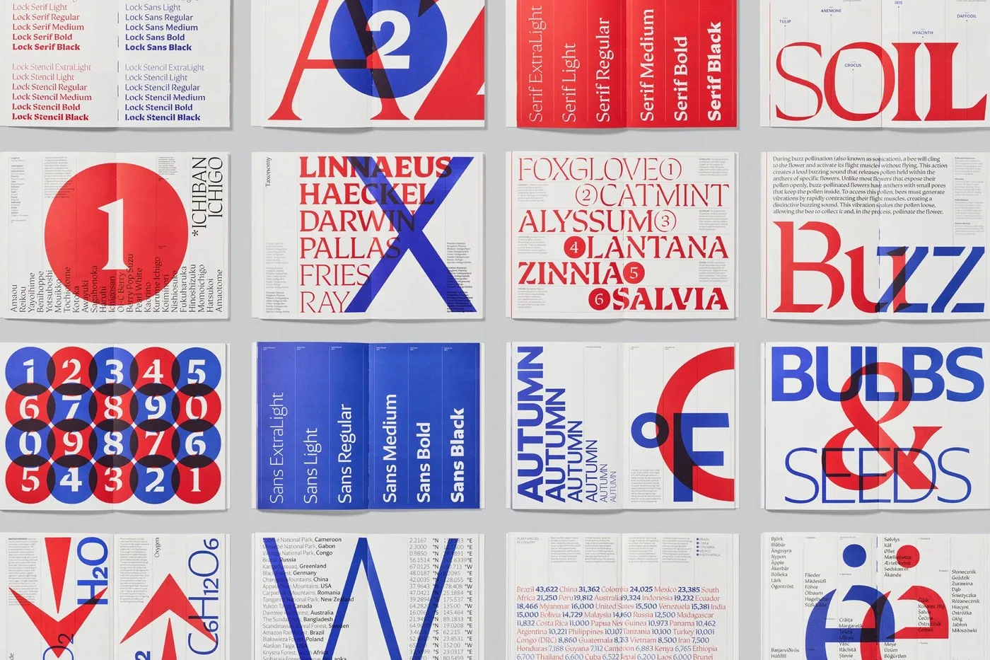
Putting It to the Test in Print To showcase the full power of this type system in print, designer Astrid Stavro crafted a stunning specimen book printed by Future Format. The editorial publication puts typography front and center, handling everything from dense taxonomy data tables to massive headline specimen pages with ease.
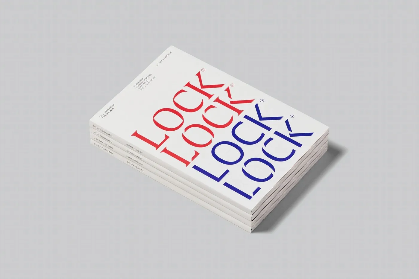
The cover features subtle blind debossing paired with two spot inks—vibrant red and deep blue—on smooth uncoated paper. It stands as clear proof that this typeface family can adapt just as brilliantly to technical, information-dense layouts as it does to bold, expressive headlines.
Check out the complete project showcase on www.behance.net/gallery/208119741/Lock-Superfamily.
Lock Superfamily: Sự kết hợp giữa Serif sắc nét và Sans tối giản từ Mash Creative
Kết hợp hai phong cách font tương phản trong cùng một dự án thiết kế chưa bao giờ là bài toán đơn giản. Để giải quyết vấn đề này, hai designer Mark Bloom và Diana Ovezea đã dành ra 2 năm phát triển bộ font Lock Superfamily cho CoType Foundry, mang đến một hệ thống chữ vô cùng linh hoạt.
Điểm thú vị của Lock nằm ở sự kết hợp giữa hai thái cực đối lập. Một bên là Lock Serif sở hữu các đường chêm (wedge serif) góc cạnh, sắc nét và đầy cá tính. Bên còn lại là Lock Sans được giản lược mọi chi tiết trang trí, giữ lại khung chữ thẳng thắn và tối giản. Dù vẻ ngoài tương phản, cả hai đều chia sẻ chung một bộ khung nét bút calligraphic. Nhờ tỷ lệ và chiều cao chữ đồng nhất, người làm thiết kế có thể linh hoạt chuyển đổi giữa các dòng tiêu đề cổ điển và phần văn bản hiện đại mà vẫn giữ nguyên tính thống nhất cho bố cục.
Cấu trúc hệ thống và tính linh hoạt
Bộ font bao gồm 4 họ chữ chính với 6 độ dày (weight) từ ExtraLight đến Black. Không dừng lại ở bản Serif và Sans tiêu chuẩn, mỗi nhánh còn sở hữu thêm phiên bản Stencil độc đáo. Thay vì tạo các đường cắt nét kiểu máy móc, tác giả đã vát những góc cắt theo nhịp điệu tự nhiên của dụng cụ viết chữ.
Lock Superfamily cũng hỗ trợ một trục Variable Font kéo dài từ 100 đến 900 cùng 12 bộ Stylistic Sets. Nhờ đó, việc thay đổi dáng chữ như ‘a’, ‘g’, ‘Q’, ‘R’, hay chèn các ký hiệu số khoanh tròn và ligature trở nên vô cùng dễ dàng.
Ấn phẩm trải nghiệm thực tế
Để thể hiện sức mạnh của hệ thống font trên chất liệu in ấn, designer Astrid Stavro đã thiết kế một cuốn sách specimen do Future Format sản xuất. Ấn phẩm này biến typography thành nhân vật chính trong các bố cục editorial, xử lý mượt mà từ những bảng dữ liệu phân loại sinh học dày đặc cho đến các trang trưng bày chữ kích thước lớn.
Bìa sách sử dụng kỹ thuật dập chìm (blind debossing) tạo độ nhám tinh tế, kết hợp in hai màu mực spot red và deep blue trên giấy uncoated mịn. Cuốn sách là bằng chứng thuyết phục cho thấy bộ font có thể đáp ứng tốt cả các dự án khoa học đòi hỏi sự rõ ràng lẫn những tiêu đề báo chí mang tính biểu cảm cao.
Có thể xem trọn vẹn dự án của www.behance.net/gallery/208119741/Lock-Superfamily trên Behance.