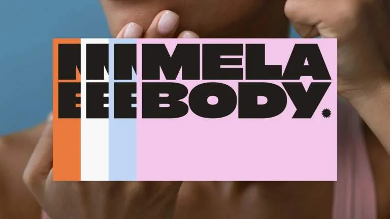
The JGroup rebrand is a striking blend of high-fashion elegance and editorial flair.
After more than 20 years of building communication strategies for powerhouse beauty and wellness brands like Rhode, Cay Skin, Haus Labs, and UNOVE, PR agency JLPR has officially rebranded as JGroup. This dynamic repositioning was brought to life under the art direction of graphic designer Rafael Cardoso, alongside creative direction from Mother Sauce’s Lauren and Victoria Durden.
JGroup’s new visual identity radiates warm, sunlit energy, effortlessly honoring print journalism heritage while elevating to the sleek aesthetics of contemporary fashion magazines.
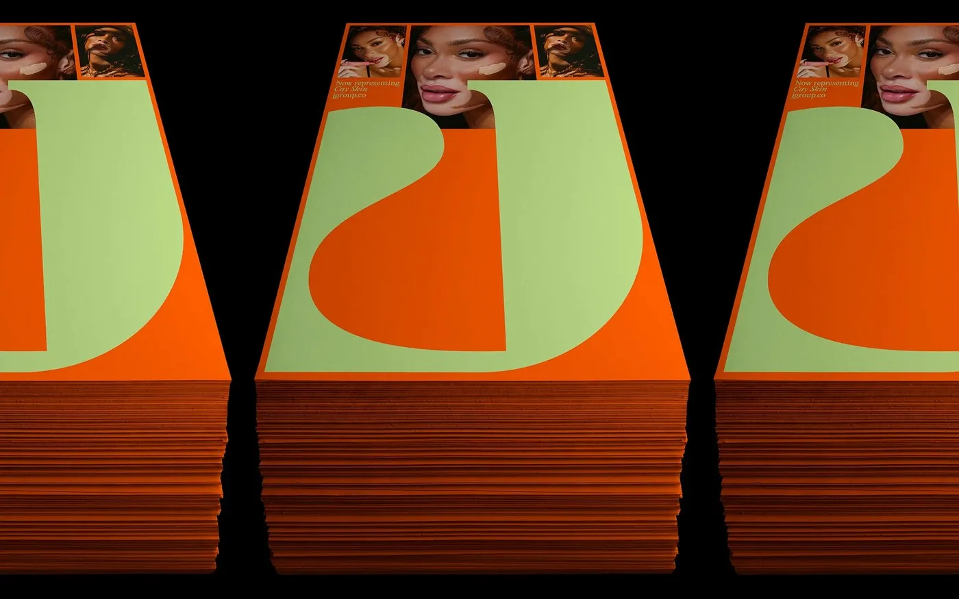
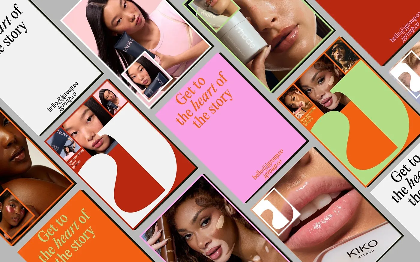
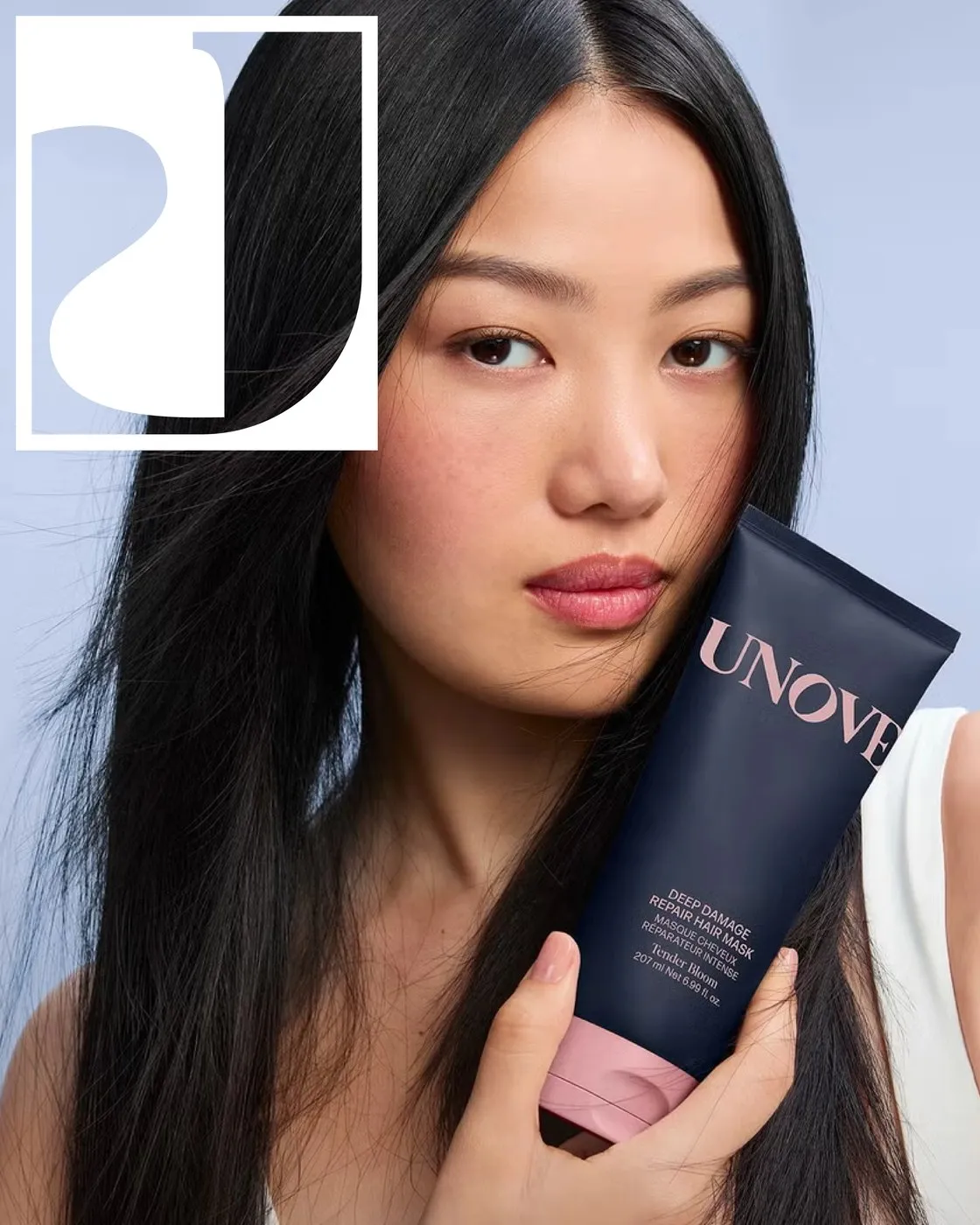
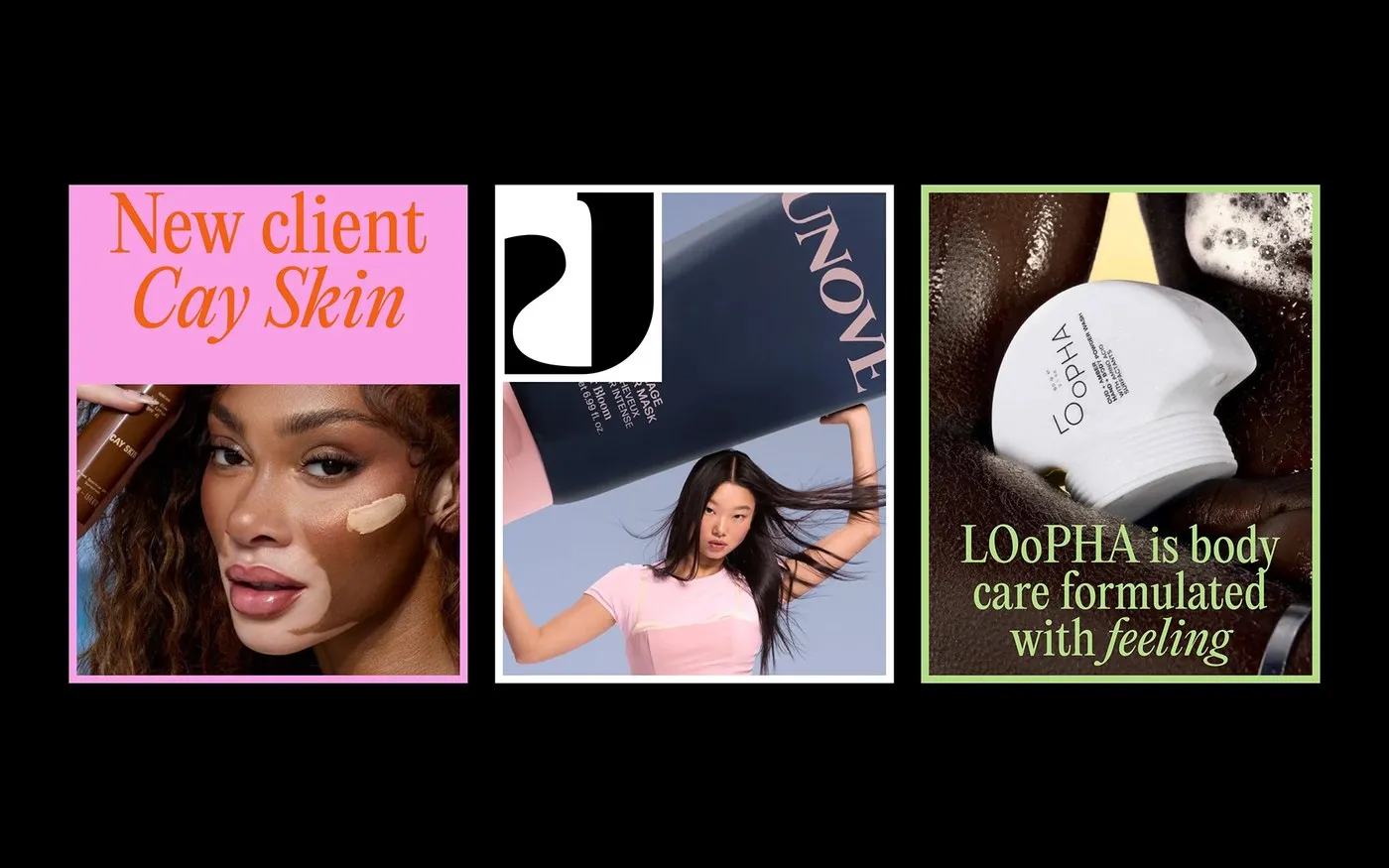
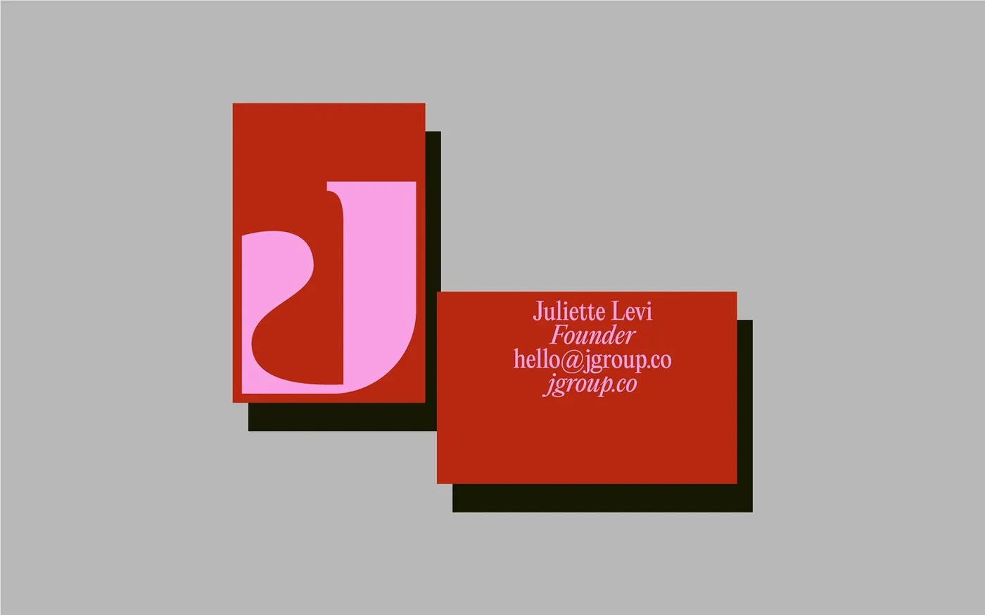
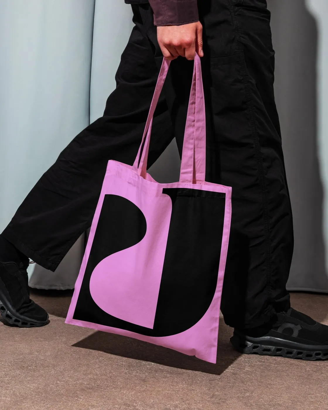
At the center of this visual system is a custom organic serif “J” monogram. Far from a static logo, the extended swash and teardrop terminal of the “J” transform into a versatile frame. On postcards, press kits, and digital lookbooks, the counter-space of the “J” cleverly crops editorial photography, creating a dynamic visual interplay between typography and imagery.
The typographic system seamlessly balances a high-contrast display serif with a clean grotesque sans-serif for web menus and contact details. Italicized headlines like “Get to the heart of the story” highlight the agency’s deep-rooted passion for storytelling.
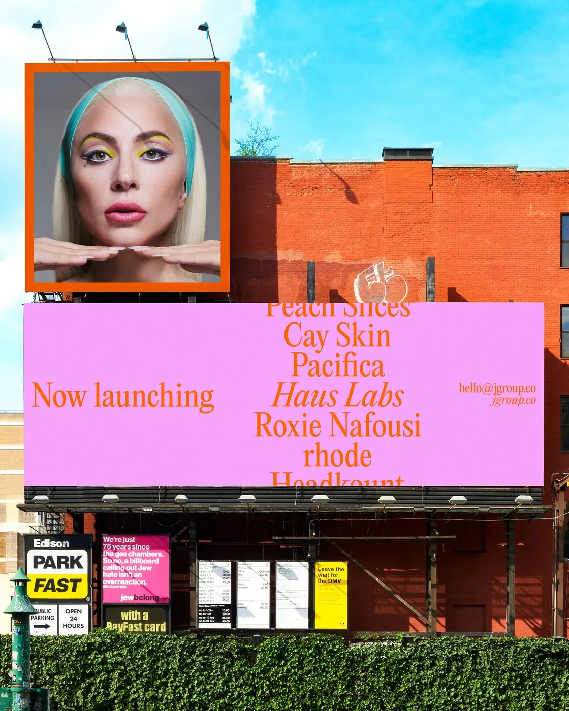
The brand’s color palette bursts with life, combining fiery orange, soft peach, pastel mint green, and deep crimson against moody black or warm paper tones. This vibrant palette makes a bold statement across physical touchpoints—from edge-painted business cards, canvas tote bags, and gift packaging to large-scale outdoor billboards.
For a closer look at the project, check out the full case study on www.behance.net/gallery/254853405/JGroup or visit the designer’s rafael-cardoso.com.
Dự án tái định vị thương hiệu JGroup mang đậm dấu ấn thời trang và báo chí
Sau hơn 20 năm xây dựng chiến lược truyền thông cho các thương hiệu làm đẹp và chăm sóc sức khỏe nổi tiếng như Rhode, Cay Skin, Haus Labs hay UNOVE, agency JLPR đã chính thức đổi tên thành JGroup. Lần tái định vị này được thực hiện dưới sự chỉ đạo nghệ thuật của nhà thiết kế Rafael Cardoso cùng định hướng sáng tạo từ Mother Sauce (Lauren và Victoria Durden).
Hệ thống nhận diện thương hiệu mới của JGroup mang năng lượng rực rỡ như ánh mặt trời, vừa tiếp nối di sản của ngành báo chí in ấn, vừa đáp ứng chuẩn mực của các tạp chí thời trang hiện đại.
Trọng tâm của bộ nhận diện là mẫu chữ monogram “J” dạng organic serif. Thay vì chỉ là một logo tĩnh thông thường, đường cong kéo dài và phần teardrop terminal của chữ “J” được biến thành một khung hình linh hoạt. Trên các bưu thiếp, press kit hay bộ lookbook kỹ thuật số, phần khoảng trống counter-space của chữ “J” được lồng ghép khéo léo để crop các bức ảnh thời trang, tạo ra sự tương tác thị giác đầy thú vị giữa typography và hình ảnh.
Cấu trúc typography kết hợp hài hòa giữa phông chữ serif tiêu đề có độ tương phản cao và phông sans-serif kiểu grotesque gọn gàng cho phần thông tin liên hệ hay menu trang web. Những dòng tiêu đề in nghiêng như “Get to the heart of the story” thể hiện rõ tinh thần kể chuyện vốn là thế mạnh truyền thông của agency.
Bảng màu của thương hiệu tràn đầy sức sống với sự kết hợp của màu cam rực, hồng đào, xanh bạc hà pastel và đỏ thẫm trên nền đen hoặc màu giấy ấm. Bảng màu này phủ sóng rộng rãi từ các sản phẩm văn phòng như danh thiếp phủ màu mép giấy, túi tote vải canvas, hộp quà tặng cho đến các biển quảng cáo ngoài trời.
Chi tiết về dự án có thể tham khảo tại www.behance.net/gallery/254853405/JGroup hoặc trang cá nhân của tác giả tại rafael-cardoso.com.