
“Staying with the Trouble” – An Experimental Zine & Art Book Project by Arina Mozh
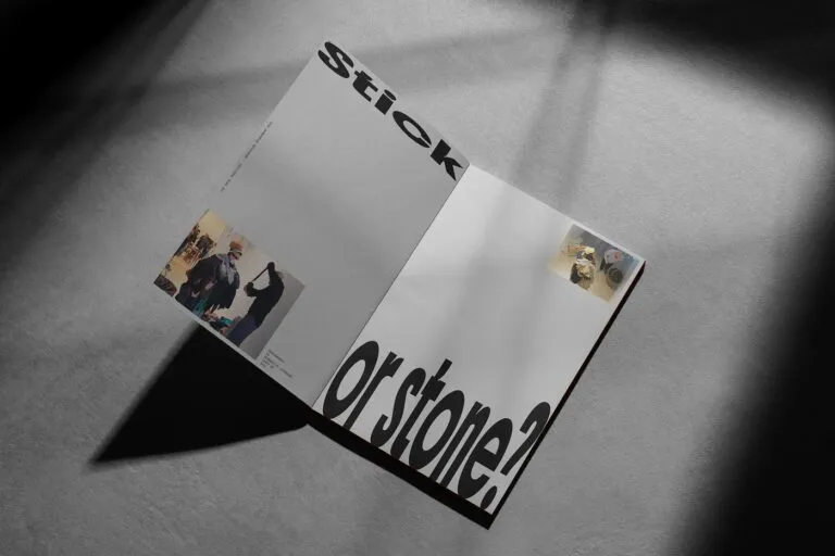
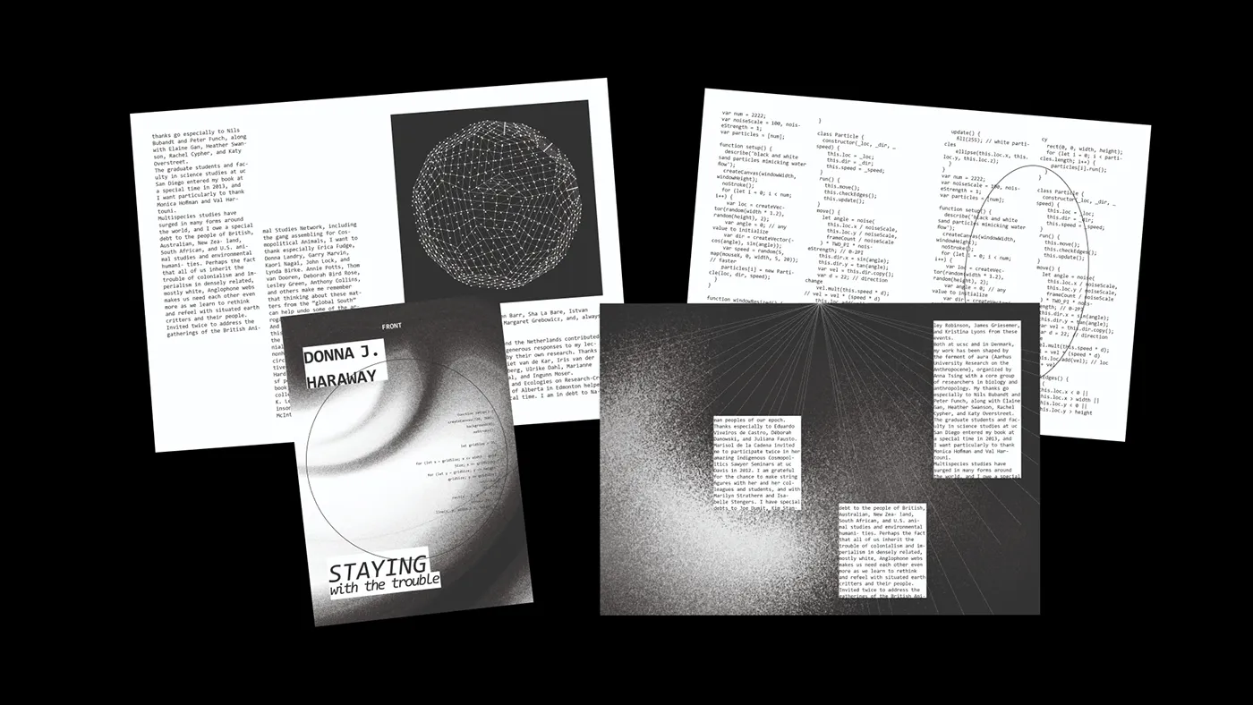
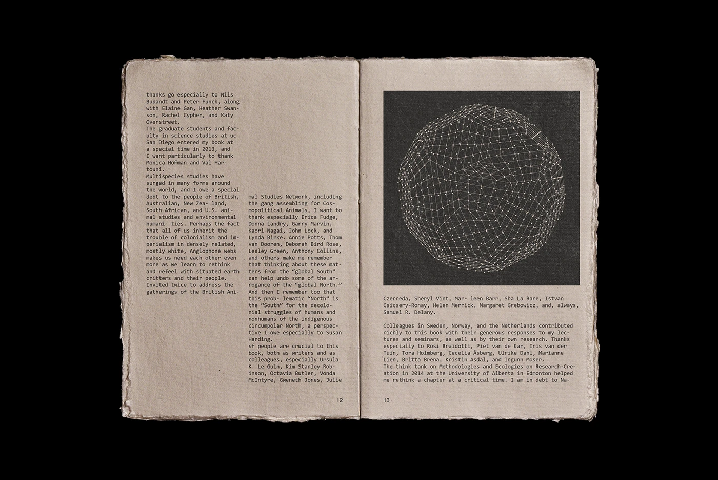
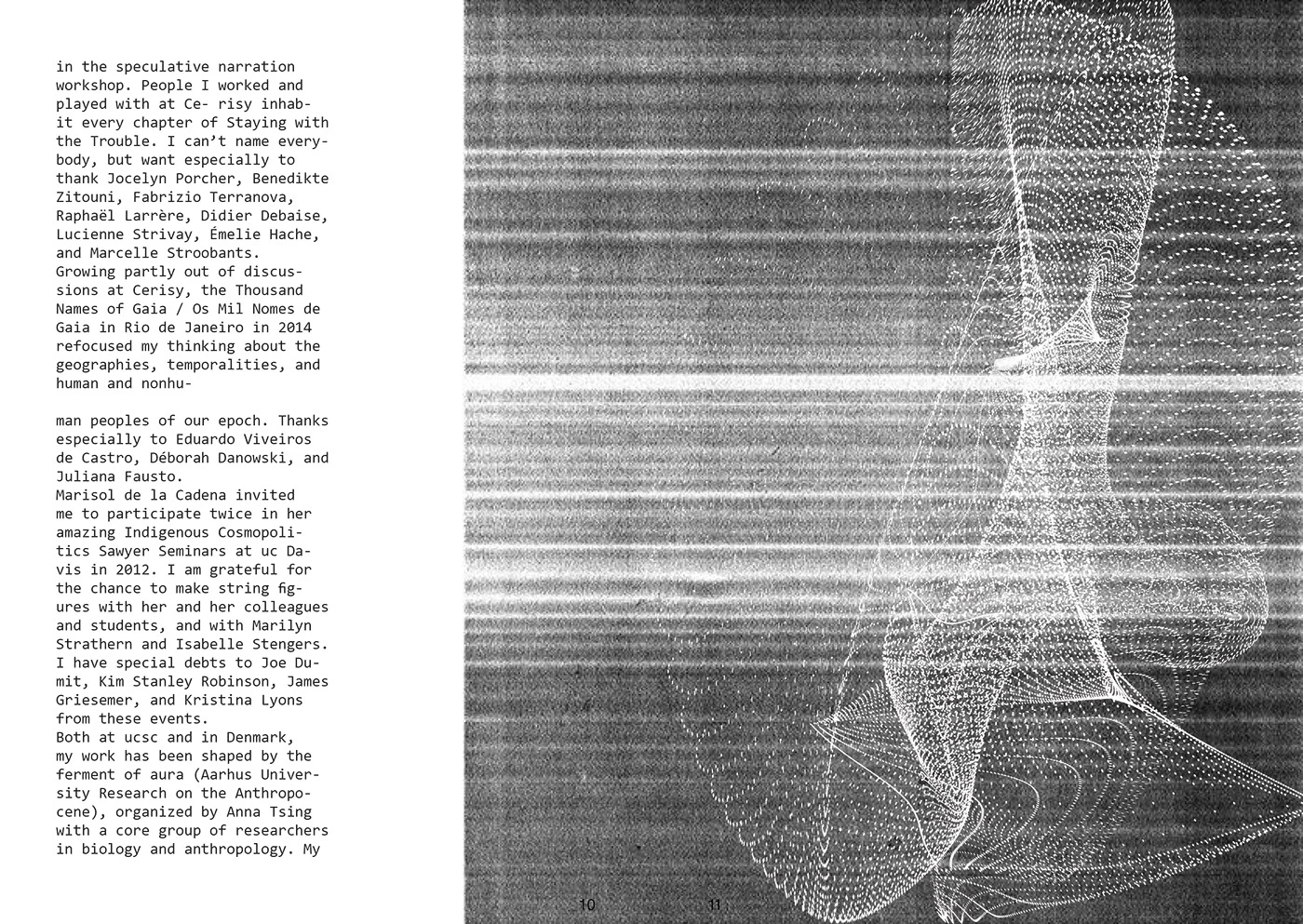
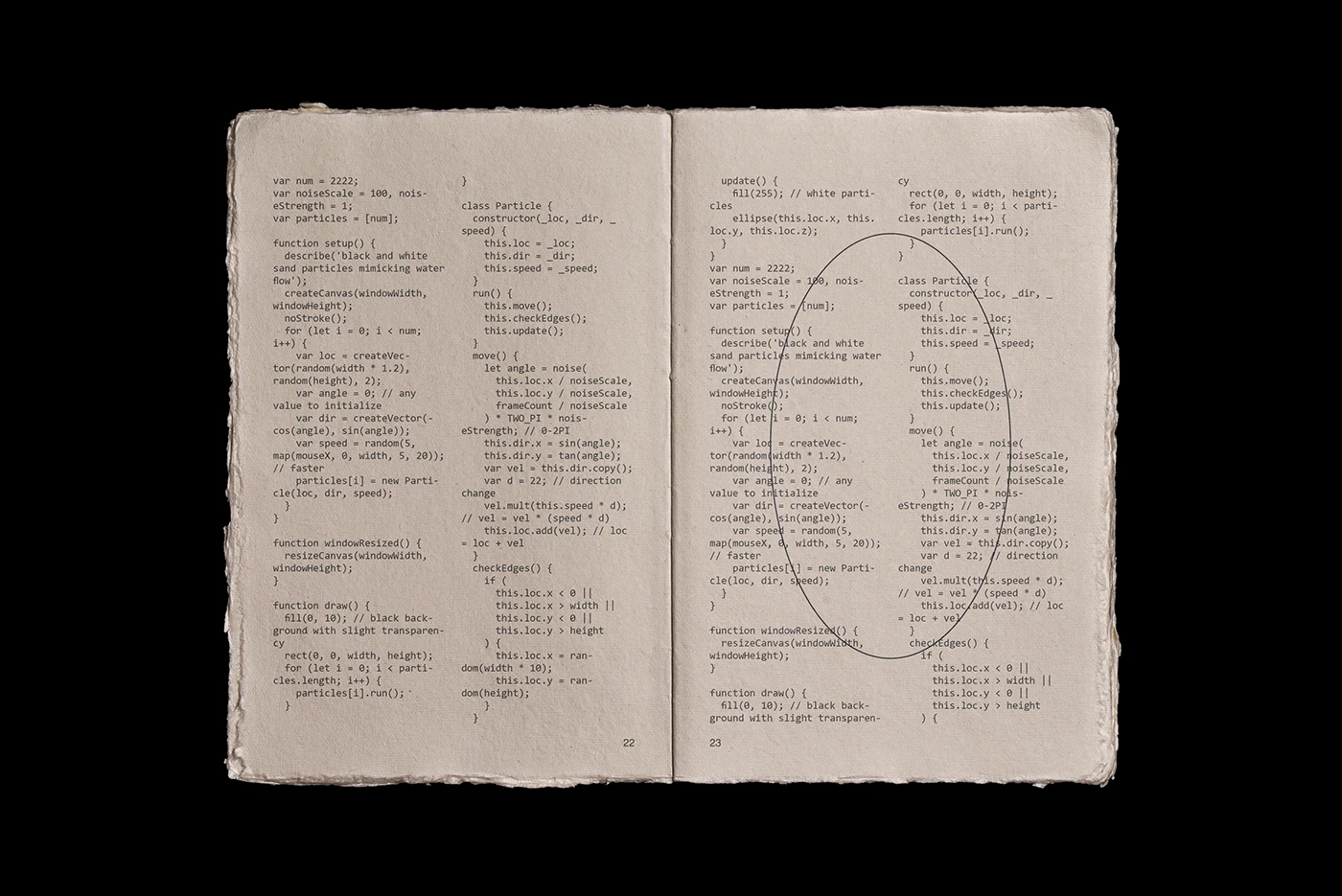
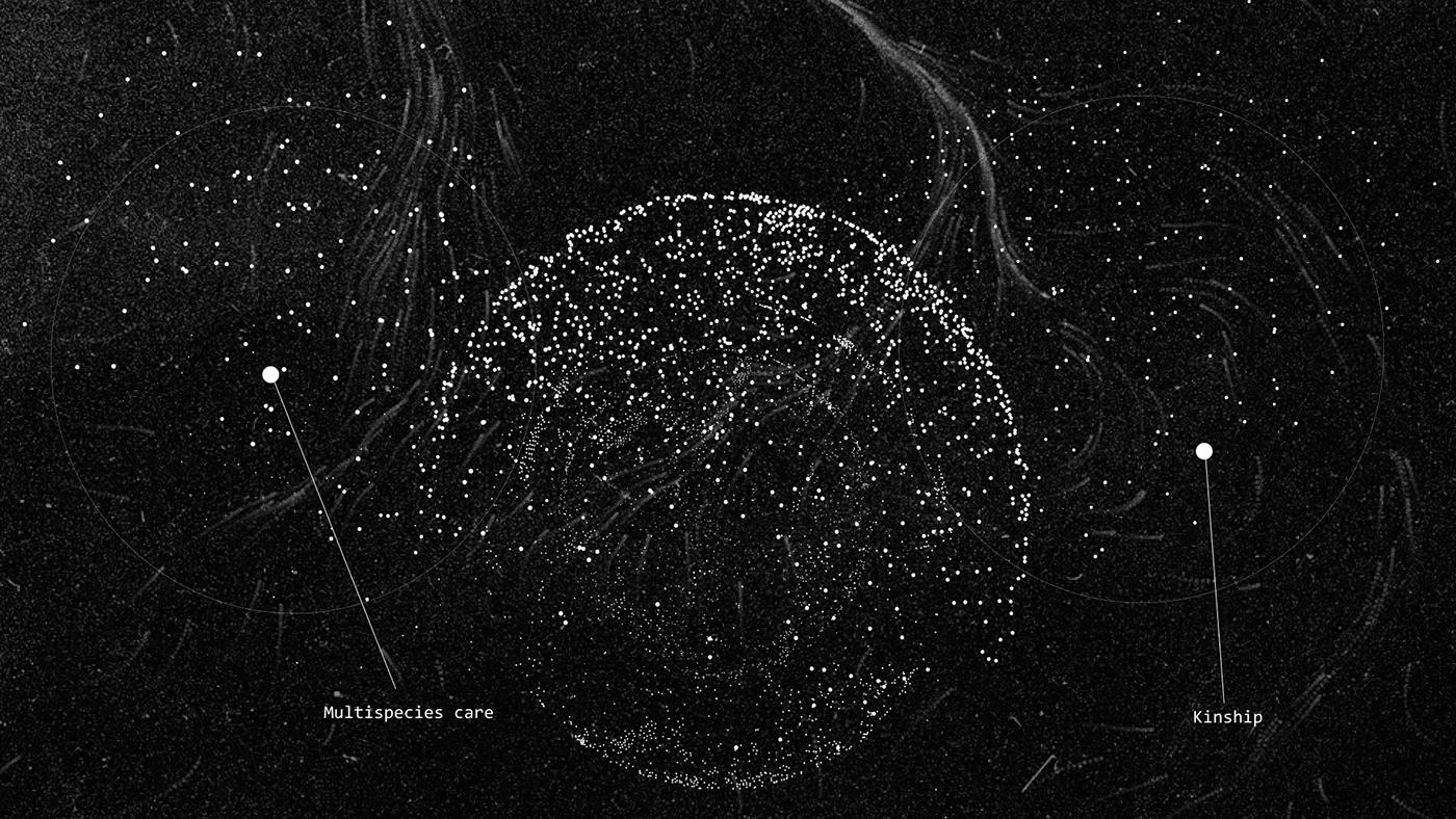
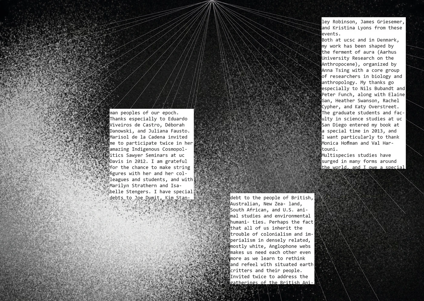
Instead of sticking to the usual art book formula with basic column grids and play-it-safe margins, Arina Mozh turns the zine “Staying with the Trouble” into a dynamic creative playground. Each spread is treated like a real canvas, where bold, oversized typography pairs up with raw photo cutouts and spontaneously layered text blocks.
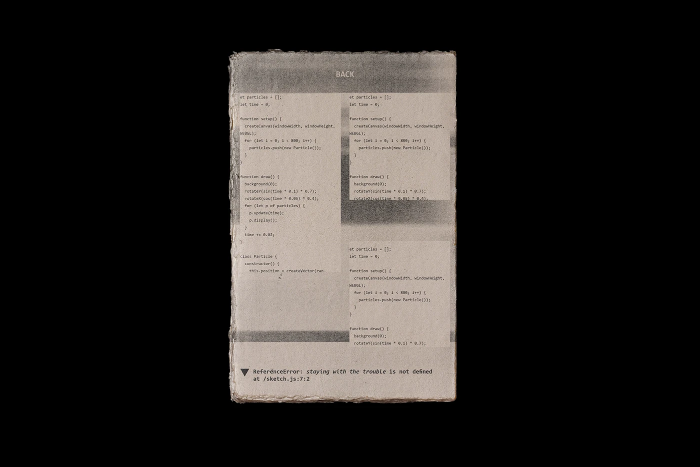
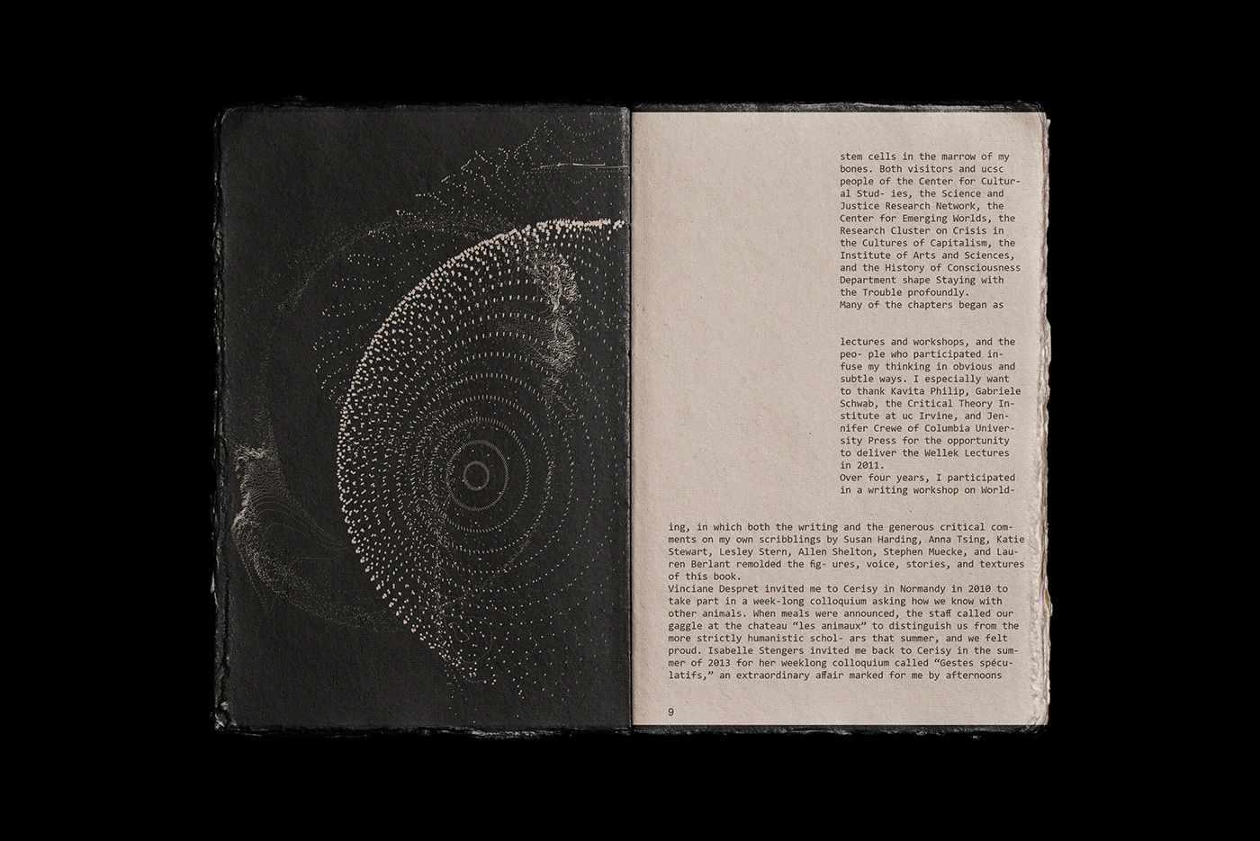
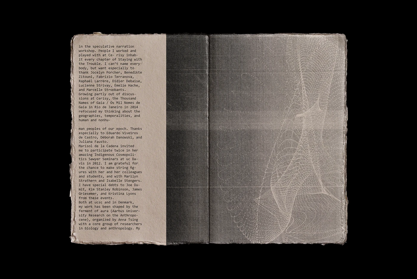
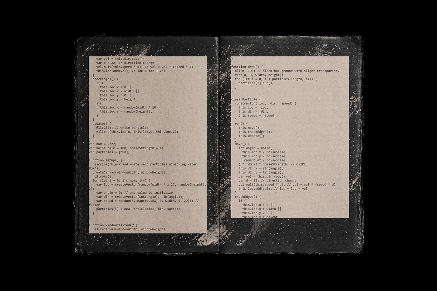
Deep black ink pops against raw, textured paper for some serious visual contrast. The zine hits that sweet spot between the raw, DIY energy of handcrafted printmaking and the sleek precision of editorial design. Thanks to generous margins, long body copy gets plenty of room to breathe, keeping the reading flow super smooth and natural with every page turn.
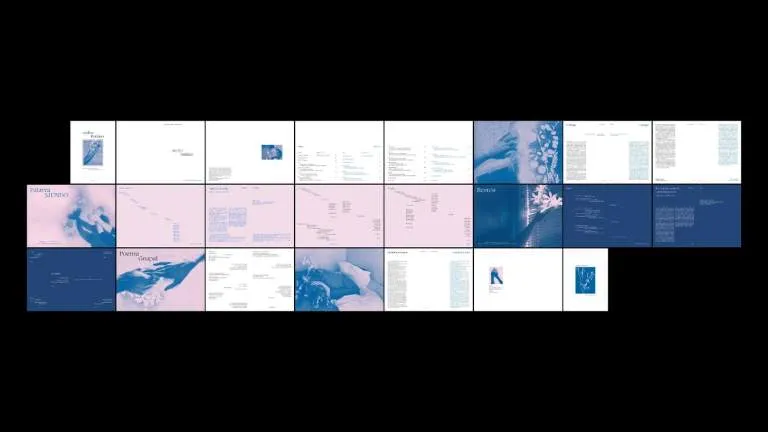
The grid system shifts fluidly from chapter to chapter. Full-bleed photos sitting right next to dense text columns effortlessly guide readers through each section. Mixing clean, crisp sans-serif body copy with sharp, edgy display type creates an awesome visual rhythm.
Even with all that experimental flair, the piece stays perfectly balanced thanks to a clear, cohesive layout structure. Invisible grid lines keep essays, image captions, and page numbers neatly organized without any clutter. A minimalist black-and-white color palette keeps all the focus right where it belongs: on the content itself.
This project is a fantastic example of how independent publishing can break traditional boundaries without needing flashy decorative details. Check out the full spreads and print details on www.behance.net/gallery/219356763/ZineArt-book-Staying-with-the-trouble.
“Staying with the Trouble” – Dự án zine art book với lưới dàn trang thử nghiệm của Arina Mozh
Thay vì đi theo lối mòn của những cuốn art book quen thuộc với hệ thống lưới chia cột đơn giản hay khoảng lề an toàn, Arina Mozh đã biến cuốn zine “Staying with the Trouble” thành một không gian sáng tạo đầy sống động. Tác giả xem mỗi đôi trang sách như một tấm canvas thực thụ, nơi typography khổ lớn sóng đôi cùng những mảng ảnh cắt thô và các khối chữ đè lớp ngẫu hứng.
Mực đen đậm nổi bật trên nền giấy thô tạo nên độ tương phản thị giác rõ rệt. Cuốn sách kết hợp hài hòa giữa chất ngẫu hứng của in ấn thủ công và sự chỉn chu của kỹ thuật dàn trang (editorial design). Nhờ các khoảng lề rộng rãi, những đoạn văn dài có đủ khoảng không để “thở”, giữ cho nhịp đọc luôn mượt mà và tự nhiên qua từng trang lật.
Hệ thống lưới (grid system) trong sách biến chuyển linh hoạt theo từng chương. Những bức ảnh tràn trang đặt cạnh các cột chữ dày dặn giúp dẫn dắt người đọc qua từng chủ đề. Sự kết hợp giữa kiểu chữ sans serif gọn gàng ở phần nội dung và các nét chữ display góc cạnh mang đến nhịp điệu thị giác ấn tượng.
Dù mang tính thử nghiệm cao, tác phẩm vẫn giữ được sự cân bằng nhờ cấu trúc layout mạch lạc. Các đường lưới ẩn giúp tổ chức bài luận, chú thích ảnh và số trang một cách ngăn nắp, không chút rườm rà. Gam màu đen – trắng tối giản giúp tập trung trọn vẹn vào phần nội dung.
Đây là một ví dụ tuyệt vời cho thấy thiết kế xuất bản độc lập hoàn toàn có thể bứt phá các giới hạn thông thường mà không cần đến những chi tiết trang trí cầu kỳ. Chi tiết về toàn bộ đôi trang và bản in có tại www.behance.net/gallery/219356763/ZineArt-book-Staying-with-the-trouble.