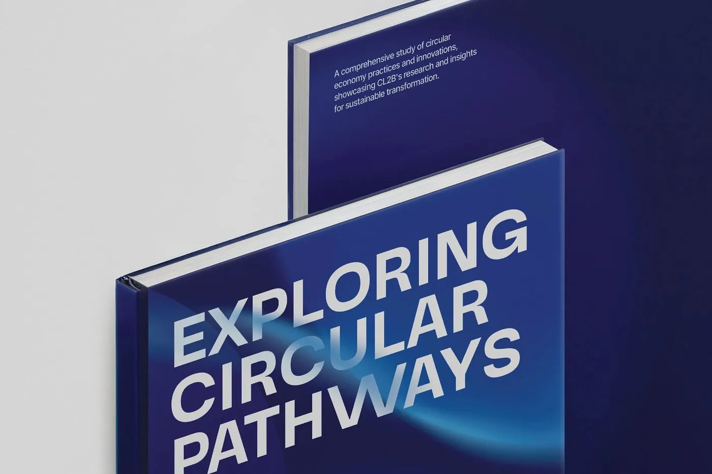
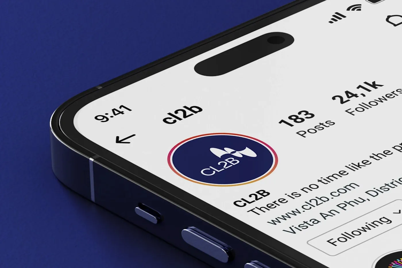
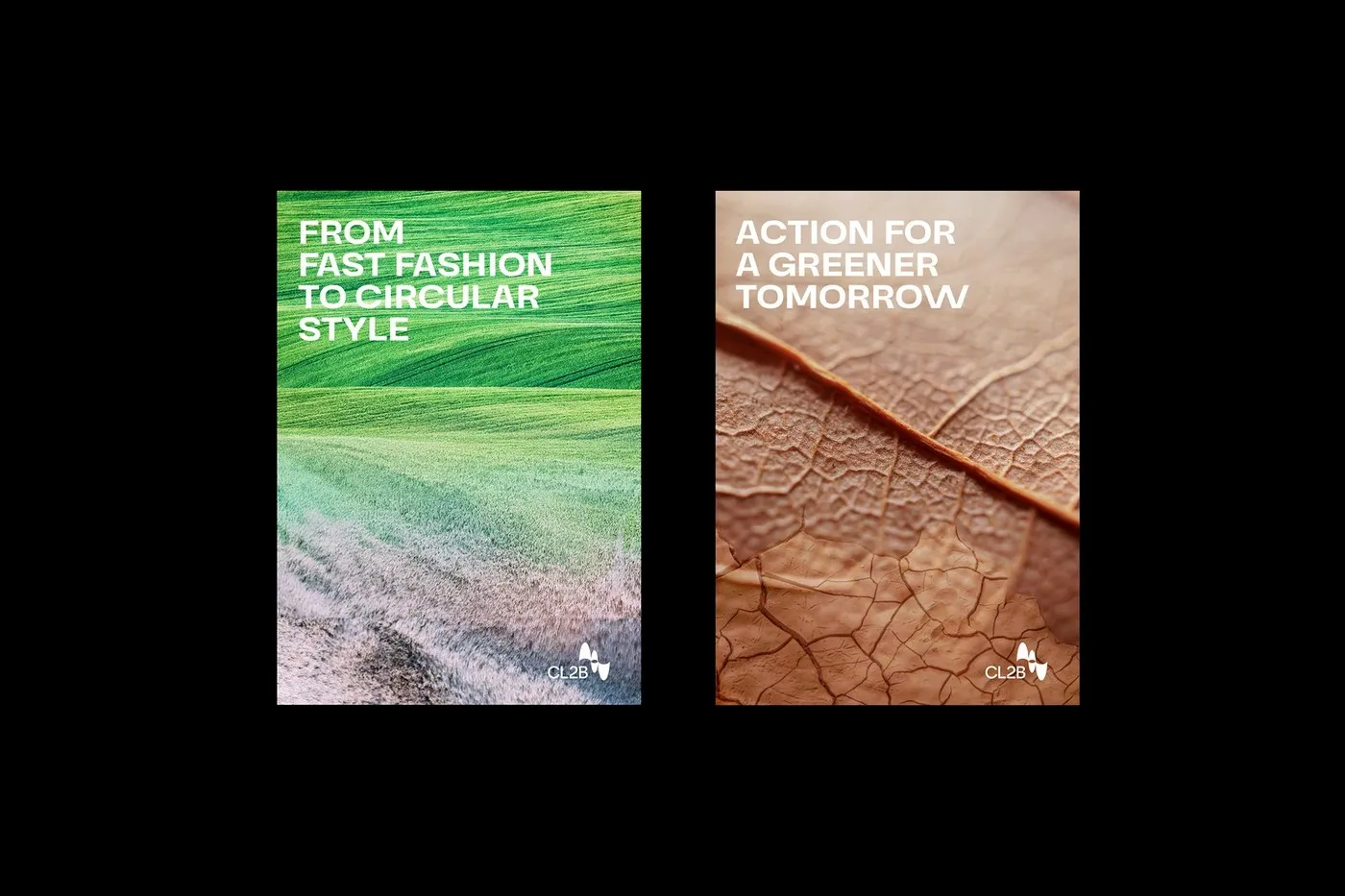
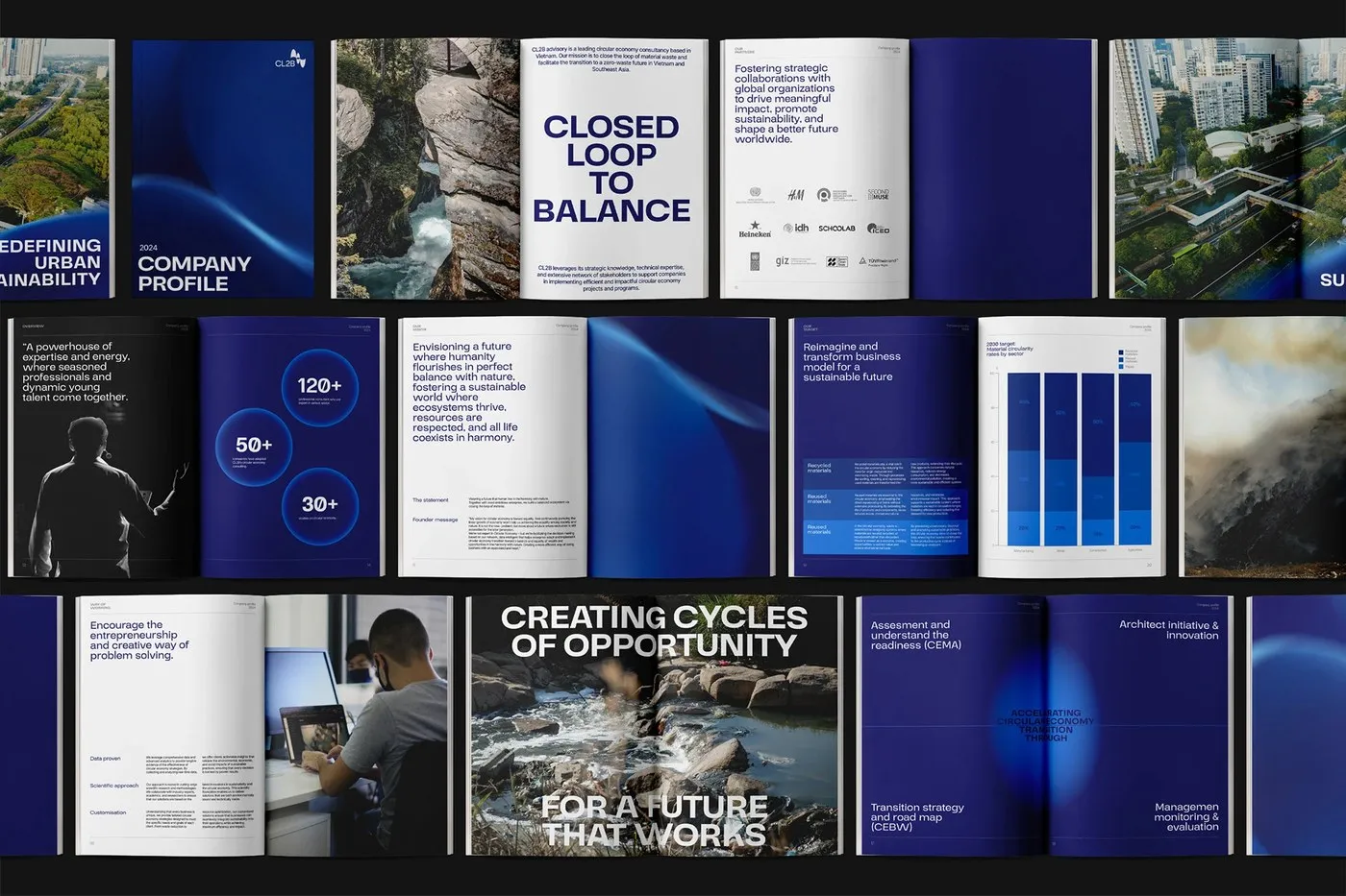
CL2B Brand Identity by Favor Design: A Fresh Take on the Circular Economy When thinking about circular economy consultancies, the color green usually comes to mind right away. However, Favor Design studio brought a completely fresh perspective to the CL2B (Closed Loop to Balance) project in Vietnam with a sleek, minimalist, and modern brand identity.
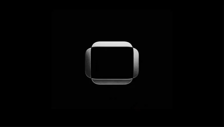
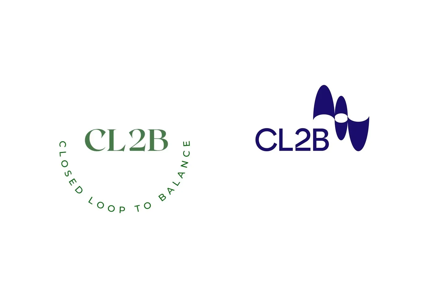
The logomark features intersecting ellipses representing continuous flow, collaboration, and an innovative spirit. Blending sharp corporate structure with soft, fluid curves beautifully captures the shift from a linear economy to a circular one. A bold, contrasting black-and-white color palette anchors the look, delivering a high-impact, professional vibe that reinforces the brand’s position in Southeast Asia.
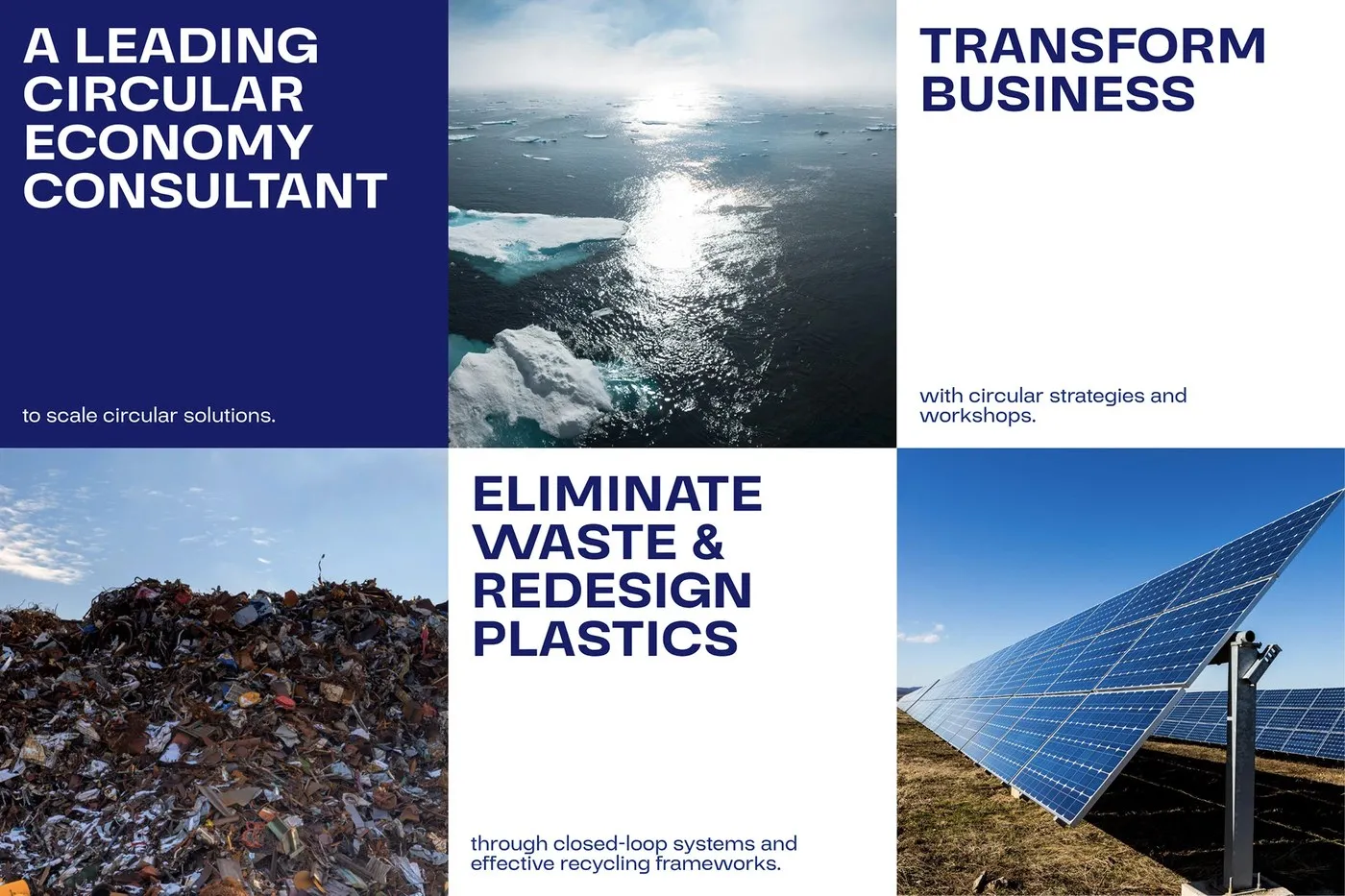
Typography-wise, the CL2B brand name uses a clean, readable grotesque sans-serif typeface. Subtle details across letterforms and numbers—paired with a well-defined typographic scale and a structured modular grid system—make organizing complex scientific data and consulting info feel effortless, clear, and visually engaging.
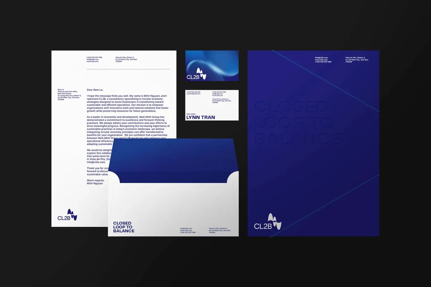
For physical print collateral, the identity system comes to life on eco-friendly paper stocks. Blind embossing on the logo adds a tactile, premium finish that feels incredible in hand. The CL2B project proves that sustainable branding can fully express core values through a minimalist mindset without relying on tired cliches.
Check out the full www.behance.net/gallery/219488657/CL2B-Closed-Loop-to-Balance and explore more creative work on www.behance.net/favordesignvn.
Bộ Nhận Diện CL2B Từ Favor Design: Góc Nhìn Mới Cho Kinh Tế Tuần Hoàn
Nhắc đến các đơn vị tư vấn kinh tế tuần hoàn, nhiều người thường nghĩ ngay đến sắc xanh lá quen thuộc. Tuy nhiên, studio Favor Design đã mang tới một góc nhìn hoàn toàn khác cho dự án CL2B (Closed Loop to Balance) tại Việt Nam bằng một bộ nhận diện tối giản và hiện đại.
Hình ảnh biểu tượng (logomark) được tạo nên từ các đường ellipse lồng vào nhau, đại diện cho dòng chảy liên tục, sự hợp tác và tinh thần đổi mới. Sự kết hợp giữa nét chỉn chu của doanh nghiệp và những đường cong mềm mại phản ánh rõ nét bước chuyển từ mô hình kinh tế tuyến tính sang kinh tế tuần hoàn. Bảng màu chủ đạo gồm hai tông đen – trắng đối lập giúp tạo độ tương phản cao, mang lại sự chuyên nghiệp và khẳng định vị thế của thương hiệu tại khu vực Đông Nam Á.
Về mặt typography, tên thương hiệu CL2B sử dụng kiểu chữ grotesque sans-serif gọn gàng, dễ đọc. Những chi tiết tinh tế ở phần chữ lẫn số, kết hợp với một typographic scale và hệ thống modular grid chặt chẽ, giúp việc sắp xếp các dữ liệu khoa học hay thông tin tư vấn phức tạp trở nên mạch lạc và trực quan hơn.
Ở phần ấn phẩm thực tế, đội ngũ thiết kế ứng dụng hệ thống nhận diện lên các chất liệu giấy thân thiện với môi trường. Kỹ thuật dập nổi (blind embossing) logo tạo nên bề mặt nổi bật và chân thực khi cầm trên tay. Dự án CL2B cho thấy thiết kế thương hiệu bền vững vẫn có thể truyền tải trọn vẹn giá trị cốt lõi bằng tư duy tối giản mà không cần đi theo những lối mòn quen thuộc.
Xem chi tiết dự án CL2B trên www.behance.net/gallery/219488657/CL2B-Closed-Loop-to-Balance và tham khảo thêm các sản phẩm khác từ www.behance.net/favordesignvn.
Nguồn: abduzeedo.com