Visual Identity for the “From The Inside” Exhibition by Jarosław Dziubek Most art exhibition graphics prefer to play it safe in the background, letting the artwork take center stage. But for the “From The Inside” exhibition, Warsaw-based designer Jarosław Dziubek took a much bolder route, crafting a visual system meant to spark instant visual curiosity.
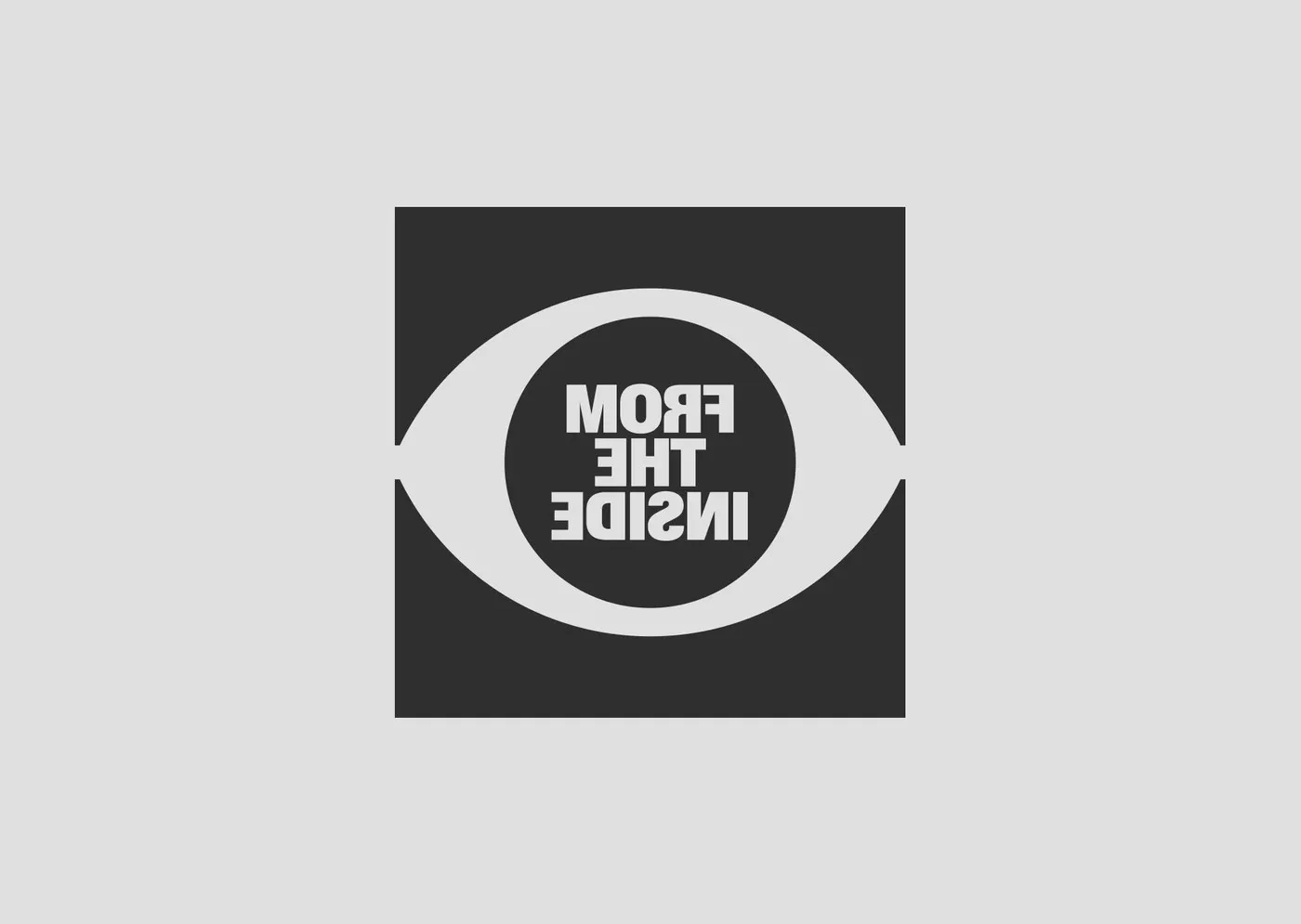
Drawing inspiration from viewing classical art through a modern lens, Dziubek developed a striking mirrored typography system. Flipping the letters like a reflection creates a clever sense of looking directly from the inside of the canvas out into the world.
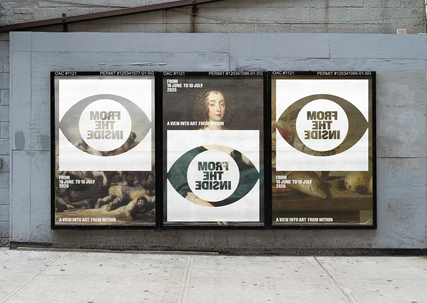
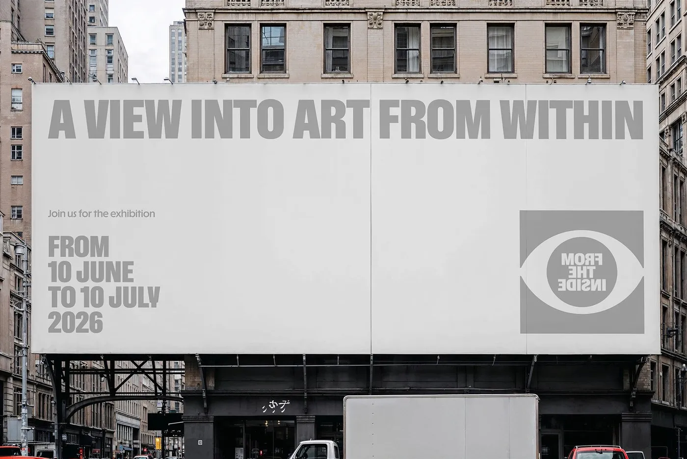
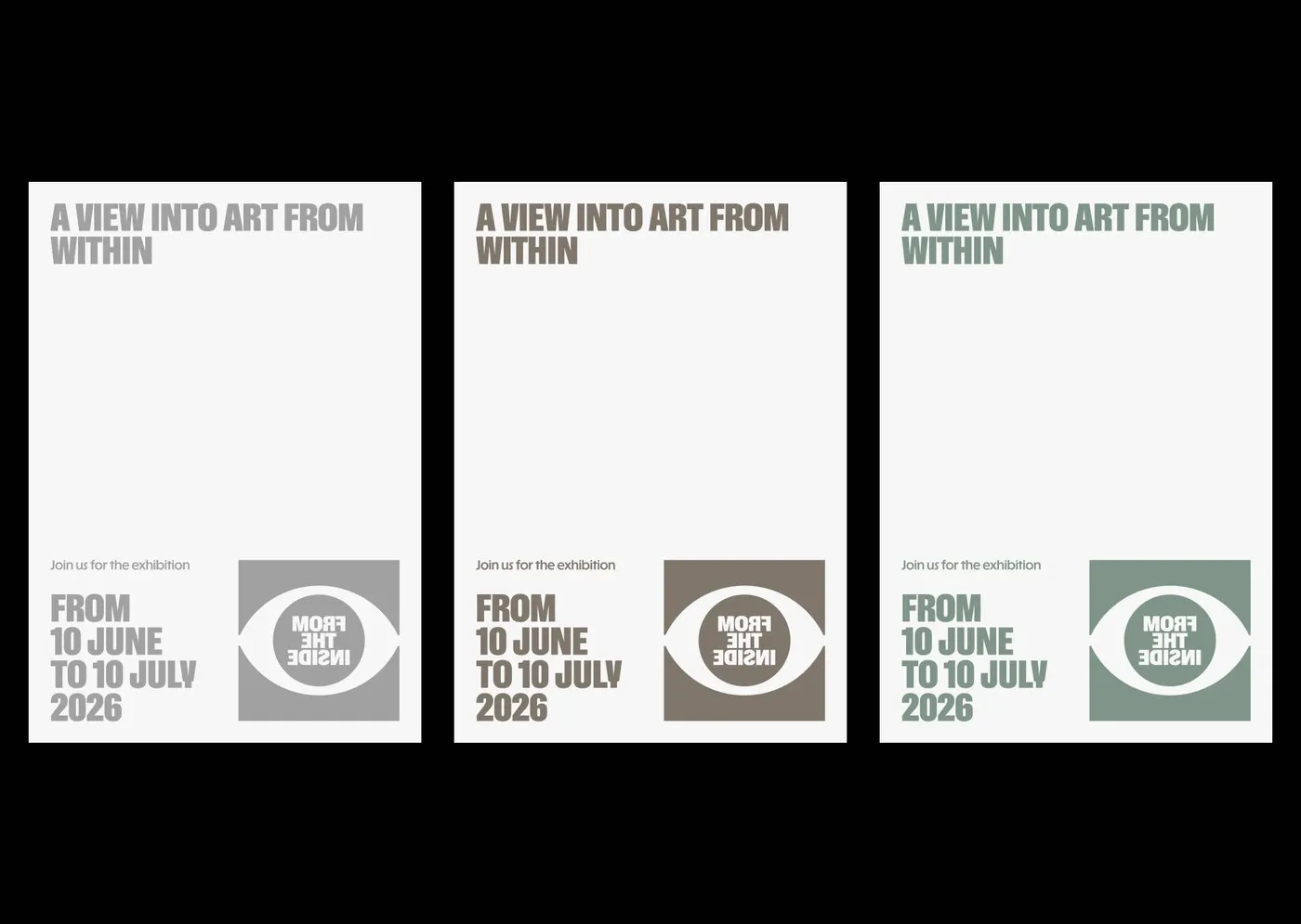
At the core of the concept sits an eye-shaped viewfinder motif. Paired with a bold, punchy condensed sans-serif typeface, it creates an awesome contrast layered right over Baroque and Renaissance oil paintings. Neat details—like permit numbers and event dates tucked cleanly in the top corners—keep the visual hierarchy balanced between big headline moments and essential event info.
The design translates effortlessly from digital concepts into physical touchpoints:
- Street posters posted directly onto wooden construction fences.
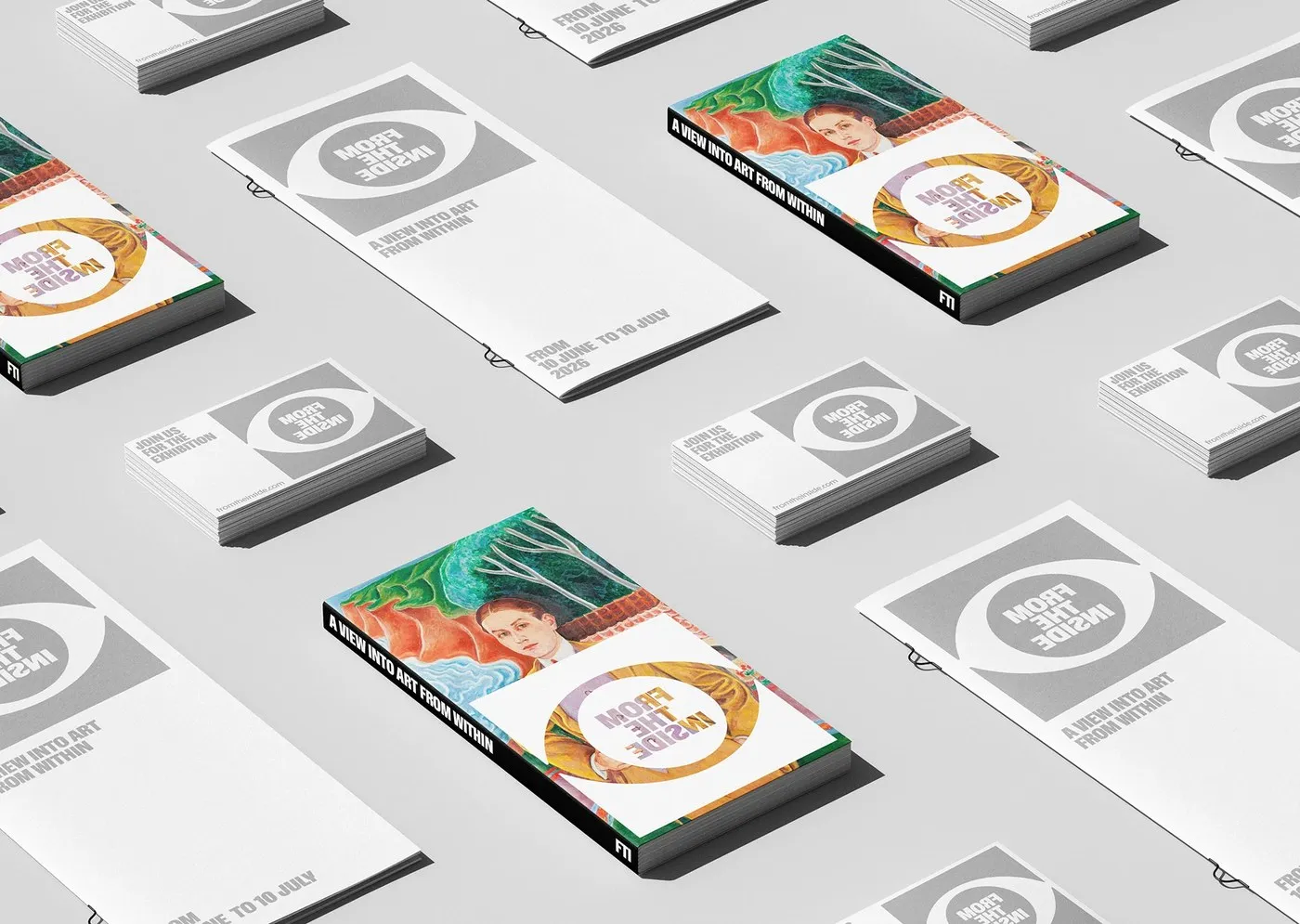
- Exhibition catalogs featuring die-cut circular covers and minimalist black staple binding.
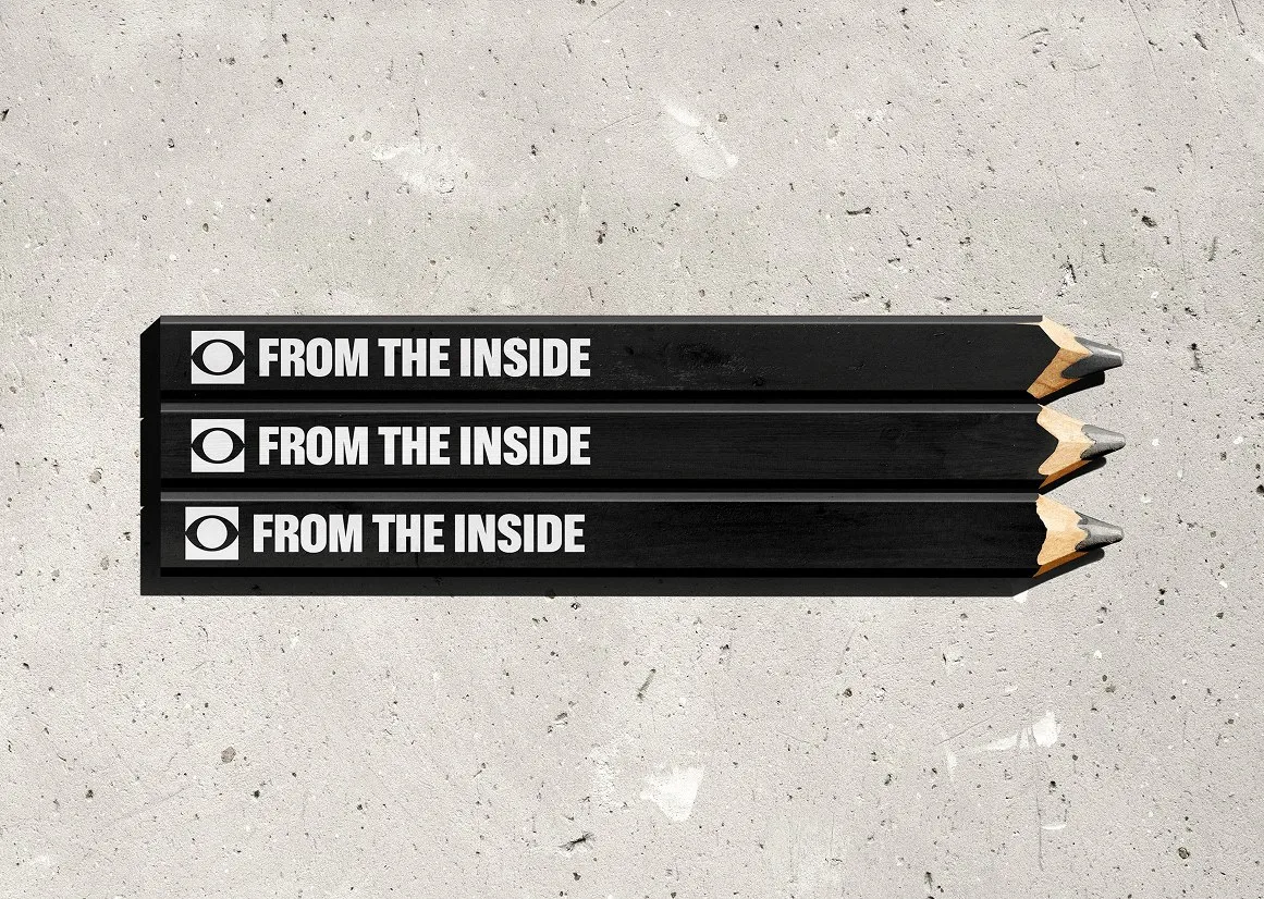
- Carpenter sketching pencils with crisp white lettering that pops against concrete walls.
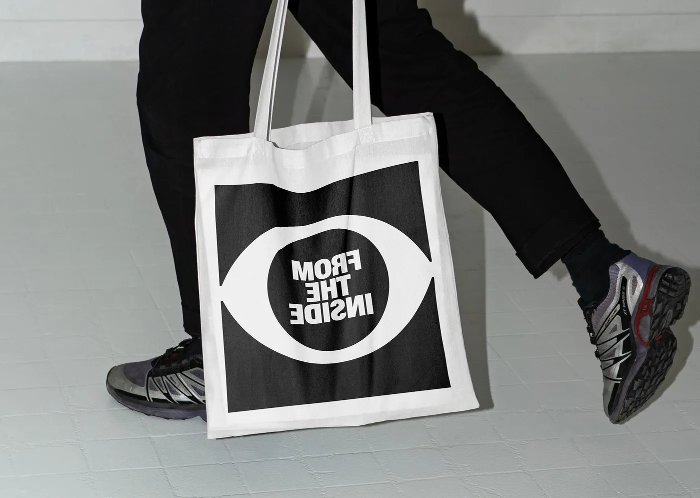
- Cotton tote bags featuring an oversized eye icon graphic.
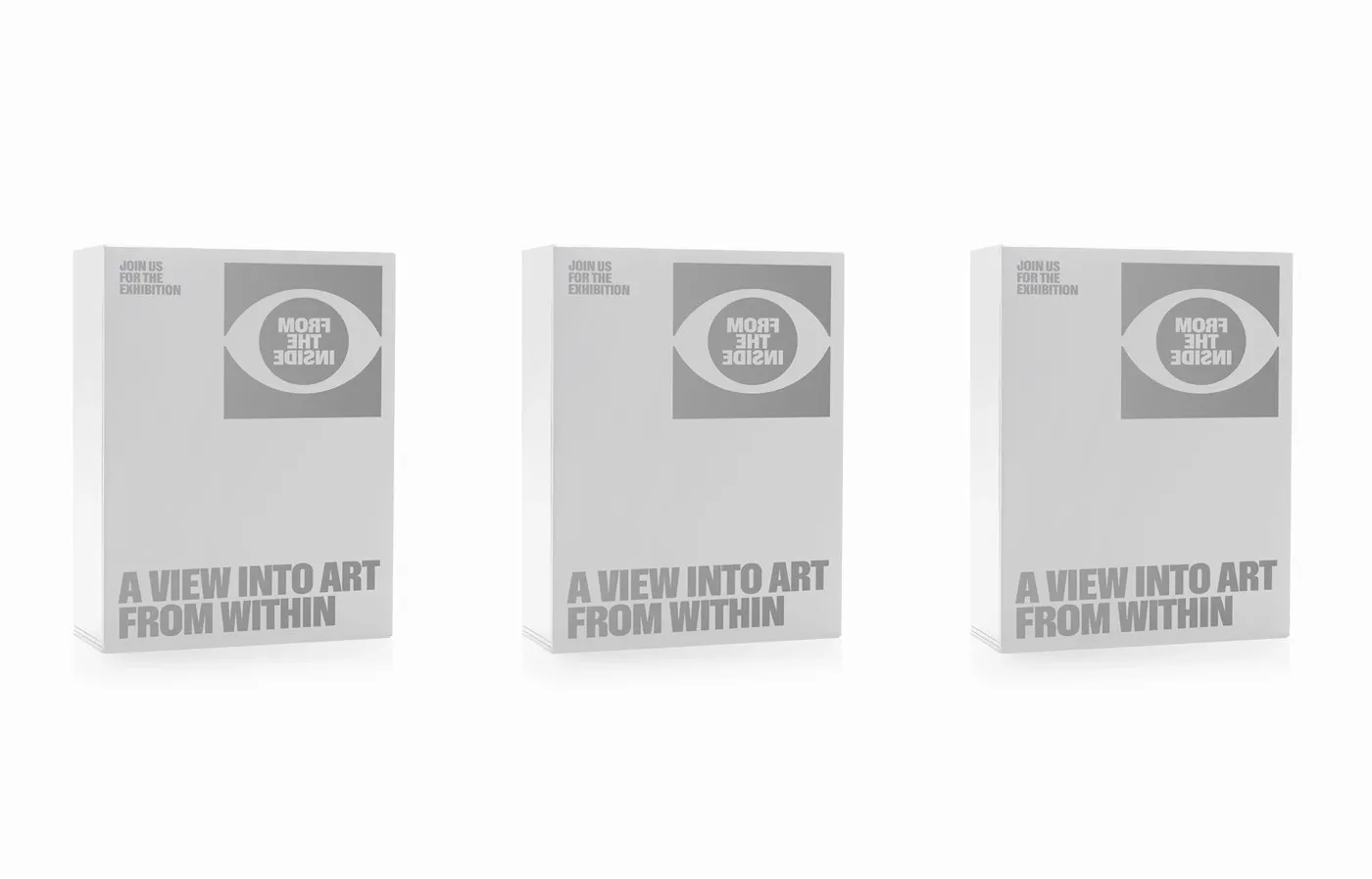
- Clean white 3D catalog display boxes that create a nice visual breather on presentation tables.
By blending unique typographic thinking with tactile material choices, Dziubek crafted a compelling design language for the gallery space. Take a closer look at the complete project on www.behance.net/gallery/255776003/From-The-Inside.
Bộ nhận diện triển lãm “From The Inside” của Jarosław Dziubek
Hệ thống đồ họa trong các triển lãm nghệ thuật thường giữ vai trò trung tính để nhường không gian cho các tác phẩm. Với dự án thiết kế cho triển lãm “From The Inside”, nhà thiết kế Jarosław Dziubek đến từ Warsaw lại chọn một hướng đi chủ động hơn để kích thích sự tò mò của thị giác.
Lấy ý tưởng từ việc quan sát nghệ thuật cổ điển dưới góc nhìn hiện đại, Dziubek tạo ra một hệ thống typography lật ngược (mirrored typography). Các chữ cái được xoay chiều như soi gương, tượng trưng cho góc nhìn từ chính bên trong bức tranh hướng ra ngoài.
Điểm tựa cho toàn bộ thiết kế là biểu tượng khung nhìn hình con mắt. Font chữ sans-serif cô đọng, khỏe khoắn tạo ra sự tương phản mạnh mẽ khi đặt đè lên các bức tranh dầu thuộc thời kỳ Baroque và Phục Hưng. Những chi tiết như mã số cấp phép hay ngày tháng triển lãm được căn chỉnh gọn gàng ở góc trên poster, giúp cân bằng giữa tiêu đề lớn và thông tin sự kiện.
Dự án không chỉ dừng lại ở bản vẽ kỹ thuật số mà được đưa vào thực tế rất mượt mà:
- Poster đường phố dán trực tiếp lên hàng rào gỗ công trình.
- Sách catalog sử dụng bìa đục lỗ tròn cùng kỹ thuật đóng ghim đen tối giản.
- Bút chì phác thảo của thợ mộc in chữ trắng nổi bật trên nền tường bê tông.
- Túi tote bằng vải cotton mang biểu tượng con mắt phóng to.
- Hộp đựng catalog màu trắng dạng 3D tạo khoảng nghỉ thị giác trên bàn trưng bày.
Bằng việc kết hợp giữa tư duy chữ độc đáo và trải nghiệm chất liệu, Dziubek đã tạo nên một ngôn ngữ thiết kế đầy ấn tượng cho không gian trưng bày. Mọi người có thể xem chi tiết dự án tại www.behance.net/gallery/255776003/From-The-Inside.