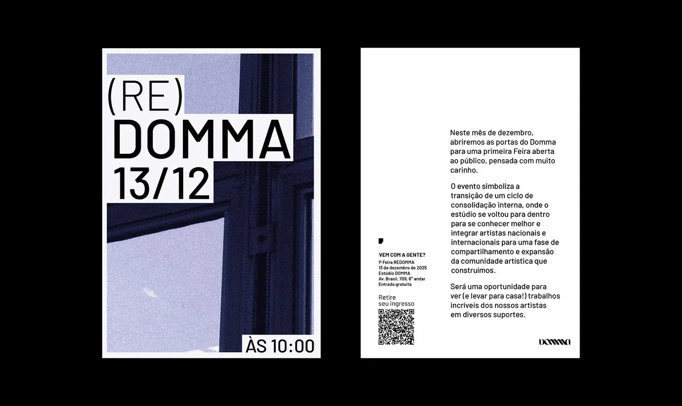
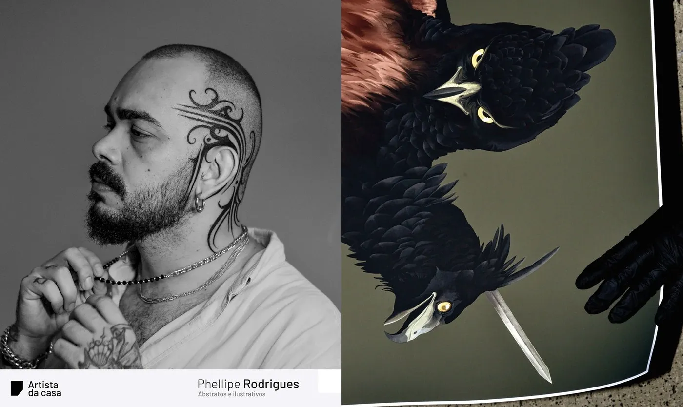
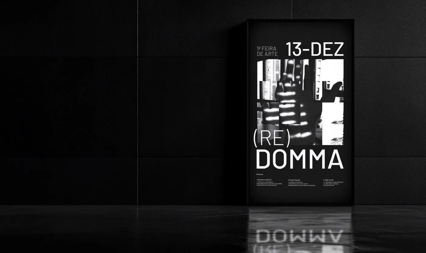
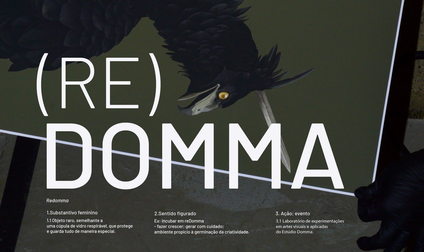

(RE)DOMMA by Gabriel Maciel: When Tattoo Art Breaks Free From the Skin Tattoo culture often gets stuck in the same old tropes when it ventures outside the parlor—think predictable blackletter typography, gritty distressed textures, or repetitive flash motifs. But Brazilian designer Gabriel Maciel took a totally fresh direction for (RE)DOMMA. He crafted a stunning visual identity for an art fair hosted by Domma, a renowned tattoo studio based in Belo Horizonte. Conceived as an experimental laboratory, the fair gives resident artists space to step beyond skin and express their creative voice across all kinds of fine art mediums—from ceramics and screenprints to oil paintings on canvas. The concept draws from the Portuguese word redoma, a protective glass bell jar that symbolizes care, incubation, and limitlessly free creative exploration.
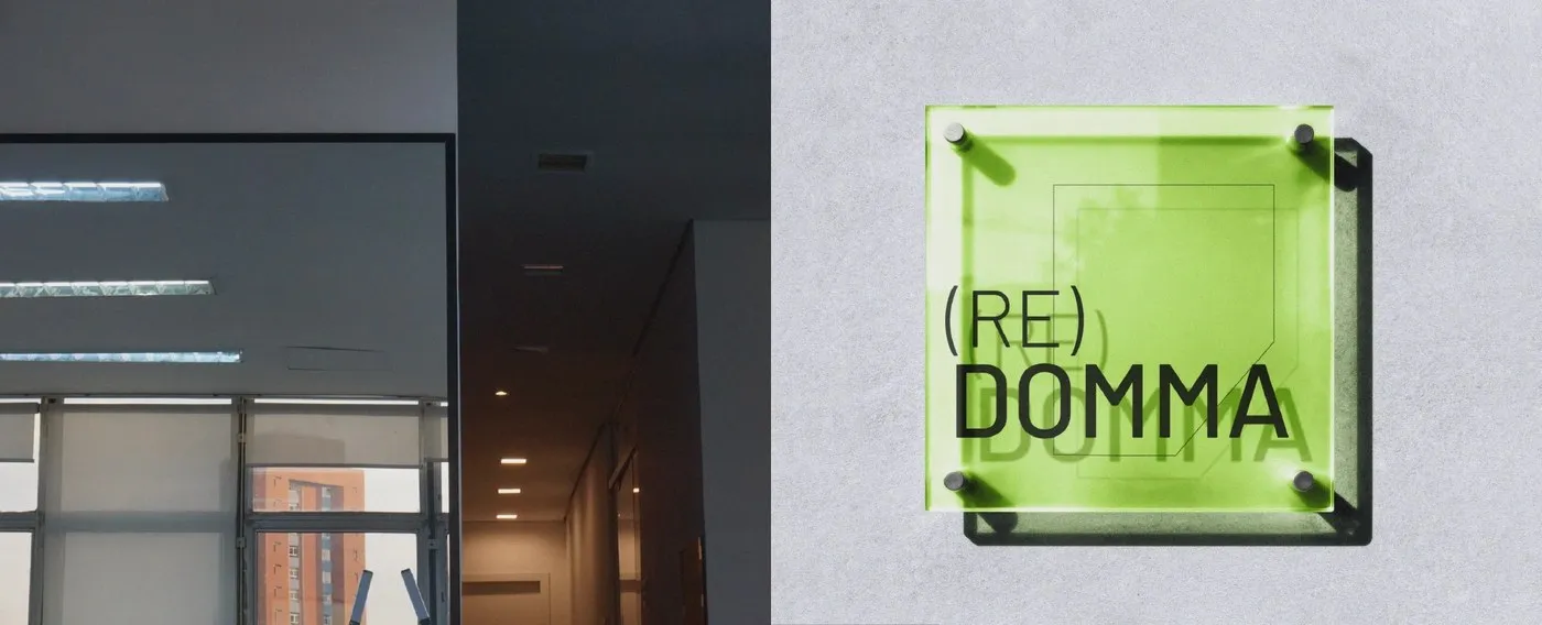
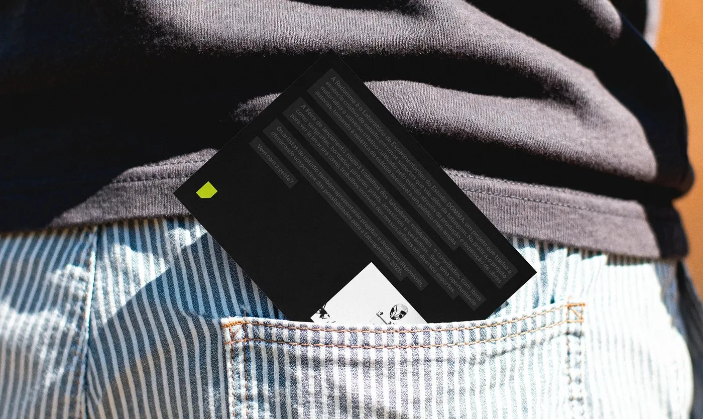
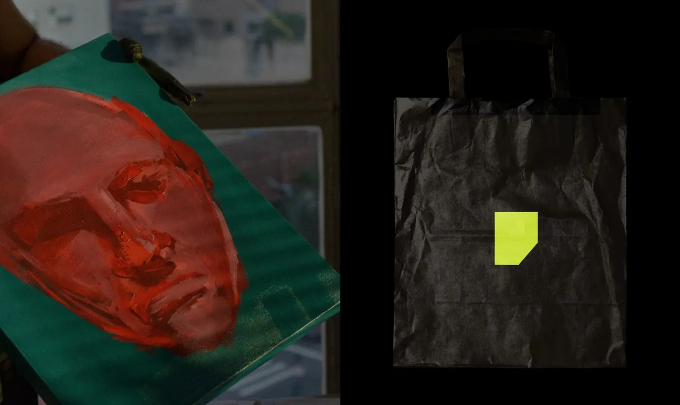
To translate that protective glass jar visually, the custom uppercase logotype adopts rigid, linear geometry inspired by the massive industrial glass windows of Domma’s physical workspace. Intersecting diagonal lines and sharp apexes give the letterforms a strong architectural authority, creating a dynamic contrast with the organic nature of tattoo artwork. Pairing with the wordmark is a modular graphic element resembling folded paper—a nod to the raw sketchbook page where every tattoo concept begins. This flexible polygon folds and shifts across layouts, framing artist profiles and seamlessly linking diverse media into one unified system.
Materiality plays a starring role in the event’s physical collateral. Large-format screenprinted posters feature rich, heavy ink deposits on uncoated newsprint, alongside tactile pieces like sturdy canvas tote bags, custom workwear jackets with embroidered patches, and printed ceramic exhibition tags. Precise file execution in Illustrator and Photoshop ensures that every fine line and sharp geometric angle translates flawlessly across rough textiles, matte paper, and architectural signage. Thanks to a tight layout grid, the brand identity does not just promote a standalone event—it establishes it as a lasting cultural mark.
Check out the full project by Gabriel Maciel on Behance.
(RE)DOMMA của Gabriel Maciel: Khi nghệ thuật xăm mình bước ra khỏi làn da qua bộ nhận diện thương hiệu ấn tượng
Văn hóa xăm mình thường hay gắn liền với các kiểu chữ gothic/blackletter quen thuộc, hiệu ứng sờn cũ hay các motif hình xăm lặp đi lặp lại khi bước ra ngoài phòng xăm. Nhưng với dự án (RE)DOMMA, designer người Brazil Gabriel Maciel đã chọn một hướng đi hoàn toàn khác. Anh đã xây dựng một hệ thống nhận diện thị giác độc đáo cho hội chợ nghệ thuật do Domma — một tiệm xăm nổi tiếng tại Belo Horizonte — tổ chức. Đây được xem như một phòng thí nghiệm thử nghiệm, nơi các nghệ sĩ xăm bước ra khỏi ranh giới làn da để thể hiện cái tôi sáng tạo trên đủ mọi chất liệu từ gốm sứ, tranh in lưới đến sơn dầu trên canvas. Ý tưởng của bộ nhận diện xuất phát từ từ “redoma” trong tiếng Bồ Đào Nha, nghĩa là chiếc lồng kính bảo vệ — biểu tượng cho sự chăm chút, nuôi dưỡng và tự do sáng tạo không giới hạn.
Để thể hiện tinh thần của chiếc lồng kính bảo vệ này về mặt thị giác, phần logotype chữ in hoa được thiết kế theo dạng hình học cứng cáp, góc cạnh, gợi liên tưởng đến những ô cửa kính công nghiệp tại chính không gian làm việc của Domma. Các đường chéo cắt nhau và những đỉnh nhọn sắc sảo mang lại tinh thần kiến trúc mạnh mẽ, tạo nên sự tương phản thú vị với nét mềm mại của các tác phẩm xăm. Đi kèm với logo là một graphic device dạng hình đa giác xếp gấp, tượng trưng cho những tờ giấy nháp — nơi mọi ý tưởng xăm mình bắt đầu. Khối đa giác linh hoạt này có thể gấp gọn hay biến đổi trên các layout, giúp bao bọc hình ảnh artist profile cũng như kết nối các chất liệu truyền thông đa dạng trong cùng một hệ thống.
Yếu tố chất liệu đóng vai trò cực kỳ quan trọng trong các ấn phẩm thực tế của sự kiện. Poster in lưới khổ lớn sử dụng lớp mực dày dặn trên nền giấy newsprint uncoated, kết hợp cùng các sản phẩm như túi tote canvas, áo khoác workwear thêu patch và thẻ gốm trưng bày triển lãm. Việc xử lý file trên Illustrator và Photoshop đảm bảo từng đường nét nhỏ và góc cạnh hình học được tái hiện chuẩn xác trên bề mặt vải thô, giấy matte cho đến biển hiệu không gian. Nhờ hệ thống lưới (grid) chặt chẽ, bộ nhận diện không chỉ quảng bá cho một sự kiện độc lập mà còn định hình sự kiện như một dấu ấn văn hóa lâu dài.
Xem đầy đủ dự án của Gabriel Maciel trên Behance.