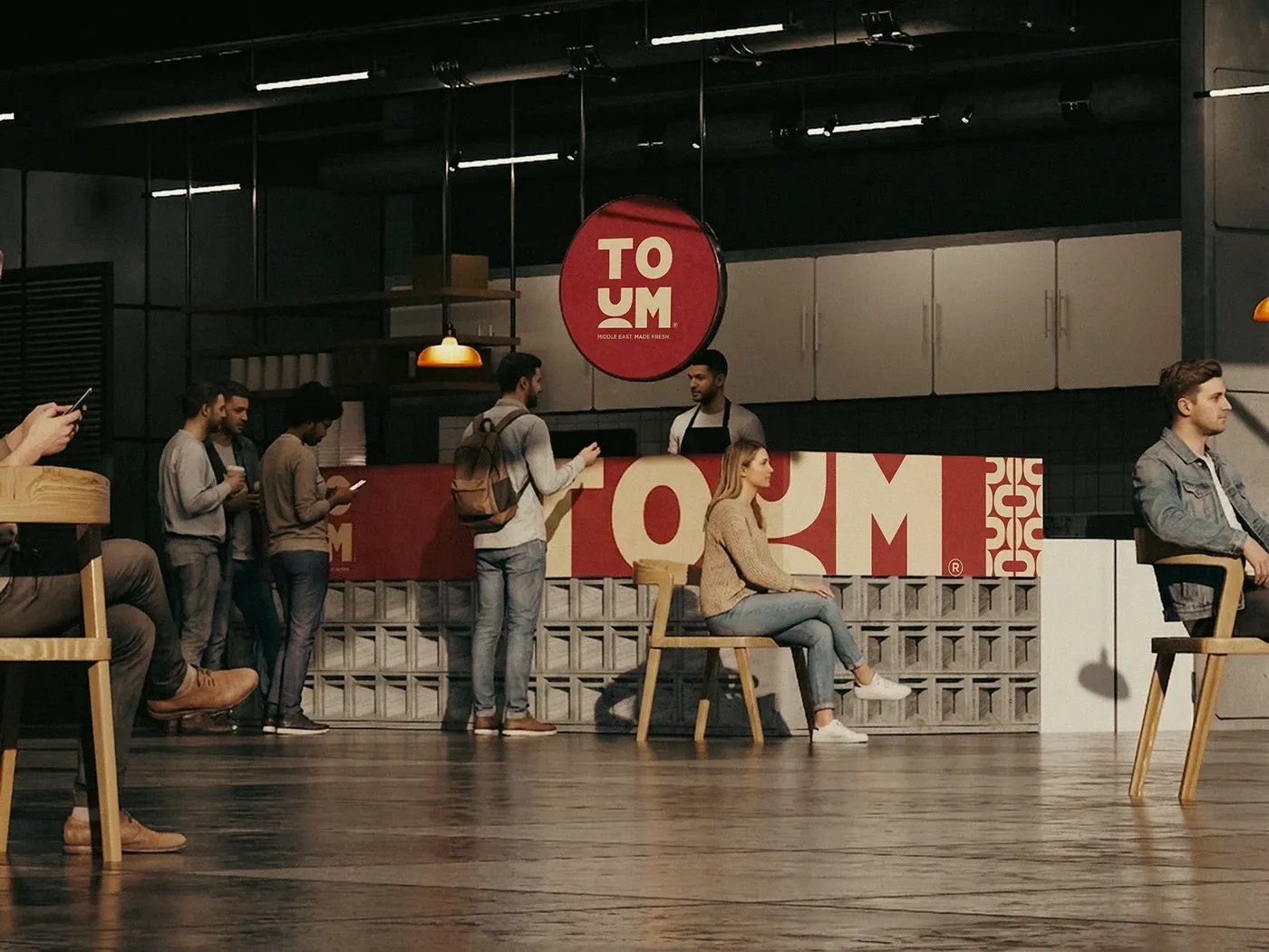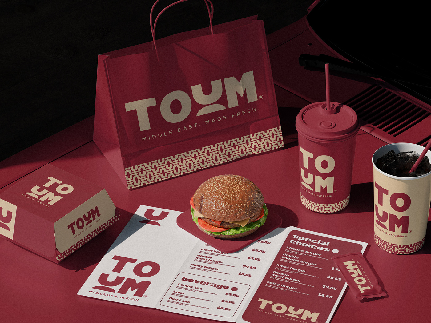
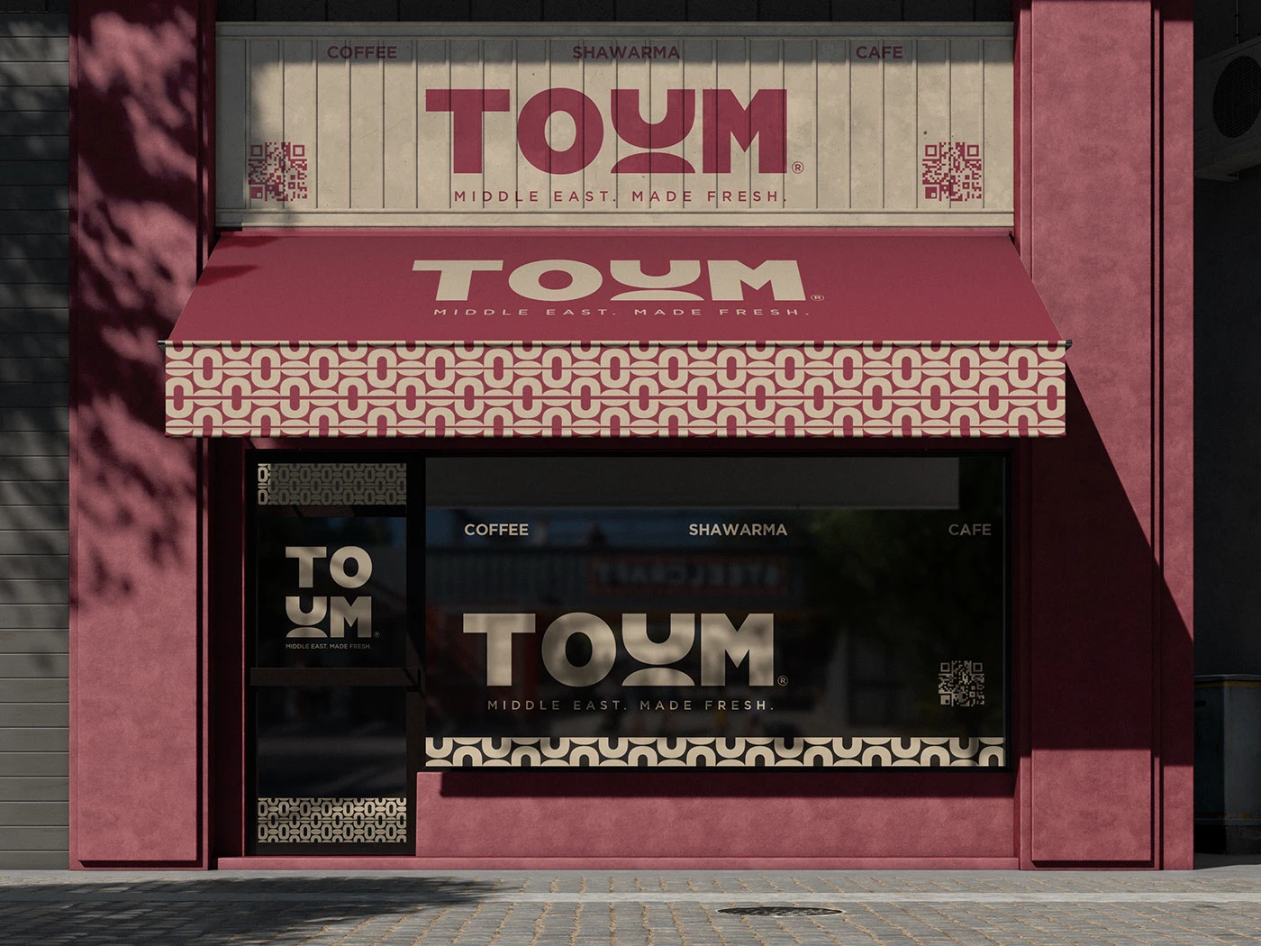
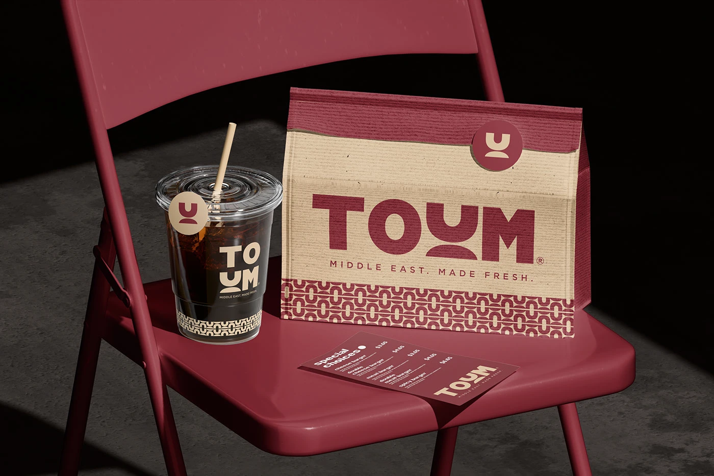
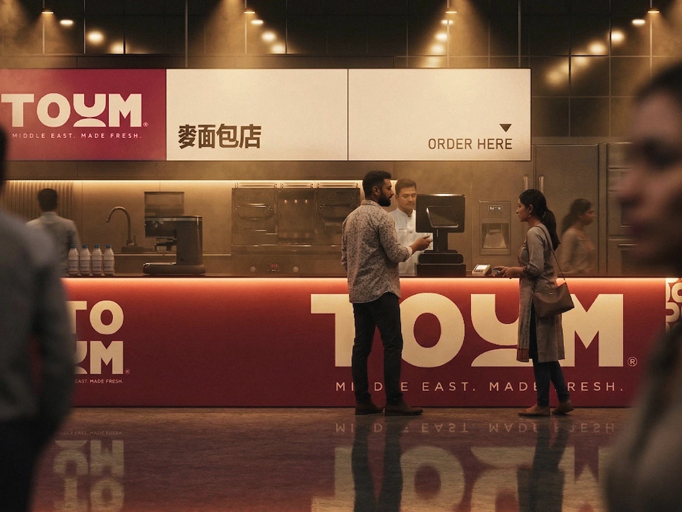

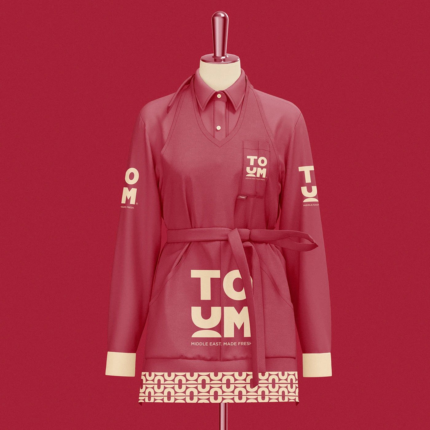
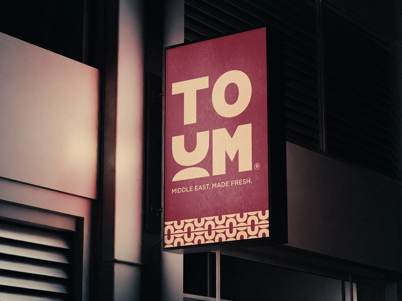
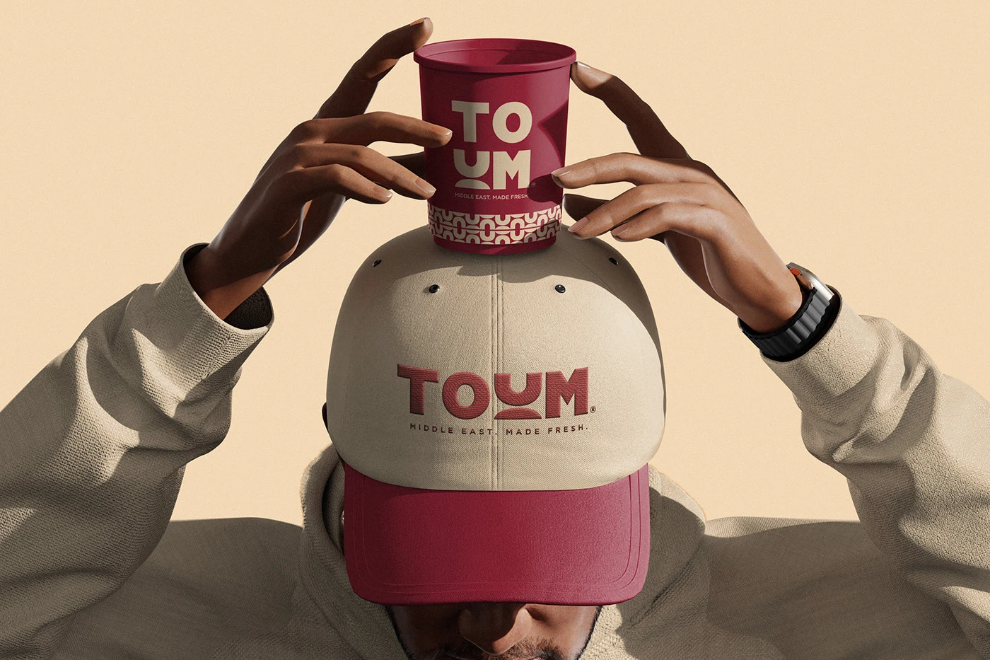
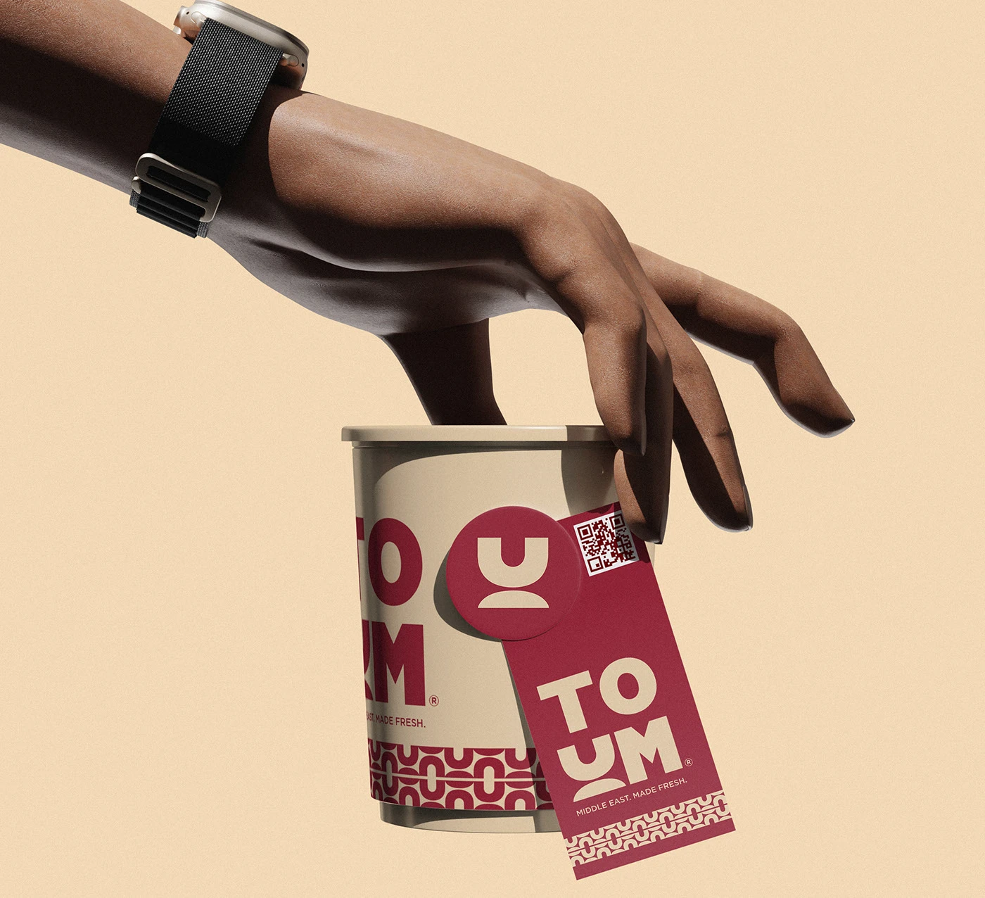
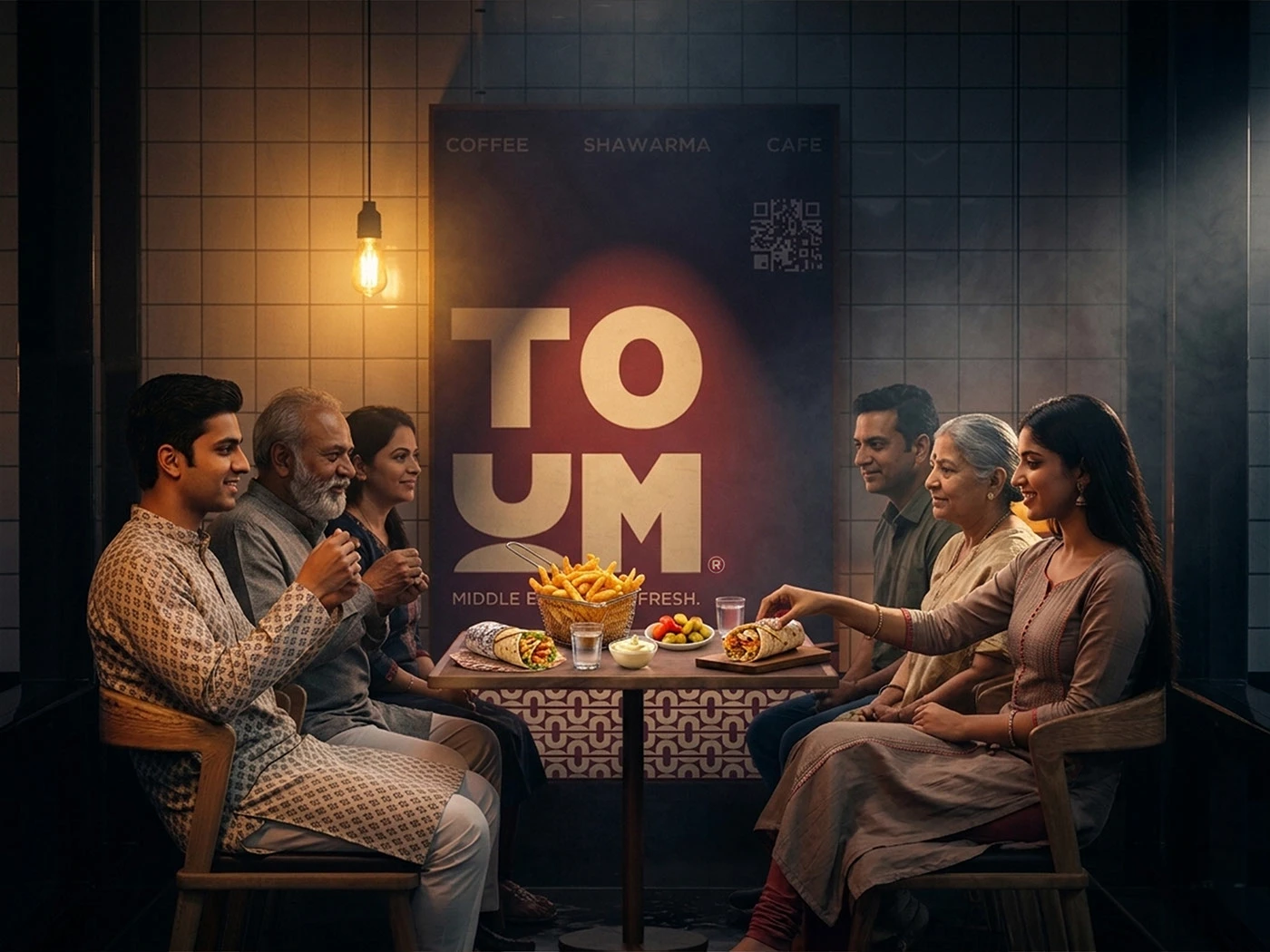
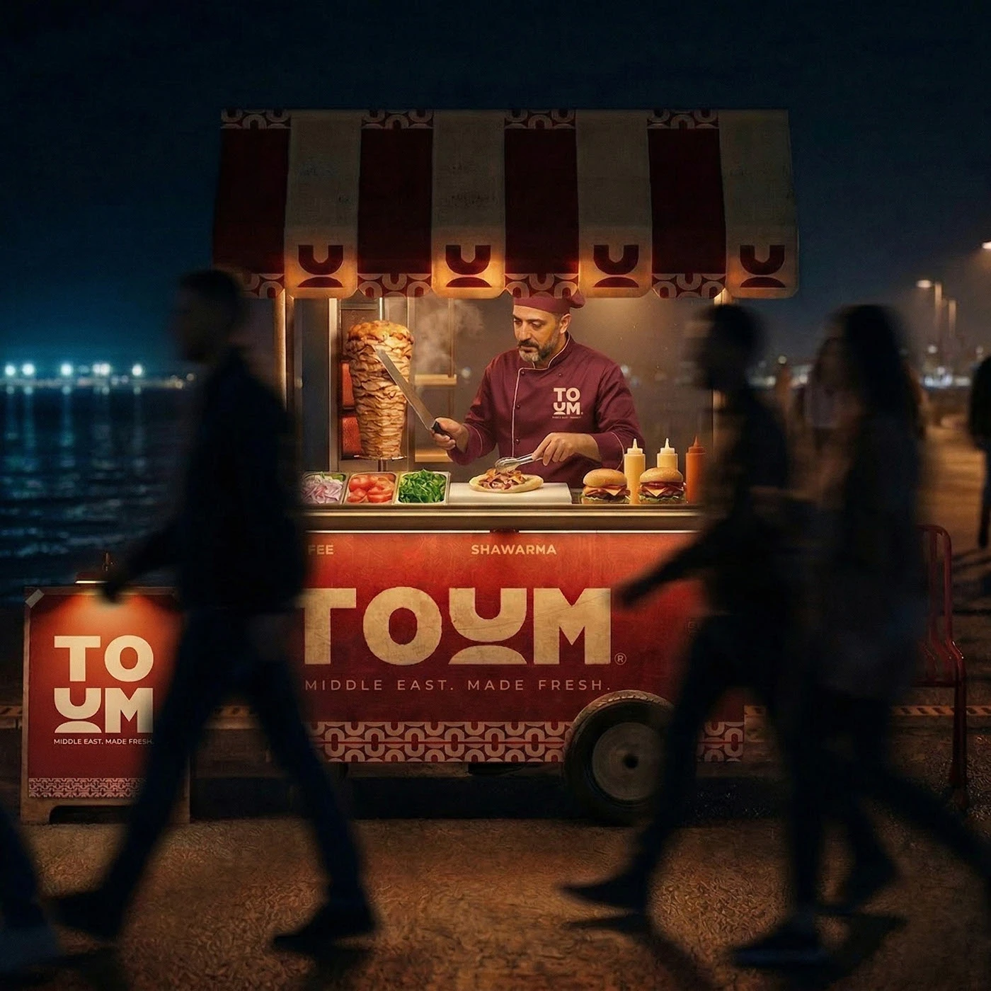
TOUM’s brand identity draws pure inspiration from Middle Eastern street food culture. Designer Kashyap Bhatt cleverly crafted a custom logotype, where the letter ‘U’ takes a fun twist, mimicking creamy toum garlic sauce and vertically sliced shawarma. The color palette dishes out warm, cozy vibes with tones pulled straight from paprika, roasted sesame, and pita bread. The best part? This design completely steers clear of the usual fast-food clichés. A bold, condensed sans-serif font brings a punchy contrast against the ultra-minimal packaging backdrop. Plus, tiny secondary labels are tucked neatly into the corners, establishing a super clean grid system across all materials. A sleek monospace font handles the secondary text, perfectly balancing out the heavy graphic elements.
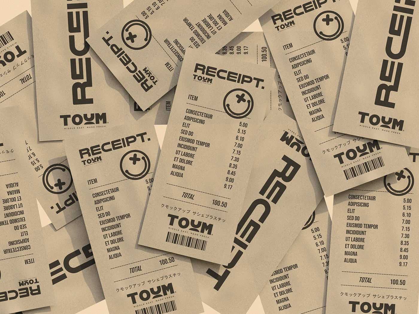
Texture and materials really take the driver’s seat in this packaging lineup. The collection features food wrap, custom tape, and sturdy cardboard boxes, transforming simple containers into a cohesive identity system. Bold black typography is printed directly onto unbleached, raw paper stock, letting the natural fibers peek through to add amazing depth to the surface. Ditching the glossy finish keeps the focus entirely on the material’s tactile feel. The layout relies on clean horizontal grid lines to keep labels, receipts, and takeout bags beautifully organized. Custom graphic stamps add that authentic bakery or street-cart charm to the wrapping paper, while the whole system scales beautifully across various box sizes.
This project beautifully translates the soul of street food into a sharp visual language. Every box shape serves as the perfect canvas to showcase the wordmark. Modern packaging design can absolutely elevate casual, everyday food concepts through the power of minimalism. Instead of cluttering the layout with unnecessary decorations, the focus stays on playing with scale and contrast to deliver a bold, grounded brand presence. Check out the full case study on this www.behance.net/gallery/247314823/TOUM-Brand-Packaging.
Bộ nhận diện của TOUM lấy cảm hứng từ chính văn hóa ẩm thực đường phố Trung Đông. Designer Kashyap Bhatt đã khéo léo tạo ra một logotype tùy chỉnh, nổi bật với chữ U được biến tấu từ hình ảnh sốt tỏi toum và những lát thịt shawarma cắt dọc. Bảng màu của dự án mang lại cảm giác rất ấm áp với các tông màu lấy từ ớt paprika, mè rang và bánh mì pita. Điểm cộng là thiết kế này đã né được những lối mòn quen thuộc của các thương hiệu fast food thông thường. Việc sử dụng font sans-serif dạng condensed dày dặn giúp tạo độ tương phản mạnh mẽ với phần nền bao bì tinh giản. Ngoài ra, các nhãn phụ nhỏ được xếp gọn gàng ở các góc, tạo nên một hệ thống lưới (grid) chỉn chu trên mọi ấn phẩm. Font monospace thanh mảnh được chọn cho phần text phụ để cân bằng thị giác với những mảng graphic đậm nét.
Chất liệu chính là yếu tố dẫn dắt toàn bộ thiết kế bao bì lần này. Bộ sưu tập bao gồm giấy gói thực phẩm, băng keo custom và hộp carton cứng cáp, biến những chiếc hộp đơn giản thành một hệ thống nhận diện đồng nhất. Phần chữ màu đen đậm được in trực tiếp lên phôi giấy thô chưa qua tẩy trắng, để lộ các sợi giấy tự nhiên giúp tăng chiều sâu cho bề mặt. Việc không phủ bóng giúp tôn lên trọn vẹn kết cấu thực tế của chất liệu. Bố cục sử dụng các đường lưới ngang để sắp xếp nhãn mác, hóa đơn và túi mang đi một cách cực kỳ ngăn nắp. Những con dấu graphic cũng được đóng thêm để tạo chất tiệm bánh hay quán ăn đường phố cho lớp giấy gói, đồng thời hệ thống này vẫn rất linh hoạt trên nhiều kích thước hộp khác nhau.
Dự án này đã chuyển hóa thành công gốc rễ của ẩm thực đường phố thành những quy tắc thị giác rõ ràng. Mỗi kiểu dáng hộp đóng vai trò như một khoảng trống hoàn hảo để tôn vinh phần wordmark. Thiết kế bao bì hiện đại hoàn toàn có thể nâng tầm những mô hình đồ ăn bình dân nhờ vào sự tối giản. Thay vì nhồi nhét chi tiết trang trí, tác giả tập trung vào việc tương phản tỷ lệ để mang lại một diện mạo mạnh mẽ và thực tế cho thương hiệu. Xem trọn vẹn case study này trên portfolio của www.behance.net/gallery/247314823/TOUM-Brand-Packaging.