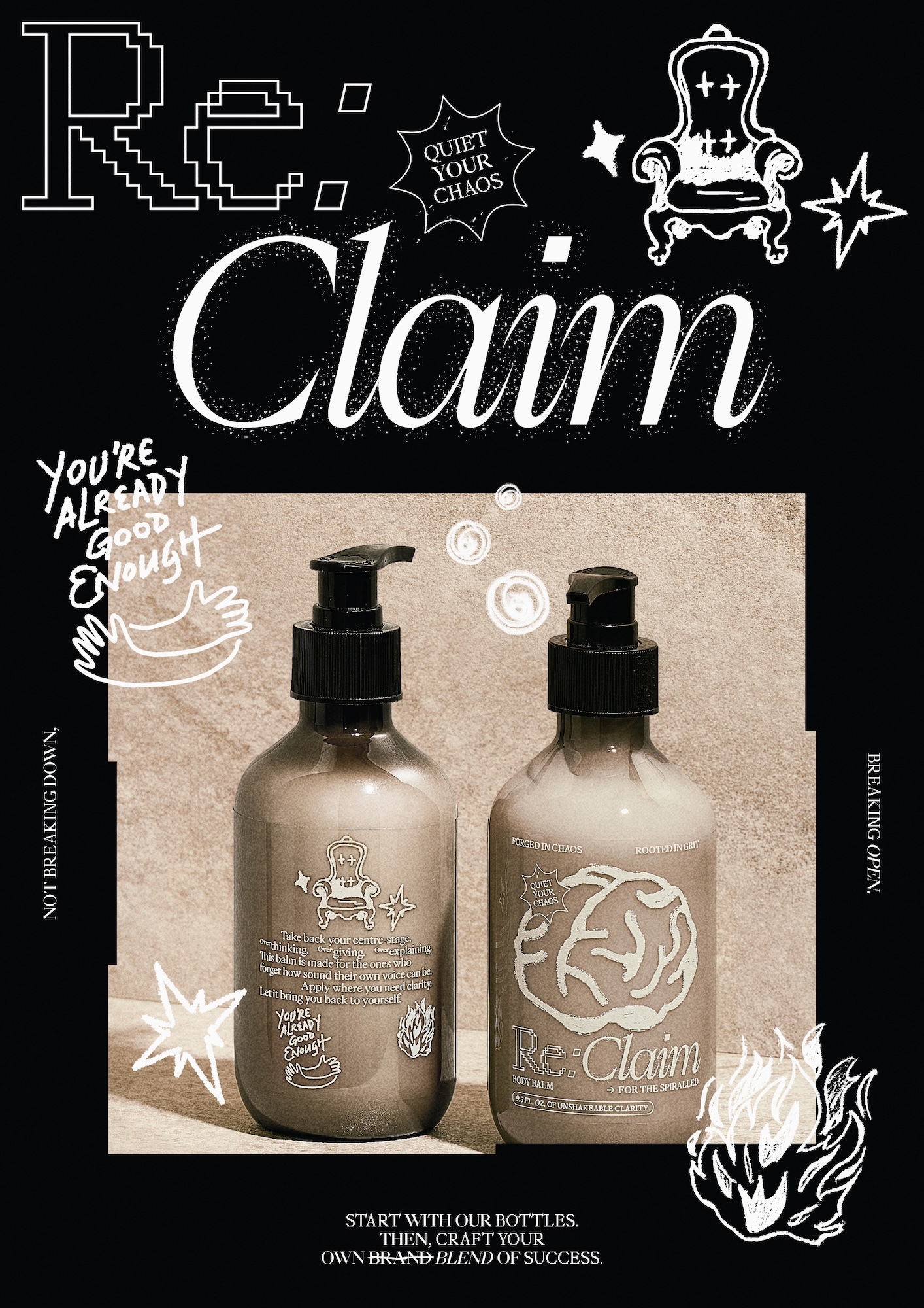
Pressure and burnout have long been the unwanted sidekicks of the creative community. According to the Mentally Healthy 2024 survey, a staggering 70% of industry professionals have faced this exhausting reality. Seeing this crisis as a unique opportunity to explore how design can boost mental well-being, the team at House of Adjaycent created Re:Label—a conceptual skincare packaging project designed to transform routine self-care into moments of psychological repair. The project hits incredibly close to home, born from the real-life experiences of designers Jay Liu, Claire Chang, and Darryl Cheong during casual post-pandemic get-togethers focused on finding ways to decompress.
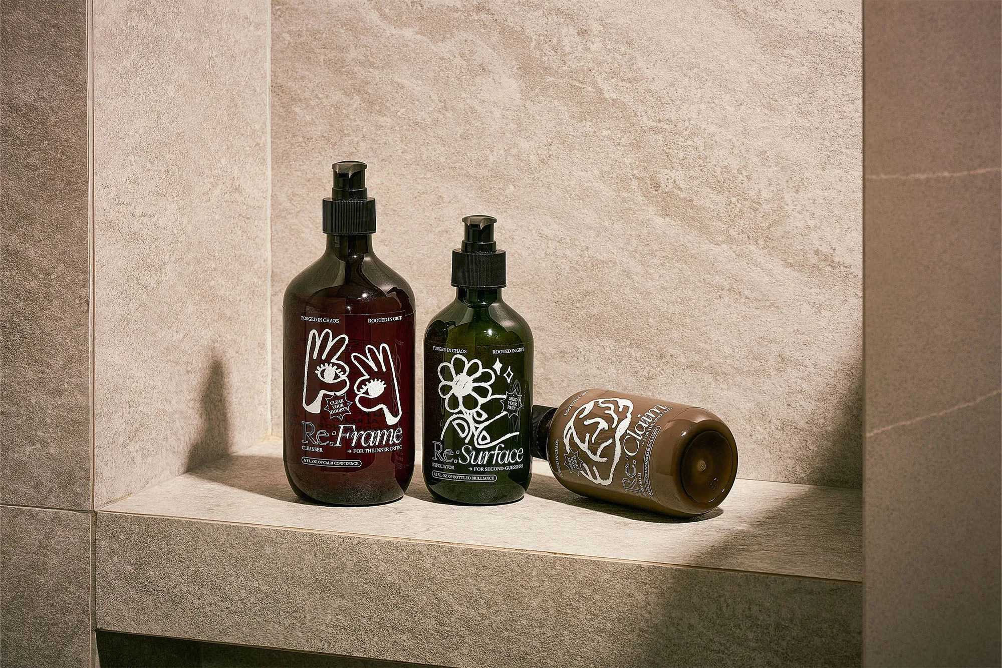
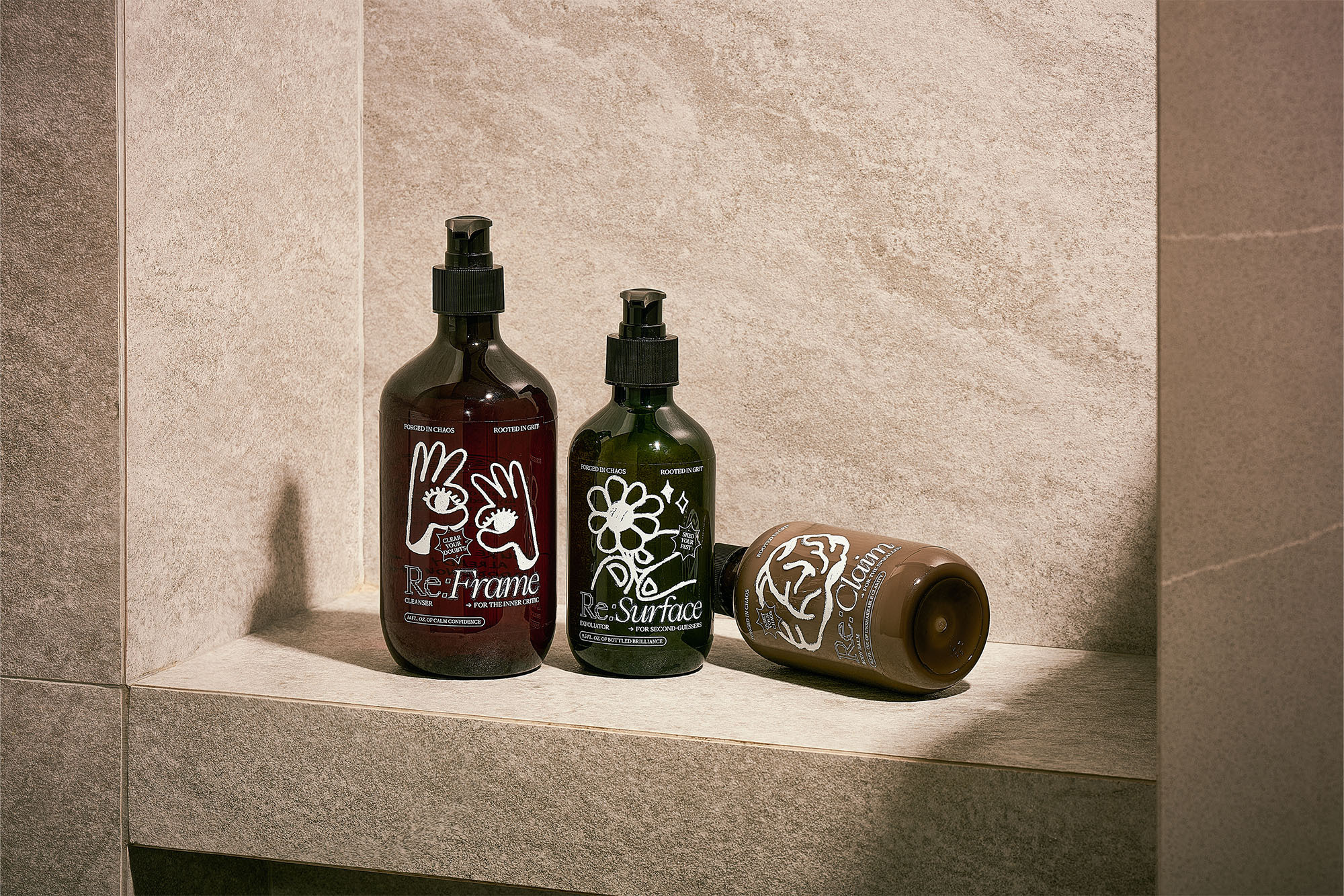
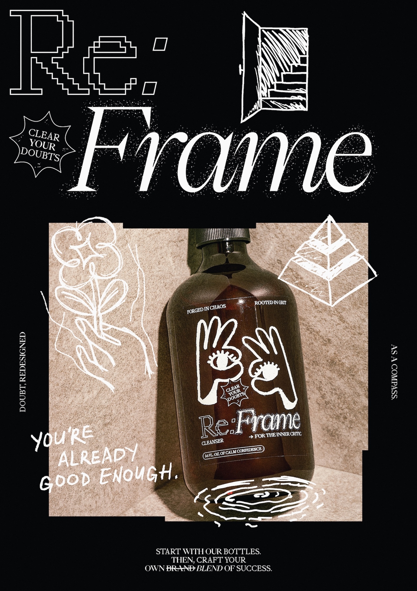
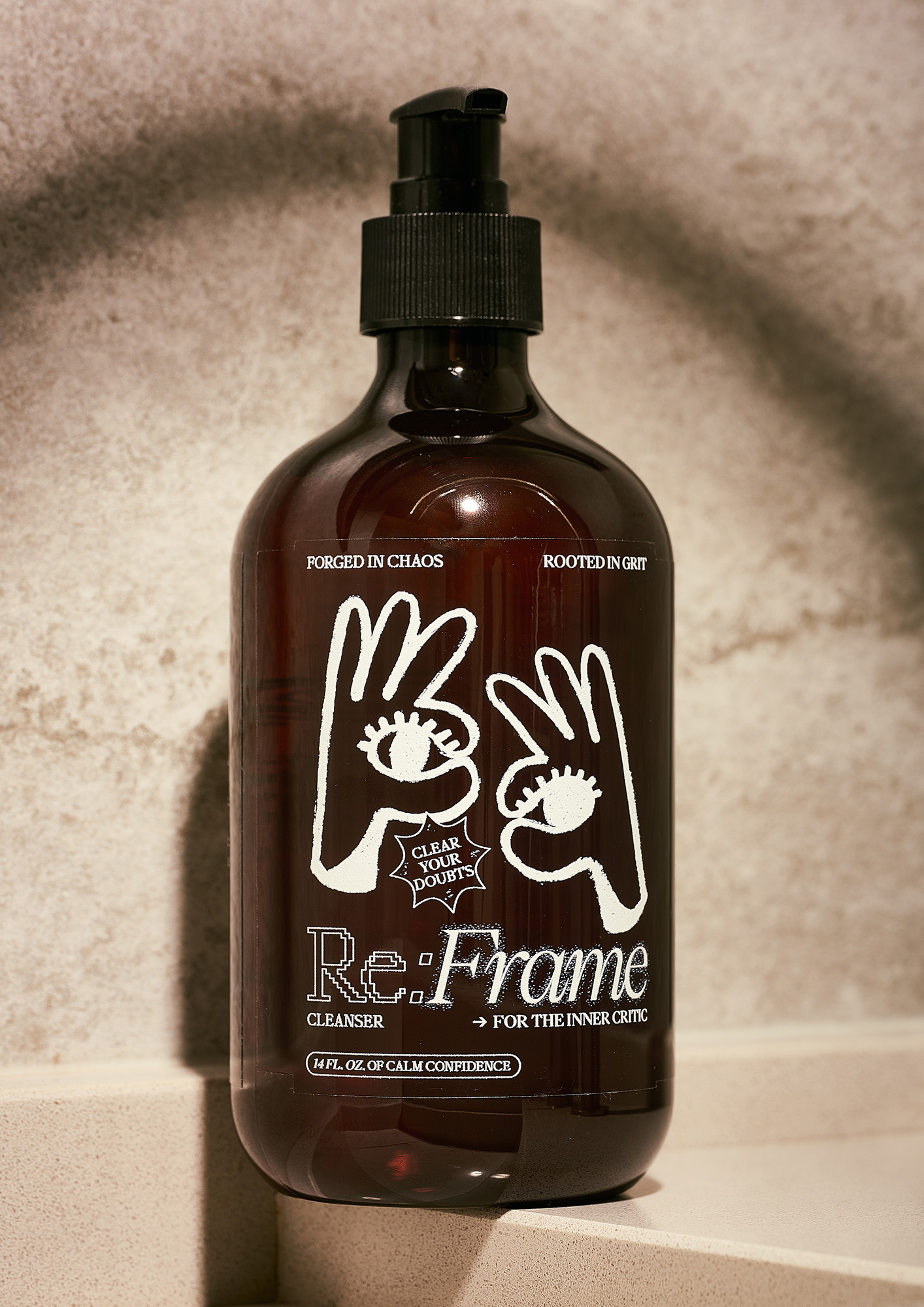
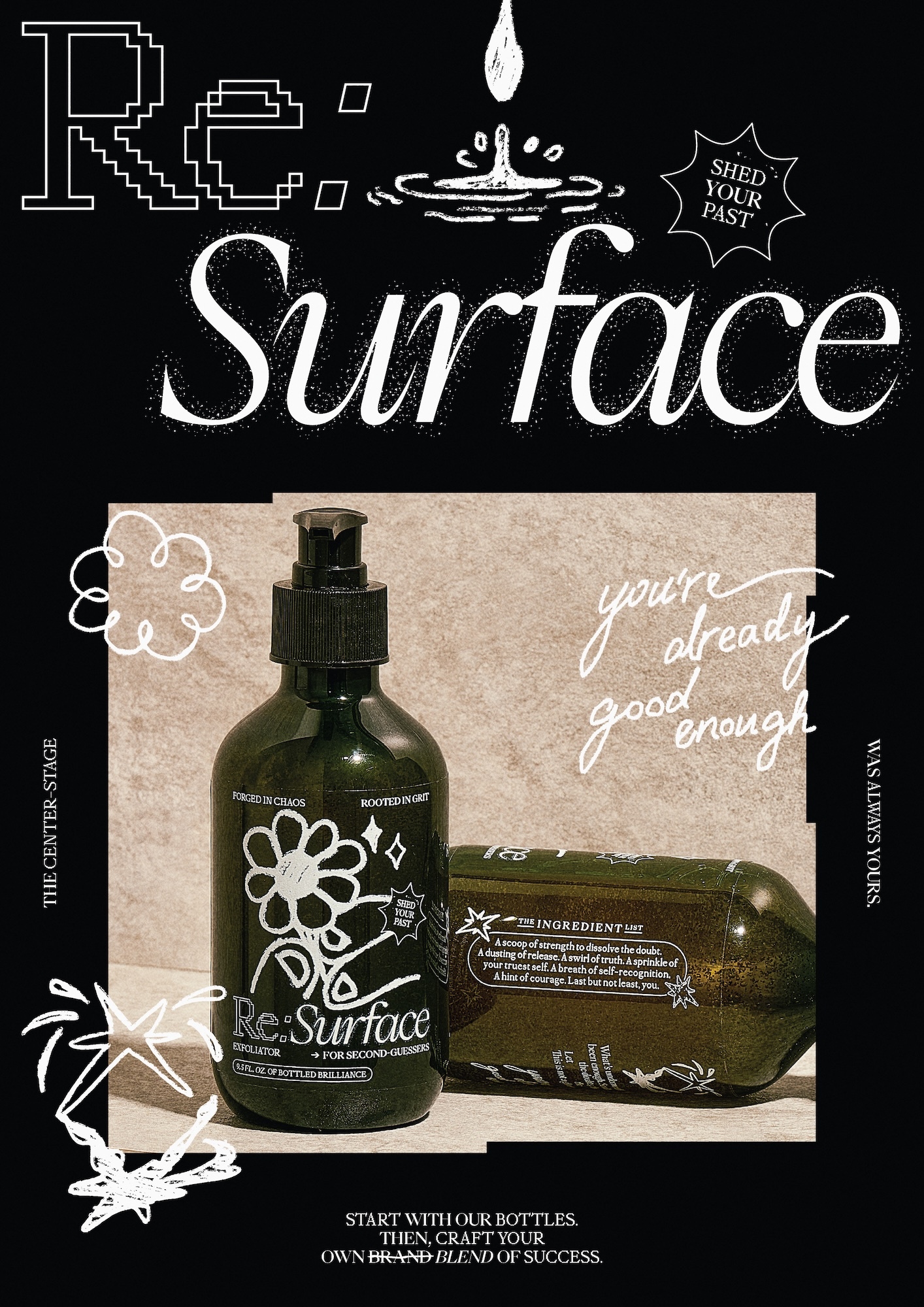
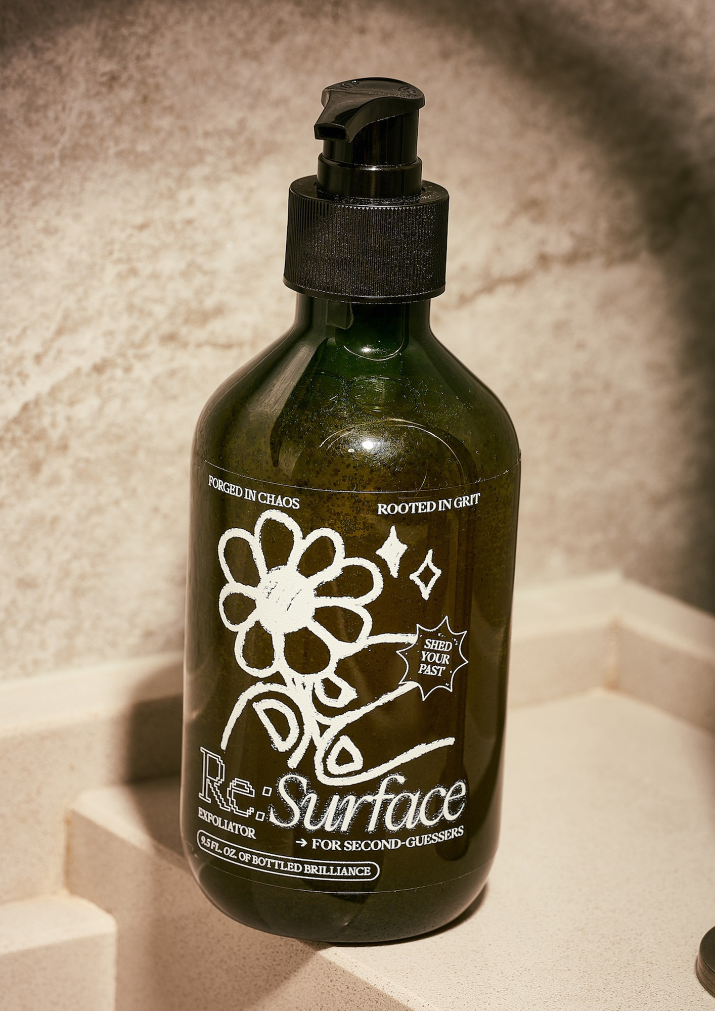
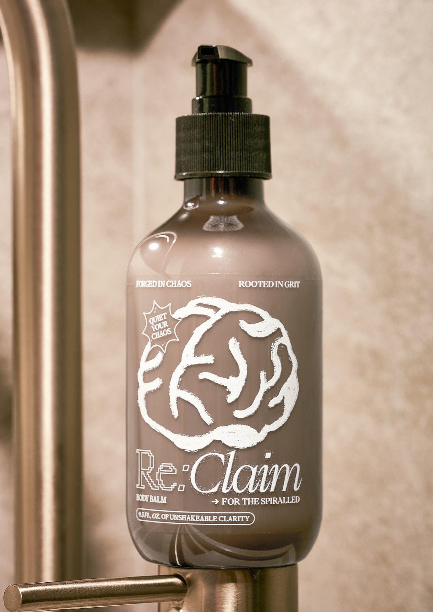
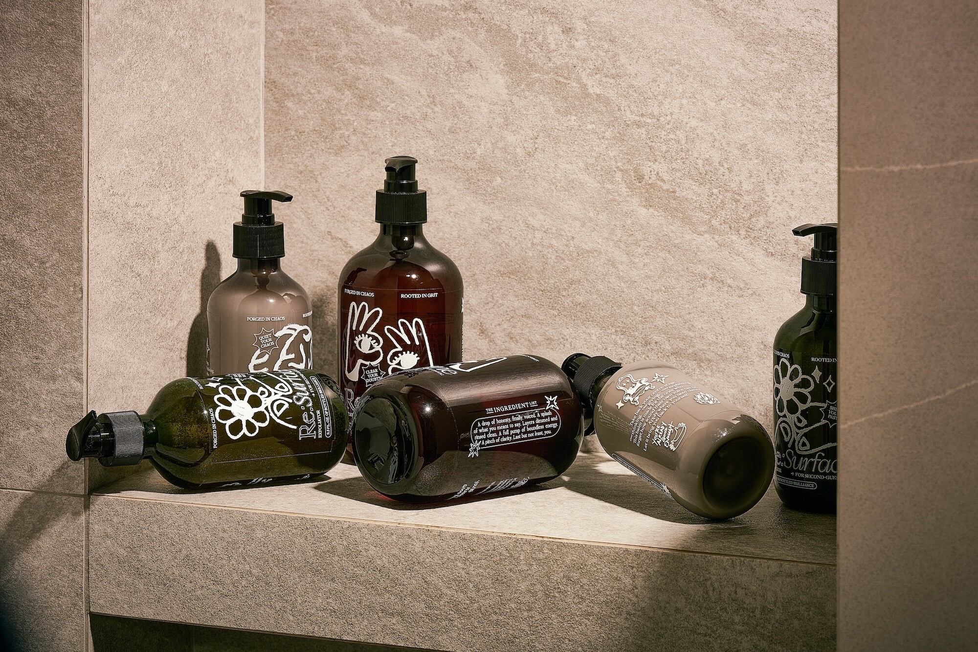
The product trilogy beautifully corresponds to three core psychological hurdles faced during total burnout: Re:Frame helps shift perspectives in the face of harsh self-criticism; Re:Surface gently guides users out of uncertainty and self-doubt; and Re:Claim restores balance during completely overwhelming moments. One of the coolest details is how the ingredient list on each bottle reads like poetry, offering gentle emotional cues like “a splash of clarity” or “a full pump of quiet strength.” Combined with charming, hand-drawn illustrations—like a throne, a doorway, or a shooting star—the design creates a deep emotional connection that invites users to pause and check in with themselves.
When it comes to typography, the project identity is anchored by two gorgeous typefaces from Pangram Pangram Foundry: PP Eiko and PP Mondwest. The pairing of an elegant, editorial serif with a structured, pixelated font creates a fascinating visual tension, perfectly mirroring the inner tug-of-war that creative minds navigate daily. To take it a step further, House of Adjaycent made a conscious choice to completely avoid AI-generated visuals, celebrating instead the raw authenticity, time, and heart behind human craft.
The color palette also underwent a pretty dramatic evolution. Originally set to feature dusty orange, olive green, and soft lilac, the direction shifted completely once the translucent bottles arrived, opting for pure white UV ink printed on clear stickers instead. This means each label inherits the hue of the liquid inside, ensuring that no two bottles look or feel exactly the same. The printing technique even adds a subtle, grainy texture that feels beautifully tactile in the hand.
Instead of chasing the hyper-glossy, flawless aesthetic of traditional luxury wellness brands, Re:Label proudly embraces the beauty of imperfection, sending a powerful message that it is completely okay to be a work in progress. The experience doesn’t end when the bottles are empty, either—users are actively encouraged to refill and remix their own blends, transforming a simple skincare routine into an empowering, self-authored ritual of reinvention.
Áp lực và burnout (kiệt sức) từ lâu đã trở thành một tình trạng phổ biến đối với dân làm sáng tạo. Theo khảo sát Mentally Healthy 2024, có đến 70% nhân sự trong ngành từng phải đối mặt với vấn đề này. Nhìn nhận đây là một cơ hội để thay đổi cách thiết kế tác động đến sức khỏe tinh thần, studio House of Adjaycent đã tạo nên Re:Label – một dự án thiết kế bao bì cho dòng sản phẩm chăm sóc da thử nghiệm, giúp biến những thói quen tự chăm sóc bản thân mỗi ngày thành những khoảnh khắc chữa lành tâm lý. Dự án này được ra đời từ chính trải nghiệm thực tế của đội ngũ thiết kế gồm Jay Liu, Claire Chang và Darryl Cheong sau những cuộc trò chuyện tìm cách giải tỏa căng thẳng hậu đại dịch.
Bộ ba sản phẩm trong dự án tương ứng với ba thử thách tâm lý cốt lõi khi bị quá tải: Re:Frame giúp thay đổi góc nhìn trước những lời tự chỉ trích gay gắt; Re:Surface hỗ trợ người dùng nhẹ nhàng bước ra khỏi những bất An, vô định; và Re:Claim giúp lấy lại sự cân bằng trong những khoảnh khắc ngập tràn áp lực. Điểm thú vị là bảng thành phần của mỗi chai sản phẩm được viết lại như những vần thơ, mang đến những lời nhắc nhở tinh tế như “một chút rõ ràng” hay “một cái nhấn cho sự bình yên”. Kết hợp với đó là các nét vẽ minh họa bằng tay mộc mạc như hình chiếc ngai vàng, cánh cửa hay ngôi sao băng, tạo nên một sự kết nối cảm xúc sâu sắc và nhắc nhở người dùng dừng lại một chút để lắng nghe bản thân.
Về mặt typography, dự án sử dụng hai phông chữ PP Eiko và PP Mondwest từ Pangram Pangram Foundry. Sự kết hợp giữa một bên là serif mềm mại, mang tính báo chí và một bên là pixelated gai góc, cấu trúc đã tạo nên một sự tương phản thú vị, phản ánh đúng sự giằng xé nội tâm mà những người làm sáng tạo thường trải qua. Đặc biệt, House of Adjaycent quyết định nói không hoàn toàn với hình ảnh do AI tạo ra để tôn vinh sự nguyên bản, tôn trọng thời gian và công sức của sự sáng tạo thuần túy từ con người.
Bảng màu của dự án ban đầu dự định sử dụng các tông màu như cam bụi, xanh olive và tím nhạt. Tuy nhiên, sau khi nhận được những vỏ chai trong suốt, thiết kế đã chuyển hướng sang dùng mực UV trắng in trên nhãn dán trong suốt. Nhờ vậy, phần sticker sẽ hòa quyện và thay đổi sắc độ theo màu sắc của dung dịch bên trong, khiến cho không có hai chai sản phẩm nào hoàn toàn giống nhau. Kỹ thuật in này cũng tạo ra bề mặt nhám nhẹ, mang lại cảm giác thô mộc, chân thật khi cầm trên tay.
Thay vì chạy theo vẻ bóng bẩy, hoàn hảo của các thương hiệu mỹ phẩm cao cấp thông thường, Re:Label chọn cách tôn vinh những nét không hoàn hảo để gửi gắm thông điệp: việc chấp nhận bản thân đang trong quá trình hoàn thiện là điều hoàn toàn bình thường. Trải nghiệm không dừng lại ở việc sử dụng hết sản phẩm, người dùng hoàn toàn có thể tái sử dụng vỏ chai để tự pha trộn những công thức mới cho riêng mình, biến việc chăm sóc da thành một hành trình tự tái định hình bản thân.