Cheeeeese Turns TGLF’s Monogram into a Bold New Brand Identity To mark a big 10-year milestone, The Geneva Learning Foundation (TGLF) decided to refresh the classic Trajan logo it relied on for a decade. Geneva-based design agency cheeeeese was brought in to craft the brand’s vibrant new look.
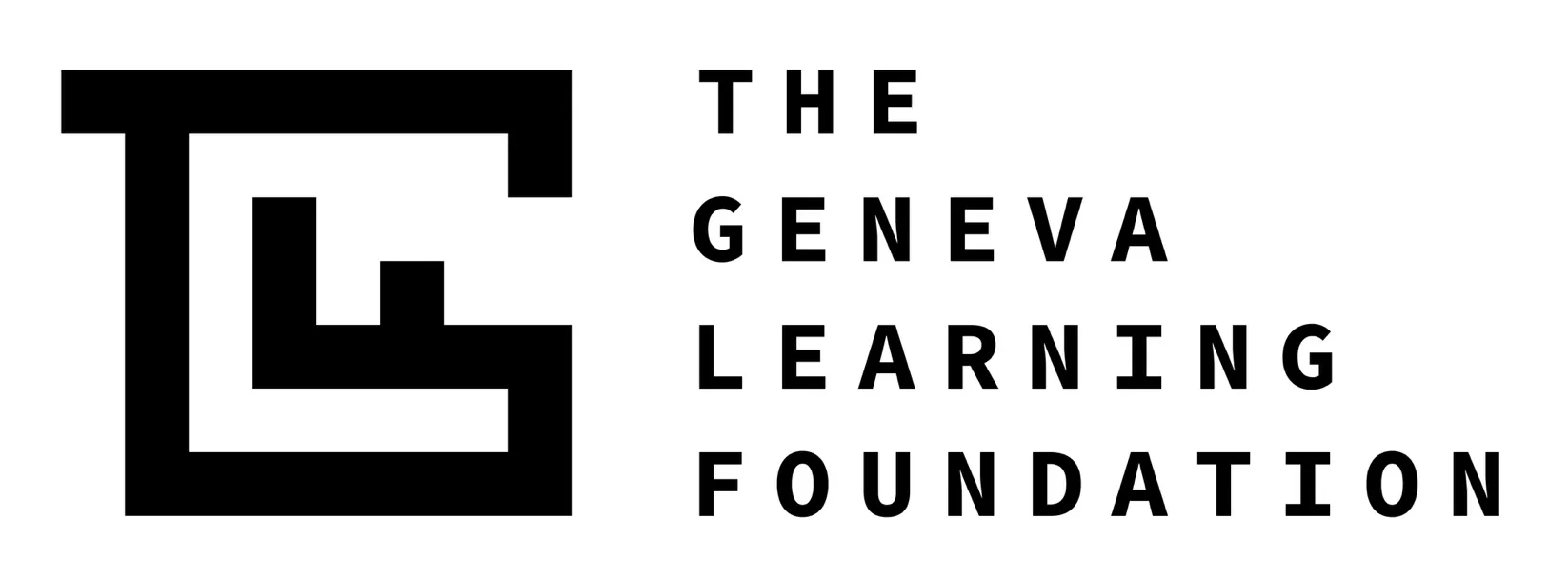
This time around, cheeeeese cleverly fused the letters T, G, L, and F into a single continuous path, creating a maze drawn on a sleek pixel grid. The labyrinth design symbolizes the complex, everyday challenges faced by healthcare workers. Tucked right inside the maze is a single-stroke key inspired by Saint Peter’s key from Geneva’s coat of arms. This key reflects TGLF’s core mission: diving deep into tough problems, unlocking paths forward, and placing solutions directly into the hands of problem-solvers. For the hero launch image, the symbol was built as an outdoor sculpture of striped panels in blue, green, cream, and orange set in an open field. TGLF founder Reda Sadki praised Art Director Lea Pérez for condensing all these big ideas into a single, instantly memorable glyph.
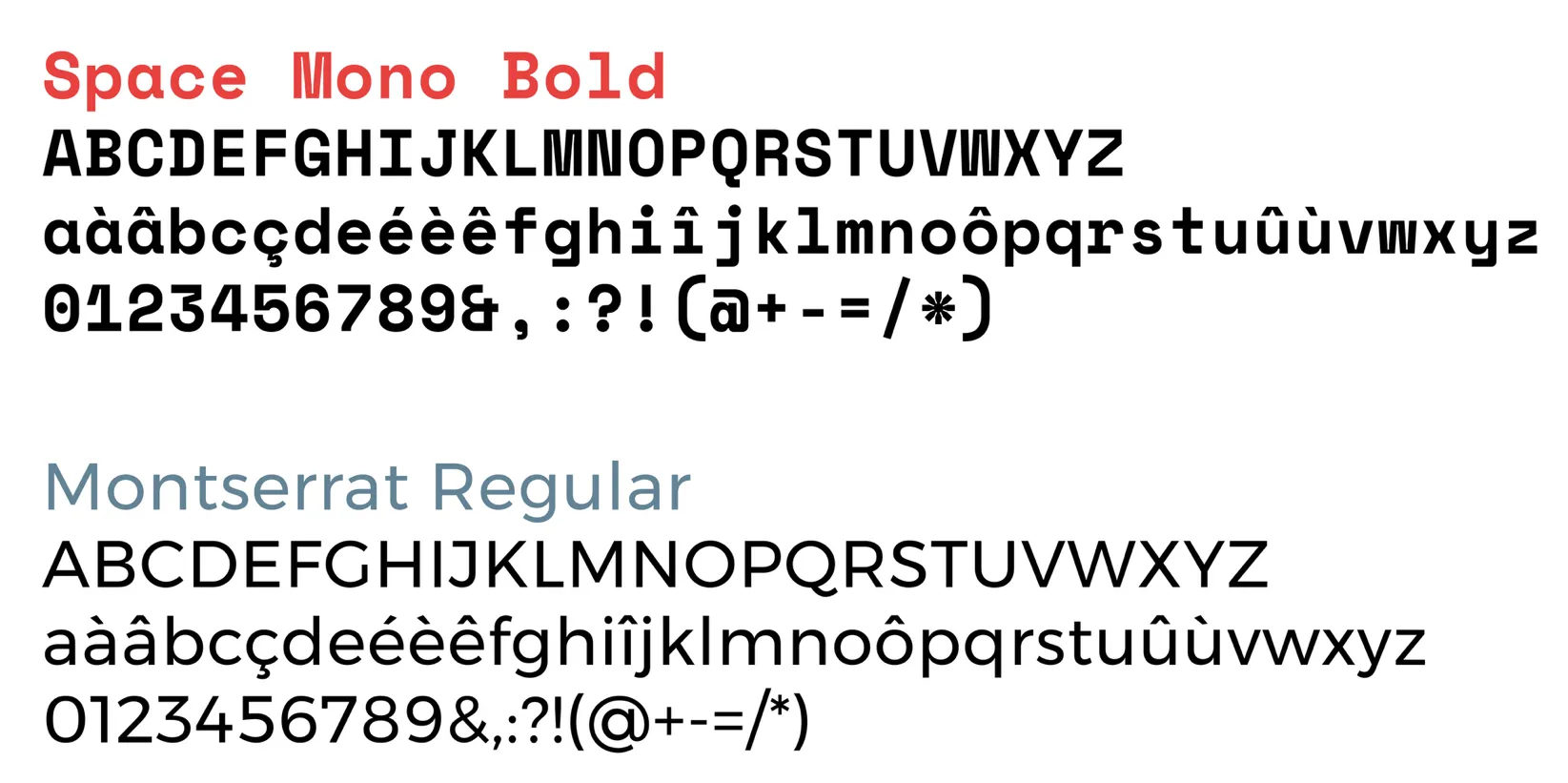
Every turn within the labyrinth snaps precisely to the pixel grid, giving the emblem impressive engineering discipline. The wordmark features Colophon Foundry’s Space Mono from Google Fonts, complemented by Source Code Pro and Montserrat for supporting details. This clean typographic direction marks a complete shift away from traditional serif fonts like Trajan, which are common across the non-profit sector. Running from May to September 2026, the redesign project explored three creative directions in June before TGLF landed on the lettermark concept.
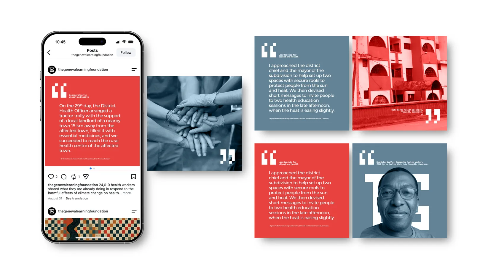
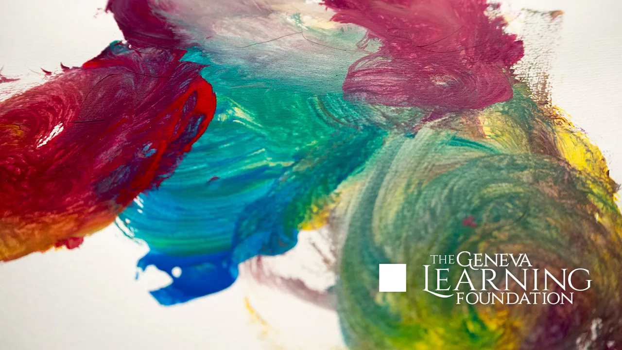
The new brand identity is rolled out across a wide range of platforms for an organization reaching 80,000 healthcare and humanitarian workers in over 100 countries. Deliverables included logo design, a complete visual identity, guidelines, and social media assets like phone mockups and duotone quote cards. Compared to the former logo—a Trajan wordmark set against paint splatters—this redesign is a total makeover.
The project was spearheaded by Geneva agency cheeeeese.com/, under creative direction from Cédric Delmont and art direction by Lea Pérez. For more details on the redesign, check out www.learning.foundation/2026/10/07/agency-cheeeeese-creates-a-new-logo-for-the-geneva-learning-foundations-tenth-anniversary/.
cheeeeese biến tên viết tắt của TGLF thành bộ nhận diện thương hiệu mới
Đánh dấu cột mốc 10 năm thành lập, Tổ chức Geneva Learning Foundation (TGLF) đã thay đổi thiết kế logo Trajan vốn gắn bó trong một thập kỷ qua. Dự án tái thiết kế bộ nhận diện này do agency cheeeeese tại Geneva đảm nhận.
Lần này, cheeeeese đã lồng ghép 4 chữ cái T, G, L và F thành một hình mê cung được vẽ trên hệ lưới pixel grid, tạo ra một đường nét liền mạch. Hình ảnh mê cung tượng trưng cho những bài toán và thử thách phức tạp mà các nhân viên y tế gặp phải mỗi ngày. Bên trong mê cung là chi tiết chìa khóa được vẽ bằng một nét đơn, lấy cảm hứng từ chìa khóa của Thánh Phêrô trên huy hiệu thành phố Geneva. Chìa khóa này đại diện cho tinh thần làm việc của TGLF: đi sâu vào vấn đề, tìm ra lối thoát và trao giải pháp cho những người giải quyết. Hình ảnh chính đại diện cho đợt ra mắt là biểu tượng dạng điêu khắc gồm các tấm sọc màu xanh dương, xanh lá, màu kem và cam đặt ngoài cánh đồng. Nhà sáng lập TGLF, ông Reda Sadki, từng nhận xét rằng Giám đốc nghệ thuật Lea Pérez đã cô đọng toàn bộ ý tưởng thành một biểu tượng duy nhất khiến người xem nhớ ngay chỉ sau một lần nhìn.
Mọi khúc ngoặt trong mê cung đều được căn theo hệ lưới pixel grid để đảm bảo tính kỷ luật và sự chuẩn xác. Phần wordmark sử dụng phông chữ Space Mono của Colophon Foundry trên Google Fonts, kết hợp với Source Code Pro và Montserrat cho các phần phụ trợ. Thiết kế mới này là bước chuyển mình hoàn toàn khỏi font serif Trajan cổ điển—kiểu phông chữ vốn xuất hiện phổ biến ở nhiều tổ chức phi lợi nhuận. Dự án kéo dài từ tháng 5 đến tháng 9 năm 2026, với 3 phương án được đề xuất vào tháng 6 năm 2026 trước khi TGLF chốt chọn phương án phát triển từ các chữ cái viết tắt.
Bộ nhận diện mới được ứng dụng trên nhiều kênh cho một tổ chức tiếp cận tới 80.000 nhân viên y tế và nhân đạo tại hơn 100 quốc gia. Danh mục công việc gồm thiết kế logo, bộ nhận diện thị giác, guideline cùng các mẫu social media như mockup khung điện thoại và card trích dẫn hai tông màu duotone. So với diện mạo cũ dùng font Trajan đặt trên vết sơn lem, thiết kế mới mang lại sự thay đổi toàn diện.
Dự án do cheeeeese.com/ (Geneva) thực hiện, dưới sự chỉ đạo sáng tạo của Cédric Delmont và chỉ đạo nghệ thuật của Lea Pérez. Chi tiết thêm về dự án có thể tham khảo tại www.learning.foundation/2026/10/07/agency-cheeeeese-creates-a-new-logo-for-the-geneva-learning-foundations-tenth-anniversary/.