Danh mục: design inspiration

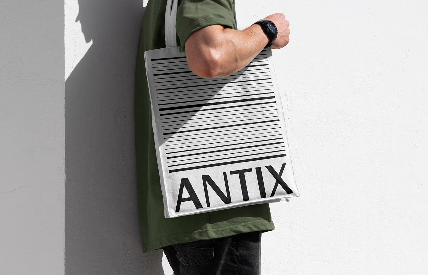
Antix Digital Product Identity: A Minimalist Branding System
Antix just dropped a super sleek digital ecosystem, complete with a killer brand strategy and a monochrome packaging system designed right in-house by Antix Studio. This creative crew built a modular branding system that serves as the rock-solid foundation for the entire visual direction. The color palette is a gorgeous match-up between ultra-luxurious charcoal black…

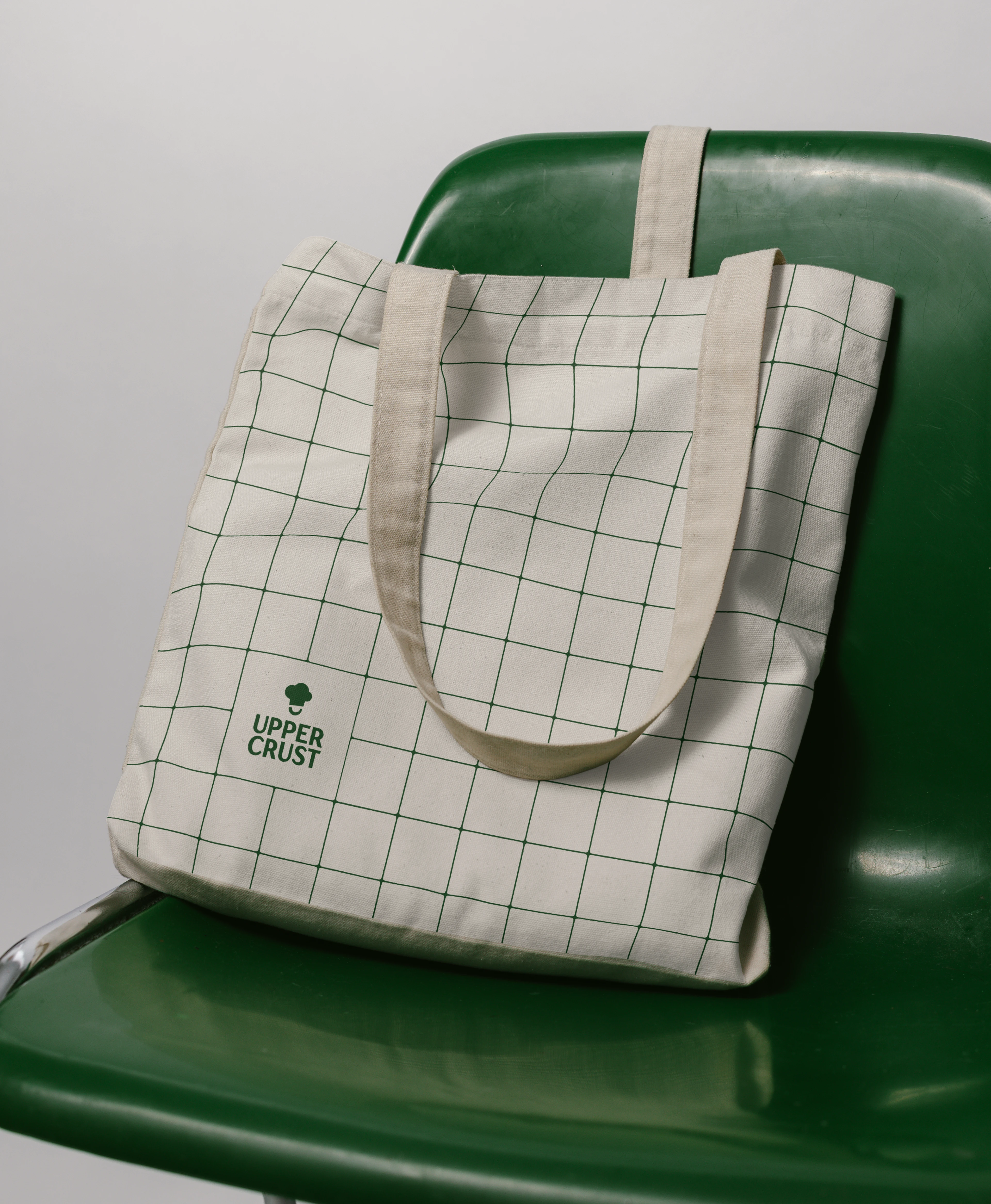
A Modern Take on Approachable Excellence: The Upper Crust Food Service Rebrand by Amanda Coppeti
Upper Crust Food Service is a heavy hitter in the US catering and food service industry, famously fueling fraternity and sorority houses, summer camps, and schools nationwide. To mark a major strategic evolution, the brand teamed up with Hoot Design Co. and designer Amanda Coppeti for a total identity makeover. The big challenge here? Finding…

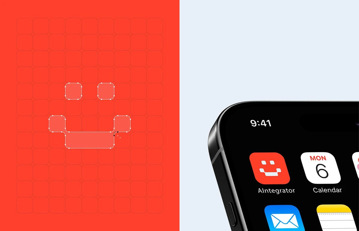
AIntegrator Studio Develops Futuristic Modular Branding for AIntegrator
AIntegrator just dropped a futuristic tech platform with a super strategic brand identity featuring a glowing dark UI, all crafted by AIntegrator Studio. The creative crew built a modular branding system that serves as a rock-solid foundation for this AI platform’s visual direction. The color palette hits the sweet spot with a deep midnight charcoal…

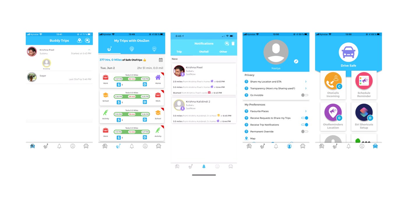
Otozen Mobile App: Designing a High-Contrast UI/UX for Safe Driving
The interface of the Otozen mobile app is beautifully crafted, keeping drivers focused on the road through an incredibly smart information architecture. A modular grid system is used to its full potential, keeping the UI super clean and geometrically precise. This intentional layout cuts out the digital noise, putting driver safety front and center. High-contrast…

Figma 3D Motion Design Concept by Yujin Kim and VSLAB
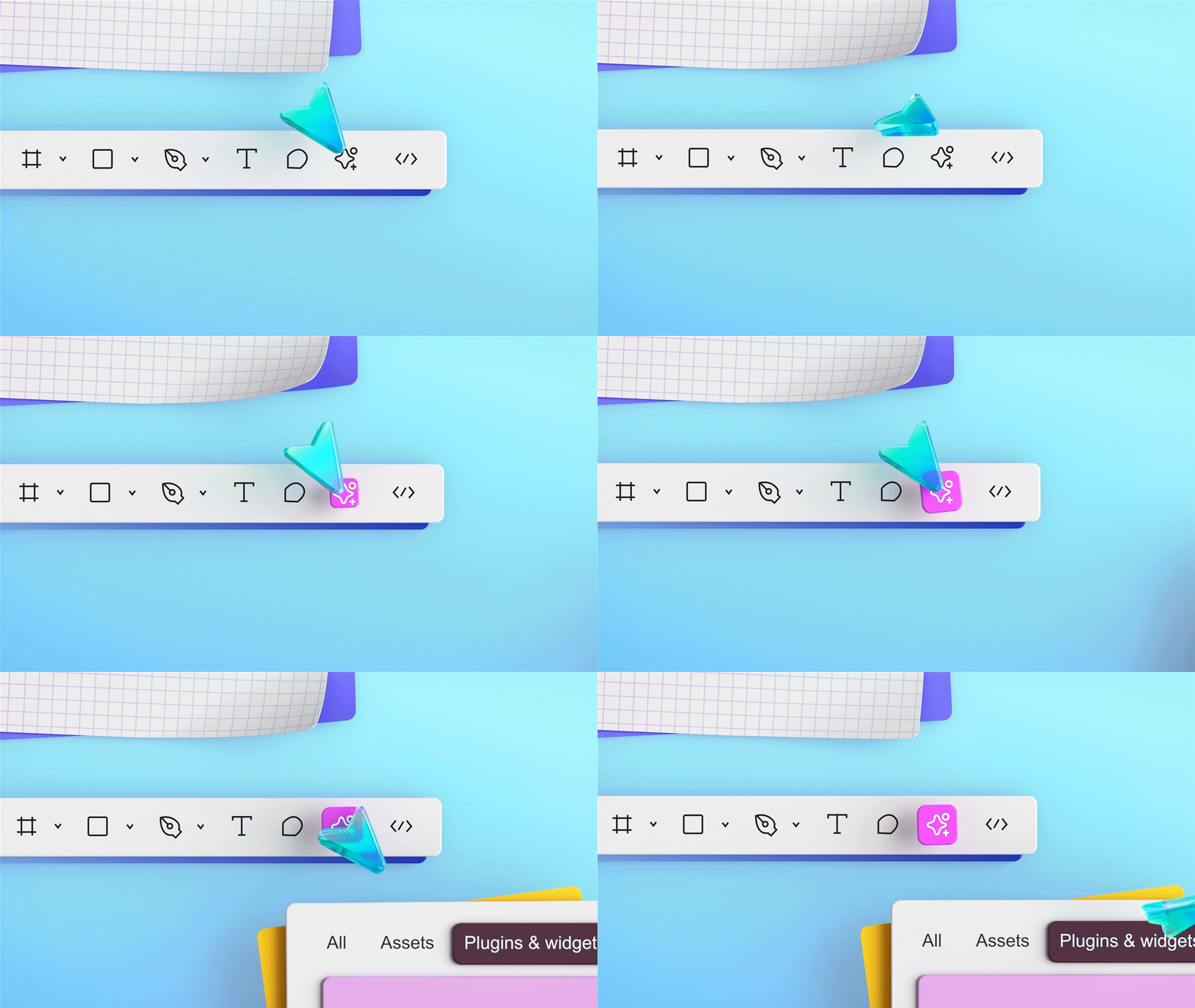
Check out this stunning new visual concept for Figma, fresh from South Korean designer Yujin Kim and the team at VSLAB Official! Instead of the usual flat 2D interfaces, this project brings the UI/UX world into a whole new dimension with vibrant 3D motion design. The piece beautifully highlights Figma’s superpower: real-time collaboration that connects…

Archivr: Systemizing Task Management Identity with LAIN Branding
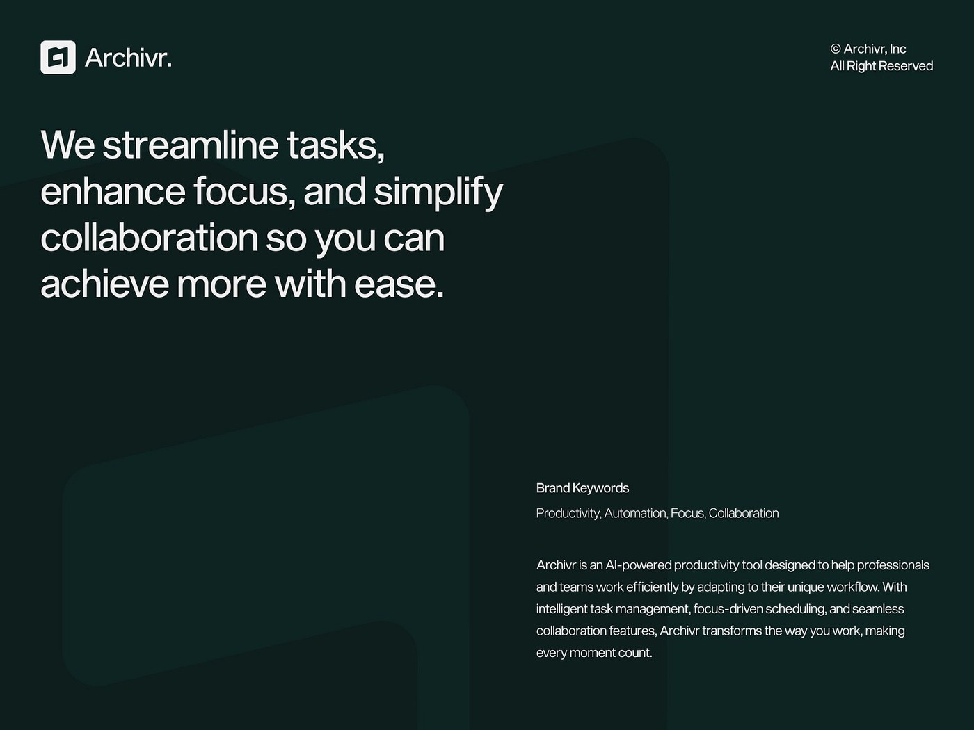
LAIN Branding built an incredibly structured framework for this platform. The design is shaped by super clean letterforms and a beautifully minimalist typography system. With this project, the studio proves just how powerful a strict grid system can be when it comes to bringing order to task management software. By stripping away unnecessary fluff, the…

Visualizing the Power of Acer Premium OLED Monitors
This promotional project for the Acer Premium OLED monitor lineup sets up a super modern vibe where high-gear productivity meets stylish everyday living. The visual style beautifully blends warm ambient lighting with pops of vibrant color, totally blurring the line between a home office and a cozy living space. Plenty of open space and clever…

Cocomoco Bakery & Coffee Embraces Minimalism with a Tactile Identity System
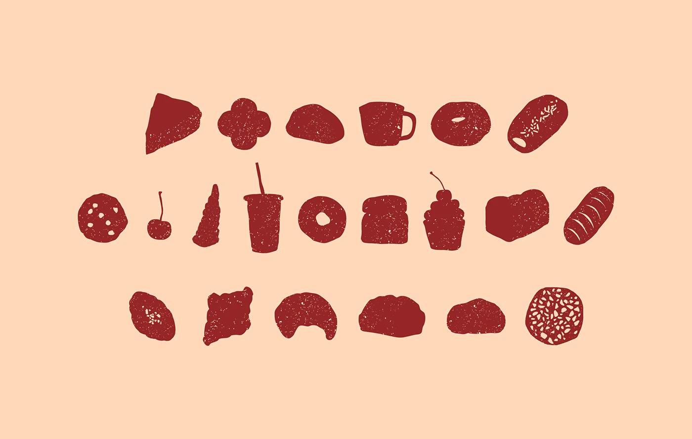
Cocomoco Bakery & Coffee just dropped a gorgeous new brand identity that’s all about warmth and a cozy, handcrafted feel, beautifully executed by Cocomoco Studio. The real magic lies in the clever mix of terracotta packaging, warm cream typography, and raw kraft paper. This striking contrast pops across pastry bags, coffee cups, and takeout boxes,…
Dual-Identity Branding for Ellis Butchers by Studio Blackburn
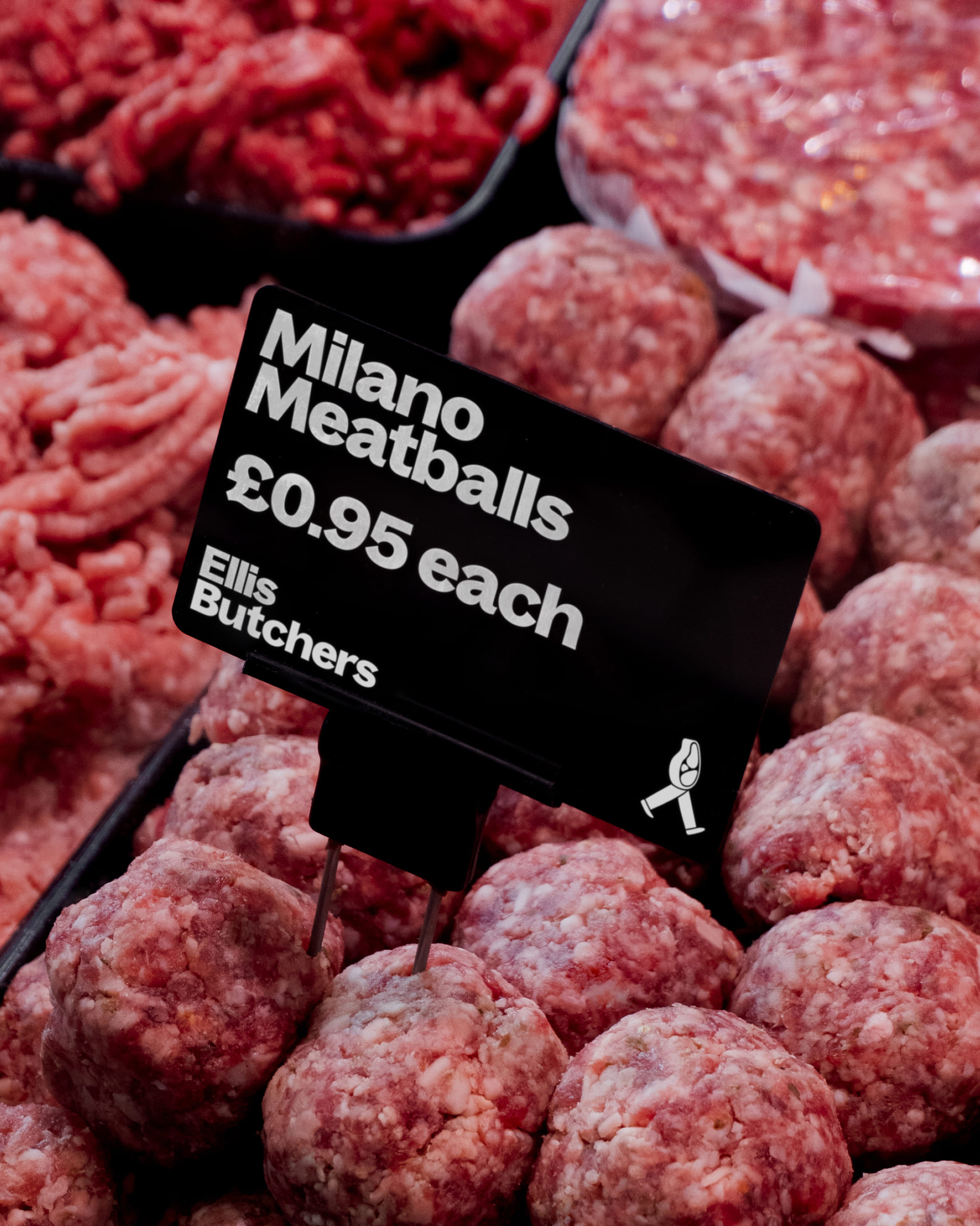
Studio Blackburn just rolled out a super fun brand identity for the Ellis Butchers chain, tackling the classic challenge of one brand with two totally different personalities across its two locations. With founder Nick Ellis owning spots in both Blackheath Village and Blackheath Standard, the big challenge was creating a cohesive parent brand that still…

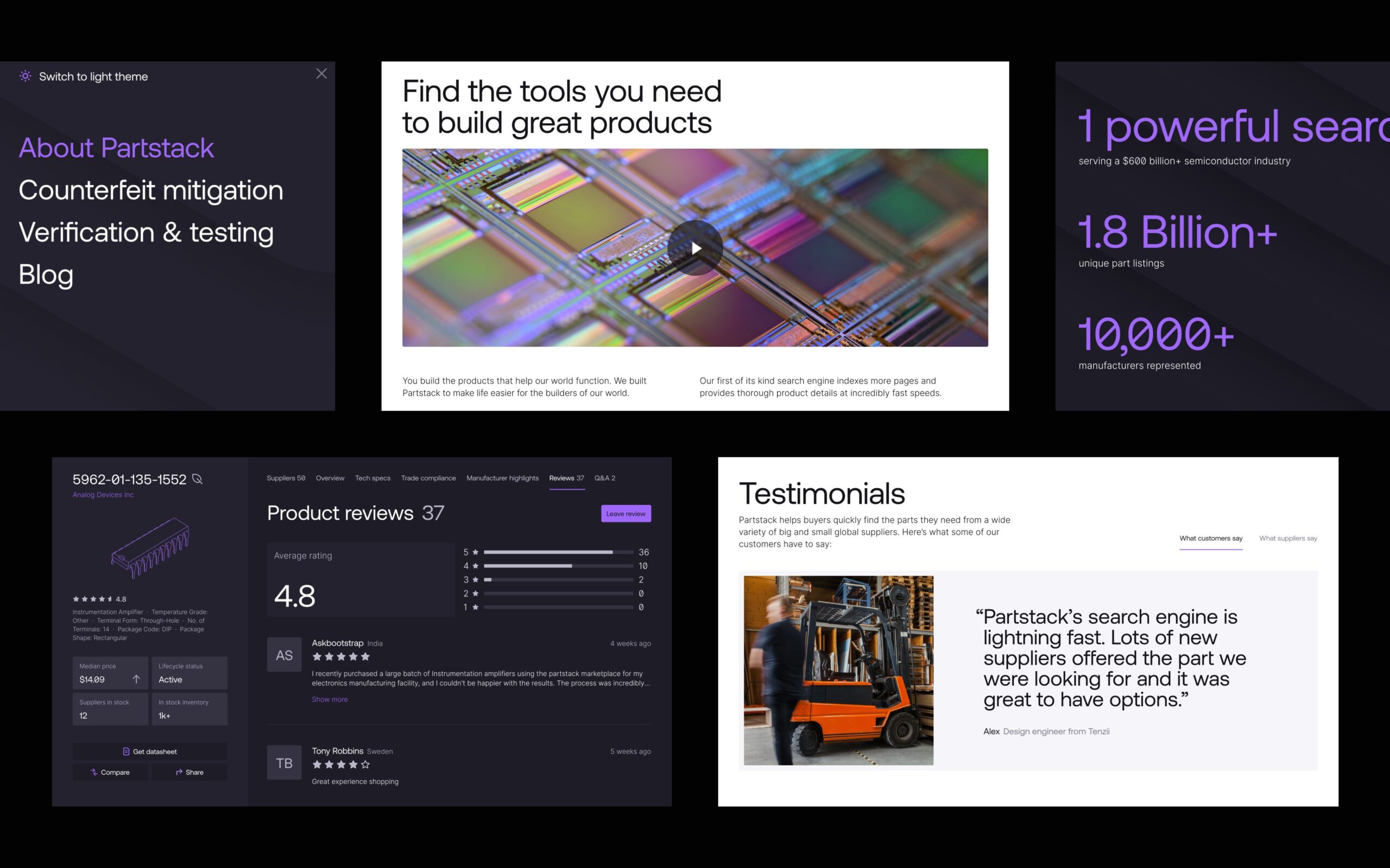
Partstack Introduces a New Industrial Brand Identity by Clay
Silicon Valley-based design agency Clay just gave Partstack’s online platform a seriously impressive makeover. The design team took a complex semiconductor catalog and transformed it into a super readable, highly adaptable interface. Packed with a clean, industrial visual language, the new brand identity feels incredibly sharp thanks to a tight layout system. Pairing the geometric…

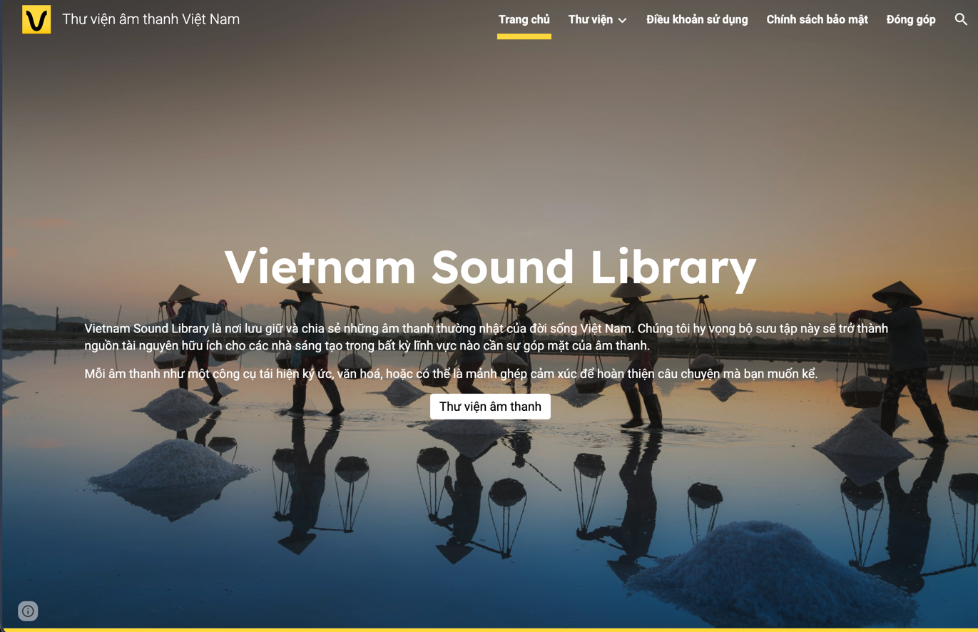
Vietnam Sound Library: An Audio Archive of Everyday Vietnamese Life
Ever found yourself scrambling to find those perfect, familiar everyday sounds of Vietnam to level up a creative project? Look no further! The www.vietnamsoundlibrary.com/ is a super cool archive that solves that exact problem. This platform is dedicated to preserving and sharing the most authentic, day-to-day sounds of Vietnamese life. The project aims to be…

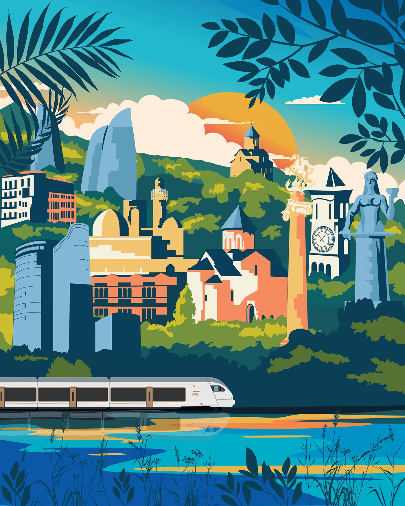
Modernizing Azerbaijan Railways (ADY) Through Vibrant Animated Illustrations
Azerbaijan Railways (ADY) has long been the backbone of the nation’s transit network, beautifully bridging its rich history with a forward-looking vision. Recently, ADY underwent an impressive modern upgrade by rolling out next-gen, high-speed Stadler passenger trains, completely redefining passenger comfort and travel style. This stunning illustration series is a creative concept project celebrating ADY’s…

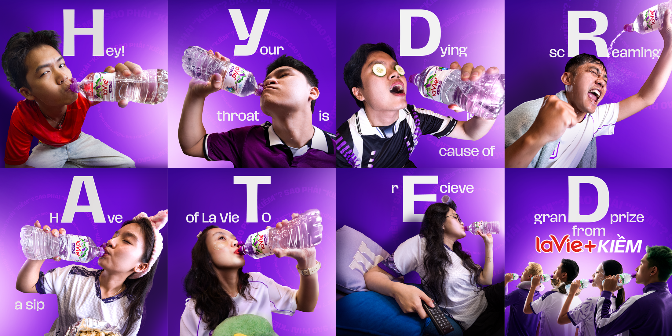
Nestlé La Vie and Ogilvy Vietnam Turn Football Ad Breaks Into Real Hydration Moments
There is nothing worse than tuning into a football match at home, only to have the halftime excitement totally ruined by an endless barrage of commercial breaks. Talk about a major buzzkill for the fans! Recognizing this ultimate frustration, La Vie—Vietnam’s leading mineral water brand—decided it was time to bring back the true, original meaning…

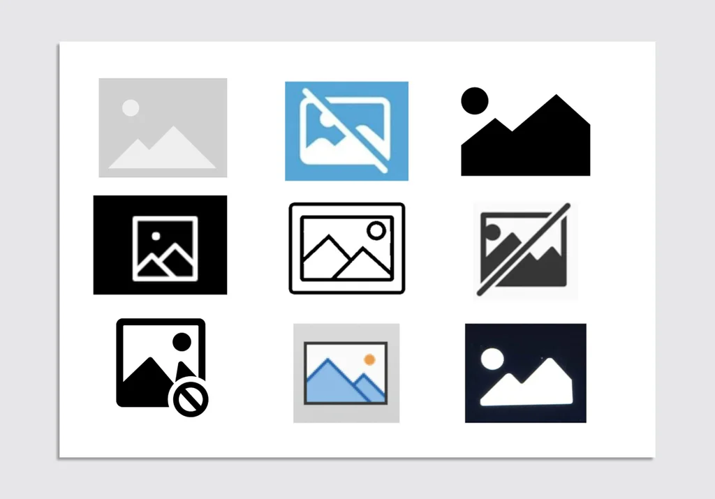
The Unexpected Origin and Symbolism of the Mountain Peak Image Placeholder
Ever been browsing the web and ran into that lonely little box with two mountain peaks because an image failed to load or is taking its sweet time? It is the universal placeholder icon for a missing image. But ever wonder how this specific double-mountain design became the absolute gold standard across the entire digital…
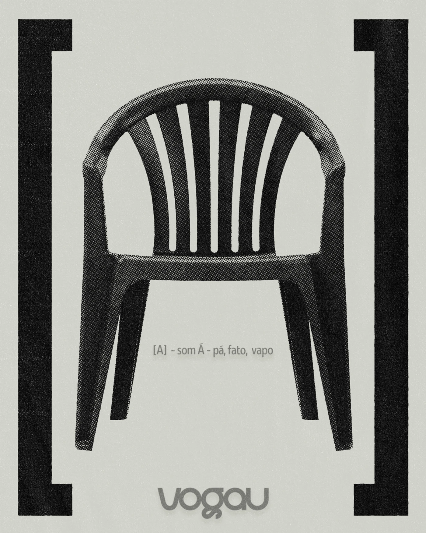
A Sophisticated Visual Identity for Vogau by Monga Design
Vogau just dropped a gorgeous new high-end visual identity, crafted by the talented folks at Monga Design and Mateus Yuzo. This rebranding completely elevates the brand with a sleek, unforgettable look. The new system pairs a soft, organic color palette with ultra-clean layout grids. These geometric shapes deliver a beautifully modern take on minimalism. By…

Minh Long’s 55-Year Evolution: From Traditional Retail to Lifestyle Brand Experience
A legendary Vietnamese porcelain brand just celebrated its half-century milestone with a seriously bold makeover! Moving way beyond standard retail, Minh Long is inviting everyone to experience a true lifestyle journey. The stunning new showroom at 17 Ba Huyen Thanh Quan (Xuan Hoa Ward, HCMC) brings this fresh vision to life, laying down a beautiful…

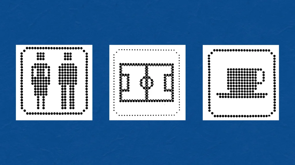
The Return of Puntograma: Argentina’s Forgotten 1978 World Cup Signage System
When thinking about design for massive sporting events like the World Cup, logos and cute mascots usually steal the spotlight. However, the signage and wayfinding system for the 1978 World Cup in Argentina is a fascinating, super practical masterclass in design that many people have completely overlooked. Dubbed “Puntograma” (which translates to “dot-a-gram” or “point-a-gram”),…

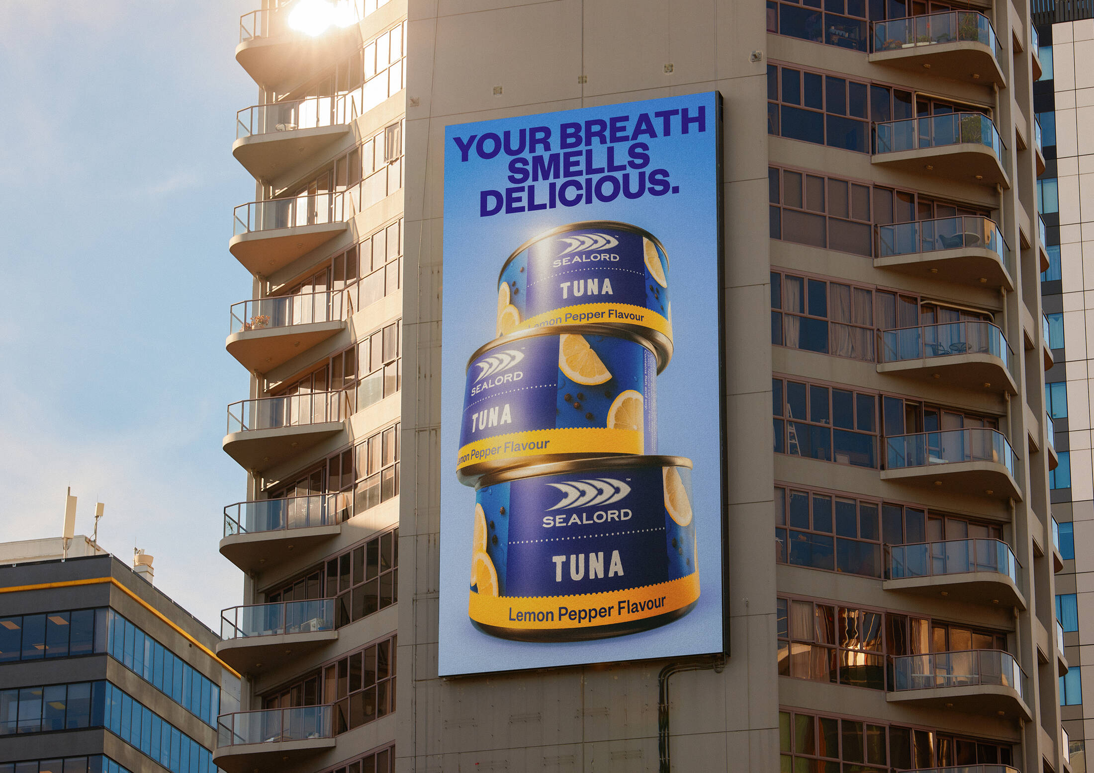
Sealord and Motion Sickness Launch We Love Fish Campaign to Fight Fishame
Seafood brand just teamed up with creative agency motionsickness to launch “We Love Fish”—a fresh brand platform encouraging New Zealanders to proudly embrace their love for fish without any awkwardness. The core concept revolves around “fishame” (that pesky fish shame)—the guilt or hesitation people often feel due to the smell, the mess of cooking it,…

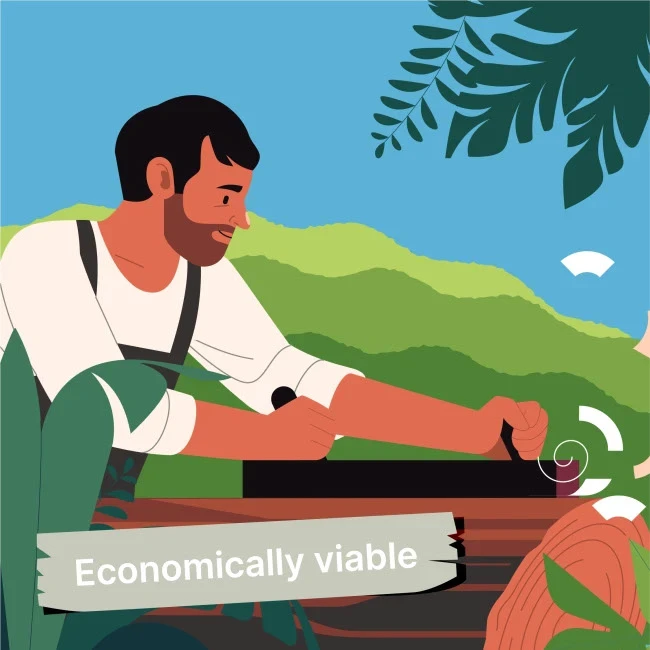
Simplifying FSC Principles Through Motion Design
This super cool design project transforms dry technical documents into vivid visual stories! This explainer video series was created for the Forest Stewardship Council (FSC) to simplify their incredibly complex Principles, Criteria, and Indicators (PCI). The Challenge How do you turn a dense, academic industry handbook into a story that actually connects with people emotionally?…