ZEKOSHIP Brand Identity by Designer Rokeya Akter In global logistics, standing out with a sharp, trustworthy visual image is everything. For ZEKOSHIP—a powerhouse providing freight forwarding and international supply chain management—designer Rokeya Akter crafted a sleek, modern, highly technical brand identity built around the core message: “Take Control. Manage Shipping.”
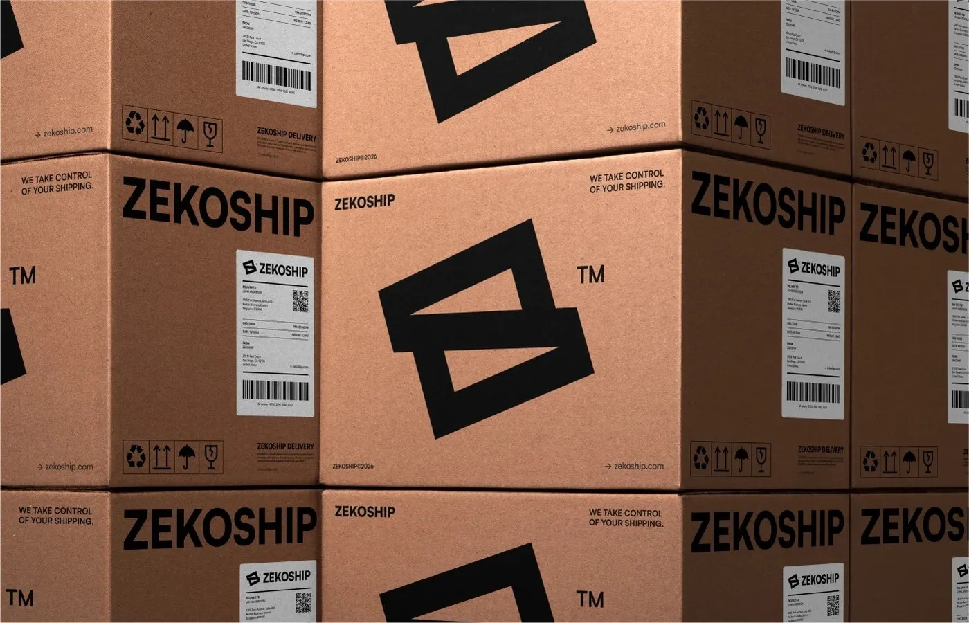
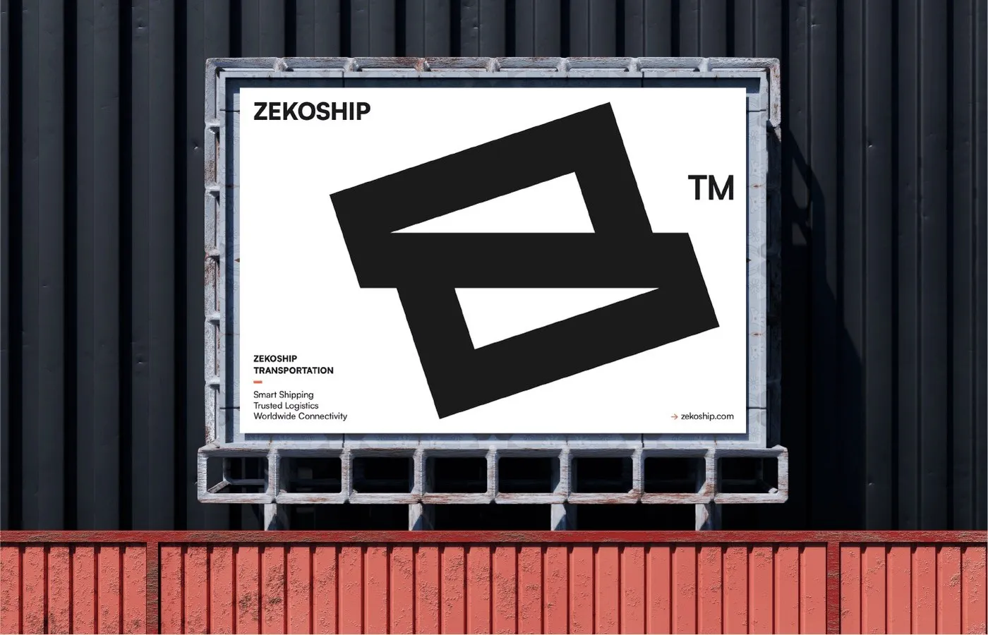
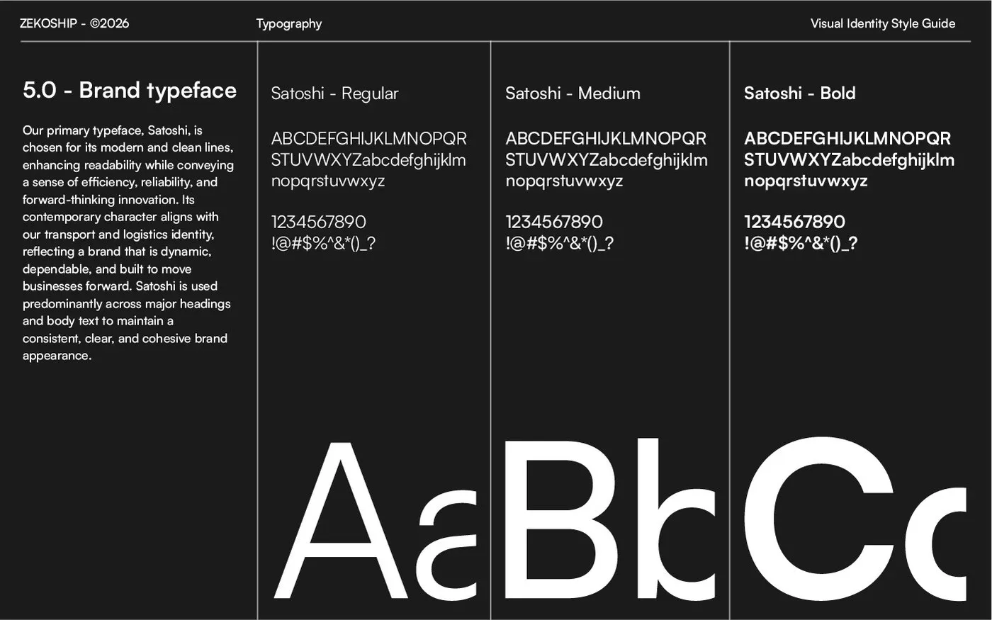
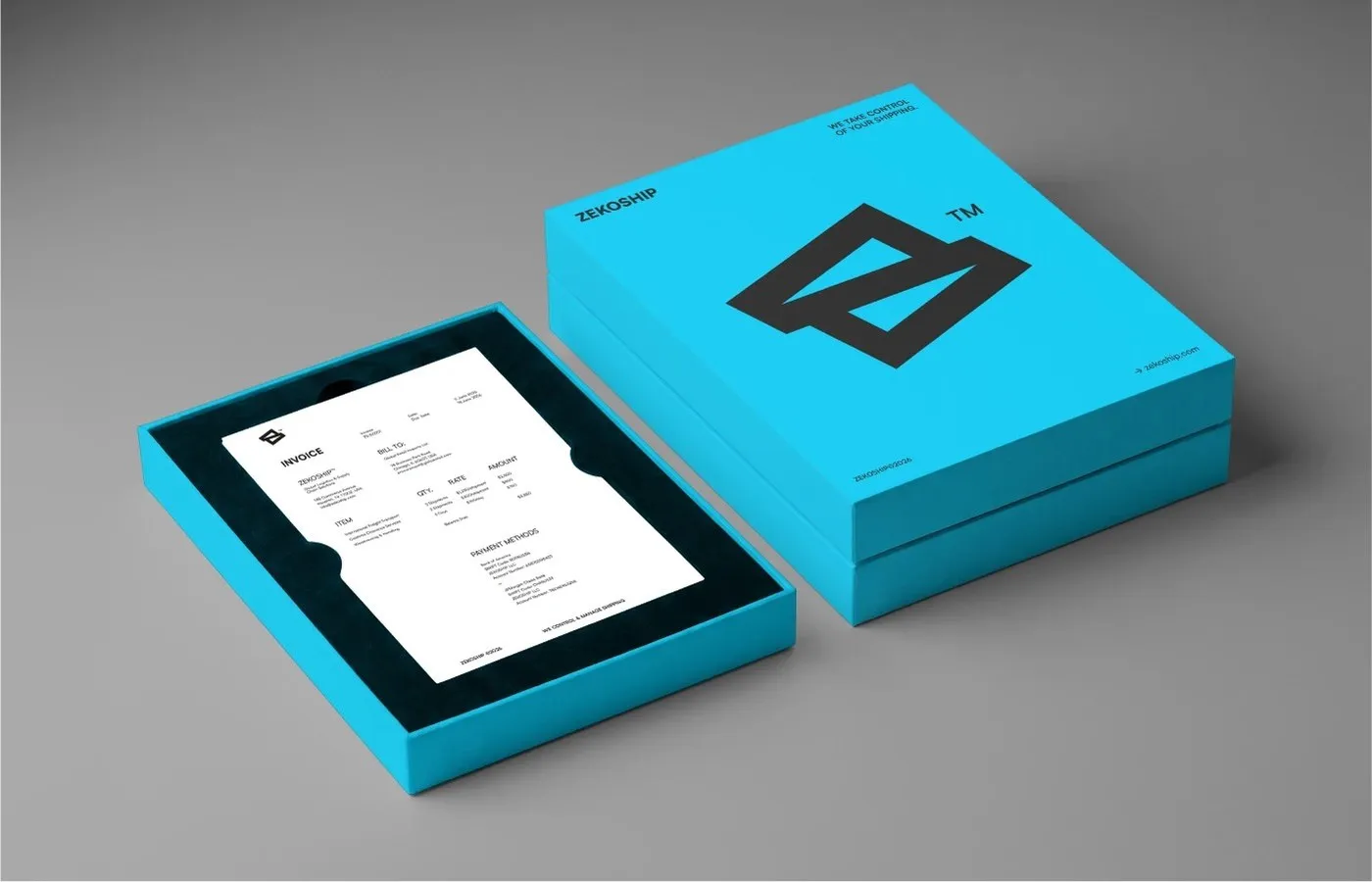
At the heart of the design lies a geometric monogram combining the letter “Z” with sharp diagonal lines that echo shipping transit routes. Satoshi, a fresh neo-grotesque typeface from Indian Type Foundry, takes center stage as the primary font. With its crisp Regular, Medium, and Bold weights, Satoshi delivers razor-sharp geometric precision, ensuring every bit of info stays crystal clear—whether on packaging labels, signage, or order-tracking interfaces.
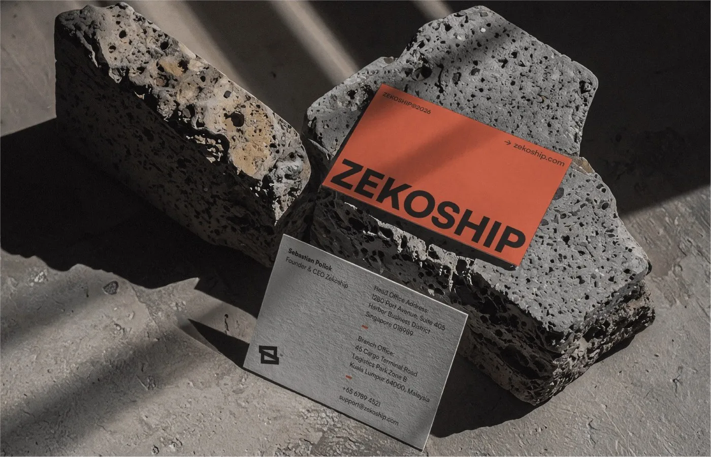
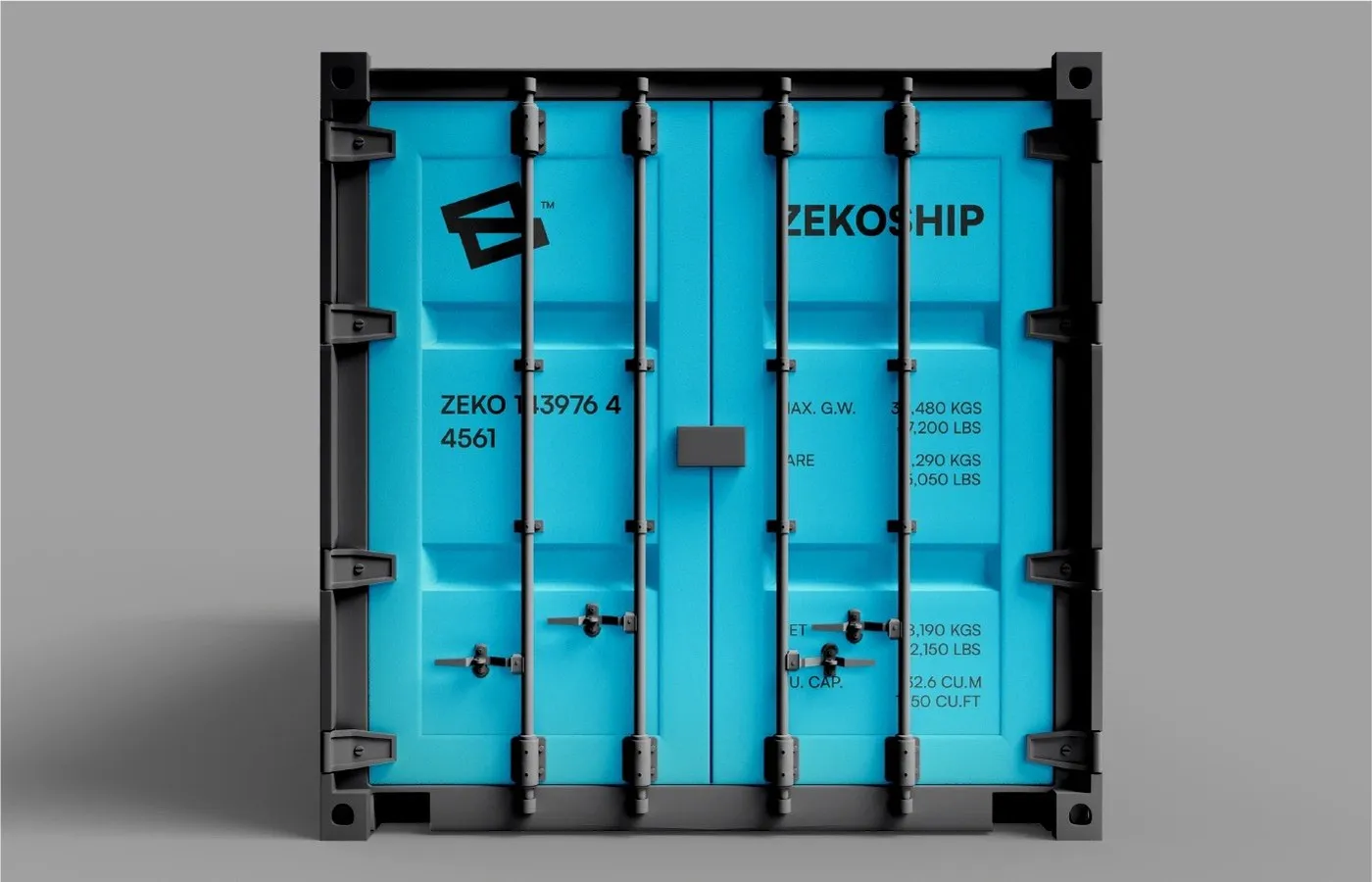
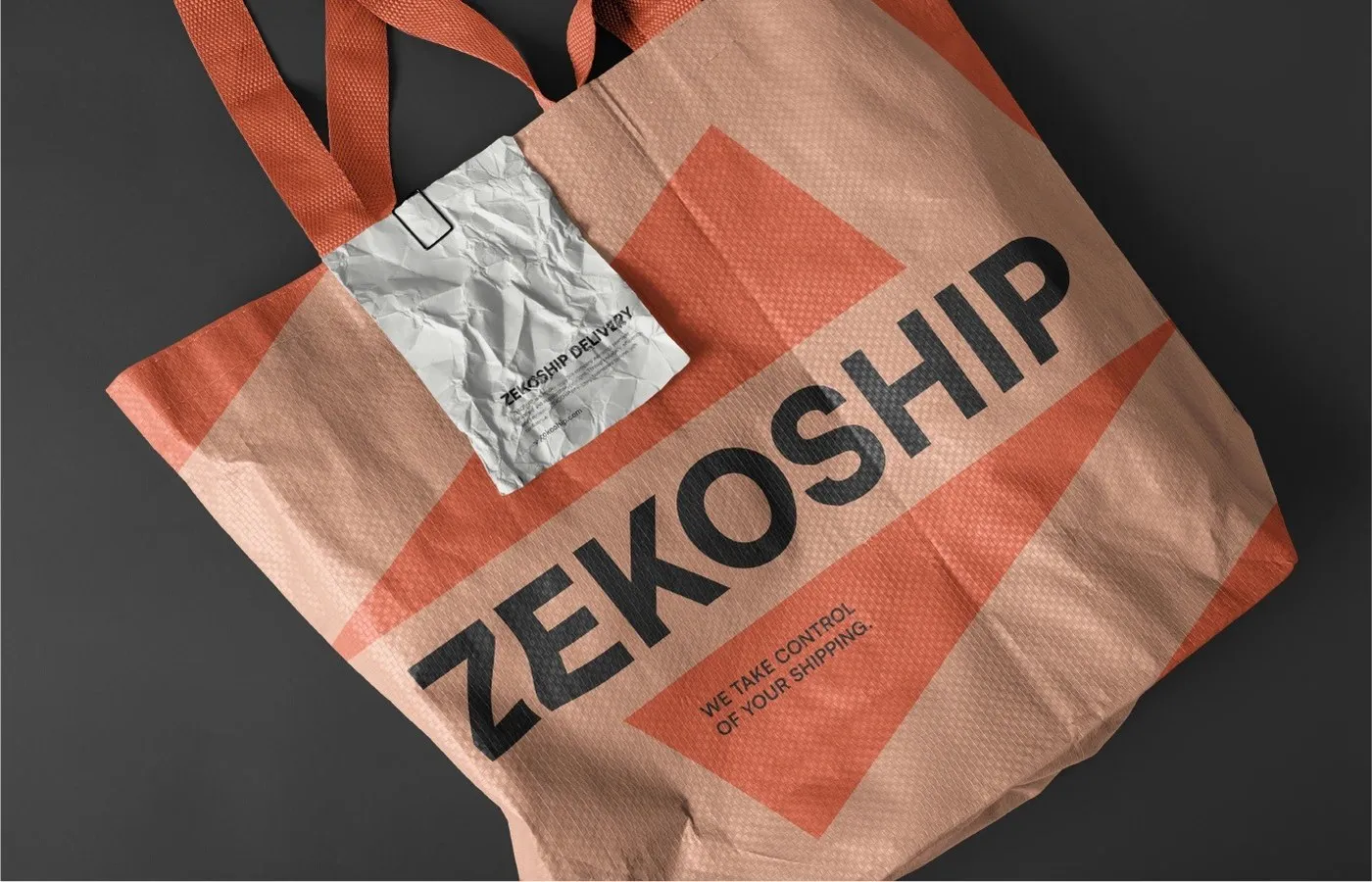
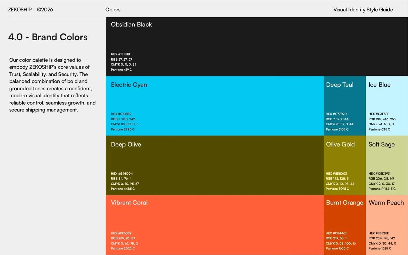
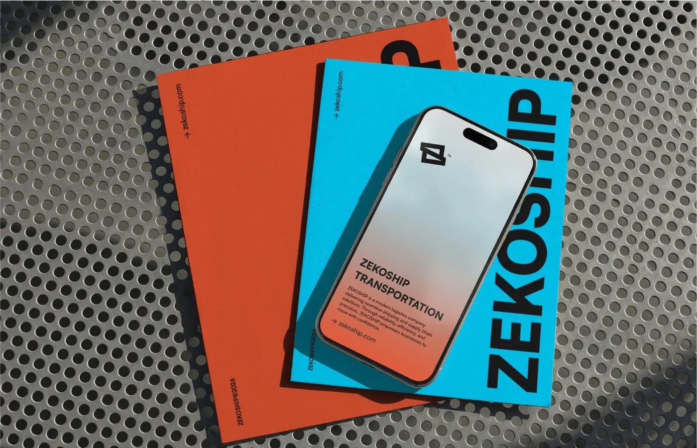
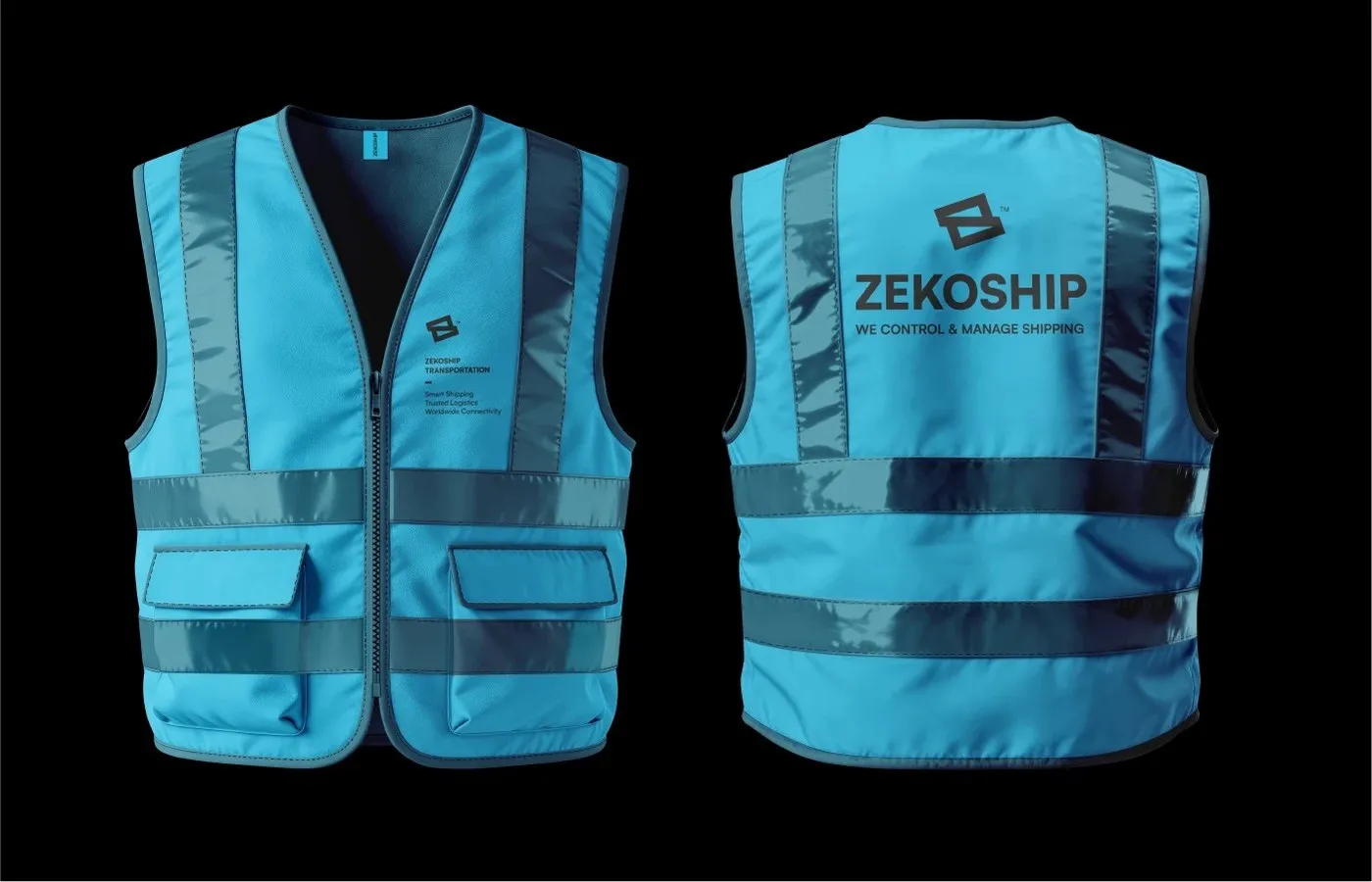
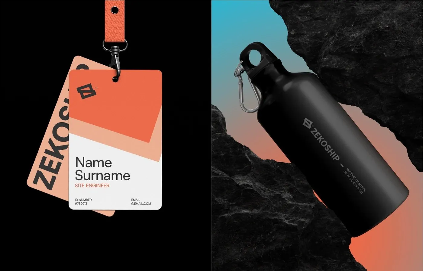
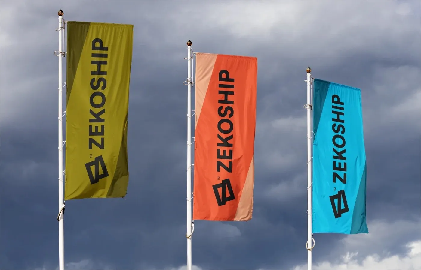
What really sets this branding apart is the bold color palette and tactile material choices. Stepping away from predictable, traditional logistics blues, the brand rocks a high-contrast palette featuring Obsidian Black (Pantone 419 C), Electric Cyan (Pantone 2995 C), Coral (Pantone 2026 C), and Deep Olive (Pantone 4485 C). This energetic visual system comes to life across touchpoints everywhere: screen-printed cardboard boxes with barcodes, stencil-painted steel shipping containers, premium cotton business cards, high-vis safety vests, and woven packaging bags.
Check out the full project on www.behance.net/gallery/255089093/ZEKOSHIP-Brand-Identity-Design.
Bộ nhận diện thương hiệu ZEKOSHIP từ designer Rokeya Akter
Trong ngành logistics toàn cầu, việc xây dựng một hình ảnh trực quan rõ ràng và đáng tin cậy là yếu tố rất quan trọng. Đối với ZEKOSHIP – đơn vị cung cấp dịch vụ giao nhận vận tải và quản lý chuỗi cung ứng quốc tế, designer Rokeya Akter đã phát triển một bộ nhận diện thương hiệu hiện đại, gọn gàng và đậm chất kỹ thuật dựa trên thông điệp cốt lõi “Take Control. Manage Shipping”.
Trọng tâm của thiết kế là biểu tượng monogram dạng hình học, kết hợp giữa chữ cái Z và các đường chéo mô phỏng tuyến đường vận tải. Phông chữ chủ đạo được sử dụng là Satoshi, một kiểu chữ neo-grotesque hiện đại từ Indian Type Foundry. Các định dạng Regular, Medium và Bold của Satoshi mang lại tỷ lệ hình học chuẩn xác, giúp thông tin hiển thị rõ ràng từ nhãn bao bì, biển hiệu cho đến giao diện theo dõi đơn hàng.
Điểm nét riêng của dự án nằm ở cách phối màu và xử lý bề mặt chất liệu. Thay vì đi theo gam màu xanh truyền thống của ngành vận tải, bộ nhận diện sử dụng các tông màu tương phản mạnh mẽ bao gồm Obsidian Black (Pantone 419 C), Electric Cyan (Pantone 2995 C), Coral (Pantone 2026 C) và Deep Olive (Pantone 4485 C). Hệ thống nhận diện này được áp dụng nhất quán trên nhiều điểm chạm thực tế: từ thùng carton in lụa có mã mã vạch, container thép sơn stencil, danh thiếp chất liệu cotton cho đến áo bảo hộ phản quang và túi dệt bao bì.
Xem đầy đủ dự án của www.behance.net/gallery/255089093/ZEKOSHIP-Brand-Identity-Design trên Behance.