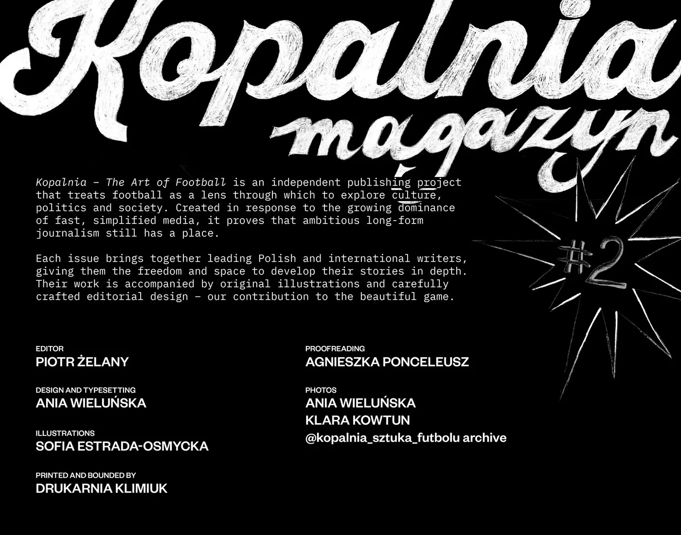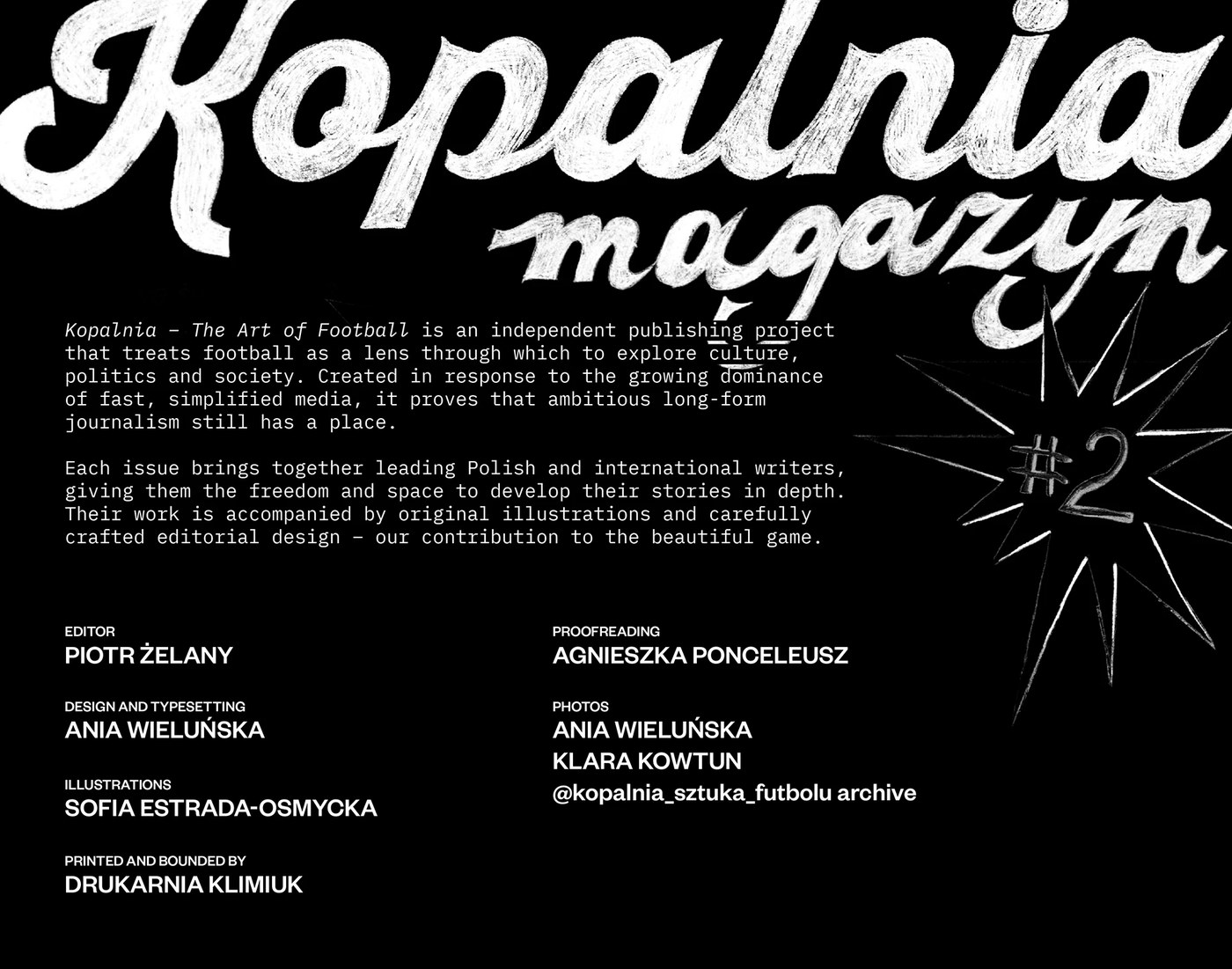
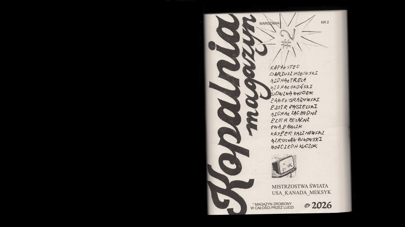
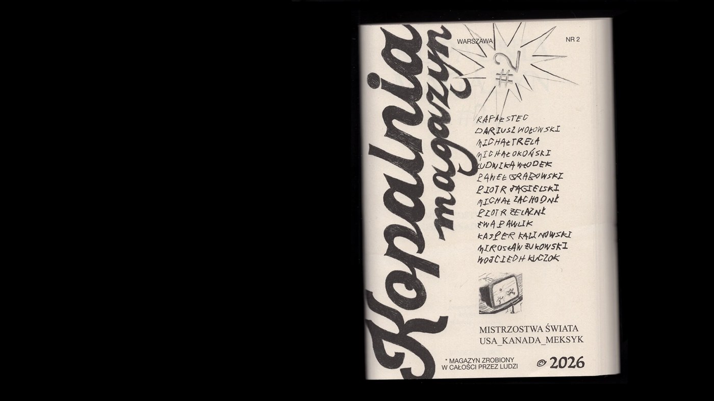
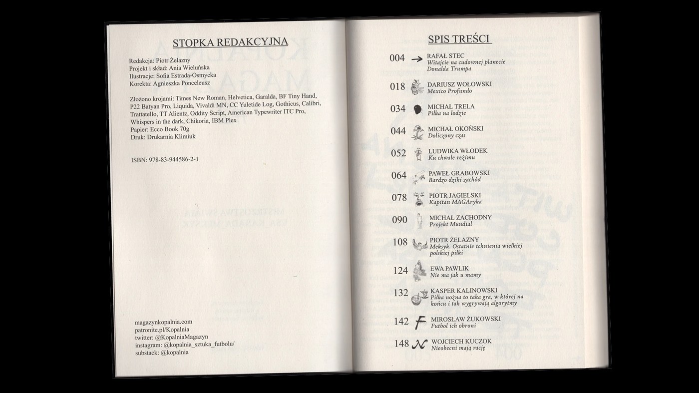
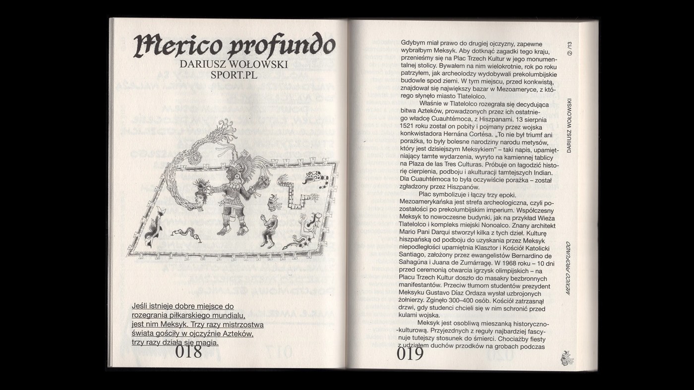
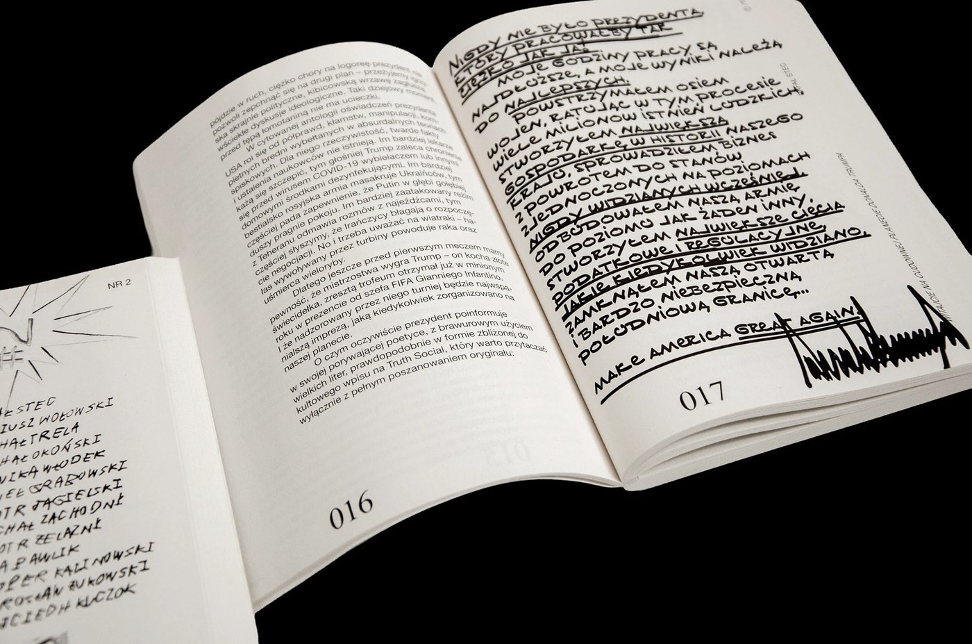
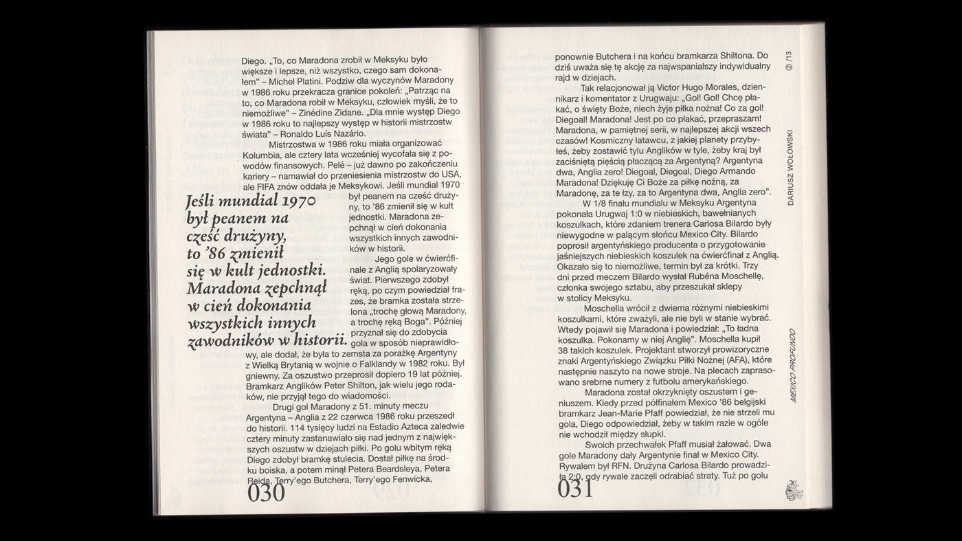
The magazine’s layout rocks a super precise that effortlessly organizes long essays, illustrations, and visual hierarchy. The studio created an awesome visual rhythm and striking contrast by playing with negative space and rich, dense blocks of black ink. Every single article brings its own unique personality to the table while still honoring the core geometric shapes of the overall system. It’s a perfect balance that feels incredibly cohesive yet bursting with energy as you flip through the pages.
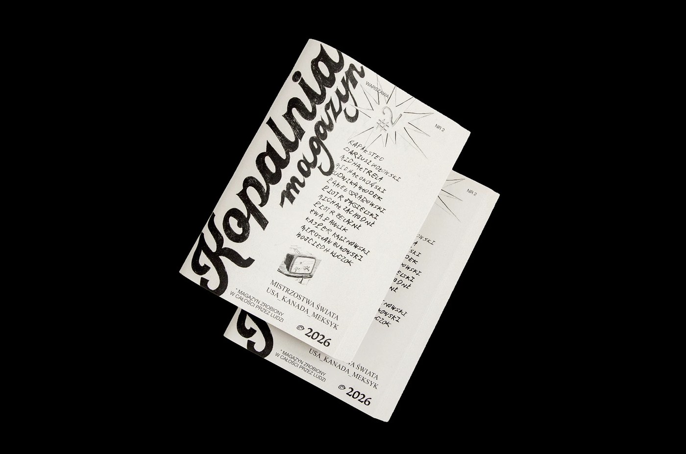
A major high point is the flawless typographic scaling and baseline alignment. In this issue, the typography turns into a truly tactile experience, especially when paired with the raw, textured paper and an exposed spine that grounds the product in classic design principles. Ania Wieluńska proves that printing with absolutely nothing but black ink can deliver stunning visual depth without relying on color palettes at all.
Ultimately, this design project serves as a powerful statement on the enduring strength of print in a digital world. By ditching mainstream trends to focus on materiality and tactile contrast, the studio has created a total collector’s item for sports journalism. Dive deeper into this design and explore the full gallery right over on the www.behance.net/gallery/253332069/Kopalnia-Magazine-2-World-Cup-2026.
Thiết kế layout của cuốn tạp chí cực kỳ chỉn chu, giúp sắp xếp các bài tiểu luận dài, các khối minh họa và phân cấp thị giác một cách mượt mà. Studio đã tạo ra nhịp điệu thị giác và sự tương phản đầy ấn tượng bằng cách kết hợp khéo léo giữa khoảng trắng (negative space) và các mảng mực đen đậm đặc. Mỗi bài viết trong ấn phẩm đều sở hữu một cá tính riêng nhưng vẫn tuân thủ phom dáng hình học cốt lõi của toàn bộ hệ thống. Sự cân bằng này mang lại cảm giác vừa nhất quán vừa ngập tràn năng lượng khi lật mở từng trang sách.
Điểm cộng lớn của ấn phẩm nằm ở cách căn chỉnh tỷ lệ typo (typographic scaling) và căn dòng cơ sở (baseline alignment). Trong số tạp chí lần này, chữ nghĩa đã trở thành một trải nghiệm xúc giác thực thụ khi kết hợp với chất liệu thô mộc và phần gáy sách để trần, giúp định hình phom dáng sản phẩm theo những nguyên lý thiết kế kinh điển. Ania Wieluńska đã chứng minh rằng việc chỉ sử dụng mực đen khi in ấn vẫn có thể tạo nên độ sâu thị giác ấn tượng mà không cần phụ thuộc vào các bảng màu.
Sau cùng, dự án thiết kế này đã khẳng định sức mạnh của ngành in ấn giữa thời đại kỹ thuật số. Bằng cách từ chối những xu hướng đại trà để tập trung vào tính chất liệu và sự tương phản xúc giác, studio đã tạo ra một tác phẩm đáng sưu tầm cho nền báo chí thể thao. Độc giả có thể tìm hiểu thêm về thiết kế này và xem trọn bộ ảnh tại www.behance.net/gallery/253332069/Kopalnia-Magazine-2-World-Cup-2026.