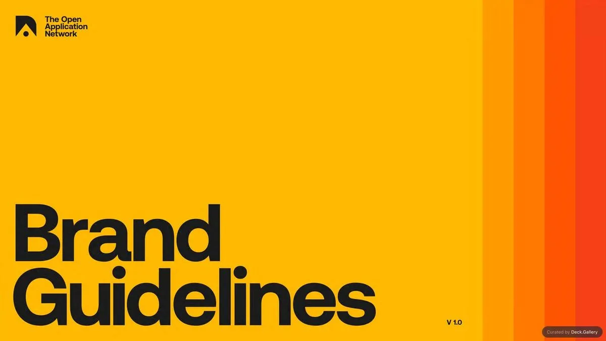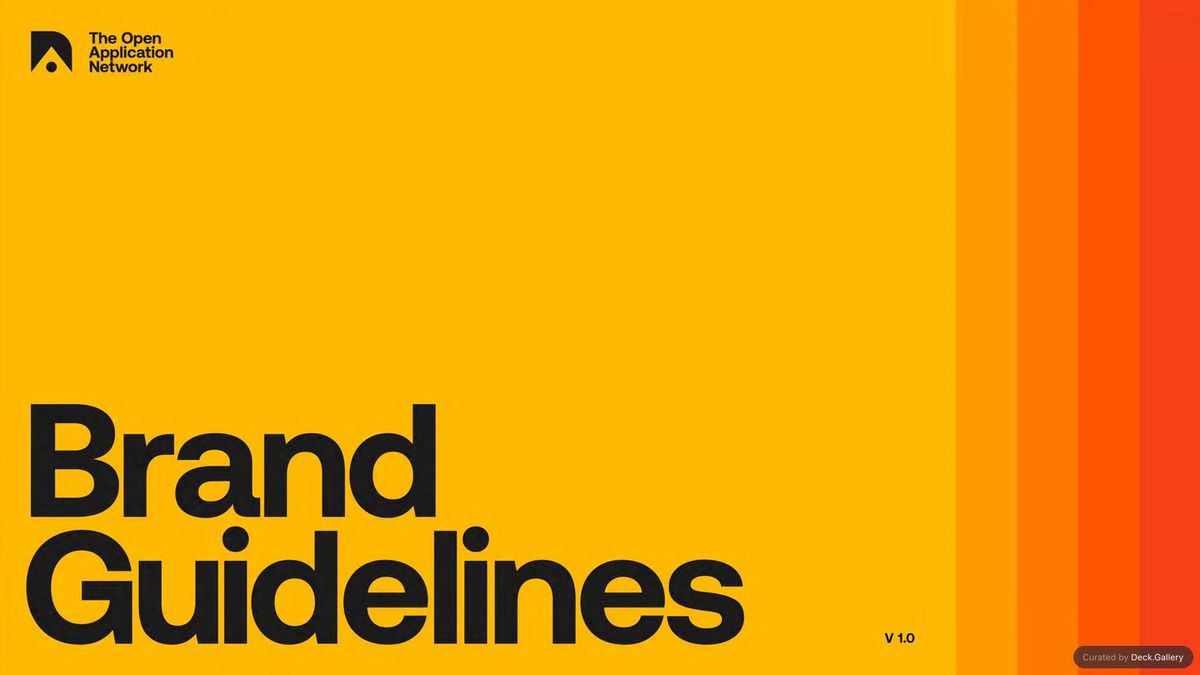
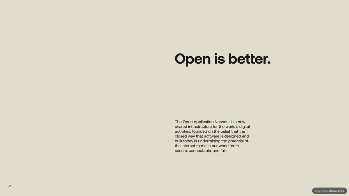
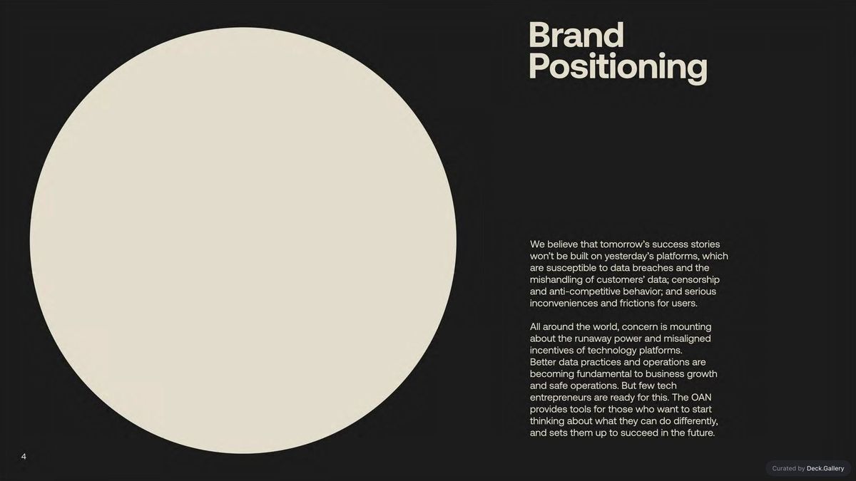
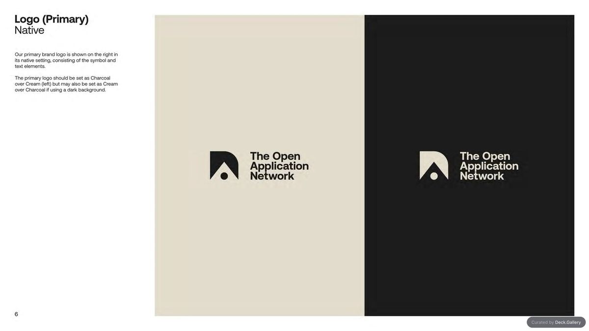
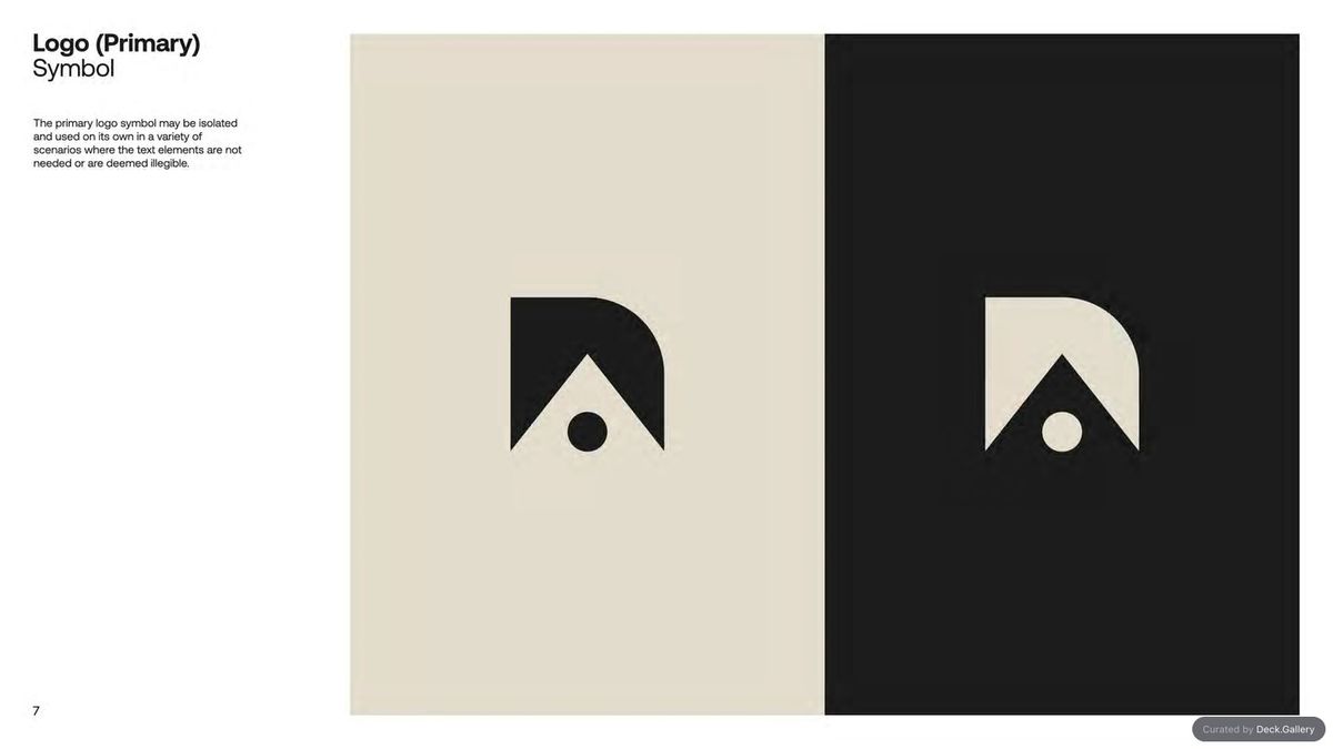
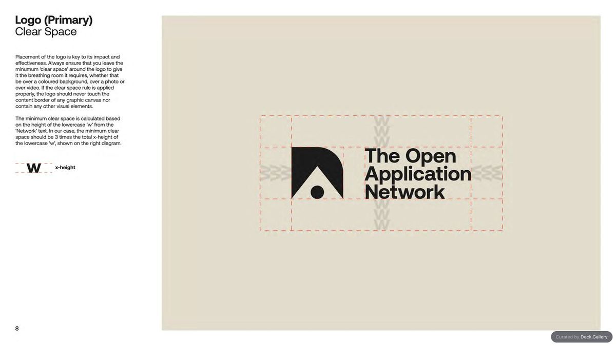
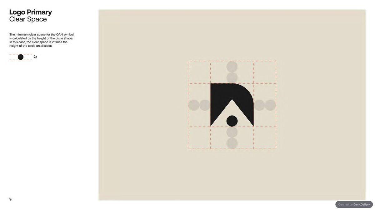
Nền tảng lưu trữ và tuyển chọn slide deck Deck.gallery vừa mang đến một không gian cực kỳ gọn gàng để tôn vinh những thiết kế xuất sắc. Giao diện của trang web được tối giản hết mức với tông nền trung tính để dồn mọi sự chú ý vào tác phẩm. Trong số đó, bộ presentation được thiết kế riêng cho The Open Application Network (OAN) thực sự gây ấn tượng bởi bố cục siêu sạch sẽ. Toàn bộ cấu trúc dựa trên một hệ thống branding dạng mô-đun (modular) nghiêm ngặt, thiết lập nên những quy tắc rõ ràng cho bộ nhận diện doanh nghiệp. Hệ thống thị giác này sử dụng các hình khối hình học sắc nét cùng họa tiết chấm hạt (stippled patterns) để mô phỏng sự kết nối mạng lưới. Bằng cách kết hợp những đồ họa chuẩn xác này với hệ màu có độ tương phản thấp, các trang slide vẫn giữ được phong thái kỹ thuật và uy tín trên mọi phương tiện truyền thông.
Hệ thống nhận diện này đã khéo léo dịch chuyển các giá trị mạng lưới phức tạp thành những bố cục slide có cấu trúc rõ ràng. Tài liệu này đưa ra các quy tắc cụ thể về căn lề (margins), độ giãn chữ (typography tracking) đồng nhất và vị trí đặt logo cân đối. Sự tương phản giữa các mảng màu xanh đậm (deep blue) và các điểm nhấn neon rực rỡ mang lại nhiều cảm hứng. Cách làm này cho thấy hạ tầng công nghệ hoàn toàn có thể trở nên gần gũi hơn mà không làm mất đi tính chính xác kỹ thuật vốn có. Các slide thuyết trình tận dụng khoảng trắng (whitespace) rộng rãi và hạn chế tối đa các đường phân chia ngang, giúp người xem dễ dàng tiếp nhận từng chi tiết nhỏ. Định hướng thiết kế này làm cho các hướng dẫn kỹ thuật trở nên liền mạch, giúp các designer dễ dàng duy trì tính nhất quán trên nhiều môi trường bố cục khác nhau.
Sau cùng thì bộ nhận diện này đã đơn giản hóa cách các designer tương tác với nền tảng của doanh nghiệp. Đội ngũ tuyển chọn đã thành công trong việc làm nổi bật một trải nghiệm mang cảm giác nguyên bản và vô cùng tinh tế. Hệ thống lưới (grid system) sạch sẽ giúp các hướng dẫn thiết kế có thể đọc hiểu ngay lập tức. Lựa chọn bố cục này biến tác phẩm trở thành một công cụ đáng tin cậy. Dự án tùy biến này là minh chứng cho thấy phong cách tối giản chiến lược có thể hiện đại hóa các kênh truyền thông doanh nghiệp phức tạp một cách hiệu quả ra sao. Để xem thêm chi tiết về các bố cục slide thuyết trình này, mọi người có thể tham khảo thêm tại deck.gallery/the-oan-brand-guidelines/. Nền tảng này thực sự đã thổi hồn vào những bố cục quy chuẩn.
Deck.gallery, a go-to platform for archiving and curating slide decks, delivers a seriously clean space to celebrate standout design. The website’s interface is as minimalist as it gets, using a neutral backdrop to let the artwork do all the talking. Among the featured gems, a custom presentation deck crafted for The Open Application Network (OAN) absolutely steals the show with its ultra-clean layouts. The entire structure relies on a strict modular branding system that sets crystal-clear rules for the corporate identity. This visual system mixes sharp geometric shapes with stippled patterns to beautifully mimic network connectivity. By pairing these precise graphics with a low-contrast color palette, the slides maintain a technical yet authoritative vibe across all media platforms.
This identity system brilliantly translates complex network values into beautifully structured slide layouts. The documentation spells out specific rules for margins, uniform typography tracking, and balanced logo placement. The contrast between the deep blue tones and vibrant neon accents is incredibly inspiring, proving that tech infrastructure can feel totally approachable without losing its signature technical precision. The presentation slides make great use of generous whitespace and keep horizontal dividers to an absolute minimum, making it super easy for viewers to absorb every single detail. This design direction turns technical guidelines into a seamless experience, helping designers maintain effortless consistency across different layouts.
Ultimately, this brand identity completely simplifies how designers interact with the corporate platform. The curation team did an awesome job highlighting a raw, incredibly sophisticated experience. A clean grid system makes the design guidelines instantly readable, turning this project into a highly reliable tool. This custom project is proof of how strategic minimalism can effortlessly modernize complex corporate communication. To dive deeper into these presentation layouts, check out the details over at deck.gallery/the-oan-brand-guidelines/. This platform truly breathes life into standard layouts!