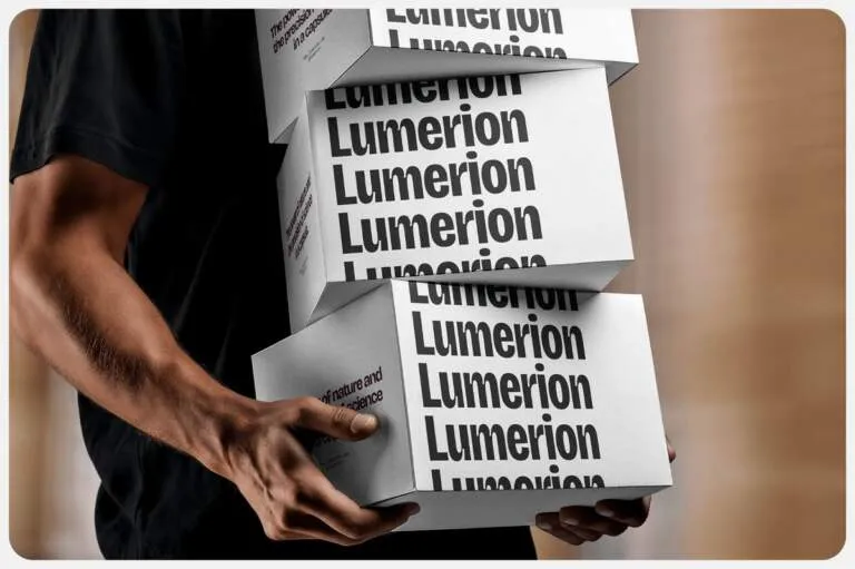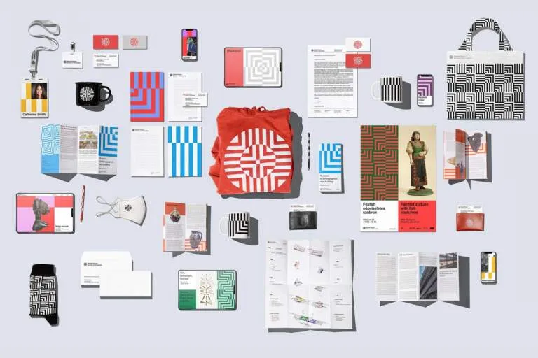




Dự án nhận diện thương hiệu bằng hình minh họa này thể hiện kỹ năng xử lý vector cực kỳ điêu luyện của Yulia Papka. Tác giả áp dụng hệ thống lưới (grid system) cực kỳ chặt chẽ, giúp các đường nét vector căn chỉnh chuẩn chỉnh theo từng khối hình học chính xác. Mỗi yếu tố đồ họa đều có một khoảng không gian riêng rõ ràng. Chính việc sử dụng hệ thống lưới tối giản này đã dẫn dắt mắt người xem một cách tự nhiên và tạo nên một sự tương phản thị giác đầy ấn tượng. Các hình minh họa dạng phẳng (flat illustration) cũng giúp cân bằng lại phần viền bố cục khá rộng của thiết kế.
Bảng màu được tiết chế tinh tế để tạo nên nhịp điệu thị giác rõ rệt. Dự án chọn sự kết hợp giữa sắc vàng ấm áp và màu đen sâu thẳm. Các mảng màu phẳng hoàn toàn nói không với hiệu ứng chuyển màu (gradient) thông thường, giúp định hình một phong cách nhận diện thương hiệu bằng hình minh họa vô cùng rõ nét. Nếu được in ấn với lớp mực dày trên chất liệu giấy không tráng phủ (uncoated paper), tác phẩm chắc chắn sẽ mang lại cảm giác vô cùng chân thực khi chạm vào.
Yulia Papka đã khéo léo lấy cảm hứng từ phong cách thiết kế biên tập (editorial design) của giữa thế kỷ trước, từ đó làm mới lại những chiếc poster cổ điển để chúng phù hợp hơn với màn hình kỹ thuật số ngày nay. Hệ thống thiết kế này mang lại một hiệu ứng thị giác lâu bền. Những hình khối vector đơn giản nhưng lại chứa đựng chiều sâu ý tưởng rất lớn, giải quyết mượt mà các nhu cầu truyền thông hiện đại.
Xem thêm thông tin chi tiết về dự án tại website của www.behance.net/gallery/132201083/Vector-illustrations-2021.
This illustrated branding project puts Yulia Papka’s seriously impressive vector skills on full display. By using a super tight grid system, every single vector line aligns perfectly with precise geometric shapes, giving each graphic element its own breathing room. This minimalist grid naturally guides the viewer’s eyes and creates a striking visual contrast, while the flat illustrations do a fantastic job of balancing out the design’s generous margins.
The color palette is beautifully restrained to create a distinct visual rhythm, opting for a bold combo of warm yellow and deep black. Relying purely on flat colors without any standard gradients really locks in a sharp, definitive look for this illustrated identity. Imagine this printed with thick ink on uncoated paper—it would definitely have an amazing, tactile feel.
Yulia Papka masterfully draws inspiration from mid-century editorial design, putting a fresh spin on classic posters to make them perfect for today’s digital screens. This design system delivers a timeless visual impact, using simple vector shapes that carry a ton of conceptual depth to seamlessly handle modern communication needs.
Check out all the details over on the Behance project page.