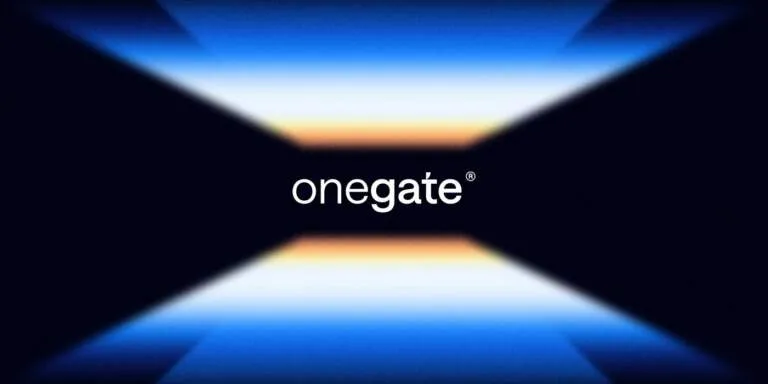
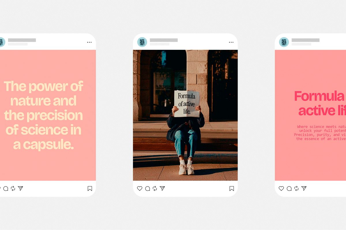
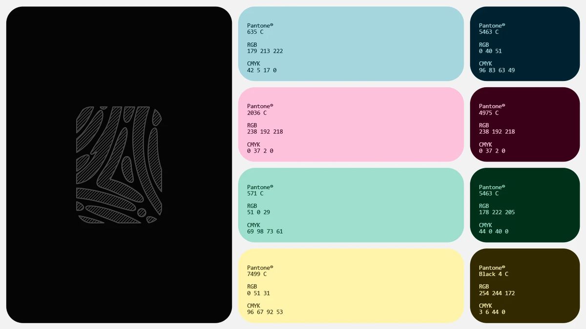

Lumerion vừa ra mắt một bộ nhận diện công nghệ mang đậm hơi hướng tương lai với hệ thống branding modular cực kỳ bài bản từ creative agency Abissal Brands. Điểm nhấn ở đây là sự kết hợp giữa các khối 3D phát sáng và hệ thống lưới chỉn chu làm nền tảng cho định hướng thị giác của nền tảng công nghệ này. Bảng màu của dự án sử dụng màu xanh navy đậm của không gian làm nền, kết hợp với các dải màu gradient neon rực rỡ sắc nét. Sự tương phản này tạo nên hiệu ứng thị giác mạnh mẽ trên mọi giao diện số và ấn phẩm truyền thông. Về typography, đội ngũ thiết kế chọn font sans-serif tinh giản, cấu trúc rõ ràng để cân bằng giữa tính kỹ thuật và hệ thống lưới hiện đại. Khi đặt những ký tự kỹ thuật số sắc nét này cạnh các vật thể tinh thể 3D phát sáng, tổng thể thiết kế tạo ra một sự đối lập đầy hút mắt. Mọi tài nguyên layout đều được căn thẳng tắp theo hệ thống lưới dọc (vertical grid), giúp đảm bảo tính trật tự và phân cấp thị giác rõ ràng, tránh cho bố cục bị rối mắt.
Hệ thống phát sáng trong Branding Công nghệ
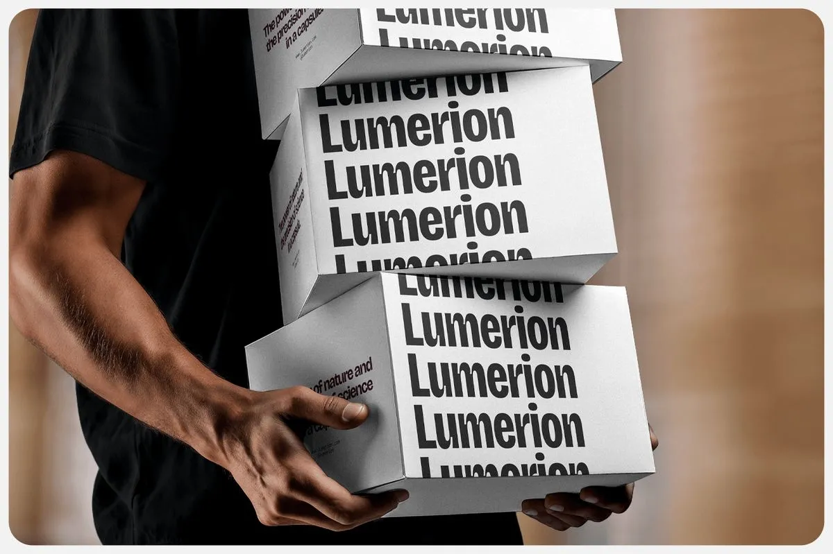
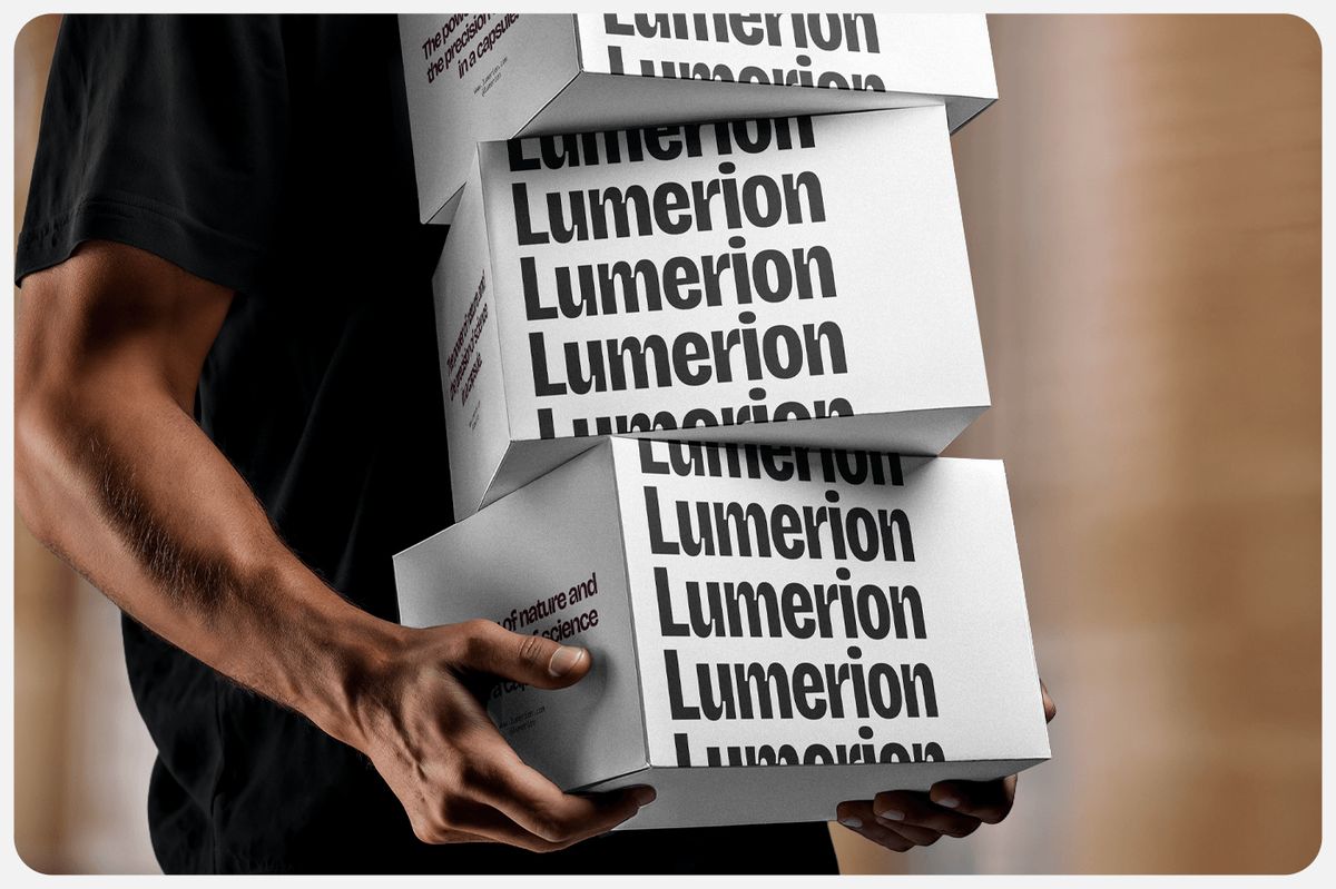
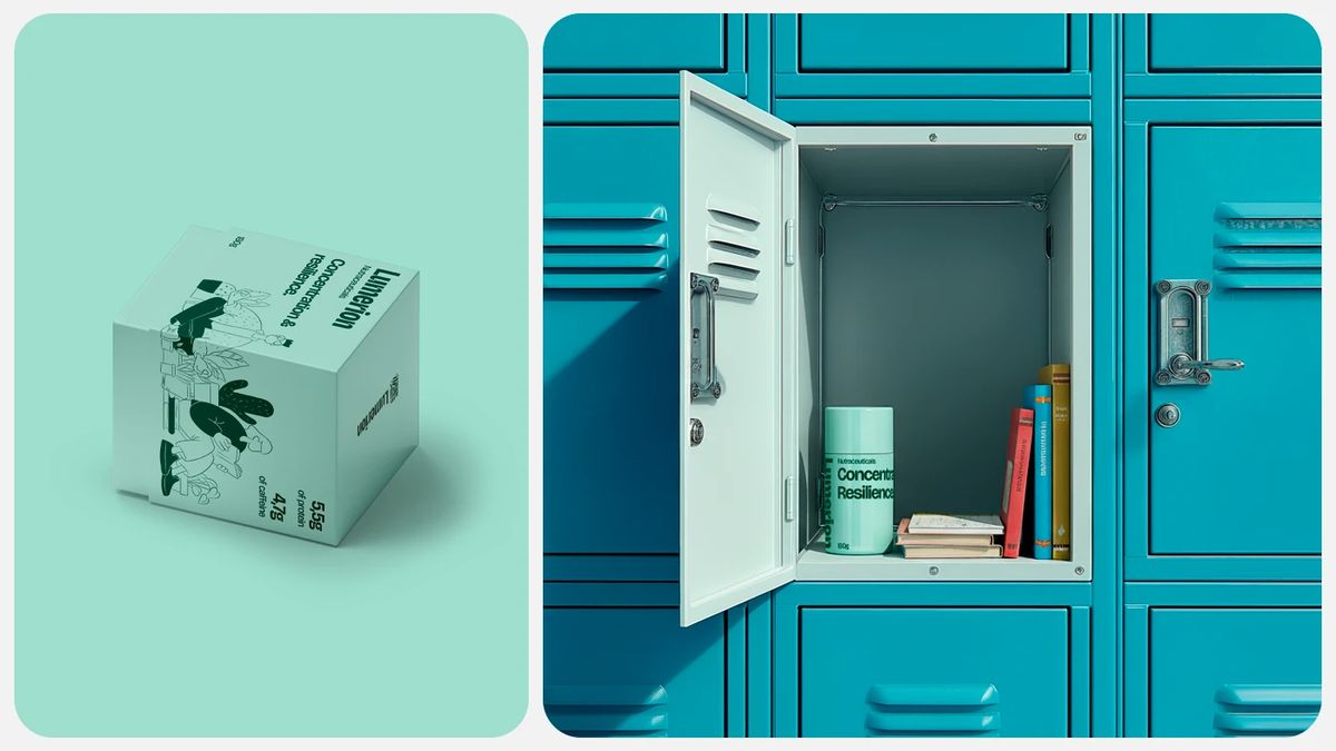
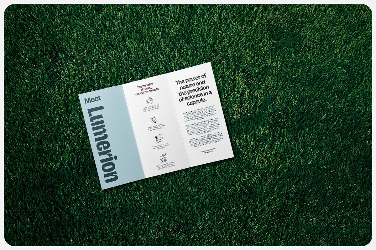
Hệ thống nhận diện kỹ thuật số này còn được mang ra đời thực thông qua các chất liệu in ấn cực kỳ tinh tế. Các ấn phẩm văn phòng sử dụng chất liệu giấy mỹ thuật tối màu, bề mặt matte (lì) kết hợp với kỹ thuật ép kim phản quang (iridescent foil stamping), giúp những layout chữ đơn giản bỗng trở nên vô cùng cao cấp khi chạm vào. Sự tương phản giữa bề mặt giấy tối và những đường nét phát sáng mang lại rất nhiều cảm hứng, chứng minh rằng đồ họa thương mại vẫn có thể cực kỳ chất lượng mà không cần nhồi nhét quá nhiều họa tiết trang trí phức tạp. Hộp bao bì và banner kỹ thuật số đều được ưu tiên những khoảng trắng ngập tràn cùng cấu trúc lưới sạch sẽ, tạo nên sự đồng bộ tuyệt đối cho toàn bộ tài sản thương hiệu.
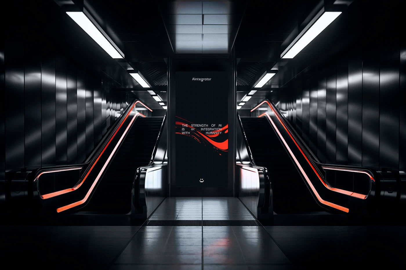
Sau cùng thì bộ nhận diện này đã giúp đơn giản hóa cách người dùng tương tác với một nền tảng đám mây phức tạp. Đội ngũ thiết kế đã thành công trong việc tạo ra một layout vừa chuyên nghiệp lại vừa hiện đại. Hệ thống lưới sạch sẽ giúp các thông số kỹ thuật trở nên dễ đọc chỉ trong một cái liếc mắt, biến các ấn phẩm editorial trở thành một công cụ trực quan đáng tin cậy. Dự án này là minh chứng rõ ràng cho thấy phong cách tối giản chiến lược (strategic minimalism) có thể làm mới các nhãn hiệu tiện ích doanh nghiệp hiệu quả như thế nào. Nếu muốn ngắm kỹ hơn về bộ nhận diện trực quan này, mọi người có thể xem thêm tại www.behance.net/gallery/237463503/Lumerion. Dự án thực sự đã thổi hồn vào những tài sản thương hiệu tiêu chuẩn.
Lumerion just rolled out a futuristic new tech identity featuring a beautifully structured modular branding system from creative agency Abissal Brands. The highlight here is the combination of glowing 3D blocks and a meticulous grid system that serves as the foundation for the tech platform’s visual direction. The project’s color palette uses a deep space navy as the background, paired with sharp, vibrant neon gradients. This contrast delivers a powerful visual punch across all digital interfaces and media assets. For typography, the design team opted for a clean, structured sans-serif font to balance technical utility with a modern grid. Placing these sharp digital characters next to glowing 3D crystal objects creates a seriously eye-catching contrast. Every layout asset aligns perfectly to a vertical grid, ensuring a clear visual hierarchy and keeping the layout beautifully organized.
Glowing Systems in Tech Branding This digital identity translates beautifully into the physical world through some incredibly refined print materials. The stationery uses dark, matte fine art paper paired with iridescent foil stamping, making simple typographic layouts feel instantly premium to the touch. The contrast between the dark paper and the glowing lines brings tons of inspiration, proving that commercial graphics can be top-tier without overloading the layout with complex decorative patterns. Packaging boxes and digital banners both lean into generous white space and clean grid structures, ensuring absolute cohesion across all brand assets.
Ultimately, this identity simplifies how users interact with a complex cloud platform. The design team nailed the balance between professional and modern layout design. The clean grid system makes technical specs readable at a single glance, turning editorial pieces into a highly reliable visual tool. This project is a stellar example of how strategic minimalism can effectively refresh enterprise utility brands. To get a closer look at this stunning visual identity, check it out over on the www.behance.net/gallery/237463503/Lumerion. The project truly breathes new life into standard brand assets.