
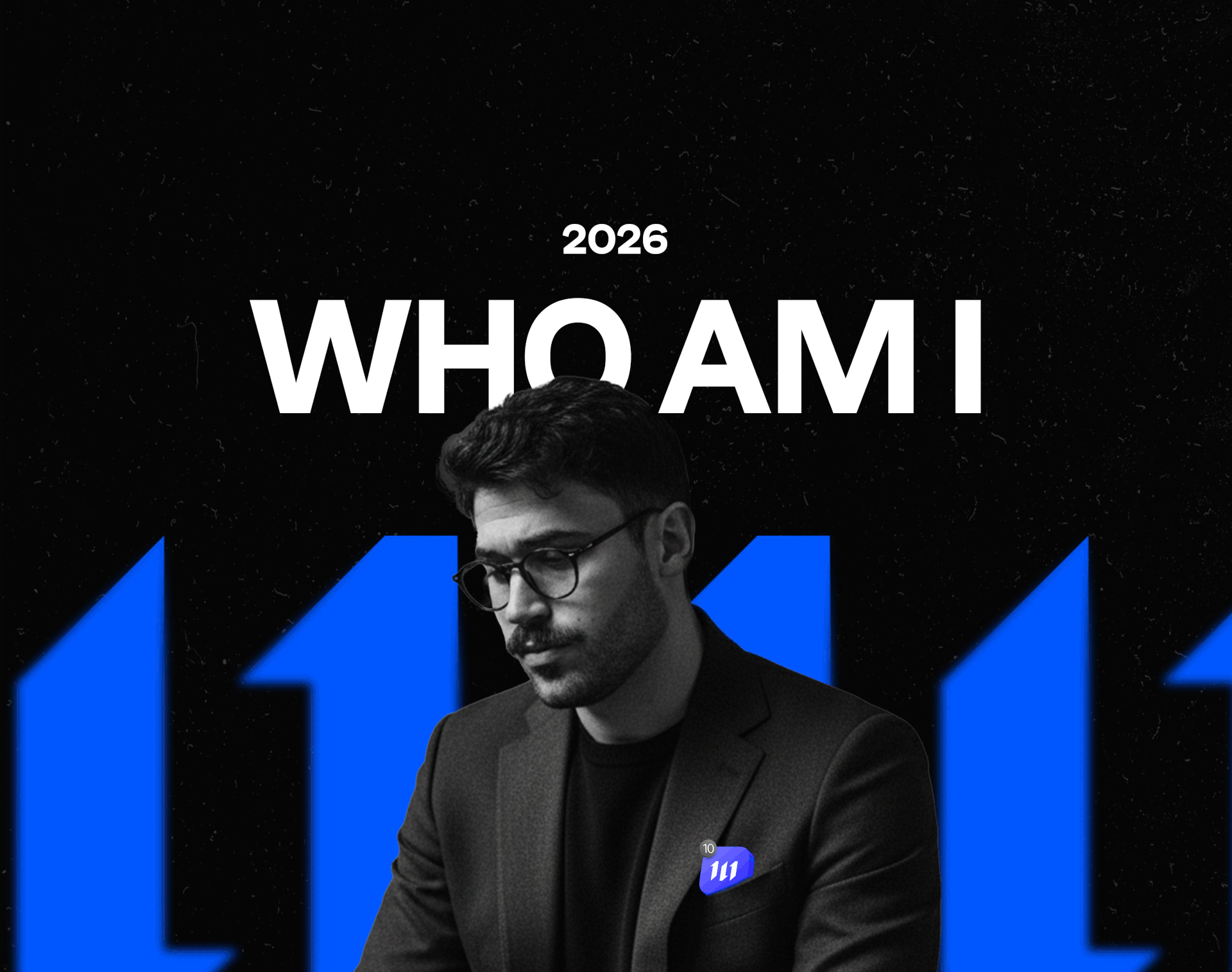
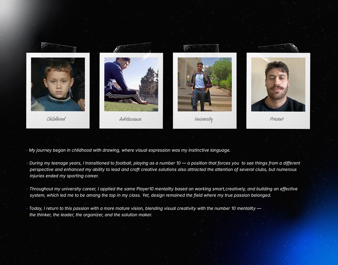

Mỗi nhà thiết kế đều có một phong cách riêng để định hình dấu ấn cá nhân. Với Mehdi Drd, một nhà thiết kế tài năng đến từ Algeria, câu trả lời nằm ở sự kỷ luật và tư duy của một “playmaker” – người kiến tạo lối chơi trên sân bóng. Dự án thiết kế bộ nhận diện thương hiệu mới cho M10 Studio chính là minh chứng rõ nét cho phong cách tối giản nhưng đầy chiến thuật này.
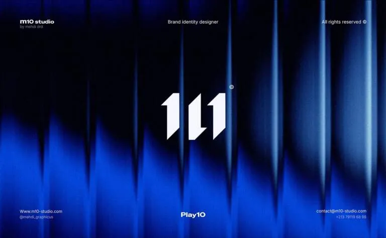
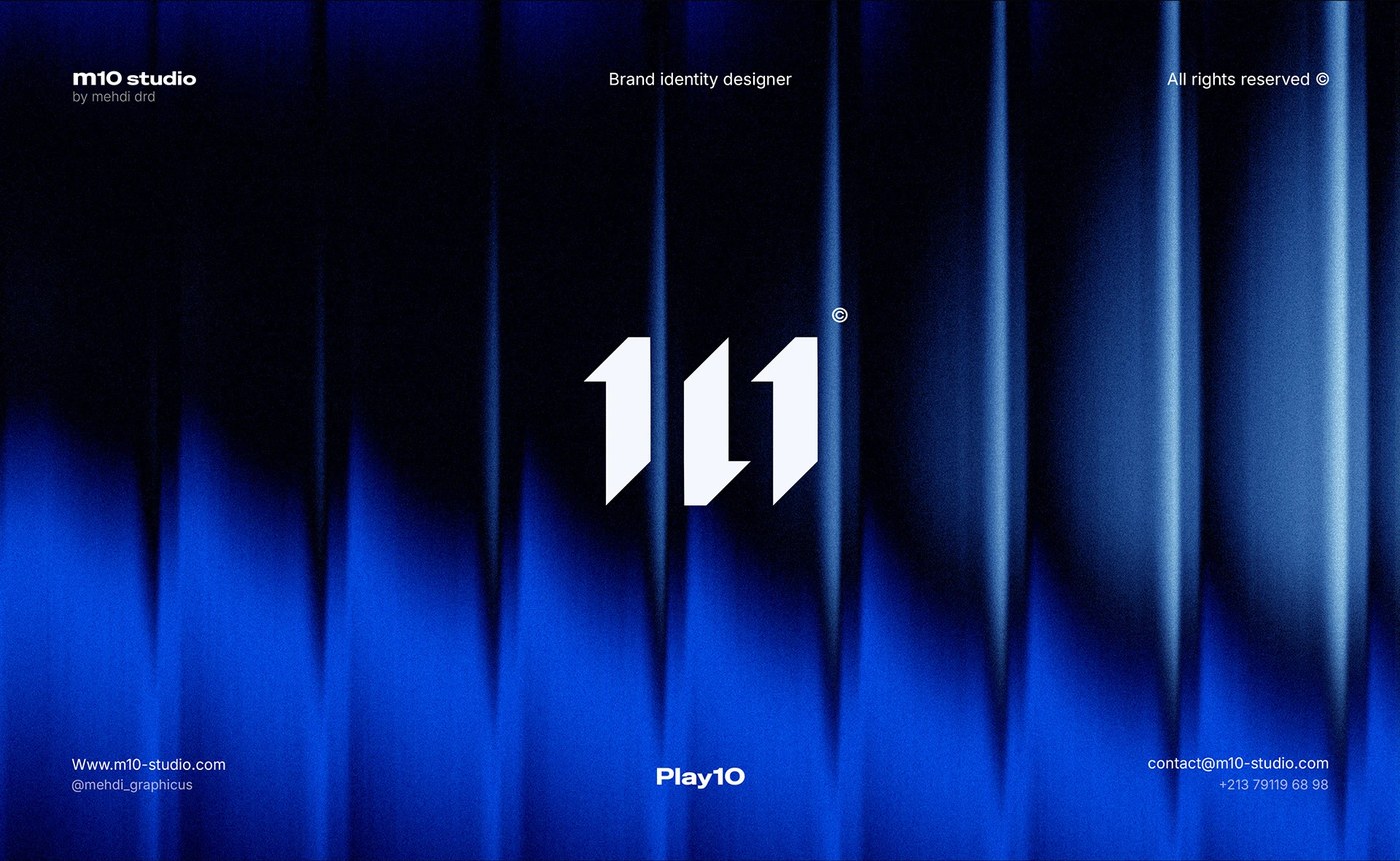
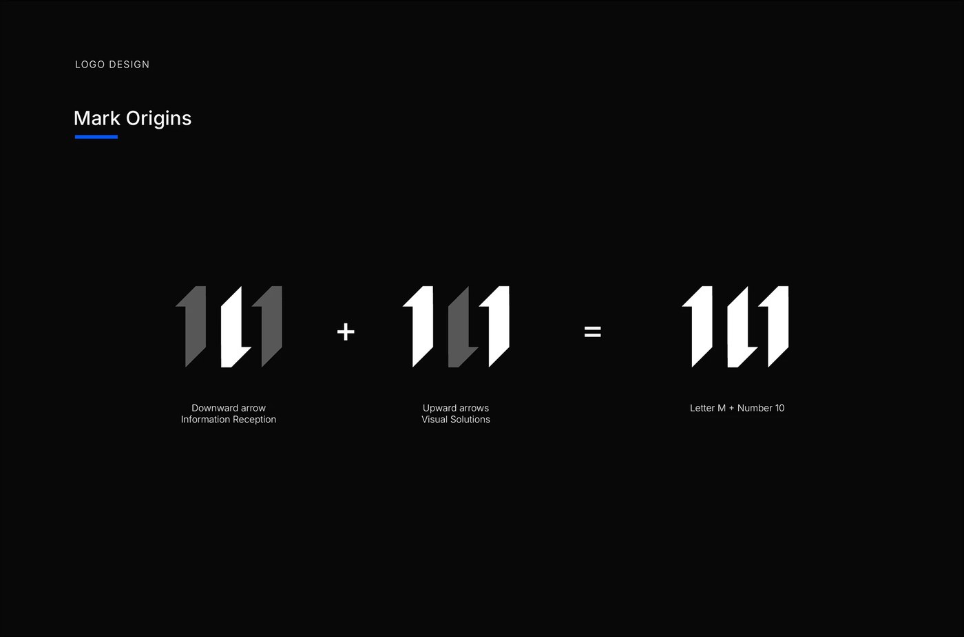
Điểm nhấn của bộ nhận diện là chiếc logo monogram được tạo hình cực kỳ vững chãi và thông minh từ những mũi tên hình học. Ở đây, mũi tên hướng xuống tượng trưng cho sự lắng nghe sâu sắc, thấu hiểu khách hàng. Trong khi đó, hai mũi tên hướng lên lại đại diện cho sự phát triển vượt trội và những giải pháp chiến lược mà studio mang lại. Hệ thống hình ảnh này hoạt động nhịp nhàng như cách một cầu thủ kiến tạo phân phối bóng trên sân cỏ. Logo có khả năng hiển thị cực tốt, dễ dàng co giãn linh hoạt từ màn hình kỹ thuật số cho đến các ấn phẩm in ấn thực tế.
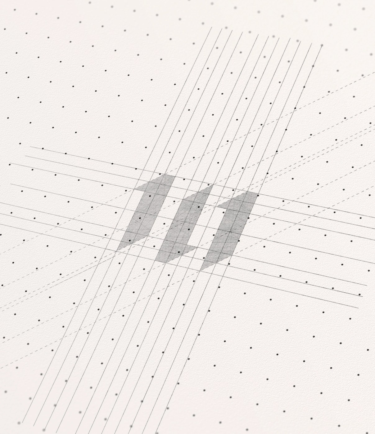
Mọi chi tiết trong thiết kế đều tuân thủ một hệ thống lưới (grid system) nghiêm ngặt để giữ sự cân bằng và cấu trúc hoàn hảo. Khoảng trắng được tận dụng tối đa để tạo cảm giác dễ thở, giúp người xem tập trung hoàn toàn vào những thông điệp quan trọng. Đúng với tinh thần tối giản, thiết kế loại bỏ hoàn toàn các chi tiết trang trí rườm rà để tôn vinh công năng sử dụng thực tế.
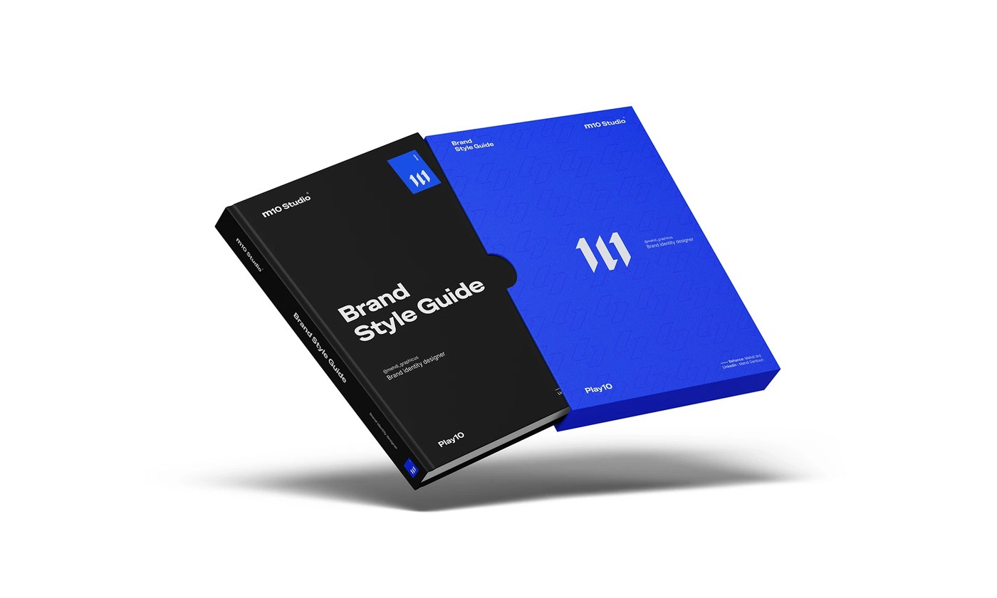
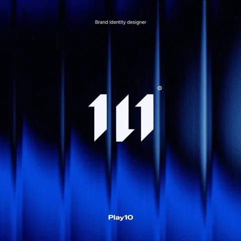
Về màu sắc, Mehdi Drd chọn tông xanh hoàng gia sâu thẳm, hay còn gọi là Lazuli, làm màu chủ đạo. Sắc xanh này mang lại cảm giác chuyên nghiệp, tin cậy và vô cùng dịu mắt. Đi kèm với đó là các tông màu sáng tối bổ trợ, giúp tối ưu hóa khả năng hiển thị trên cả danh thiếp vật lý lẫn các nền tảng mạng xã hội. Hệ thống typography cũng được chăm chút kỹ lưỡng với font chữ sans-serif hiện đại, tạo sự tương phản mạnh mẽ về tỷ lệ giữa tiêu đề và nội dung để người đọc dễ dàng nắm bắt thông tin.
Sự chỉn chu này đã giúp dự án nhận được sự công nhận từ tổ chức danh giá World Brand Design Society. Đây chắc chắn là một case study tuyệt vời cho những ai đang muốn xây dựng một hệ thống nhận diện thương hiệu cá nhân mạch lạc, chuyên nghiệp mà không cần đến những chi tiết cầu kỳ.
Cùng ngắm nhìn trọn vẹn dự án đầy cảm hứng này của www.behance.net/gallery/244023205/M10-Studio-Personal-Brand-Identity-Visual-System trên Behance nhé!
Every designer has a unique way of carving out a signature style. For Mehdi Drd, a talented designer based in Algeria, it all comes down to discipline and the strategic mindset of a soccer “playmaker.” The newly designed brand identity for M10 Studio is a perfect showcase of this minimalist, highly tactical approach.
The star of the show is a monogram logo cleverly crafted from bold, geometric arrows. Here, the downward-pointing arrow represents deep listening and a thorough understanding of client needs. Meanwhile, the two upward-pointing arrows symbolize growth and the strategic solutions the studio delivers. This visual system moves together as seamlessly as a playmaker passing a ball across the pitch. Plus, the logo is incredibly versatile, scaling effortlessly from tiny digital screens to large physical prints.
Every single detail in this design adheres to a strict grid system to maintain absolute balance and structure. Negative space is used generously to give the eyes some breathing room, keeping the focus entirely on the core message. True to the spirit of minimalism, there is no room for unnecessary fluff here—everything is built around pure functionality.
When it comes to the color palette, Mehdi Drd went with a deep, rich royal blue known as Lazuli as the primary color. This shade strikes the perfect balance of professional, trustworthy, and incredibly easy on the eyes. It is paired with supporting light and dark tones to ensure maximum readability, whether on a physical business card or social media feeds. The typography is just as intentional, utilizing a modern sans-serif font that builds a strong hierarchy through scale, making the information super easy to scan and digest.
This incredible attention to detail earned the project well-deserved recognition from the prestigious World Brand Design Society. It is definitely a stellar case study for anyone looking to build a clean, professional personal brand without any unnecessary clutter.
Check out the full, inspiring project on www.behance.net/gallery/244023205/M10-Studio-Personal-Brand-Identity-Visual-System!