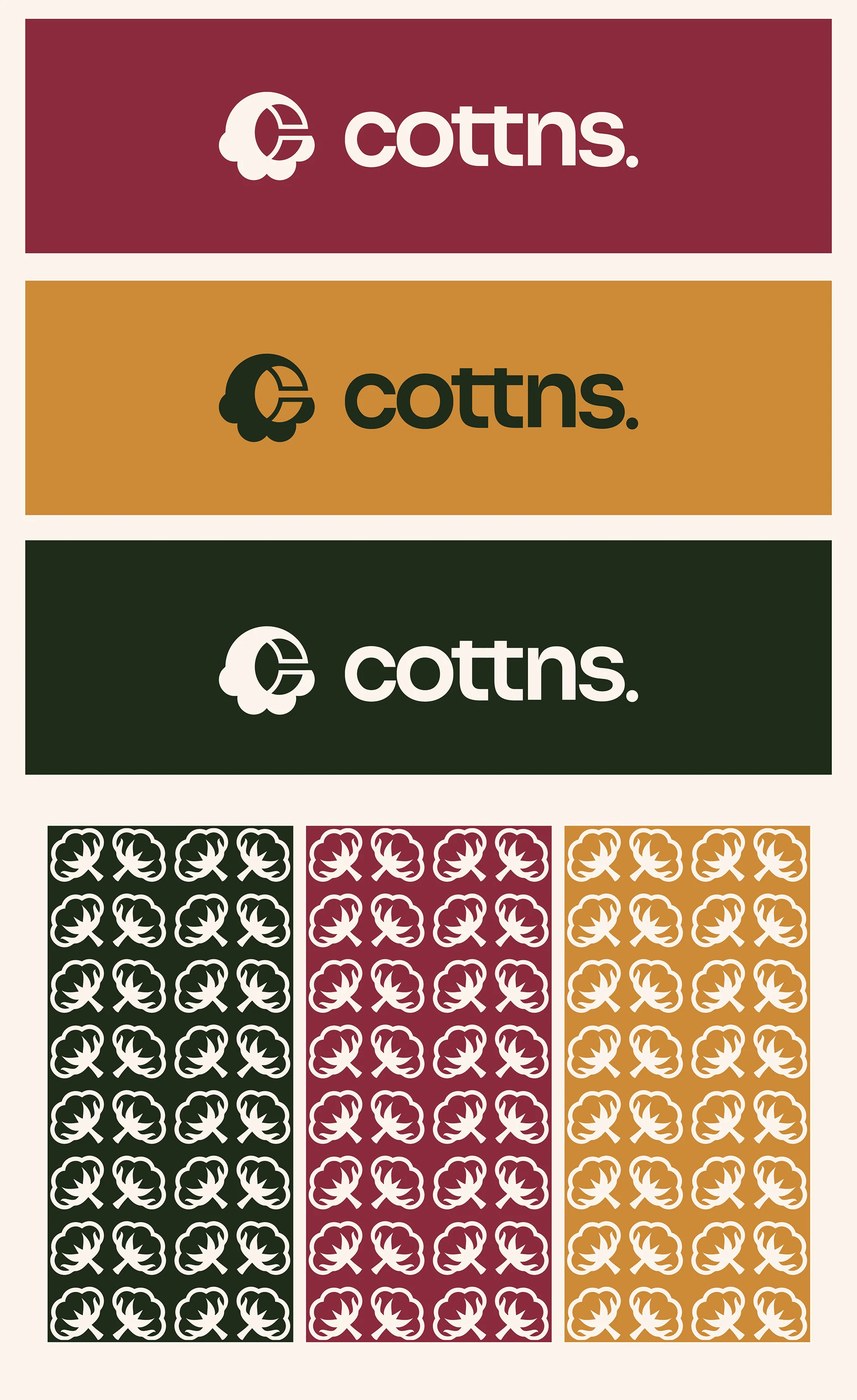
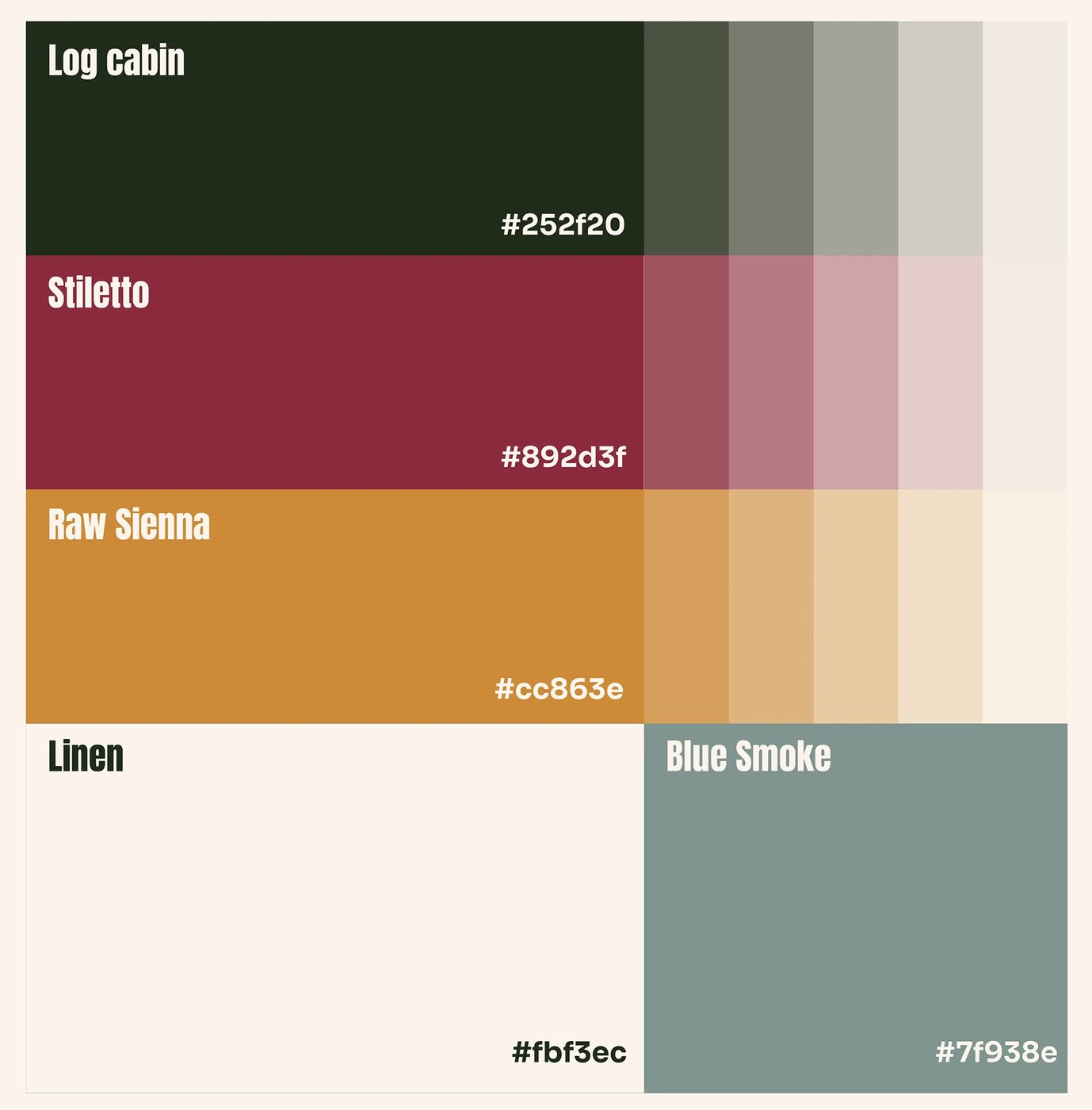
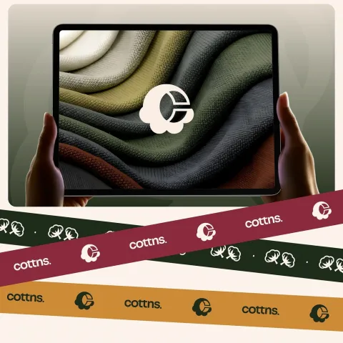
Joshua Oladele vừa trình làng một bộ nhận diện thương hiệu cực kỳ chất lượng cho COTTN. Dự án này tận dụng chính những chất liệu tự nhiên và bảng màu siêu nhẹ nhàng để tôn vinh nét tinh khôi của sợi cotton hữu cơ.
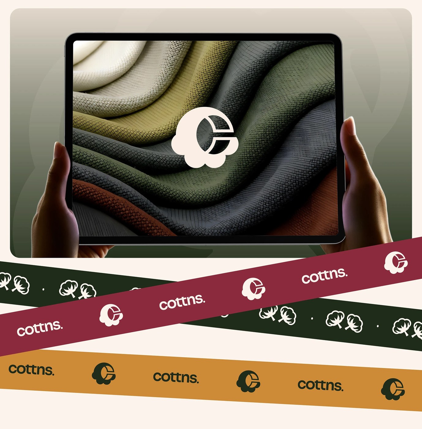
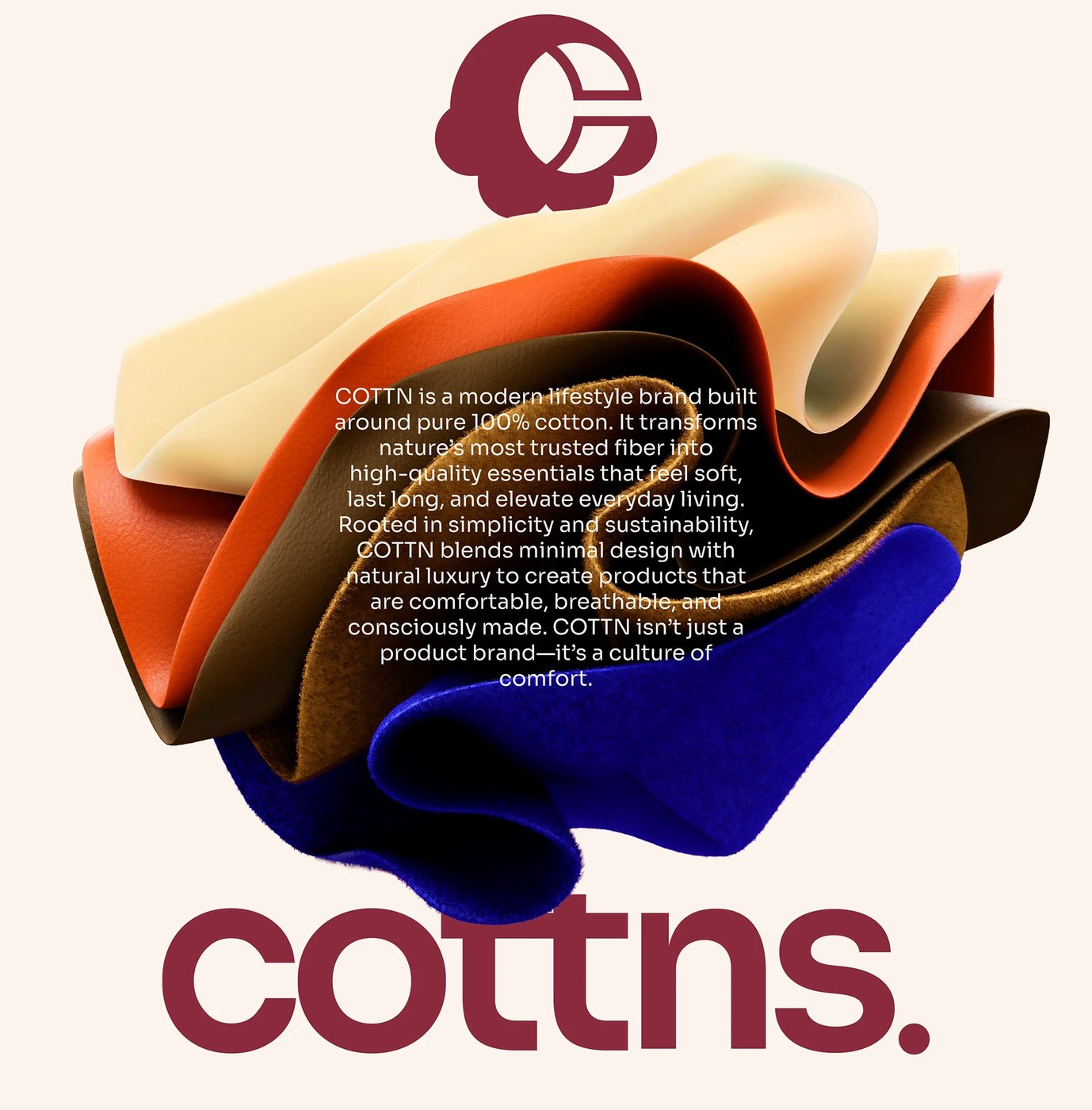
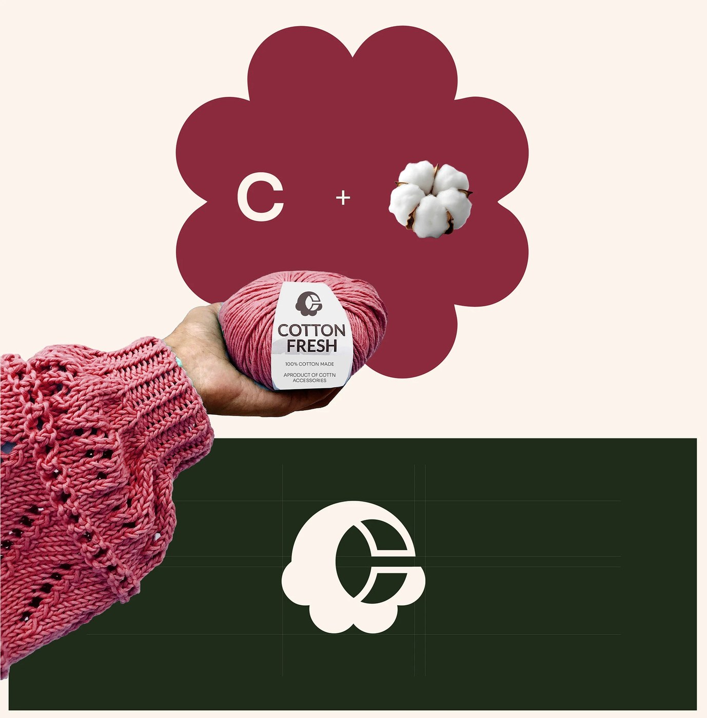
Hệ thống hình ảnh mới của COTTN xoay quanh trải nghiệm thị giác và xúc giác từ 100% cotton nguyên chất. Thay vì lạm dụng đồ họa cầu kỳ hay các chi tiết trang trí rườm rà, bộ nhận diện tập trung khai thác các đặc tính cốt lõi của chất liệu vải: sự mềm mại, khoảng thở trống trải và cảm giác thoải mái tự nhiên. Mỗi một lựa chọn thiết kế đều góp phần củng cố thêm những giá trị nền tảng của thương hiệu là tính bền vững, sự chân thật và nét tinh tế giản đơn. Là một thương hiệu dệt may hiện đại, mục tiêu của COTTN là mang sự sang trọng, thoáng mát vào cuộc sống thường nhật, đảm bảo mọi chi tiết đều được chăm chút tỉ mỉ từ cánh đồng cho đến tấm vải thành phẩm.
Câu chuyện chất liệu trong thiết kế thương hiệu
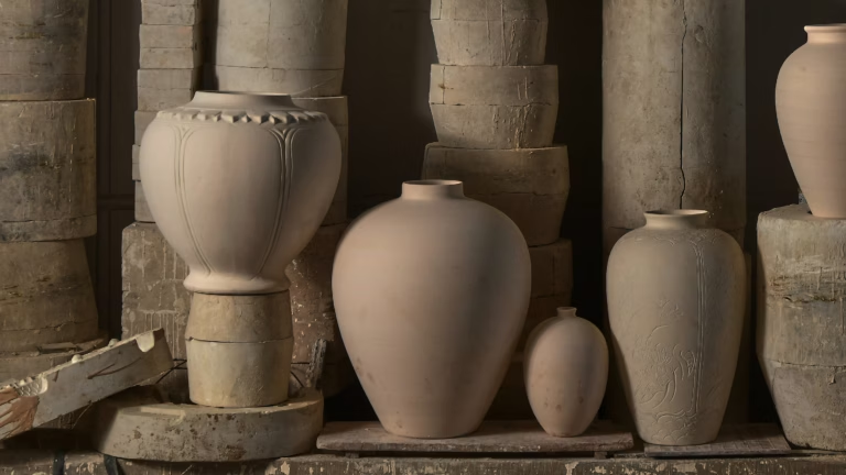
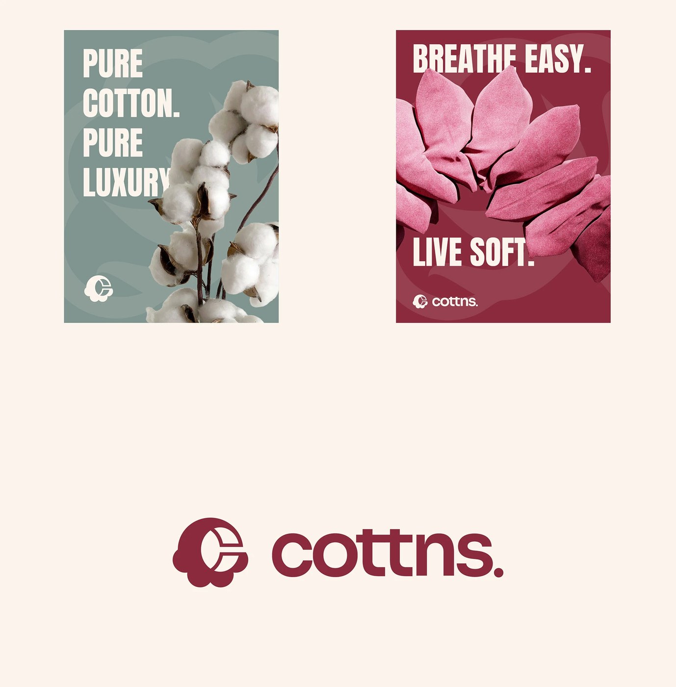
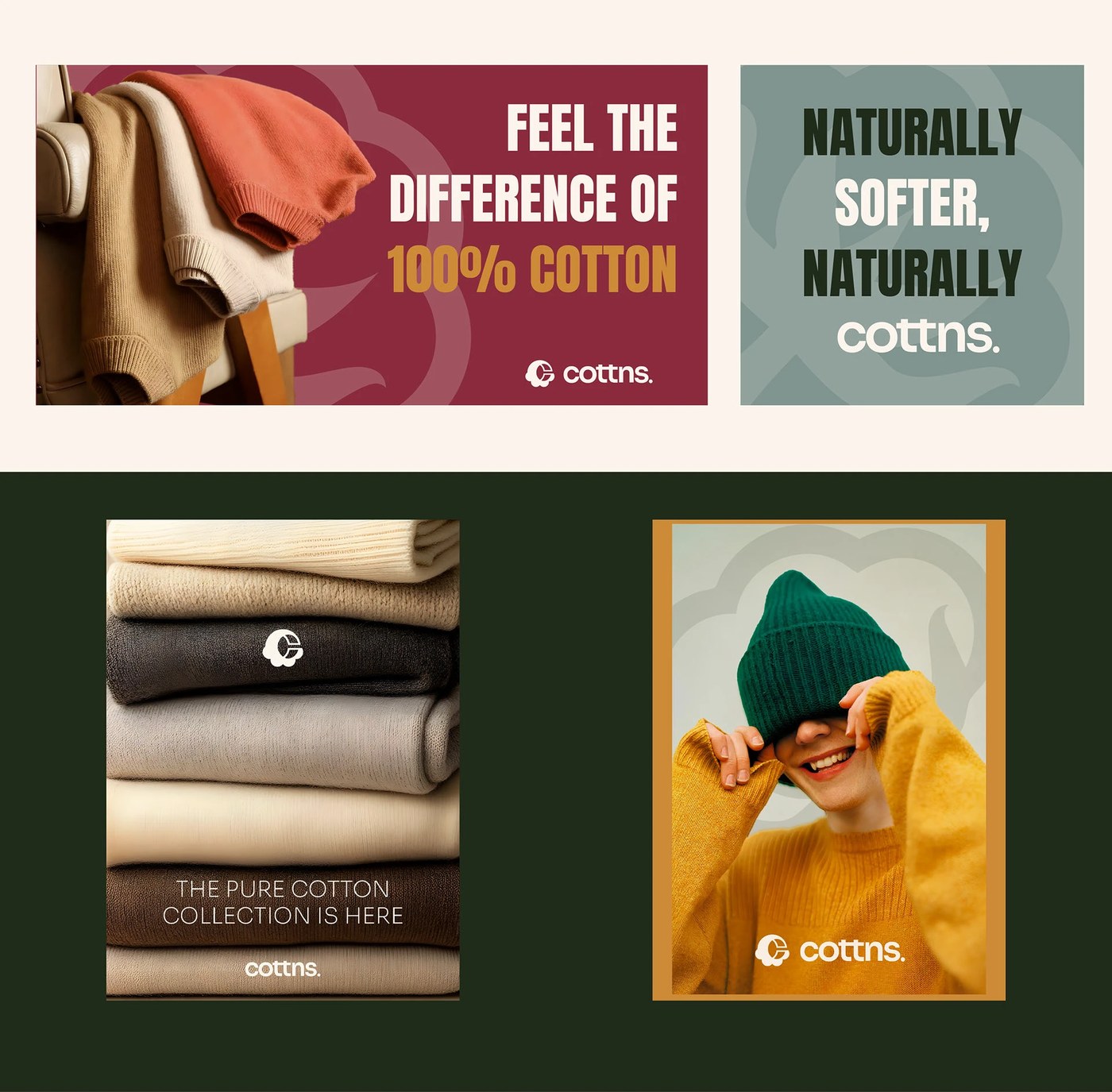
Cách sắp xếp typography và hình ảnh kết hợp vô cùng ăn ý, tạo nên một cảm giác cao cấp rõ rệt. Nhờ ưu tiên bố cục sạch sẽ cùng những hình khối hữu cơ (organic shapes), Joshua Oladele đã giúp bộ nhận diện trở nên nhẹ nhàng và bay bổng như chính chất liệu vải cao cấp mà thương hiệu đại diện. Việc ứng dụng các tông màu dịu mắt cùng texture nhẹ nhàng giúp thương hiệu toát lên vẻ sang trọng mà không cần phô trương, hoa mỹ. Cách tiếp cận mộc mạc, chân thực này làm cho ngôn ngữ thị giác vừa cao cấp lại vừa gần gũi với tệp khách hàng toàn cầu đang tìm kiếm giá trị nguyên bản.
Yếu tố bền vững luôn là kim chỉ nam cho mọi sứ mệnh của COTTN, và dự án này đã thể hiện trọn vẹn cam kết đó qua một tư duy thẩm mỹ tối giản, không phô trương. Quá trình thiết kế tôn trọng hành trình của sự trung thực và thuần khiết, nhấn mạnh tầm quan trọng của việc dùng 100% cotton nguyên chất giữa thời đại của thời trang nhanh (fast fashion). Từng yếu tố trong bộ nhận diện như đang cùng nhịp thở với chính chất liệu mà nó đại diện.
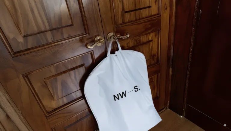
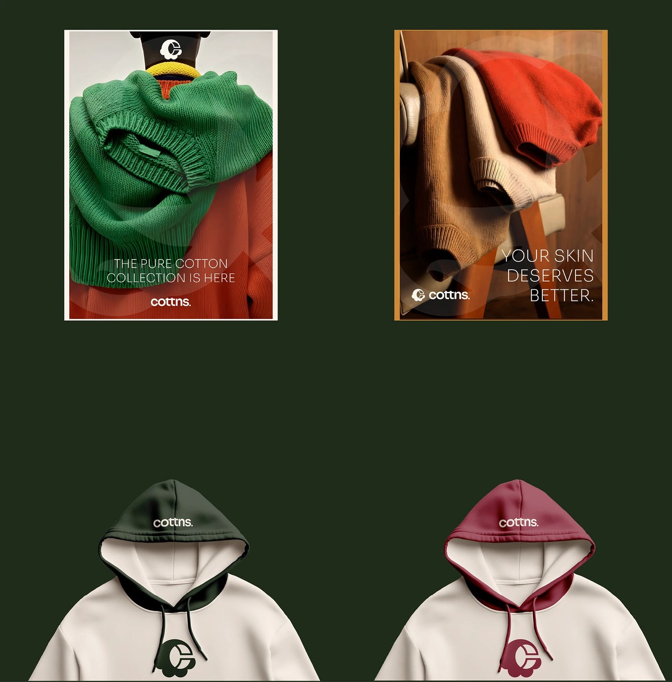
Kết quả là một hệ thống thiết kế hòa hợp giữa sự đơn giản và sức mạnh nội tại, tạo nền tảng vững chắc cho sự phát triển cũng như mở rộng các dòng sản phẩm dệt may của COTTN trong tương lai. Từ bao bì đóng gói cho đến các điểm chạm kỹ thuật số (digital touchpoints), ngôn ngữ thị giác luôn giữ được sự đồng bộ và sức hút mạnh mẽ.
Thiết kế bởi behance.net/johuaoladele Xem chi tiết dự án tại behance.net/gallery/239873213/Cottn-Visual-Identity
Joshua Oladele just dropped a stunning new visual identity for COTTN. This project leans heavily into natural textures and a super soft, soothing color palette to celebrate the pure vibe of organic cotton.
COTTN’s fresh visual system is all about that tactile, sensory experience of 100% pure cotton. Instead of overloading things with complex graphics or fussy details, the identity focuses on the fabric’s core traits: softness, breathing room, and effortless comfort. Every single design choice backs up the brand’s core pillars—sustainability, authenticity, and simple sophistication. As a modern textile brand, COTTN aims to bring casual luxury and breathability into everyday life, making sure every detail is meticulously crafted from the cotton field right down to the finished fabric.
Telling a Material Story Through Brand Design The pairing of typography and imagery works beautifully here, serving up some serious high-end vibes. By prioritizing clean layouts and organic shapes, Joshua Oladele gives the brand identity a light, airy feel—mimicking the premium fabric itself. Soft, muted tones combined with subtle textures allow the brand to exude luxury without feeling loud or flashy. It’s a raw, authentic approach that keeps the visual language both elevated and deeply relatable for a global audience searching for genuine value.
Sustainability is always the ultimate north star for COTTN, and this project beautifully captures that commitment through an understated, minimalist aesthetic. The design process honors a journey of honesty and purity, championing the importance of 100% pure cotton in an era dominated by fast fashion. Every element in the identity feels like it’s breathing in perfect harmony with the actual material.
The result is a design system that perfectly balances simplicity with inner strength, building a rock-solid foundation for COTTN to grow and expand its textile lines down the road. From the packaging to the digital touchpoints, the visual language stays incredibly consistent and captivating throughout.
Designed by https://www.google.com/url?q=https://www.google.com/url?q%3Dhttps://www.behance.net/johuaoladele%26sa%3DE%26source%3Dworkflows&sa=E&source=workflows. Check out the full project details https://www.google.com/url?q=https://www.google.com/url?q%3Dhttps://www.behance.net/gallery/239873213/Cottn-Visual-Identity%26sa%3DE%26source%3Dworkflows&sa=E&source=workflows.