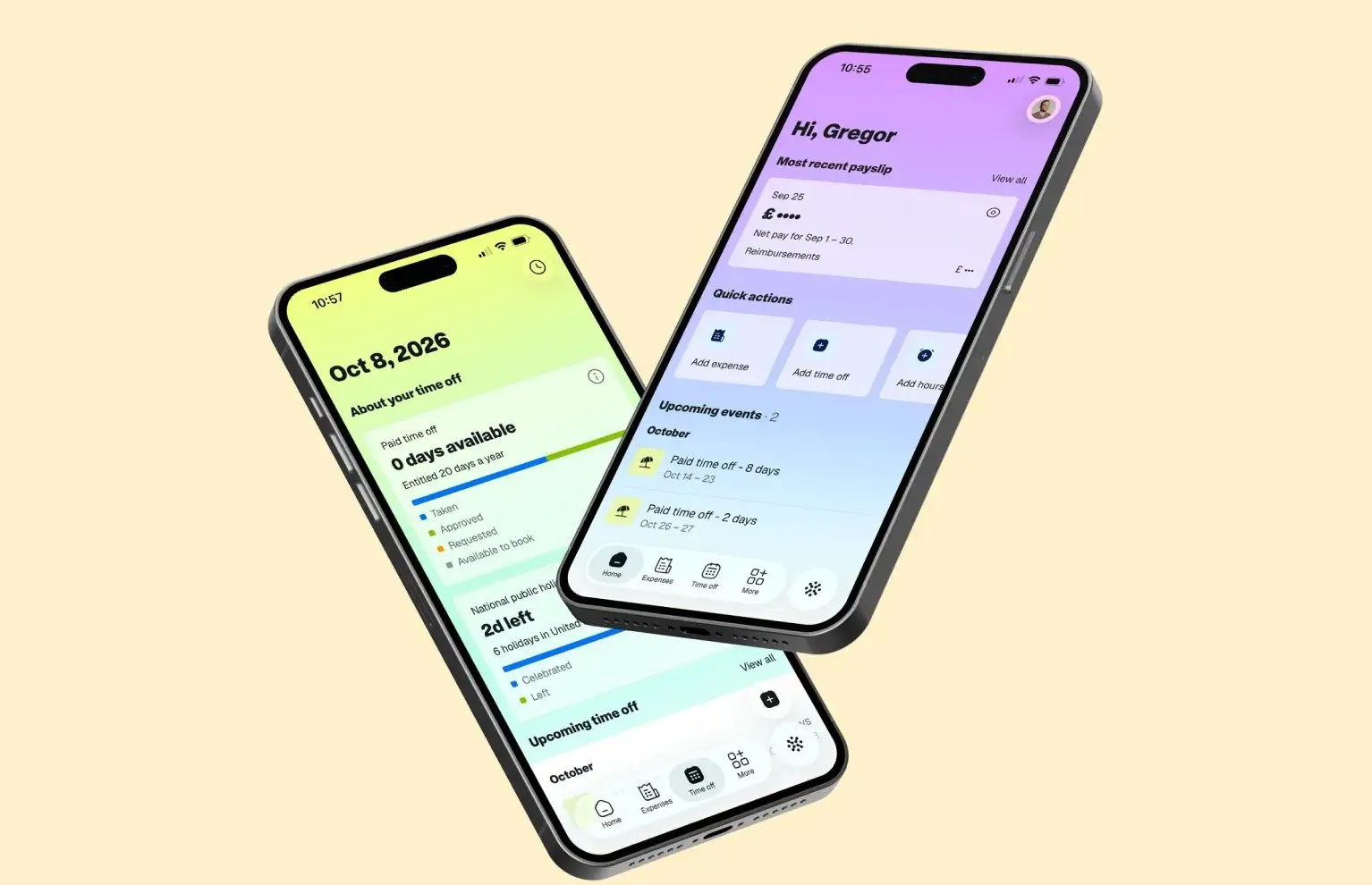

COLLINS Rebrands Remote with Modular Cubes and Banknote Gradients Remote powers global HR and payroll management across more than 150 countries and 77 currencies, but its previous visual identity fell short of showcasing that impressive scale. Recognizing that payroll infrastructure relies on repeating, foundational units—much like bricks, shipping containers, or cargo pallets—design studio COLLINS chose the modular cube as the core element of the new brand identity.
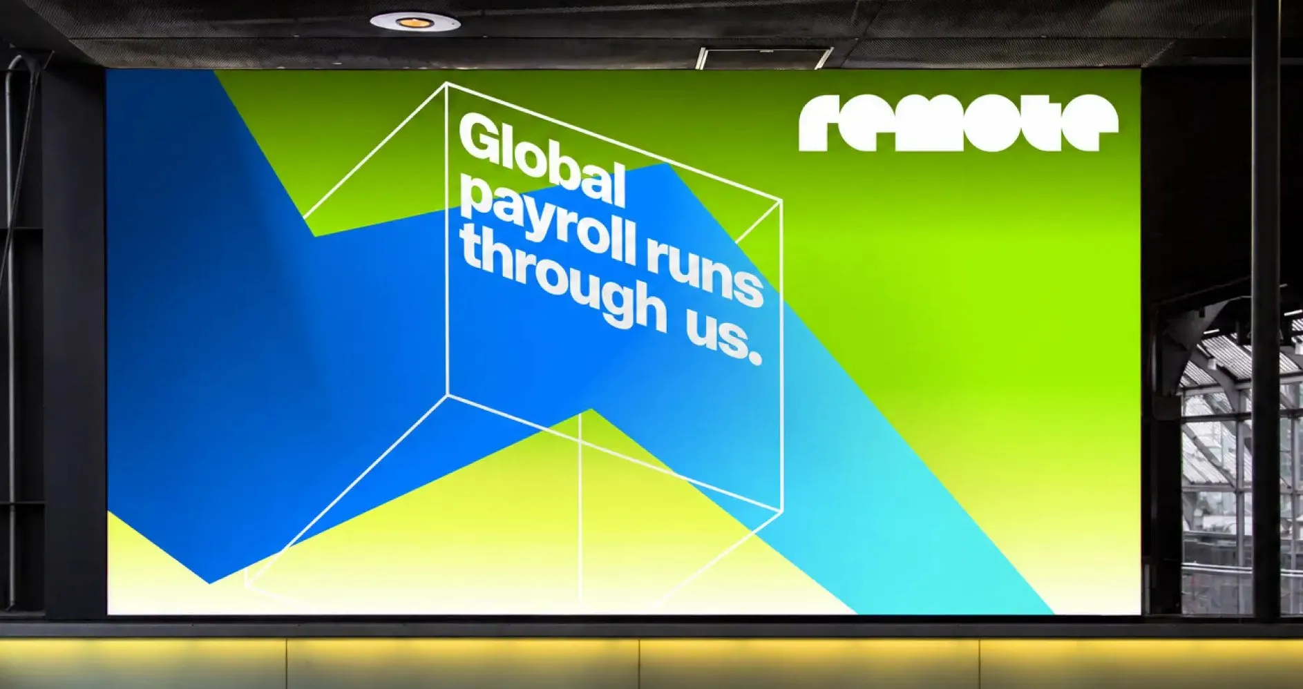
The cube serves as the heart and soul of the whole design system. It can stack, rotate, stretch, or snap together to build larger, dynamic structures. COLLINS brought this system to life through three distinct treatments: clean flat line drawings for charts and data, a sleek one-point perspective version, and an isometric style that maintains its shape across all dimensions. No matter how many cubes fill the visual field, every perspective line converges on a single vanishing point, effortlessly communicating the core concept of “many parts, one system”.
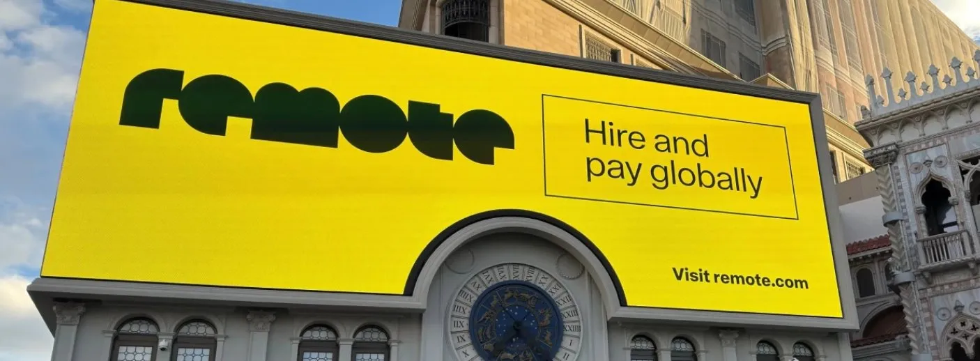
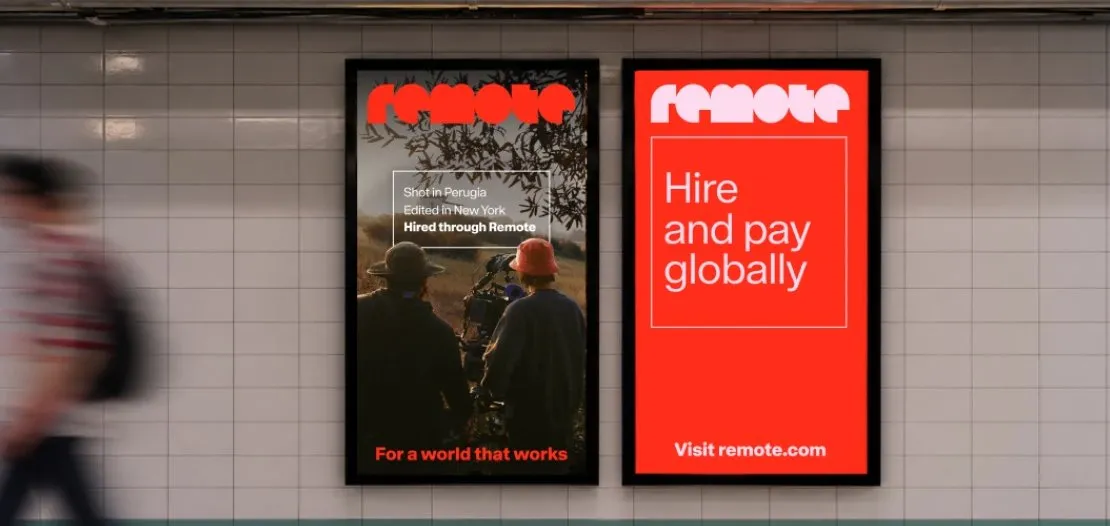
When it comes to typography, COLLINS ditched the old rounded “R” icon to introduce a fresh geometric wordmark full of personality, paired perfectly with the bold Rotina headline font from Sharp Type. The color palette draws direct inspiration from paper banknotes around the globe. Vibrant gradients shifting through reds, oranges, greens, blues, and violets celebrate the 77+ currencies Remote handles every single day.
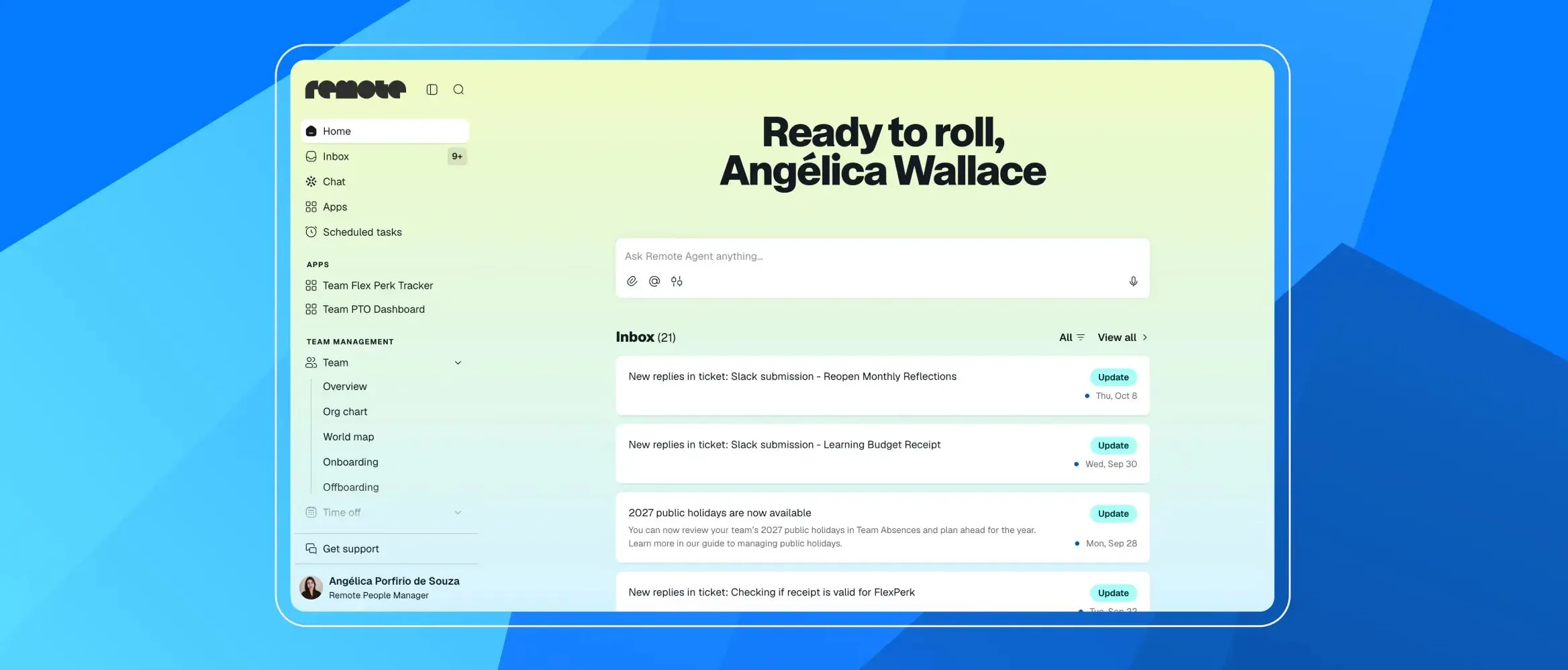
This new visual identity has rolled out everywhere, from mobile apps and web interfaces to the city-wide “For a World That Works” ad campaign. Check out the full story on the remote.com/blog/introducing-remote-s-new-mission-brand-pay-the-world.
COLLINS tái định vị thương hiệu Remote qua hình khối lập phương và bảng màu tiền tệ
Remote là nền tảng quản lý và trả lương nhân sự toàn cầu đang phục vụ tại hơn 150 quốc gia với hơn 77 loại tiền tệ. Tuy nhiên, nhận diện thương hiệu cũ chưa thực sự làm nổi bật được quy mô ấn tượng này. Nhận thấy hạ tầng dịch vụ trả lương luôn vận hành dựa trên những đơn vị lặp đi lặp lại — tương tự như một viên gạch, một chiếc container hay một pallet hàng — studio thiết kế COLLINS đã quyết định lấy hình khối lập phương làm nhân tố chủ đạo cho bộ nhận diện mới.
Khối lập phương chính là linh hồn của toàn bộ hệ thống. Nó có thể xếp chồng, xoay chuyển, kéo giãn hoặc ghép lại với nhau thành các cấu trúc lớn hơn. Hệ thống hình khối này được thể hiện theo ba dạng: dạng nét phẳng dùng cho biểu đồ và dữ liệu, dạng phối cảnh một điểm tụ và dạng isometric giữ nguyên hình thái ở mọi chiều. Dù xuất hiện bao nhiêu khối đi nữa, mọi cạnh phối cảnh đều phải quy tụ về một điểm tụ duy nhất, truyền tải trọn vẹn tinh thần “nhiều phần tử, một hệ thống”.
Về mặt chữ viết, COLLINS đã loại bỏ biểu tượng chữ R bo tròn cũ để tạo nên một wordmark hoàn toàn mới từ các hình khối hình học cá tính, kết hợp cùng font chữ headlines Rotina đến từ Sharp Type. Bảng màu của thương hiệu lấy cảm hứng trực tiếp từ màu sắc trên các tờ tiền giấy khắp thế giới. Những dải màu chuyển sắc (gradient) tươi tắn từ đỏ, cam, xanh lá đến xanh dương và tím thể hiện hình ảnh hơn 77 đồng tiền mà Remote xử lý mỗi ngày.
Hệ thống nhận diện mới này hiện đã được phủ sóng đồng bộ từ ứng dụng di động, giao diện web cho đến chiến dịch quảng cáo “For a World That Works” tại nhiều thành phố lớn. Bạn có thể xem toàn bộ câu chuyện về dự án trên trang web chính thức của remote.com/blog/introducing-remote-s-new-mission-brand-pay-the-world.