&Walsh Designs a Cinematic Brand Identity for BATCH Inspired by Film Mattes
BATCH is a game-changing software built to pull mattes—the technique of isolating characters and objects from background scenes—processing an entire feature film in just a few hours instead of months. Teaming up for the launch, creative studio &Walsh built a brand identity that visually reflects the inner workings of the tool itself.
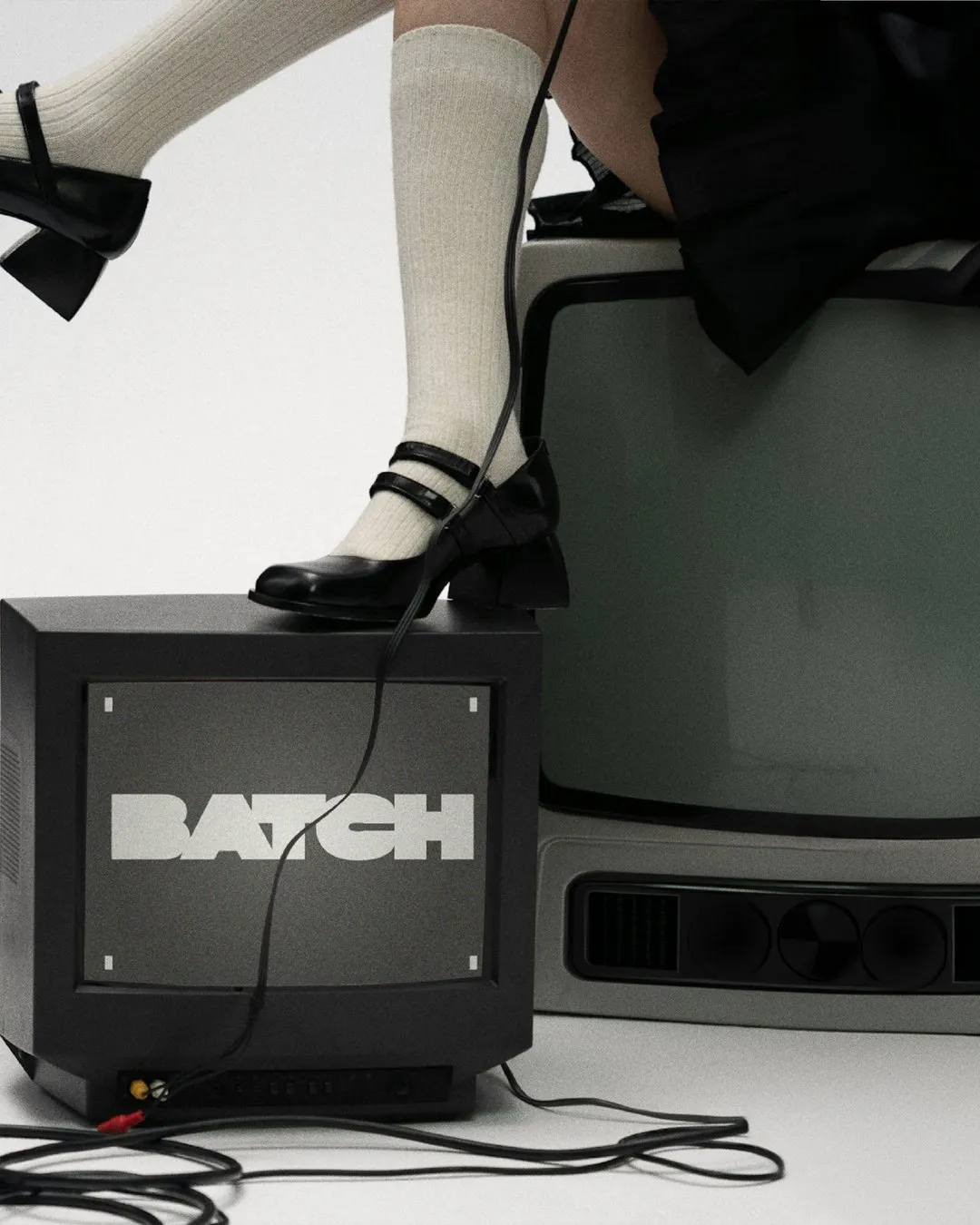
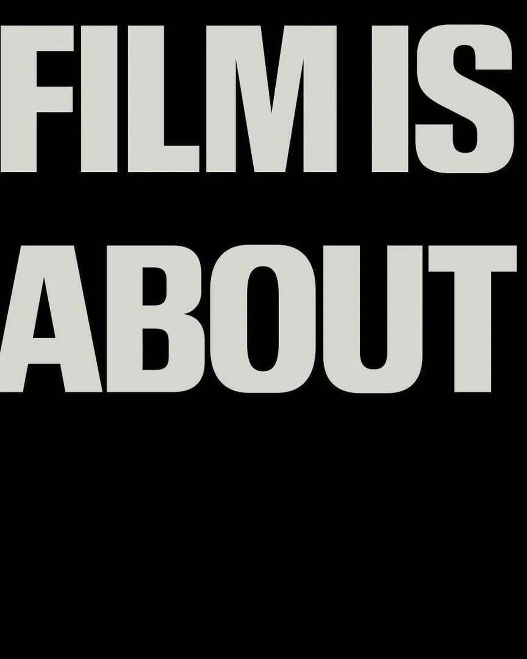
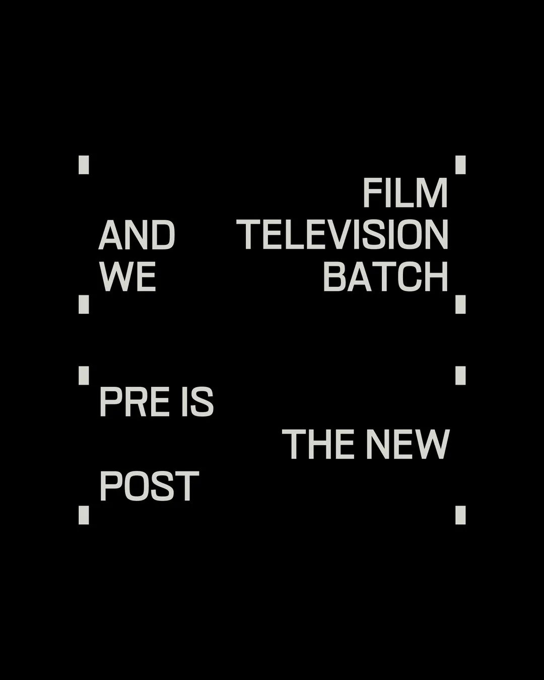
The real highlight is the bold, blocky wordmark set in crisp white against black, shaped directly from the masking layers used in film editing. Surrounding the logo, the visual language captures the vibe of an editing suite—featuring tactile film grain, rounded mask cutouts, stacks of vintage CRT TVs, and warm-toned film frames popping against a near-monochrome canvas. The brand keeps its messaging direct and punchy with tags like “Pre is the new post” and “Film is about to start”.
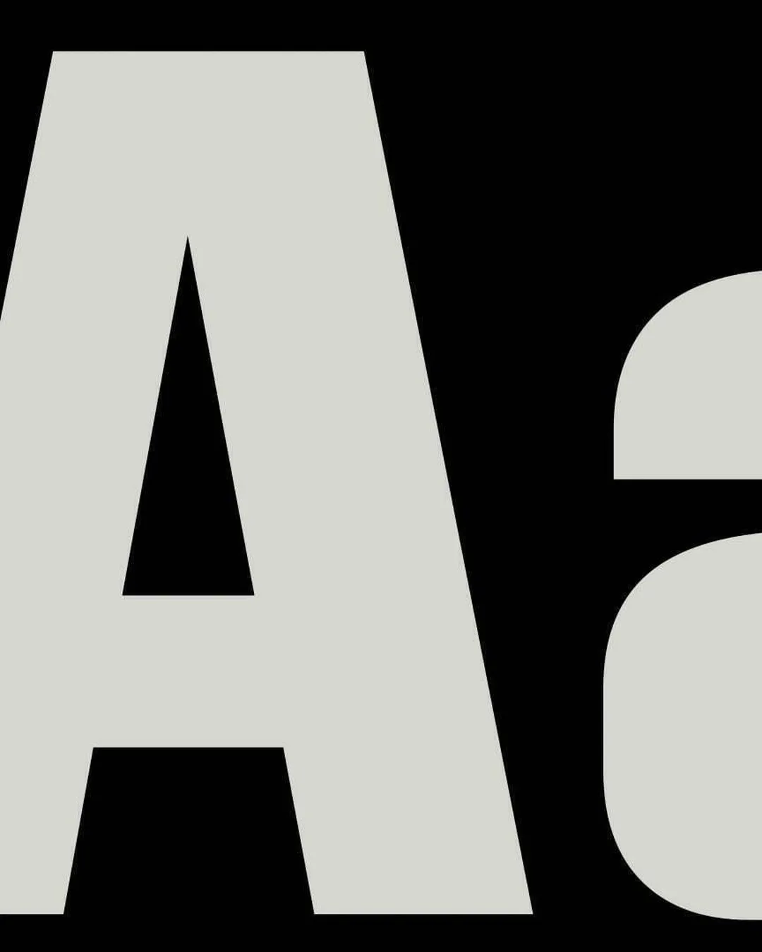
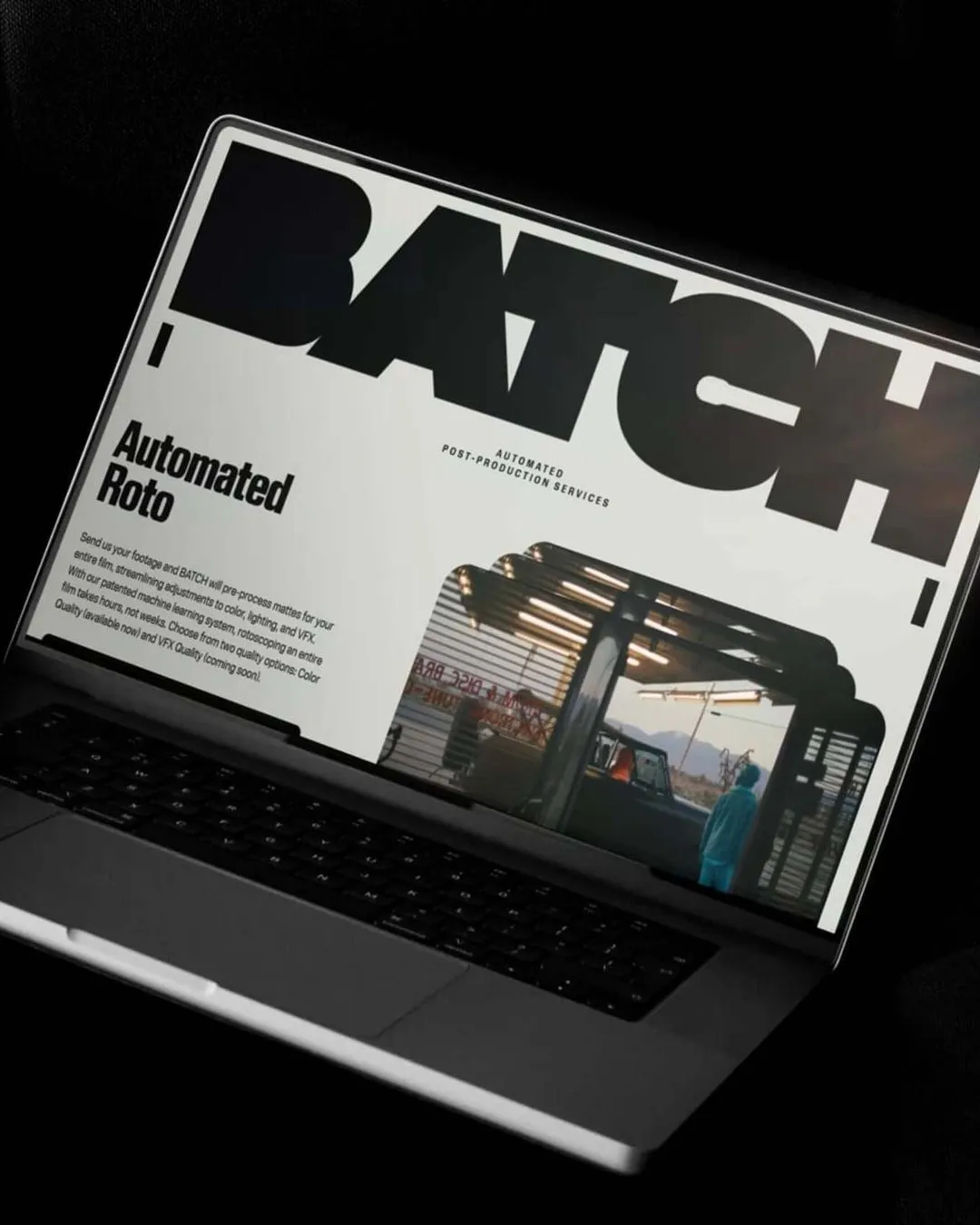
Typography carries the entire design concept. &Walsh turned the logo into a clever illustration of the product itself by custom-crafting the wordmark out of the software’s mask shapes. The type specimen makes a huge statement with a heavy grotesque letter ‘A’ blown up to poster scale, surrounded by sleek little production labels—just like the spec tags found on individual film frames. This layout system keeps things super consistent at every scale: a big bold statement, crisp micro-labels, and a classic black-and-white color scheme. On the website, the wordmark sits right above an “Automated Roto” header alongside cinematic stills.
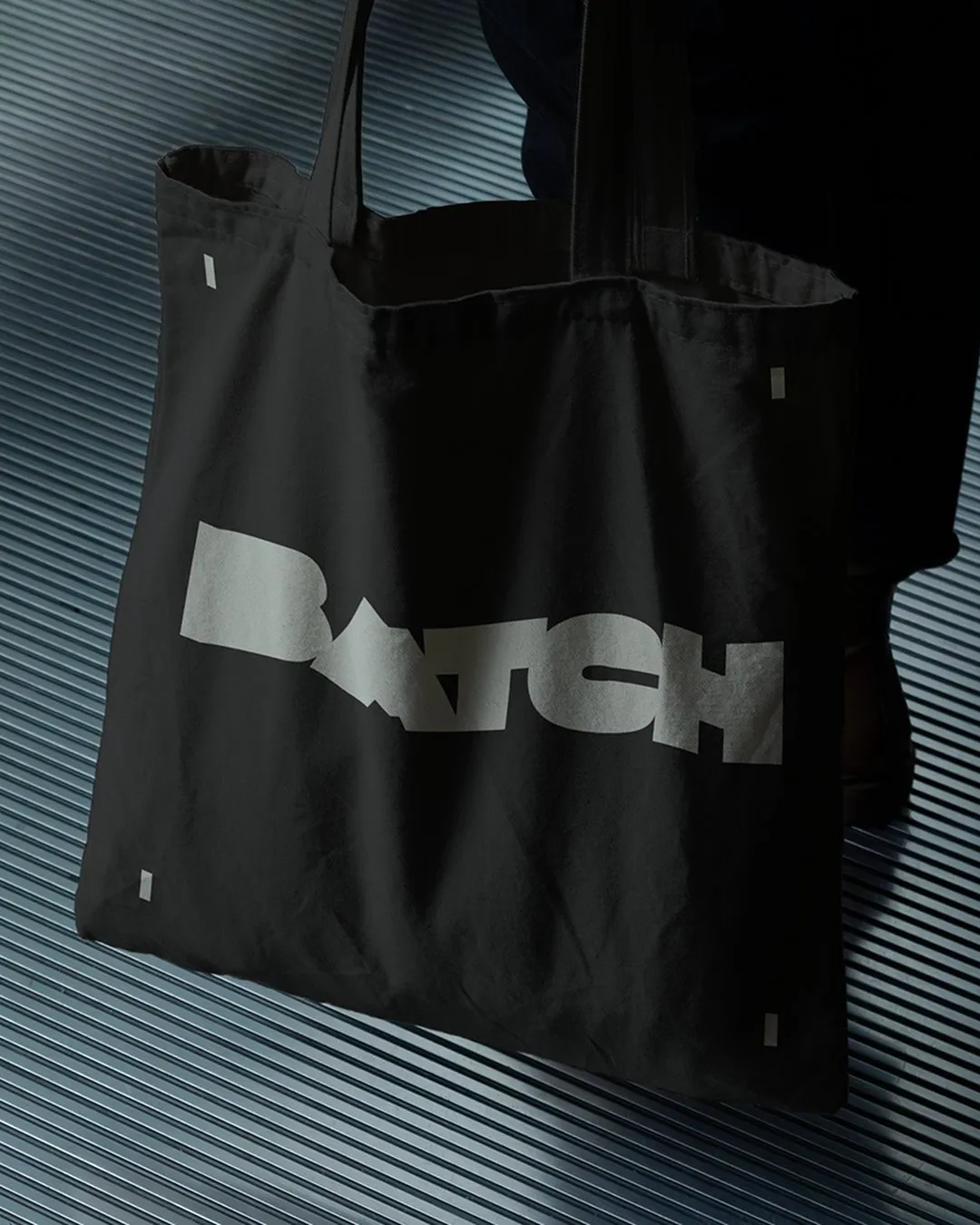
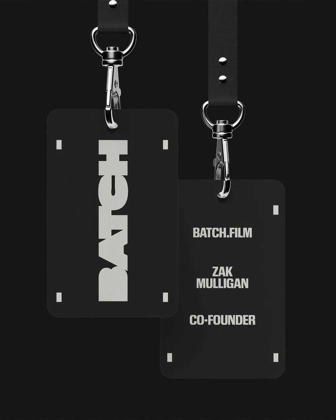
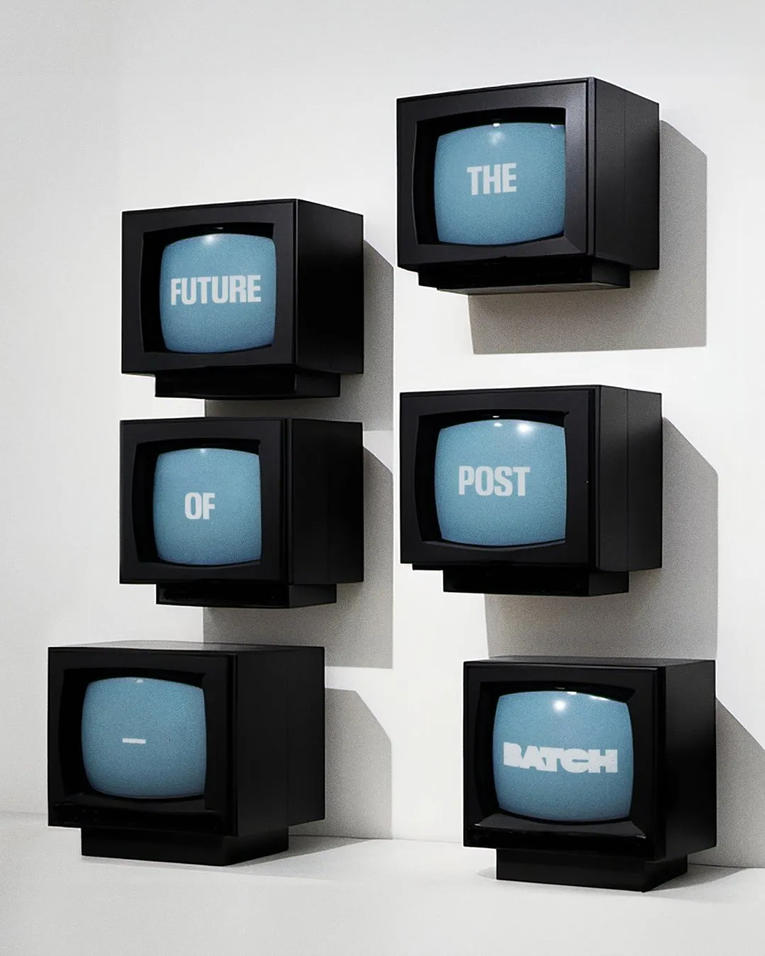
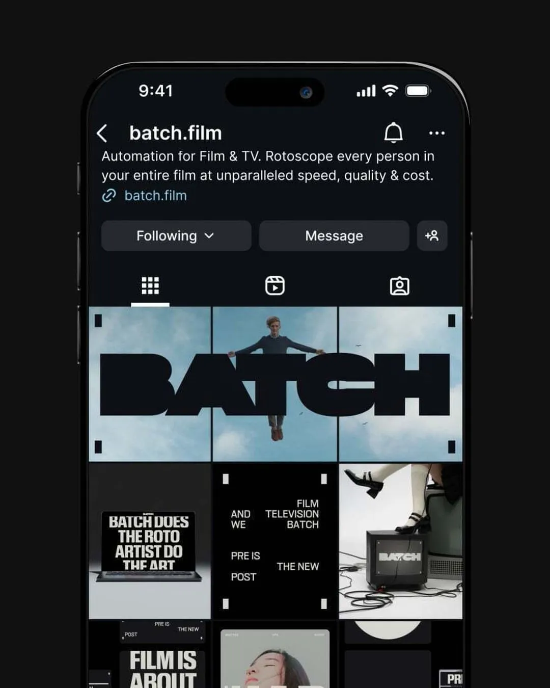
The visual identity stays incredibly tight across every single touchpoint, anchored by a minimal palette. Deep black and off-white form the backdrop for typography, while full-color film stills bring in vibrant bursts of color. Merch like the black canvas tote features a flat gray logo. The co-founder’s lanyard highlights a vertical white BATCH logo over black, paired with founder info and the domain BATCH.FILM printed underneath. Another standout detail is a CRT TV wall displaying “The Future of Post” across multiple screens—splitting up words across monitors before resolving on the BATCH logo at the end. Across digital platforms, from laptop screens to Instagram posts, the identity maintains total discipline across its wordmark placement, headers, and imagery.
&Walsh Thiết Kế Bộ Nhận Diện Thương Hiệu BATCH Dựa Trên Hình Khối Film Matte
BATCH là phần mềm chuyên xử lý tách phông (pull mattes) – kỹ thuật bóc tách nhân vật và vật thể ra khỏi bối cảnh – cho cả một bộ phim chỉ trong vài giờ thay vì mất hàng tháng trời. Đồng hành cùng dự án này, studio &Walsh đã tạo nên một bộ nhận diện thương hiệu mang dáng dấp trực quan của chính công cụ sản xuất.
Điểm nhấn chủ đạo nằm ở phần wordmark dạng hình khối màu trắng trên nền đen, với nét chữ dày dặn như một khối thống nhất và được tạo hình từ chính các lớp mask trong dựng phim. Xung quanh logo, ngôn ngữ thị giác bám sát không khí phòng dựng: từ hiệu ứng film grain, các mảng mask bo góc, dàn TV CRT cho tới những khung hình phim màu ấm nổi bật trên nền gần như đơn sắc. Nhãn hàng cũng chọn góc tiếp cận vô cùng trực diện qua các khẩu hiệu như “Pre is the new post” hay “Film is about to start”.
Yếu tố typography gánh vác toàn bộ ý tưởng thiết kế. &Walsh đã biến logo thành hình ảnh minh họa cho chính sản phẩm khi vẽ riêng wordmark từ hình dáng lớp mask mà phần mềm tạo ra. Bản type specimen nổi bật với chữ A kiểu grotesque nét dày phóng to ở quy mô poster, xung quanh đính các nhãn sản xuất (production labels) nhỏ gọn – dạng thẻ thông số quen thuộc trên mỗi frame hình. Bố cục này giữ nguyên tắc thống nhất ở mọi quy mô: một câu tuyên bố thật lớn, các nhãn nhỏ chính xác cùng tông màu đen trắng chuẩn mực. On-site website cũng sắp xếp wordmark nằm ngay trên tiêu đề “Automated Roto” cùng một khung hình phim.
Tính nhất quán của nhận diện thương hiệu được duy trì chặt chẽ trên mọi điểm chạm nhờ bảng màu tối giản. Đen và trắng ngà làm nền cho chữ, trong khi sắc màu duy nhất lại đến từ các khung hình phim. Mẫu túi tote vải đen mang logo màu xám phẳng. Dây đeo thẻ của co-founder in chữ BATCH xoay dọc màu trắng trên nền đen, đi kèm tên founder và địa chỉ BATCH.FILM in nhỏ phía dưới. Ấn tượng không kém là bức tường TV CRT hiển thị dòng chữ “The Future of Post” phân tách từng từ trên mỗi màn hình, kết thúc bằng logo BATCH ở khung hình cuối. Trên các thiết bị số như màn hình laptop hay trang Instagram, bộ nhận diện vẫn giữ nguyên sự kỷ luật từ bố cục wordmark, tiêu đề cho tới hình ảnh.