
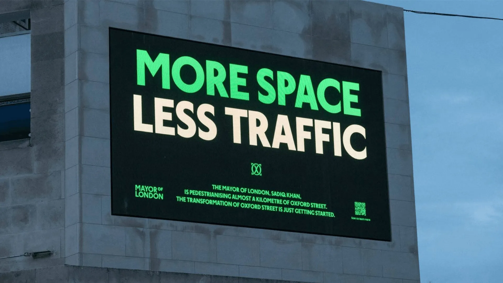

Oxford Street Gets Its First Brand Identity by Koto London’s world-famous, bustling retail haven—Oxford Street—officially has its first-ever brand identity in history, designed by creative studio Koto. Titled “For Everyone,” the launch coincides with the stretch between Orchard Street and Great Portland Street officially transitioning into a fully pedestrianized zone.
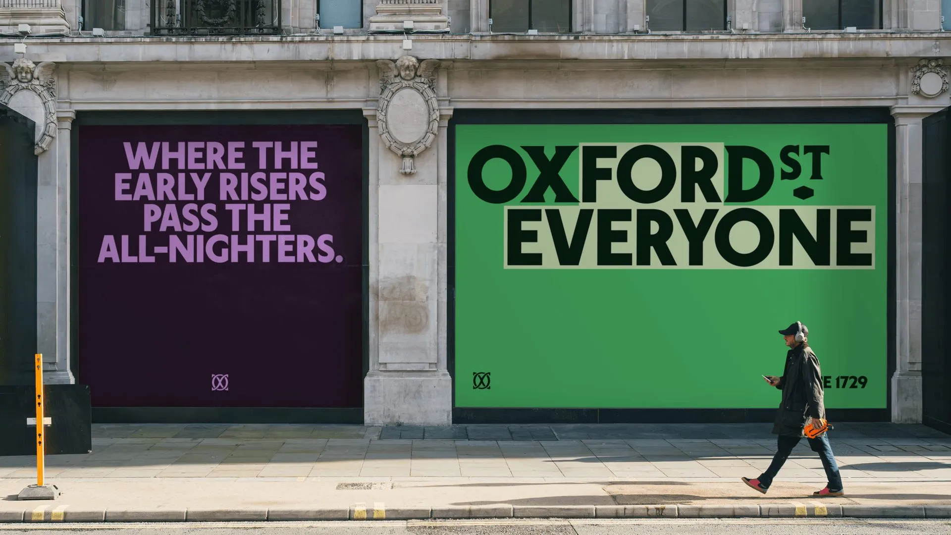
Koto’s core design concept is delightfully straightforward yet wonderfully effective: placing the word “for” right at the heart of the “Oxford St” wordmark. This flexible framework allows signage, posters, and headlines to extend into playful, context-aware phrases like “for shopping and stopping,” “for walkers and talkers,” or “for early risers and all-nighters”.
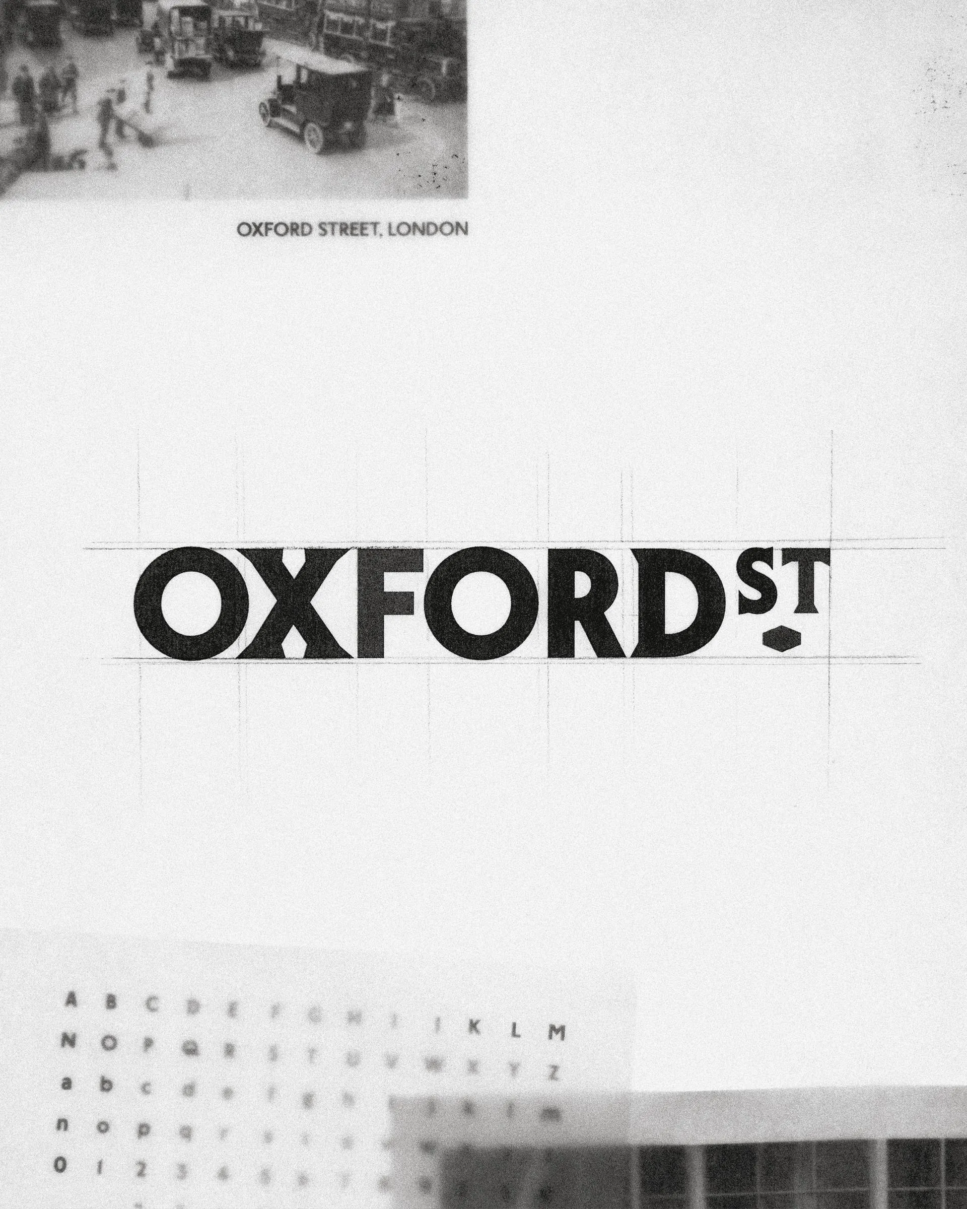
When it comes to typography, Koto crafted London Sans—a crisp, contemporary typeface overflowing with local character—and paired it against London Serif, drawn from historical street signage. Nestled within the wordmark is a subtle diamond lozenge, serving as a charming throwback to classic storefront plaques. On promotional posters, lettering flows in rhythmic curves to mirror the lively dynamic of moving foot traffic. The system also packs a custom monogram referencing local architecture alongside a clean, grid-based icon set.
A vibrant green hue anchors the wayfinding system, bringing a fresh, open, and greener public feel to the space. Meanwhile, high-contrast poster designs pair punchy shades like purple and green so messages stand out effortlessly to pedestrians from afar.
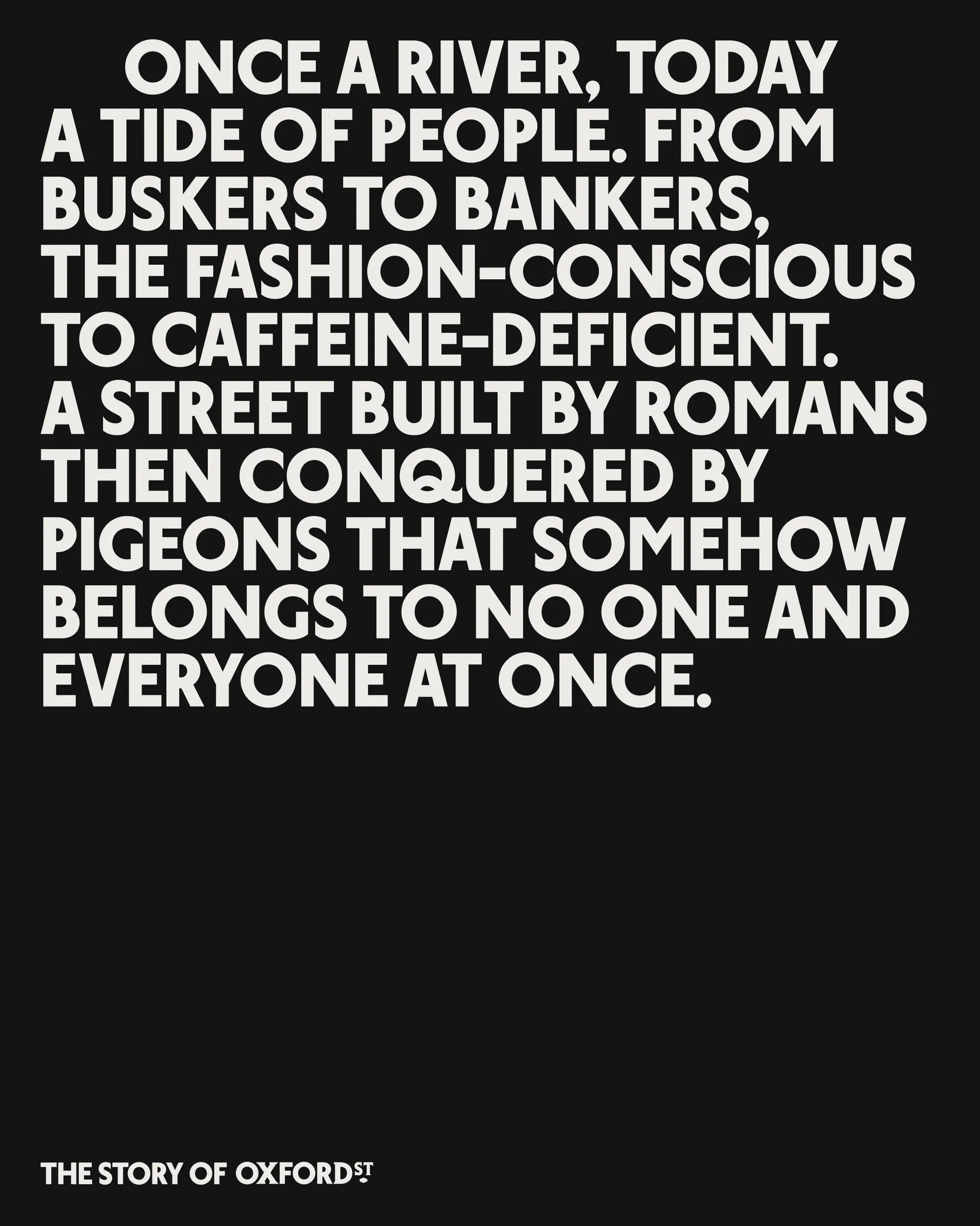
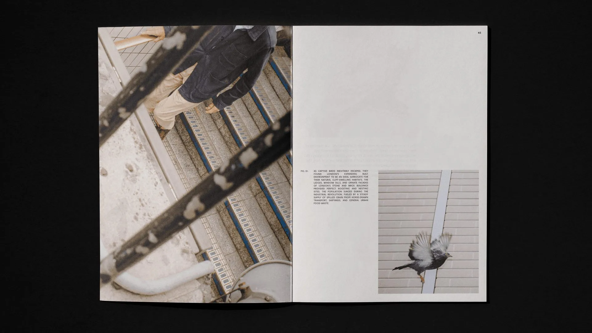
What makes the art direction truly special is how it shuns slick, over-produced retail advertising in favor of raw, candid, unfiltered moments of everyday city life. By taking a step back, the branding system allows the street itself to tell the story, creating a vibe that feels genuinely warm, welcoming, and rooted in community.
Check out the full case study on koto.com/projects/oxford-street.
Lần đầu tiên con phố Oxford có nhận diện thương hiệu riêng do Koto thực hiện
Phố mua sắm sầm uất và nổi tiếng bậc nhất London – Oxford Street – vừa chính thức sở hữu bộ nhận diện thương hiệu đầu tiên trong lịch sử do studio Koto sáng tạo. Dự án mang tên For Everyone, ra mắt cùng thời điểm đoạn đường giữa Orchard Street và Great Portland Street chuyển sang thành phố đi bộ hoàn toàn.
Ý tưởng thiết kế của Koto vô cùng trực diện nhưng hiệu quả: đặt từ “for” ngay trung tâm của wordmark “Oxford St”. Nhờ cấu trúc này, mọi biển hiệu, poster hay tiêu đề đều có thể tiếp tục câu văn theo nhiều cách khác nhau, linh hoạt phục vụ cho từng ngữ cảnh: “for shopping and stopping” (cho mua sắm và dừng chân), “for walkers and talkers” (cho người đi dạo và trò chuyện), hay “for early risers and all-nighters” (cho người dậy sớm lẫn kẻ thức khuya).
Về mảng typography, Koto tạo ra bộ font London Sans mang tinh thần đương đại và nét đặc trưng địa phương, kết hợp đối lập với kiểu chữ serif London Serif được lấy cảm hứng từ các biển hiệu lịch sử lâu đời trên phố. Giữa wordmark còn có một hình thoi nhỏ (lozenge) gợi nhớ đến những bảng hiệu cửa hàng cổ điển. Trên các poster, chữ được sắp xếp uốn lượn nhịp nhàng, mô phỏng chuyển động của dòng người qua lại. Bộ nhận diện cũng bao gồm một monogram kết nối các chữ cái dựa trên kiến trúc địa phương, cùng hệ thống icon đơn giản được dàn trang theo lưới chặt chẽ.
Màu xanh lá rực rỡ trên hệ thống biển chỉ dẫn wayfinding mang lại cảm giác về một không gian công cộng xanh và thoáng đãng hơn. Các poster truyền thông sử dụng mảng màu tương phản mạnh như tím và xanh lá để người đi đường dễ dàng nhận diện từ xa.
Đặc biệt, định hướng hình ảnh (art direction) của dự án không đi theo lối mòn của ảnh quảng cáo bán lẻ chỉn chu, mà tập trung vào những khoảnh khắc đời thường, chân thực và không qua filter của người dân. Hệ thống nhận diện chọn cách lùi lại một bước để chính con phố tự cất lời, tạo nên một hình ảnh vừa gần gũi vừa đậm chất không gian công cộng.
Bạn có thể xem thêm chi tiết dự án tại trang của koto.com/projects/oxford-street.