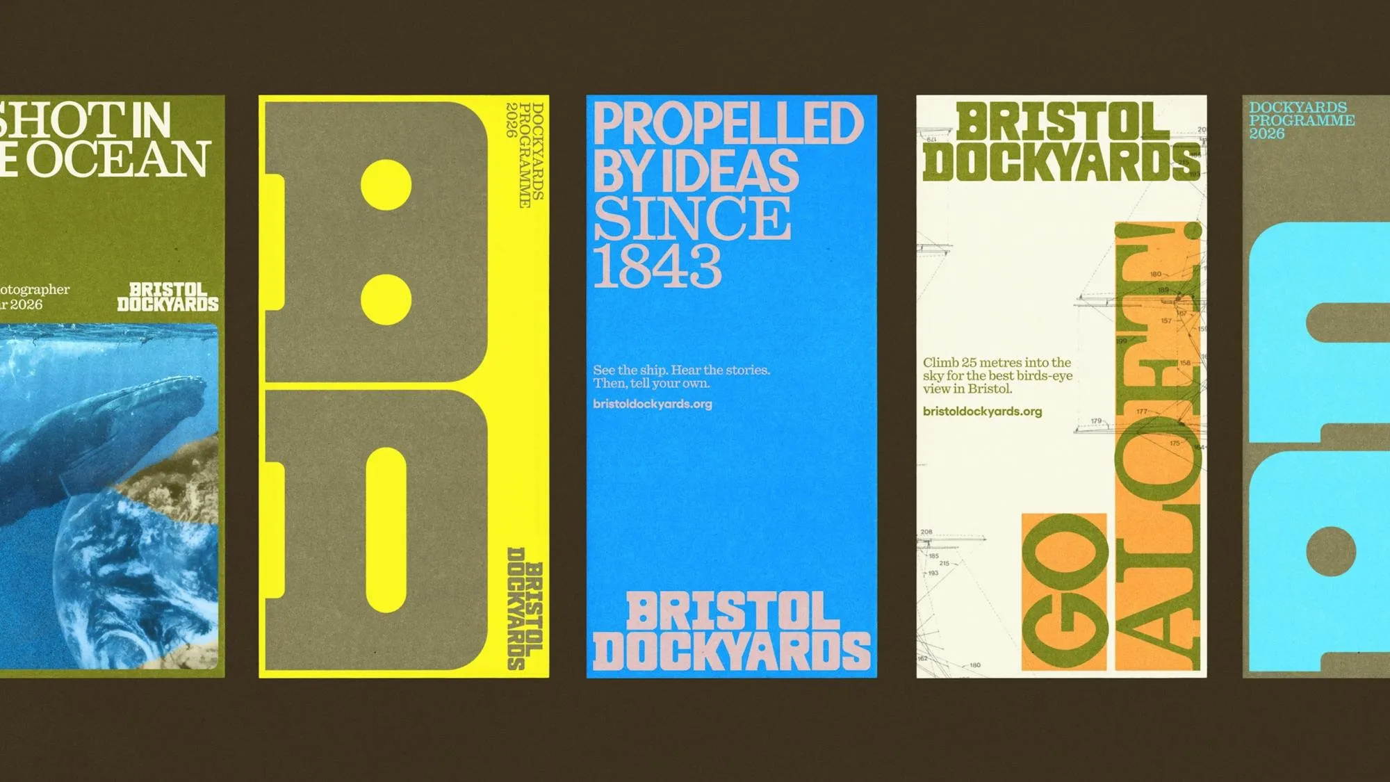
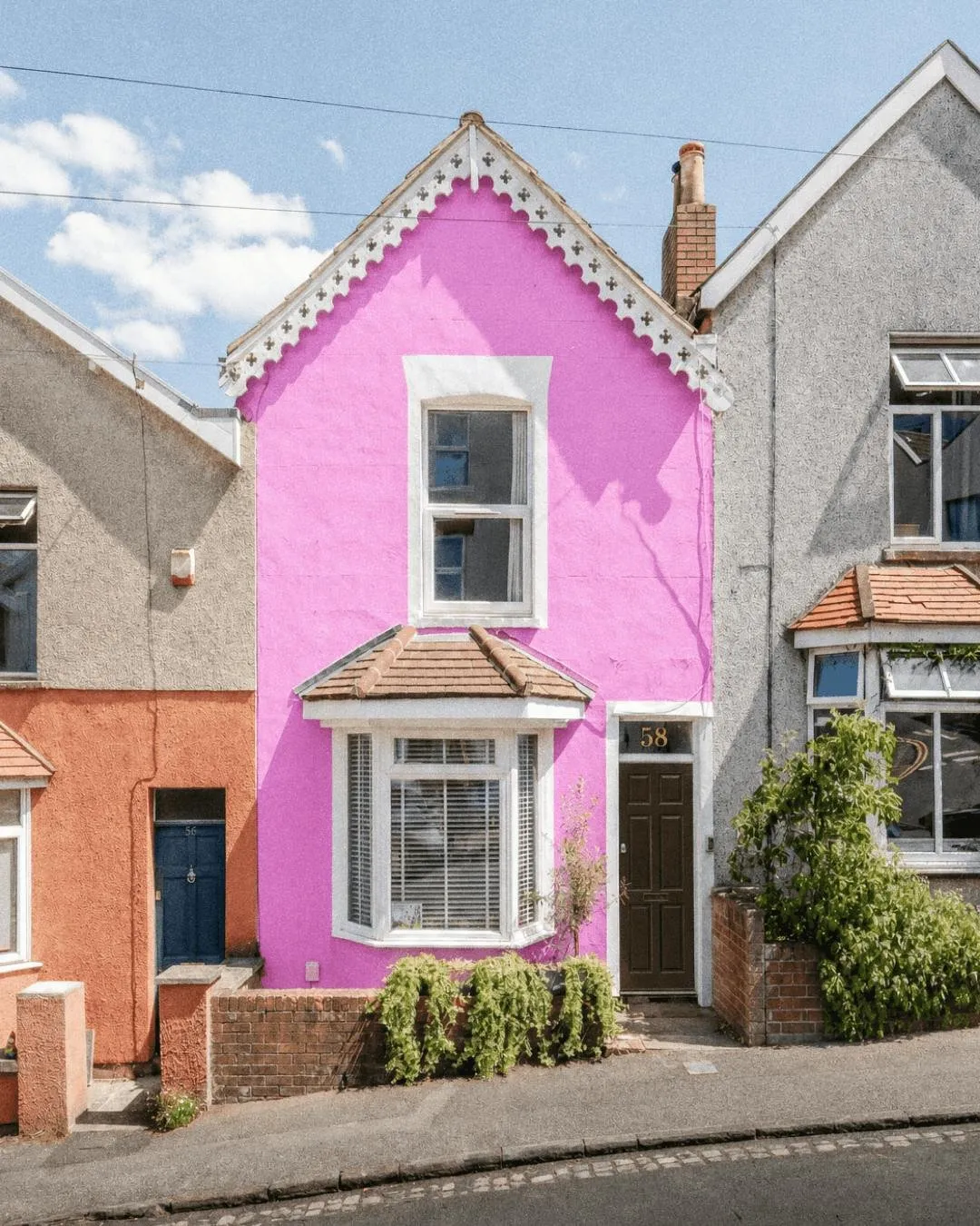
Breathing Life into History with Bristol Dockyards’ New Brand Identity Instead of playing it safe with the usual navy blue and nautical white, design studio HOW+HOW gave Bristol Dockyards a vibrant, one-of-a-kind refresh. The new identity rocks a playful hero pink inspired by the iconic terraced houses of Cliftonwood, perfectly balanced with olive green, sunny yellow, sky blue, and pop orange.
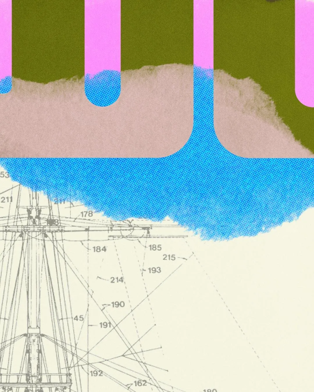
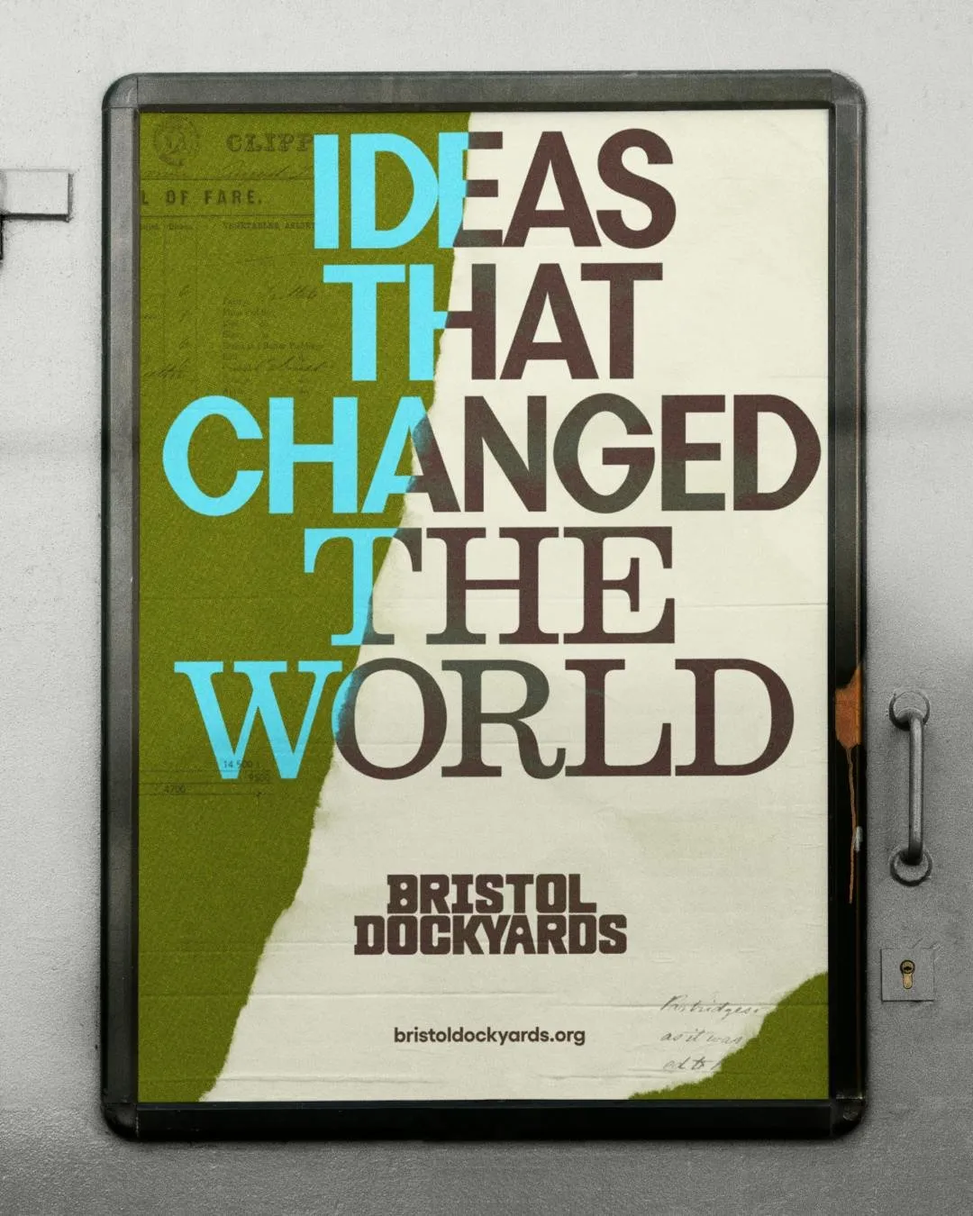
The standout highlight of the project is its expressive collage system. The studio seamlessly blended archival blueprints, shipyard hardware details, halftone textures, and spontaneous torn-paper edges. Thanks to this tactile touch, history stays vibrant, approachable, and full of artistic energy rather than feeling like a dry museum display.
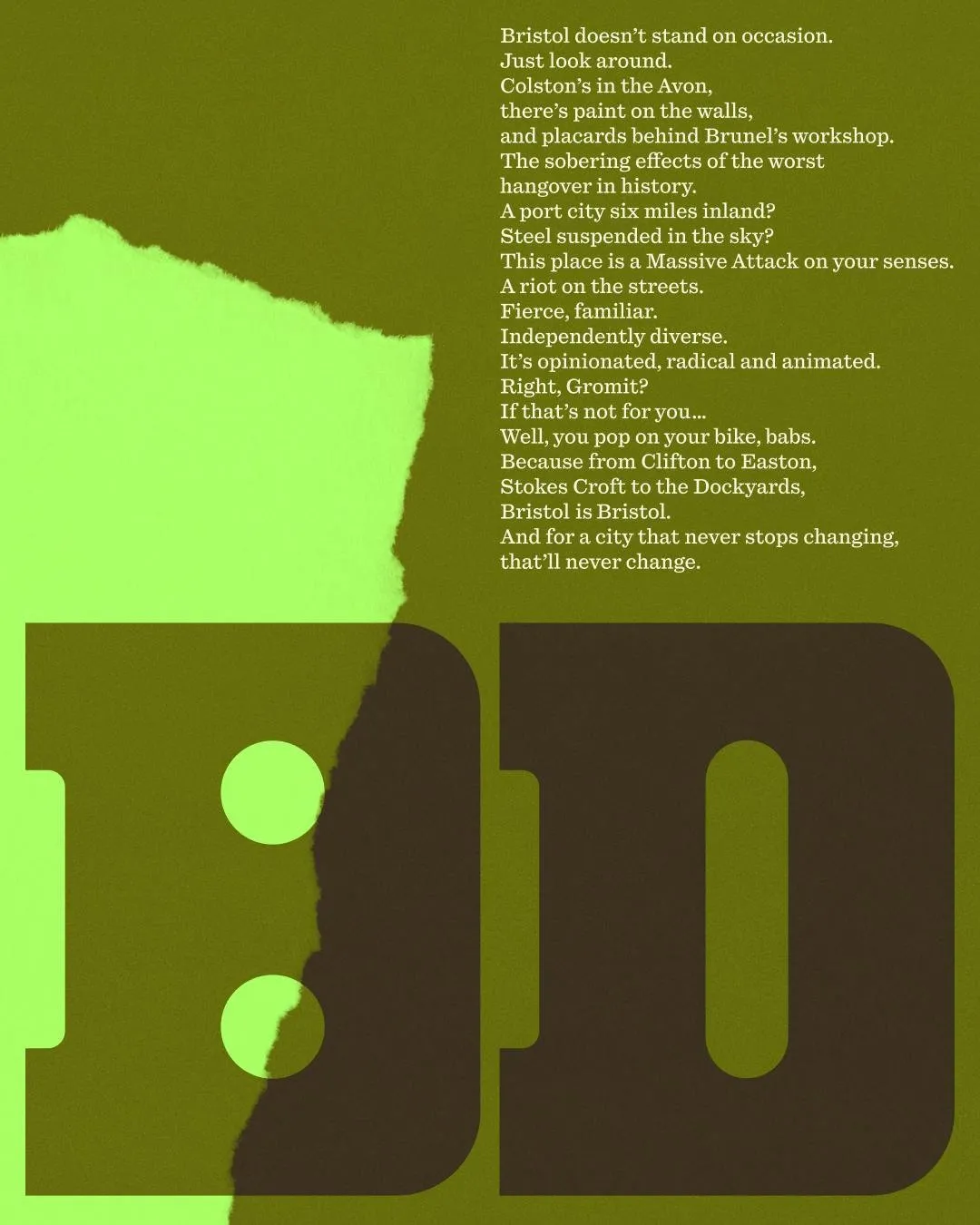
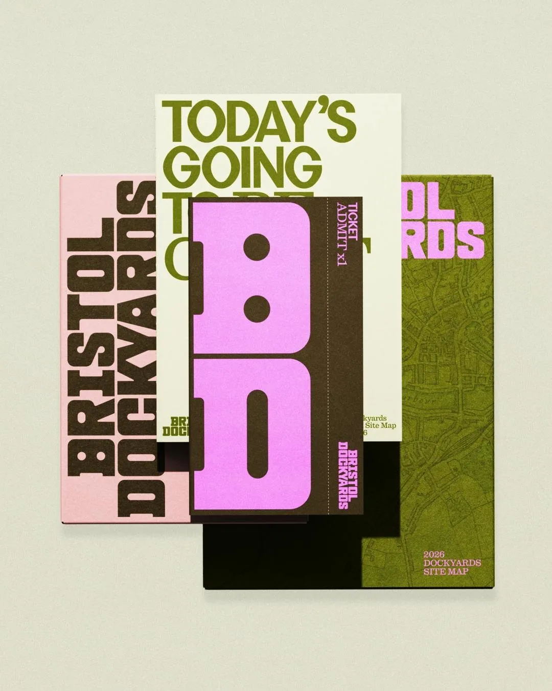
To keep all that visual energy balanced, the typography works as a sturdy structural anchor. The brand name is set in bold, blocky lettering with BRISTOL stacked atop DOCKYARDS, softened by gentle rounded corners. A dramatic BD monogram takes center stage at a huge scale on event tickets and publication covers. Pairing modern block type with classic serif headline fonts creates a dynamic grid system where torn paper edges define the flow between color blocks.
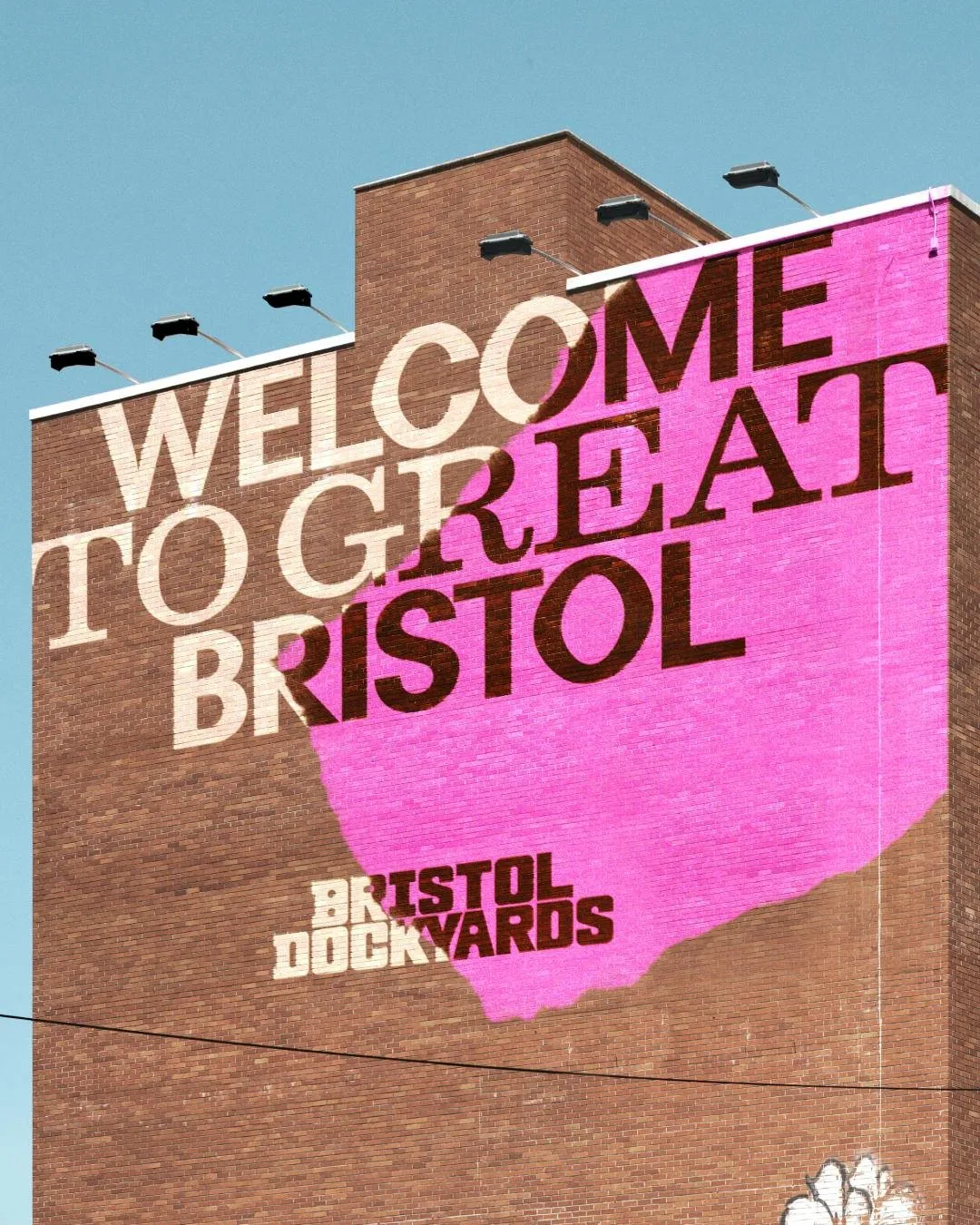
This visual consistency carries over smoothly to every application, from print brochures, site maps, and entry passes to a massive outdoor brick mural. The real-world results are just as striking: online conversions skyrocketed to more than triple their previous rate, and public engagement nearly doubled to hit 54%.
Check out the full project at how.studio/branding/bristol-dockyards.
Thổi Hồn Lịch Sử Vào Bộ Nhận Diện Mới Của Bristol Dockyards
Thay vì đi theo lối mòn với sắc xanh navy và trắng quen thuộc của ngành hàng hải, studio HOW+HOW đã mang đến cho Bristol Dockyards một diện mạo vô cùng độc đáo. Bộ nhận diện khoác lên mình tông hồng chủ đạo lấy cảm hứng từ những ngôi nhà ở Cliftonwood, kết hợp hài hòa cùng các gam màu xanh olive, vàng tươi, xanh bầu trời và cam.
Điểm đặc sắc của dự án nằm ở hệ thống tranh ghép collage đầy cảm xúc. Studio đã khéo léo kết hợp các bản vẽ lưu trữ, chi tiết thiết bị xưởng tàu, hiệu ứng halftone và những đường xé giấy ngẫu hứng. Nhờ đó, yếu tố lịch sử không bị biến thành những tấm biển bảo tàng khô khan mà trở nên sống động, gần gũi và giàu tính nghệ thuật.
Để giữ cho tổng thể visual được cân bằng, hệ thống typography đóng vai trò như một khung nẹp chắc chắn. Tên thương hiệu được xếp khối dày dặn với từ BRISTOL đặt trên DOCKYARDS cùng các góc bo tròn mềm mại. Biểu tượng monogram BD xuất hiện nổi bật ở tỉ lệ lớn trên vé tham quan hay bìa ấn phẩm. Sự tương phản giữa font chữ khối hiện đại và font serif cổ điển của phần tiêu đề tạo nên một cấu trúc grid ấn tượng, nơi những vết xé giấy quyết định sự chuyển giao giữa các mảng màu.
Tính đồng bộ được thể hiện mượt mà trên mọi ứng dụng thực tế, từ brochure, bản đồ site map, vé vào cửa cho đến bức tường gạch vẽ mural khổ lớn ngoài trời. Hiệu quả thực tế của dự án cũng vô cùng ấn tượng: tỷ lệ chuyển đổi trực tuyến tăng hơn gấp ba lần và mức độ tương tác của công chúng tăng gần gấp đôi, đạt mốc 54%.
Xem chi tiết dự án tại how.studio/branding/bristol-dockyards.