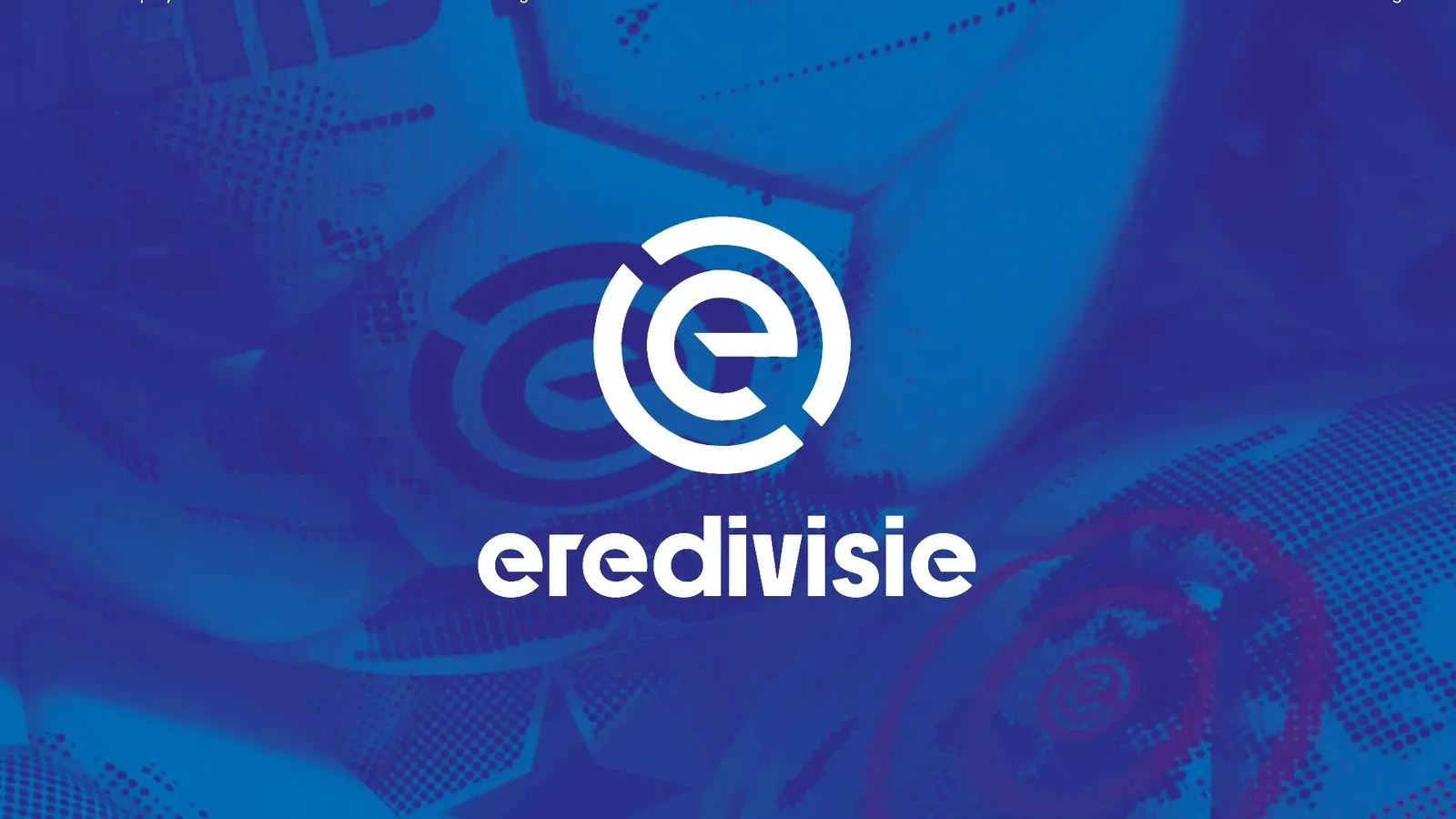
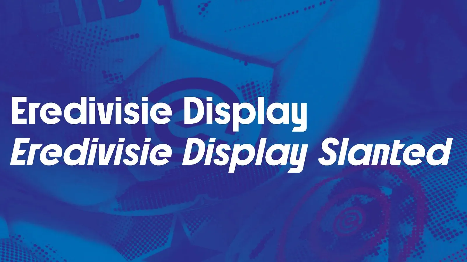
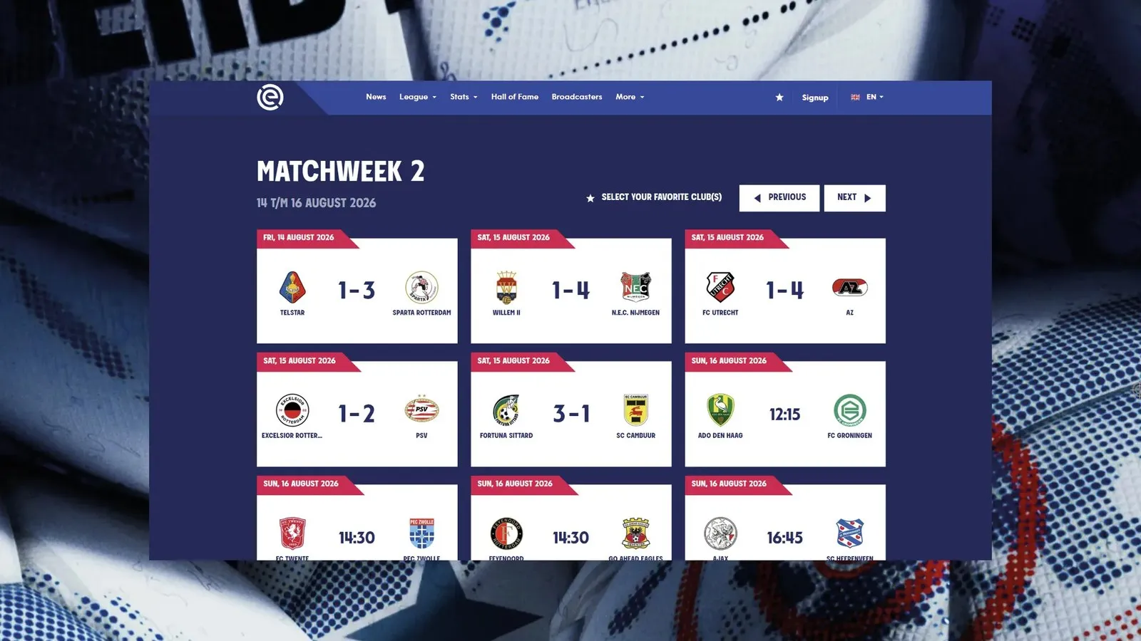
Eredivisie Display: Turning a Football Logo into an Epic Broadcast Typeface Sports leagues always need a clear, consistent visual voice across every channel. So when design studio GraphicHunters teamed up with Blaze Type to expand the brand identity for the Dutch top-flight league, Eredivisie, the primary logo was already set in stone. Rather than starting from scratch, the mission was to turn that iconic circular badge into a custom typeface built to perform seamlessly anywhere—from high-def TV screens to massive stadium displays. Thanks to prior experience engineering typography for Borussia Dortmund, Blaze Type already knew the playbook for European football branding inside and out.
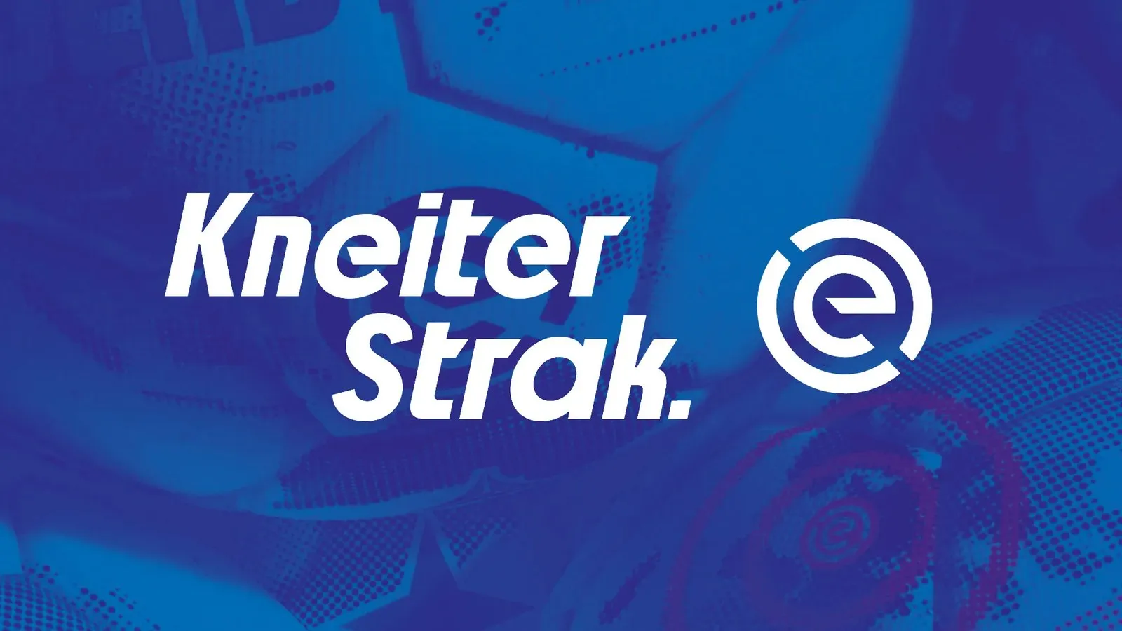
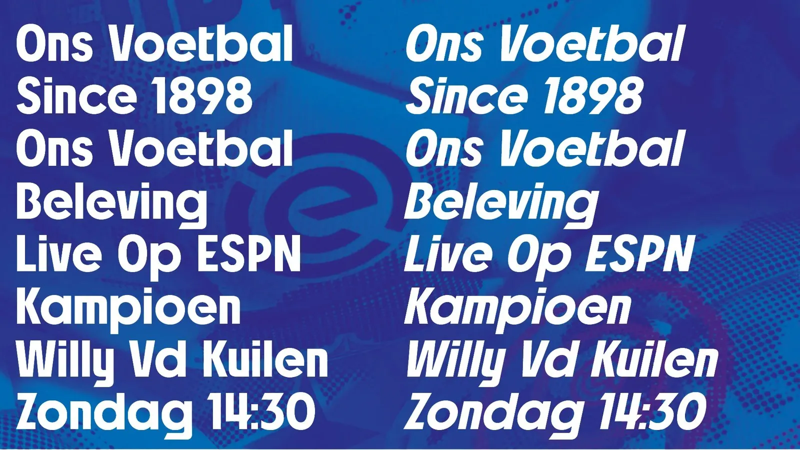
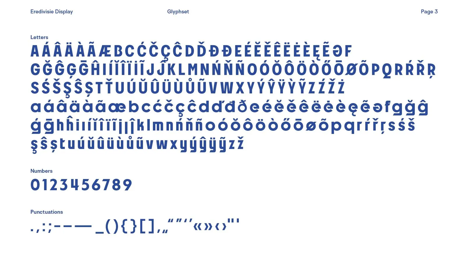
The original logo offered plenty of specific visual cues: a rounded lowercase ‘e’, sharp bevels, and punchy geometric shapes. Instead of just copy-pasting those forms onto a few headline letters, Sebastien Hayez and the team at Blaze Type turned them into a systematic set of rules applied consistently across the entire character set. Circular bowls, crisp diagonal cuts, and open counters stay beautifully unified across uppercase letters, numerals, and punctuation. The result? Flawless legibility. From tiny scorebug numbers to massive stadium LED boards, the letter spacing stays rock-solid, even during fast-paced live broadcast cuts.
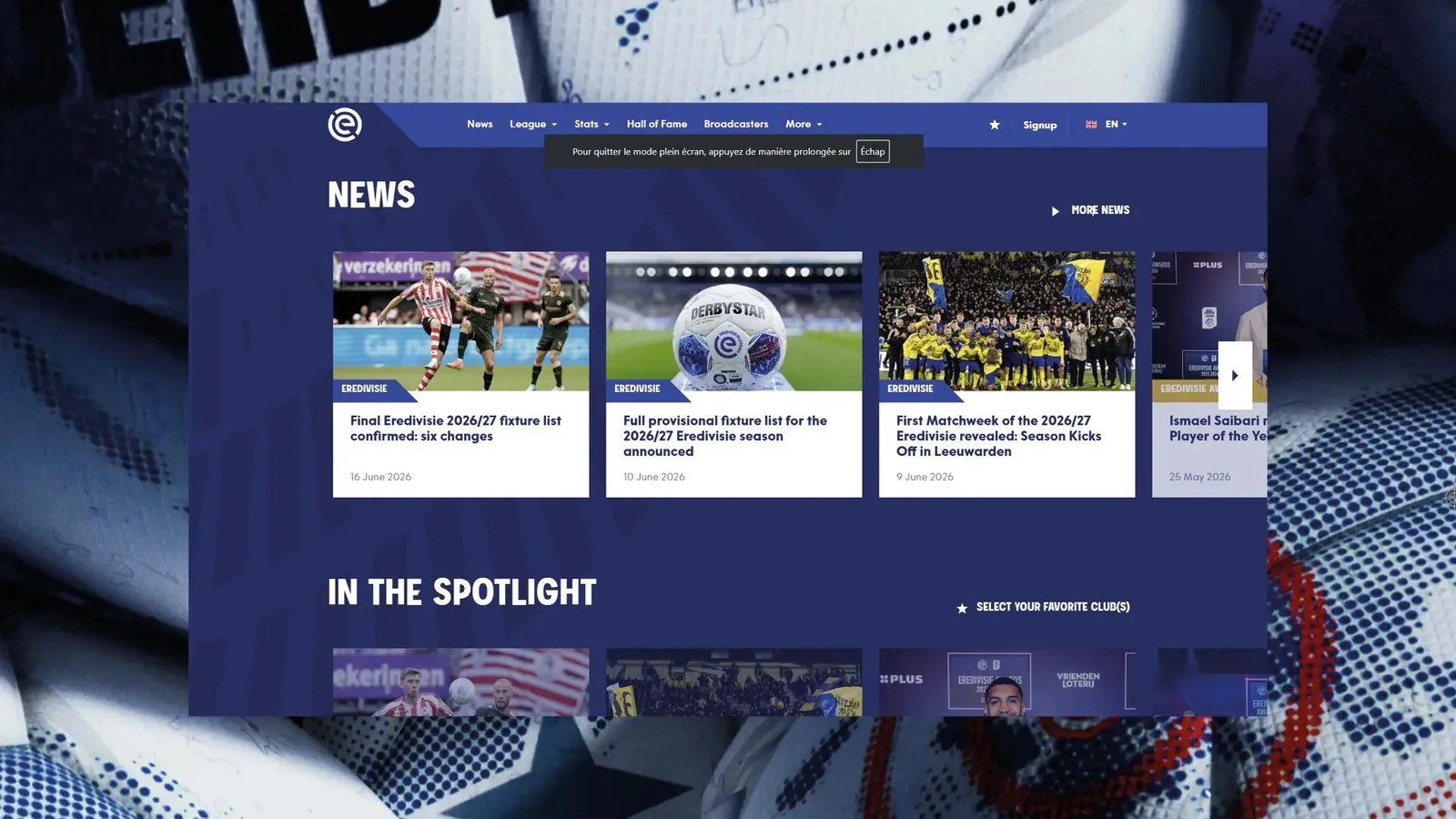
Smooth collaboration was key to making this project shine. GraphicHunters spearheaded the art direction and brand identity management, while Blaze Type focused entirely on font engineering and glyph drawing in Illustrator. The final result avoids the cookie-cutter feel of off-the-shelf condensed grotesks. Every stroke weight, terminal angle, and punctuation mark carries the exact DNA of the original Eredivisie logo. It is a razor-sharp typography system ready for pitch-side banners, TV lower-thirds, and matchday posters alike.
For more details on the project, check out blazetype.eu/case-studies/eredivisie.
Eredivisie Display: Khi biểu tượng bóng đá trở thành bộ font phát sóng ấn tượng
Các giải đấu thể thao luôn cần một “tiếng nói” đồng bộ và rõ ràng trên mọi phương tiện truyền thông. Khi studio GraphicHunters hợp tác cùng Blaze Type để mở rộng nhận diện mới cho giải vô địch quốc gia Hà Lan (Eredivisie), logo chính của giải đấu đã được cố định từ trước. Đội ngũ thiết kế không cần phải tạo lại hướng đi từ đầu, mà nhiệm vụ là chuyển hóa biểu tượng hình tròn đó thành một bộ font chữ tùy biến (custom typeface) hoạt động bền bỉ trên màn hình phát sóng lẫn không gian sân vận động. Nhờ kinh nghiệm kỹ thuật typography cho Borussia Dortmund trước đó, Blaze Type nắm rất rõ cách vận hành trong môi trường bóng đá Châu Âu.
Biểu tượng gốc mang lại các gợi ý thiết kế cụ thể: chữ ‘e’ thường bo tròn, đường vát sắc nét cùng các hình khối cơ bản. Thay vì chỉ sao chép đơn thuần các hình dạng đó lên vài chữ cái tiêu đề, Sebastien Hayez cùng nhóm thiết kế Blaze Type đã chuẩn hóa chúng thành các quy tắc áp dụng nhất quán cho toàn bộ bảng ký tự. Những phần bầu chữ (circular bowls), đường cắt chéo gọn gàng và khoảng hở nét chữ (open counters) xuất hiện đồng nhất trên tất cả chữ hoa, chữ số lẫn ký tự phụ âm. Nhờ vậy, tính dễ đọc luôn được đảm bảo. Từ các con số hiển thị trên bảng tỷ số thu nhỏ cho đến dải đèn LED kéo dài quanh khán đài, khoảng cách chữ (spacing) vẫn giữ độ ổn định cao dưới tốc độ chuyển cảnh nhanh của máy quay live.
Mô hình hợp tác ăn ý chính là yếu tố giúp dự án đạt hiệu quả cao. GraphicHunters định hình nghệ thuật và quản lý nhận diện thương hiệu, trong khi Blaze Type tập trung hoàn toàn vào kỹ thuật font (font engineering) và vẽ glyph trong Illustrator. Thành phẩm không bị rơi vào lối mòn nhạt nhòa của các bộ font condensed grotesk thương mại sẵn có. Mọi chuyển đổi độ dày (weight), góc kết thúc nét cho đến dấu câu đều mang chính xác DNA từ logo gốc của Eredivisie. Đây là một hệ thống typography sắc bén, đáp ứng tốt cho biển quảng cáo ven sân, đồ họa lower-third truyền hình lẫn poster trận đấu.
Thông tin chi tiết về dự án có tại blazetype.eu/case-studies/eredivisie.