Rothfield’s Ultra-Precise Brand Identity by Studio Julius Behind the success of so many massive brands, the powerhouses pulling the strings in the background rarely get the spotlight. Enter Rothfield—an Australian marketing execution partner that spent decades evolving from traditional print management and corporate gifts into a full-scale procurement, production, and logistics powerhouse. To build an identity system that truly matches their impressive scale, Melbourne-based Studio Julius teamed up with Stake Reputation for strategy and Josh Le Good for motion design. Instead of taking the predictable route with generic corporate logistics visuals, the design team built the entire brand concept around calibration, measurement, and the crisp precision of technical drafting tools.
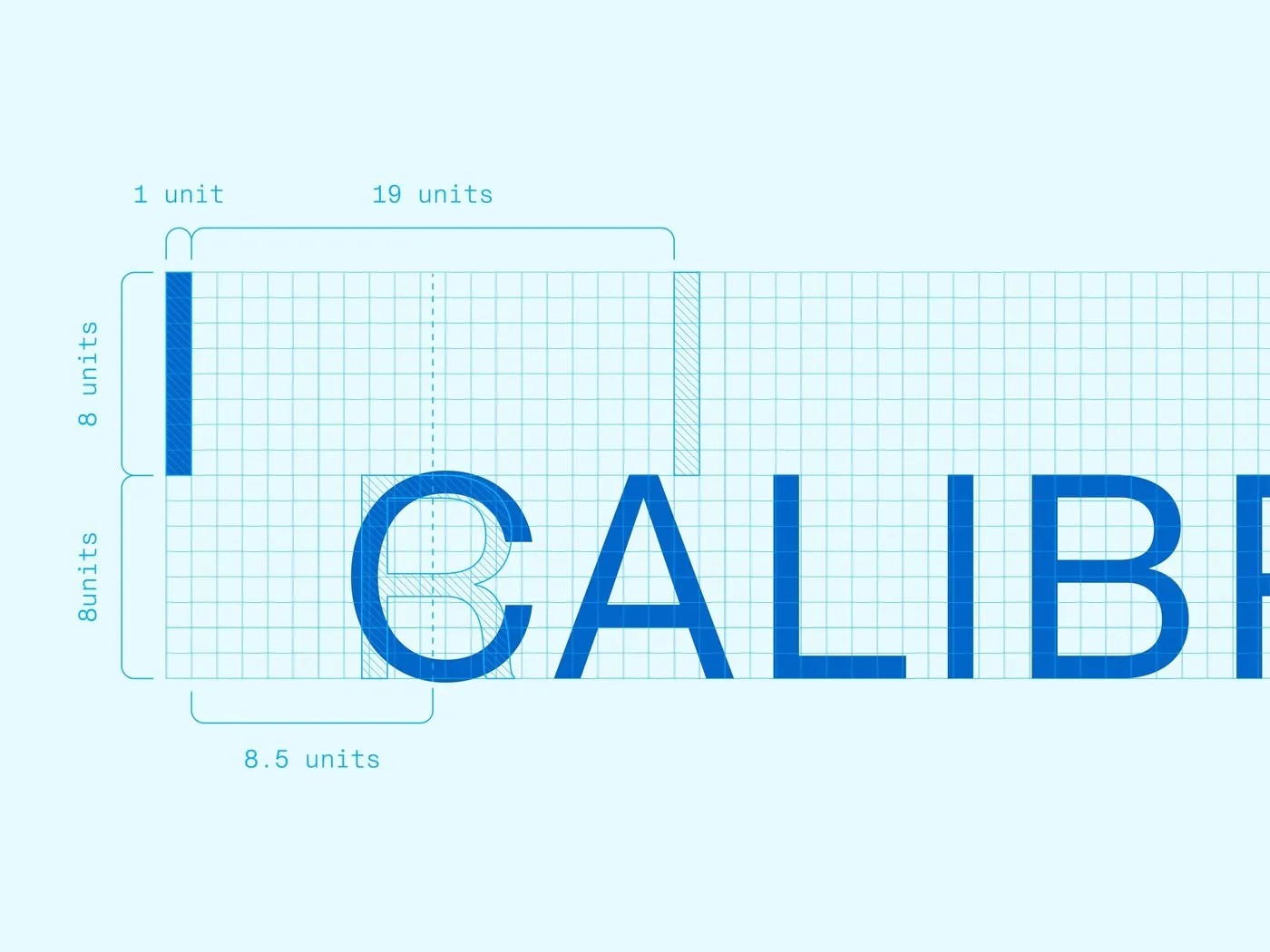
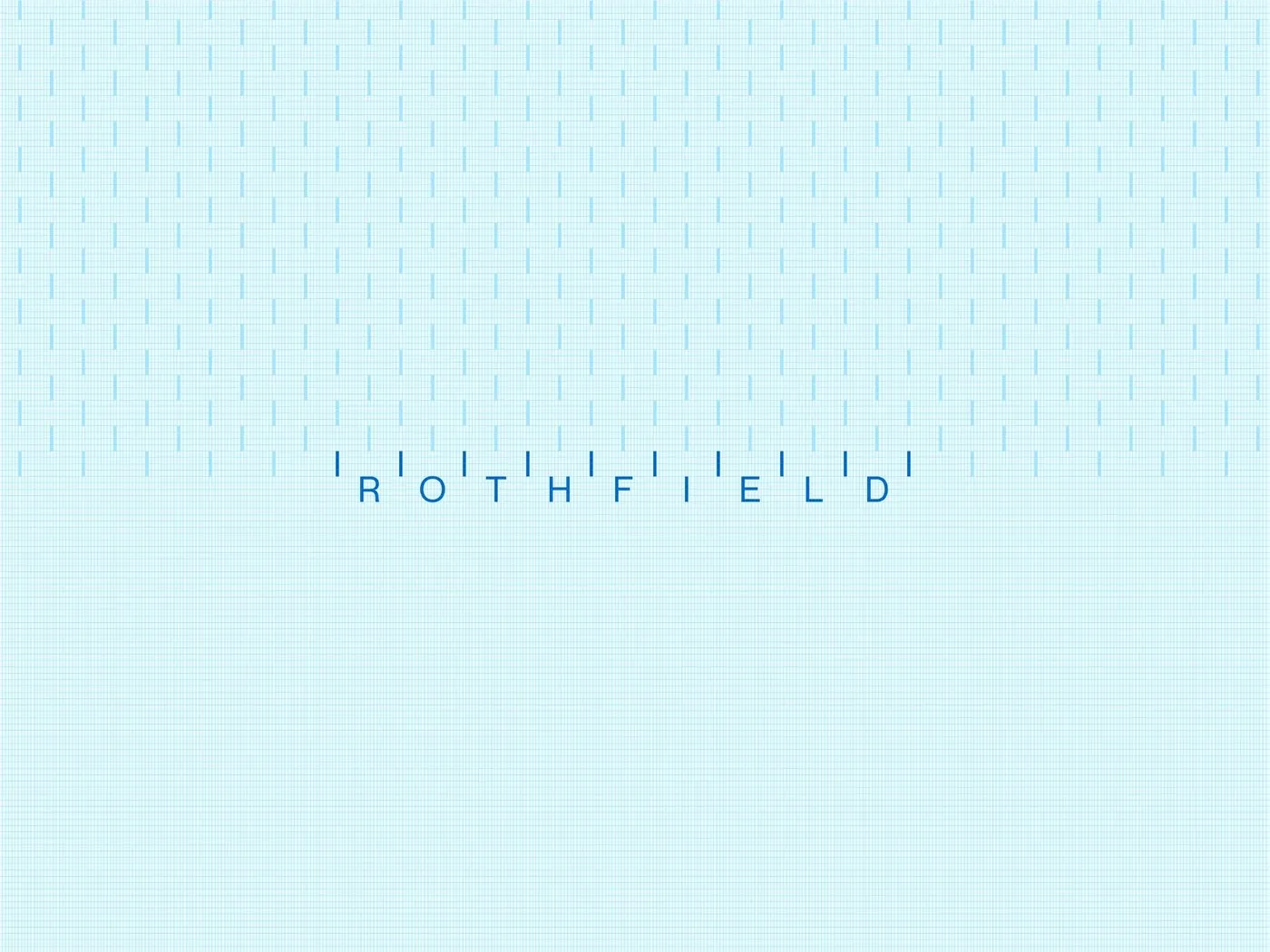
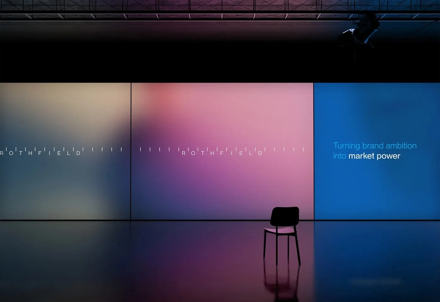
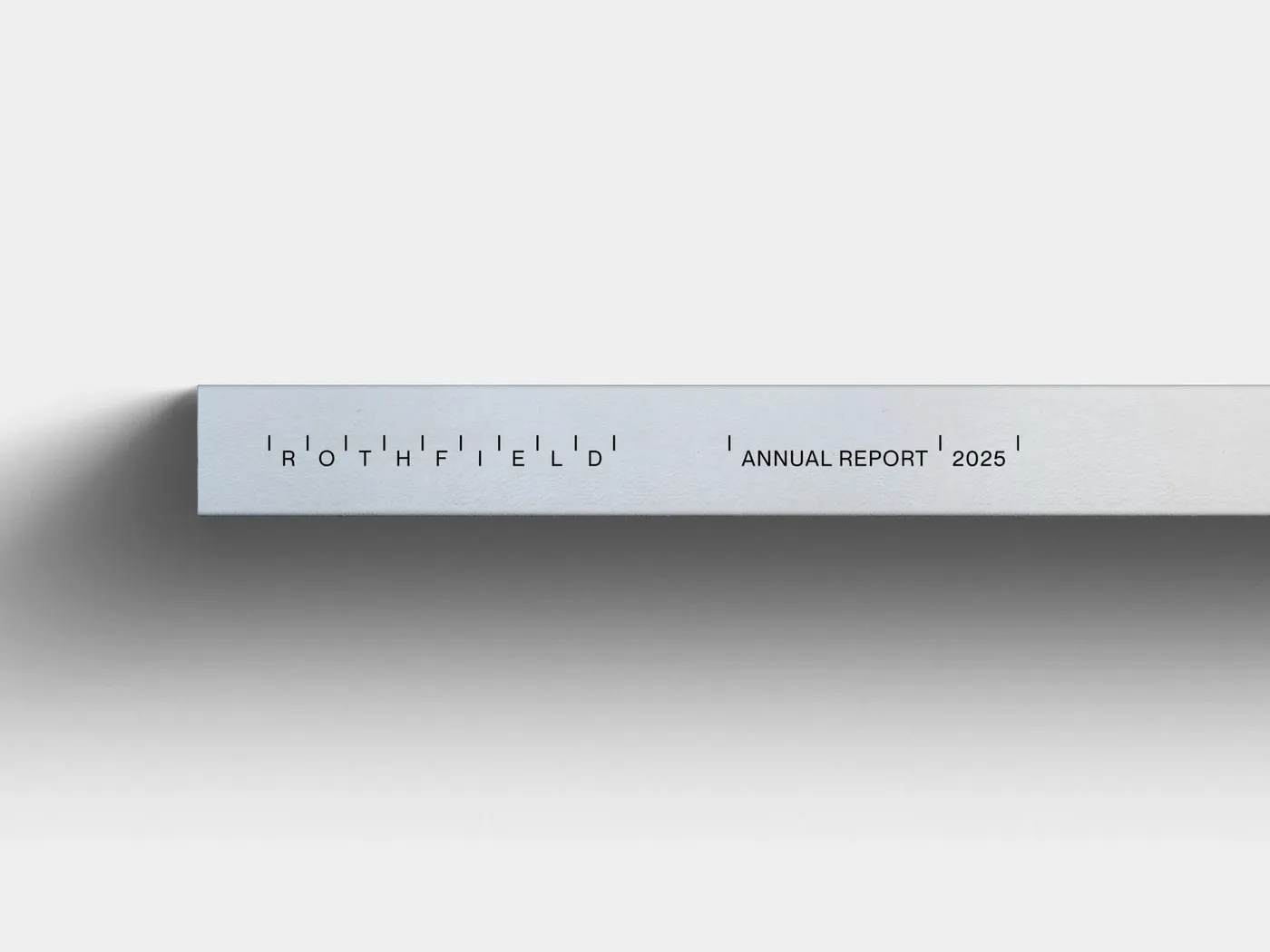
Take a close look at the wordmark: crisp geometric sans-serif letters sit neatly between vertical tick marks, precisely aligned to strict unit intervals of 1, 8, 8.5, and 19. This ultra-technical design detail instantly calls to mind architectural scale rulers, crop marks, and print press registration guides. When space gets tight—like on clothing hangtags or a tiny favicon—the full logo scales down seamlessly into a sleek | R | symbol tucked safely between two tick marks. To keep all those precise geometric shapes from feeling too rigid or cold, the studio paired the tick marks with a warm art direction called “People in Motion”—using softly blurred human silhouettes set against warm gradients to celebrate the hardworking crew behind every campaign.
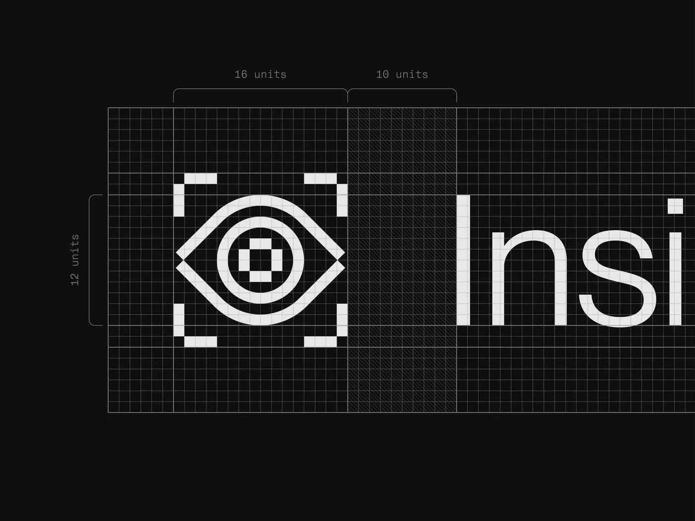
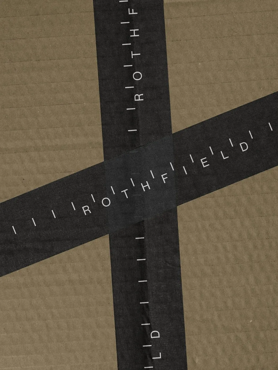
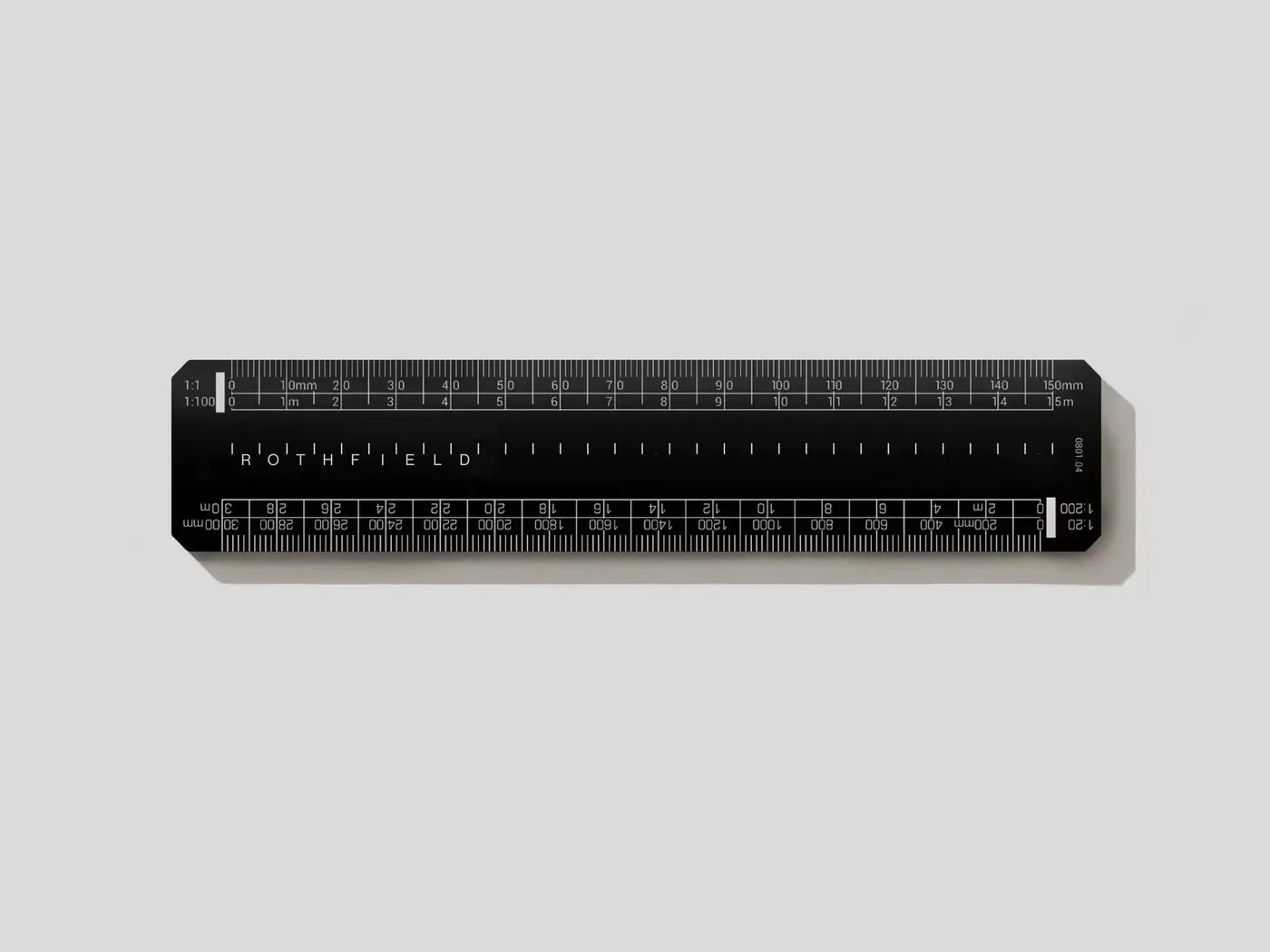
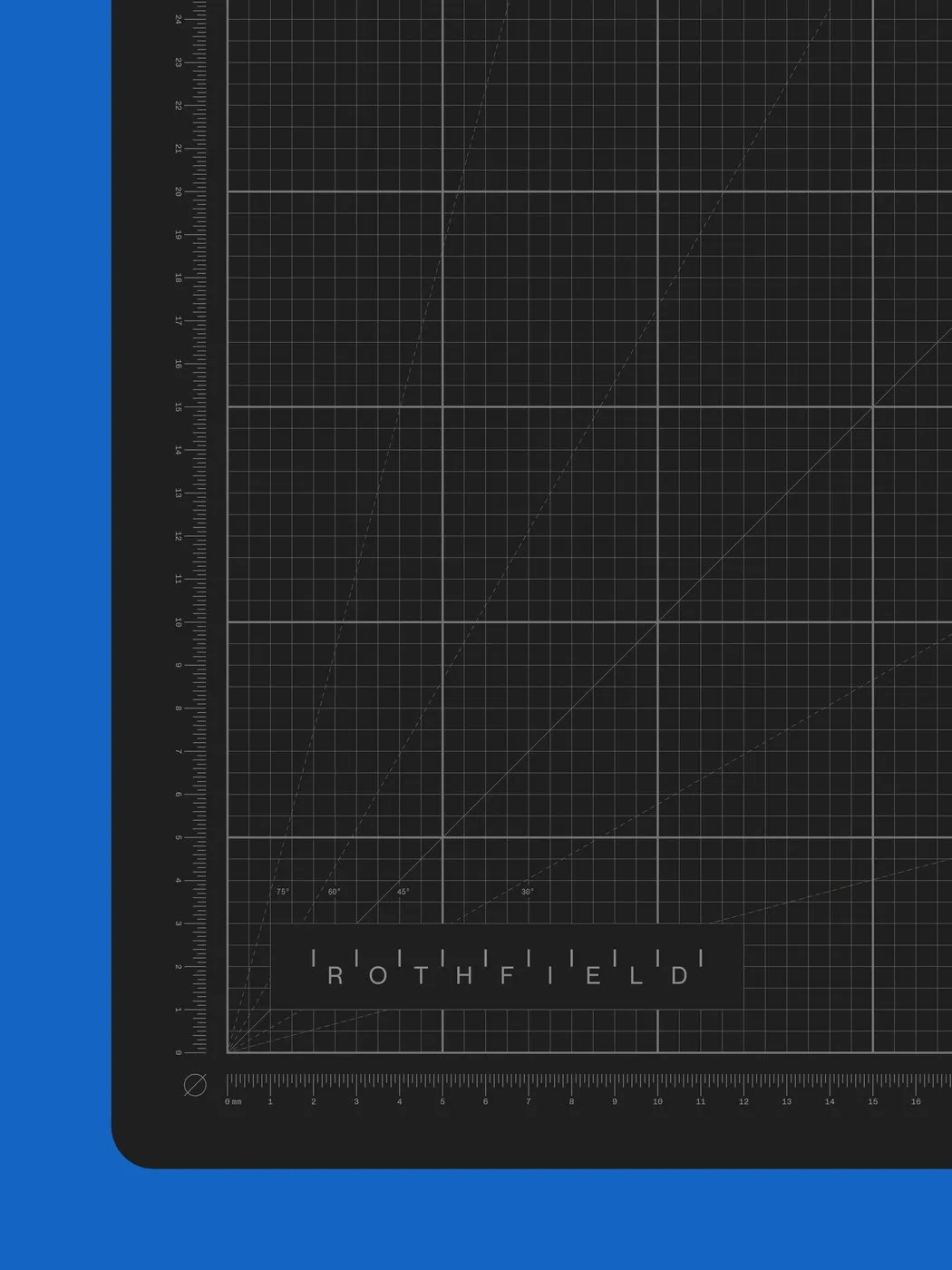
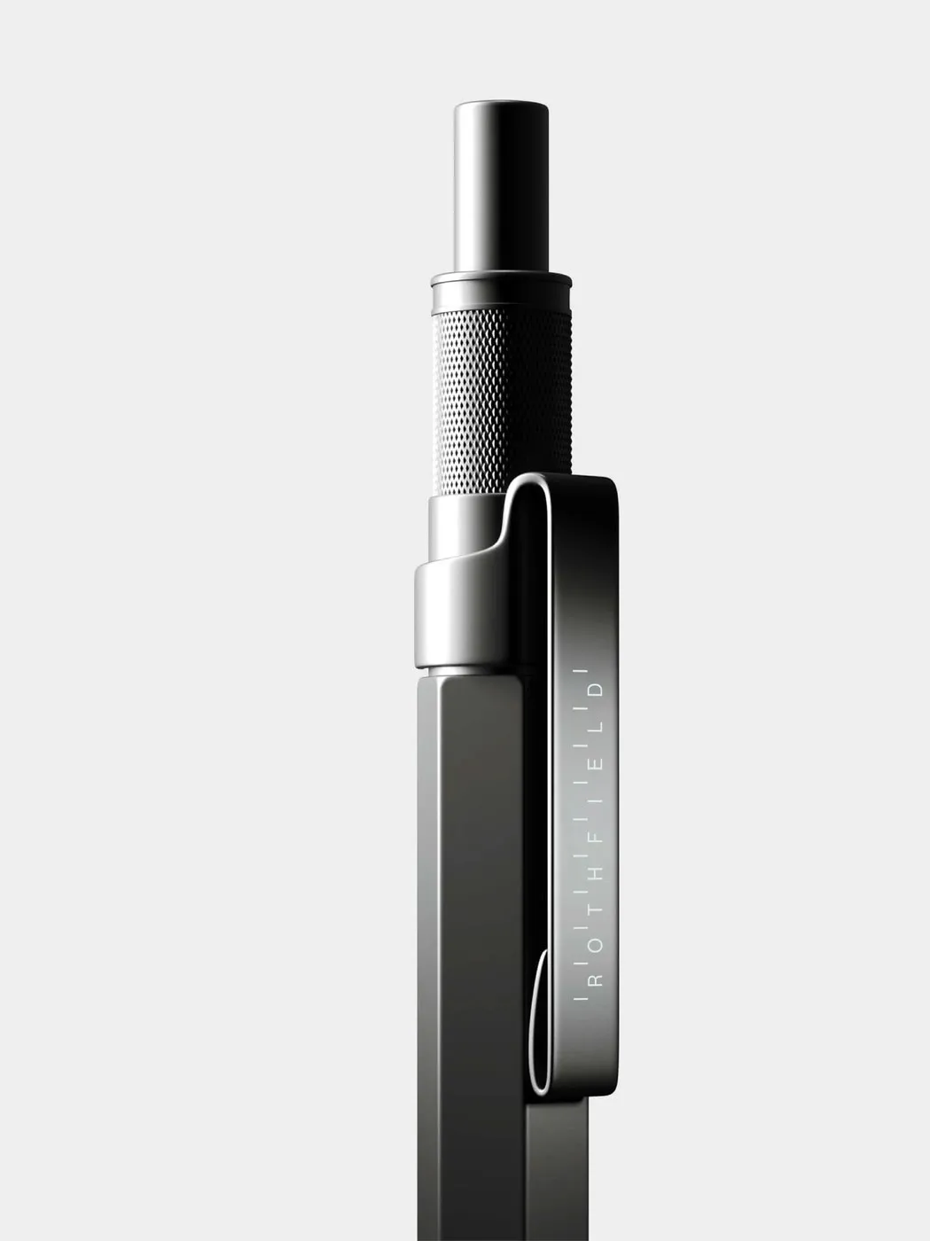
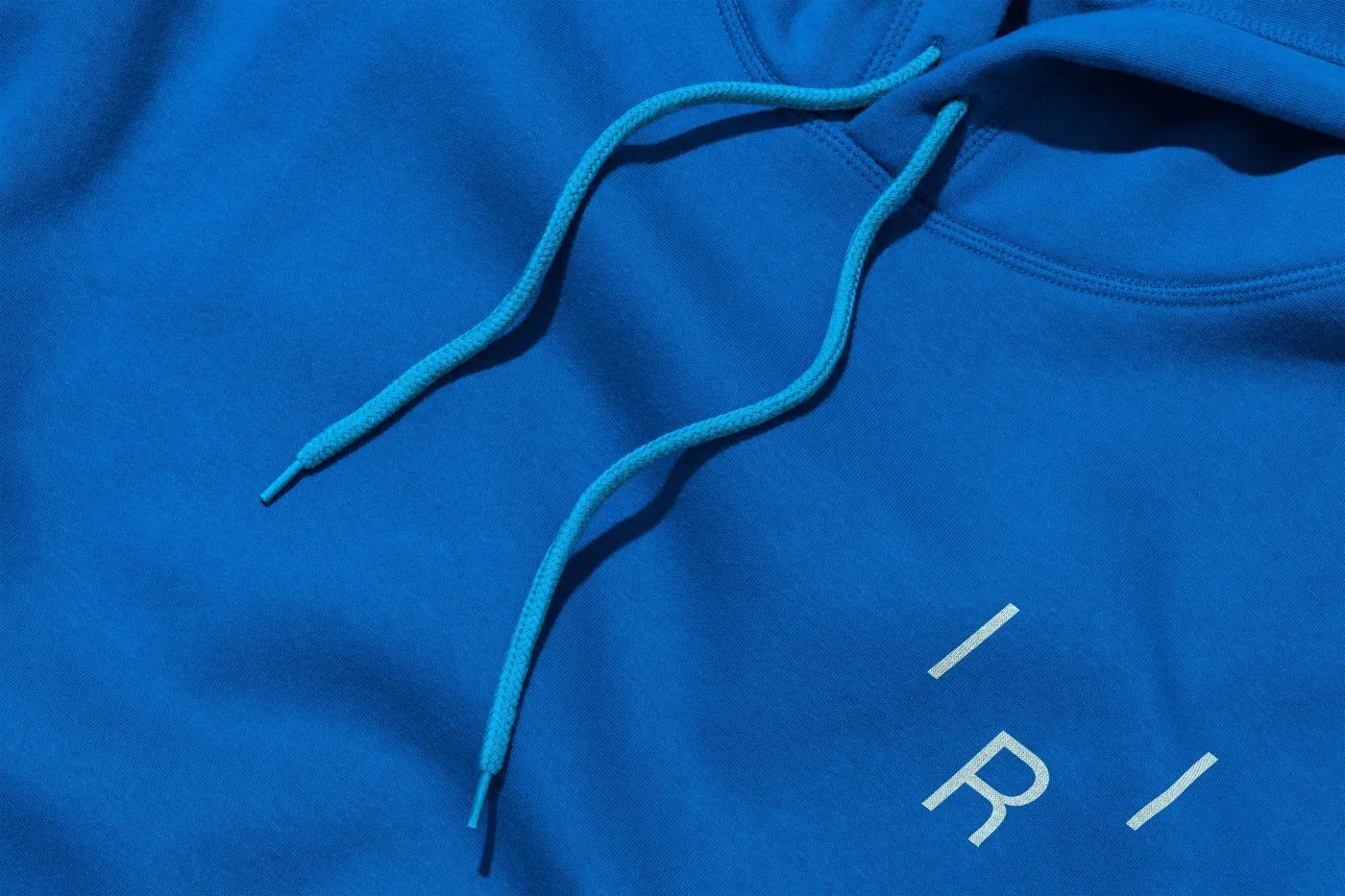
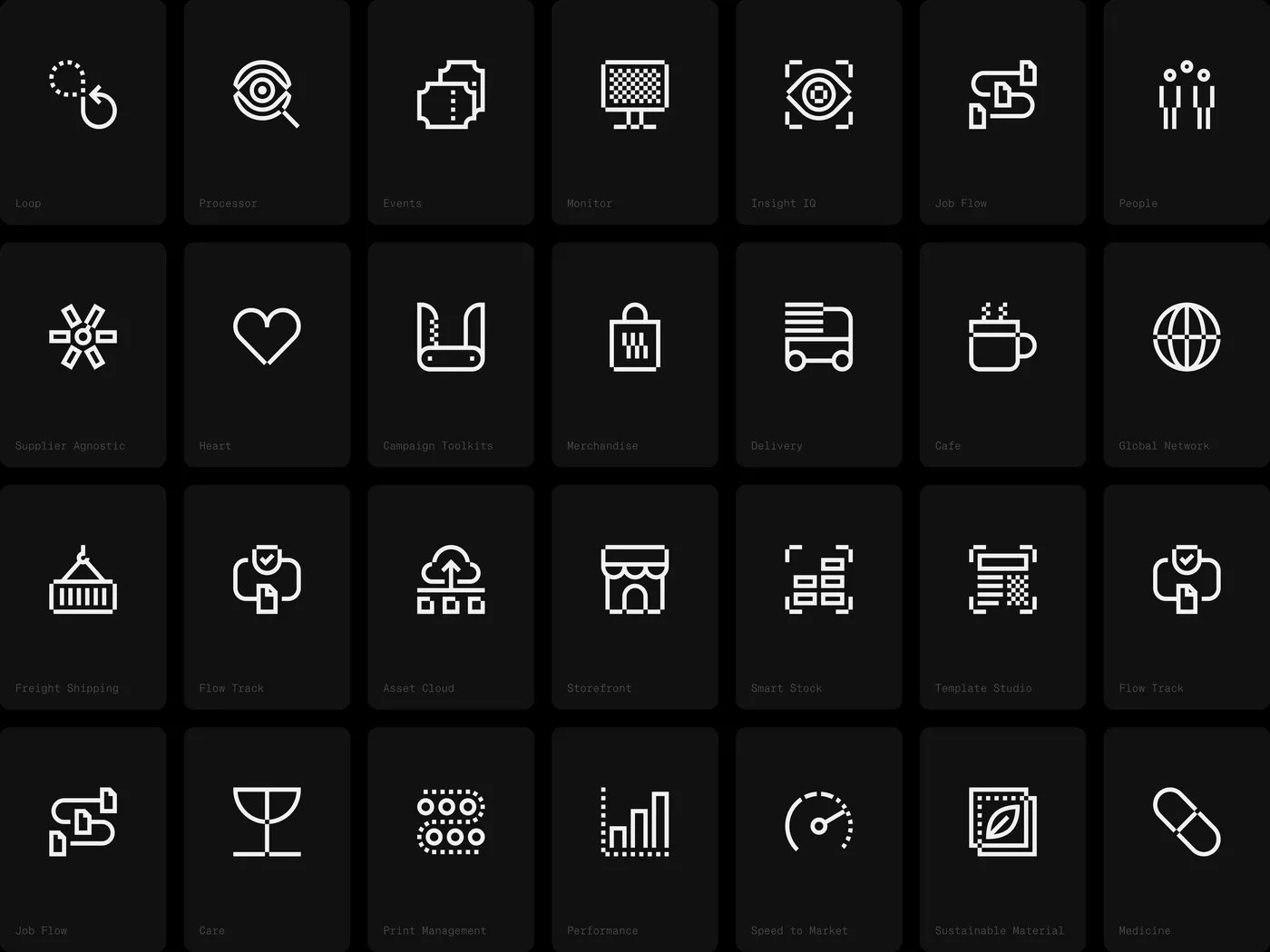
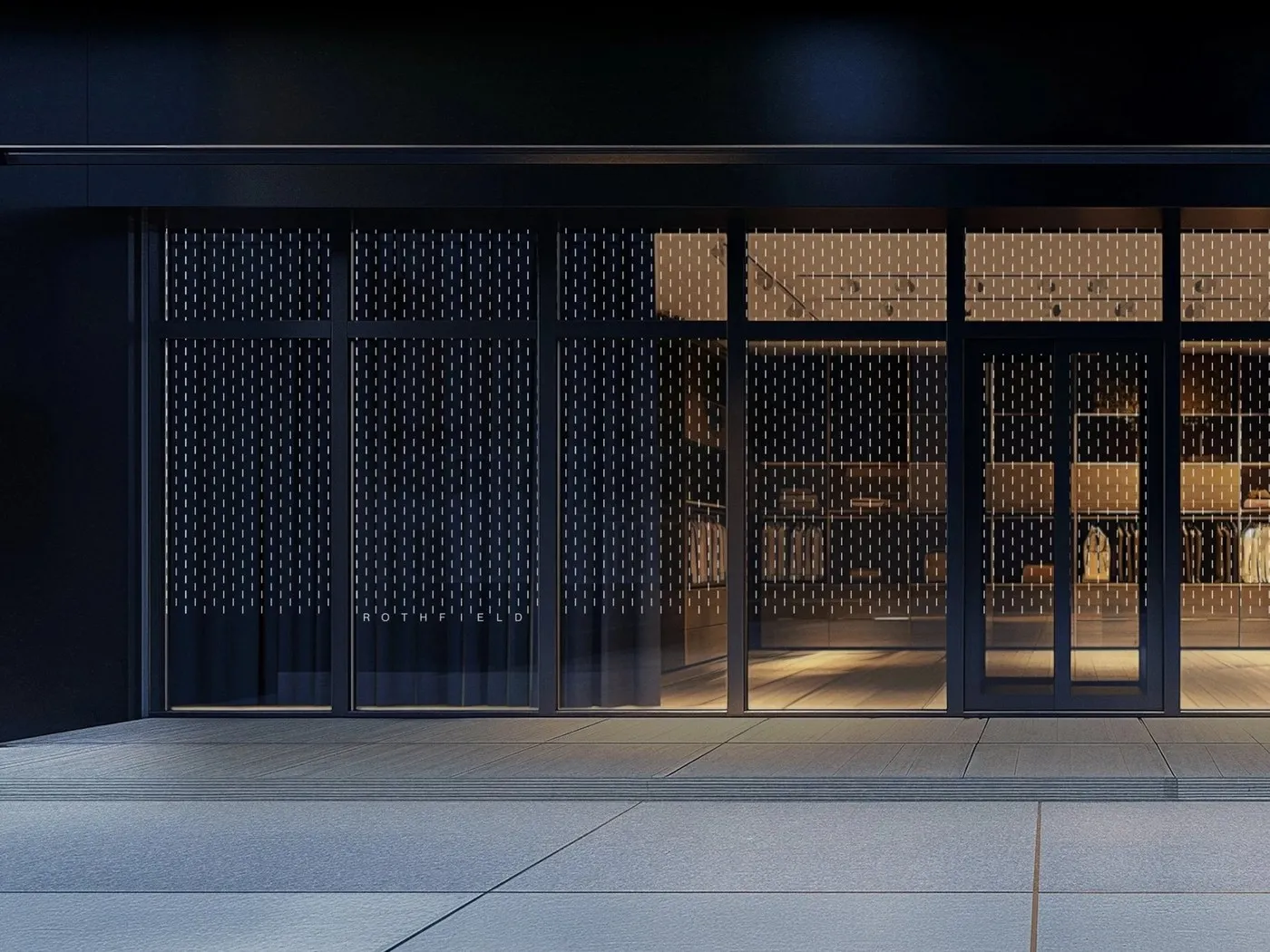
What makes this identity system so impressive is how effortlessly it translates from digital drafting boards to real-world touchpoints. On the Rothfield Connect platform, a custom 28-icon set designed on a 16-unit grid brings modules like Print Management, Freight Shipping, Smart Stock, and Insight IQ to life. On the physical side, the brand makes its mark with black anodized aluminum scale rulers engraved with 1:100 millimeter ticks, dark technical cutting mats lined with 30-to-75-degree angles, matte black metal pens, and heavy-duty kraft tape sealing up shipping boxes. You’ll even find those signature tick marks running down the spine of the 2025 Annual Report, embroidered onto vibrant cobalt blue hoodies, and etched onto storefront glass.
Check out the full brand identity project over on the www.julius.com.au/rothfield.
Bộ nhận diện thương hiệu chuẩn xác và tỉ mỉ của Rothfield do Studio Julius thực hiện
Đằng sau sự thành công của nhiều thương hiệu lớn, những đơn vị hậu thuẫn phía sau thường ít khi được chú ý tới. Rothfield – một đối tác thực thi marketing tại Úc – đã phát triển suốt nhiều thập kỷ từ quản lý in ấn truyền thống và quà tặng doanh nghiệp thành một quy trình thu mua, sản xuất và logistics toàn diện. Để xây dựng một hệ thống nhận diện tương xứng với quy mô thực tế, Studio Julius tại Melbourne đã hợp tác cùng Stake Reputation về mặt chiến lược và Josh Le Good về motion design. Thay vì đi theo lối mòn của các hình ảnh logistics doanh nghiệp thông thường, đội ngũ thiết kế đã định hình toàn bộ nhận diện dựa trên khái niệm hiệu chuẩn (calibration), phép đo và sự chính xác của các công cụ bản vẽ kỹ thuật.
Nhìn kỹ vào phần wordmark, các chữ cái dạng geometric sans-serif gọn gàng nằm giữa những vạch chia dọc (tick marks), được căn chỉnh theo các khoảng đơn vị nghiêm ngặt 1, 8, 8.5 và 19. Chi tiết thiết kế mang đậm tính kỹ thuật này gợi liên tưởng ngay đến thước tỷ lệ kiến trúc, vạch canh lề (crop marks) hay dấu căn chỉnh in ấn (press registration guides). Khi ứng dụng ở không gian hẹp như thẻ treo quần áo hay favicon, logo đầy đủ có thể thu gọn thành một biểu tượng | R | nằm gọn giữa hai vạch chia. Để tránh cảm giác quá khô cứng từ các hình khối hình học, studio đã kết hợp các vạch chia với định hướng hình ảnh mang tên “People in Motion” — sử dụng bóng người làm mờ nhẹ cùng tông màu gradient ấm áp để thể hiện những con người thầm lặng đằng sau các chiến dịch.
Điểm ấn tượng của hệ thống này là khả năng dịch chuyển mượt mà từ bản vẽ kỹ thuật số sang các công cụ thực tế. Trên nền tảng Rothfield Connect, bộ icon 28 biểu tượng được thiết kế trên lưới 16 đơn vị, áp dụng cho các mô-đun như Print Management, Freight Shipping, Smart Stock hay Insight IQ. Về mặt vật lý, bộ nhận diện được thể hiện qua thước kẻ kiến trúc bằng nhôm anodized đen khắc vạch chia millimeter 1:100, thảm cắt kỹ thuật màu tối với góc cắt từ 30 đến 75 độ, bút kim loại đen nhám, và băng keo giấy kraft gia cố trên thùng carton. Ngay cả gáy sách Báo cáo Thường niên 2025, áo hoodie thêu màu xanh cobalt hay kính mờ cửa hàng cũng xuất hiện những vạch chia đặc trưng này.
Bạn có thể xem đầy đủ dự án nhận diện thương hiệu này trên trang portfolio của www.julius.com.au/rothfield.