Span Breathes Fresh Prairie Energy Into Chicago’s Nature Museum Brand Identity Chicago’s Peggy Notebaert Nature Museum has been a beloved local staple since 1857. Driven by a fresh strategic plan, Nick Adam and the design team at Span stepped up to update a visual identity that had remained untouched for two decades. Taking inspiration directly from Illinois’ native prairies, they crafted a warm, welcoming brand system built to resonate with everyone—from casual weekend visitors to scientific researchers. Right at the entrance, a bold vertical banner sets the tone with “NATURE MUSEUM” set in milkweed cream against a deep catalpa green backdrop, paired with flowing petal forms behind it and the inspiring phrase “INSPIRING NATURE CHAMPIONS” right above the doors.
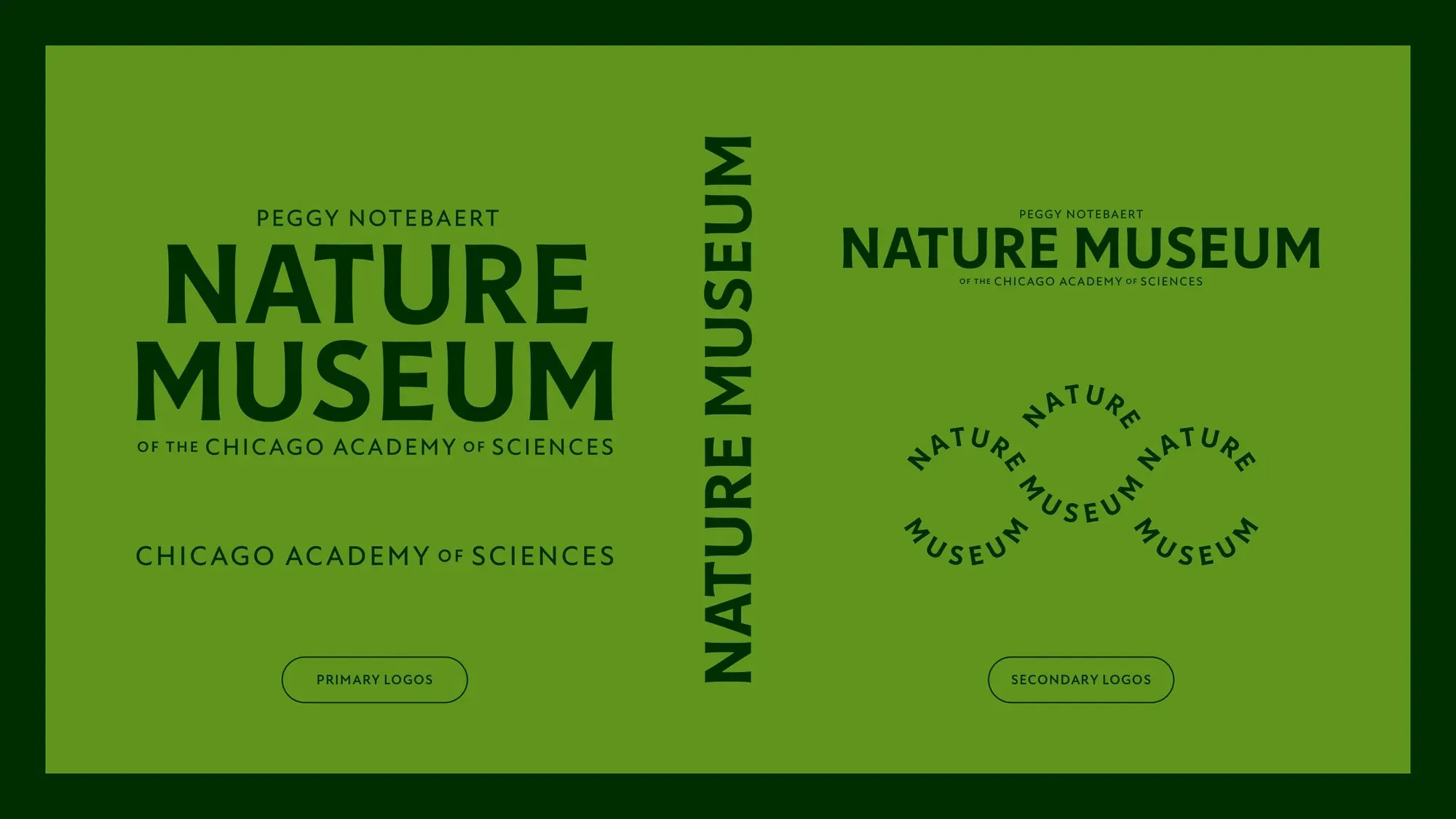
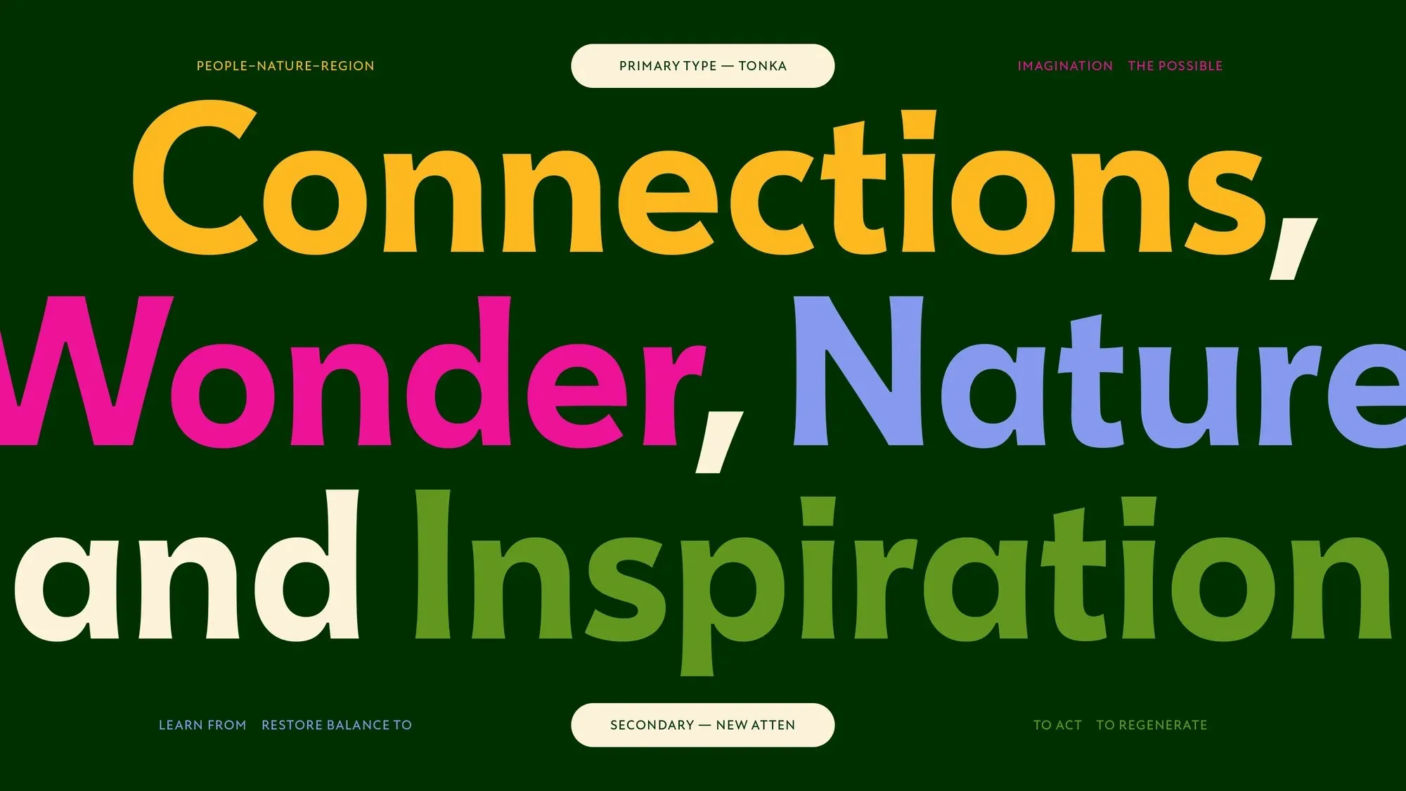
The primary wordmark relies on Céline Hurka’s Tonka typeface, featuring softly flared stems that strike a sweet balance between historic character and organic charm. “PEGGY NOTEBAERT” rests gently above the stacked “NATURE MUSEUM” text, grounded by the base line “OF THE CHICAGO ACADEMY OF SCIENCES”. For supporting copy, the brand uses New Atten—a charming humanist sans-serif designed by Miles Newlyn, inspired by the distinctive voice of Sir David Attenborough. Another standout detail is a circular NATURE MUSEUM seal wrapping around a delicate butterfly icon, bringing to mind classic field research station stamps.
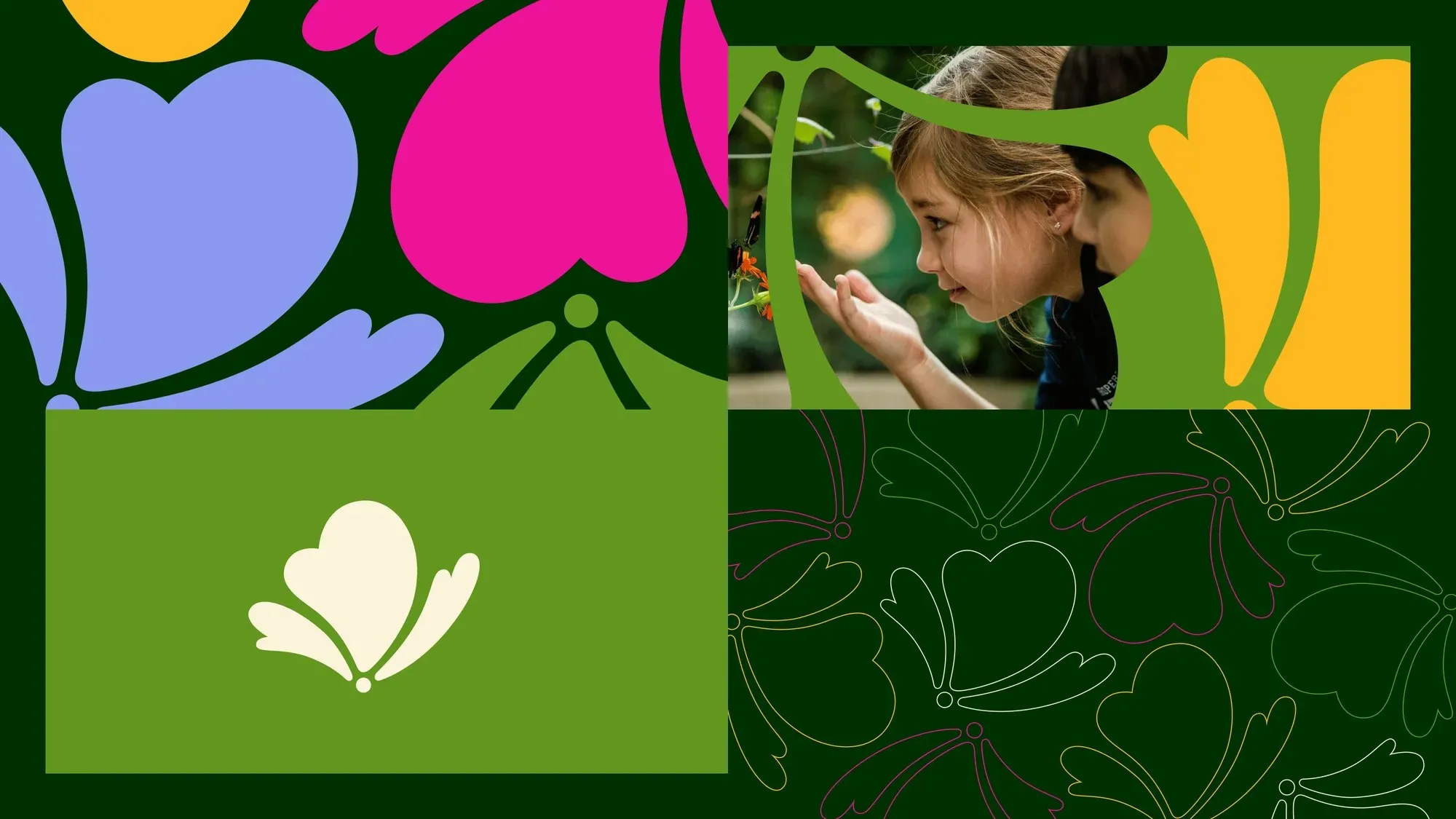
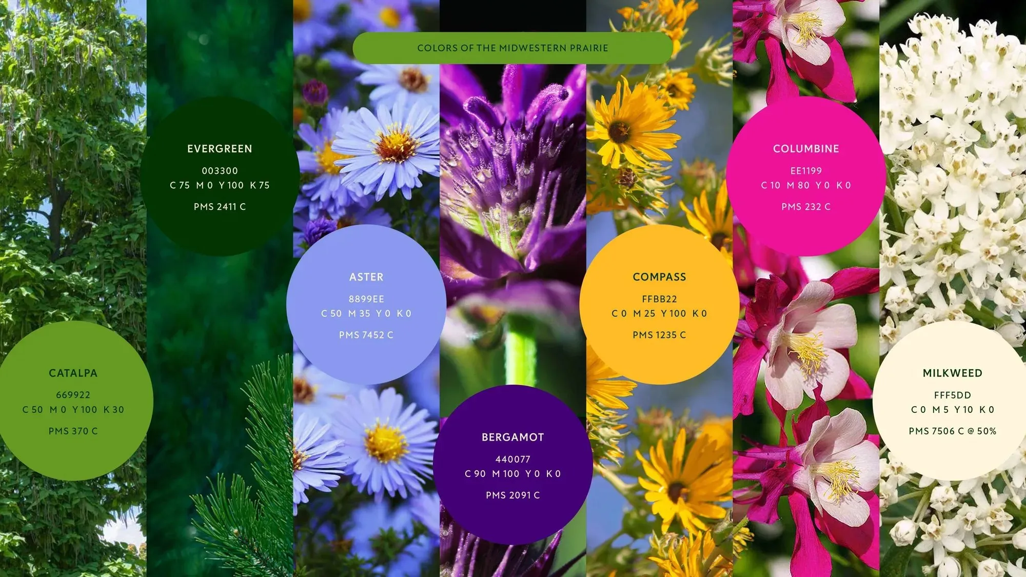
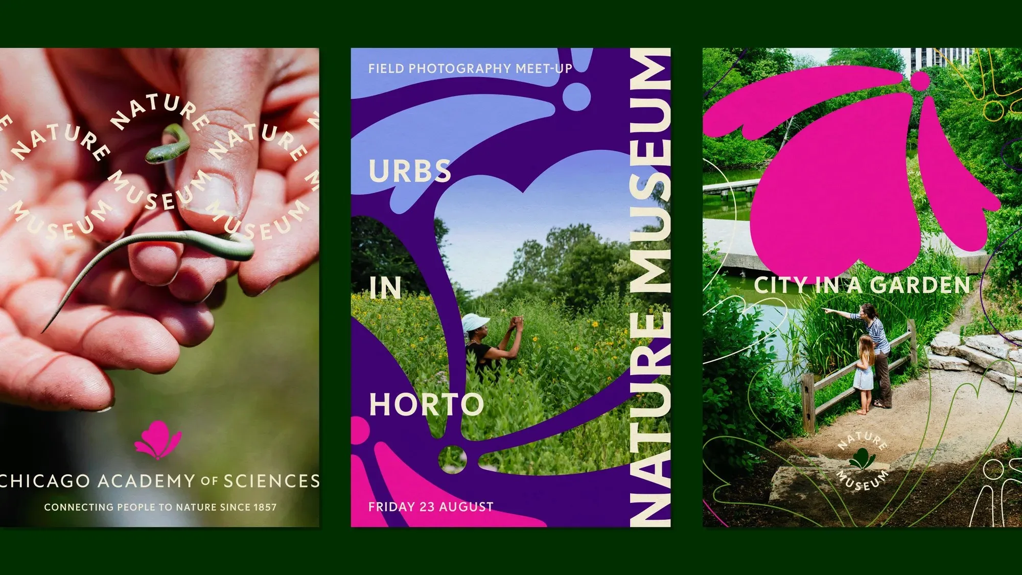
Drawing straight from prairie flora, the color system relies on seven specific PMS shades. Catalpa green and Evergreen act as the grounding structural anchors, while Columbine pink, Aster blue, and Compass yellow inject vibrant bursts of visual energy. Meanwhile, milkweed cream delivers crisp legibility and high contrast across diverse background colors. The flexible main icon seamlessly transforms between a butterfly, a flower, or a cloud, taking on three dynamic roles across the identity: a standalone logo, a photo framing device, and a repeating graphic pattern.
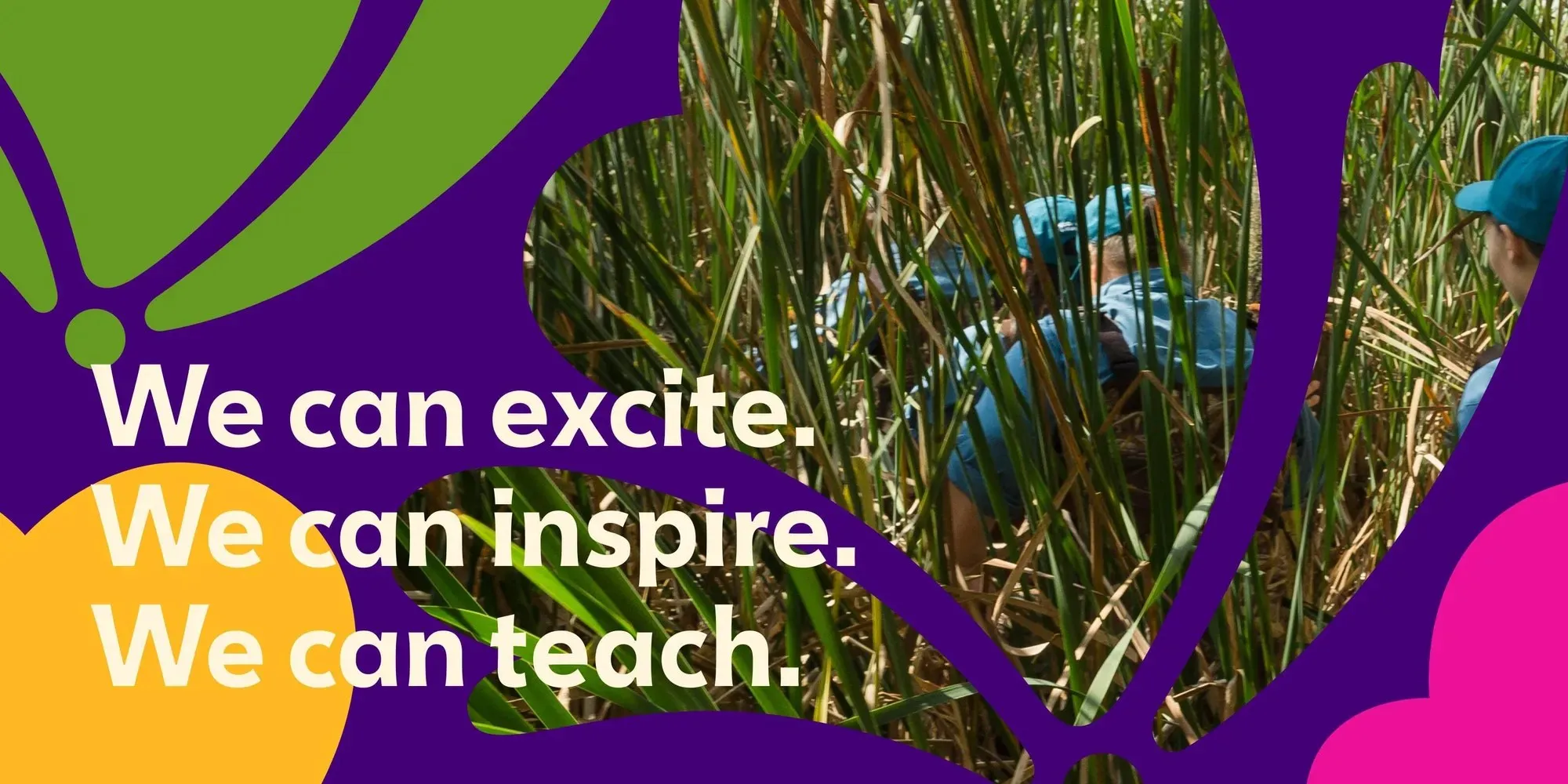
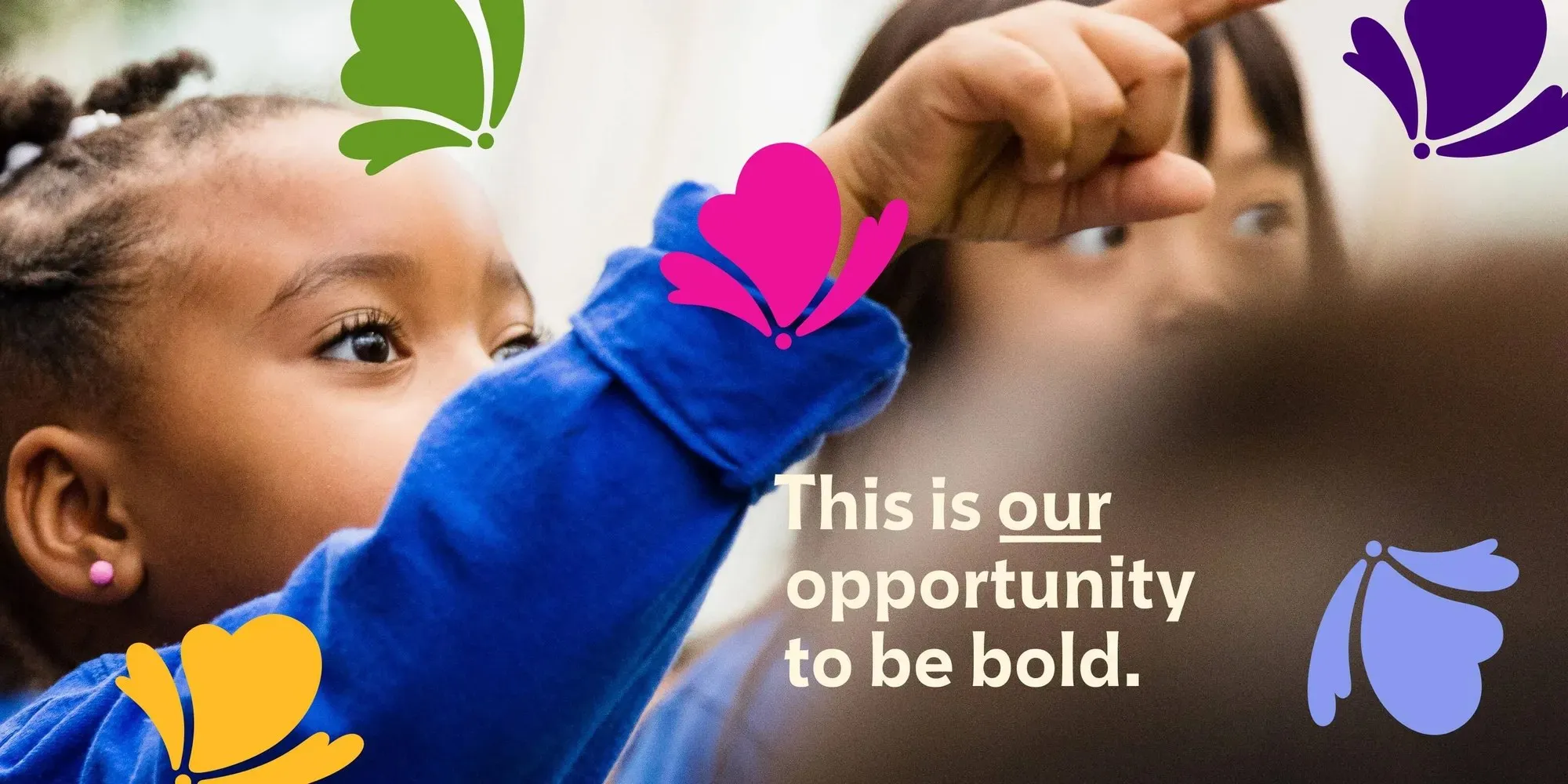
Going beyond core branding, Span also revamped the museum’s website, environmental signage, and merchandise line. Campaign graphics pair punchy, uplifting copy—like “We can excite. We can inspire. We can teach.” and “This is our opportunity to be bold.”—with stunning wetland photography framed by the new custom icon shapes. As President and CEO Erin Amico points out, the museum is so much more than a showcase for past history, making this vibrant refresh the perfect reflection of where the institution is headed.
Check out all the project details over on the span.studio/projects/nature-museum-visual-identity.
Span Thổi Sức Sống Đồng Cỏ Vào Bộ Nhận Diện Cho Nature Museum
Bảo tàng Nature Museum (Peggy Notebaert) tại Chicago đã gắn bó với cộng đồng địa phương từ năm 1857. Đứng trước yêu cầu từ kế hoạch chiến lược mới, đội ngũ thiết kế của Nick Adam tại Span đã tiến hành cập nhật bộ nhận diện thương hiệu đã giữ nguyên suốt hai thập kỷ. Ý tưởng chủ đạo được khai thác từ các đồng cỏ tự nhiên ở Illinois, mang lại vẻ ngoài thân thiện, ấm áp nhưng vẫn đáp ứng được tệp công chúng đa dạng, từ khách tham quan cuối tuần đến các nhà nghiên cứu khoa học. Ngay ở lối vào, ấn tượng thị giác được tạo bởi tấm banner dọc mang chữ NATURE MUSEUM màu kem milkweed trên nền xanh catalpa, kết hợp cùng biểu tượng cánh hoa uốn lượn phía sau và dòng chữ “INSPIRING NATURE CHAMPIONS” phía trên cửa ra vào.
Logo dạng wordmark sử dụng phông chữ Tonka của Céline Hurka với phần chân chữ hơi xòe nhẹ, tạo cảm giác vừa mang tính lịch sử vừa mang hơi thở tự nhiên. Dòng chữ “PEGGY NOTEBAERT” đặt phía trên chữ “NATURE MUSEUM” xếp chồng, cùng phần chân đế “OF THE CHICAGO ACADEMY OF SCIENCES”. Phông chữ phụ đi kèm là New Atten – một kiểu chữ humanist sans do Miles Newlyn thiết kế, lấy cảm hứng từ giọng nói của Sir David Attenborough. Một chi tiết đáng chú ý khác là con dấu tròn NATURE MUSEUM uốn quanh biểu tượng hình con bướm, gợi liên tưởng đến những chiếc tem ở trạm nghiên cứu dã ngoại.
Bảng màu của dự án lấy cảm hứng từ hệ thực vật đồng cỏ với 7 mã màu PMS cụ thể. Hai tông xanh Catalpa và Evergreen giữ vai trò tạo khung cấu trúc, trong khi hồng Columbine, xanh Aster và vàng Compass tạo điểm nhấn thị giác nổi bật. Màu kem Milkweed giúp phần chữ luôn đảm bảo độ tương phản và dễ đọc khi đặt trên các nền màu. Biểu tượng chính có hình dáng linh hoạt, vừa gợi liên tưởng đến con bướm, bông hoa hoặc đám mây, được ứng dụng dưới ba dạng: logo độc lập, khung crop hình ảnh, và dạng hoa văn lặp lại.
Bên cạnh bộ nhận diện cốt lõi, Span cũng hoàn thiện lại trang web, hệ thống biển chỉ dẫn và các sản phẩm lưu niệm cho bảo tàng. Các ấn phẩm chiến dịch kết hợp các thông điệp ngắn gọn như “We can excite. We can inspire. We can teach.” và “This is our opportunity to be bold.” trên nền ảnh chụp đầm lầy được đóng khung theo hình dáng biểu tượng. Chủ tịch kiêm CEO Erin Amico nhận định rằng bảo tàng không chỉ đơn thuần là nơi lưu giữ lịch sử, và bộ nhận diện mới này là bước chuyển mình phù hợp với định hướng phát triển hiện tại.
Xem thêm chi tiết về dự án này trên trang case study của span.studio/projects/nature-museum-visual-identity.