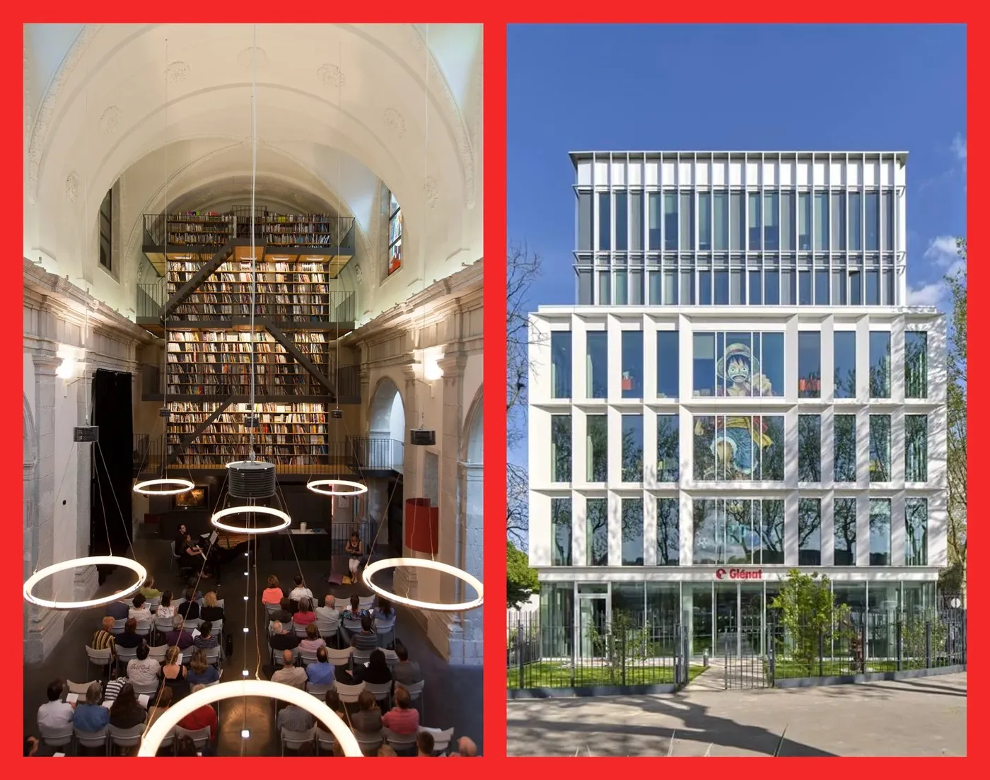
How Brand Brothers Tackled Glénat’s Brand Identity Refresh Glénat stands as one of France’s premier publishing powerhouses, founded back in 1969 in Grenoble by Jacques Glénat. With an incredible catalog of over 14,000 titles and a network of 2,000 authors, they are the creative home behind pop-culture giants like Dragon Ball, One Piece, Akira, and Titeuf, spanning four main categories: comic books (BD), manga, children’s literature, and art books.
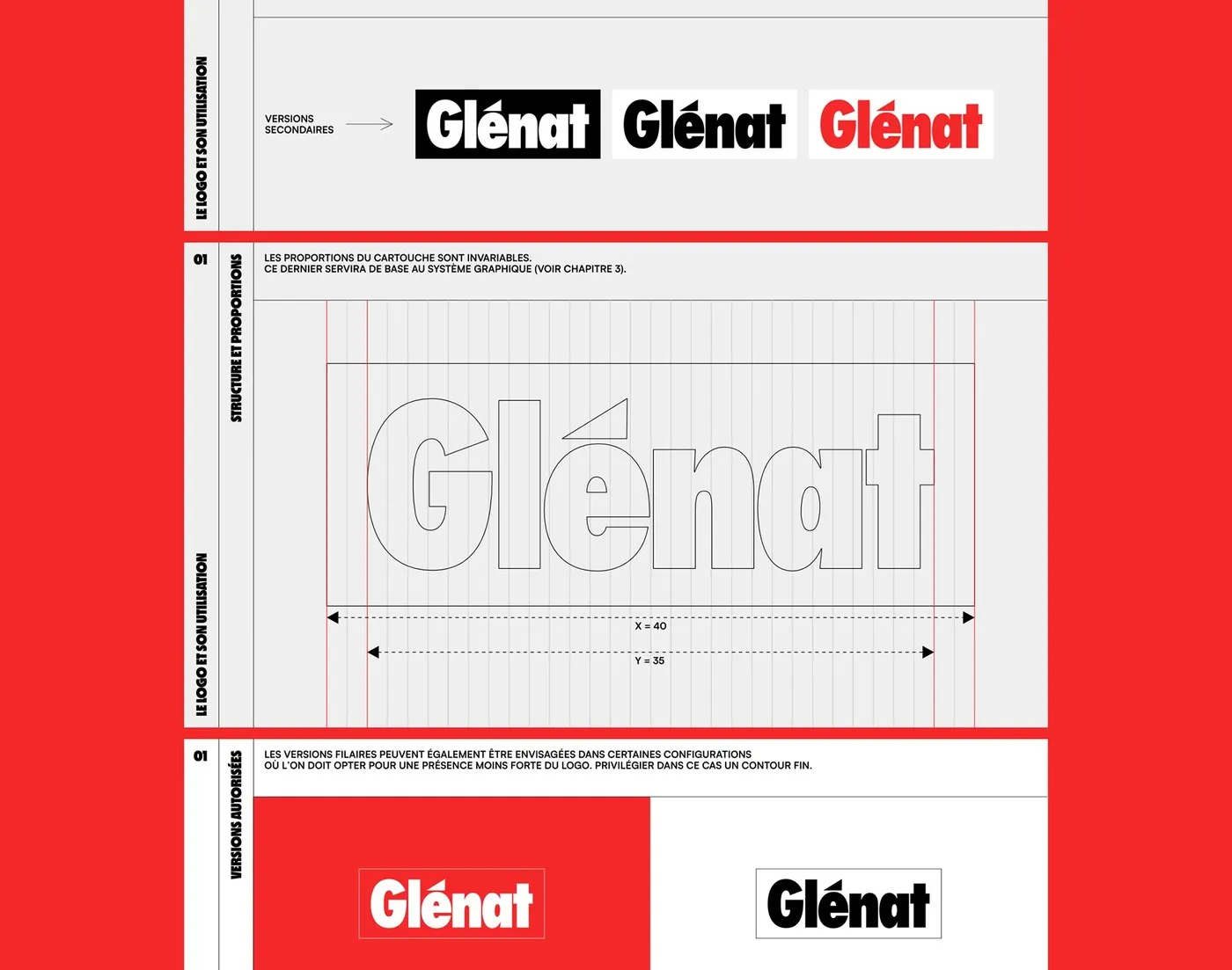
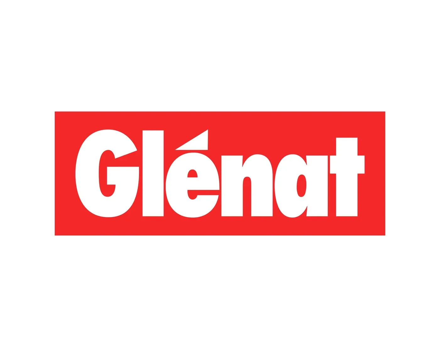
The creative team at Brand Brothers faced an exciting design challenge: Glénat’s classic logotype—built with Futura Condensed Extra Bold—is a landmark in French publishing and was strictly off-limits for modifications. The design mission was to craft a flexible, dynamic visual identity system that honors this iconic heritage while seamlessly uniting their massive catalog.
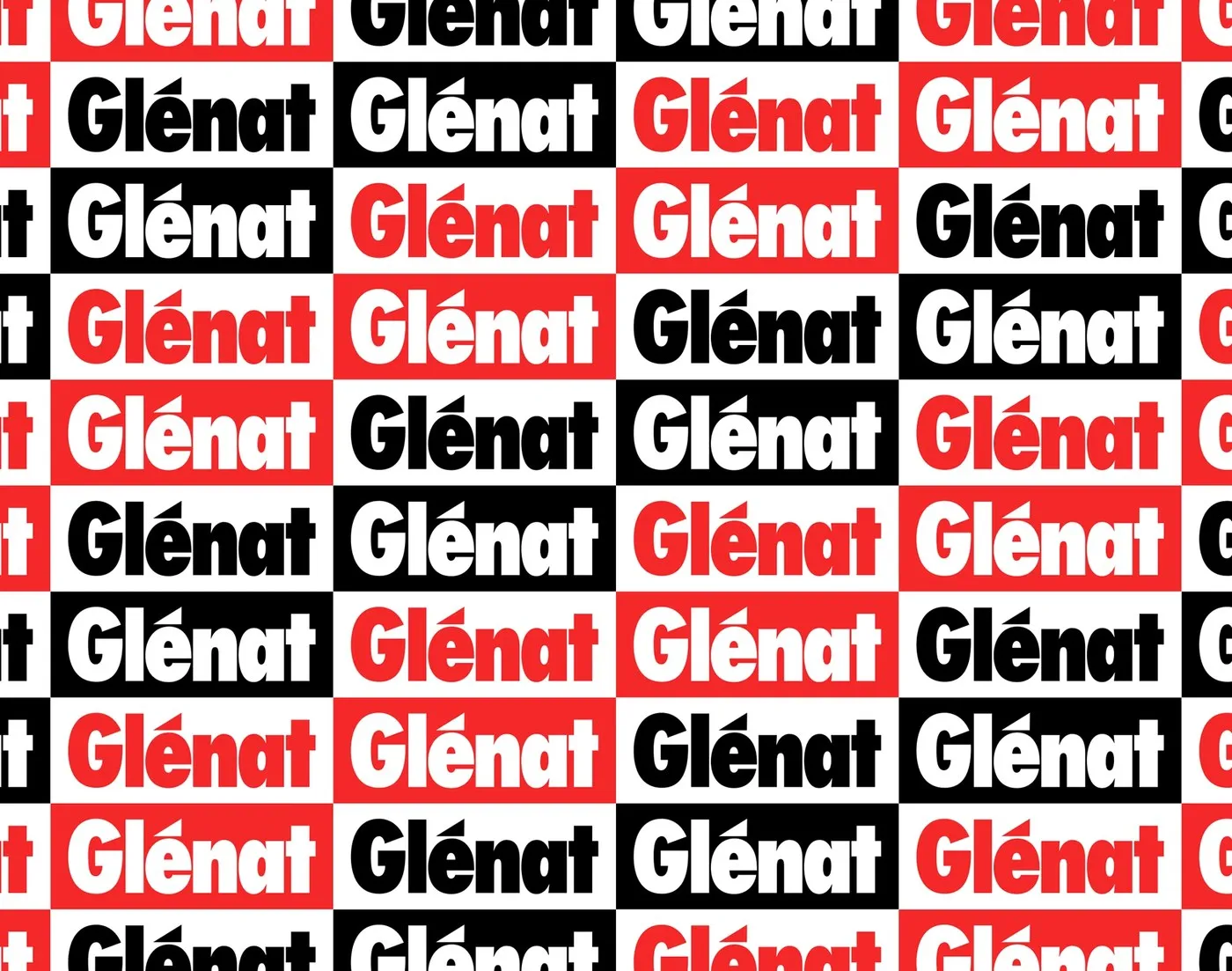
The initial solution framed the original logo inside a bold red container (a cartouche). This simple move provides a standardized visual anchor that serves as the perfect springboard for building out the broader brand language.
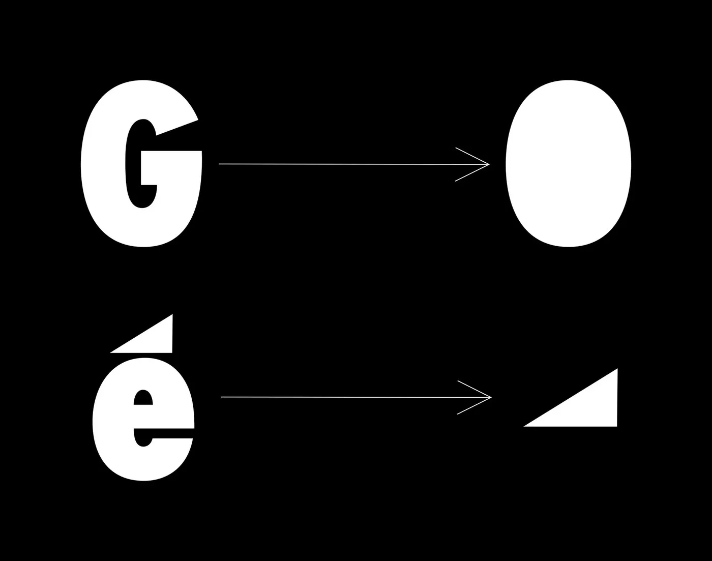
Where the design magic really happens is how Brand Brothers extracted pure geometric shapes directly from the original mark. By deconstructing the typography, the design team isolated two core building blocks: a vertical oval from the letter “G” and a right-angled triangle from the acute accent on the “é”. From just these two simple shapes, the studio generated an entire graphic alphabet. Built on a tight grid system, this setup ensures rock-solid visual consistency whether rendered as solid color fills, clean wireframe outlines, or across vibrant marketing materials.
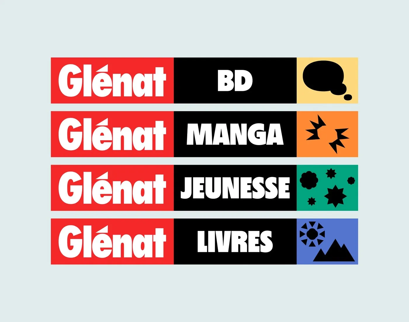
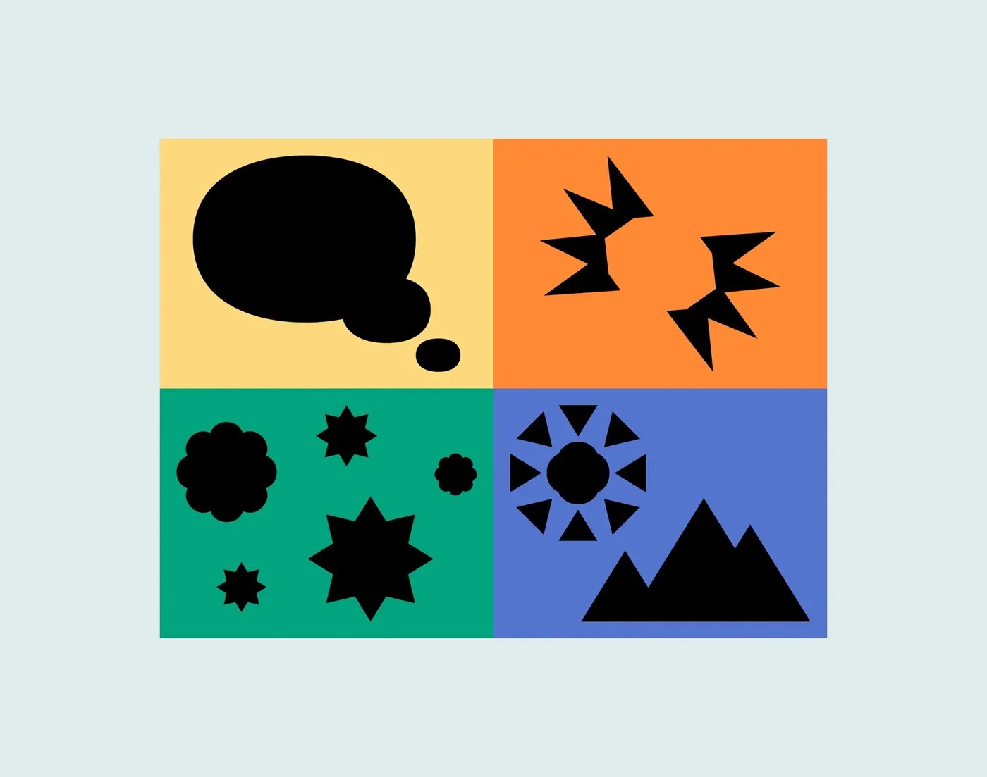
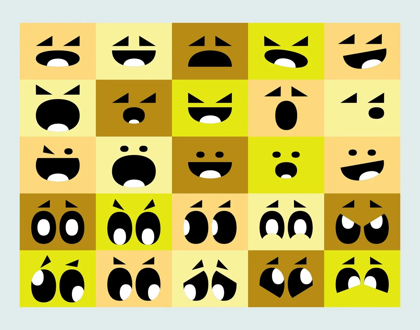
This playful visual system breaks down into two complementary icon families: “Emotion icons,” which bring reading to life through expressive faces and eyes, and “Ambiance icons,” which evoke storytelling settings using abstract forms. To give each editorial line its own flavor, every segment gets a dedicated palette: rich amber for comic books (BD), energetic orange for manga, deep emerald green for kids’ books, and periwinkle blue for art titles.
Taking things a step further, motion design brings these geometric forms to life across digital platforms. The flexible system gives Glénat a unified visual presence across printed catalogs, web interfaces, and major event displays, while still leaving book covers completely clear for authors to express their own artistic visions.
Check out more details of this design project on www.behance.net/gallery/232974123/Glnat-Identity-system.
Brand Brothers và bài toán làm mới bộ nhận diện thương hiệu cho Glénat
Glénat là một trong những nhà xuất bản danh tiếng tại Pháp, được thành lập từ năm 1969 tại Grenoble bởi Jacques Glénat. Với kho tàng hơn 14.000 đầu sách và hợp tác cùng 2.000 tác giả, họ sở hữu nhiều cái tên vô cùng quen thuộc như Dragon Ball, One Piece, Akira hay Titeuf, trải dài trên 4 mảng nội dung chính: truyện tranh (BD), manga, sách thiếu nhi và sách nghệ thuật.
Thách thức đặt ra cho studio Brand Brothers là logo được tạo từ font Futura Condensed Extra Bold của Glénat đã trở thành biểu tượng kinh điển trong ngành xuất bản Pháp và hoàn toàn không thể thay đổi. Nhiệm vụ của đội ngũ thiết kế là làm sao xây dựng một hệ thống nhận diện linh hoạt, vừa giữ trọn giá trị di sản, vừa đủ sức bao quát toàn bộ danh mục sản phẩm đồ sộ.
Giải pháp đầu tiên được đưa ra là đặt logo nguyên bản vào trong một khung đỏ (cartouche). Chi tiết này đóng vai trò như một chiếc khung chuẩn hóa, làm điểm tựa vững chắc để phát triển toàn bộ ngôn ngữ thị giác phía sau.
Điểm thú vị nằm ở cách Brand Brothers khai thác các yếu tố hình học ngay trên biểu tượng gốc. Họ phân tích nét chữ và chiết xuất ra hai hình khối nền tảng: hình o-van đứng từ chữ “G” và hình tam giác vuông từ dấu sắc trên chữ “é”. Chỉ từ hai mảnh ghép đơn giản này, studio đã phát triển thành một bộ chữ đồ họa (graphic alphabet) riêng biệt. Mọi tỷ lệ đều tuân theo hệ thống lưới nghiêm ngặt, giúp bộ nhận diện giữ được sự nhất quán tuyệt đối dù xuất hiện ở dạng mảng màu phẳng, nét đơn wireframe hay trên các ấn phẩm truyền thông.
Ngôn ngữ thị giác này tiếp tục được chia thành hai nhóm biểu tượng hỗ trợ nhau: nhóm “Emotion icons” thể hiện các biểu cảm khuôn mặt và ánh mắt sinh động khi đọc sách, còn nhóm “Ambiance icons” gợi mở không gian câu chuyện qua những hình khối trừu tượng. Mỗi mảng sách cũng được quy định một bảng màu riêng: màu hổ phách cho truyện tranh BD, cam rực rỡ cho manga, xanh ngọc bảo cho sách thiếu nhi và xanh periwinkle cho sách nghệ thuật.
Bên cạnh đó, các hình khối còn được ứng dụng chuyển động (motion design) để xuất hiện sinh động trên các nền tảng kỹ thuật số. Hệ thống thiết kế này giúp Glénat hiện diện đồng nhất từ catalogue in ấn, website cho đến các sự kiện lớn, trong khi vẫn dành trọn không gian thiết kế bìa sách cho sự sáng tạo của các tác giả.
Xem thêm chi tiết thiết kế dự án tại www.behance.net/gallery/232974123/Glnat-Identity-system.